6 Relationships Between Categorical Variables
Objectives
After successfully completing this lesson, you should be able to:
- Use a table of cross-classified data to find summaries that answer questions of interest about data. This includes the ability to:
- Distinguish between and interpret: percentages, probabilities, conditional percentages, and conditional probabilities
- Distinguish between and interpret: risk, relative risk, and increased risk.
- Distinguish between and interpret: odds and odds ratio
- Understand that an observed association between two variables can be misleading or even reverse direction when there is another variable that interacts strongly with both variables (Simpson’s Paradox).
Lesson Overview
We have seen that the way in which you display and summarize variables depends on whether it is a categorical variable or a measurement variable. For example a pie chart or bar graph might be used to display the distribution of a categorical variable while a boxplot or histogram might be used to picture the distribution of a measurement variable. To study the relationship between two variables, a comparative bar graph will show associations between categorical variables while a scatterplot illustrates associations for measurement variables. We have also learned different ways to summarize quantitative variables with measures of center and spread and correlation. In this lesson we focus on statistical summaries of categorical variables and their relationships.
Example 6.1 (One Sample of One Categorical Variable) The following question was asked of 555 students taking STAT 100.
Survey Question: How would you describe your hometown? “Rural,” “Suburban,” “Small Town,” or “Big City?”
The results from this question are pictured in Figure 6.1 where you can see that the majority of Penn State students who were enrolled in STAT 100 during that semester were from the suburbs.
The bar graph provides a more informative picture than a pie chart in this case as it allows us to see the natural ordering of the categories.
Now, it is important to remember that before data is displayed in a bar graph like the one above, it must first be tabulated to calculate the percents that let us see the variable’s distribution. For one variable that just involves dividing the count in each category by the total to get the proportion - and then converting those to percents by multiplying the proportions by 100% (if percents are desired). Table 6.1 shows the distribution and the calculations for the data in Example 6.1.
| Hometown | Count | Proportion | Percent |
|---|---|---|---|
| Rural | 75 | 75 / 555 = 0.14 | 0.14 × 100% = 14% |
| Suburb | 296 | 296 / 555 = 0.53 | 0.53 × 100% = 53% |
| Small Town | 139 | 139 / 555 = 0.25 | 0.25 × 100% = 25% |
| Big City | 45 | 45 / 555 = 0.08 | 0.08 × 100% = 8% |
| Total | n = 555 | 555 / 555 = 1.0 | 1.0 × 100% = 100% |
Describing Categorical Data
Definition 6.1 (Contingency Table) A contingency table displays how two categorical variables are related in a table with how many individuals fall in each combination of categories. The categories of one variable define the rows and categories of the other variable define the columns of the table.
| Freshman | Sophomore | Junior | Senior | Total | |
|---|---|---|---|---|---|
| Yes | 42 | 55 | 76 | 81 | 254 |
| No | 58 | 45 | 24 | 19 | 146 |
| Total | 100 | 100 | 100 | 100 | 400 |
Definition 6.2 (2x2 Table) A 2×2 table is a contingency table with 2 rows and 2 columns (i.e. it shows how categorical variables that have only two possibilities each are related).
| Uneven Sidewalks | Even Sidewalks | |
|---|---|---|
| High (over 20%) | 98 | 418 |
| Low (under 10%) | 9 | 301 |
| Total | 107 | 719 |
Definition 6.3 (Sample Proportion) A sample proportion is the proportion of times something happens in the sample data. The sample proportion is often used to estimate the value of a population proportion (the corresponding proportion of times it happens in the whole population).
Definition 6.4 (Conditional proportion) A conditional proportion is the proportion of times something occurs assuming a specific condition is true (such as assuming the data come from one specific row of a contingency table)
Definition 6.5 (Population probability) A population probability is the proportion of times you expect something to occur when you draw randomly from a population. A conditional probability is the proportion of times you expect something to occur assuming a specific condition is true.
Definition 6.6 (Odds) The odds of something happening is the proportion of times it happens divided by the proportion of times it doesn’t.
Definition 6.7 (Odds Ratio) An odds ratio is the odds of something happening under one circumstance divided by the odds in another circumstance.
Definition 6.8 (Risk) A risk is a proportion of individuals that have an undesirable trait.
Definition 6.9 (Relative Risk) A relative risk is a risk under one circumstance divided by the risk in another circumstance.
Definition 6.10 (Increased Risk) An increased risk is the percentage increase in risk under one circumstance over a risk under another circumstance, or baseline risk without that circumstance. Increased risk = 100% × (relative risk - 1)
Example 6.2 
Consider the following survey question that was asked of four different samples of Penn State students: 100 freshman (Fr), 100 sophomores (So), 100 juniors (Jr), and 100 seniors (Sr).
Question: Do you currently own at least one credit card?
- Yes
- No
The results for the responses to this question are found in Table 6.2 below.
| Credit Card Response | Freshman | Sophomore | Junior | Senior | Total |
|---|---|---|---|---|---|
| Yes | 42 | 55 | 76 | 81 | 254 |
| No | 58 | 45 | 24 | 19 | 146 |
| Total | 100 | 100 | 100 | 100 | 400 |
This is an example of a 2 × 4 contingency table because there are 2 rows and 4 columns to the data in the table. Conditioning on the class rank (i.e. looking at the distribution within each column separately), we find that the percentage of Seniors who have a credit card is 81%. Conditioning on credit card ownership, we find that the percentage of credit card holders in the study who are seniors = 81 / 254 or about 32%.
In this example, the most relevant percentages of interest for comparison are the ones that condition on the class rank. Table 6.3 shows the conversion of counts to percents for this sample. Each of these percents is called conditional percents because each calculation is restricted to or contingent on the year in school. In this case, it was trivial to convert the counts into percents because the sample size is exactly 100 for each sample. However, since this doesn’t usually happen, it is good practice to include the percentages most relevant to the problem at hand in the table and to include a total that allows the reader to quickly pick out what is adding to 100%. Of course, the comparison of interest might also be displayed graphically in a cluster bar graph. Figure 6.1 is an example of a cluster bar graph that displays the conditional percents for the data found in Table 6.3.
| Credit Card Response | Freshman | Sophomore | Junior | Senior | Total |
|---|---|---|---|---|---|
| Yes | 42 / 100 = .42 (42%) | 55 (55%) | 76 (76%) | 81 (81%) | 254 (63.5%) |
| No | 58 / 100 = .58 (58%) | 45 (45%) | 24 (24%) | 19 (19%) | 146 (36.5%) |
| Total | 100 / 100 = 1.00 (100%) | 100 (100%) | 100 (100%) | 100 (100%) | 400 (100%) |
The graph in Figure 6.2 above does suggest that there is a difference in the percent of Penn State students who own at least one credit card when considering the year in school. Specifically, as a Penn State student progresses from freshman to senior year, it is more likely that he or she will own at least one credit card.
You should also notice that there is redundant information on the graph because the question allows for only a “yes” or “no” response. As the percent who say “yes” increases from freshman to senior year, the percent who say “no” also decreases from freshman to senior year. This holds true because the data is summarized as percents within each school year.
6.1 Numbers That Can Describe 2×2 Tables
Here we examine five measures that are often used to describe data collected in a 2 × 2 table.
- Risk = proportion with the undesirable trait = (number with trait/total)
- Relative Risk = Risk1 / Risk2
- Increased Risk = (Relative Risk - 1.0) × 100%
- Odds = (number or proportion with a trait/number or proportion without the trait)
- Odds Ratio= Odds1 / Odds2
The first three of these, involving “risk”, are applied in situations describing an outcome variable that is undesirable (e.g. pertaining to outcomes that are diseases or injuries). The last two, involving “odds” are applied more generally.
Example 6.3 
A 2013 study in the journal Medicine & Science in Sports & Exercise examined the incidence of knee injuries for male and female high school athletes that occur in one of nine different sports as recorded in the new National Sports-Related Injury Surveillance System. The response variable was whether the athlete experienced a knee injury in a sports competition for each game they participated in. The data are summarized in Table 6.4 below.
| Sex | Yes | No | Total number of games |
|---|---|---|---|
| Female | 1,492 | 6,513,792 | 6,515,284 |
| Male | 3,624 | 10,655,200 | 10,658,824 |
| Total | 5,116 | 17,168,992 | 17,174,108 |
Risk
In this example, the undesirable trait (outcome) is experiencing a knee injury. So the calculated risk of injury for each gender is:
- For Females: Risk = (number with trait)/total = 1492/6515284 = 0.000229 (0.0229%)
- For Males: Risk = (number with trait)/total = 3624/10658824 = 0.000340 (0.0340%)
Risk interpretation: High school girls run a risk of knee injury in about 2.29 out of every 10,000 games they take part in while high school boys have a risk of about 3.40 knee injuries per 10,000 games.
Risk is just another name for a probability or proportion for an adverse outcome. Depending on the context, we might be speaking about the true population risk (probability) or about a sample-based proportion that provides an estimate of the probability. Risks are often reported in percentage terms or, for risks of rare events, in terms of cases per some large number of events (for example per 10,000 events as above).
Relative and increased risk
Risks between groups or between different situations are then compared using the relative risk and the increased risk. For example, we might compare the risk of knee injuries for males to the risk for females competing in high school sports.
Relative risk = Riskmales / Riskfemales = 3.40 / 2.29 ≈ 1.485
Relative risk interpretation: For each high school sporting event they take part in, a male athlete is 1.485 times more likely to experience a knee injury than a female athlete.
Increased risk = (Relative Risk - 1.0) × 100% = (1.485 - 1.0) × 100% = 48.5%
Increased risk interpretation: The risk of knee injury during a high school sporting event is 48.5% higher for male athletes than for female athletes.
Relative risks and increased risks are reported in the news all the time. However, these measures are almost always descriptive statistics arising from observational data so be careful to examine possible confounders before drawing conclusions. In this example, high school boys are seen to have a greater risk of knee injury than high school girls competing in sports competitions. However, there is a very different mix of the type of sports played and it turns out that girls have a higher risk if you condition on a particular sport played by both sexes like basketball, volleyball, or soccer. The data for the males is strongly affected by football which has the highest rate of knee injuries of any sport and is played exclusively in high school by boys.
Some ways you can be misled…
Watch the baseline:
In reading about the relative or increased risks, it is important to keep in mind the baseline risk when deciding if a risk is acceptable for your own life. For example, a recent report found that the risk of dying in a plane crash is about 2.7 times greater when flying on a commuter airline compared with flying on a major carrier. This high relative risk might dissuade you from ever flying on a commuter airline. But, for major U.S. carriers, the chance of being killed on a particular flight is about 1 in 20 million chances; so the risk is very small regardless.
Think about whether the risk pertains to you:
As mentioned, the risk of knee injuries in high school sports depends a great deal on the particular sport. If you are taking part in swimming or diving competitions knee injuries occur in just one or two swim meets out of every 100,000. On the other hand, a boy playing football might injure his knee in about 1 or 2 of every 1000 games. That latter risk might be a deterrent to some when considering the risk during the 40 or 50 games that would be played over a high school player’s four years in school. The lesson: risk calculations are often conditional on a specific population or situation. To evaluate your own risk it is important to consider how close the situation fits your own.
Example 6.4 An article in The Journal of Epidemiology and Community Health examined how well sidewalks are maintained in different neighborhoods in St. Louis, Missouri. A number of sidewalk segments were randomly selected from throughout the city and classified as to whether the sidewalk was too uneven for walking or whether it was satisfactory for walking. Some data from this study is provided in Table 6.5 below, which focuses on how the condition of the sidewalks relates to the poverty rate of the households in the neighborhood. Low poverty rate areas are those with less than 10% of the households in poverty, while high poverty rate neighborhoods would be those with more than 20% of the households in poverty.
| Poverty Rate of neighborhood | Uneven Sidewalks | Even Sidewalks | Total |
|---|---|---|---|
| High (over 20%) | 98 | 418 | 516 |
| Low (under 10%) | 9 | 301 | 310 |
| Total | 107 | 719 | 826 |
You should be able to answer questions like the following about this table:
What percent of the sidewalk segments were too uneven for walking?
Answer = 107 / 826 or about 13%What percent of the sidewalk segments in high poverty areas were too uneven for walking?
Answer = 98 / 516 or about 19%What are the odds that a sidewalk would be too uneven for walking?
Answer = 107 / 719 = 0.149 or about 1 to 6.7What is the ratio of the odds that a sidewalk segment is too uneven in a high poverty area to the odds of being too uneven in a low poverty area?
Answer = 98 / 418 ÷ 9 / 301 = 98(301) / 418(9) ≈ 7.84
Odds Ratio
The last question leads us to the odds ratio.
Odds ratio interpretation: The odds of a sidewalk being uneven are about 7.84 times as big in a high poverty neighborhood compared with a low poverty area.
An interesting property of the odds ratio is that it comes out the same regardless of whether your condition on the explanatory variable or on the response variable (e.g. it will be the same for prospective studies that condition on the exposure and for retrospective studies that condition on the outcome). In the sidewalk study, the odds that an uneven sidewalk is in a high poverty area is 98/9 and the odds that an even sidewalk is in a high poverty area is 418/301. The odds ratio is then 98 / 9 ÷ 418 / 301 = 98(301) / 418(9) ≈ 7.84.
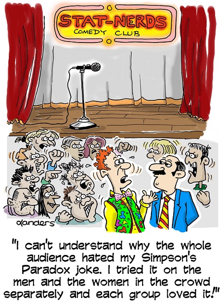
6.2 Simpson’s Paradox
Example 6.5 
The Civil Rights Act of 1964 outlawed discriminatory practices based on race in voting rights, segregation in schools, workplace rules, and at facilities that serve the public. After a long filibuster by some southern Senators, the final bill was approved in a bipartisan vote in June of 1964.
The following tables show the results of the votes in both the Senate and the House broken down by political party and region of the country.
| The House Vote | Democrats | Republicans | ||
|---|---|---|---|---|
| Yes | No | Yes | No | |
| Northern | 145 | 9 | 138 | 24 |
| Southern | 7 | 87 | 0 | 10 |
| Total | 152 | 96 | 138 | 34 |
| The Senate Vote | Democrats | Republicans | ||
|---|---|---|---|---|
| Yes | No | Yes | No | |
| Northern | 45 | 1 | 27 | 5 |
| Southern | 1 | 20 | 0 | 1 |
| Total | 46 | 21 | 27 | 6 |
Try It! - By Party
Use Table 6.6 above to answer the following questions (the answers are all shown in Table 6.7 - but try not to look there until you try them on your own).
What percent of Democrats in the House voted for the bill?
61%What percent of Republicans in the House voted for the bill?
80%What percent of Democrats in the Senate voted for the bill?
69%What percent of Republicans in the Senate voted for the bill?
82%In each chamber of Congress, what party voted proportionately more for the Civil Rights Bill of 1964?
Republicans
Try It!- By Region
Now use Table 6.6 to consider the following questions where the region represented (north or south) is taken into account (again the answers are all shown in Table 6.7 - but try not to look there until you try them on your own).
What percent of Northern Senate Democrats voted for the bill? How about Southern Senate Democrats?
Northern Democrats: 98%
Southern Democrats: 5%
What percent of Northern Senate Republicans voted for the bill? How about Southern Senate Republicans?
Northern Democrats: 84%
Southern Democrats: 0%
What percent of Northern House Democrats voted for the bill? How about Southern House Democrats?
Northern Democrats: 94%
Southern Democrats: 7%
What percent of Northern House Republicans voted for the bill? How about Southern House Republicans?
Northern Democrats: 85%
Southern Democrats: 0%
In each chamber of Congress, and in each region of the country, what party voted proportionately more for the Civil Rights Bill of 1964?
Chamber: Senate
Region: Northern
Party: Republicans
| The House Vote | Democrats | Republicans | ||
|---|---|---|---|---|
| Yes | No | Yes | No | |
| Northern | 145 (94%) | 9 | 138 (85%) | 24 |
| Southern | 7 (7%) | 87 | 0 (0%) | 10 |
| Total | 152 (61%) | 96 | 138 (80%) | 34 |
| The Senate Vote | Democrats | Republicans | ||
|---|---|---|---|---|
| Yes | No | Yes | No | |
| Northern | 45 (98%) | 1 | 27 (84%) | 5 |
| Southern | 1 (5%) | 20 | 0 (0%) | 1 |
| Total | 46 (69%) | 21 | 27 (82%) | 6 |
Simpson’s Paradox:
Answering the above questions leads to an interesting finding. For each chamber of Congress Democrats have a higher percentage than Republicans voting for the bill in both the North and the South (the only two possibilities), and yet they had a lower percentage overall. Look again at the numbers in Table 6.7 and you will see how that happened. Back in 1964, there was a huge imbalance in representation by region -most Southern Senators and Representatives were Democrats at the time and the negative votes were almost all associated with that region.
The relationship between Party and vote on the civil rights bill was highly affected by a third variable - the region represented. This was an example of Simpson’s Paradox.
An observed association between two variables can change or even reverse direction when there is another variable that interacts strongly with both variables.
Example 6.6 (Smoking and Survival) 
1314 women took part in a study of heart disease and smoking that was conducted in 1972-1974 in Newcastle, United Kingdom. A follow-up study of the same subjects was recently conducted nearly thirty years later. Of the 582 women who were smokers in the original study, 76.2% were still alive in the follow-up study. Of the 732 non-smokers, 68.6% were still alive twenty years later. Does this show a beneficial effect of smoking? What might have caused this counter-intuitive result?
Answer: To find the confounding factor that might be driving this paradoxical result, think about the variable most associated with dying over a two or three-decade period? Of course, the key variable associated with your survival over a 20-30 year period is your current age. The smokers were much younger women than the non-smokers at the beginning of the study (there aren’t very many old smokers). For example, if you look just at those who were over 64 years old in the original study, 14% of the 49 smokers were still alive compared with 17% of the 193 non-smokers. This is another example of Simpson’s Paradox (the perils of aggregation across a potential confounding factor) - a disproportionate number of nonsmokers were over the age of 64 at the beginning of the study.
6.3 Test Yourself!
Select the answer you think is correct, then proceed to the next question.
Question 1
| Home Games | Away Games | |
|---|---|---|
| Won | 51 | 37 |
| Lost | 30 | 44 |
The table above shows the record for the Pittsburgh Pirates in the 2014 season. What percent of their home games did the Pirates win?
Question 2
| Home Games | Away Games | |
|---|---|---|
| Won | 51 | 37 |
| Lost | 30 | 44 |
The table above shows the record for the Pittsburgh Pirates in the 2014 season. What percent of the Pirates’ wins were at home in 2014?
Question 3
| Home Games | Away Games | |
|---|---|---|
| Won | 51 | 37 |
| Lost | 30 | 44 |
The table above shows the record for the Pittsburgh Pirates in the 2014 season. What are the odds that a Pirates’ victory occured at home?
Question 4
| Home Games | Away Games | |
|---|---|---|
| Won | 51 | 37 |
| Lost | 30 | 44 |
The table shows the record for the Pittsburgh Pirates in the 2014 season. The ratio of the odds of the Pirates winning at home to the odds of them winning on the road is the same as the ratio of them being at home for a win to them being at home for a loss.
Question 5
Suppose the percentage of men who graduate within 4 years of starting college is higher for engineering majors than for education majors and the percentage of women who graduate within 4 years of starting college is also higher for engineering majors.
6.4 Have Fun With It!