Review for Lessons 1 to 4 (Exam 1)
This page is essentially the page of formulas and notes that you can use to study for Exam 1. You will find a printable version of this in Canvas that you can print out and bring to your proctored exams. The printable version also includes the normal table which you may need for the exam as well.
Outline of Material Covered on Exam 1
Margin of Error
The Margin of Error for a sample proportion from a random sample is around \(1 / \sqrt{n}\) where n is the sample size. It does not depend on the population size.
The Idea:
A sample statistic is a random quantity that would come out differently if you took another sample. For an unbiased sample, the Margin of Error tells you the maximum that a sample statistic will be off from what you’d get in a census for 95% of all samples (5% of all samples would find your sample value outside that range). The Margin of Error tells you about the variability arising from the sampling - it doesn’t say anything about other types of errors that might occur like those due to bias in the procedures you use.
An Example:
In October, 2015, the Gallup Poll interviewed approximately 3600 American adults, aged 18 and older and asked them “Are you feeling better about your financial situation these days, or not?” It turned out that 50% said yes, 48% said no, and 2% gave neither answer. They reported a Margin of Error (MOE) of ± 2%. If Gallup had done a similar poll of 3500 interviews, but just amongst Pennsylvania adults - the MOE would still be the same (despite the larger population in the whole country). Also, the Margin of Error goes with the square root of the sample size, so if Gallup had used a sample of just 100 people, then their MOE would be 6 times bigger.
Online notes: The Beauty of Sampling
Sampling Types
- simple random sampling
- stratified sampling
- cluster sampling
- systematic sampling
- non-probability sampling schemes (e.g. voluntary / convenience / self-selected / haphazard)
The Idea:
There are many different ways to gather a sample… The easiest sampling plan is just the simple random sample. That’s like putting everyone’s name from the population into a hat and drawing your sample from that.
An Example:
You want to know the opinions that the 500 bowling league participants have about the snack bar facilities of a bowling alley. To get a sample of 100 of these league players, you take a list with all 500 names and draw 100 of them at random.
Sometimes you know there are specific groups that might differ in their results and so, in a stratified sampling plan, you take separate random samples within each group.
An Example:
You are conducting a poll about possible solutions to the problem of sexual assaults on campus and you know that men and women are likely to have different opinions. In a stratified sampling plan you would take a separate poll of women and men and then put those two samples together.
In a cluster sampling plan, you sample naturally occurring groups and then pick everyone within the sampled groups for your final sample.
An Example:
You want a sample of students who are in one of 100 classrooms. A cluster sample might pick 10 classrooms and then question every student in those 10 classrooms.
In a systematic sample you take, say, every tenth person on a list into your sample.
An Example:
You want to know what mobile carrier is being used by people waiting in line to get into a store to buy a new type of cellphone, so you interview every 5th person in the line.
Finally, there are often disastrous sampling schemes that do not allow you to gauge the probability that particular elements of the population are sampled. One type of non-probability sampling is a volunteer sample where the sample chooses itself by volunteering to participate.
An Example:
You want to know how well the audience of a radio station likes the music of a new band so you advertise a toll-free number and interview anyone that calls in.
Another disastrous scheme is a convenience sampling plan where you just sample the people easiest to find and interview.
An Example:
You quickly gather audience opinion about a new play by talking to everyone in the front row of an auditorium because they are the easiest to reach and talk to.
Online notes: Simple Random Sampling and Other Sampling Methods
Comparative Study Types:
- observational versus experimental
- retrospective versus prospective
- matched pair & block designs
- subject-blinded /researcher-blinded / double-blinded
Variable Types
explanatory / response / confounding
The Idea:
An explanatory variable tries to explain or provide a putative cause for changes in a response variable that is the outcome of interest. The effect of a confounding variable on the response cannot be separated from the effect of the explanatory variable so it provides an alternate explanation of the data.
An Example:
Women are reported to get higher blood alcohol levels than men after they drink the same amount of alcohol. But women generally weigh less than men and lighter people will have lower alcohol concentrations in their blood because of their size. Here, gender is the explanatory variable that is supposed to explain changes in the response variable of blood alcohol content but the data can also be explained by the confounding variable of weight.Online notes: Defining a Common Language for Comparative Studies
categorical / ordinal / discrete measurement / continuous measurement
The Idea:
A nominal categorical variable is one that puts individuals or objects into categories or groups that have no logical ordering while an ordinal variable puts individuals or objects into categories with a natural ordering. Measurement variables assign a number and may be either discrete where you can count all of the possibilities, or continuous where the possible values are on a continuum. Which of these types of variables we are working with often determines the type of graph or summary we use to describe them.
An Example:
A survey of students collected data on a variety of:
- nominal categorical variables:
- race (white/black/other)
- who they voted for in the last congressional election (Democrat/Republican/other/did not vote)
- and whether they belong to a fraternity or sorority (yes/no)
- ordinal variables:
- class rank (freshman/sophomore/junior/senior)
- support for abortion rights (legal in all cases/legal except third trimester/legal only in cases of rape or incest/illegal in all cases)
- discrete measurement variables:
- number of siblings
- number of cigarettes smoked the day before the survey
- continuous variables:
- height (inches)
- weight (pounds)
- grade point average
Online notes: Defining a Common Language
- nominal categorical variables:
Measurement Issues
- bias
- reliability
- validity
The Idea:
Reliability deals with how consistent a measurement is (ask yourself: if you repeat the process over and over will the numbers I get be very close to each other or not?). Bias deals with whether the measurement is on target (ask yourself: if you take lots of measurements will they average around the true value?). Validity deals with the appropriateness of the measurement (ask yourself: does this get at the concept I am trying to measure?)
An Example:
I pace off a room to measure how wide it is and come up with 15 paces. Then I state that “this room is 15 yards wide” (i.e. I am using my paces to measure yards)
- Reliability issues: - I am not a robot so my paces are pretty inconsistent. One time I might get 15 paces and another time I might get 13 paces or 16 paces for that same room. That is the hallmark of an unreliable measurement. - Bias issues: - I am a short guy, so my paces are around 31 inches long on average (rather than 36 inches for a yard). Thus, every time I use paces and call them yards my numbers are too high (more of my little paces than there are yards in the lengths I’m trying to measure). Also, I can’t walk a perfect straight line so again I will get too many paces when I try to measure a length. These are two ways that my paces are biased. - Validity issues: - Paces do get at the concept of “length” pretty well so they are fairly valid in that sense. But if you really want the concept of “length in yards,” then the reasons given about bias would be an indication of a lack of validity.
Online notes: Defining a Common Language
Sampling Issues
- low response rate
- nonresponse bias
- question wording issues
sampling frame ≠ population; small sample size (low reliability); non-probability sampling schemes
Experiment Issues:
- confounding variables
- interacting variables
- placebo, Hawthorne, and experimenter effects
- lack of ecological validity
- generalizability
Observational Study Issues:
- confounding
- claiming causation when only association is shown
- extending the results inappropriately
- using the past as a source of data
The Five Number Summary
- minimum, lower quartile, median, upper quartile, maximum
The Idea:
The five-number summary uses the quartiles to try to draw out the salient features of the distribution of a measurement variable. Thus, it separates the data into compartments that hold about 25% of the data each. Its values are plotted in the boxplot.
An Example:
For 2013 model year cars, the EPA reports that the worst gas mileage (combining city and highway driving) was for the high-performance Bugatti Veyron that got just 10 miles per gallon (mpg). The best gas mileage was for the Toyota Prius C that got 50 mpg that year. We can see how those extremes compared to the rest of the distribution by noting that the 25th percentile amongst all 2013 model year cars was \(Q_L = 16\) mpg, the median mileage was 19 mpg, and the 75th percentile was at \(Q_U = 22\) mpg. Of course the values in the upper tail of the distribution were more spread out (the top 25% went from 22 mpg out to 50 mpg) than the values at the low end (the bottom 25% went from 10 mpg to 16 mpg) due to the very high mileage achieved by the hybrids. This indicated a somewhat skewed to the right distribution.
Online notes: Five Useful Numbers (Percentiles)
Measure of Location
- mean
- median
The Idea:
The mean is the numerical average while the median is the 50th percentile (half the numbers are bigger and half are smaller). The median is a better descriptor of the concept of “a typical value” while the mean gets at concepts related to a total. In a skewed histogram the mean is drawn toward the tail with the outliers while the median is unaffected by outliers.
An Example:
The average household income in Pennsylvania in 2013 was $70,685 while the median household income that year was $52,548. The median income is a better reflection of the income of a typical household while the mean income is a better reflection of the total income flow in the state. The mean is higher because the distribution of household incomes is skewed to the right with a few outliers on the high end.
Online notes: Numbers: Summarizing Measurement Data
Measures of Variability:
- standard deviation
- \(IQR (= Q_U - Q_L)\)
The Idea:
Examining the variability in a measurement is a core statistical issue. The standard deviation measures how far data values come from the mean. If there was no variability, every measurement would be the same - all being the mean value - and the standard deviation would be zero. As a rule of thumb, about 68% of the values come in a symmetric histogram come within one standard deviation of the mean. However, the standard deviation is quite sensitive to outliers so it does not provide a good measure of variation for describing a heavily skewed distribution. A resistant measure of variation is the Inter-Quartile Range (IQR). It gives the range of the middle 50% of the data by looking at how far you need to go to get from the 25th percentile to the 75th percentile.
An Example:
A study of risk factors associated with low infant birth weight was conducted at Baystate Medical Center in Springfield Massachusetts and found a mean birth weight of 2945 grams (that’s about 6 pounds 8 ounces: a triangle marks the position of the mean in the histogram below) with a standard deviation of 729 grams (about 26 ounces). The IQR was 3478 - 2413 = 1065 grams. A picture of the histogram and boxplot show how these measures of variability compare. In this case about 71% (shaded area in histogram) of the babies weighed within one standard deviation of the average so the rule of thumb worked pretty well.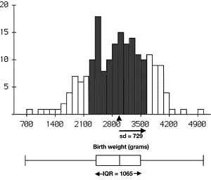
Online notes: Measures of Spread or Variation
Measures of Relative Standing
- percentiles
- standard scores (also known as z-scores)
Pictures of Distributions
boxplots or histograms for measurement variables
The Idea:
The distribution of a measurement variable is provided by a histogram that puts counts or proportions of values (or percent of values) that fall into each of many classes of equal width. A boxplot is just a graph of the five-number summary. The histogram gives more detail but boxplots are a more concise plot that is very useful when you are trying to compare the differences between distributions for multiple groups.
An Example:
A histogram of the gas mileage (combined highway and city) for each car model provided on the EPA website for the 2013 model year is given below. For example, there were 184 different cars with mileage between 20 and 22 mpg (that’s the most for any of the two-mpg intervals). The boxplots in the picture on the right shows how the mileage compares between hybrid and traditional vehicles in the 2013 model year.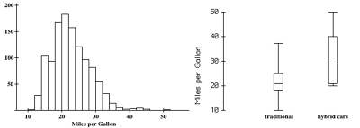
Online notes: Graphs: Displaying Measurement Data and Five Useful Numbers (Percentiles).
piecharts or bar-graphs for categorical variables (bar graphs for ordinal variables)
The Idea:
A pie chart displays the percentages for each category of a categorical variable. It provides a reasonable picture for displaying proportions - especially if the number of categories is not too large. However, when a categorical variable is ordinal or when a comparison of percentages across different populations or sub-populations are desired then using a bar graph or comparative bar graph (also called a cluster barograph) is more appropriate. Also, a bar graph may be used to display other summary statistics besides percentages.
An Example:
As part of the “State of the Global Workplace” report, Gallup interviewed a random sample of workers in 142 different countries. Below is a comparative bar graph of the results regarding workplace engagement in three areas of the world: North America, Western Europe, and East Asia. Gallup defines an “engaged” worker as one who is psychologically committed to their jobs, a “not engaged” worker as one who lacks motivation to invest discretionary effort in organizational goals, and a “disengaged” worker as one who is unhappy and actively negative about the organization. The cluster bar graph presents the ordered categories left-to-right from most engaged to the least engaged workers makes it easy to examine comparisons. We can readily see that employees in North America reported being most engaged in their work, and those in East Asia least engaged and with the Western Europeans falling in between. Presenting this data in three separate pie charts would not be appropriate (since pie charts don’t display the ordering and are difficult to use for comparisons).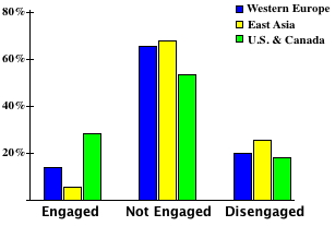
Online notes: Statistical Pictures.
time series plots for tracking summaries over time (issues: trend / seasonality / random fluctuations)
The Idea:
A time series plot is a line graph showing how s summary statistic changes over time. In looking at time series plots it is important to think about the three principal issues of:
- long-term trend
- seasonal effects including any type of natural repeating patterns
- random fluctuations around these effects
An Example:
The time series plots below show how different major components of the Consumer Price Index have changed over the fifteen-year period from 2000 to 2015. The inflation rate for Medical Care costs (in red) shows a clear linear upward trend over the long term with only minor fluctuations around that trend. The price of apparel (orange line) shows a very obvious seasonal trend with lower costs in the summer and winter and higher costs in the spring and fall. The price of the Transportation component (green line) has shown a general upward trend but also shows the most random fluctuation of any of the subcomponents (which would be expected since this component includes the highly volatile cost of fuel).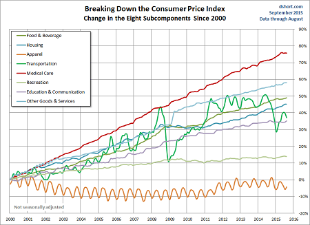
Online notes: Statistical Pictures.
Distribution Shapes:
- skewed left / skewed right / symmetric / bimodal
- normal (bell-shaped)
The Idea:
The distribution of a variable tells us the proportion of time each possible value occurs and, for a measurement variable, the distribution is displayed in a histogram. This includes skewed to the right where higher values are more spread out and most values are bunched up on the low side; skewed to the left where lower values are more spread out and most values are bunched up on the high side; symmetric where the distribution shows a mirror image on both sides of the middle; and bimodal where there are two prominent peaks in the shape.
An Example:
What shape should we expect for the distribution of each of the following four variables?
1. the weights of boxes of spaghetti noodles 2. the number of cans of soda that students in this class drank yesterday 3. the heights of all of the people at a day care center including both the children and the teachers 4. the number of eggs in a carton that are intact (i.e. not cracked)
- would be symmetric as the weight would be the sum of the weights of many similar noodles
- would be skewed to the right since many would drink no soda at all, the number of cans cannot be negative, and there might be some outliers on the high side
- would be bimodal since it is arising from two very separate sub-populations (the children and the adults)
- would be skewed left since most cartons would have all twelve eggs intact, the number can never go above 12, and there might be a rare outlier where the carton was dropped and many eggs are cracked
Online notes: Graphs: Displaying Measurement Data
Standardized Score
The z-score is equal to the value minus the average all divided by the standard deviation
The Idea:
Standard scores (or z-scores) give a measure of relative standing on a list by telling you how many standard deviations above (+) or below (-) the mean you are. To interpret a standard score, first look at the sign; negative z-scores indicate a value below the mean while positive z-scores indicate a value above the mean. Next, look at the size of the number. Values within one standard deviation of the mean (z-scores between -1 and +1) are pretty common and will usually make up most of the distribution. Values outside of three standard deviations away from the mean are quite rare and indicate an extreme value either on the low side (z-scores less than -3) or extreme on the high side (z-scores bigger than +3).
An Example:
NBA MVP Stephen Curry of the Golden State Warriors is an excellent free throw shooter, making about 91% of his free throws in the 2014-2015 season. That year, the league average for starting players was 78% with a standard deviation of 9%. Curry’s standard score was then (z = (91 - 78)/9 ≈ 1.4). You can see from his standard score that his free throwing shooting was a good deal above average. However, the distribution of free throw percentage accuracy is a skewed left distribution with a few very poor shooters being extreme outliers on the low side (e.g. DeAndre Jordan shot only 40% from the free throw line for a z-score around -4). That inflates the standard deviation and makes the interpretation of standard scores a bit more difficult. Remember, z-scores work best for symmetric histograms.
The Idea:
Percentiles tell us the number that has a specific percentage of the values in a distribution below it. The 90th percentile has 90% of the values below it and 10% above; the 60th percentile has 60% of the values below it and 40% above, etc.
An Example:
NBA superstar LeBron James formally of the Cleveland Cavaliers made only 71% of his free throws during the 2014-2015 season. This put him at the 16th percentile amongst starting players. While he excelled at many things, 84% of starting players had a greater free throw shooting accuracy.
Online notes: Standard Scores.
Observed Value
The observational value is equal to the mean plus the product of the standardized score times the standard deviation.
Emperical Rule
If a distribution is close to the normal curve, then about 68% of the values are within one standard deviation of the mean and 95% are within two standard deviations of the mean.
The Idea:
When the histogram is symmetric (and especially if it is close to the bell-shaped normal curve) then the empirical rule gives us a good idea of how the standard scores are related to where the data are located. About 68% will have standard scores between -1 and +1 and about 95% will have standard scores between -2 and +2. If the number of standard deviations away from the mean is not a round number, we can look up the z-score on the internet to get percentages.
An Example:
Subjects in a study of a new diabetes treatment had an average systolic blood pressure of 130 with a standard deviation of 15 and their blood pressures approximately followed the normal curve.
What percentage of these subjects had blood pressures between 115 and 145?
Answer: 68% since this is asking about being within one standard deviation of the mean.
What percentage of these subjects had blood pressures below 140?
Answer: the z-score for 140 is \(z = (140-130)/15 = 0.67\).
Online notes: The Normal Curve.
Percentiles of the normal distribution depend only on standard scores (z).