12: Correlation & Simple Linear Regression
12: Correlation & Simple Linear RegressionObjectives
- Construct a scatterplot using Minitab and interpret it
- Identify the explanatory and response variables in a given scenario
- Identify situations in which correlation or regression analyses are appropriate
- Compute Pearson r using Minitab, interpret it, and test for its statistical significance
- Construct a simple linear regression model (i.e., y-intercept and slope) using Minitab, interpret it, and test for its statistical significance
- Compute and interpret a residual given a simple linear regression model
- Compute and interpret the coefficient of determination (R2)
- Explain how outliers can influence correlation and regression analyses
- Explain why extrapolation is inappropriate
In Lesson 11 we examined relationships between two categorical variables with the chi-square test of independence. In this lesson, we will examine the relationships between two quantitative variables with correlation and simple linear regression. Quantitative variables have numerical values with magnitudes that can be placed in a meaningful order. You were first introduced to correlation and regression in Lesson 3.4. We will review some of the same concepts again, and we will see how we can test for the statistical significance of a correlation or regression slope using the t distribution.
In addition to reading Section 9.1 in the Lock5 textbook this week, you may also want to go back to review Sections 2.5 and 2.6 where scatterplots, correlation, and regression were first introduced.
12.1 - Review: Scatterplots
12.1 - Review: ScatterplotsIn Lesson 3 you learned that a scatterplot can be used to display data from two quantitative variables. Let's review.
- Scatterplot
- A graphical representation of two quantitative variables in which the explanatory variable is on the x-axis and the response variable is on the y-axis.
How do we determine which variable is the explanatory variable and which is the response variable? In general, the explanatory variable attempts to explain, or predict, the observed outcome. The response variable measures the outcome of a study.
- Explanatory variable
-
Variable that is used to explain variability in the response variable, also known as an independent variable or predictor variable; in an experimental study, this is the variable that is manipulated by the researcher.
- Response variable
-
The outcome variable, also known as a dependent variable.
When describing the relationship between two quantitative variables, we need to consider the following:
- Direction (positive or negative)
- Form (linear or non-linear)
- Strength (weak, moderate, strong)
- Outliers
In this class we will focus on linear relationships. This occurs when the line-of-best-fit for describing the relationship between \(x\) and \(y\) is a straight line. The linear relationship between two variables is positive when both increase together; in other words, as values of \(x\) get larger values of \(y\) get larger. This is also known as a direct relationship. The linear relationship between two variables is negative when one increases as the other decreases. For example, as values of \(x\) get larger values of \(y\) get smaller. This is also known as an indirect relationship.
Scatterplots are useful tools for visualizing data. Next we will explore correlations as a way to numerically summarize these relationships.
Minitab® – Review of Using Minitab to Construct a Scatterplot
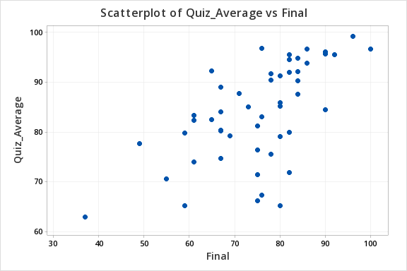
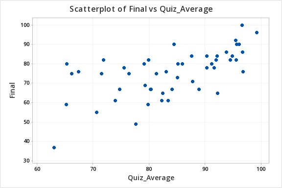
Let's construct a scatterplot to examine the relation between quiz scores and final exam scores.
- Open the Minitab file: Exam.mpx
- Select Graph > Scatterplot
- Select Simple
- Enter the variable Final in the box on the left into the Y variable box
- Enter the variable Quiz Average in the box on the left into the X variable box
- Click OK
This should result in the following scatterplot:

12.2 - Correlation
12.2 - CorrelationIn this course, we have been using Pearson's \(r\) as a measure of the correlation between two quantitative variables. In a sample, we use the symbol \(r\). In a population, we use the symbol \(\rho\) ("rho").
Pearson's \(r\) can easily be computed using Minitab. However, understanding the conceptual formula may help you to better understand the meaning of a correlation coefficient.
- Pearson's \(r\): Conceptual Formula
-
\(r=\dfrac{\sum{z_x z_y}}{n-1}\)
where \(z_x=\dfrac{x - \overline{x}}{s_x}\) and \(z_y=\dfrac{y - \overline{y}}{s_y}\)
When we replace \(z_x\) and \(z_y\) with the \(z\) score formulas and move the \(n-1\) to a separate fraction we get the formula in your textbook: \(r=\dfrac{1}{n-1}\sum{\left(\dfrac{x-\overline x}{s_x}\right) \left( \dfrac{y-\overline y}{s_y}\right)}\)
In this course you will never need to compute \(r\) by hand, we will always be using Minitab to perform these calculations.
Minitab® – Computing Pearson's r
We previously created a scatterplot of quiz averages and final exam scores and observed a linear relationship. Here, we will compute the correlation between these two variables.
- Open the Minitab file: Exam.mpx
- Select Stat > Basic Statistics > Correlation
- Double click the Quiz_Average and Final in the box on the left to insert them into the Variables box
- Click OK
This should result in the following output:
Method
Correlation type Pearson
Number of rows used 50
Correlation
| Quiz_Average | |
|---|---|
| Final | 0.609 |
Properties of Pearson's r
- \(-1\leq r \leq +1\)
- For a positive association, \(r>0\), for a negative association \(r<0\), if there is no relationship \(r=0\)
- The closer \(r\) is to 0 the weaker the relationship and the closer to +1 or -1 the stronger the relationship (e.g., \(r=-.88\) is a stronger relationship than \(r=+.60\)); the sign of the correlation provides direction only
- Correlation is unit free; the \(x\) and \(y\) variables do NOT need to be on the same scale (e.g., it is possible to compute the correlation between height in centimeters and weight in pounds)
- It does not matter which variable you label as \(x\) and which you label as \(y\). The correlation between \(x\) and \(y\) is equal to the correlation between \(y\) and \(x\).
The following table may serve as a guideline when evaluating correlation coefficients
| Absolute Value of \(r\) | Strength of the Relationship |
|---|---|
| 0 - 0.2 | Very weak |
| 0.2 - 0.4 | Weak |
| 0.4 - 0.6 | Moderate |
| 0.6 - 0.8 | Strong |
| 0.8 - 1.0 | Very strong |
12.2.1 - Hypothesis Testing
12.2.1 - Hypothesis TestingIn testing the statistical significance of the relationship between two quantitative variables we will use the five step hypothesis testing procedure:
In order to use Pearson's \(r\) both variables must be quantitative and the relationship between \(x\) and \(y\) must be linear
Research Question | Is the correlation in the population different from 0? | Is the correlation in the population positive? | Is the correlation in the population negative? |
|---|---|---|---|
Null Hypothesis, \(H_{0}\) | \(\rho=0\) | \(\rho= 0\) | \(\rho = 0\) |
Alternative Hypothesis, \(H_{a}\) | \(\rho \neq 0\) | \(\rho > 0\) | \(\rho< 0\) |
Type of Hypothesis Test | Two-tailed, non-directional | Right-tailed, directional | Left-tailed, directional |
Minitab will not provide the test statistic for correlation. It will provide the sample statistic, \(r\), along with the p-value (for step 3).
Optional: If you are conducting a test by hand, a \(t\) test statistic is computed in step 2 using the following formula:
\(t=\dfrac{r- \rho_{0}}{\sqrt{\dfrac{1-r^2}{n-2}}} \)
In step 3, a \(t\) distribution with \(df=n-2\) is used to obtain the p-value.
Minitab will give you the p-value for a two-tailed test (i.e., \(H_a: \rho \neq 0\)). If you are conducting a one-tailed test you will need to divide the p-value in the output by 2.
If \(p \leq \alpha\) reject the null hypothesis, there is convincing evidence of a relationship in the population.
If \(p>\alpha\) fail to reject the null hypothesis, there is not enough evidence of a relationship in the population.
Based on your decision in Step 4, write a conclusion in terms of the original research question.
12.2.1.1 - Example: Quiz & Exam Scores
12.2.1.1 - Example: Quiz & Exam ScoresExample: Quiz and exam scores
Is there a relationship between students' quiz averages in a course and their final exam scores in the course?
Let's use the 5 step hypothesis testing procedure to address this process research question.
In order to use Pearson's \(r\) both variables must be quantitative and the relationship between \(x\) and \(y\) must be linear. We can use Minitab to create the scatterplot using the file: Exam.mpx
Note that when creating the scatterplot it does not matter what you designate as the x or y axis. We get the following which shows a fairly linear relationship.
Our hypotheses:
- Null Hypothesis, \(H_{0}\): \(\rho=0\)
- Alternative Hypothesis, \(H_{a}\): \(\rho\ne0\)
Use Minitab to compute \(r\) and the p-value.
- Open the file in Minitab
- Select Stat > Basic Statistics > Correlation
- Enter the columns Quiz_Average and Final in the Variables box
- Select the Results button and check the Pairwise correlation table in the new window
- OK and OK
Pairwise Pearson Correlations
| Sample 1 | Sample 2 | N | Correlation | 95% CI for \(\rho\) | P-Value |
|---|---|---|---|---|---|
| Final | Quiz_Average | 50 | 0.609 | (0.398, 0.758) | 0.000 |
Our sample statistic r = 0.609.
From our output the p-value is 0.000.
If \(p \leq \alpha\) reject the null hypothesis, there is evidence of a relationship in the population.
There is evidence of a relationship between students' quiz averages and their final exam scores in the population.
12.2.1.2 - Example: Age & Height
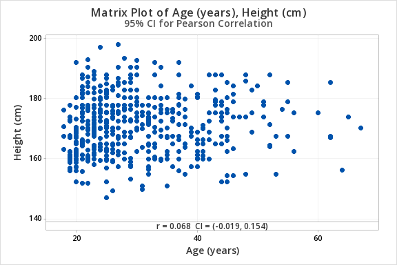
12.2.1.2 - Example: Age & HeightData concerning body measurements from 507 adults retrieved from body.dat.txt for more information see body.txt. In this example, we will use the variables of age (in years) and height (in centimeters) only.
For the full data set and descriptions see the original files:
For this example, you can use the following Minitab file: body.dat.mpx
Research question: Is there a relationship between age and height in adults?
Age (in years) and height (in centimeters) are both quantitative variables. From the scatterplot below we can see that the relationship is linear (or at least not non-linear).
\(H_0: \rho = 0\)
\(H_a: \rho \neq 0\)
From Minitab:
Pairwise Pearson Correlations
| Sample 1 | Sample 2 | N | Correlation | 95% CI for \(\rho\) | P-Value |
|---|---|---|---|---|---|
| Height (cm) | Age (years) | 507 | 0.068 | (-0.019, 0.154) | 0.127 |
\(r=0.068\)
\(p=.127\)
\(p > \alpha\) therefore we fail to reject the null hypothesis.
There is not enough evidence of a relationship between age and height in the population from which this sample was drawn.
12.2.1.3 - Example: Temperature & Coffee Sales
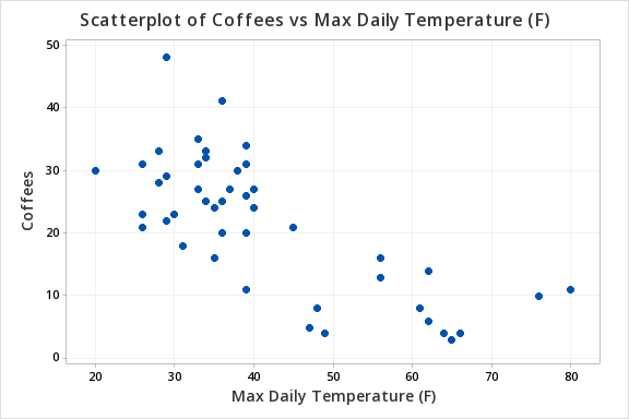
12.2.1.3 - Example: Temperature & Coffee SalesData concerning sales at student-run cafe were retrieved from cafedata.xls more information about this data set available at cafedata.txt. Let's determine if there is a statistically significant relationship between the maximum daily temperature and coffee sales.
For this example, you can use the following Minitab file: cafedata.mpx
Maximum daily temperature and coffee sales are both quantitative variables. From the scatterplot below we can see that the relationship is linear.
\(H_0: \rho = 0\)
\(H_a: \rho \neq 0\)
From Minitab:
Pairwise Pearson Correlations
Sample 1 | Sample 2 | N | Correlation | 95% CI for \(\rho\) | P-Value |
|---|---|---|---|---|---|
Max Daily Temperature (F) | Coffees | 47 | -0.741 | (-0.848, -0.577) | 0.000 |
\(r=-0.741\)
\(p=.000\)
\(p \leq \alpha\) therefore we reject the null hypothesis.
There is convincing evidence of a relationship between the maximum daily temperature and coffee sales in the population.
12.2.2 - Correlation Matrix
12.2.2 - Correlation MatrixWhen examining correlations for more than two variables (i.e., more than one pair), correlation matrices are commonly used. In Minitab, if you request the correlations between three or more variables at once, your output will contain a correlation matrix with all of the possible pairwise correlations. For each pair of variables, Pearson's r will be given along with the p value. The following pages include examples of interpreting correlation matrices.
12.2.2.1 - Example: Student Survey
12.2.2.1 - Example: Student SurveyConstruct a correlation matrix to examine the relationship between how many hours per week students exercise, their heights, their weights, and their resting pulse rates.
This example uses the 'StudentSurvey' dataset from the Lock5 textbook. The data was collected from a sample of 362 college students.
To construct a correlation matrix in Minitab...
- Open the Minitab file: StudentSurvey.mpx
- Select Stat > Basic Statistics > Correlation
- Enter the variables Exercise, Height, Weight and Pulse into the Variables box
- Select the Graphs... button and select Correlations and p-values from the dropdown
- Select the Results... button and verify that the Correlation matrix and the Pairwise correlation table boxes are checked
- Click OK and OK
This should result in the following output:
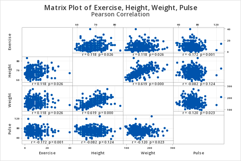
Correlation
| Exercise | Height | Weight | |
|---|---|---|---|
| Height | 0.118 | ||
| Weight | 0.118 | 0.619 | |
| Pulse | -0.172 | -0.082 | -0.120 |
Pairwise Pearson Correlations
| Sample 1 | Sample 2 | N | Correlation | 95% CI for ρ | P-Value |
|---|---|---|---|---|---|
| Height | Exercise | 354 | 0.118 | (0.014, 0.220) | 0.026 |
| Weight | Exercise | 356 | 0.118 | (0.015, 0.220) | 0.026 |
| Pulse | Exercise | 361 | -0.172 | (-0.271, -0.071) | 0.001 |
| Weight | Height | 352 | 0.619 | (0.551, 0.680) | 0.000 |
| Pulse | Height | 355 | -0.082 | (-0.184, 0.023) | 0.124 |
| Pulse | Weight | 357 | -0.120 | (-0.221, -0.016) | 0.023 |
Interpretation
When we look at the matrix graph or the pairwise Pearson correlations table we see that we have six possible pairwise combinations (every possible pairing of the four variables). Let's say we wanted to examine the relationship between exercise and height. We would find the row in the pairwise Pearson correlations table where these two variables are listed for sample 1 and sample 2. In this case, that is the first row. The correlation between exercise and height is 0.118 and the p-value is 0.026.
If we were conducting a hypothesis test for this relationship, these would be step 2 and 3 in the 5 step process.
12.2.2.2 - Example: Body Correlation Matrix
12.2.2.2 - Example: Body Correlation MatrixConstruct a correlation matrix using the variables age (years), weight (Kg), height (cm), hip girth, navel (or abdominal girth), and wrist girth.
This example is using the body dataset. These data are from the Journal of Statistics Education data archive.
For this example, you can use the following Minitab file: body.dat.mpx
To construct a correlation matrix in Minitab...
- Open the Minitab file: StudentSurvey.mpx
- Select Stat > Basic Statistics > Correlation
- Enter the variables Age(years), Weight (Kg), Height (cm), Hip girth at level of bitrochan, Navel (or "Abdominal") girth, and Wrist minimum girth into the Variables box
- Select the Graphs... button and select Correlations and p-values from the dropdown
- Select the Results... button and verify that the Correlation matrix and Pairwise correlation table boxes are checked
- Click OK and OK
This should result in the following partial output:
Pairwise Pearson Correlations
| Sample 1 | Sample 2 | N | Correlation | 95% CI for ρ | P-Value |
|---|---|---|---|---|---|
| Weight (Kg) | Age (years) | 507 | 0.207 | (0.122, 0.289) | 0.000 |
| Height (cm) | Age (years) | 507 | 0.068 | (-0.019, 0.154) | 0.127 |
| Hip girth at level of bitrochan | Age (years) | 507 | 0.227 | (0.143, 0.308) | 0.000 |
| Navel (or "Abdominal") girth at | Age (years) | 507 | 0.422 | (0.348, 0.491) | 0.000 |
| Wrist minimum girth | Age (years) | 507 | 0.192 | (0.107, 0.275) | 0.000 |
| Height (cm) | Weight (Kg) | 507 | 0.717 | (0.672, 0.757) | 0.000 |
| Hip girth at level of bitrochan | Weight (Kg) | 507 | 0.763 | (0.724, 0.797) | 0.000 |
| Navel (or "Abdominal") girth at | Weight (Kg) | 507 | 0.712 | (0.666, 0.752) | 0.000 |
| Wrist minimum girth | Weight (Kg) | 507 | 0.816 | (0.785, 0.844) | 0.000 |
| Hip girth at level of bitrochan | Height (cm) | 507 | 0.339 | (0.259, 0.413) | 0.000 |
| Navel (or "Abdominal") girth at | Height (cm) | 507 | 0.313 | (0.232, 0.390) | 0.000 |
| Wrist minimum girth | Height (cm) | 507 | 0.691 | (0.642, 0.734) | 0.000 |
| Navel (or "Abdominal") girth at | Hip girth at level of bitrochan | 507 | 0.826 | (0.796, 0.852) | 0.000 |
| Wrist minimum girth | Hip girth at level of bitrochan | 507 | 0.459 | (0.387, 0.525) | 0.000 |
| Wrist minimum girth | Navel (or "Abdominal") girth at | 507 | 0.435 | (0.362, 0.503) | 0.000 |
Cell contents grouped by Age, Weight, Height, Hip Girth, and Abdominal Girth; First row: Pearson correlation, Following row: P-Value
Cell contents grouped by Age, Weight, Height, Hip Girth, and Abdominal Girth; First row: Pearson correlation, Following row: P-Value
This correlation matrix presents 15 different correlations. For each of the 15 pairs of variables, the 'Correlation' column contains the Pearson's r correlation coefficient and the last column contains the p value.
The correlation between age and weight is \(r=0.207\). This correlation is statistically significant (\(p=0.000\)). That is, there is evidence of a relationship between age and weight in the population.
The correlation between age and height is \(r=0.068\). This correlation is not statistically significant (\(p=0.127\)). There is not enough evidence of a relationship between age and height in the population.
The correlation between weight and height is \(r=0.717\). This correlation is statistically significant (\(p<0.000\)). That is, there is evidence of a relationship between weight and height in the population.
And so on.
12.3 - Simple Linear Regression
12.3 - Simple Linear RegressionRecall from Lesson 3, regression uses one or more explanatory variables (\(x\)) to predict one response variable (\(y\)). In this lesson we will be learning specifically about simple linear regression. The "simple" part is that we will be using only one explanatory variable. If there are two or more explanatory variables, then multiple linear regression is necessary. The "linear" part is that we will be using a straight line to predict the response variable using the explanatory variable.
You may recall from an algebra class that the formula for a straight line is \(y=mx+b\), where \(m\) is the slope and \(b\) is the \(y\)-intercept. The slope is a measure of how steep the line is; in algebra this is sometimes described as "change in \(y\) over change in \(x\)," or "rise over run". A positive slope indicates a line moving from the bottom left to top right. A negative slope indicates a line moving from the top left to bottom right. For every one unit increase in \(x\) the predicted value of \(y\) increases by the value of the slope. The \(y\) intercept is the location on the \(y\) axis where the line passes through; this is the value of \(y\) when \(x\) equals 0.
In statistics, we use a similar formula:
- Simple Linear Regression Line in a Sample
- \(\widehat{y}=b_0 +b_1 x\)
-
\(\widehat{y}\) = predicted value of \(y\) for a given value of \(x\)
\(b_0\) = \(y\)-intercept
\(b_1\) = slope
In the population, the \(y\)-intercept is denoted as \(\beta_0\) and the slope is denoted as \(\beta_1\).
Some textbook and statisticians use slightly different notation. For example, you may see either of the following notations used:
\(\widehat{y}=\widehat{\beta}_0+\widehat{\beta}_1 x \;\;\; \text{or} \;\;\; \widehat{y}=a+b x\)
Note that in all of the equations above, the \(y\)-intercept is the value that stands alone and the slope is the value attached to \(x\).
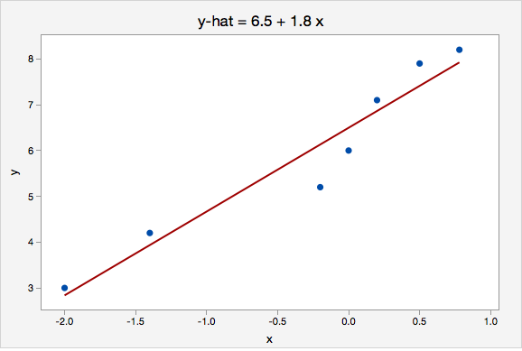
Example: Interpreting the Equation for a Line
The plot below shows the line \(\widehat{y}=6.5+1.8x\)
Here, the \(y\)-intercept is 6.5. This means that when \(x=0\) then the predicted value of \(y\) is 6.5.
The slope is 1.8. For every one unit increase in \(x\), the predicted value of \(y\) increases by 1.8.
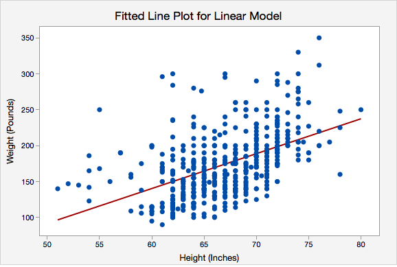
Example: Interpreting the Regression Line Predicting Weight with Height
Data were collected from a random sample of World Campus STAT 200 students. The plot below shows the regression line \(\widehat{weight}=-150.950+4.854(height)\)
Here, the \(y\)-intercept is -150.950. This means that an individual who is 0 inches tall would be predicted to weigh -150.905 pounds. In this particular scenario this intercept does not have any real applicable meaning because our range of heights is about 50 to 80 inches. We would never use this model to predict the weight of someone who is 0 inches tall. What we are really interested in here is the slope.
The slope is 4.854. For every one inch increase in height, the predicted weight increases by 4.854 pounds.
Review: Key Terms
In the next sections you will learn how to construct and test for the statistical significance of a simple linear regression model. But first, let's review some key terms:
- Explanatory variable
-
Variable that is used to explain variability in the response variable, also known as an independent variable or predictor variable; in an experimental study, this is the variable that is manipulated by the researcher.
- Response variable
-
The outcome variable, also known as a dependent variable.
- Simple linear regression
-
A method for predicting one response variable using one explanatory variable and a constant (i.e., the yy-intercept).
- y-intercept
-
The point on the \(y\)-axis where a line crosses (i.e., value of \(y\) when \(x = 0\)); in regression, also known as the constant.
- Slope
-
A measure of the direction (positive or negative) and steepness of a line; for every one unit increase in \(x\), the change in \(y\). For every one unit increase in \(x\) the predicted value of \(y\) increases by the value of the slope.
12.3.1 - Formulas
12.3.1 - FormulasSimple linear regression uses data from a sample to construct the line of best fit. But what makes a line “best fit”? The most common method of constructing a regression line, and the method that we will be using in this course, is the least squares method. The least squares method computes the values of the intercept and slope that make the sum of the squared residuals as small as possible.
Recall from Lesson 3, a residual is the difference between the actual value of y and the predicted value of y (i.e., \(y - \widehat y\)). The predicted value of y ("\(\widehat y\)") is sometimes referred to as the "fitted value" and is computed as \(\widehat{y}_i=b_0+b_1 x_i\).
Below, we'll look at some of the formulas associated with this simple linear regression method. In this course, you will be responsible for computing predicted values and residuals by hand. You will not be responsible for computing the intercept or slope by hand.
Residuals
Residuals are symbolized by \(\varepsilon \) (“epsilon”) in a population and \(e\) or \(\widehat{\varepsilon }\) in a sample.
As with most predictions, you expect there to be some error. For example, if we are using height to predict weight, we wouldn't expect to be able to perfectly predict every individuals weight using their height. There are many variables that impact a person's weight, and height is just one of those many variables. These errors in regression predictions are called prediction error or residuals.
A residual is calculated by taking an individual's observed y value minus their corresponding predicted y value. Therefore, each individual has a residual. The goal in least squares regression is to construct the regression line that minimizes the squared residuals. In essence, we create a best fit line that has the least amount of error.
- Residual
- \(e_i =y_i -\widehat{y}_i\)
-
\(y_i\) = actual value of y for the ith observation
\(\widehat{y}_i\) = predicted value of y for the ith observation
- Sum of Squared Residuals
-
Also known as Sum of Squared Errors (SSE)
\(SSE=\sum (y-\widehat{y})^2\)
Computing the Intercept & Slope
Statistical software will compute the values of the \(y\)-intercept and slope that minimize the sum of squared residuals. The conceptual formulas below show how these statistics are related to one another and how they relate to correlation which you learned about earlier in this lesson. In this course we will always be using Minitab to compute these values.
- Slope
- \(b_1 =r \dfrac{s_y}{s_x}\)
-
\(r\) = Pearson’s correlation coefficient between \(x\) and \(y\)
\(s_y\) = standard deviation of \(y\)
\(s_x\) = standard deviation of \(x\)
- y-intercept
- \(b_0=\overline {y} - b_1 \overline {x}\)
-
\(\overline {y}\) = mean of \(y\)
\(\overline {x}\) = mean of \(x\)
\(b_1\) = slope
Review of New Terms
Before we continue, let’s review a few key terms:
- Least squares method
- Method of constructing a regression line which makes the sum of squared residuals as small as possible for the given data.
- Predicted Value
- Symbolized as \(\widehat y\) ("y-hat") and also known as the "fitted value," the expected value of y for a given value of x
- Residual
- Symbolized as \(\varepsilon \) (“epsilon”) in a population and \(e\) or \(\widehat{\varepsilon }\) in a sample, an individual's observed y value minus their predicted y value (i.e., \(e=y- \widehat{y}\)); on a scatterplot, this is the vertical distance between the observed y value and the regression line
- Sum of squared residuals
- Also known as the sum of squared errors ("SSE"), the sum of all of the residuals squared: \(\sum (y-\widehat{y})^2\).
12.3.2 - Assumptions
12.3.2 - AssumptionsIn order to use the methods above, there are four assumptions that must be met:
- Linearity: The relationship between \(x\) and y must be linear. Check this assumption by examining a scatterplot of \(x\) and \(y\).
- Independence of errors: There is not a relationship between the residuals and the predicted values. Check this assumption by examining a scatterplot of “residuals versus fits.” The correlation should be approximately 0.
- Normality of errors: The residuals must be approximately normally distributed. Check this assumption by examining a normal probability plot; the observations should be near the line. You can also examine a histogram of the residuals; it should be approximately normally distributed. The distribution will not be perfectly normal because we're working with sample data and there may be some sampling error, but the distribution should not be clearly skewed.
- Equal variances: The variance of the residuals should be consistent across all predicted values. Check this assumption by examining the scatterplot of “residuals versus fits.” The variance of the residuals should be consistent across the x-axis. If the plot shows a pattern (e.g., bowtie or megaphone shape), then variances are not consistent and this assumption has not been met.
Example: Checking Assumptions
The following example uses students' scores on two tests.
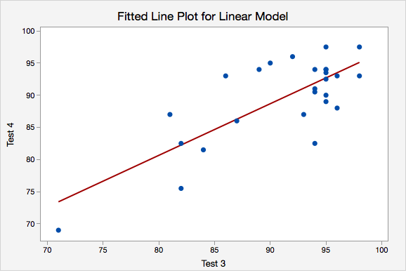
- Linearity. The scatterplot below shows that the relationship between Test 3 and Test 4 scores is linear.
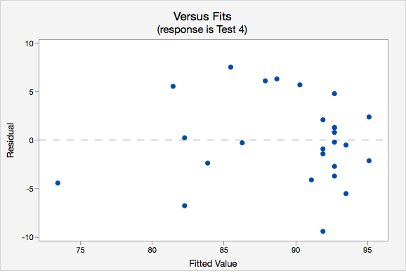
- Independence of errors. The plot of residuals versus fits is shown below. The correlation shown in this scatterplot is approximately \(r=0\), thus this assumption has been met.
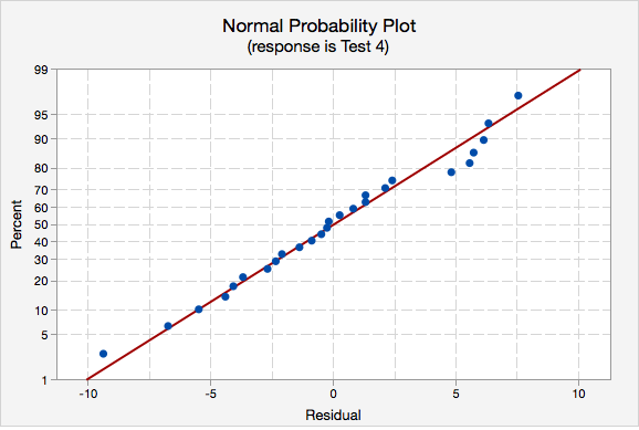
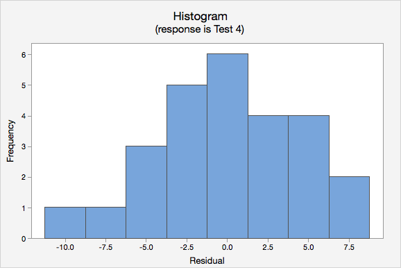
- Normality of errors. On the normal probability plot we are looking to see if our observations follow the given line. This tells us that the distribution of residuals is approximately normal. We could also look at the second graph which is a histogram of the residuals; here we see that the distribution of residuals is approximately normal.
- Equal variance. Again we will use the plot of residuals versus fits. Now we are checking that the variance of the residuals is consistent across all fitted values.

12.3.3 - Minitab - Simple Linear Regression
12.3.3 - Minitab - Simple Linear RegressionMinitab® – Obtaining Simple Linear Regression Output
We previously created a scatterplot of quiz averages and final exam scores and observed a linear relationship. Here, we will use quiz scores to predict final exam scores.
- Open the Minitab file: Exam.mpx
- Select Stat > Regression > Regression > Fit Regression Model...
- Select Final in the box on the left to insert it into the Response box on the right
- Select Quiz_Average in the box on the left to insert it into the Continuous Predictors box on the right
- Under the Graphs tab, click the box for Four in one
- Click OK
This should result in the following output:
Regression Equation
Final = 12.1 + 0.751 Quiz_Average
Coefficients
| Term | Coef | SE Coef | T-Value | P-Value | VIF |
|---|---|---|---|---|---|
| Constant | 12.1 | 11.9 | 1.01 | 0.315 | |
| Quiz_Average | 0.751 | 0.141 | 5.31 | 0.000 | 1.00 |
Model Summary
| S | R-sq | R-sq(adj) | R-sq(pred) |
|---|---|---|---|
| 9.71152 | 37.04% | 35.73% | 29.82% |
Analysis of Variance
| Source | DF | Adj SS | Adj MS | F-Value | P-Value |
|---|---|---|---|---|---|
| Regression | 1 | 2664 | 2663.66 | 28.24 | 0.000 |
| Quiz_Average | 1 | 2664 | 2663.66 | 28.24 | 0.000 |
| Error | 48 | 4527 | 94.31 | ||
| Total | 49 | 7191 |
Fits and Diagnostics for Unusual Observations
| Obs | Final | Fit | Resid | Std Resid | |
|---|---|---|---|---|---|
| 11 | 49.00 | 70.50 | -21.50 | -2.25 | R |
| 40 | 80.00 | 61.22 | 18.78 | 2.03 | R |
| 47 | 37.00 | 59.51 | -22.51 | -2.46 | R |
R Large residual
On the next page you will learn how to test for the statistical significance of the slope.
12.3.4 - Hypothesis Testing for Slope
12.3.4 - Hypothesis Testing for SlopeWe can use statistical inference (i.e., hypothesis testing) to draw conclusions about how the population of \(y\) values relates to the population of \(x\) values, based on the sample of \(x\) and \(y\) values.
The equation \(Y=\beta_0+\beta_1 x\) describes this relationship in the population. Within this model there are two parameters that we use sample data to estimate: the \(y\)-intercept (\(\beta_0\) estimated by \(b_0\)) and the slope (\(\beta_1\) estimated by \(b_1\)). We can use the five step hypothesis testing procedure to test for the statistical significance of each separately. Note, typically we are only interested in testing for the statistical significance of the slope because that tells us that \(\beta_1 \neq 0\) which means that \(x\) can be used to predict \(y\). When \(\beta_1 = 0\) then the line of best fit is a straight horizontal line and having information about \(x\) does not change the predicted value of \(y\); in other words, \(x\) does not help us to predict \(y\). If the value of the slope is anything other than 0, then the predict value of \(y\) will be different for all values of \(x\) and having \(x\) helps us to better predict \(y\).
We are usually not concerned with the statistical significance of the \(y\)-intercept unless there is some theoretical meaning to \(\beta_0 \neq 0\). Below you will see how to test the statistical significance of the slope and how to construct a confidence interval for the slope; the procedures for the \(y\)-intercept would be the same.
The assumptions of simple linear regression are linearity, independence of errors, normality of errors, and equal error variance. You should check all of these assumptions before preceding.
| Research Question | Is the slope in the population different from 0? | Is the slope in the population positive? | Is the slope in the population negative? |
|---|---|---|---|
| Null Hypothesis, \(H_{0}\) | \(\beta_1 =0\) | \(\beta_1= 0\) | \(\beta_1= 0\) |
| Alternative Hypothesis, \(H_{a}\) | \(\beta_1\neq 0\) | \(\beta_1> 0\) | \(\beta_1< 0\) |
| Type of Hypothesis Test | Two-tailed, non-directional | Right-tailed, directional | Left-tailed, directional |
Minitab will compute the \(t\) test statistic:
\(t=\dfrac{b_1}{SE(b_1)}\) where \(SE(b_1)=\sqrt{\dfrac{\dfrac{\sum (e^2)}{n-2}}{\sum (x- \overline{x})^2}}\)
Minitab will compute the p-value for the non-directional hypothesis \(H_a: \beta_1 \neq 0 \)
If you are conducting a one-tailed test you will need to divide the p-value in the Minitab output by 2.
If \(p\leq \alpha\) reject the null hypothesis. If \(p>\alpha\) fail to reject the null hypothesis.
Based on your decision in Step 4, write a conclusion in terms of the original research question.
12.3.4.1 - Example: Quiz and exam scores
12.3.4.1 - Example: Quiz and exam scoresConstruct a model using quiz averages to predict final exam scores.
This example uses the exam data set found in this Minitab file: Exam.mpx
- \(H_0\colon \beta_1 =0\)
- \(H_a\colon \beta_1 \neq 0\)
The scatterplot below shows that the relationship between quiz average and final exam score is linear (or at least it's not non-linear).
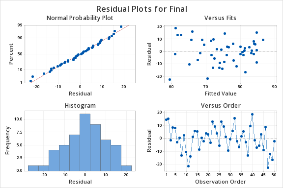
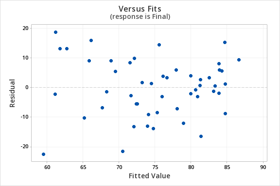
The plot of residuals versus fits below can be used to check the assumptions of independent errors and equal error variances. There is not a significant correlation between the residuals and fits, therefore the assumption of independent errors has been met. The variance of the residuals is relatively consistent for all fitted values, therefore the assumption of equal error variances has been met.
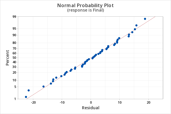
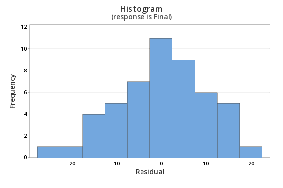
Finally, we must check for the normality of errors. We can use the normal probability plot below to check that our data points fall near the line. Or, we can use the histogram of residuals below to check that the errors are approximately normally distributed.
Now that we have check all of the assumptions of simple linear regression, we can examine the regression model.
We will use the coefficients table from the Minitab output.
Coefficients
Term | Coef | SE Coef | T-Value | P-Value | VIF |
|---|---|---|---|---|---|
Constant | 12.1 | 11.9 | 1.01 | 0.315 | |
Quiz_Average | 0.751 | 0.141 | 5.31 | 0.000 | 1.00 |
\(t = 5.31\)
\(p=0.000\)
\(p < \alpha\), reject the null hypothesis
There is convincing evidence that that students' quiz averages can be used to predict their final exam scores in the population.
12.3.4.2 - Example: Business Decisions
12.3.4.2 - Example: Business DecisionsA student-run cafe wants to use data to determine how many wraps they should make today. If they make too many wraps they will have waste. But, if they don't make enough wraps they will lose out on potential profit. They have been collecting data concerning their daily sales as well as data concerning the daily temperature. They found that there is a statistically significant relationship between daily temperature and coffee sales. So, the students want to know if a similar relationship exists between daily temperature and wrap sales. The video below will walk you through the process of using simple linear regression to determine if the daily temperature can be used to predict wrap sales. The screenshots and annotation below the video will walk you through these steps again.
Can daily temperature be used to predict wrap sales?
Data concerning sales at a student-run cafe were obtained from a Journal of Statistics Education article. Data were retrieved from cafedata.xls more information about this data set available at cafedata.txt.
For the analysis you can use the Minitab file: cafedata.mpx
- \(H_0\colon \beta_1 =0\)
- \(H_a\colon \beta_1 \neq 0\)
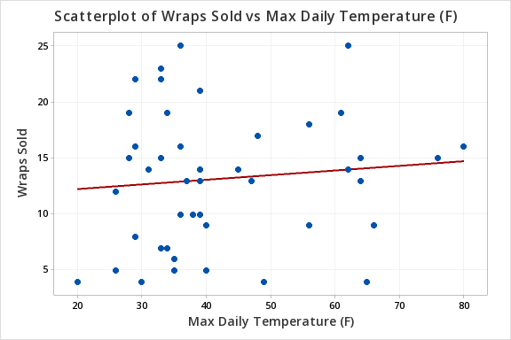
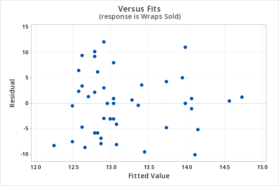
The scatterplot below shows that the relationship between maximum daily temperature and wrap sales is linear (or at least it's not non-linear). Though the relationship appears to be weak.
The plot of residuals versus fits below can be used to check the assumptions of independent errors and equal error variances. There is not a significant correlation between the residuals and fits, therefore the assumption of independent errors has been met. The variance of the residuals is relatively consistent for all fitted values, therefore the assumption of equal error variances has been met.
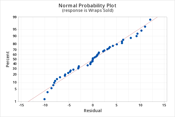
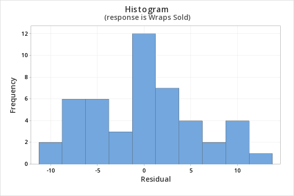
Finally, we must check for the normality of errors. We can use the normal probability plot below to check that our data points fall near the line. Or, we can use the histogram of residuals below to check that the errors are approximately normally distributed.
Now that we have check all of the assumptions of simple linear regression, we can examine the regression model.
Regression Equation
Wraps Sold = 11.42 + 0.0414 Max Daily Temperature (F)
Coefficients
| Term | Coef | SE Coef | T-Value | P-Value | VIF |
|---|---|---|---|---|---|
| Constant | 11.42 | 2.66 | 4.29 | 0.000 | |
| Max Daily Temperature (F) | 0.0414 | 0.0603 | 0.69 | 0.496 | 1.00 |
Model Summary
| S | R-sq | R-sq(adj) | R-sq(pred) |
|---|---|---|---|
| 5.90208 | 1.04% | 0.00% | 0.00% |
Analysis of Variance
| Source | DF | Adj SS | Adj MS | F-Value | P-Value |
|---|---|---|---|---|---|
| Regression | 1 | 16.41 | 16.41 | 0.47 | 0.496 |
| Max Daily Temperature (F) | 1 | 16.41 | 16.41 | 0.47 | 0.496 |
| Error | 45 | 1567.55 | 34.83 | ||
| Lack-of-Fit | 24 | 875.17 | 36.47 | 1.11 | 0.411 |
| Pure Error | 21 | 692.38 | 32.97 | ||
| Total | 46 | 1583.96 |
\(t = 0.69\)
\(p=0.496\)
\(p > \alpha\), fail to reject the null hypothesis
There is not enough evidence to conclude that maximum daily temperature can be used to predict the number of wraps sold in the population of all days.
12.3.5 - Confidence Interval for Slope
12.3.5 - Confidence Interval for SlopeWe can use the slope that was computed from our sample to construct a confidence interval for the population slope (\(\beta_1\)). This confidence interval follows the same general form that we have been using:
- General Form of a Confidence Interval
- \(sample statistic\pm(multiplier)\ (standard\ error)\)
- Confidence Interval of \(\beta_1\)
- \(b_1 \pm t^\ast (SE_{b_1})\)
-
\(b_1\) = sample slope
\(t^\ast\) = value from the \(t\) distribution with \(df=n-2\)
\(SE_{b_1}\) = standard error of \(b_1\)
Example: Confidence Interval of \(\beta_1\)
Below is the Minitab output for a regression model using Test 3 scores to predict Test 4 scores. Let's construct a 95% confidence interval for the slope.
| Term | Coef | SE Coef | T-Value | P-Value | VIF |
|---|---|---|---|---|---|
| Constant | 16.37 | 12.40 | 1.32 | 0.1993 | |
| Test 3 | 0.8034 | 0.1360 | 5.91 | <0.0001 | 1.00 |
From the Minitab output, we can see that \(b_1=0.8034\) and \(SE(b_1)=0.1360\)
We must construct a \(t\) distribution to look up the appropriate multiplier. There are \(n-2\) degrees of freedom.
\(df=26-2=24\)
\(t_{24,\;.05/2}=2.064\)
\(b_1 \pm t \times SE(b_1)\)
\(0.8034 \pm 2.064 (0.1360) = 0.8034 \pm 0.2807 = [0.523,\;1.084]\)
We are 95% confident that \(0.523 \leq \beta_1 \leq 1.084 \)
In other words, we are 95% confident that in the population the slope is between 0.523 and 1.084. For every one point increase in Test 3 the predicted value of Test 4 increases between 0.523 and 1.084 points.
12.3.5.1 - Example: Quiz and exam scores
12.3.5.1 - Example: Quiz and exam scoresData from a sample of 50 students were used to build a regression model using quiz averages to predict final exam scores. Construct a 95% confidence interval for the slope.
This example uses the Minitab file: Exam.mpx
We can use the coefficients table that we produced in the previous regression example using the exam data.
Coefficients
| Term | Coef | SE Coef | T-Value | P-Value | VIF |
|---|---|---|---|---|---|
| Constant | 12.1 | 11.9 | 1.01 | 0.315 | |
| Quiz_Average | 0.751 | 0.141 | 5.31 | 0.000 | 1.00 |
The general form of a confidence interval is sample statistic \(\pm\) multiplier(standard error).
We have the following:
- \(b_1\) (sample slope) is 0.751
- t multiplier for degrees of freedom of (50-2) = 48 is 2.01
- The standard error of the slope (\(SE_{b_1}\) is 0.141 from our table
The confidence interval is...
\begin{align} \text{sample statistic} &\pm \text{multiplier*standard error}\\ 0.751 &\pm 2.01 (0.141)\\ 0.751&\pm 0.283 \\ [0.468 &, 1.034] \end{align}
Interpret
I am 95% confident that the slope for this model is between 0.468 and 1.034 in the population.
12.4 - Coefficient of Determination
12.4 - Coefficient of DeterminationThe amount of variation in the response variable that can be explained by (i.e. accounted for) the explanatory variable is denoted by \(R^2\). This is known as the coefficient of determination or R-squared.
Example: \(R^2\) From Output
| S | R-sq | R-sq(adj) | R-sq(pred) |
|---|---|---|---|
| 9.71152 | 37.04% | 35.73% | 29.82% |
In our Exam Data example this value is 37.04% meaning that 37.04% of the variation in the final exam scores can be explained by quiz averages.
The coefficient of determination is equal to the correlation coefficient squared. In other words \(R^2=(Pearson's\;r)^2\)
Example: \(R^2\) From Pearson's r
The correlation between quiz averages and final exam scores was \(r=.608630\)
Coefficient of determination: \(R^2=.608630^2=.3704\)
| Pearson correlation of Quiz_Average and Final = 0.608630 |
| P-Value = <0.0001 |
When going from \(r\) to \(R^2\) you can simply square the correlation coefficient. \(R^2\) will always be a positive value between 0 and 1.0. When going from \(R^2\) to \(r\), in addition to computing \(\sqrt{R^2}\), the direction of the relationship must also be taken into account. If the relationship is positive then the correlation will be positive. If the relationship is negative then the correlation will be negative.
Examples: From \(R^2\) to \(r\)
Quiz Averages and Final Exam Scores
There is a direct (i.e., positive) relationship between quiz averages and final exam scores. The coefficient of determination (\(R^2\)) is 37.04%. What is the correlation between quiz averages and final exam scores?
\(r=\sqrt{R^2}=\sqrt{.3704}= \pm .6086\)
The correlation is \(r=+.6086\) because we are told that there is a positive relationship between the two variables.
Daily High Temperatures and Hot Chocolate Sales
As the daily high temperature decreases, hot chocolate sales increase at a restaurant. 49% of the variance in hot chocolate sales can be attributed to variance in daily high temperatures. What is the correlation between daily high temperatures and hot chocolate sales?
\(R^2=.49\) \(r=\sqrt{.49}= \pm .7\)
The correlation between daily high temperatures and hot chocolate sales is \(r=-.7\). Because there is an indirect relationship between the two variables, the correlation is negative.
12.5 - Cautions
12.5 - CautionsHere we will examine a few important issues related to correlation and regression: the impact of outliers, extrapolation, and the interpretation of causation.
Influence of Outliers
An outlier may decrease or increase a correlation value. Below, in the first plot there are no outliers. In the second and third plots, each have one outlier. Depending on the location of the outlier, the correlation could be decreased or increased.
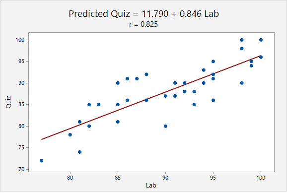
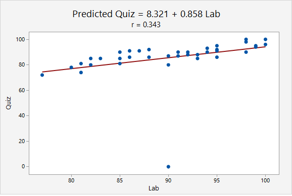
When the point (90, 0) was added, the correlation decreased from r = 0.825 to r = 0.343. This decrease occurred because the outlier was not in line with the pattern of the other points.
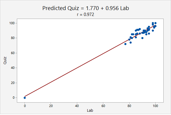
When the point (0, 0) was added, the correlation increased from r = 0.825 to r = 0.972. This increase occurred because the outlier was in line with the pattern of the other points.
Extrapolation
A regression equation should not be used to make predictions for values that are far from those that were used to construct the model or for those that come from a different population. This misuse of regression is known as extrapolation.
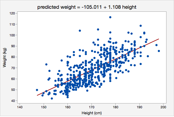
For example, the regression line below was constructed using data from adults who were between 147 and 198 centimeters tall. It would not be appropriate to use this regression model to predict the height of a child. For one, children are a different population and were not included in the sample that was used to construct this model. And second, the height of a child will likely not fall within the range of heights used to construct this regression model. If we wanted to use height to predict weight in children, we would need to obtain a sample of children and construct a new model.
Interpretation of Causation
Recall from earlier in the course, correlation does not equal causation. To establish causation one must rule out the possibility of lurking variables. The best method to accomplish this is through a solid design of your experiment, preferably one that uses a control group and randomization methods.
For example, consider smoking cigarettes and lung cancer. Does smoking cause lung cancer? Initially this was answered as yes, but this was based on a strong correlation between smoking and lung cancer. Not until scientific research verified that smoking can lead to lung cancer was causation established. If you were to review the history of cigarette warning labels, the first mandated label only mentioned that smoking was hazardous to your health. Not until 1981 did the label mention that smoking causes lung cancer.
12.6 - Correlation & Regression Example
12.6 - Correlation & Regression ExampleExample: Vertical jump to predict 40-yd dash time
Each spring in Indianapolis, IN the National Football League (NFL) holds its annual combine. The combine is a place for college football players to perform various athletic and psycholological tests in front of NFL scouts.
Two of the most recognized tests are the forty-yard dash and the vertical jump. The forty-yard dash is the most popular test of speed, while the vertical jump measures the lower body power of the athlete.
Football players train extensively to improve these tests. We want to determine if the two tests are correlated in some way. If an athlete is good at one will they be good at the other? In this particular example, we are going to determine if the vertical jump could be used to predict the forty-yard dash time in college football players at the NFL combine.
Data from the past few years were collected from a sample of 337 college football players who performed both the forty-yard dash and the vertical jump.
Solution
We can learn more about the relationship between these two variables using correlation and regression.
Is there an association?
The correlation is given in the Minitab output:
P-Value = <0.0001
The variables have a strong, negative association.
Can we predict 40-yd dash time from vertical jump height?
Next, we'll conduct the simple linear regression procedure to determine if our explanatory variable (vertical jump height) can be used to predict the response variable (40 yd time).
Assumptions
First, we'll check our assumptions to use simple linear regression.
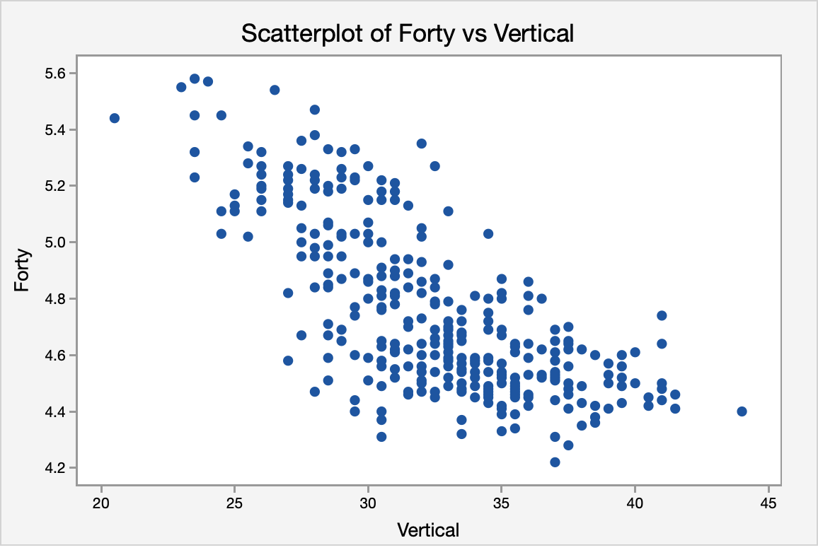
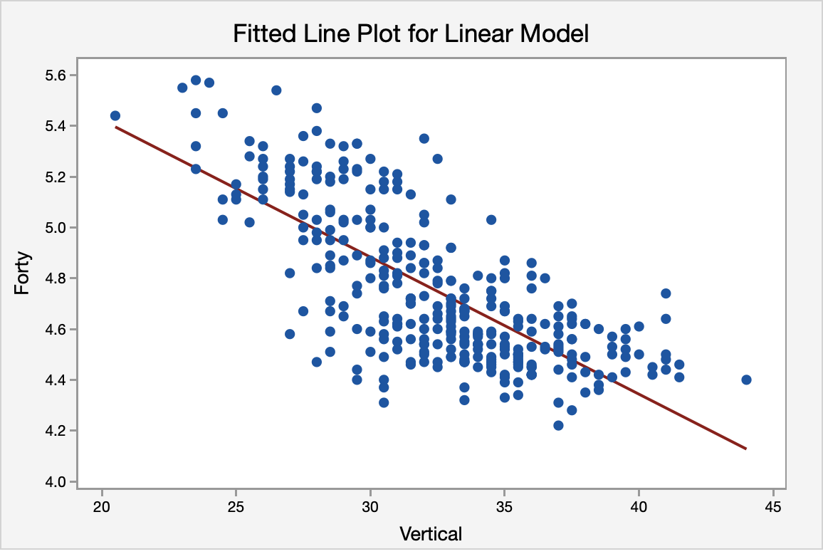
The scatterplot below shows a linear, moderately negative relationship between the vertical jump (in inches) and the forty-yard dash time (in seconds).
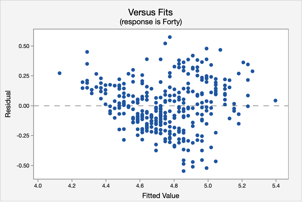
The correlation shown in the Versus Fits scatterplot is approximately 0. This assumption is met.
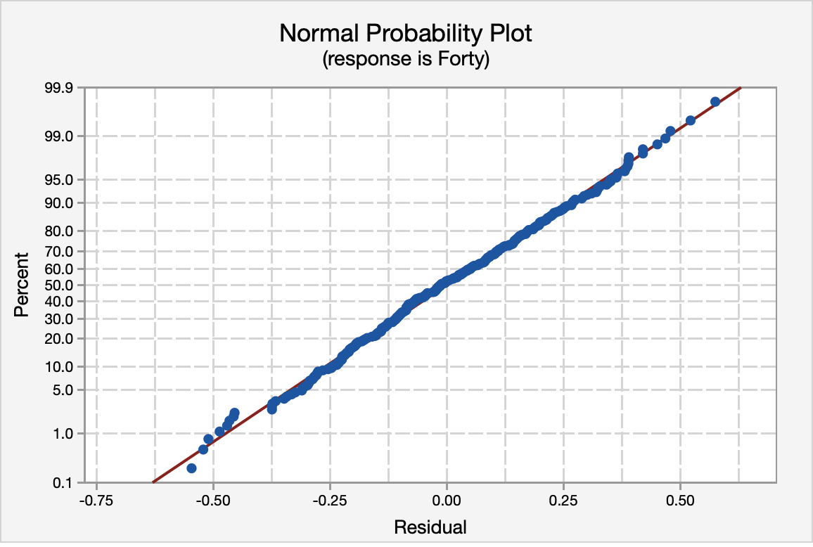
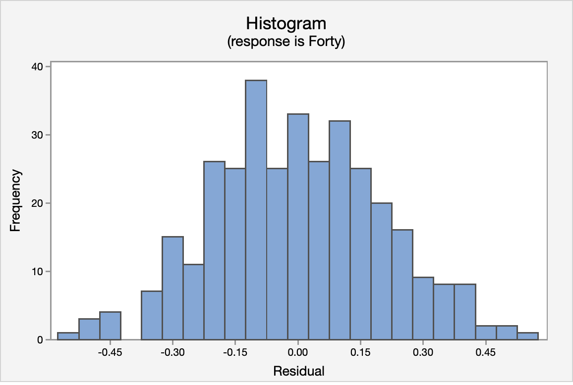
The normal probability plot and the histogram of the residuals confirm that the distribution of residuals is approximately normal.
Again, using the Versus Fits scatterplot we see no pattern among the residuals. We can assume equal variances.

ANOVA Table
The ANOVA source table gives us information about the entire model. The \(p\) value for the model is <0.0001. Because this is simple linear regression (SLR), this is the same \(p\) value that we found earlier when we examined the correlation and the same \(p\) value that we see below in the test of the statistical significance for the slope. Our \(R^2\) value is 0.5323 which tells us that 53.23% of the variance in forty-yard dash times can be explained by the vertical jump height of the athlete. This is a fairly good \(R^2\) for SLR.
Analysis of Variance
| Source | DF | Adj SS | Adj MS | F-Value | P-Value |
|---|---|---|---|---|---|
| Regression | 1 | 15.8872 | 15.8872 | 381.27 | <0.0001 |
| Error | 335 | 13.9591 | 0.0417 | ||
| Total | 336 | 29.8464 |
Model Summary
| S | R-sq | R-sq(adj) |
|---|---|---|
| 0.204130 | 53.23% | 53.09% |
Coefficients
| Predictor | Coef | SE Coef | T-Value | P-Value |
|---|---|---|---|---|
| Constant | 6.50316 | 0.09049 | 71.87 | <0.0001 |
| Vertical | -0.053996 | 0.002765 | -19.53 | <0.0001 |
Regression Equation
The regression equation for the two variables is:Forty = 6.50316 - 0.053996 Vertical
The regression equation indicates that for every inch gain in vertical jump height the 40-yd dash time will decrease by 0.053996 (the slope of the regression line). Finally, the fitted line plot shows us the regression equation on the scatter plot.
12.7 - Lesson 12 Summary
12.7 - Lesson 12 SummaryObjectives
- Construct a scatterplot using Minitab and interpret it
- Identify the explanatory and response variables in a given scenario
- Identify situations in which correlation or regression analyses are appropriate
- Compute Pearson r using Minitab, interpret it, and test for its statistical significance
- Construct a simple linear regression model (i.e., y-intercept and slope) using Minitab, interpret it, and test for its statistical significance
- Compute and interpret a residual given a simple linear regression model
- Compute and interpret the coefficient of determination (R2)
- Explain how outliers can influence correlation and regression analyses
- Explain why extrapolation is inappropriate
In this lesson you learned how to test for the statistical significance of Pearson's \(r\) and the slope of a simple linear regression line using the \(t\) distribution to approximate the sampling distribution. You were also introduced to the coefficient of determination.