12.1 - Review: Scatterplots
12.1 - Review: ScatterplotsIn Lesson 3 you learned that a scatterplot can be used to display data from two quantitative variables. Let's review.
- Scatterplot
- A graphical representation of two quantitative variables in which the explanatory variable is on the x-axis and the response variable is on the y-axis.
How do we determine which variable is the explanatory variable and which is the response variable? In general, the explanatory variable attempts to explain, or predict, the observed outcome. The response variable measures the outcome of a study.
- Explanatory variable
-
Variable that is used to explain variability in the response variable, also known as an independent variable or predictor variable; in an experimental study, this is the variable that is manipulated by the researcher.
- Response variable
-
The outcome variable, also known as a dependent variable.
When describing the relationship between two quantitative variables, we need to consider the following:
- Direction (positive or negative)
- Form (linear or non-linear)
- Strength (weak, moderate, strong)
- Outliers
In this class we will focus on linear relationships. This occurs when the line-of-best-fit for describing the relationship between \(x\) and \(y\) is a straight line. The linear relationship between two variables is positive when both increase together; in other words, as values of \(x\) get larger values of \(y\) get larger. This is also known as a direct relationship. The linear relationship between two variables is negative when one increases as the other decreases. For example, as values of \(x\) get larger values of \(y\) get smaller. This is also known as an indirect relationship.
Scatterplots are useful tools for visualizing data. Next we will explore correlations as a way to numerically summarize these relationships.
Minitab® – Review of Using Minitab to Construct a Scatterplot
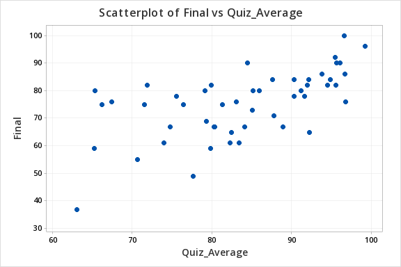
Let's construct a scatterplot to examine the relation between quiz scores and final exam scores.
- Open the Minitab file: Exam.mpx
- Select Graph > Scatterplot
- Select Simple
- Enter the variable Final in the box on the left into the Y variable box
- Enter the variable Quiz Average in the box on the left into the X variable box
- Click OK
This should result in the following scatterplot: