2: Describing Data, Part 1
2: Describing Data, Part 1Objectives
- Compute and interpret a basic proportion/risk/probability and odds
- Select and interpret the appropriate visual representations for one categorical variable, two categorical variables, and one quantitative variable
- Use Minitab to construct frequency tables, pie charts, bar charts, two-way tables, clustered bar charts, histograms, and dotplots
- Compute and interpret complements, intersections, unions, and conditional probabilities given a two-way table
- Identify outliers on a histogram or dotplot
- Interpret the shape of a distribution
- Compute and interpret the mean, median, mode, and standard deviation
- Compute and interpret percentiles and z scores
- Apply the Empirical Rule
- Interpret a five number summary
This lesson corresponds to Sections 2.1-2.3, and P.1 in the Lock5 textbook.
Recall from Lesson 1 that variables can be classified as categorical or quantitative:
- Categorical
- Names or labels (i.e., categories) with no logical order or with a logical order but inconsistent differences between groups, also known as qualitative.
- Quantitative
- Numerical values with magnitudes that can be placed in a meaningful order with consistent intervals, also known as numerical.
The graphs, descriptive statistics, and inferential statistics that are appropriate depending on the nature of the variable(s) in a given scenario. Before beginning this lesson, you should be able to classify variables as categorical or quantitative. If you are having difficulties with this, go back to review Lesson 1 or speak with your instructor.
2.1 - Categorical Variables
2.1 - Categorical VariablesCategorical variables are discussed in Sections 2.1 and P.1 of the Lock5 textbook.
Variables can be classified as categorical or quantitative. In this section of the lesson, we will be focusing on categorical variables. Categorical variables are those that provide groupings that may have no logical order, or a logical order with inconsistent difference between groups (e.g., the difference between 1 and 2 is not equivalent to the difference between 3 and 4).
This course includes many examples and practice problems for you. Many of these will apply the concepts that we learn to experiments involving rolling a die or randomly selecting a card from a standard 52-card deck. If you are unfamiliar with either of these, take a moment here to review.
- Die
-
A standard die has 6 sides: 1, 2, 3, 4, 5, 6
- 52-Card Deck
-
A standard 52-card deck of playing cards has 13 Hearts, 13 Diamonds, 13 Spades, and 13 Clubs. Hearts (♥) and Diamonds (♦) are red suits. Spades (♠) and Clubs (♣) are black suits. For each suit, there is a 2, 3, 4, 5, 6, 7, 8, 9, 10, Jack, Queen, King, and Ace. Jacks, Queens, and Kings are "face cards."
2.1.1 - One Categorical Variable
2.1.1 - One Categorical VariableData concerning one categorical variable can be summarized using a proportion.
- Proportion
- \(Proportion=\dfrac{Number\;in\;the\;category}{Total\;number}\)
The symbol for a sample proportion is \(\widehat{p}\) and is read as "p-hat." The symbol for a population proportion is \(p\).
The formula for a sample proportion may also be written as \(\widehat p = \frac{x}{n}\) where \(x\) is the number in the sample with the trait of interest and \(n\) is the sample size.
A proportion must be between 0 and 1.00.
Example: Black Cards
A standard 52-card deck contains \(26\) red cards and \(26\) black cards. What proportion of cards are black?
\(p=\dfrac{26}{52}=0.50\)
The symbol \(p\) was used because this is the proportion of all cards (i.e., the population) that are black.
Example: World Campus Undergraduate Students
In the Fall 2014 semester, there were \(82,382\) undergraduate students enrolled in Penn State. Of those, \(6,245\) were World Campus students. What proportion of all Penn State undergraduate students were World Campus students?
\(p=\dfrac{6245}{82382}=0.076\)
The symbol \(p\) was used because this is the proportion of all Penn State undergraduate students (i.e., the population) that are World Campus students.
Example: Broken Cookies
In a sample of \(30\) randomly selected packages of chocolate chip cookies, \(18\) contained broken cookies. What proportion of these selected packages had broken cookies?
\(\widehat{p}=\dfrac{18}{30}=0.60\)
These data were collected from a sample so the symbol \(\widehat{p}\) was used to denote a sample proportion.
2.1.1.1 - Risk and Odds
2.1.1.1 - Risk and OddsYou may have heard the terms risk and odds before. They are both ways to communicate the likelihood of an event.
Risk and odds are often confused with one another. The formulas for computing risk and odds are different and their interpretations are different.
In statistics, the word risk communicates the likelihood of an event occurring. This is synonymous with probability or proportion (i.e., the formulas are the same).
- Risk
- The probability that an event will occur. It may be written as a decimal, a fraction, or a percent.
- Risk
- \(Risk= \dfrac{number \;with \;the\; outcome}{total\;number\;of\;outcomes}\)
Example: Asthma Risk
\(60\) out of \(1000\) teens have asthma.
\(risk=\dfrac{60}{1000}=0.06\)
This means that \(6\%\) of teens experience asthma.
Example: Flu Risk
\(45\) out of \(100\) children get the flu each year.
\(risk=\dfrac{45}{100}=0.45\) or \(45\%\)
Odds
- Odds
- Express risk by comparing the likelihood of an event happening to the likelihood it does not happen.
- Odds
-
\(odds = \dfrac {number \;with \;the\; outcome}{number \;without \;the \;outcome}\)
OR
\(odds=\dfrac{risk}{1-risk}\)
We often interpret odds in relation to the value of 1. For example, if the odds of a game are in favor of the house 2 to 1, that means for every 2 games the house wins it will lose 1.
Example: Passing Odds
In one large class, 850 students passed an exam while 150 students failed. Because we have the raw counts, we can use the first odds formula.
\(odds=\dfrac {number \;with \;the\; outcome}{number \;without \;the \;outcome}=\dfrac{850}{150}=5.667\)
The odds of passing were 5.667 to 1. In other words, for every 5.667 students who passed the exam there was 1 who failed.
Example: Flu Odds
The risk of a child getting the flu is \(45\%\) which can also be written as \(0.45\). Because we have the risk, we can use the second odds formula.
\(odds=\dfrac{risk}{1-risk}=\dfrac{0.45}{1-0.45}=\dfrac{0.45}{0.55}=0.818\)
The odds of a child getting the flu is \(0.818\) to \(1\).
2.1.1.2 - Visual Representations
2.1.1.2 - Visual RepresentationsFrequency tables, pie charts, and bar charts can all be used to display data concerning one categorical (i.e., nominal- or ordinal-level) variable. Below are descriptions for each along with some examples. At the end of this lesson you will learn how to construct each of these using Minitab.
Frequency Tables
A frequency table contains the counts of how often each value occurs in the dataset. Some statistical software, such as Minitab, will use the term tally to describe a frequency table. Frequency tables are most commonly used with nominal- and ordinal-level variables, though they may also be used with interval- or ratio-level variables if there are a limited number of possible outcomes.
In addition to containing counts, some frequency tables may also include the percent of the dataset that falls into each category, and some may include cumulative values. A cumulative count is the number of cases in that category and all previous categories. A cumulative percent is the percent in that category and all previous categories. Cumulative counts and cumulative percentages should only be presented when the data are at least ordinal-level.
The first example is a frequency table displaying the counts and percentages for Penn State undergraduate student enrollment by campus. Because this is a nominal-level variable, cumulative values were not included.
| Campus | Count | Percent |
|---|---|---|
| University Park | 40,639 | 50.1% |
| Commonwealth Campuses | 27,100 | 33.4% |
| PA College of Technology | 4,981 | 6.1% |
| World Campus | 8,360 | 10.3% |
| Total | 81,080 | 100% |
Penn State Fall 2019 Undergraduate Enrollments
The next example is a frequency table for an ordinal-level variable: class standing. Because ordinal-level variables have a meaningful order, we sometimes want to look at the cumulative counts or cumulative percents, which tell us the number or percent of cases at or below that level.
As an example, let's interpret the values in the "Sophomore" row. There are 22 sophomore students in this sample. There are 27 students who are sophomore or below (i.e., first-year or sophomore). In terms of percentages, 34.4% of students are sophomores and 42.2% of students are sophomores or below.
| Class Standing | Count | Cumulative Count | Percent | Cumulative Percent |
|---|---|---|---|---|
| First-Year | 5 | 5 | 7.8% | 7.8% |
| Sophomore | 22 | 27 | 34.4% | 42.2% |
| Junior | 17 | 44 | 26.6% | 68.8% |
| Senior | 20 | 64 | 31.3% | 100.0% |
Pie Charts
A pie chart displays data concerning one categorical variable by partitioning a circle into "slices" that represent the proportion in each category. When constructing a pie chart, pay special attention to the colors being used to ensure that it is accessible to individuals with different types of colorblindness.
Bar Charts
A bar chart is a graph that can be used to display data concerning one nominal- or ordinal-level variable. The bars, which may be vertical or horizontal, symbolize the number of cases in each category. Note that the bars on a bar chart are separated by spaces; this communicates that this a categorical variable.
The first example below is a bar chart with vertical bars. The second example is a bar chart with horizontal bars. Both examples are displaying the same data. On both charts, the size of the bar represents the number of cases in that category.
Penn State Fall 2019 Undergraduate Enrollments
Penn State Fall 2019 Undergraduate Enrollments
Considerations
Pie charts tend to work best when there are only a few categories. If a variable has many categories, a pie chart may be difficult to read. In those cases, a frequency table or bar chart may be more appropriate. Each visual display has its own strengths and weaknesses. When first starting out, you may need to make a few different types of displays to determine which most clearly communicates your data.
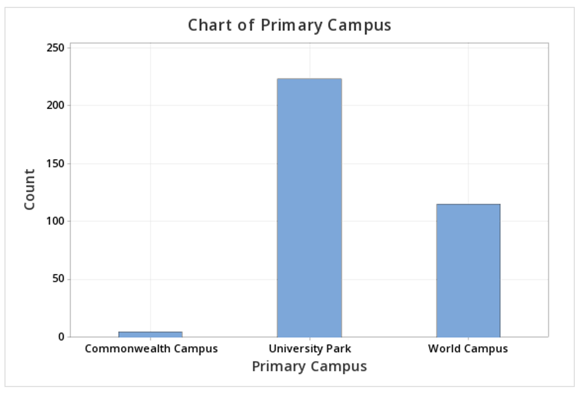
2.1.1.2.1 - Minitab: Frequency Tables
2.1.1.2.1 - Minitab: Frequency TablesMinitab® – Frequency Table
This example will use data collected from a sample of STAT 200 students. These data can be downloaded using:
To create a frequency table of the primary campus variable in Minitab:
- Open the data file in Minitab
- From the tool bar, select Stat > Tables > Tally Individual Variables
- Double click the variable Primary Campus in the box on the left to insert it into the Variable box on the right
- Under Statistics, check Counts and Percents
- Click OK
This should result in the following frequency table:
| Primary Campus | Count | Percent |
|---|---|---|
| Commonwealth Campus | 5 | 1.46 |
| University Park | 223 | 65.01 |
| World Campus | 115 | 33.53 |
| N= | 343 |
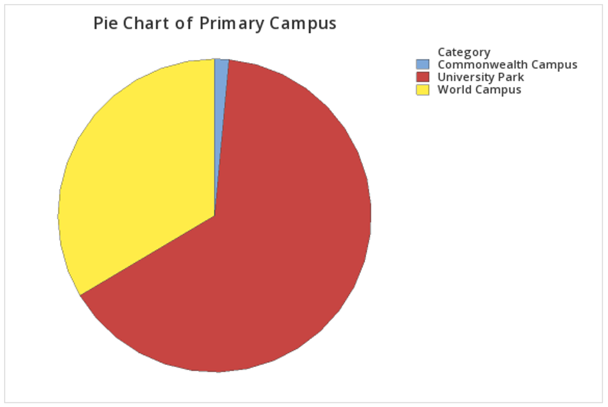
2.1.1.2.2 - Minitab: Pie Charts
2.1.1.2.2 - Minitab: Pie ChartsMinitab® – Pie Chart (Raw Data)
This example will use data collected from a sample of students enrolled in online sections of STAT 200 during the Summer 2020 semester. These data can be downloaded as a CSV file:
To create a pie chart using raw data:
- Open the data file in Minitab
- From the tool bar, select Graph > Pie Chart...
- Select Counts of Unique Values
- Click OK
- Double click the variable Primary Campus in the box on the left to insert it into the Categorical variables box on the right
- Click OK
This should result in the pie chart below:
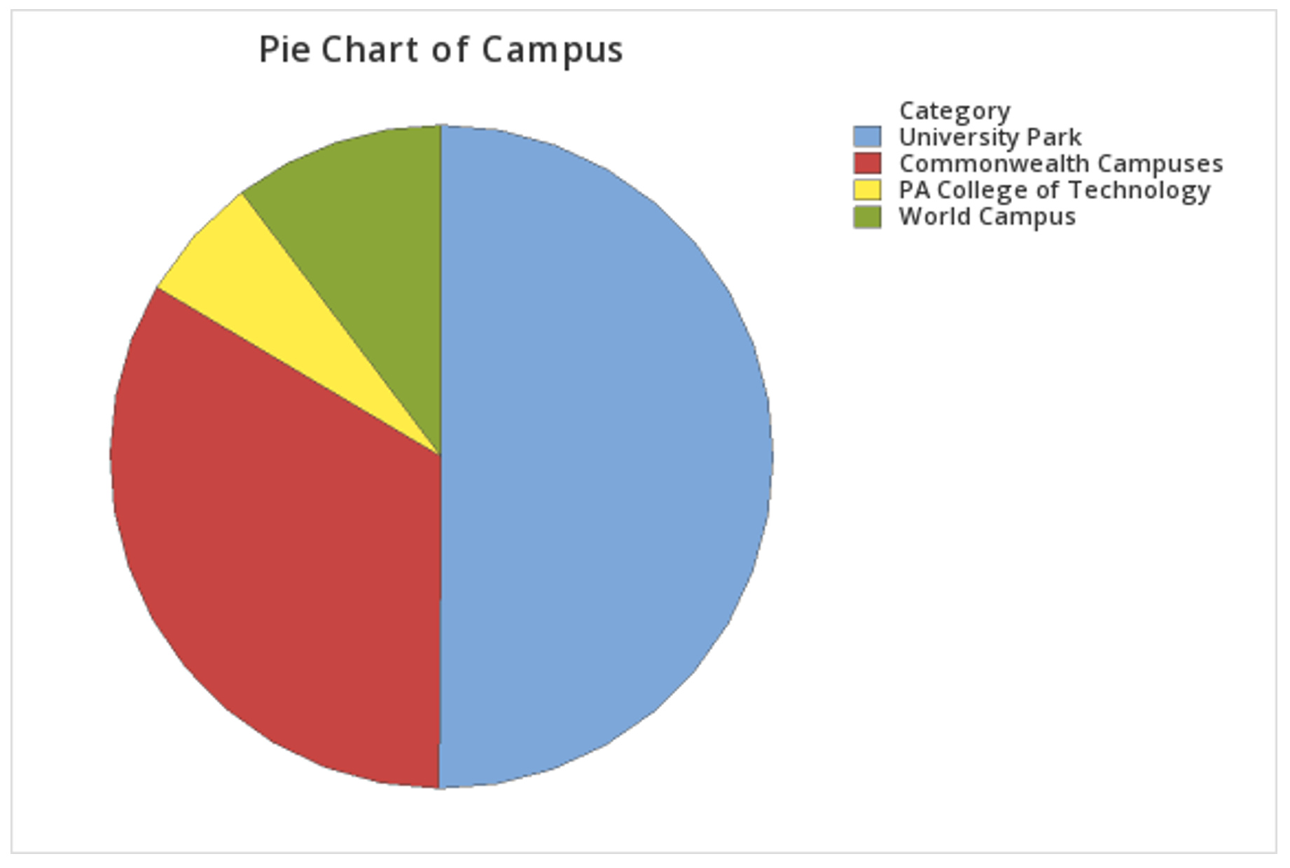
Minitab® – Pie Chart (Summarized Data)
In the example above, raw data were used. In other words, the data file contained one row for each case. It is also possible to use Minitab to construct a pie chart with summarized data, for example, if you have your counts in a frequency table. If this is the case, follow the steps below. This example uses the following data concerning Penn State undergraduate enrollment:
| Campus | Count |
|---|---|
| University Park | 40,639 |
| Commonwealth Campuses | 27,100 |
| PA College of Technology | 4,981 |
| World Campus | 8,360 |
Penn State Fall 2019 Undergraduate Enrollments
To create a pie chart using summarized data:
- Enter the data into a blank Minitab worksheet with one column containing the Campus names and a second column containing the Count for each campus
- From the tool bar, select Graph > Pie Chart...
- Select Summarized Data in a Table
- Click OK
- Double click Campus in the box on the left to insert it into the Categorical variable box on the right
- Double click Count in the box on the left to insert it into the Summary variables box on the right
- Click OK
This should result in the pie chart below:
2.1.1.2.3 - Minitab: Bar Charts
2.1.1.2.3 - Minitab: Bar ChartsMinitab® – Bar Chart (Raw Data)
This example will use data collected from a sample of students enrolled in online sections of STAT 200 during the Summer 2020 semester. These data can be downloaded as a CSV file:
To create a bar graph of the primary campus variable in Minitab:
- Open the data file in Minitab
- From the tool bar, select Graph > Bar Chart > Counts of Unique Values...
- Select One Variable
- Click OK
- Double click the variable Primary Campus in the box on the left to insert it into the Categorical variable box on the right
- Click OK
This should result in the bar graph below:
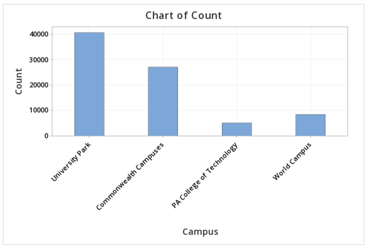
Minitab® – Bar Chart (Summarized Data)
In the example above, raw data were used. In other words, the data file contained one row for each case. It is also possible to use Minitab to construct a bar chart with summarized data, for example, if you have your counts in a frequency table. If this is the case, follow the steps below. This example uses the following data concerning Penn State undergraduate enrollment:
| Campus | Count |
|---|---|
| University Park | 40,639 |
| Commonwealth Campuses | 27,100 |
| PA College of Technology | 4,981 |
| World Campus | 8,360 |
Penn State Fall 2019 Undergraduate Enrollments
To create a bar chart using summarized data:
- Enter the data into a blank Minitab worksheet with one column containing the Campus names and a second column containing the Count for each campus
- From the tool bar, select Graph > Bar Chart > Summarized Data in a Table...
- Under One Column of Values, select Simple
- Click OK
- Double click Count in the box on the left to insert it into the Y-variable box on the right
- Double click Campus in the box on the left to insert it into the Categorical variable box on the right
- Click OK
This should result in the bar chart below:
2.1.2 - Two Categorical Variables
2.1.2 - Two Categorical VariablesData concerning two categorical (i.e., nominal- or ordinal-level) variables can be displayed in a two-way contingency table, clustered bar chart, or stacked bar chart. Here, we'll look at an example of each. At the end of this lesson, you will learn how Minitab can be used to make two-way contingency tables and clustered bar charts.
Two-Way Contingency Table
A two-way contingency table, also know as a two-way table or just contingency table, displays data from two categorical variables. This is similar to the frequency tables we saw in the last lesson, but with two dimensions. One variable will be represented in the rows and a second variable will be represented in the columns. Later in this lesson we'll see how a two-way table can be used to compute a variety of different proportions.
The example below displays the counts of Penn State undergraduate and graduate students who are Pennsylvania residents and not Pennsylvania residents.
| PA Resident | Non-PA Resident | Total | |
|---|---|---|---|
| Undergraduate | 54,239 | 26,841 | 81,080 |
| Graduate | 5,596 | 9,732 | 15,328 |
| Total | 59,835 | 36,573 | 96,408 |
Stacked Bar Chart
A stacked bar chart is also known as a segmented bar chart. One categorical variable is represented on the x-axis and the second categorical variable is displayed as different parts (i.e., segments) of each bar. The stacked bar chart below was constructed using the statistical software program R.
On this stacked bar chart, the bar on the left represents the number of students who are Pennsylvania residents. The bar on the right represents the number of students who are not Pennsylvania residents. The bottom of each bar, which is light green, represents the number of students who are enrolled at the undergraduate-level. The top of each bar, which is blue, represents the number of students who are enrolled at the graduate-level.
From this bar chart, we can see that overall there are more students who are Pennsylvania residents than non-Pennsylvania residents because the bar on the left is higher than the bar on the right. In both bars, the light green section is much bigger than the blue section, which tells us that there are more undergraduate-students than there are graduate-students in both groups.
The light green section is bigger in the left bar compared to the right bar, which tells us that undergraduate-students are more likely to be Pennsylvania residents. The blue section is bigger in the right bar compared to the left bar, which tells us that graduate-students are more likely to be non-Pennsylvania residents.
Clustered Bar Chart
In a clustered bar chart each bar represents one combination of the two categorical variables. If you compare this to the two-way contingency table above, each bar represents the value in one cell. This is also known as a side-by-side bar chart. The clustered bar chart below was made using Minitab.
Choosing the Best Visual Display
The two-way contingency table, stacked bar chart, and clustered bar chart shown above were all made using the same data concerning Penn State enrollments by academic level and state residency. The best visual display depends on the scenario. For example, if our primary goal was to compare the number of students who are Pennsylvania residents and non-Pennsylvania residents, and academic level was a secondary variable of interest, the stacked bar chart may be preferred. If we wanted to compare the number of students in each combination of academic level and state residency to see which groups were largest and smallest, the clustered bar chart may be preferred. Often, more than one of these graphs may be appropriate.
2.1.2.1 - Minitab: Two-Way Contingency Table
2.1.2.1 - Minitab: Two-Way Contingency TableMinitab® – Two-Way Contingency Table
This example will use data collected from a sample of students enrolled in online sections of STAT 200.
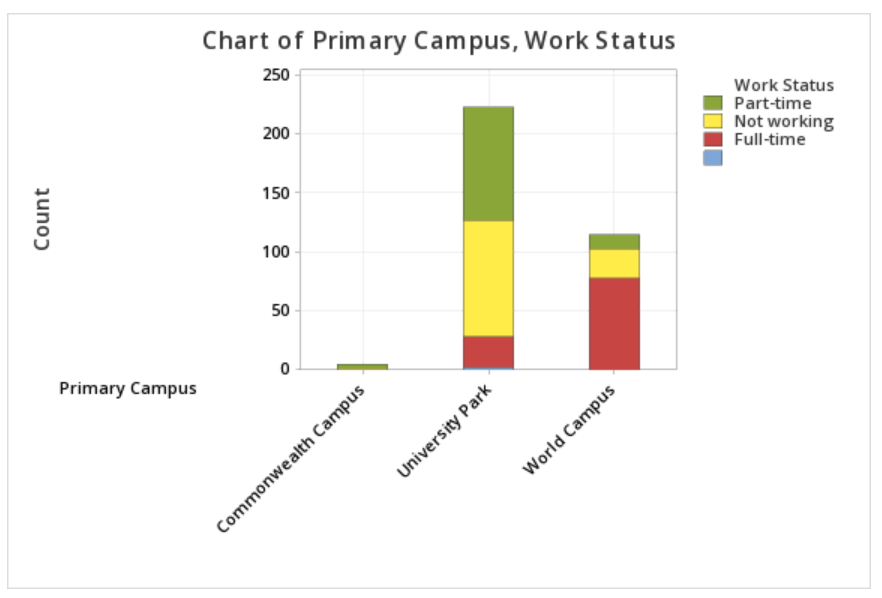
To create a two-way table of the Work Status and Primary Campus variables in Minitab:
- Open the data file in Minitab
- From the tool bar, select Stat > Tables > Cross Tabulation and Chi-Square
- We have a data file where each row represents one case, so we will keep the default data entry method of Raw data (categorical variables) in the drop down menu
- Click in the Rows box, then double click the variable Work Status to insert it into the Rows box on the right
- Click in the Columns box, then double click the variable Primary Campus to insert it into the Columns box on the right
- Click OK
This should result in the two-way table below:
| Commonwealth Campus | University Park | World Campus | All | |
|---|---|---|---|---|
| Full-time | 0 | 26 | 78 | 104 |
| Not working | 1 | 99 | 25 | 125 |
| Part-Time | 4 | 96 | 12 | 112 |
| Missing | 0 | 2 | 0 | * |
| All | 5 | 221 | 115 | 341 |
| Cell Contents: Count | ||||
Additional Display Options
The default in Minitab is to display the counts. Under Display you also have the option to select Row percents, Column percents, and Total percents.
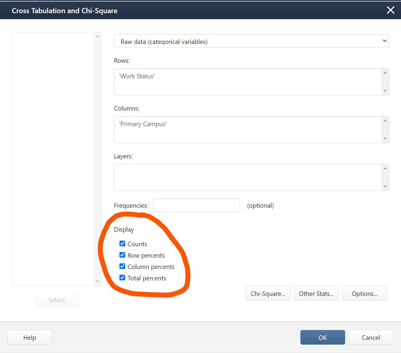
The output below is what you would get if you selected all four display options:
| Commonwealth Campus | University Park | World Campus | All | |
|---|---|---|---|---|
| Full-time |
0 0.00 0.00 0.00 |
26 25.00 11.76 7.62 |
78 75.00 67.83 22.87 |
104 100.00 30.50 30.50 |
| Not working |
1 0.80 20.00 0.29 |
99 79.20 44.80 29.03 |
25 20.00 21.74 7.33 |
125 100.00 36.66 36.66 |
| Part-Time |
4 3.57 80.00 1.17 |
96 85.71 43.44 28.15 |
12 10.71 10.43 3.52 |
112 100.00 32.84 32.84 |
| Missing |
0 * * * |
2 * * * |
0 * * * |
* * * * |
| All |
5 1.47 100.00 1.47 |
221 64.81 100.00 64.81 |
115 33.72 100.00 33.72 |
341 100.00 100.00 100.00 |
|
Cell Contents |
||||
Here, each cell contains four values. The top number in each cell is the count. This is the number of students in that group. For example, there were 78 World Campus students who were working full-time.
The second number in each cell is the percentage of the row. In the cell for World Campus students working full-time, that value is 75.00. The row represents the students who were working full-time. This means that 75% of all students who were working full time were World Campus students. This is an example of a conditional probability: P(World Campus | Full-Time).
The third number in each cell is the percentage for that column. In the cell for World Campus students working full-time, that value is 67.83. The column represents World Campus. This means that 67.83% of all World Campus students were working full-time. This is an example of a conditional probability: P(Full-Time | World Campus).
The last number in each cell is the percentage of the total. In the cell for World Campus students working full-time, that value is 22.87. This means that 22.87% of all students who completed this survey were World Campus students who were working full-time. This is an example of an intersection: P(World Campus ∩ Full-Time).
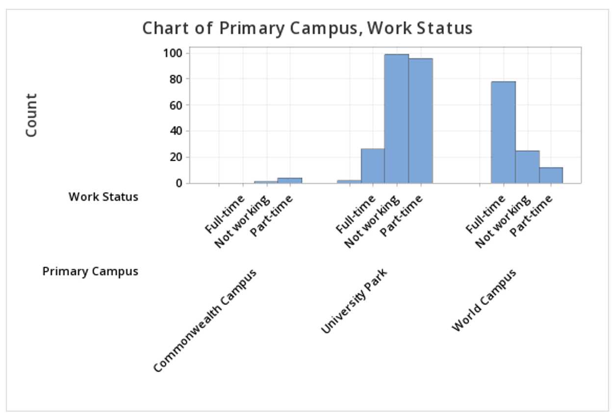
2.1.2.2 - Minitab: Clustered Bar Chart
2.1.2.2 - Minitab: Clustered Bar ChartMinitab® – Clustered Bar Chart
This example will use data collected from a sample of students enrolled in online sections of STAT 200.
To create a clustered bar chart of the Work Status and Primary Campus variables in Minitab:
- Open the data file in Minitab
- From the tool bar, select Graph > Bar Chart > Counts of Unique Values
- Select Multiple Variables
- Click OK
- Double click the variables Work Status and Primary Campus to insert them both into the Categorical variables box on the right
- Click OK
This should result in the clustered bar chart below:
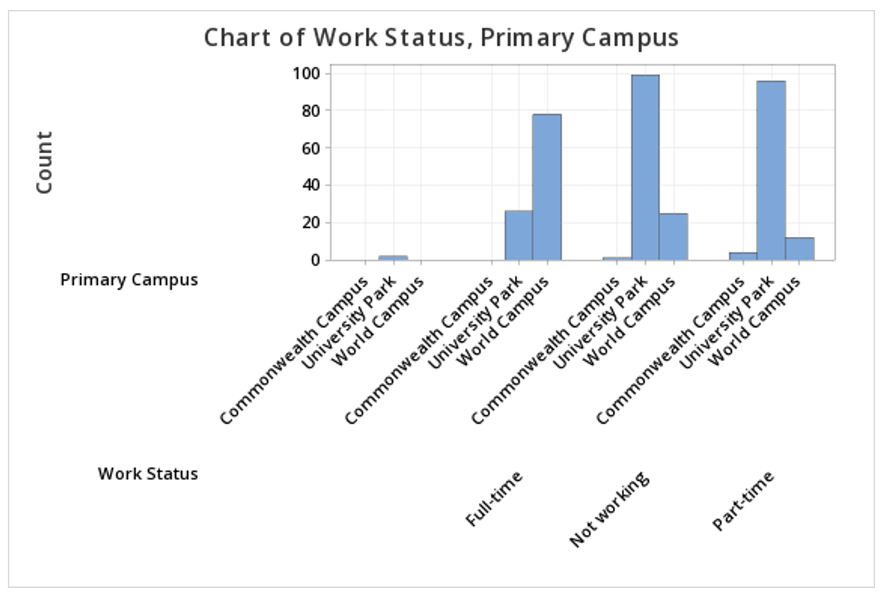
Note: The order in which the variables are entered into the Categorical variables box determines how the bars will be clustered. For example, if we entered Primary Campus and then Work Status, the result would be the following clustered bar chart:
Summarized Data
In the example above, raw data were used. In other words, our Minitab worksheet contained one row for each case. It is also possible to use Minitab to construct a clustered bar chart with summarized data, for example, if you have data in a frequency table. To do this, select Graph > Bar Chart > Summarized Data in a Table > Two-Way Table > Clustered or Stacked. Double click each of your variables to move them into the Y-variables box. Move the column containing row labels into the Row labels box. The default is to Cluster variables, which is what should be selected to create a clustered bar chart, with Rows first, Y's below. You also have the option of choosing which variable your bars are clustered by; to flip the variables, select Y's first, rows below from the drop-down.
2.1.2.3 - Minitab: Stacked Bar Chart
2.1.2.3 - Minitab: Stacked Bar ChartMinitab® – Stacked Bar Chart (Raw Data)
This example will use data collected from a sample of students enrolled in online sections of STAT 200.
To create a stacked bar chart of the Work Status and Primary Campus variables in Minitab:
- Open the data file in Minitab
- Select Graph > Bar Chart > Counts of Unique Values
- Select Multiple Variables
- Click OK
- Double click the variables Work Status and Primary Campus to insert them both into the Categorical variables box on the right
- Under Display categorical variables select Last variable stacked
- Click OK
This should result in the stacked bar chart below:
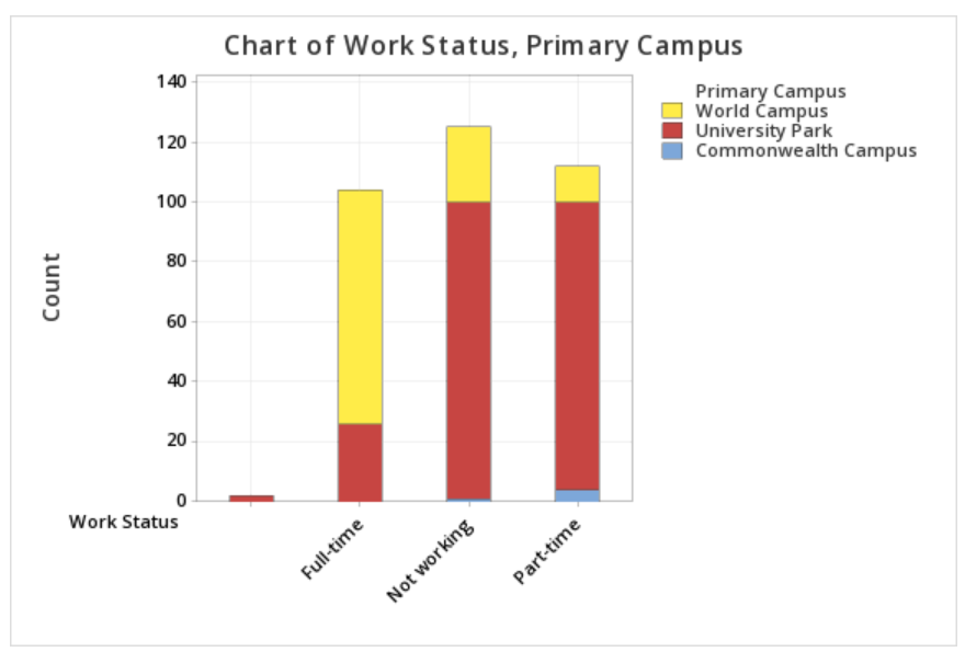
Note: The order in which the variables are entered into the Categorical variables box in Minitab determines how the bars will be clustered. For example, if we entered Primary Campus and then Work Status, the result would be the following clustered bar chart:
Summarized Data
In the example above, raw data were used. In other words, our Minitab worksheet contained one row for each case. It is also possible to use Minitab to construct a stacked bar chart with summarized data, for example, if you have data in a frequency table. To do this, select Graph > Bar Chart > Summarized Data in a Table > Two-Way Table > Clustered or Stacked. Double click each of your variables to move them into the Y-variables box. Move the column containing row labels into the Row labels box. Select Stack variables. The default is to Stack Y-variables; you can flip the variables by changing this to Stack rows.
2.1.3 - Probability Rules
2.1.3 - Probability RulesThe probability rules covered in this lesson can be found in section P.1 of the Lock5 textbook.
Earlier in this lesson you were introduced to proportions. We used the notation: \(Proportion=\frac{Number\;in\;the\;category}{Total\;number}\).
When we discuss probabilities, we will use the notation below where \(P(A)\) is the probability of event \(A\) occurring. Probabilities are typically written in decimal form but may also be translated to percentages.
Note that this is the same formula that you learned earlier in Lesson 2.1.1 for a proportion.
- Probability of Event A
- \(P(A)=\dfrac{Number\;in\;group\;A}{Total\;number}\)
Example: Spades
What is the probability that a randomly selected card from a standard 52-card deck will be a spade? There are 13 spades in the deck of 52.
\(P(spade)=\dfrac{13}{52}=0.25\)
The probability of pulling a spade is 0.25. We could also say that there is a 25% chance of pulling a spade.
Example: Odd Numbers
If you roll a six-sided die, what is the probability of getting an odd number? There are three odd numbers on the die (1, 3, 5).
\(P(odd)=\dfrac{3}{6}=0.50\)
The probability of rolling an odd number is 0.50. We could also say that there 50% chance of rolling an odd number.
Example: Raffle
There are a total of 500 raffle tickets and you have purchased 10. What is the probability that one of your tickets will be randomly selected to win the raffle?
\(P(winning)=\dfrac{10}{500}=0.02\)
The probability of you winning is 0.02. We could also say that there is a 2% chance that you will win.
2.1.3.1 - Range of Probabilities
2.1.3.1 - Range of ProbabilitiesThe probability of an impossible event is 0 and the probability of a certain event is 1. The range of possible probabilities is: \(0 \leq P(A) \leq 1\). It is not possible to have a probability less than 0 or greater than 1.
Example: Rolling an 8
It is impossible to roll an eight on a six-sided die.
\(P(rolling\; 8)= \dfrac{0}{6} = 0\)
Example: Blue Cards
In a standard 52-card deck all cards are black or red. There are no blue cards.
\(P(blue)=\dfrac{0}{52}=0\)
Example: Rolling a Value Between 1 and 6
A six-sided die contains the values 1, 2, 3, 4, 5, and 6. All rolls will result in a value between 1 and 6.
\(P(rolling \;1 \;to\; 6)=\dfrac{6}{6}=1.00\)
2.1.3.2 - Combinations of Events
2.1.3.2 - Combinations of EventsIn situations with two or more categorical variables there are a number of different ways that combinations of events can be described: intersections, unions, complements, and conditional probabilities. Each of these combinations of events is covered in your textbook. However, note that your textbook does not use the symbols that are most commonly used when discussing these combinations of events. The symbols that we will be using are in the table below. In this section, you will also learn about disjoint events and independent events.
| Combination | Symbol | Definition |
|---|---|---|
| Disjoint | Never occurring together | |
| Independent | Unrelated | |
| Intersection | \(P(A\cap B)\) | Probability of A and B |
| Union | \(P(A\cup B)\) |
Probability of A or B Note: This includes the possibility of A and B |
| Complement | \(P(A^C)\) | The probability of NOT A |
| Conditional | \(P(A\mid B)\) | The probability of A given B |
2.1.3.2.1 - Disjoint & Independent Events
2.1.3.2.1 - Disjoint & Independent EventsDisjoint events and independent events are different. Events are considered disjoint if they never occur at the same time; these are also known as mutually exclusive events. Events are considered independent if they are unrelated.
Disjoint Events
Disjoint events are events that never occur at the same time. These are also known as mutually exclusive events.
These are often visually represented by a Venn diagram, such as the below. In this diagram, there is no overlap between event A and event B. These two events never occur together, so they are disjoint events.
Example: First-Year & Sophomore Students
Let's consider undergraduate class level. A student can be classified as a first-year student, sophomore, junior, or senior.
Being a first-year student and being a sophomore are disjoint events because an individual cannot be classified as both at the same time.
Independent Events
Independent events are unrelated events. The outcome of one event does not impact the outcome of the other event. Independent events can, and do often, occur together.
The following examples use stacked bar charts to demonstrated what two variables that are and are not independent look like in relation to one another.
Example: Penguin Species & Biological Sex
The segmented bar chart above displays data from a research study concerning penguins (see Palmer Penguins). Within each of the three species of penguin, half of the penguins are male and half are female. In this sample, penguin species and biological sex are independent. Knowing the species of a penguin does not change the probability that they are male or female. And, knowing the biological sex of a penguin does not change the probability that it is an Adelie, Chinstrap, or Gentoo penguin.
Non-Example: Enrollment Status by Campus
The segmented bar chart above displays data concerning Penn State students' status as full- or part-time and their primary campus (data from Penn State's Data Digest). The proportion of students who are part-time is different at each campus. Only 2.7% of University Park students are enrolled part-time while 69.2% of World Campus students are enrolled part-time. Enrollment status and primary campus are not independent. If we know a student's campus, that changes the probability of them being a full- or part-time student. If we know that a student is full- or part-time, that chances the probability that they came from a specific campus.
2.1.3.2.2 - Intersections
2.1.3.2.2 - IntersectionsThe term intersection is used to describe the overlap or two or more events. This is communicated using the character ∩. The phrase \(P(A \cap B)\) is read as "the probability of A and B."
In the form of a Venn diagram, we can picture this as the overlap between two [or more] events.
Example: Cards
What is the probability of randomly selecting a card from a standard 52-card deck that is a red card and a king?
There are 2 kings that are red cards: the king of hearts and the king of diamonds.
\(P(red \cap king)=\dfrac{2}{52}=.0385\)
Example: Penn State Enrollment
The two-way contingency table below displays the Penn State's undergraduate enrollments from Fall 2019 in terms of status (full-time and part-time) and primary campus (data from the Penn State Factbook).
| Full-Time | Part-Time | Total | |
|---|---|---|---|
| University Park | 39529 | 1110 | 40639 |
| Commonwealth Campuses | 24306 | 2794 | 27100 |
| PA College of Technology | 4110 | 871 | 4981 |
| World Campus | 2574 | 5786 | 8360 |
| Total | 70519 | 10561 | 81080 |
What proportion of Penn State students were full-time University Park students?
This is an example of an intersection because we are looking for the proportion of all students who are both full-time and University Park.
\(P(FullTime \cap UniversityPark)=\dfrac{39529}{81080}=0.488\)
What proportion of Penn State students were part-time World Campus students?
This is an example of an intersection because we are looking for the proportion of all students who are both part-time and World Campus.
\(P(PartTime \cap WorldCampus) = \dfrac{5786}{81080}=0.071\)
2.1.3.2.3 - Unions
2.1.3.2.3 - UnionsA union is communicated using the symbol ∪. \(P(A \cup B)\) is read as "the probability of A or B." Note that in mathematics, "or" means "and/or." The Venn diagram below depicts the union of A and B.
If the values of P(A), P(B), and P(A ∩ B) are all known, the formula below can be used to compute the union of A and B. Conceptually, the union of A and B is equal to A plus B minus the overlap of A and B.
- Union
- \(P(A\cup B) = P(A)+P(B)-P(A\cap B)\)
Example: Hearts or Spades
What is the probability of randomly selecting a card from a standard 52-card deck that is a heart or spade?
In a standard 52-card deck, 13 cards are hearts, 13 cards are spades, and no cards are both a heart and a spade.
\(P(heart) = \dfrac{13}{52}\)
\(P(spade) = \dfrac{13}{52}\)
\(P(heart \cap spade) = \dfrac{0}{52}\)
Using the formula given above:
\(P(heart \cup spade)=\dfrac{13}{52}+\dfrac{13}{52}-\dfrac{0}{52}= \dfrac {26}{52}=0.5\)
Example: Hearts or Aces
What is the probability of randomly selecting a card from a standard 52-card deck that is a heart or an ace?
In a standard 52-card deck, 13 cards are hearts and 4 cards are aces. There is one ace of hearts.
\(P(heart) = \dfrac{13}{52}\)
\(P(ace) = \dfrac{4}{52}\)
\(P(heart \cap ace) = \dfrac{1}{52}\)
Using the formula given above:
\(P(heart \cup ace)=\dfrac{13}{52}+\dfrac{4}{52}-\dfrac{1}{52}=\dfrac{16}{52}=0.308\)
Example: Part-Time or World Campus
The two-way contingency table below displays the Penn State's undergraduate enrollments from Fall 2019 in terms of status (full-time and part-time) and primary campus (data from the Penn State Factbook).
| Full-Time | Part-Time | Total | |
|---|---|---|---|
| University Park | 39529 | 1110 | 40639 |
| Commonwealth Campuses | 24306 | 2794 | 27100 |
| PA College of Technology | 4110 | 871 | 4981 |
| World Campus | 2574 | 5786 | 8360 |
| Total | 70519 | 10561 | 81080 |
What proportion of all students are part-time students or World Campus students?
When we have a contingency table, we can take the appropriate values from the table as opposed to using the formula given above. In this table there are 1110 part-time University Park students, 2794 part-time Commonwealth Campus students, 871 PA College of Technology students, 5786 part-time World Campus students, and 2574 full-time World Campus students. Combined, these are all of the cells this question is asking about.
\(P(PartTime \cup WorldCampus)=\dfrac{1110+2794+871+5786+2574}{81080}=\dfrac{13135}{12242}=0.162\)
Note that the final answer would be the same if we had used the formula:
\(P(PartTime \cup WorldCampus) = \dfrac{10561}{81080}+\dfrac{8360}{81080}-\dfrac{5786}{81080}= \dfrac{13135}{81080}=0.162\)
2.1.3.2.4 - Complements
2.1.3.2.4 - ComplementsThe complement of an event is the probability that the event does not occur. The complement of \(P(A)\) is written as \(P(A^C)\) or \(P(A')\).
In the diagram below, we can see that \(A^{C}\) is everything in the sample space that is not A.
Mathematically, if we know \(P(A)\), we can use that value to compute \(P(A^{C})\) using the following formula.
- Complement of A
- \(P(A^{C})=1−P(A)\)
Example: Coin Flip
When flipping a coin, one can flip heads or tails. Thus, \(P(Tails^{C})=P(Heads)\) and \(P(Heads^{C})=P(Tails)\)
Example: Hearts
If you randomly select a card from a standard 52-card deck, you could pull a heart, diamond, spade, or club. The complement of pulling a heart is the probability of pulling a diamond, spade, or club. In other words: \(P(Heart^{C})=P(Diamond,\; Spade,\;\;Club)\)
Example: Rain

According to the weather report, there is a 30% chance of rain today: \(P(Rain) = .30\)
Raining and not raining are complements.
\(P(Not \:rain)=P(Rain^{C})=1-P(Rain)=1-.30=.70\)
There is a 70% chance that it will not rain today.
The sum of all of the probabilities for possible events is equal to 1.
Example: Cards
In a standard 52-card deck there are 26 black cards and 26 red cards. All cards are either black or red.
\(P(red)+P(black)=\frac{26}{52}+\frac{26}{52}=1\)
Example: Dominant Hand
Of individuals with two hands, it is possible to be right-handed, left-handed, or ambidextrous. Assuming that these are the only three possibilities and that there is no overlap between any of these possibilities:
\(P(right\;handed)+P(left\;handed)+P(ambidextrous) = 1\)
2.1.3.2.5 - Conditional Probability
2.1.3.2.5 - Conditional ProbabilityA conditional probability is the probability of one event occurring given that a second event is known to have occurred. This is communicated using the symbol \(\mid\) which is read as "given." For example, \(P(A\mid B)\) is read as "Probability of A given B."
A conditional probability can be computed using a two-way contingency table. In the examples below, note that we're only interested in the events in one row or column.
Example: PA Resident given Undergraduate
The two-way contingency table below displays Penn State World Campus enrollments from Fall 2019 in terms of academic level (undergraduate and graduate) and state residency (Pennsylvania and non-Pennsylvania).
| Pennsylvania | Non-Pennsylvania | Total | |
|---|---|---|---|
| Undergraduate | 3757 | 4603 | 8360 |
| Graduate | 2253 | 4074 | 6327 |
| Total | 6010 | 8677 | 14687 |
Given an individual is an undergraduate student, what is the probability they are a Pennsylvania resident?
We know the individual is an undergraduate student, so we will only look at the row containing the 8360 undergraduate students. Of those 8360 undergraduate students, 3757 were Pennsylvania residents.
\(P(PA \mid Undergrad) = \dfrac{3757}{8360}=0.449\)
Given an individual is a Pennsylvania resident, what is the probability they are an undergraduate student?
Note that most cases, \(P(A\mid B) \ne P(B \mid A)\). This question is different from the first question because the two events are flipped. Here, we know the individual is a Pennsylvania resident, we we will only look at the column containing the 6010 Pennsylvania residents. Of those 6010 Pennsylvania residents, 3757 were undergraduate students.
\(P(Undergrad \mid PA) = \dfrac{3757}{6010}=0.625\)
What proportion of graduate students are Pennsylvania residents?
This question is worded slightly differently, but it is also a conditional probability. This translates to \(P(PA \mid Graduate)\). Of the 6327 graduate students, 2253 were Pennsylvania residents.
\(P(PA \mid Graduate) = \dfrac{2253}{6327}=0.356\)
Sensitivity & Specificity
Sensitivity and specificity are two specific types of conditional probabilities that are often applied in situations involving testing (e.g., medical testing for a given condition). Sensitivity is the probability of testing positive given that one actually has the condition. Specificity is the probability of testing negative given that one actually does not have the condition. Ideally, we would like both sensitivity and specificity rates to be high.
Example: Sensitivity & Specificity
Compute the sensitivity and specificity of the test data presented in the following two-way contingency table.
| Actually Sick | Actually Healthy | Total | |
|---|---|---|---|
| Tested Positive | 15 | 5 | 20 |
| Tested Negative | 2 | 19 | 21 |
| Total | 17 | 24 | 41 |
Sensitivity is the proportion of all people who were actually sick who tested positive. As a conditional probability, \(P(positive \mid sick)\). There were 17 people in the sample who were actually sick. Of those, 15 tested positive.
\(Sensitivity = \dfrac{15}{17}=0.882\)
Specificity is the proportion of all people who were actually healthy who tested negative. As a conditional probability, \(P(negative \mid healthy)\). There were 24 people in the sample who were actually healthy. Of those, 19 tested negative.
\(Specificity = \dfrac {19}{24}=0.792\)
2.1.3.2.5.1 - Advanced Conditional Probability Applications
2.1.3.2.5.1 - Advanced Conditional Probability ApplicationsAdvanced Formulas
Conditional probabilities can also be computed using the following formulas. Note that these two formulas are identical, but A and B are switched. Again, if the contingency table is available it is usually most efficient to take the appropriate values from the table, as shown above, as opposed to using these formulas.
- Conditional Probability of A Given B
- \(P(A\mid B)=\dfrac{P(A \: \cap\: B)}{P(B)}\)
- Conditional Probability of B Given A
- \(P(B\mid A)=\dfrac{P(A \: \cap\: B)}{P(A)}\)
Example: Clubs
In a standard 52-card deck, there are 26 black cards including 13 clubs. All clubs are black, therefore there are 13 black clubs.
What is the probability that a randomly selected card is a club given that it is a black card?
We are given that \(P(club)=\frac{13}{52}=0.25\), \(P(black)=\frac{26}{52}=0.50\), and \(P(club \: \cap\: black)=\frac{13}{52}=0.25\)
\(P(club\mid black)=\dfrac{P(club \: \cap\: black)}{P(black)}=\dfrac{0.25}{0.50}=0.50\)
Given that a randomly selected card is black, there is a 50% chance that it's a club.
Independent Events Written as Conditional Probabilities
If events A and B are independent then \(P(A) = P(A \mid B)\). In other words, whether or not event B occurs does not change the probability of event A occurring.
Example: Checking for Independence, Aces and Hearts
A card is randomly drawn from a 52-card deck. Are the events of drawing an ace and drawing a heart independent?
In a standard 52-card deck, there are 4 aces and 13 hearts. Therefore \(P(ace)=\frac{4}{52}\) and \(P(heart)=\frac{13}{52}\). Out of 13 hearts, 1 is an ace, which translates to \(P(ace \mid heart) = \frac{1}{13}\).
To determine if these two events are independent we can compare \(P(A)\) to \(P(A\mid B)\). If we call being an ace event A and being a heart event B, then we're comparing \(P(ace)\) to \(P(ace \mid heart)\).
\(P(ace)=\frac{4}{52}=0.0769\)
\(P(ace \mid heart) = \frac{1}{13}=0.0769\)
These values are identical, therefore we can conclude that the events of drawing an ace and drawing a heart are independent.
2.2 - One Quantitative Variable
2.2 - One Quantitative VariableOne quantitative variable is covered in Sections 2.2 and 2.3 of the Lock5 textbook. In these sections, you will learn how to describe the distribution of a quantitative variable in terms of shape, central tendency, and variability. You will be introduced to the normal distribution, z scores, percentiles, graphs, and the five-number-summary.
2.2.1 - Graphs: Dotplots and Histograms
2.2.1 - Graphs: Dotplots and HistogramsDotplots and histograms are both graphical displays that can be used with one quantitative variable. Below are descriptions for each along with some examples and instructions for constructing each in Minitab.
Dotplots
A dotplot can also be used to display data concerning one interval- or ratio-level variable. Each dot represents one, or more, data points. In the first example below, each dot represents one observation.
In this second example, the key at the bottom tells us that each dot may represent up to 2 observations.
Later in the course, in Lessons 4 and 5, we will study statistical inference and the application we will use will rely heavily on dotplots. For example, we will use dotplots to determine the proportion of points greater than, less than, or between two values. This can be determined by counting the dots.
Minitab® – Dotplot
This example will use data collected from a sample of students enrolled in online sections of STAT 200 during the Summer 2020 semester. These data can be downloaded as a CSV file:
To create a dotplot of the number of online courses completed:
- Open the data set in Minitab
- From the tool bar, select Graph > Dotplot...
- Under One Y Variable, select Simple
- Click OK
- Double click the variable Online Courses Completed in the box on the left to insert it into the Y-variable box on the right
- Click OK
This should result in the following dotplot:
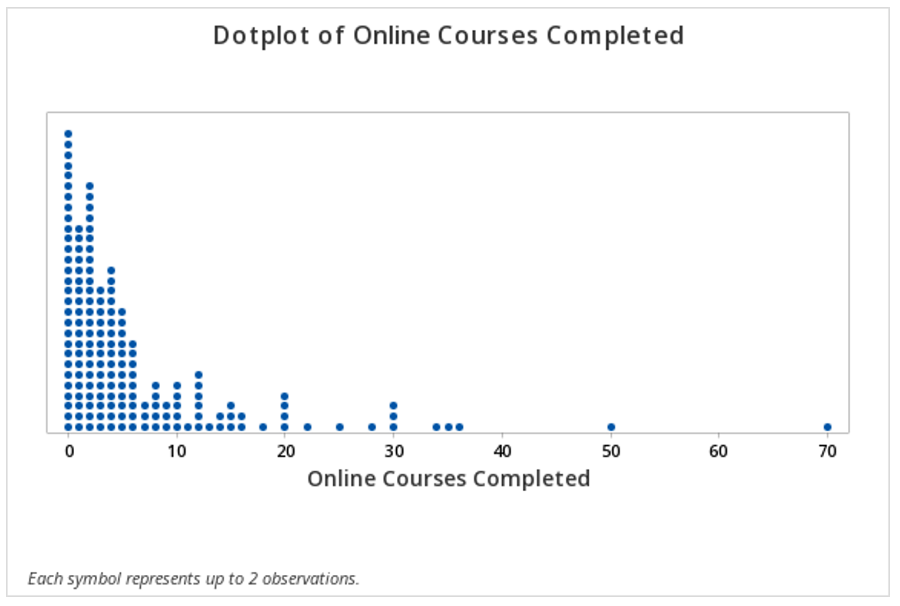
Minitab®
Histograms
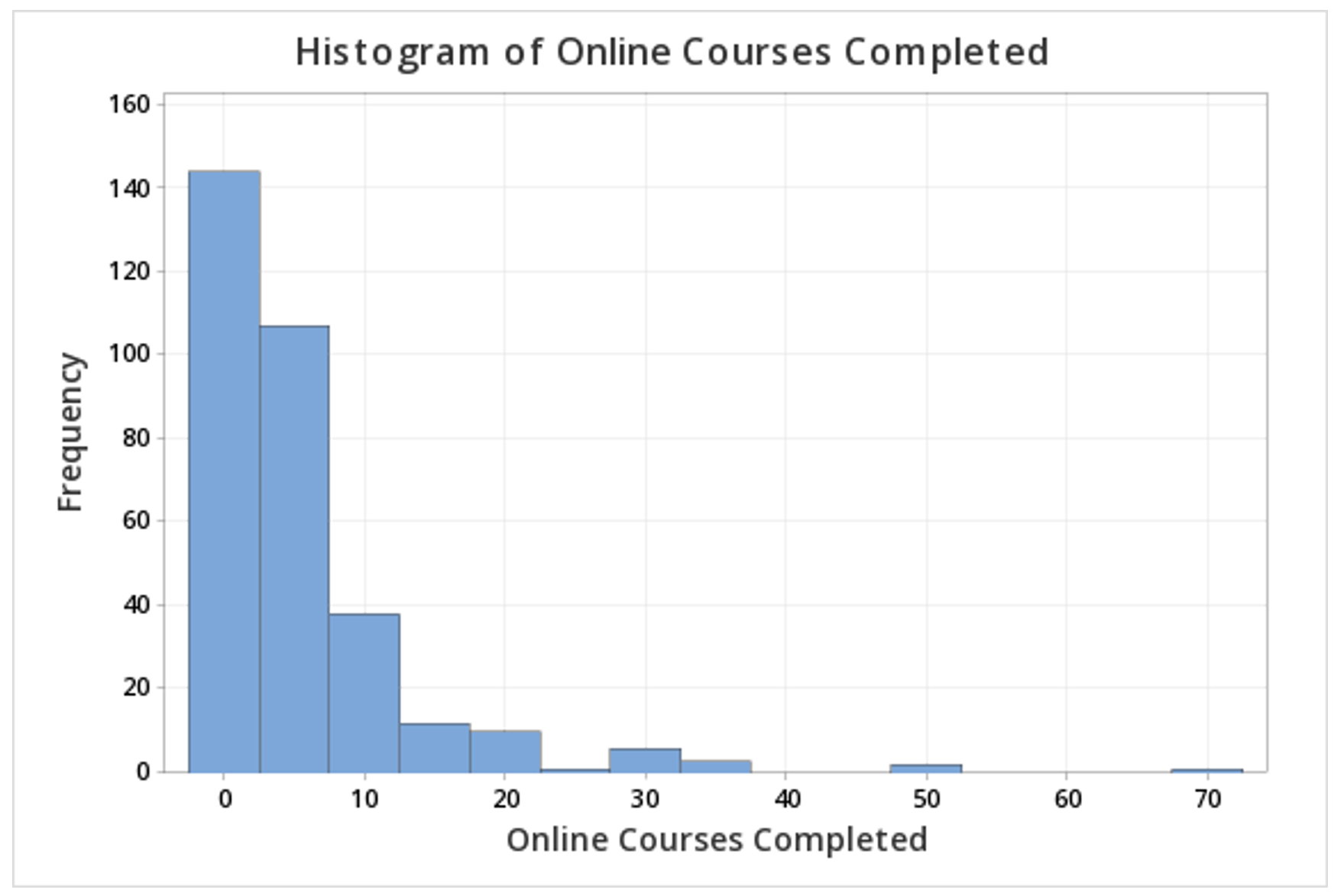
This example will use data collected from a sample of students enrolled in online sections of STAT 200 during the Summer 2020 semester. These data can be downloaded as a CSV file:
To create a histogram of the number of online courses completed in Minitab:
- Open the data set in Minitab
- From the tool bar, select Graph > Histogram...
- Under One Y Variable, select Simple
- Click OK
- Double click the variable Online Courses Completed in the box on the left to insert it into the Y-variable box on the right
- Click OK
This should result in the following histogram:
2.2.2 - Outliers
2.2.2 - OutliersSome observations within a set of data may fall outside the general scope of the other observations. Such observations are called outliers. Outliers can be identified by looking at a dotplot or histogram. In Lesson 3 you'll learn about boxplots which can also be used to identify outliers. When constructing a boxplot, Minitab identifies outliers using mathematical methods that you will see next week. This week we will identify outliers by making a relatively subjective judgement from a given a list of data points, a dotplot, or a histogram.
Example: Dotplot of Hours Watching TV
A sample of STAT 200 students was surveyed and asked how many hours per week they watch television. A dotplot was constructed using these data.
The right-most dot is definitely an outlier because it is much higher than any other points. The other higher points, around 55, 50, and 46, may be outliers. Next week we will learn about some mathematical methods for identifying outliers that can help us make decisions in cases like this where it is not obvious which values are outliers.
Example: Histogram of Best Marriage Age
This sample of students was also asked what they believed was the best age to get married. A histogram was constructed using these data.
There appear to be three outliers in this sample, all on the higher end.
2.2.3 - Shape
2.2.3 - ShapeQuantitative variables are often discussed in terms of their shape. Both dotplots and histograms can be used to interpret a distribution's shape. A distribution may be described in terms of symmetry and skewness.
- Symmetrical Distribution
-
A distribution that is similar on both sides of the center.
- Normal Distribution
-
One specific type of symmetrical distribution. This is also known as a bell-shaped distribution.
- Skewed
- A distribution in which values are more spread out on one side of the center than on the other.
- Right Skewed
-
A distribution in which the higher values (towards the right on a number line) are more spread out than the lower values. This is also known as positively skewed.
- Left Skewed
-
A distribution in which the lower values (towards the left on a number line) are more spread out than the higher values. This is also known as negatively skewed.
2.2.4 - Measures of Central Tendency
2.2.4 - Measures of Central TendencyQuantitative variables are often summarized using numbers to communicate their central tendency. The mean, median, and mode are three of the most commonly used measures of central tendency.
- Mean
-
The numerical average; calculated as the sum of all of the data values divided by the number of values.
The sample mean is represented as \(\overline{x}\) ("x-bar") and the population mean is denoted as the Greek letter \(\mu\) ("mu"). The formula is the same for the sample mean and the population mean.
- Population Mean
- \(\mu=\dfrac{\Sigma x}{N}\)
- Sample Mean
- \(\overline {x} = \dfrac{\Sigma x}{n}\)
- Median
- The middle of the distribution that has been ordered from smallest to largest; for distributions with an even number of values, this is the mean of the two middle values.
- Mode
- The most frequently occurring value(s) in the distribution, may be used with quantitative or categorical variables.
Example: Hours Spent Studying

A professor asks a sample of 7 students how many hours they spent studying for the final. Their responses are: 5, 7, 8, 9, 9, 11, and 13.
Mean
\(\overline{x} = \dfrac{\sum x}{n} =\dfrac{5+7+8+9+9+11+13}{7} =\dfrac{62}{7} =8.857\)
The mean is 8.857 hours.
Median
The observations are already in order from smallest to largest. The middle observation is 9 hours. The median is 9 hours.
Mode
The most frequently occurring observation was 9 hours. The mode is 9 hours.
In this example, the mean, median, and mode are all similar. Recall from our discussion of shape, the mean, median, and mode are all equal when a distribution is symmetric. This distribution of hours spent studying is probably close to symmetrical.
Example: Test Scores
A teacher wants to examine students’ test scores. Their scores are: 74, 88, 78, 90, 94, 90, 84, 90, 98, and 80.
Mean
\(\overline{x}\: =\: \dfrac{\sum x}{n} = \dfrac{74+88+78+90+94+90+84+90+98+80}{10} = \dfrac{866}{10}=86.6\)
The mean score was 86.6.
Median
First, we need to put the scores in order from lowest to highest: 74, 78, 80, 84, 88, 90, 90, 90, 94, 98
Because there is an even number of scores, the median will be the mean of the middle two values. The middle two values are 88 and 90. \(\frac{88+90}{2}=89\)
The median is 89.
Mode
The most frequently occurring score was 90. There were 3 students who scored a 90; this is the mode. Because this distribution has one mode, it is unimodal.
In this example the mean is slightly lower than the median which is slightly lower than the mode. Recall from our discussion of shape that this occurs when a distribution is skewed to the left. This distribution is probably slightly skewed to the left.
Example: Household Size
A group of children are asked how many people live in their household. The following data is collected: 4, 3, 6, 2, 2, 4, 3.
Mean
\(\overline{x} = \dfrac{\sum x}{n}=\dfrac{4+3+6+2+2+4+3}{7}=\dfrac{24}{7}=3.429\)
The mean household size in this group of children is 3.429 people.
Median
First, we need to put all of the values in order from smallest to largest: 2, 2, 3, 3, 4, 4, 6
The value in the middle of this distribution is 3. The median is 3.
Mode
In this distribution, the most common values are 2, 3, and 4. Each of these values occurs twice. There are 3 modes: 2, 3, and 4. This distribution is multimodal.
2.2.4.1 - Skewness & Central Tendency
2.2.4.1 - Skewness & Central TendencyThe preferred measure of central tendency often depends on the shape of the distribution. Of the three measures of tendency, the mean is most heavily influenced by any outliers or skewness.
In a symmetrical distribution, the mean, median, and mode are all equal. In these cases, the mean is often the preferred measure of central tendency.
For distributions that have outliers or are skewed, the median is often the preferred measure of central tendency because the median is more resistant to outliers than the mean. Below you will see how the direction of skewness impacts the order of the mean, median, and mode. Note that the mean is pulled in the direction of the skewness (i.e., the direction of the tail).
2.2.5 - Measures of Spread
2.2.5 - Measures of SpreadThe standard deviation is the most commonly used measure of variability when working with interval- or ratio-level variables. In a sample, this is denoted as \(s\). In a population, we use the Greek letter \(\sigma\) ("sigma").
When computing the standard deviation by hand, it is necessary to first compute the variance. The variance is equal to the standard deviation squared. In a sample, this is denoted as \(s^2\). In a population, it is \(\sigma^2\).
On this page we will provide some examples of computing standard deviation and variance by hand, but after this lesson you will always compute the standard deviation and variance using software such as Minitab.
- Sample Standard Deviation
- \(s=\sqrt{\dfrac{\sum (x-\overline{x})^{2}}{n-1}}\)
There are a number of methods for calculating the standard deviation. If you look through different textbooks or search online, you may find different formulas and procedures. To compute the standard deviation for a sample, we will use the formulas above and the following steps:
Step 1: Compute the sample mean: \(\overline{x} = \dfrac{\sum x}{n}\).
Step 2: Subtract the sample mean from each individual value: \(x-\overline{x}\), these are the deviations.
Step 3: Square each deviation: \((x-\overline{x})^{2}\), these are the squared deviations.
Step 4: Add the squared deviations: \(\sum (x-\overline{x})^{2}\), this is the sum of squares.
Step 5: Divide the sum of squares by \(n-1\): \(\frac{\sum (x-\overline{x})^{2}}{n-1}\), this is the sample variance \((s^{2})\).
Step 6: Take the square root of the sample variance: \(\sqrt{\frac{\sum (x-\overline{x})^{2}}{n-1}}\), this is the sample standard deviation (\(s\)).
The formula for computing the standard deviation in a population is slightly different. Note that the denominator chances from \(n-1\) to \(N\). In this course, we will primarily be using the sample standard deviation, but you can review the following formulas to see the similarities.
- Population Standard Deviation
- \(\sigma=\sqrt{\dfrac{\sum (x-\mu)^{2}}{N}}\)
- Sample Variance
- \(s^2=\dfrac{\sum (x-\overline{x})^{2}}{n-1}\)
- Population Variance
- \(\sigma^2=\dfrac{\sum (x-\mu)^{2}}{N}\)
Video Example
The video below walks through an example of computing a sample standard deviation by hand.
Example: Hours Spent Studying

A professor asks a sample of 7 students how many hours they spent studying for the final. Their responses are: 5, 7, 8, 9, 9, 11, and 13.
Step 1: Compute the mean
\(\overline{x} = \dfrac{\sum x}{n}=\dfrac{5+7+8+9+9+11+13}{7}=8.857\)
Step 2: Compute the deviations
| \(x\) | \(x - \overline{x}\) |
|---|---|
| 5 | \(5 - 8.857 = -3.857\) |
| 7 | \(7 - 8.857 = -1.857\) |
| 8 | \(8 - 8.857 = -0.857\) |
| 9 | \(9 - 8.857 = 0.143\) |
| 9 | \(9 - 8.857 = 0.143\) |
| 11 | \(11 - 8.857 = 2.143\) |
| 13 | \(13 - 8.857 = 4.143\) |
Step 3: Square the deviations
| \(x\) | \(x - \overline{x}\) | \((x-\overline{x})^{2}\) |
|---|---|---|
| 5 | \(5 - 8.857 = -3.857\) | \(-3.857^{2} = 14.876\) |
| 7 | \(7 - 8.857 = -1.857\) | \(-1.857^{2} = 3.448\) |
| 8 | \(8 - 8.857 = -0.857\) | \(-0.857^{2} = 0.734\) |
| 9 | \(9 - 8.857 = 0.143\) | \(0.143^{2} = 0.0020\) |
| 9 | \(9 - 8.857 = 0.143\) | \(0.143^{2} = 0.0020\) |
| 11 | \(11 - 8.857 = 2.143\) | \(2.143^{2} = 4.592\) |
| 13 | \(13 - 8.857 = 4.143\) | \(4.143^{2} = 17.164\) |
Step 4: Sum the squared deviations
\(SS=\sum (x-\overline{x})^{2}=14.876+3.448+0.734+.020+.020+4.592+17.164=40.854\)
The sum of squares is 40.854
Step 5: Divide by n - 1 to compute the variance
\(s^{2}=\dfrac{\sum (x-\overline{x})^{2}}{n-1}=\dfrac{40.854}{7-1}=6.809\)
The variance is 6.809
Step 6: Take the square root of the variance
\(s=\sqrt{s^{2}}=\sqrt{6.809}=2.609\)
The standard deviation is 2.609
2.2.6 - Minitab: Central Tendency & Variability
2.2.6 - Minitab: Central Tendency & VariabilityMinitab may be used to compute descriptive statistics for numeric variables, including the mean, median, mode, standard deviation, and variance.
Note that these are the default setting in Minitab:
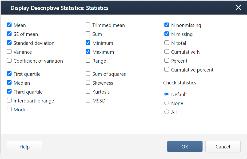
If you want additional statistics, such as the mode, variance, range, or interquartile range (IQR), you will need to select them in the Statistics window.
Minitab® – Central Tendency
Central Tendency and Variability
This example will use data collected from a sample of students enrolled in online sections of STAT 200 during the Summer 2020 semester. These data can be downloaded as a CSV file:
To obtain measures of central tendency and variability in Minitab:
- Open the data set in Minitab
- From the tool bar, select Stat > Basic Statistics > Display Descriptive Statistics...
- Double click the variable Online Courses Completed in the box on the left to insert it into the Variables box on the right
- Click on the Statistics button and select the descriptive statistics you want displayed (e.g., Variance, Interquartile range, Mode)
- Click OK
- Click OK
This should result in the following output:
| Variable | N | N* | Mean | SE Mean | StDev | Variance | Minimum | Q1 | Median | Q3 | Maximum | IQR | Mode | N for Mode |
|---|---|---|---|---|---|---|---|---|---|---|---|---|---|---|
| Online Courses Completed | 324 | 19 | 5.6975 | 0.4579 | 8.2429 | 67.945 | 0.0000 | 1.0000 | 3.0000 | 6.0000 | 70.0000 | 5.000 | 0 | 57 |
2.2.7 - The Empirical Rule
2.2.7 - The Empirical RuleA normal distribution is symmetrical and bell-shaped.
The Empirical Rule is a statement about normal distributions. Your textbook uses an abbreviated form of this, known as the 95% Rule, because 95% is the most commonly used interval. The 95% Rule states that approximately 95% of observations fall within two standard deviations of the mean on a normal distribution.
- Normal Distribution
- A specific type of symmetrical distribution, also known as a bell-shaped distribution
- Empirical Rule
-
On a normal distribution about 68% of data will be within one standard deviation of the mean, about 95% will be within two standard deviations of the mean, and about 99.7% will be within three standard deviations of the mean
The normal curve showing the empirical rule.
- 95% Rule
- On a normal distribution approximately 95% of data will fall within two standard deviations of the mean; this is an abbreviated form of the Empirical Rule
Example: Pulse Rates

Suppose the pulse rates of 200 college men are bell-shaped with a mean of 72 and standard deviation of 6.
- About 68% of the men have pulse rates in the interval \(72\pm1(6)=[66, 78]\).
- About 95% of the men have pulse rates in the interval \(72\pm2(6)=[60, 84]\).
- About 99.7% of the men have pulse rates in the interval \(72\pm 3(6)=[54, 90]\).
Example: IQ Scores
IQ scores are normally distributed with a mean of 100 and a standard deviation of 15.
- About 68% of individuals have IQ scores in the interval \(100\pm 1(15)=[85,115]\).
- About 95% of individuals have IQ scores in the interval \(100\pm 2(15)=[70,130]\).
- About 99.7% of individuals have IQ scores in the interval \(100\pm 3(15)=[55,145]\).
2.2.8 - z-scores
2.2.8 - z-scoresOften we want to describe an observation in relation to the distribution of all observations. We can do this using a z-score. By converting observations to z-scores, we can compare observations from different distributions.
- z-score
-
Distance between an individual score and the mean in standard deviation units; also known as a standardized score.
- z-score
- \(z=\dfrac{x - \overline{x}}{s}\)
-
\(x\) = original data value
\(\overline{x}\) = mean of the original distribution
\(s\) = standard deviation of the original distribution
This equation could also be rewritten in terms of population values: \(z=\frac{x-\mu}{\sigma}\)
Later in the course, we will learn more about the z-distribution, which is a special case of the normal distribution.
- z-distribution
-
A bell-shaped distribution with a mean of 0 and standard deviation of 1, also known as the standard normal distribution.
Example: Milk

A study of 66,831 dairy cows found that the mean milk yield was 12.5 kg per milking with a standard deviation of 4.3 kg per milking (data from Berry, et al., 2013).
A cow produces 18.1 kg per milking. What is this cow’s z-score?
\(z=\frac{x-\overline{x}}{s} =\frac{18.1-12.5}{4.3}=1.302\)
This cow’s z-score is 1.302; her milk production was 1.302 standard deviations above the mean.
A cow produces 12.5 kg per milking. What is this cow’s z-score?
\(z=\frac{x-\overline{x}}{s} =\frac{12.5-12.5}{4.3}=0\)
This cow’s z-score is 0; her milk production was the same as the mean.
A cow produces 8 kg per milking. What is this cow’s z-score?
\(z=\frac{x-\overline{x}}{s} =\frac{8-12.5}{4.3}=-1.047\)
This cow’s z-score is -1.047; her milk production was 1.047 standard deviations below the mean.
Berry, D. P., Coyne, J., Boughlan, B., Burke, M., McCarthy, J., Enright, B., Cromie, A. R., McParland, S. (2013). Genetics of milking characteristics in dairy cows. Animal, 7(11), 1750-1758.
Example: Comparing Test Scores
SAT-Math scores are normally distributed with a mean of 500 and standard deviation of 100. ACT-Math scores are normally distributed with a mean of 18 and standard deviation of 6. A student has taken both tests. They scored 600 on the SAT-Math and 22 on the ACT-Math. Which score is more impressive?
We can't directly compare the student's SAT and ACT scores because they are on different scales. We can convert these test scores into z-scores so we can directly compare them.
\(z_{SAT}=\frac{600-500}{100}=1\)
This student scored 1 standard deviation above the mean on the SAT-Math.
\(z_{ACT}=\frac{22-18}{6}=0.667\)
This student scored 0.667 standard deviations above the mean on the ACT-Math.
The student's SAT-Math score is more impressive than their ACT-Math score because the z-score is higher. They scored better than a larger proportion of other test takers on the SAT-Math.
2.2.9 - Percentiles
2.2.9 - PercentilesThere are slightly different definitions of percentiles and different statistical software and textbooks may use different formulas. In this course, we will be using the definition from your textbook:
- Percentile
- Proportion of a distribution less than a given value.
Example: Final Exam Scores
The dotplot below displays the final exam scores from a sample of 100 students. Estimate the 90th percentile.
Given that there are 100 dots on this plot, the 90th percentile will fall around the 90th and 91st points. We can estimate the 90th percentile by counting down 10 from the top. The point that is 10th from the top is 59. Thus, the 90th percentile in this sample is a score of 59 points.
2.2.10 - Five Number Summary
2.2.10 - Five Number SummaryA five number summary can be used to communicate some key descriptive statistics. It is comprised of five values, presented in the following order:
- Minimum: Smallest value
- First quartile (Q1): 25th percentile (value that separates the bottom 25% of the distribution from the top 75%)
- Median: Middle value (50th percentile)
- Third quartile (Q3): 75th percentile (value that separates the bottom 75% of the distribution from the top 25%)
- Maximum: Largest value
- Five Number Summary
- Minimum, Q1, Median, Q3, Maximum
Five number summaries are used to describe some of the key features of a distribution. Using the values in a five number summary we can also compute the range and interquartile range.
- Range
- The difference between the maximum and minimum values.
- Range
- \(Range = Maximum - Minimum\)
- Note:
- The range is heavily influenced by outliers. For this reason, the interquartile range is often preferred because it is resistant to outliers.
- Interquartile range (IQR)
- The difference between the first and third quartiles.
- Interquartile Range
- \(IQR = Q_3 - Q_1\)
Example: Hours Spent Studying

A professor asks a sample of students how many hours they spent studying for the final. The five number summary for their responses is (5, 7, 9, 11, 13).
Range
The maximum is 13 and the minimum is 5.
\(Range = 13 - 5 = 8\)
Interquartile Range
The third quartile is 11 and the first quartile is 7.
\(IQR = Q_3 - Q_1 = 11 - 7 = 4\)
Example: Test Scores
A teacher wants to examine students’ test scores. The five number summary for their scores is (74, 80, 89, 90, 98).
Range
The highest score is 98. The lowest score is 74.
\(Range = 98 - 74 = 24\)
Interquartile Range
The third quartile is 90 and the first quartile is 80.
\(IQR = Q3 - Q1 = 90 - 80 = 10\)
2.3 - Lesson 2 Summary
2.3 - Lesson 2 SummaryObjectives
- Compute and interpret a basic proportion/risk/probability and odds
- Select and interpret the appropriate visual representations for one categorical variable, two categorical variable, and one quantitative variable
- Use Minitab to construct frequency tables, pie charts, bar charts, two-way tables, clustered bar charts, histograms, and dotplots
- Compute and interpret complements, intersections, unions, and conditional probabilities given a two-way table
- Identify outliers on a histogram or dotplot
- Interpret the shape of a distribution
- Compute and interpret the mean, median, mode, and standard deviation
- Compute and interpret percentiles and z scores
- Apply the Empirical Rule
- Interpret a five number summary
In this lesson, you learned how to display and summarize data concerning one categorical variable, two categorical variables, and one quantitative variable. Review the learning objectives above. You should be able to successfully complete each of these tasks before moving on. If you have any questions, post them on the Lesson 2 Discussion Board in Canvas.
In Lesson 3 we will build on this as we examine how to display and summarize data concerning the relationship between a categorical and a quantitative variable and two quantitative variables.