3.4.1 - Scatterplots
3.4.1 - ScatterplotsRecall from Lesson 1.1.2, in some research studies one variable is used to predict or explain differences in another variable. In those cases, the explanatory variable is used to predict or explain differences in the response variable.
- Explanatory variable
-
Variable that is used to explain variability in the response variable, also known as an independent variable or predictor variable; in an experimental study, this is the variable that is manipulated by the researcher.
- Response variable
-
The outcome variable, also known as a dependent variable.
A scatterplot can be used to display the relationship between the explanatory and response variables. Or, a scatterplot can be used to examine the association between two variables in situations where there is not a clear explanatory and response variable. For example, we may want to examine the relationship between height and weight in a sample but have no hypothesis as to which variable impacts the other; in this case, it does not matter which variable is on the x-axis and which is on the y-axis.
- Scatterplot
- A graphical representation of two quantitative variables in which the explanatory variable is on the x-axis and the response variable is on the y-axis.
When examining a scatterplot, we need to consider the following:
- Direction (positive or negative)
- Form (linear or non-linear)
- Strength (weak, moderate, strong)
- Bivariate outliers
In this class, we will focus on linear relationships. This occurs when the line-of-best-fit for describing the relationship between x and y is a straight line. The linear relationship between two variables is positive when both increase together; in other words, as values of x get larger values of y get larger. This is also known as a direct relationship. The linear relationship between two variables is negative when one increases as the other decreases. For example, as values of x get larger values of y get smaller. This is also known as an indirect relationship.
A bivariate outlier is an observation that does not fit with the general pattern of the other observations.
Example: Baseball

Data concerning baseball statistics and salaries from the 1991 and 1992 seasons is available at:
The scatterplot below shows the relationship between salary and batting average for the 337 baseball players in this sample.
From this scatterplot, we can see that there does not appear to be a meaningful relationship between baseball players' salaries and batting averages. We can also see that more players had salaries at the low end and fewer had salaries at the high end.
Example: Height and Shoe Size

Data concerning the heights and shoe sizes of 408 students were retrieved from:
The scatterplot below was constructed to show the relationship between height and shoe size.
There is a positive linear relationship between height and shoe size in this sample. The magnitude of the relationship appears to be strong. There do not appear to be any outliers.
Example: Height and Weight
Data concerning body measurements from 507 individuals retrieved from:
For more information see:
The scatterplot below shows the relationship between height and weight.
There is a positive linear relationship between height and weight. The magnitude of the relationship is moderately strong.
Example: Cafés

Data concerning sales at student-run café were retrieved from:
For more information about this data set, visit:
The scatterplot below shows the relationship between maximum daily temperature and coffee sales.
There is a negative linear relationship between the maximum daily temperature and coffee sales. The magnitude is moderately strong. There do not appear to be any outliers.
3.4.1.1 - Minitab: Simple Scatterplot
3.4.1.1 - Minitab: Simple ScatterplotMinitab® – Simple Scatterplot
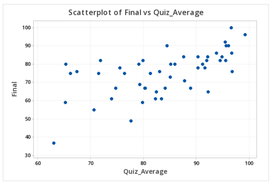
The file below contains data concerning students' quiz averages and final exam scores. Let's construct a scatterplot with the quiz averages on the horizontal axis and final exam scores on the vertical axis.
- Open the data file in Minitab
- From the tool bar, select Graphs > Scatterplot > One Y Variable > Simple
- Double click the variable Final on the left to move it to the Y variable box on the right
- Double click the variable Quiz_Average on the left to move it to the X variable box on the right
- Click OK
This should result in the scatterplot below:
