3.5 - Relations between Multiple Variables
3.5 - Relations between Multiple VariablesSection 2.7 of the Lock5 textbook introduces you to some data visualizations that may be used with more than two variables. Here, we will look at a few examples of these data visualizations and how they can be interpreted.
3.5.1 - Scatterplot with Groups
3.5.1 - Scatterplot with GroupsA scatterplot with groups can be used to display the relationship between two quantitative variables and one categorical variable. Like the scatterplot that you learned about earlier, the quantitative variables are shown on the x- and y-axes. Now, the different levels of the categorical variable are communicated using different colored points or different shaped points.
Minitab® – Scatterplots with Groups
This example will use the Palmer penguins dataset:
To create a scatterplot with groups in Minitab:
- Open the data file in Minitab
- From the tool bar, select Graph > Scatterplot > One Y Variable > Groups Overlaid
- Double click the variable body_mass_g in the box on the left to insert it into the Y variable box on the right
- Double click the variable flipper_length_mm in the box on the left to insert it into the X variable box on the right
- Double click the variable species in the box on the left to insert it into the Group variables box on the right
- Click OK
This should result in the following scatterplot with groups:
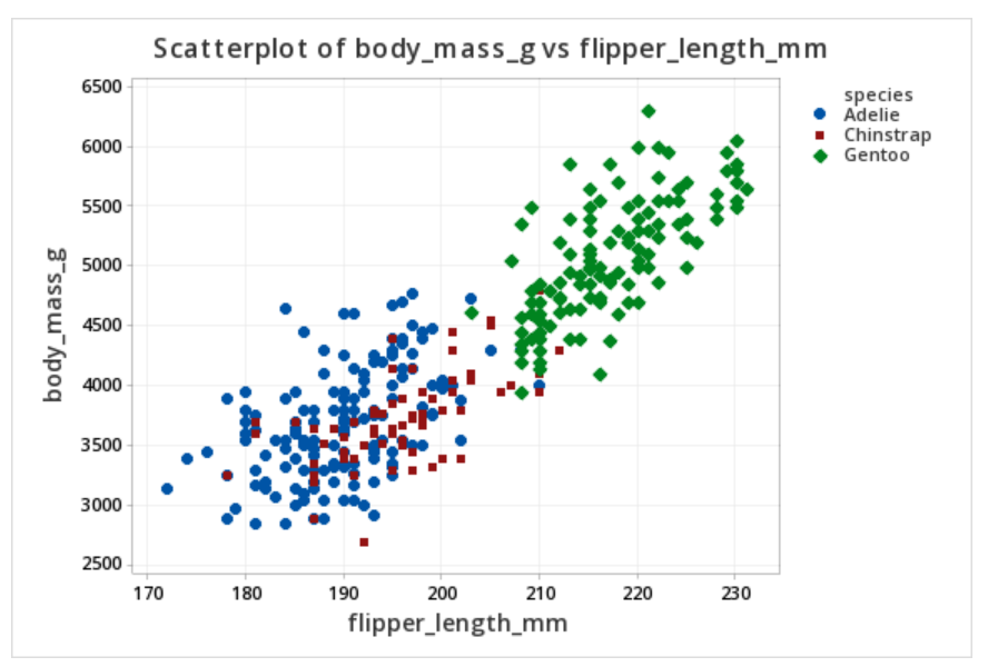
The scatterplot above shows the relationship between flipper length (in millimeters) and body mass (in grams) while noting which penguins were adelie, chipstrap, and gentoo by using markers that are different colors and shapes. Overall, there is a strong positive relationship between flipper length and body mass in this sample. Gentoo penguins tend to be larger than adelie or chipstrap penguins both in terms of their body mass and their flipper length.
3.5.2 - Bubble Plots
3.5.2 - Bubble PlotsA bubble plot can be used to display data concerning three quantitative variables at a time and a categorical grouping variable. In the example below, three variables are displayed: one on the \(x\)-axis, one on the \(y\)-axis, and one as the size of the bubbles. In Figures 2.75 and 2.76 in your textbook, four variables are displayed: quantitative variables are represented on the x-axis, y-axis, and as the size of the bubbles; a categorical variable is represented by the color of the bubbles.
Example: Height, Weight, & Days Exercising
The plot below was made using the statistical software R. Data were collected from World Campus students. They were asked for their heights, weights, and how many days per week they exercised. Researchers believed that there would be a linear relationship between height and weight overall but that number of days exercised would also be a factor. In this plot height (in inches) is on the \(x\)-axis, weight (in pounds) is on the \(y\)-axis, and the size of each bubble is determined by the number of days per week that the individual exercised.
Larger bubbles signify more days per week exercising. From this plot, we can see that there is a positive linear relationship between height and weight. We can also see that many of the larger bubbles (i.e., people who exercise more) tend to fall below the line of best fit and more of the smaller bubbles are above the line. In other words, people who spend more time at the gym have larger negative residuals. This means that for their height, they weigh less than predicted given a model that uses only height to predict weight.
Example: Air Quality in New York
The bubble plot above displays data for three quantitative variables plus a categorical variable. The x axis represents the day of the month and the y axis represents a measure of the air quality. The size of each bubble is the wind speed on that day. And, the color of the bubble represents the month.
It looks like the pink bubbles, particularly starting on the sixth of the month, tend to be lower than the blue and green. This means that air pollution tends to be lower in September compared to July and August. The larger bubbles tend to be lower, representing lower air pollution on windier days.
3.5.3 - Time Series Plot
3.5.3 - Time Series PlotA time series plot displays time on the \(x\)-axis and a quantitative response variable on the \(y\)-axis. Minitab will construct time series plots (Graphs > Time Series Plots) and will conduct time series analyses which are covered in upper-level statistics courses. Here, you should be able to interpret a time series plot.
Example: Deaths by Horsekicks
Source: https://commons.wikimedia.org/wiki/File:R-horsekick_totals-by_year.svg
The time series plot above of "Deaths by horsekick in Prussian cavalry corps, 1875-94" displays the number of annual deaths in each of these 20 years. In other words, one quantitative variable is examined over time.
Example: Changes in Religious Affiliations
Source: Duncan Keith: https://commons.wikimedia.org/wiki/File:Bsa-religion-question-1983-2006.svg
The time series plot above presents data from the British Social Attitudes Survey concerning religious affiliation. Here, percentages are compared for three different groups over time. We can see that the proportion of individuals who identify as Christian decreased during this time while the proportion who have no religion is increasing and the proportion of other non-Christians has stayed relatively steady and low.