2.1.1.2 - Visual Representations
2.1.1.2 - Visual RepresentationsFrequency tables, pie charts, and bar charts can all be used to display data concerning one categorical (i.e., nominal- or ordinal-level) variable. Below are descriptions for each along with some examples. At the end of this lesson you will learn how to construct each of these using Minitab.
Frequency Tables
A frequency table contains the counts of how often each value occurs in the dataset. Some statistical software, such as Minitab, will use the term tally to describe a frequency table. Frequency tables are most commonly used with nominal- and ordinal-level variables, though they may also be used with interval- or ratio-level variables if there are a limited number of possible outcomes.
In addition to containing counts, some frequency tables may also include the percent of the dataset that falls into each category, and some may include cumulative values. A cumulative count is the number of cases in that category and all previous categories. A cumulative percent is the percent in that category and all previous categories. Cumulative counts and cumulative percentages should only be presented when the data are at least ordinal-level.
The first example is a frequency table displaying the counts and percentages for Penn State undergraduate student enrollment by campus. Because this is a nominal-level variable, cumulative values were not included.
| Campus | Count | Percent |
|---|---|---|
| University Park | 40,639 | 50.1% |
| Commonwealth Campuses | 27,100 | 33.4% |
| PA College of Technology | 4,981 | 6.1% |
| World Campus | 8,360 | 10.3% |
| Total | 81,080 | 100% |
Penn State Fall 2019 Undergraduate Enrollments
The next example is a frequency table for an ordinal-level variable: class standing. Because ordinal-level variables have a meaningful order, we sometimes want to look at the cumulative counts or cumulative percents, which tell us the number or percent of cases at or below that level.
As an example, let's interpret the values in the "Sophomore" row. There are 22 sophomore students in this sample. There are 27 students who are sophomore or below (i.e., first-year or sophomore). In terms of percentages, 34.4% of students are sophomores and 42.2% of students are sophomores or below.
| Class Standing | Count | Cumulative Count | Percent | Cumulative Percent |
|---|---|---|---|---|
| First-Year | 5 | 5 | 7.8% | 7.8% |
| Sophomore | 22 | 27 | 34.4% | 42.2% |
| Junior | 17 | 44 | 26.6% | 68.8% |
| Senior | 20 | 64 | 31.3% | 100.0% |
Pie Charts
A pie chart displays data concerning one categorical variable by partitioning a circle into "slices" that represent the proportion in each category. When constructing a pie chart, pay special attention to the colors being used to ensure that it is accessible to individuals with different types of colorblindness.
Bar Charts
A bar chart is a graph that can be used to display data concerning one nominal- or ordinal-level variable. The bars, which may be vertical or horizontal, symbolize the number of cases in each category. Note that the bars on a bar chart are separated by spaces; this communicates that this a categorical variable.
The first example below is a bar chart with vertical bars. The second example is a bar chart with horizontal bars. Both examples are displaying the same data. On both charts, the size of the bar represents the number of cases in that category.
Penn State Fall 2019 Undergraduate Enrollments
Penn State Fall 2019 Undergraduate Enrollments
Considerations
Pie charts tend to work best when there are only a few categories. If a variable has many categories, a pie chart may be difficult to read. In those cases, a frequency table or bar chart may be more appropriate. Each visual display has its own strengths and weaknesses. When first starting out, you may need to make a few different types of displays to determine which most clearly communicates your data.
2.1.1.2.1 - Minitab: Frequency Tables
2.1.1.2.1 - Minitab: Frequency TablesMinitab® – Frequency Table
This example will use data collected from a sample of STAT 200 students. These data can be downloaded using:
To create a frequency table of the primary campus variable in Minitab:
- Open the data file in Minitab
- From the tool bar, select Stat > Tables > Tally Individual Variables
- Double click the variable Primary Campus in the box on the left to insert it into the Variable box on the right
- Under Statistics, check Counts and Percents
- Click OK
This should result in the following frequency table:
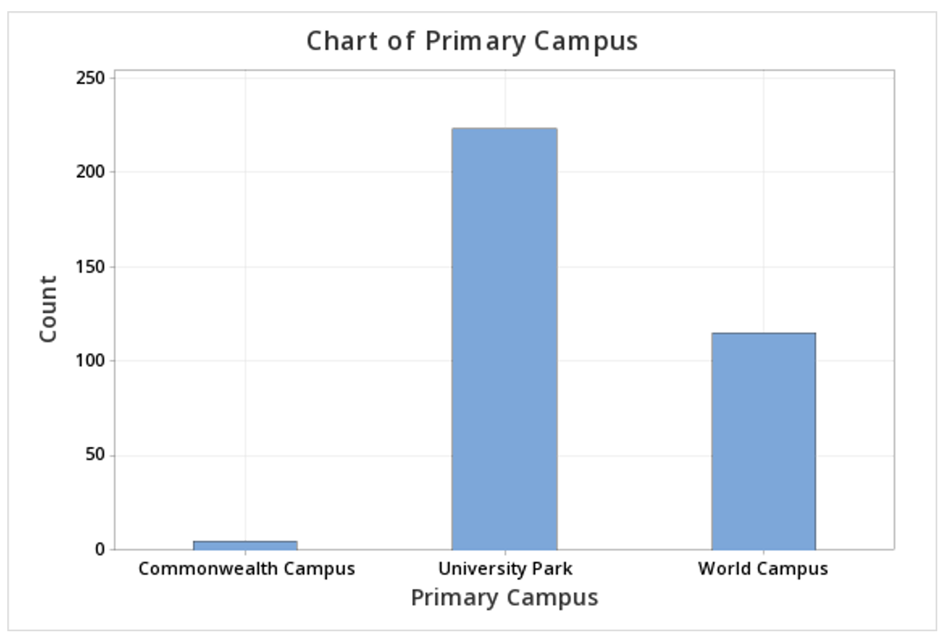
| Primary Campus | Count | Percent |
|---|---|---|
| Commonwealth Campus | 5 | 1.46 |
| University Park | 223 | 65.01 |
| World Campus | 115 | 33.53 |
| N= | 343 |
2.1.1.2.2 - Minitab: Pie Charts
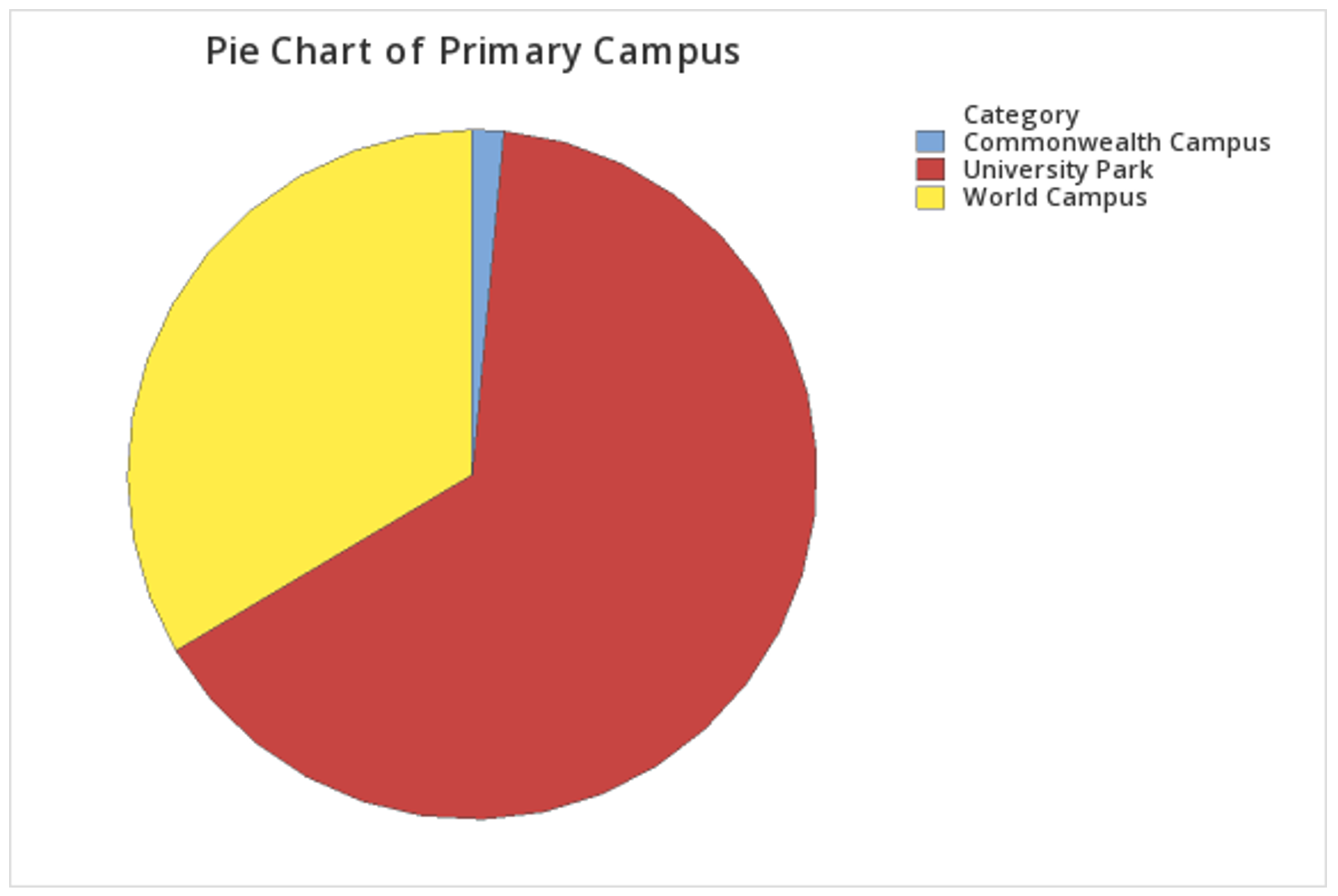
2.1.1.2.2 - Minitab: Pie ChartsMinitab® – Pie Chart (Raw Data)
This example will use data collected from a sample of students enrolled in online sections of STAT 200 during the Summer 2020 semester. These data can be downloaded as a CSV file:
To create a pie chart using raw data:
- Open the data file in Minitab
- From the tool bar, select Graph > Pie Chart...
- Select Counts of Unique Values
- Click OK
- Double click the variable Primary Campus in the box on the left to insert it into the Categorical variables box on the right
- Click OK
This should result in the pie chart below:
Minitab® – Pie Chart (Summarized Data)
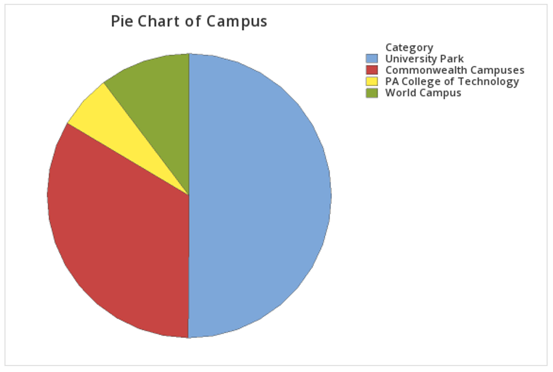
In the example above, raw data were used. In other words, the data file contained one row for each case. It is also possible to use Minitab to construct a pie chart with summarized data, for example, if you have your counts in a frequency table. If this is the case, follow the steps below. This example uses the following data concerning Penn State undergraduate enrollment:
| Campus | Count |
|---|---|
| University Park | 40,639 |
| Commonwealth Campuses | 27,100 |
| PA College of Technology | 4,981 |
| World Campus | 8,360 |
Penn State Fall 2019 Undergraduate Enrollments
To create a pie chart using summarized data:
- Enter the data into a blank Minitab worksheet with one column containing the Campus names and a second column containing the Count for each campus
- From the tool bar, select Graph > Pie Chart...
- Select Summarized Data in a Table
- Click OK
- Double click Campus in the box on the left to insert it into the Categorical variable box on the right
- Double click Count in the box on the left to insert it into the Summary variables box on the right
- Click OK
This should result in the pie chart below:
2.1.1.2.3 - Minitab: Bar Charts
2.1.1.2.3 - Minitab: Bar ChartsMinitab® – Bar Chart (Raw Data)
This example will use data collected from a sample of students enrolled in online sections of STAT 200 during the Summer 2020 semester. These data can be downloaded as a CSV file:
To create a bar graph of the primary campus variable in Minitab:
- Open the data file in Minitab
- From the tool bar, select Graph > Bar Chart > Counts of Unique Values...
- Select One Variable
- Click OK
- Double click the variable Primary Campus in the box on the left to insert it into the Categorical variable box on the right
- Click OK
This should result in the bar graph below:
Minitab® – Bar Chart (Summarized Data)
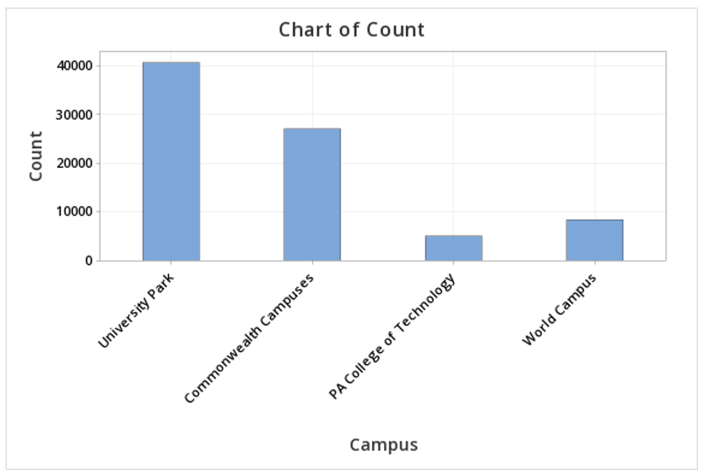
In the example above, raw data were used. In other words, the data file contained one row for each case. It is also possible to use Minitab to construct a bar chart with summarized data, for example, if you have your counts in a frequency table. If this is the case, follow the steps below. This example uses the following data concerning Penn State undergraduate enrollment:
| Campus | Count |
|---|---|
| University Park | 40,639 |
| Commonwealth Campuses | 27,100 |
| PA College of Technology | 4,981 |
| World Campus | 8,360 |
Penn State Fall 2019 Undergraduate Enrollments
To create a bar chart using summarized data:
- Enter the data into a blank Minitab worksheet with one column containing the Campus names and a second column containing the Count for each campus
- From the tool bar, select Graph > Bar Chart > Summarized Data in a Table...
- Under One Column of Values, select Simple
- Click OK
- Double click Count in the box on the left to insert it into the Y-variable box on the right
- Double click Campus in the box on the left to insert it into the Categorical variable box on the right
- Click OK
This should result in the bar chart below: