2.1.2 - Two Categorical Variables
2.1.2 - Two Categorical VariablesData concerning two categorical (i.e., nominal- or ordinal-level) variables can be displayed in a two-way contingency table, clustered bar chart, or stacked bar chart. Here, we'll look at an example of each. At the end of this lesson, you will learn how Minitab can be used to make two-way contingency tables and clustered bar charts.
Two-Way Contingency Table
A two-way contingency table, also know as a two-way table or just contingency table, displays data from two categorical variables. This is similar to the frequency tables we saw in the last lesson, but with two dimensions. One variable will be represented in the rows and a second variable will be represented in the columns. Later in this lesson we'll see how a two-way table can be used to compute a variety of different proportions.
The example below displays the counts of Penn State undergraduate and graduate students who are Pennsylvania residents and not Pennsylvania residents.
| PA Resident | Non-PA Resident | Total | |
|---|---|---|---|
| Undergraduate | 54,239 | 26,841 | 81,080 |
| Graduate | 5,596 | 9,732 | 15,328 |
| Total | 59,835 | 36,573 | 96,408 |
Stacked Bar Chart
A stacked bar chart is also known as a segmented bar chart. One categorical variable is represented on the x-axis and the second categorical variable is displayed as different parts (i.e., segments) of each bar. The stacked bar chart below was constructed using the statistical software program R.
On this stacked bar chart, the bar on the left represents the number of students who are Pennsylvania residents. The bar on the right represents the number of students who are not Pennsylvania residents. The bottom of each bar, which is light green, represents the number of students who are enrolled at the undergraduate-level. The top of each bar, which is blue, represents the number of students who are enrolled at the graduate-level.
From this bar chart, we can see that overall there are more students who are Pennsylvania residents than non-Pennsylvania residents because the bar on the left is higher than the bar on the right. In both bars, the light green section is much bigger than the blue section, which tells us that there are more undergraduate-students than there are graduate-students in both groups.
The light green section is bigger in the left bar compared to the right bar, which tells us that undergraduate-students are more likely to be Pennsylvania residents. The blue section is bigger in the right bar compared to the left bar, which tells us that graduate-students are more likely to be non-Pennsylvania residents.
Clustered Bar Chart
In a clustered bar chart each bar represents one combination of the two categorical variables. If you compare this to the two-way contingency table above, each bar represents the value in one cell. This is also known as a side-by-side bar chart. The clustered bar chart below was made using Minitab.
Choosing the Best Visual Display
The two-way contingency table, stacked bar chart, and clustered bar chart shown above were all made using the same data concerning Penn State enrollments by academic level and state residency. The best visual display depends on the scenario. For example, if our primary goal was to compare the number of students who are Pennsylvania residents and non-Pennsylvania residents, and academic level was a secondary variable of interest, the stacked bar chart may be preferred. If we wanted to compare the number of students in each combination of academic level and state residency to see which groups were largest and smallest, the clustered bar chart may be preferred. Often, more than one of these graphs may be appropriate.
2.1.2.1 - Minitab: Two-Way Contingency Table
2.1.2.1 - Minitab: Two-Way Contingency TableMinitab® – Two-Way Contingency Table
This example will use data collected from a sample of students enrolled in online sections of STAT 200.
To create a two-way table of the Work Status and Primary Campus variables in Minitab:
- Open the data file in Minitab
- From the tool bar, select Stat > Tables > Cross Tabulation and Chi-Square
- We have a data file where each row represents one case, so we will keep the default data entry method of Raw data (categorical variables) in the drop down menu
- Click in the Rows box, then double click the variable Work Status to insert it into the Rows box on the right
- Click in the Columns box, then double click the variable Primary Campus to insert it into the Columns box on the right
- Click OK
This should result in the two-way table below:
| Commonwealth Campus | University Park | World Campus | All | |
|---|---|---|---|---|
| Full-time | 0 | 26 | 78 | 104 |
| Not working | 1 | 99 | 25 | 125 |
| Part-Time | 4 | 96 | 12 | 112 |
| Missing | 0 | 2 | 0 | * |
| All | 5 | 221 | 115 | 341 |
| Cell Contents: Count | ||||
Additional Display Options
The default in Minitab is to display the counts. Under Display you also have the option to select Row percents, Column percents, and Total percents.
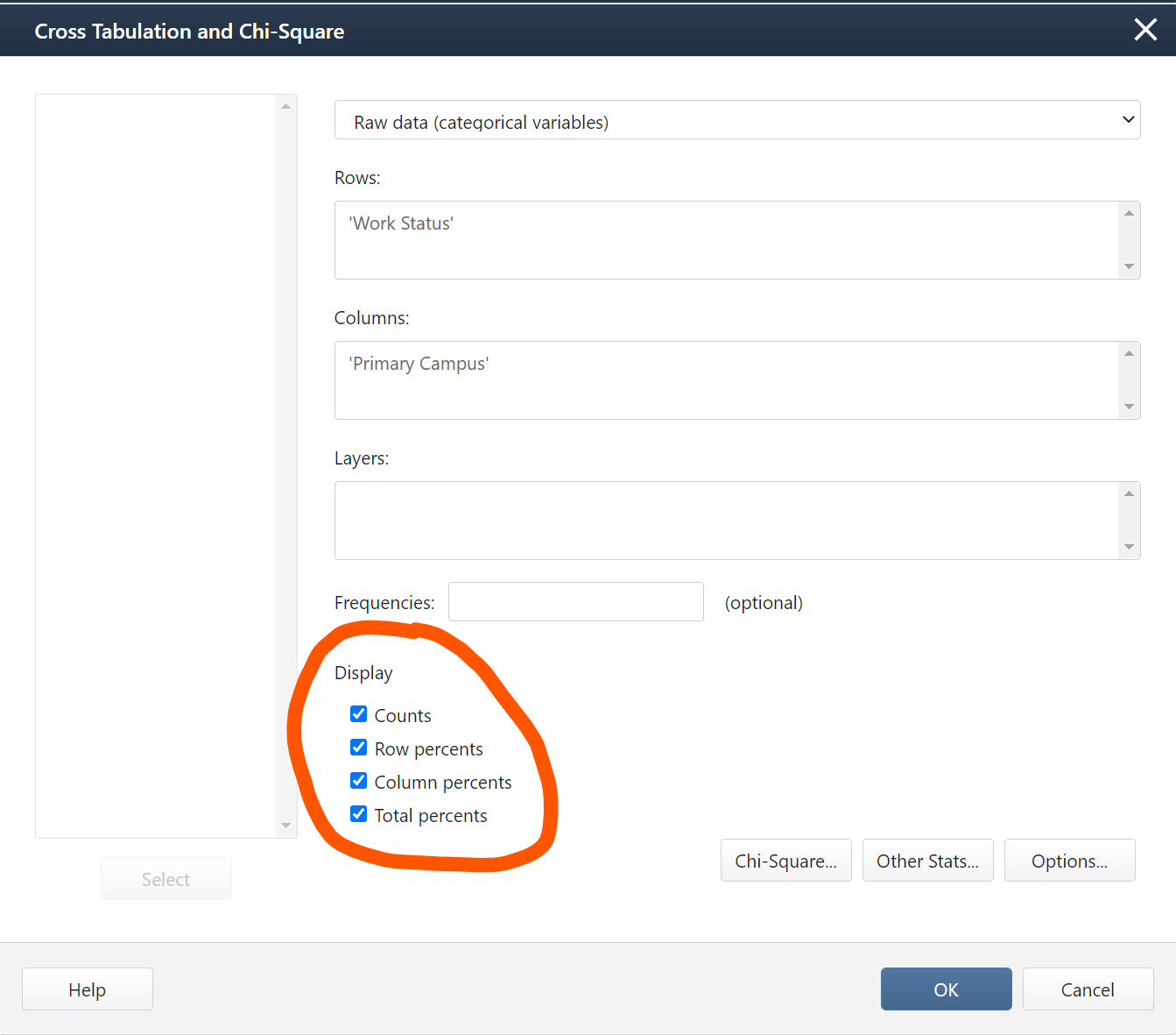
The output below is what you would get if you selected all four display options:
| Commonwealth Campus | University Park | World Campus | All | |
|---|---|---|---|---|
| Full-time |
0 0.00 0.00 0.00 |
26 25.00 11.76 7.62 |
78 75.00 67.83 22.87 |
104 100.00 30.50 30.50 |
| Not working |
1 0.80 20.00 0.29 |
99 79.20 44.80 29.03 |
25 20.00 21.74 7.33 |
125 100.00 36.66 36.66 |
| Part-Time |
4 3.57 80.00 1.17 |
96 85.71 43.44 28.15 |
12 10.71 10.43 3.52 |
112 100.00 32.84 32.84 |
| Missing |
0 * * * |
2 * * * |
0 * * * |
* * * * |
| All |
5 1.47 100.00 1.47 |
221 64.81 100.00 64.81 |
115 33.72 100.00 33.72 |
341 100.00 100.00 100.00 |
|
Cell Contents |
||||
Here, each cell contains four values. The top number in each cell is the count. This is the number of students in that group. For example, there were 78 World Campus students who were working full-time.
The second number in each cell is the percentage of the row. In the cell for World Campus students working full-time, that value is 75.00. The row represents the students who were working full-time. This means that 75% of all students who were working full time were World Campus students. This is an example of a conditional probability: P(World Campus | Full-Time).
The third number in each cell is the percentage for that column. In the cell for World Campus students working full-time, that value is 67.83. The column represents World Campus. This means that 67.83% of all World Campus students were working full-time. This is an example of a conditional probability: P(Full-Time | World Campus).
The last number in each cell is the percentage of the total. In the cell for World Campus students working full-time, that value is 22.87. This means that 22.87% of all students who completed this survey were World Campus students who were working full-time. This is an example of an intersection: P(World Campus ∩ Full-Time).
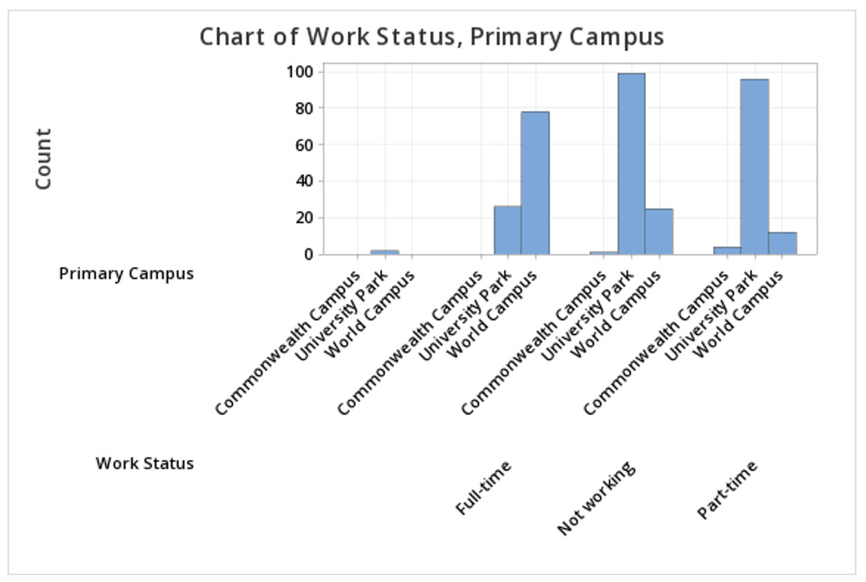
2.1.2.2 - Minitab: Clustered Bar Chart
2.1.2.2 - Minitab: Clustered Bar ChartMinitab® – Clustered Bar Chart
This example will use data collected from a sample of students enrolled in online sections of STAT 200.
To create a clustered bar chart of the Work Status and Primary Campus variables in Minitab:
- Open the data file in Minitab
- From the tool bar, select Graph > Bar Chart > Counts of Unique Values
- Select Multiple Variables
- Click OK
- Double click the variables Work Status and Primary Campus to insert them both into the Categorical variables box on the right
- Click OK
This should result in the clustered bar chart below:
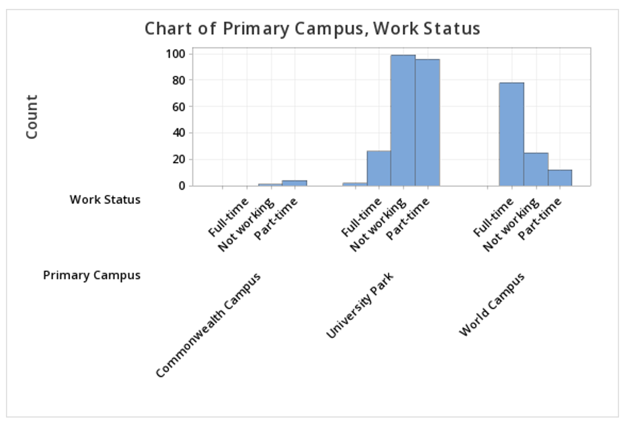
Note: The order in which the variables are entered into the Categorical variables box determines how the bars will be clustered. For example, if we entered Primary Campus and then Work Status, the result would be the following clustered bar chart:
Summarized Data
In the example above, raw data were used. In other words, our Minitab worksheet contained one row for each case. It is also possible to use Minitab to construct a clustered bar chart with summarized data, for example, if you have data in a frequency table. To do this, select Graph > Bar Chart > Summarized Data in a Table > Two-Way Table > Clustered or Stacked. Double click each of your variables to move them into the Y-variables box. Move the column containing row labels into the Row labels box. The default is to Cluster variables, which is what should be selected to create a clustered bar chart, with Rows first, Y's below. You also have the option of choosing which variable your bars are clustered by; to flip the variables, select Y's first, rows below from the drop-down.
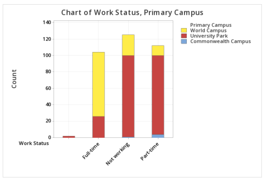
2.1.2.3 - Minitab: Stacked Bar Chart
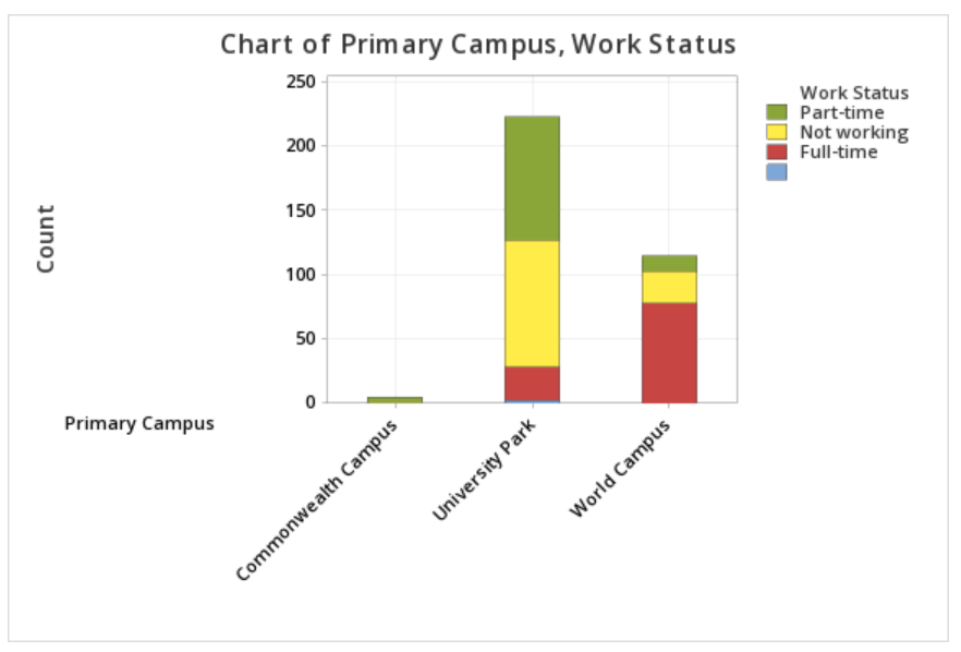
2.1.2.3 - Minitab: Stacked Bar ChartMinitab® – Stacked Bar Chart (Raw Data)
This example will use data collected from a sample of students enrolled in online sections of STAT 200.
To create a stacked bar chart of the Work Status and Primary Campus variables in Minitab:
- Open the data file in Minitab
- Select Graph > Bar Chart > Counts of Unique Values
- Select Multiple Variables
- Click OK
- Double click the variables Work Status and Primary Campus to insert them both into the Categorical variables box on the right
- Under Display categorical variables select Last variable stacked
- Click OK
This should result in the stacked bar chart below:
Note: The order in which the variables are entered into the Categorical variables box in Minitab determines how the bars will be clustered. For example, if we entered Primary Campus and then Work Status, the result would be the following clustered bar chart:
Summarized Data
In the example above, raw data were used. In other words, our Minitab worksheet contained one row for each case. It is also possible to use Minitab to construct a stacked bar chart with summarized data, for example, if you have data in a frequency table. To do this, select Graph > Bar Chart > Summarized Data in a Table > Two-Way Table > Clustered or Stacked. Double click each of your variables to move them into the Y-variables box. Move the column containing row labels into the Row labels box. Select Stack variables. The default is to Stack Y-variables; you can flip the variables by changing this to Stack rows.