3.4 - Two Quantitative Variables
3.4 - Two Quantitative VariablesLater in the course, we will devote an entire lesson to analyzing two quantitative variables. In this lesson, you will be introduced to scatterplots, correlation, and simple linear regression. A scatterplot is a graph used to display data concerning two quantitative variables. Correlation is a measure of the direction and strength of the relationship between two quantitative variables. Simple linear regression uses one quantitative variable to predict a second quantitative variable. You will not need to compute correlations or regression models by hand in this course. There is one example of computing a correlation by hand in the notes to show you how it relates to z scores, but for all assignments, you should be using Minitab to compute these statistics.
3.4.1 - Scatterplots
3.4.1 - ScatterplotsRecall from Lesson 1.1.2, in some research studies one variable is used to predict or explain differences in another variable. In those cases, the explanatory variable is used to predict or explain differences in the response variable.
- Explanatory variable
-
Variable that is used to explain variability in the response variable, also known as an independent variable or predictor variable; in an experimental study, this is the variable that is manipulated by the researcher.
- Response variable
-
The outcome variable, also known as a dependent variable.
A scatterplot can be used to display the relationship between the explanatory and response variables. Or, a scatterplot can be used to examine the association between two variables in situations where there is not a clear explanatory and response variable. For example, we may want to examine the relationship between height and weight in a sample but have no hypothesis as to which variable impacts the other; in this case, it does not matter which variable is on the x-axis and which is on the y-axis.
- Scatterplot
- A graphical representation of two quantitative variables in which the explanatory variable is on the x-axis and the response variable is on the y-axis.
When examining a scatterplot, we need to consider the following:
- Direction (positive or negative)
- Form (linear or non-linear)
- Strength (weak, moderate, strong)
- Bivariate outliers
In this class, we will focus on linear relationships. This occurs when the line-of-best-fit for describing the relationship between x and y is a straight line. The linear relationship between two variables is positive when both increase together; in other words, as values of x get larger values of y get larger. This is also known as a direct relationship. The linear relationship between two variables is negative when one increases as the other decreases. For example, as values of x get larger values of y get smaller. This is also known as an indirect relationship.
A bivariate outlier is an observation that does not fit with the general pattern of the other observations.
Example: Baseball

Data concerning baseball statistics and salaries from the 1991 and 1992 seasons is available at:
The scatterplot below shows the relationship between salary and batting average for the 337 baseball players in this sample.
From this scatterplot, we can see that there does not appear to be a meaningful relationship between baseball players' salaries and batting averages. We can also see that more players had salaries at the low end and fewer had salaries at the high end.
Example: Height and Shoe Size

Data concerning the heights and shoe sizes of 408 students were retrieved from:
The scatterplot below was constructed to show the relationship between height and shoe size.
There is a positive linear relationship between height and shoe size in this sample. The magnitude of the relationship appears to be strong. There do not appear to be any outliers.
Example: Height and Weight
Data concerning body measurements from 507 individuals retrieved from:
For more information see:
The scatterplot below shows the relationship between height and weight.
There is a positive linear relationship between height and weight. The magnitude of the relationship is moderately strong.
Example: Cafés

Data concerning sales at student-run café were retrieved from:
For more information about this data set, visit:
The scatterplot below shows the relationship between maximum daily temperature and coffee sales.
There is a negative linear relationship between the maximum daily temperature and coffee sales. The magnitude is moderately strong. There do not appear to be any outliers.
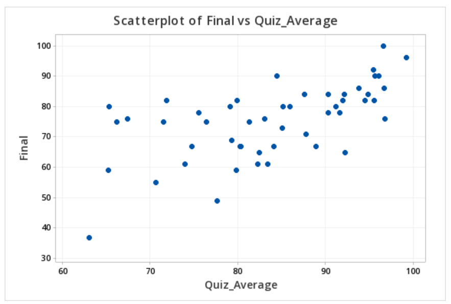
3.4.1.1 - Minitab: Simple Scatterplot
3.4.1.1 - Minitab: Simple ScatterplotMinitab® – Simple Scatterplot
The file below contains data concerning students' quiz averages and final exam scores. Let's construct a scatterplot with the quiz averages on the horizontal axis and final exam scores on the vertical axis.
- Open the data file in Minitab
- From the tool bar, select Graphs > Scatterplot > One Y Variable > Simple
- Double click the variable Final on the left to move it to the Y variable box on the right
- Double click the variable Quiz_Average on the left to move it to the X variable box on the right
- Click OK
This should result in the scatterplot below:
3.4.2 - Correlation
3.4.2 - CorrelationIn this course, we will be using Pearson's \(r\) as a measure of the linear relationship between two quantitative variables. In a sample, we use the symbol \(r\). In a population, we use the Greek letter \(\rho\) ("rho"). Pearson's \(r\) can easily be computed using statistical software.
- Correlation
- A measure of the direction and strength of the relationship between two variables.
- \(-1\leq r \leq +1\)
- For a positive association, \(r>0\), for a negative association \(r<0\), if there is no relationship \(r=0\)
- The closer \(r\) is to \(0\) the weaker the relationship and the closer to \(+1\) or \(-1\) the stronger the relationship (e.g., \(r=-0.88\) is a stronger relationship than \(r=+0.60\)); the sign of the correlation provides direction only
- Correlation is unit free; the \(x\) and \(y\) variables do NOT need to be on the same scale (e.g., it is possible to compute the correlation between height in centimeters and weight in pounds)
- It does not matter which variable you label as \(x\) and which you label as \(y\). The correlation between \(x\) and \(y\) is equal to the correlation between \(y\) and \(x\).
The following table may serve as a guideline when evaluating correlation coefficients:
| Absolute Value of \(r\) | Strength of the Relationship |
|---|---|
| 0 - 0.2 | Very weak |
| 0.2 - 0.4 | Weak |
| 0.4 - 0.6 | Moderate |
| 0.6 - 0.8 | Strong |
| 0.8 - 1.0 | Very strong |
- Correlation does NOT equal causation. A strong relationship between \(x\) and \(y\) does not necessarily mean that \(x\) causes \(y\). It is possible that \(y\) causes \(x\), or that a confounding variable causes both \(x\) and \(y\).
- Pearson's \(r\) should only be used when there is a linear relationship between \(x\) and \(y\). A scatterplot should be constructed before computing Pearson's \(r\) to confirm that the relationship is not non-linear.
- Pearson's \(r\) is not resistant to outliers. Figure 1 below provides an example of an influential outlier. Influential outliers are points in a data set that increase the correlation coefficient. In Figure 1 the correlation between \(x\) and \(y\) is strong (\(r=0.979\)). In Figure 2 below, the outlier is removed. Now, the correlation between \(x\) and \(y\) is lower (\(r=0.576\)) and the slope is less steep.
Note that the scale on both the x and y axes has changed. In addition to the correlation changing, the y-intercept changed from 4.154 to 70.84 and the slope changed from 6.661 to 1.632.
3.4.2.1 - Formulas for Computing Pearson's r
3.4.2.1 - Formulas for Computing Pearson's rThere are a number of different versions of the formula for computing Pearson's \(r\). You should get the same correlation value regardless of which formula you use. Note that you will not have to compute Pearson's \(r\) by hand in this course. These formulas are presented here to help you understand what the value means. You should always be using technology to compute this value.
First, we'll look at the conceptual formula which uses \(z\) scores. To use this formula we would first compute the \(z\) score for every \(x\) and \(y\) value. We would multiply each case's \(z_x\) by their \(z_y\). If their \(x\) and \(y\) values were both above the mean then this product would be positive. If their x and y values were both below the mean this product would be positive. If one value was above the mean and the other was below the mean this product would be negative. Think of how this relates to the correlation being positive or negative. The sum of all of these products is divided by \(n-1\) to obtain the correlation.
- Pearson's r: Conceptual Formula
-
\(r=\dfrac{\sum{z_x z_y}}{n-1}\)
where \(z_x=\dfrac{x - \overline{x}}{s_x}\) and \(z_y=\dfrac{y - \overline{y}}{s_y}\)
When we replace \(z_x\) and \(z_y\) with the \(z\) score formulas and move the \(n-1\) to a separate fraction we get the formula in your textbook: \(r=\frac{1}{n-1}\Sigma{\left(\frac{x-\overline x}{s_x}\right) \left( \frac{y-\overline y}{s_y}\right)}\)
3.4.2.2 - Example of Computing r by Hand (Optional)
3.4.2.2 - Example of Computing r by Hand (Optional)Again, you will not need to compute \(r\) by hand in this course. This example is meant to show you how \(r\) is computed with the intention of enhancing your understanding of its meaning. In this course, you will always be using Minitab or StatKey to compute correlations.
In this example we have data from a random sample of \(n = 9\) World Campus STAT 200 students from the Spring 2017 semester. WileyPlus scores had a maximum possible value of 100. Midterm exam scores had a maximum possible value of 50. Remember, the \(x\) and \(y\) variables do not need to be on the same metric to compute a correlation.
| ID | WileyPlus | Midterm |
|---|---|---|
| A | 82 | 37 |
| B | 100 | 47 |
| C | 96 | 33 |
| D | 96 | 36 |
| E | 80 | 44 |
| F | 77 | 35 |
| G | 100 | 50 |
| H | 100 | 49 |
| I | 94 | 45 |
Minitab was used to construct a scatterplot of these two variables. We need to examine the shape of the relationship before determining if Pearson's \(r\) is the appropriate correlation coefficient to use. Pearson's \(r\) can only be used to check for a linear relationship. For this example I am going to call WileyPlus grades the \(x\) variable and midterm exam grades the \(y\) variable because students completed WileyPlus assignments before the midterm exam.
Summary Statistics
From this scatterplot we can determine that the relationship may be weak, but that it is reasonable to consider a linear relationship. If we were to draw a line of best fit through this scatterplot we would draw a straight line with a slight upward slope. Now, we'll compute Pearson's \(r\) using the \(z\) score formula. The first step is to convert every WileyPlus score to a \(z\) score and every midterm score to a \(z\) score. When we constructed the scatterplot in Minitab we were also provided with summary statistics including the mean and standard deviation for each variable which we need to compute the \(z\) scores.
| Variable | N* | Mean | StDev | Minimum | Maximum |
|---|---|---|---|---|---|
| Midterm | 9 | 41.778 | 6.534 | 33.000 | 50.000 |
| WileyPlus | 9 | 91.667 | 9.327 | 77.000 | 100.000 |
| ID | WileyPlus | \(z_x\) |
|---|---|---|
| A | 82 | \(\frac{82-91.667}{9.327}=-1.036\) |
| B | 100 | \(\frac{100-91.667}{9.327}=0.893\) |
| C | 96 | \(\frac{96-91.667}{9.327}=0.465\) |
| D | 96 | \(\frac{96-91.667}{9.327}=0.465\) |
| E | 80 | \(\frac{80-91.667}{9.327}=-1.251\) |
| F | 77 | \(\frac{77-91.667}{9.327}=-1.573\) |
| G | 100 | \(\frac{100-91.667}{9.327}=0.893\) |
| H | 100 | \(\frac{100-91.667}{9.327}=0.893\) |
| I | 94 | \(\frac{94-91.667}{9.327}=0.250\) |
- z-score
- \(z_x=\frac{x - \overline{x}}{s_x}\)
A positive value in the \(z_x\) column means that the student's WileyPlus score is above the mean. Now, we'll do the same for midterm exam scores.
| ID | Midterm | \(z_y\) |
|---|---|---|
| A | 37 | \(\frac{37-41.778}{6.534}=-0.731\) |
| B | 47 | \(\frac{47-41.778}{6.534}=0.799\) |
| C | 33 | \(\frac{33-41.778}{6.534}=-1.343\) |
| D | 36 | \(\frac{36-41.778}{6.534}=-0.884\) |
| E | 44 | \(\frac{44-41.778}{6.534}=0.340\) |
| F | 35 | \(\frac{35-41.778}{6.534}=-1.037\) |
| G | 50 | \(\frac{50-41.778}{6.534}=1.258\) |
| H | 49 | \(\frac{49-41.778}{6.534}=1.105\) |
| I | 45 | \(\frac{45-41.778}{6.534}=0.493\) |
Our next step is to multiply each student's WileyPlus \(z\) score with his or her midterm exam score.
| ID | \(z_x\) | \(z_y\) | \(z_x z_y\) |
|---|---|---|---|
| A | -1.036 | -0.731 | 0.758 |
| B | 0.893 | 0.799 | 0.714 |
| C | 0.465 | -1.343 | -0.624 |
| D | 0.465 | -0.884 | -0.411 |
| E | -1.251 | 0.340 | -0.425 |
| F | -1.573 | -1.037 | 1.631 |
| G | 0.893 | 1.258 | 1.124 |
| H | 0.893 | 1.105 | 0.988 |
| I | 0.250 | 0.493 | 0.123 |
A positive "cross product" (i.e., \(z_x z_y\)) means that the student's WileyPlus and midterm score were both either above or below the mean. A negative cross product means that they scored above the mean on one measure and below the mean on the other measure. If there is no relationship between \(x\) and \(y\) then there would be an even mix of positive and negative cross products; when added up these would equal around zero signifying no relationship. If there is a relationship between \(x\) and \(y\) then these cross products would primarily be going in the same direction. If the correlation is positive then these cross products would primarily be positive. If the correlation is negative then these cross products would primarily be negative; in other words, students with higher \(x\) values would have lower \(y\) values and vice versa. Let's add the cross products here and compute our \(r\) statistic.
\(\sum z_x z_y = 0.758+0.714-0.624-0.411-0.425+1.631+1.124+0.988+0.123=3.878\)
\(r=\frac{3.878}{9-1}=0.485\)
There is a positive, moderately strong, relationship between WileyPlus scores and midterm exam scores in this sample.
3.4.2.3 - Minitab: Compute Pearson's r
3.4.2.3 - Minitab: Compute Pearson's rMinitab® – Pearson's r
We previously created a scatterplot of quiz averages and final exam scores and observed a linear relationship. Here, we will compute the correlation between these two variables.
- Open the data file in Minitab: Exam.mwx (or Exam.csv)
- Choose Stat > Basic Statistics > Correlation.
- In Variables, enter Double click the Quiz_Average and Final in the box on the left to insert them into the Variables box
- Click Graphs.
- In Statistics to display on plot, choose Correlations and intervals.
This should result in the following:
| Quiz_Average | |
|---|---|
| Final | 0.609 |
3.4.3 - Simple Linear Regression
3.4.3 - Simple Linear RegressionRegression uses one or more explanatory variables (\(x\)) to predict one response variable (\(y\)). In this course, we will be learning specifically about simple linear regression. The "simple" part is that we will be using only one explanatory variable. If there are two or more explanatory variables, then multiple linear regression is necessary. The "linear" part is that we will be using a straight line to predict the response variable using the explanatory variable. Unlike in correlation, in regression is does matter which variable is called \(x\) and which is called \(y\). In regression, the explanatory variable is always \(x\) and the response variable is always \(y\). Both \(x\) and \(y\) must be quantitative variables.
You may recall from an algebra class that the formula for a straight line is \(y=mx+b\), where \(m\) is the slope and \(b\) is the y-intercept. The slope is a measure of how steep the line is; in algebra, this is sometimes described as "change in y over change in x," (\(\frac{\Delta y}{\Delta x}\)), or "rise over run." A positive slope indicates a line moving from the bottom left to top right. A negative slope indicates a line moving from the top left to bottom right. The y-intercept is the location on the y-axis where the line passes through. In other words, when \(x=0\) then \(y=y - intercept\).
In statistics, we use similar formulas:
- Simple Linear Regression Line: Sample
- \(\widehat{y}=a+bx\)
-
\(\widehat{y}\) = predicted value of \(y\) for a given value of \(x\)
\(a\) = \(y\)-intercept
\(b\) = slope
In a population, the y-intercept is denoted as \(\beta_0\) ("beta sub 0") or \(\alpha\) ("alpha"). The slope is denoted as \(\beta_1\) ("beta sub 1") or just \(\beta\) ("beta").
- Simple Linear Regression Line: Population
- \(\widehat{y}=\alpha+\beta x\)
Simple linear regression uses data from a sample to construct the line of best fit. But what makes a line “best fit”? The most common method of constructing a simple linear regression line, and the only method that we will be using in this course, is the least squares method. The least squares method finds the values of the y-intercept and slope that make the sum of the squared residuals (also know as the sum of squared errors or SSE) as small as possible.
- Residual
- The difference between an observed y value and the predicted y value. In other words, \(y- \widehat y\). On a scatterplot, this is the vertical distance between the line of best fit and the observation. In a sample this may be denoted as \(e\) or \(\widehat \epsilon\) ("epsilon-hat") and in a population this may be denoted as \(\epsilon\) ("epsilon")
- Residual
- \(e=y-\widehat{y}\)
-
\(y\) = actual value of \(y\)
\(\widehat{y}\) = predicted value of \(y\)
Example
The plot below shows the line \(\widehat{y}=6.5+1.8x\)
Identify and interpret the y-intercept.
The y-intercept is 6.5. When \(x=0\) the predicted value of y is 6.5.
Identify and interpret the slope.
The slope is 1.8. For every one unit increase in x, the predicted value of y increases by 1.8.
Compute and interpret the residual for the point (-0.2, 5.1).
The observed x value is -0.2 and the observed y value is 5.1.
The formula for the residual is \(e=y-\widehat{y}\)
We can compute \(\widehat{y}\) using the regression equation that we have and \(x=-0.2\)
\(\widehat{y}=6.5+1.8(-0.2)=6.14\)
Given an x value of -0.2, we would predict this observation to have a y value of 6.14. In reality, they had a y value of 5.1. The residual is the difference between these two values.
\(e=y-\widehat{y}=5.1-6.14=-1.04\)
The residual for this observation is -1.04. This observation's y value is 1.04 less than predicted given their x value.
Cautions
- Avoid extrapolation. This means that a regression line should not be used to make a prediction about someone from a population different from the one that the sample used to define the model was from.
- Make a scatterplot of your data before running a regression model to confirm that a linear relationship is reasonable. Simple linear regression constructs a straight line. If the relationship between x and y is not linear, then a linear model is not the most appropriate.
- Outliers can heavily influence a regression model. Recall the plots that we looked at when learning about correlation. The addition of one outlier can greatly change the line of best fit. In addition to examining a scatterplot for linearity, you should also be looking for outliers.
Later in the course, we will devote a week to correlation and regression.
3.4.3.1 - Minitab: SLR
3.4.3.1 - Minitab: SLRMinitab® – Simple Linear Regression
We previously created a scatterplot of quiz averages and final exam scores and observed a linear relationship. Here, we will use quiz scores to predict final exam scores.
- Open the Minitab file: Exam.mwx (or Exam.csv)
- Select Stat > Regression > Regression > Fit Regression Model...
- Double click Final in the box on the left to insert it into the Responses (Y) box on the right
- Double click Quiz_Average in the box on the left to insert it into the Continuous Predictors (X) box on the right
- Click OK
This should result in the following output:
Regression Equation
Final = 12.1 + 0.751 Quiz_Average
Coefficients
| Term | Coef | SE Coef | T-Value | P-Value | VIF |
|---|---|---|---|---|---|
| Constant | 12.1 | 11.9 | 1.01 | 0.3153 | |
| Quiz_Average | 0.751 | 0.141 | 5.31 | 0.000 | 1.00 |
Model Summary
| S | R-sq | R-sq(adj) | R-sq(pred) |
|---|---|---|---|
| 9.71152 | 37.04% | 35.73% | 29.82% |
Analysis of Variance
| Source | DF | Adj SS | Adj MS | F-Value | P-Value |
|---|---|---|---|---|---|
| Regression | 1 | 2664 | 2663.66 | 28.24 | 0.000 |
| Quiz_Average | 1 | 2664 | 2663.66 | 28.24 | 0.000 |
| Error | 48 | 4527 | 94.31 | ||
| Total | 49 | 7191 |
Fits and Diagnostics for Unusual Observations
| Obs | Final | Fit | Resid | Std Resid | |
|---|---|---|---|---|---|
| 11 | 49.00 | 70.50 | -21.50 | -2.25 | R |
| 40 | 80.00 | 61.22 | 18.78 | 2.03 | R |
| 47 | 37.00 | 59.51 | -22.51 | -2.46 | R |
R Large residual
Interpretation
In the output in the above example we are given a simple linear regression model of Final = 12.1 + 0.751 Quiz_Average
This means that the y-intercept is 12.1 and the slope is 0.751.
3.4.3.2 - Example: Interpreting Output
3.4.3.2 - Example: Interpreting OutputThis example uses the "CAOSExam" dataset available from http://www.lock5stat.com/datapage.html.
CAOS stands for Comprehensive Assessment of Outcomes in a First Statistics course. It is a measure of students' statistical reasoning skills. Here we have data from 10 students who took the CAOS at the beginning (pre-test) and end (post-test) of a statistics course.
Research question: How can we use students' pre-test scores to predict their post-test scores?
Minitab was used to construct a simple linear regression model. The two pieces of output that we are going to interpret here are the regression equation and the scatterplot containing the regression line.
Let's work through a few common questions.
What is the regression model?
The "regression model" refers to the regression equation. This is \(\widehat {posttest}=21.43 + 0.8394(Pretest)\)
Identify and interpret the slope.
The slope is 0.8394. For every one point increase in a student's pre-test score, their predicted post-test score increases by 0.8394 points.
Identify and interpret the y-intercept.
The y-intercept is 21.43. A student with a pre-test score of 0 would have a predicted post-test score of 21.43. However, in this scenario, we should not actually use this model to predict the post-test score of someone who scored 0 on the pre-test because that would be extrapolation. This model should only be used to predict the post-test score of students from a comparable population whose pre-test scores were between approximately 35 and 65.
One student scored 60 on the pre-test and 65 on the post-test. Calculate and interpret that student's residual.
This student's observed x value was 60 and their observed y value was 65.
\(e=y- \widehat y\)
We have y. We can compute \(\widehat y\) using the x value and regression equation that we have.
\(\widehat y = 21.43 + 0.8394(60) = 71.794\)
\(e=65-71.794=-6.794\)
This student's residual is -6.794. They scored 6.794 points lower on the post-test than we predicted given their pre-test score.