3.5.1 - Scatterplot with Groups
3.5.1 - Scatterplot with GroupsA scatterplot with groups can be used to display the relationship between two quantitative variables and one categorical variable. Like the scatterplot that you learned about earlier, the quantitative variables are shown on the x- and y-axes. Now, the different levels of the categorical variable are communicated using different colored points or different shaped points.
Minitab® – Scatterplots with Groups
This example will use the Palmer penguins dataset:
To create a scatterplot with groups in Minitab:
- Open the data file in Minitab
- From the tool bar, select Graph > Scatterplot > One Y Variable > Groups Overlaid
- Double click the variable body_mass_g in the box on the left to insert it into the Y variable box on the right
- Double click the variable flipper_length_mm in the box on the left to insert it into the X variable box on the right
- Double click the variable species in the box on the left to insert it into the Group variables box on the right
- Click OK
This should result in the following scatterplot with groups:
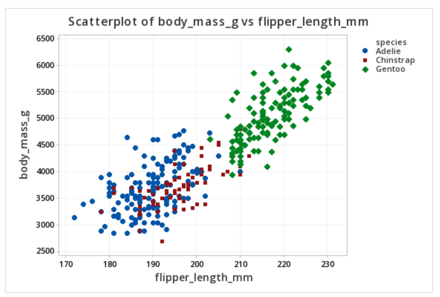
The scatterplot above shows the relationship between flipper length (in millimeters) and body mass (in grams) while noting which penguins were adelie, chipstrap, and gentoo by using markers that are different colors and shapes. Overall, there is a strong positive relationship between flipper length and body mass in this sample. Gentoo penguins tend to be larger than adelie or chipstrap penguins both in terms of their body mass and their flipper length.