Lesson 13: Exploring Continuous Data
Lesson 13: Exploring Continuous DataOverview

In the beginning of this course (in the very first lesson!), we learned how to distinguish between discrete and continuous data. Discrete data are, again, data with a finite or countably infinite number of possible outcomes. Continuous data, on the other hand, are data which come from an interval of possible outcomes. Examples of discrete data include the number of siblings a randomly selected person has, the total on the faces of a pair of six-sided dice, and the number of students you need to ask before you find one who loves Stat 414. Examples of continuous data include:
- the amount of rain, in inches, that falls in a randomly selected storm
- the weight, in pounds, of a randomly selected student
- the square footage of a randomly selected three-bedroom house
In each of these examples, the resulting measurement comes from an interval of possible outcomes. Recall that the measurement tool is often the restricting factor with continuous data. That is, if I say I weigh 120 pounds, I don't actually weigh exactly 120 pounds... that's just what my scale tells me. In reality, I might weigh 120.01284027401307 pounds... that's where the interval of possible outcomes comes in. That is, the possible measurements cannot be put into one-to-one correspondence with the integers.
In this lesson, we'll investigate (or in some cases, review?) ways of summarizing continuous data. We'll summarize the data graphically using histograms, stem-and-leaf plots, and box plots. We've already discussed a couple of ways of summarizing continuous data numerically via the sample mean and sample variance. Here, we'll investigate how to summarize continuous data numerically using order statistics and various functions of order statistics.
One more thing here.... we'll be learning how to summarize data by hand. In reality, you would rarely rarely rarely ever do that in practice. Maybe if you were stranded on a desert island? In reality, 999 times out of a 1000, you and I are going to use statistical software to calculate percentiles and to create histograms, stem-and-leaf plots, and box plots. What's important here is that you just get the idea of how such graphs are created and such statistics are calculated, so that you know what they tell you when you encounter them.
Objectives
- To learn how to create and read a histogram.
- To learn and be able to apply the empirical rule to a set of data.
- To learn how to create and read a stem-and-leaf plot.
- To learn how to create and read a box plot.
- To learn how to use order statistics to determine sample percentiles.
- To learn how to calculate the five-number summary for a set of data.
13.1 - Histograms
13.1 - HistogramsExample 13-1
The material on this page should look awfully familiar as we briefly investigated histograms in the first lesson of the course. We review them again briefly here.
The following numbers are the measured nose lengths (in millimeters) of 60 students:
| 38 | 50 | 38 | 40 | 35 | 32 | 45 | 50 | 40 | 32 | 40 | 47 | 70 | 55 | 51 |
| 43 | 40 | 45 | 45 | 55 | 37 | 50 | 45 | 45 | 55 | 50 | 45 | 35 | 52 | 32 |
| 45 | 50 | 40 | 40 | 50 | 41 | 41 | 40 | 40 | 46 | 45 | 40 | 43 | 45 | 42 |
| 45 | 45 | 48 | 45 | 45 | 35 | 45 | 45 | 40 | 45 | 40 | 40 | 45 | 35 | 52 |
Recall that although the numbers look discrete, they are technically continuous. The measuring tools, which consisted of a piece of string and a ruler, were the limiting factors in getting more refined measurements. In most cases, it appears as if nose lengths come in five-millimeter increments... 35, 40, 45, 55... but that's, again, just measurement error. In order to create a histogram of these continuous measurements, we will use the following guidelines.
To create a histogram of continuous data
First, you have to group the data into a set of classes, typically of equal length. There are many, many sets of rules for defining the classes. For our purposes, we'll just rely on our common sense — having too few classes is as bad as having too many.
- Determine the number, \(n\), in the sample.
- Define \(k\) class intervals \((c_0, c_1], (c_1, c_2], \ldots, (c_{k-1}, c_k]\) .
- Determine the frequency, \(f_i\), of each class \(i\).
- Calculate the relative frequency (proportion) of each class by dividing the class frequency by the total number in the sample — that is, \(\frac{f_i}{n}\).
- For a frequency histogram: draw a rectangle for each class with the class interval as the base and the height equal to the frequency of the class.
- For a relative frequency histogram: draw a rectangle for each class with the class interval as the base and the height equal to the relative frequency of the class.
- For a density histogram: draw a rectangle for each class with the class interval as the base and the height equal to \(h(x)=\dfrac{f_i}{n(c_i-c_{i-1})}\)
Example 13-1 Continued
Here's what the work would like for our nose length example if we used 5 mm classes centered at 30, 35, ... 70:
| Class Interval | Tally | Frequency | Relative Frequency | Density Height |
|---|---|---|---|---|
| 27.5-32.5 | || | 2 | 0.033 | 0.0066 |
| 32.5-37.5 | ||||| | 5 | 0.083 | 0.0166 |
| 37.5-42.5 | ||||| ||||| ||||| || | 17 | 0.283 | 0.0566 |
| 42.5-47.5 | ||||| ||||| ||||| ||||| | | 21 | 0.350 | 0.0700 |
| 47.5-52.5 | ||||| ||||| | | 11 | 0.183 | 0.0366 |
| 52.5-57.5 | ||| | 3 | 0.183 | 0.0366 |
| 57.5-62.5 | 0 | 0 | 0 | |
| 62.5-67.5 | 0 | 0 | 0 | |
| 67.5-72.5 | | | 1 | 0.017 | 0.0034 |
| 60 | 0.999 (rounding) |
And, here is what the density histogram would like:
Note that a density histogram is just a modified relative frequency histogram. A density histogram is defined so that:
- the area of each rectangle equals the relative frequency of the corresponding class, and
- the area of the entire histogram equals 1.
Empirical Rule
We've previously learned that the sample mean can be thought of as the "center" of a set of data, while the sample standard deviation indicates "how spread out" the data are from the sample mean. Now, if a histogram is "mound-shaped" or "bell-shaped," then we can use the sample mean, sample standard deviation, and what is called the Empirical Rule to determine three intervals for which we would expect approximately 68%, 95%, and 99.7% of the data to fall.
The Empirical Rule tells us that if a histogram is at least approximately bell-shaped, then:
- Approximately 68% of the data are in the interval:
\((\bar{x}-s,\bar{x}+s)\)
- Approximately 95% of the data are in the interval:
\((\bar{x}-2s,\bar{x}+2s)\)
- Approximately 99.7% of the data are in the interval:
\((\bar{x}-3s,\bar{x}+3s)\)
Example 13-2
The federal government's average income from federal income taxes (on a per capita basis) for each of the 50 states in fiscal year 1991 is \$1252.44 with a standard deviation of \$393.75. Assuming the data are approximately bell-shaped, use the Empirical Rule to determine three intervals for which we would expect approximately 68%, 95%, and 99.7% of the data to fall.
Solution
The Empirical Rule tells us that we can expect 68% of the per capita taxes to fall between:
\(\bar{x}-s=\$ 1252.44-\$ 393.75=\$ 858.69\) and \(\bar{x}+s=\$ 1252.44+\$ 393.75=\$ 1646.19\)
The Empirical Rule also tells us that we can expect 95% of the per capita taxes to fall between:
\(\bar{x}-2s=\$ 1252.44-2(\$ 393.75)=\$ 464.94\) and \(\bar{x}+2s=\$ 1252.44+2(\$ 393.75)=\$ 2039.94\)
The Empirical Rule also tells us that we can expect 99.7% (virtually all!) of the per capita taxes to fall between:
\(\bar{x}-3s=\$ 1252.44-3(\$ 393.75)=\$ 71.19\) and \(\bar{x}+3s=\$ 1252.44+3(\$ 393.75)=\$ 2433.69\)
13.2 - Stem-and-Leaf Plots
13.2 - Stem-and-Leaf PlotsExample 13-3
A random sample of 64 people were selected to take the Stanford-Binet Intelligence Test. After each person completed the test, they were assigned an intelligence quotient (IQ) based on their performance on the test. The resulting 64 IQs are as follows:
| 111 | 85 | 83 | 98 | 107 | 101 | 100 | 94 | 101 | 86 |
| 105 | 122 | 104 | 106 | 90 | 123 | 102 | 107 | 93 | 109 |
| 141 | 86 | 91 | 88 | 98 | 128 | 93 | 114 | 87 | 116 |
| 99 | 94 | 94 | 406 | 436 | 402 | 75 | 96 | 78 | 116 |
| 107 | 106 | 68 | 104 | 91 | 87 | 105 | 97 | 110 | 91 |
| 107 | 107 | 85 | 117 | 93 | 108 | 91 | 110 | 105 | 99 |
| 85 | 99 | 99 | 96 |
Once the data are obtained, it might be nice to summarize the data. We could, of course, summarize the data using a histogram. One primary disadvantage of using a histogram to summarize data is that the original data aren't preserved in the graph. A stem-and-leaf plot, on the other hand, summarizes the data and preserves the data at the same time.
The basic idea behind a stem-and-leaf plot is to divide each data point into a stem and a leaf. We could divide our first data point, 111, for example, into a stem of 11 and a leaf of 1. We could divide 85 into a stem of 8 and a leaf of 5. We could divide 83 into a stem of 8 and a leaf of 3. And so on. To create the plot then, we first create a column of numbers containing the ordered stems. Our IQ data set produces stems 6, 7, 8, 9, 10, 11, 12, 13, and 14. Once the column of stems are written down, we work our way through each number in the data set, and write its leaf in the row headed by its stem.
Here's what the our stem-and-leaf plot would look like after adding the first five numbers 111, 85, 83, 98, and 107:
| 6 | |
|---|---|
| 7 | |
| 8 | 53 |
| 9 | 8 |
| 10 | 7 |
| 11 | 1 |
| 12 | |
| 13 | |
| 14 |
and here's what the completed stem-and-leaf plot would look like after adding all 64 leaves to the nine stems:
| 6 | 8 |
|---|---|
| 7 | 58 |
| 8 | 536687755 |
| 9 | 84031839446171319996 |
| 10 | 71015462796276457785 |
| 11 | 1466070 |
| 12 | 238 |
| 13 | 6 |
| 14 | 1 |
Now, rather than looking at a list of 64 unordered IQs, we have a nice picture of the data that quite readily tells us that:
- the distribution of IQs is bell-shaped
- most of the IQs are in the 90s and 100s
- the smallest IQ in the data set is 68, while the largest is 141
That's all well and good, but we could do better. First and foremost, no one in their right mind is going to want to create too many of these stem-and-leaf plots by hand. Instead, you'd probably want to let some statistical software, such as Minitab or SAS, do the work for you. Here's what Minitab's stem-and-leaf plot of the 64 IQs looks like:
| Stem-and-Leaf of IQ | N=64 | |
|---|---|---|
| Leaf Unit = 1.0 | ||
| 1 | 6 | 8 |
| 1 | 6 | 8 |
| 1 | 7 | |
| 3 | 7 | 58 |
| 4 | 8 | 3 |
| 12 | 8 | 55566778 |
| 23 | 9 | 01111333444 |
| 32 | 9 | 667889999 |
| 32 | 10 | 0112244 |
| 25 | 10 | 5556667777789 |
| 12 | 11 | 0014 |
| 8 | 11 | 667 |
| 5 | 12 | 23 |
| 3 | 12 | 8 |
| 2 | 13 | 6 |
| 1 | 14 | 1 |
Hmmm.... how does the plot differ from ours? First, Minitab tells us that there are n = 64 numbers and that the leaf unit is 1.0. Then, ignoring the first column of numbers for now, the second column contains the stems from 6 to 14. Note, though, that Minitab uses two rows for each of the stems 7, 8, 9, 10, 11, 12, and 13. Minitab takes an alternative here that we could have taken as well. When you opt to use two rows for each stem, the first row is reserved for the leaves 0, 1, 2, 3, and 4, while the second row is reserved for the leaves 5, 6, 7, 8, and 9. For example, note that the first 9 row contains the 0 to 4 leaves, while the second 9 row contains the 5 to 9 leaves. The decision to use one or two rows for the stems depends on the data. Sometimes the one row per stem option produces the better plot, and sometimes the two rows per stem plot option produces the better plot.
Do you notice any other differences between Minitab's plot and our plot? Note that the leaves in Minitab's plot are ordered. That's right... Minitab orders the data before producing the plot, and thereby creating what is called an ordered stem-and-leaf plot.
Now, back to that first column of numbers appearing in Minitab's plot. That column contains what are called depths. The depths are the frequencies accumulated from the top of the plot and the bottom of the plot until they converge in the middle. For example, the first number in the depths column is a 1. It comes from the fact that there is just one number in the first (6) stem. The second number in the depths column is also a 1. It comes from the fact that there is 1 leaf in the first (6) stem and 0 leaves in the second (the first 7) stem, and so 1 + 0 = 1. The third number in the depths column is a 3. It comes from the fact that there is 1 leaf in the first (6) stem, 0 leaves in the second (the first 7) stem, and 2 leaves in the third (the second 7) stem, and so 1 + 0 + 2 = 3. Minitab continues accumulating numbers down the column until it reaches 32 in the last 9 stem. Then, Minitab starts accumulating from the bottom of the plot. The 5 in the depths column comes, for example, from the fact that there is 1 leaf in the last (14) stem, 1 leaf in the second 13 stem, 0 leaves in the first 13 stem, 1 leaf in the second 12 stem, and 2 leaves in the first 12 stem, and so 1 + 1+ 0 + 1 + 2 = 5.
Let's take a look at another example.
Example 13-4
Let's consider a random sample of 20 concentrations of calcium carbonate (\(CaCO_3\)) in milligrams per liter.
| 130.8 | 129.9 | 131.5 | 131.2 | 129.5 | 132.7 | 131.5 | 127. | 133.7 |
| 132.2 | 134.8 | 131.7 | 133.9 | 129.8 | 131.4 | 12.8 | 132.7 | 132.8 |
| 131.4 | 131.3 |
Create a stem-and-leaf plot of the data.
Solution
Let's take the efficient route, as most anyone would likely be taken in practice, by letting Minitab generate the plot for us:
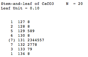
Minitab tells us that the leaf unit is 0.1, so that the stem of 127 and leaf of 8 represents the number 127.8. The depths column contains something a little different here, namely the 7 with parentheses around it. It seems that Minitab's algorithm for calculating the depths differs a bit here. It still accumulates the values from the top and the bottom, but it stops in each direction when it reaches the row containing the middle value (median) of the sample. The frequency of that row containing the median is simply placed in parentheses. That is, the median of the 20 numbers is 131.45. Therefore, because the 131 stem contains 7 leaves, the depths column for that row contains a 7 in parentheses.
In our previous example, the median of the 64 IQs is 99.5. Because 99.5 falls between two rows of the display, namely between the stems 99 and 100, Minitab calculates the depths instead as described in that example, and omits the whole "parentheses around the frequency of the median row" thing.
13.3 - Order Statistics and Sample Percentiles
13.3 - Order Statistics and Sample PercentilesThe primary advantage of creating an ordered stem-and-leaf plot is that you can readily read what are called the order statistics right off of the plot. If we have a sample of \(n\) observations represented as:
\(x_1,x_2,x_3,\cdots,x_n\)
then when the observations are ordered from smallest to largest, the resulting ordered data are called the order statistics of the sample, and are represented as:
\(y_1 \leq y_2 \leq y_3 \leq \cdots \leq y_n\)
That is, \(y_1\), the smallest data point is the first order statistic. The second smallest data point, \(y_2\), is the second order statistic. And so on, until we reach the largest data point and \(n^{th}\) order statistic, \(y_n\). From the order statistics, it is rather easy to find the sample percentiles.
Definition. If \(0<p<1\), then the \((100p)^{th}\) sample percentile has approximately \(np\) sample observations less than it, and \(n(1-p)\) sample observations greater than it.
Some sample percentiles have special names:
- The 25th percentile is also called the first quartile and is denoted as \(q_1\).
- The 50th percentile is also called the second quartile or median, and is denoted as \(q_2\) or \(m\).
- The 75th percentile is also called the third quartile and is denoted as \(q_3\).
Here's the typical method used for finding a particular sample percentile:
-
Arrange the sample data in increasing order. That is, determine the order statistics:
\(y_1 \leq y_2 \leq y_3 \leq \cdots \leq y_n\)
-
If \((n+1)p\) is an integer, then the \((100p)^{th}\) sample percentile is the \((n+1)p^{th}\) order statistic.
-
If \((n+1)p\) is not an integer, but rather equals \(r\) plus some proper fraction, \(a/b\) say, then use a weighted average of the \(r^{th}\) and \((r+1)^{st}\) order statistics. That is, define the \((100p)^{th}\) sample percentile as:
\(\tilde{\pi}_p=y_r+\left(\dfrac{a}{b}\right)(y_{r+1}-y_r)\)
Let's try this method out on an example or two.
Example 13-3 Revisited
Let's return to our random sample of 64 people selected to take the Stanford-Binet Intelligence Test. The resulting 64 IQs were sorted as follows:
| 68 | 75 | 78 | 83 | 85 | 85 | 85 | 86 | 86 | 87 |
| 84 | 88 | 90 | 91 | 91 | 91 | 91 | 93 | 93 | 93 |
| 94 | 94 | 94 | 96 | 96 | 97 | 98 | 98 | 99 | 99 |
| 99 | 99 | 100 | 101 | 101 | 102 | 102 | 104 | 104 | 105 |
| 105 | 105 | 106 | 106 | 106 | 107 | 107 | 107 | 107 | 107 |
| 108 | 109 | 110 | 110 | 111 | 114 | 116 | 116 | 117 | 122 |
| 123 | 128 | 136 | 141 |
That is, the first order statistic is \(y_1=68\), the second-order statistic is \(y_2=75\), and the \(64^{th}\) order statistic is \(y_{64}=141\). Find the 25th sample percentile, the 50th sample percentile, 75th sample percentile, and the interquartile range.
Solution
Here, we have \(n=64\) IQs. To find the 25th sample percentile, we need to consider \(p=0.25\). In that case:
\((n+1)p=(64+1)(0.25)=(65)(0.25)=16.25\)
Because 16.25 is not an integer, we are going to need to interpolate linearly between the 16th order statistic (91) and 17th order statistic (91). That is, the 25th sample percentile (or first quartile) is 91, as determined by:
\(\tilde{\pi}_{0.25}=y_{16}+(0.25)(y_{17}-y_{16})=91+0.25(91-91)=91\)
To find the 50th sample percentile, we need to consider \(p=0.50\). In that case:
\((n+1)p=(64+1)(0.5)=(65)(0.5)=32.5\)
Because 32.5 is not an integer, we are going to need to interpolate linearly between the 32nd order statistic (99)and 33rd order statistic (100). That is, the 50th sample percentile (or second quartile or median) is 99.5 as determined by:
\(\tilde{\pi}_{0.5}=y_{32}+(0.5)(y_{33}-y_{32})=99+0.5(100-99)=99.5\)
To find the 75th sample percentile, we need to consider \(p=0.75\). In that case:
\((n+1)p=(64+1)(0.75)=(65)(0.75)=48.75\)
Because 48.75 is not an integer, we are going to need to interpolate linearly between the 48th order statistic (107) and 49th order statistic (107). That is, the 75th sample percentile (or third quartile) is 107 as determined by:
\(\tilde{\pi}_{0.75}=y_{48}+(0.75)(y_{49}-y_{48})=107+0.75(107-107)=107\)
The interquartile range IQR is then 107−91 = 16.
Example 13-3 Revisited again
Let's return again to our IQ data, but this time suppose that the person deemed to have the largest IQ (141) couldn't take the pressure of the test and fainted before completing the test. In that case, the sorted data of the now \(n=63\) IQs look like this:
| 68 | 75 | 78 | 83 | 85 | 85 | 85 | 86 | 86 | 87 |
| 87 | 88 | 90 | 91 | 91 | 91 | 91 | 93 | 93 | 93 |
| 94 | 94 | 94 | 96 | 96 | 97 | 98 | 98 | 99 | 99 |
| 99 | 99 | 100 | 101 | 101 | 102 | 102 | 104 | 104 | 105 |
| 105 | 105 | 106 | 106 | 106 | 107 | 107 | 107 | 107 | 107 |
| 108 | 109 | 110 | 110 | 111 | 114 | 116 | 116 | 117 | 122 |
| 123 | 128 | 136 |
You should notice that the once largest observation (141) no longer exists in the data set. Find the 25th sample percentile, the 50th sample percentile, 75th sample percentile, and the interquartile range.
Solution
Here, we have \(n=63\) IQs. To find the 25th sample percentile, we need to consider \(p=0.25\). In that case:
\((n+1)p=(63+1)(0.25)=(64)(0.25)=16\)
Because 16 is an integer, the 25th sample percentile (or first quartile) is readily determined to be the 16th order statistic, that is, 91.
To find the 50th sample percentile, we need to consider \(p=0.50\). In that case:
\((n+1)p=(63+1)(0.5)=(64)(0.5)=32\)
Because 32 is an integer, the 50th sample percentile (or second quartile or median) is readily determined to be the 32nd order statistic, that is 99.
To find the 75th sample percentile, we need to consider \(p=0.75\). In that case:
\((n+1)p=(63+1)(0.75)=(64)(0.75)=48\)
Because 48 is an integer, the 75th sample percentile (or third quartile) is readily determined to be the 48th order statistic, that is, 107.
The interquartile range IQR is then again 107−91 = 16.
13.4 - Box Plots
13.4 - Box PlotsOn the last page, we learned how to determine the first quartile, the median, and the third quartile for a sample of data. These three percentiles, along with a data set's minimum and maximum values, make up what is called the five-number summary. One nice way of graphically depicting a data set's five-number summary is by way of a box plot (or box-and-whisker plot).
Here are some general guidelines for drawing a box plot:
- Draw a horizontal axis scaled to the data.
- Above the axis, draw a rectangular box with the left side of the box at the first quartile \(q_1\) and the right side of the box at the third quartile \(q_3\).
- Draw a vertical line connecting the lower and upper horizontal lines of the box at the median \(m\).
- For the left whisker, draw a horizontal line from the minimum value to the midpoint of the left side of the box.
- For the right whisker, draw a horizontal line from the maximum value to the midpoint of the right side of the box.
Drawn as such, a box plot does a nice job of dividing the data graphically into fourths. Note, for example, that the horizontal length of the box is the interquartile range IQR, the left whisker represents the first quarter of the data, and the right whisker represents the fourth quarter of the data.
Example 13-3 Revisited
Let's return to our random sample of 64 people selected to take the Stanford-Binet Intelligence Test. The resulting 64 IQs were sorted as follows:
| 68 | 75 | 78 | 83 | 85 | 85 | 85 | 86 | 86 | 87 |
| 87 | 88 | 90 | 91 | 91 | 91 | 91 | 93 | 93 | 93 |
| 94 | 94 | 94 | 96 | 96 | 97 | 98 | 98 | 99 | 99 |
| 99 | 99 | 100 | 101 | 101 | 102 | 102 | 104 | 104 | 105 |
| 105 | 105 | 106 | 106 | 106 | 107 | 107 | 107 | 107 | 107 |
| 108 | 109 | 110 | 110 | 111 | 114 | 116 | 116 | 117 | 122 |
| 123 | 128 | 136 | 141 |
We previously determined that the first quartile is 91, the median is 99.5, and the third quartile is 107. The interquartile range IQR is 16. Use these numbers, as well as the minimum value (68) and maximum value (141) to create a box plot of these data.
Solution
By following the guidelines given above, a hand-drawn box plot of these data looks something like this:
In reality, you will probably almost always want to use a statistical software package, such as Minitab, to create your box plots. If we ask Minitab to create a box plot for this data set, this is what we get:
Hmm. How come Minitab's box plot looks different than our box plot? Well, by default, Minitab creates what is called a modified box plot. In a modified box plot, the box is drawn just as in a standard box plot, but the whiskers are defined differently. For a modified box plot, the whiskers are the lines that extend from the left and right of the box to the adjacent values. The adjacent values are defined as the lowest and highest observations that are still inside the region defined by the following limits:
- Lower Limit: \(Q1-1.5\times IQR\)
- Upper Limit: \(Q3+1.5\times IQR\)
In this example, the lower limit is calculated as \(Q1-1.5\times IQR=91-1.5(16)=67\). Therefore, in this case, the lower adjacent value turns out to be the same as the minimum value, 68, because 68 is the lowest observation still inside the region defined by the lower bound of 67. Now, the upper limit is calculated as \(Q3+1.5\times IQR=107+1.5(16)=131\). Therefore, the upper adjacent value is 128, because 128 is the highest observation still inside the region defined by the upper bound of 131. In general, values that fall outside of the adjacent value region are deemed outliers. In this case, the IQs of 136 and 141 are greater than the upper adjacent value and are thus deemed as outliers. In Minitab's modified box plots, outliers are identified using asterisks.
Example 13-4 Revisited

Let's return to the example in which we have a random sample of 20 concentrations of calcium carbonate (\(CaCO_3\)) in milligrams per liter:
| 130.8 | 129.9 | 131.5 | 131.2 | 129.5 | 132.7 | 131.5 | 127.8 | 133.7 |
| 132.2 | 134.8 | 131.7 | 133.9 | 129.8 | 131.4 | 128.8 | 132.7 | 132.8 |
| 131.4 | 131.3 |
With a little bit of work, it can be shown that the five-number summary is as follows:
- Minimum: 127.8
- First quartile: 130.12
- Median: 131.45
- Third quartile: 132.70
- Maximum: 134.8
Use the five-number summary to create a box plot of these data.
Solution
By following the guidelines given above, a hand-drawn box plot of these data looks something like this:
In this case, the interquartile range IQR \(132.7-130.12-2.58\). Therefore, the lower limit is calculated as \(Q1-1.5\times IQR=130.12-1.5(2.58)=126.25\). Therefore, the lower adjacent value is the same as the minimum value, 127.8, because 127.8 is lowest observation still inside the region defined by the lower bound of 126.25. The upper limit is calculated as \(Q3+1.5\times IQR=132.7+1.5(2.58)=136.57\). Therefore, the upper adjacent value is the same as the maximum value, 134.8, because 134.8 is the highest observation still inside the region defined by the upper bound of 136.57. Because the lower and upper adjacent values are the same as the minimum and maximum values, respectively, the box plot looks the same as the modified box plot
13.5 - Shapes of distributions
13.5 - Shapes of distributionsHistograms and box plots can be quite useful in suggesting the shape of a probability distribution. Here, we'll concern ourselves with three possible shapes: symmetric, skewed left, or skewed right.
- Skewed Left
- For a distribution that is skewed left, the bulk of the data values (including the median) lie to the right of the mean, and there is a long tail on the left side.
- Skewed Right
- For a distribution that is skewed right, the bulk of the data values (including the median) lie to the left of the mean, and there is a long tail on the right side.
- Symmetric
- For a distribution that is symmetric, approximately half of the data values lie to the left of the mean, and approximately half of the data values lie to the right of the mean.
The following examples probably illustrate symmetry and skewness of distributions better than any formal definitions can.
Example 13-5
Consider a random sample of weights (in pounds) of 40 female college students:
| 135 | 117 | 137 | 135 | 133 | 145 | 129 | 157 | 113 | 134 |
| 144 | 141 | 132 | 138 | 133 | 134 | 132 | 135 | 152 | 141 |
| 140 | 119 | 138 | 136 | 156 | 141 | 116 | 131 | 138 | 128 |
| 120 | 148 | 130 | 140 | 121 | 137 | 121 | 145 | 145 | 125 |
Do these data suggest that the distribution of female weights is symmetric, skewed right, or skewed left?
Solution
The histogram:
and box plot of the 40 weights:
suggest that the distribution of female weights is symmetric.
Example 13-6
Consider a random sample of 26 grades on an easy statistics exam:
| 100 | 100 | 99 | 98 | 97 | 96 | 95 | 95 | 95 | 94 |
| 93 | 93 | 92 | 92 | 91 | 90 | 90 | 90 | 89 | 84 |
| 80 | 75 | 68 | 65 | 50 | 45 |
Do these data suggest that the distribution of exam scores is symmetric, skewed right, or skewed left?
Solution
The histogram:
and box plot of the 26 grades:
suggest that the distribution of easy exam scores is skewed to the left.
Example 13-7
Consider the lifetimes (in years) of a random sample of 39 Energizer bunnies:
| 0.2 | 3.6 | 3.1 | 0.9 | 0.7 | 7.8 | 1.4 | 0.4 | 3.1 | 3.4 |
| 5.3 | 3.2 | 0.3 | 3.1 | 6.0 | 2.8 | 5.6 | 0.2 | 1.4 | 0.9 |
| 2.4 | 0.8 | 1.8 | 1.0 | 2.9 | 0.5 | 0.9 | 3.2 | 1.3 | 11.1 |
| 0.8 | 1.8 | 1.4 | 0.2 | 1.0 | 1.1 | 1.6 | 0.7 | 3.2 |
Do these data suggest that the distribution of lifetimes of Energizer bunnies is symmetric, skewed right, or skewed left?
Solution
The histogram:
and box plot of the lifetimes of 39 Energizer bunnies:
suggest that the distribution of lifetimes of Energizer bunnies is skewed to the right.