1.6 - Graphing One Quantitative Variable
1.6 - Graphing One Quantitative VariableNow that we discussed how to find summary statistics for quantitative variables, the next step is to graph the data. The graphs we will discuss include:
- Dotplot
- Stem-and-leaf Diagram
- Histogram
- Boxplot
1.6.1 - Dotplots, Stem-and-Leaf Diagrams
1.6.1 - Dotplots, Stem-and-Leaf DiagramsDotplot
A dot plot displays the data as dots on a number line. It is useful to show the relative positions of the data.
Dotplot Example
Each of the ten children in the second grade was given a reading aptitude test. The scores were as follows:
95, 78, 69, 91, 82, 76, 76, 86, 88, 79
Here is a dot plot for the data.
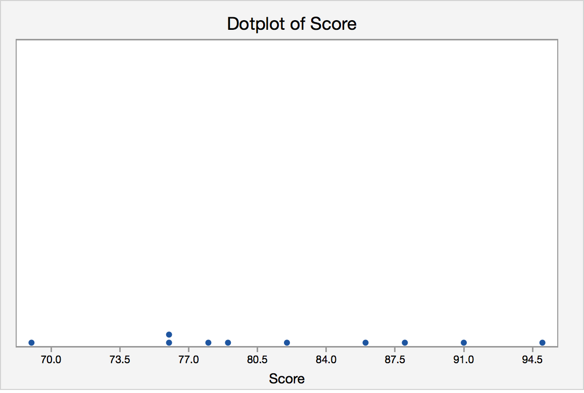
Each of the observations is represented as a dot. If there is more than one observation with the same value, a dot is placed above the others. A dotplot provides us with a quick glance at the data. We can easily see the minimum and maximum values and can see the mode is 76. Dotplots are generally used for small data sets.
Minitab®
Minitab: Dotplots
How to create a dotplot in Minitab:
- Click Graph>Dotplot
- Choose Simple.
- Enter the column with your variable
- Click OK.
Stem-and-Leaf Diagrams
To produce the diagram, the data need to be grouped based on the “stem”, which depends on the number of digits of the quantitative variable. The “leaves” represent the last digit. One advantage of this diagram is that the original data can be recovered (except the order the data is taken) from the diagram.
Stem-and-Leaf Example
Jessica weighs herself every Saturday for the past 30 weeks. The table below shows her recorded weights in pounds.
|
135 |
137 |
136 |
137 |
138 |
139 |
|
140 |
139 |
137 |
140 |
142 |
146 |
|
148 |
145 |
139 |
140 |
142 |
143 |
|
144 |
143 |
141 |
139 |
137 |
138 |
|
139 |
136 |
133 |
134 |
132 |
132 |
Create a Stem-and-Leaf Diagram for Jessica’s Weight.
Answer
The first step is to determine the stem. The weights range from 132 to 148. The stems should be 13 and 14. The leaves should be the last digit. For example, the first value (also smallest value) is 132, it has a stem of 13 and 2 as the leaf.
Stem-and-Leaf of weight of Jessica N = 30
Leaf Unit = 1.0
| 3 | 13 | 223 |
| 5 | 13 | 45 |
| 11 | 13 | 667777 |
| (7) | 13 | 8899999 |
| 12 | 14 | 0001 |
| 8 | 14 | 2233 |
| 4 | 14 | 45 |
| 2 | 14 | 6 |
| 1 | 14 | 8 |
The first column, called depths, are used to display cumulative frequencies. Starting from the top, the depths indicate the number of observations that lie in a given row or before. For example, the 11 in the third row indicates that there are 11 observations in the first three rows. The row that contains the middle observation is denoted by having a bracketed number of observations in that row; (7) for our example. We thus know that the middle value lies in the fourth row. The depths following that row indicate the number of observations that lie in a given row or after. For example, the 4 in the seventh row indicates that there are four observations in the last three rows.
Minitab®
Minitab: Stem-and-Leaf Digrams
How to create a Stem-and-Leaf Diagram in Minitab:
- Click Graph>Stem-and-Leaf
- Enter the column with your variable
- Click OK.
1.6.2 - Histograms
1.6.2 - HistogramsHistogram
If there are many data points and we would like to see the distribution of the data, we can represent the data by a frequency histogram or a relative frequency histogram.
A histogram looks similar to a bar chart but it is for quantitative data. To create a histogram, the data need to be grouped into class intervals. Then create a tally to show the frequency (or relative frequency) of the data into each interval. The relative frequency is the frequency in a particular class divided by the total number of observations. The bars are as wide as the class interval and as tall as the frequency (or relative frequency).
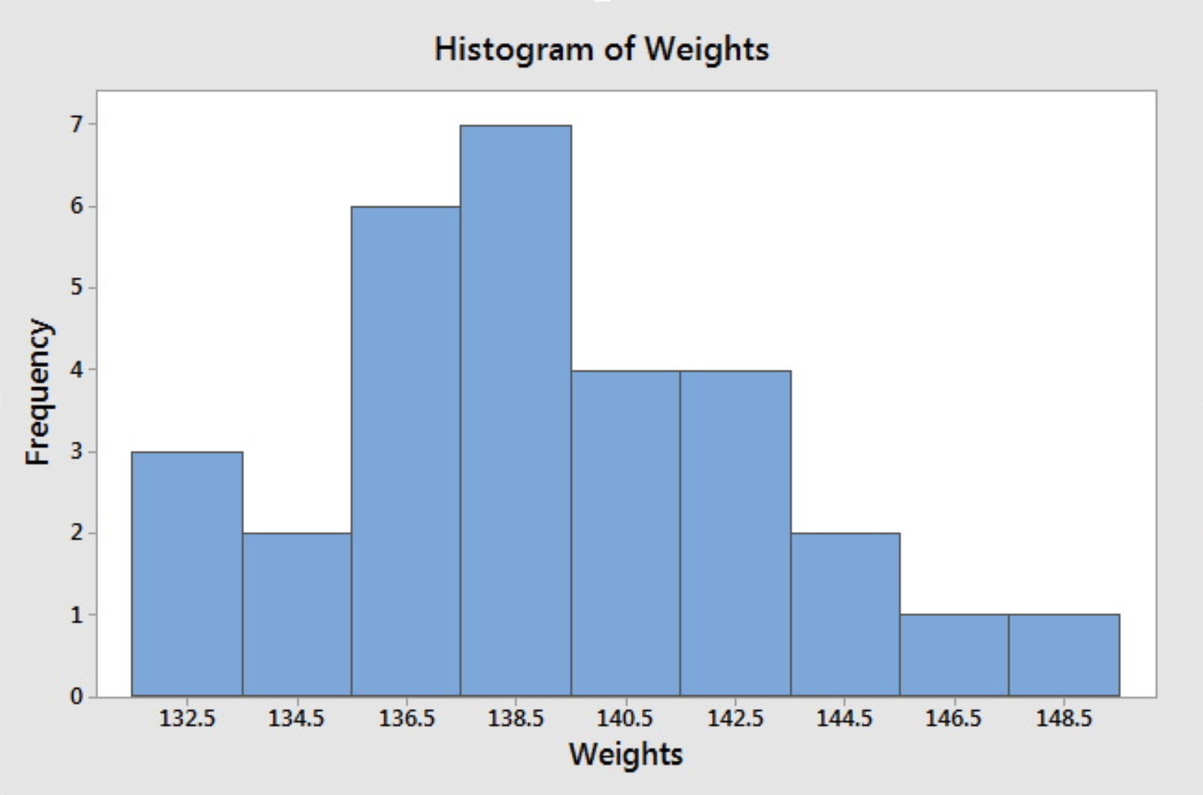
Histogram Example
Jessica weighs herself every Saturday for the past 30 weeks. The table below shows her recorded weights in pounds.
|
135 |
137 |
136 |
137 |
138 |
139 |
|
140 |
139 |
137 |
140 |
142 |
146 |
|
148 |
145 |
139 |
140 |
142 |
143 |
|
144 |
143 |
141 |
139 |
137 |
138 |
|
139 |
136 |
133 |
134 |
132 |
132 |
Create a histogram of her weight.
Answer
For histograms, we usually want to have from 5 to 20 intervals. Since the data range is from 132 to 148, it is convenient to have a class of width 2 since that will give us 9 intervals.
- 131.5-133.5
- 133.5-135.5
- 135.5-137.5
- 137.5-139.5
- 139.5-141.5
- 141.5-143.5
- 143.5-145.5
- 145.5-147.5
- 147.5-149.5
The reason that we choose the end points as .5 is to avoid confusion whether the end point belongs to the interval to its left or the interval to its right. An alternative is to specify the endpoint convention. For example, Minitab includes the left end point and excludes the right end point.
Having the intervals, one can construct the frequency table and then draw the frequency histogram or get the relative frequency histogram to construct the relative frequency histogram. The following histogram is produced by Minitab when we specify the midpoints for the definition of intervals according to the intervals chosen above.
If we do not specify the midpoint for the definition of intervals, Minitab will default to choose another set of class intervals resulting in the following histogram. According to the include left and exclude right endpoint convention, the observation 133 is included in the class 133-135.
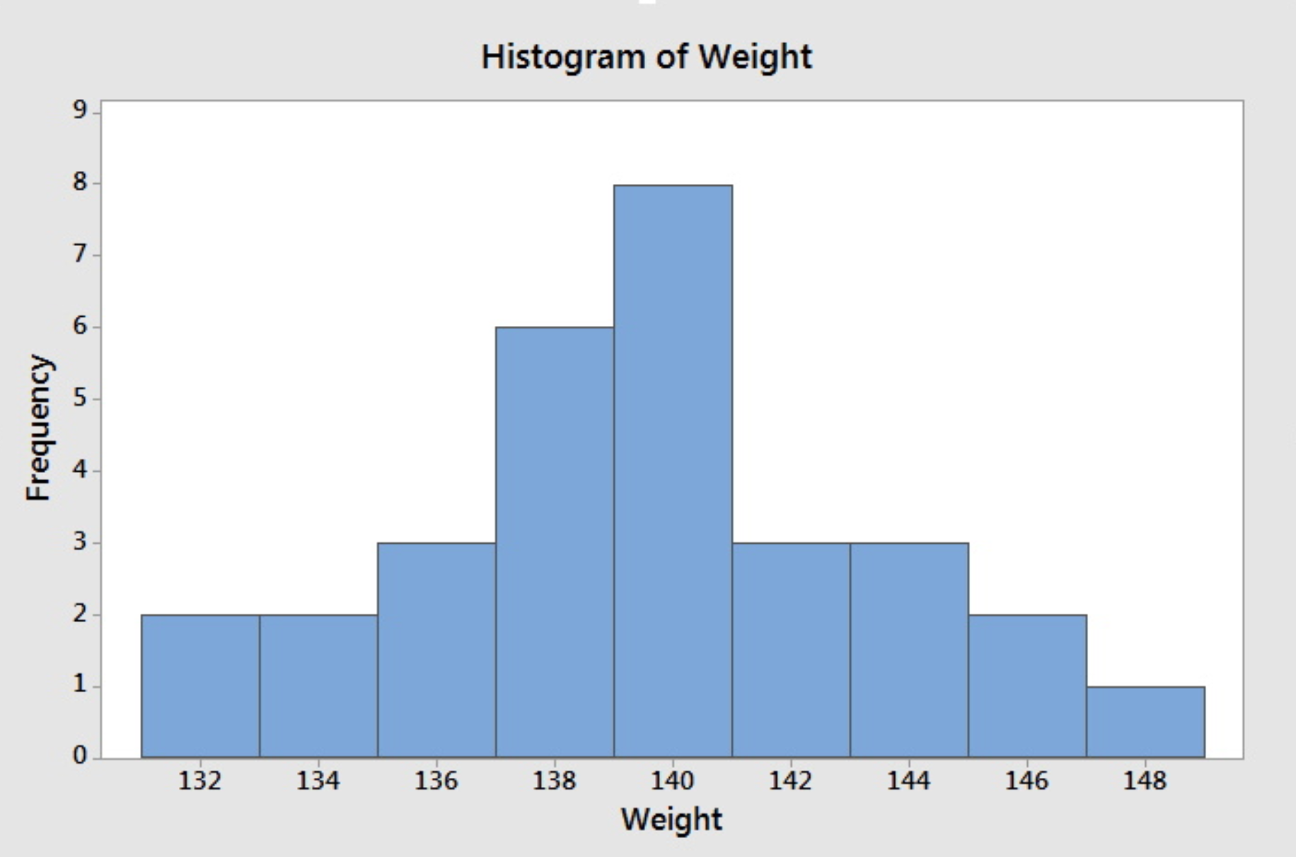
Note that different choices of class intervals will result in different histograms. Relative frequency histograms are constructed in much the same way as a frequency histogram except that the vertical axis represents the relative frequency instead of the frequency. For the purpose of visually comparing the distribution of two data sets, it is better to use relative frequency rather than a frequency histogram since the same vertical scale is used for all relative frequency--from 0 to 1.
Minitab®
Minitab: Histograms
How to create a histogram in Minitab:
- Click Graph>Histogram
- Choose Simple.
- Enter the column with your variable
- Click OK.
1.6.3 - Boxplots
1.6.3 - BoxplotsBoxplot
To create this plot we need the five number summary. Therefore, we need:
- minimum value,
- Q1 (lower quartile),
- Q2 (median),
- Q3 (upper quartile), and
- maximum value.
Using the five number summary, one can construct a skeletal boxplot.
- Mark the five number summary above the horizontal axis with vertical lines.
- Connect Q1, Q2, Q3 to form a box, then connect the box to min and max with a line to form the whisker.
Most statistical software does NOT create graphs of a skeletal boxplot but instead opt for the boxplot as follows below. Boxplots from statistical software are more detailed than skeletal boxplots because they also show outliers. However, if there are no outliers, what is produced by the software is essentially the skeletal boxplot.
The following terminology will prepare us to understand and draw this more detailed type of the boxplot.
Potential outliers are observations that lie outside the lower and upper limits.
Lower limit = Q1 - 1.5 * IQR
Upper limit = Q3 +1.5 * IQR
Adjacent values are the most extreme values that are not potential outliers.
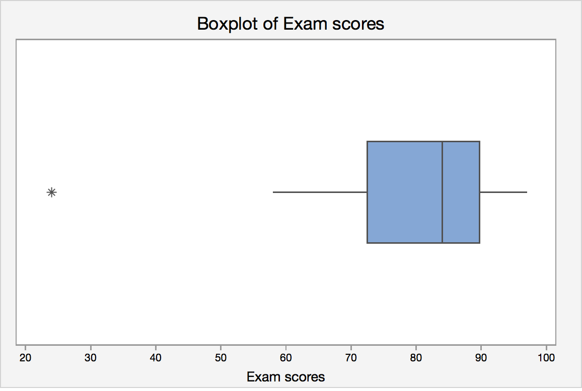
Boxplot Example
Let's revisit the final exam score data:
24, 58, 61, 67, 71, 73, 76, 79, 82, 83, 85, 87, 88, 88, 92, 93, 94, 97
IQR = Q3 - Q1 = 89 - 70 = 19.
Lower limit = Q1 - 1.5 · IQR = 70 - 1.5 *19 = 41.5
Upper limit = Q3 + 1.5 · IQR = 89 + 1.5 * 19 = 117.5
Lower adjacent value = 58
Upper adjacent value = 97
Since 24 lies outside the lower and upper limit, it is a potential outlier.
Statistical software will create a boxplot of final exam score that may look like this:
Boxplots and Distribution Shapes
Symmetric Data
A symmetric distribution with its corresponding box plot:
Right-Skewed Data
A right-skewed distribution along with it's corresponding box plot:
Left-Skewed Data
A left-skewed distribution along with it's corresponding box plot.:
Minitab®
Minitab: Boxplots
How to create a single histogram in Minitab:
- You must have a column of measurement data.
- Click Graph > Boxplot
- Under One Y, choose Simple , then click OK .
- Enter the column of interest under Graph Variables.
- Click OK .