1.6.2 - Histograms
1.6.2 - HistogramsHistogram
If there are many data points and we would like to see the distribution of the data, we can represent the data by a frequency histogram or a relative frequency histogram.
A histogram looks similar to a bar chart but it is for quantitative data. To create a histogram, the data need to be grouped into class intervals. Then create a tally to show the frequency (or relative frequency) of the data into each interval. The relative frequency is the frequency in a particular class divided by the total number of observations. The bars are as wide as the class interval and as tall as the frequency (or relative frequency).
Histogram Example
Jessica weighs herself every Saturday for the past 30 weeks. The table below shows her recorded weights in pounds.
|
135 |
137 |
136 |
137 |
138 |
139 |
|
140 |
139 |
137 |
140 |
142 |
146 |
|
148 |
145 |
139 |
140 |
142 |
143 |
|
144 |
143 |
141 |
139 |
137 |
138 |
|
139 |
136 |
133 |
134 |
132 |
132 |
Create a histogram of her weight.
Answer
For histograms, we usually want to have from 5 to 20 intervals. Since the data range is from 132 to 148, it is convenient to have a class of width 2 since that will give us 9 intervals.
- 131.5-133.5
- 133.5-135.5
- 135.5-137.5
- 137.5-139.5
- 139.5-141.5
- 141.5-143.5
- 143.5-145.5
- 145.5-147.5
- 147.5-149.5
The reason that we choose the end points as .5 is to avoid confusion whether the end point belongs to the interval to its left or the interval to its right. An alternative is to specify the endpoint convention. For example, Minitab includes the left end point and excludes the right end point.
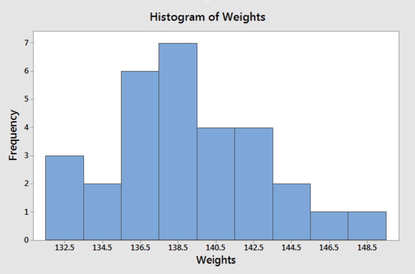
Having the intervals, one can construct the frequency table and then draw the frequency histogram or get the relative frequency histogram to construct the relative frequency histogram. The following histogram is produced by Minitab when we specify the midpoints for the definition of intervals according to the intervals chosen above.

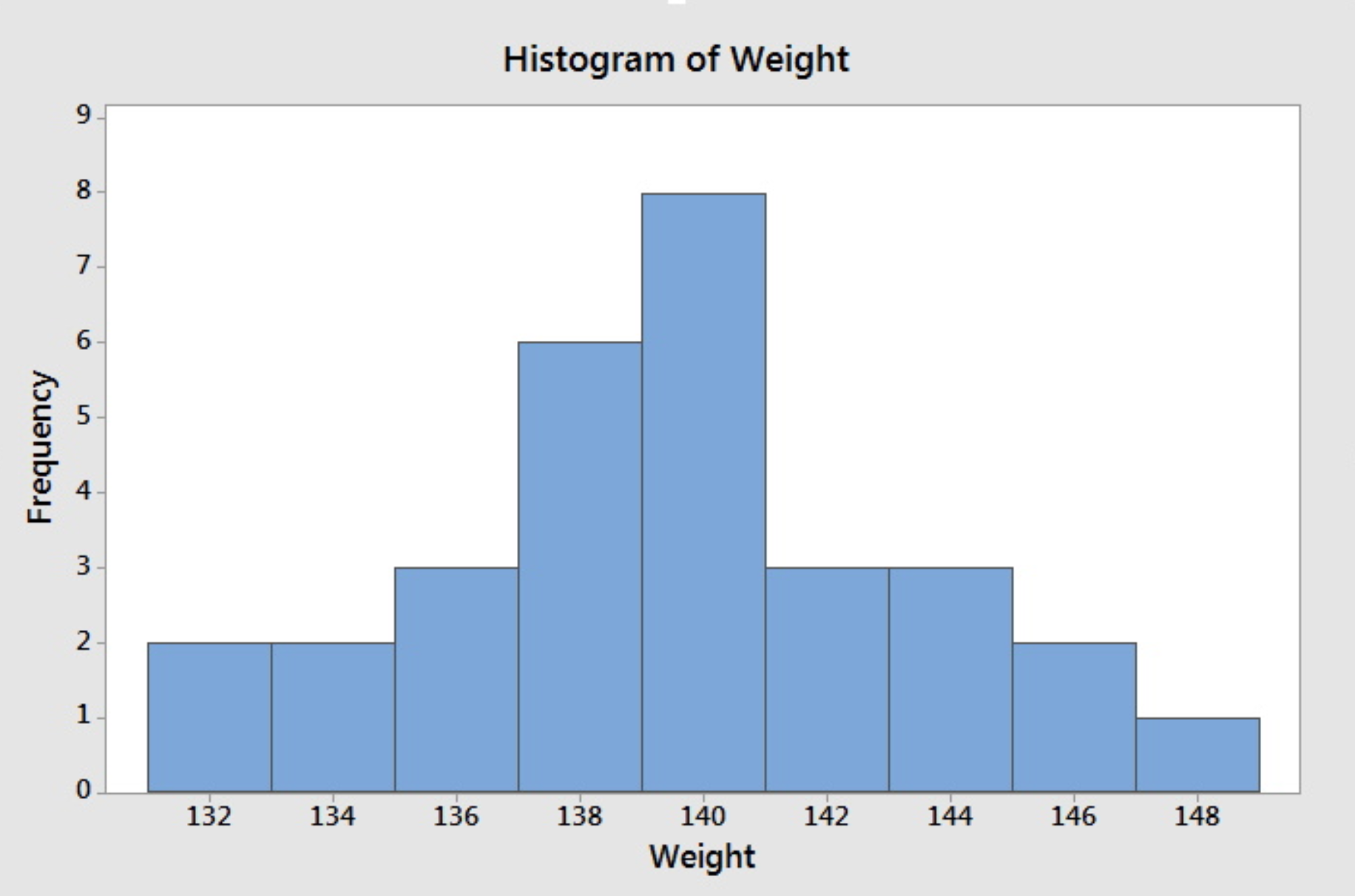
If we do not specify the midpoint for the definition of intervals, Minitab will default to choose another set of class intervals resulting in the following histogram. According to the include left and exclude right endpoint convention, the observation 133 is included in the class 133-135.

Note that different choices of class intervals will result in different histograms. Relative frequency histograms are constructed in much the same way as a frequency histogram except that the vertical axis represents the relative frequency instead of the frequency. For the purpose of visually comparing the distribution of two data sets, it is better to use relative frequency rather than a frequency histogram since the same vertical scale is used for all relative frequency--from 0 to 1.
Minitab®
Minitab: Histograms
How to create a histogram in Minitab:
- Click Graph>Histogram
- Choose Simple.
- Enter the column with your variable
- Click OK.