1.6.3 - Boxplots
1.6.3 - BoxplotsBoxplot
To create this plot we need the five number summary. Therefore, we need:
- minimum value,
- Q1 (lower quartile),
- Q2 (median),
- Q3 (upper quartile), and
- maximum value.
Using the five number summary, one can construct a skeletal boxplot.
- Mark the five number summary above the horizontal axis with vertical lines.
- Connect Q1, Q2, Q3 to form a box, then connect the box to min and max with a line to form the whisker.
Most statistical software does NOT create graphs of a skeletal boxplot but instead opt for the boxplot as follows below. Boxplots from statistical software are more detailed than skeletal boxplots because they also show outliers. However, if there are no outliers, what is produced by the software is essentially the skeletal boxplot.
The following terminology will prepare us to understand and draw this more detailed type of the boxplot.
Potential outliers are observations that lie outside the lower and upper limits.
Lower limit = Q1 - 1.5 * IQR
Upper limit = Q3 +1.5 * IQR
Adjacent values are the most extreme values that are not potential outliers.
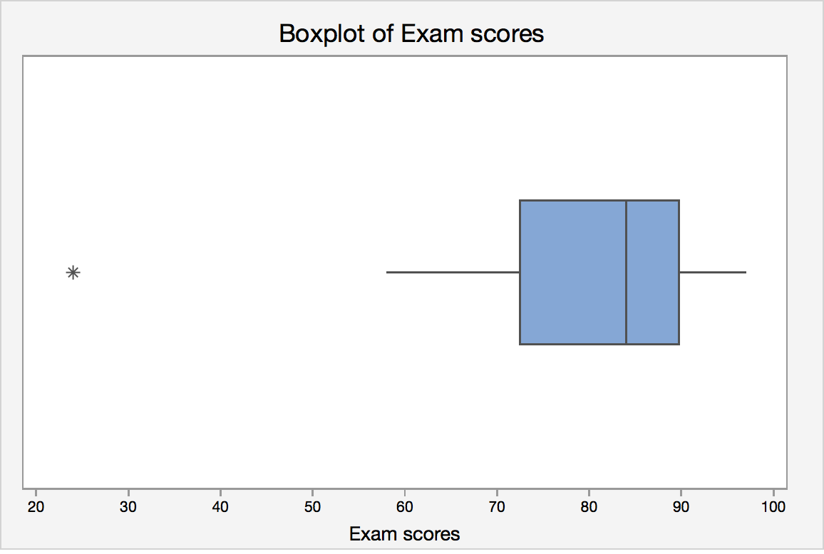
Boxplot Example
Let's revisit the final exam score data:
24, 58, 61, 67, 71, 73, 76, 79, 82, 83, 85, 87, 88, 88, 92, 93, 94, 97
IQR = Q3 - Q1 = 89 - 70 = 19.
Lower limit = Q1 - 1.5 · IQR = 70 - 1.5 *19 = 41.5
Upper limit = Q3 + 1.5 · IQR = 89 + 1.5 * 19 = 117.5
Lower adjacent value = 58
Upper adjacent value = 97
Since 24 lies outside the lower and upper limit, it is a potential outlier.
Statistical software will create a boxplot of final exam score that may look like this:
Boxplots and Distribution Shapes
Symmetric Data
A symmetric distribution with its corresponding box plot:
Right-Skewed Data
A right-skewed distribution along with it's corresponding box plot:
Left-Skewed Data
A left-skewed distribution along with it's corresponding box plot.:
Minitab®
Minitab: Boxplots
How to create a single histogram in Minitab:
- You must have a column of measurement data.
- Click Graph > Boxplot
- Under One Y, choose Simple , then click OK .
- Enter the column of interest under Graph Variables.
- Click OK .