4.6 - Normal Probability Plot of Residuals
4.6 - Normal Probability Plot of ResidualsRecall that the third condition — the "N" condition — of the linear regression model is that the error terms are normally distributed. In this section, we learn how to use a "normal probability plot of the residuals" as a way of learning whether it is reasonable to assume that the error terms are normally distributed.
Here's the basic idea behind any normal probability plot: if the data follow a normal distribution with mean \(\mu\) and variance \(σ^{2}\), then a plot of the theoretical percentiles of the normal distribution versus the observed sample percentiles should be approximately linear. Since we are concerned about the normality of the error terms, we create a normal probability plot of the residuals. If the resulting plot is approximately linear, we proceed, assuming that the error terms are normally distributed.
The theoretical pth percentile of any normal distribution is the value such that p% of the measurements fall below the value. Here's a screencast illustrating a theoretical pth percentile.
The problem is that to determine the percentile value of a normal distribution, you need to know the mean \(\mu\) and the variance \(\sigma^2\). And, of course, the parameters \(\mu\) and \(σ^{2}\) are typically unknown. Statistical theory says its okay just to assume that \(\mu = 0\) and \(\sigma^2 = 1\). Once you do that, determining the percentiles of the standard normal curve is straightforward. The pth percentile value reduces to just a "Z-score" (or "normal score"). Here's a screencast illustrating how the p-th percentile value reduces to just a normal score.
The sample pth percentile of any data set is, roughly speaking, the value such that p% of the measurements fall below the value. For example, the median, which is just a special name for the 50th percentile, is the value so that 50%, or half, of your measurements, falls below the value. Now, if you are asked to determine the 27th percentile, you take your ordered data set, and you determine the value so that 27% of the data points in your dataset fall below the value. And so on.
Consider a simple linear regression model fit a simulated dataset with 9 observations so that we're considering the 10th, 20th, ..., and 90th percentiles. A normal probability plot of the residuals is a scatter plot with the theoretical percentiles of the normal distribution on the x-axis and the sample percentiles of the residuals on the y-axis, for example:
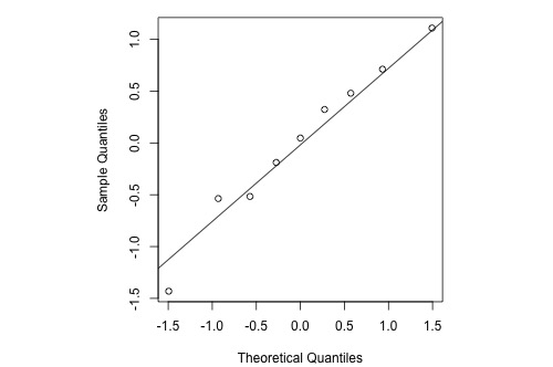
The diagonal line (which passes through the lower and upper quartiles of the theoretical distribution) provides a visual aid to help assess whether the relationship between the theoretical and sample percentiles is linear.
Note that the relationship between the theoretical percentiles and the sample percentiles is approximately linear. Therefore, the normal probability plot of the residuals suggests that the error terms are indeed normally distributed.
Statistical software sometimes provides normality tests to complement the visual assessment available in a normal probability plot (we'll revisit normality tests in Lesson 7). Different software packages sometimes switch the axes for this plot, but its interpretation remains the same.
Let's take a look at examples of the different kinds of normal probability plots we can obtain and learn what each tells us.
Normally distributed residuals
Histogram
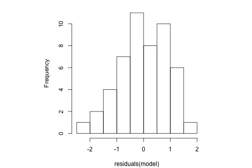
The following histogram of residuals suggests that the residuals (and hence the error terms) are normally distributed:
Normal Probability Plot
The normal probability plot of the residuals is approximately linear supporting the condition that the error terms are normally distributed.
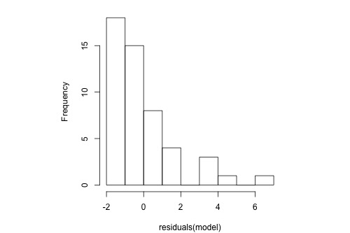
Normal residuals but with one outlier
Histogram
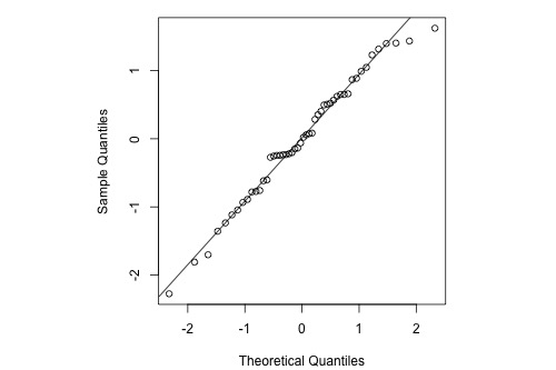
The following histogram of residuals suggests that the residuals (and hence the error terms) are normally distributed. But, there is one extreme outlier (with a value larger than 4):
Normal Probability Plot
Here's the corresponding normal probability plot of the residuals:
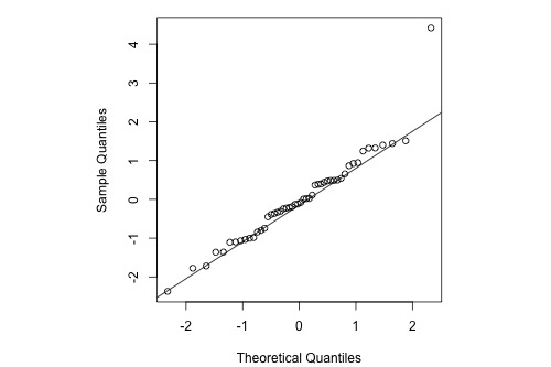
This is a classic example of what a normal probability plot looks like when the residuals are normally distributed, but there is just one outlier. The relationship is approximately linear with the exception of one data point. We could proceed with the assumption that the error terms are normally distributed upon removing the outlier from the data set.
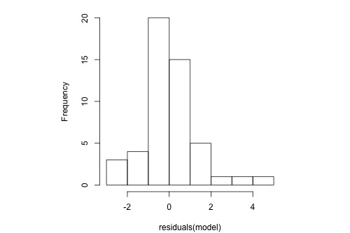
Skewed residuals
Histogram
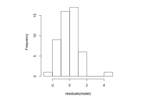
The following histogram of residuals suggests that the residuals (and hence the error terms) are not normally distributed. On the contrary, the distribution of the residuals is quite skewed.
Normal Probability Plot
Here's the corresponding normal probability plot of the residuals:
This is a classic example of what a normal probability plot looks like when the residuals are skewed. Clearly, the condition that the error terms are normally distributed is not met.
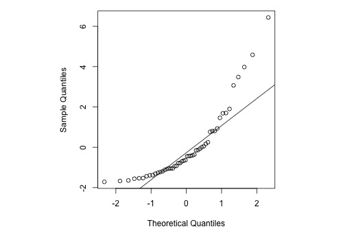
Heavy-tailed residuals
Histogram
The following histogram of residuals suggests that the residuals (and hence the error terms) are not normally distributed. There are too many extreme positive and negative residuals. We say the distribution is "heavy-tailed."
Normal Probability Plot
Here's the corresponding normal probability plot of the residuals:

The relationship between the sample percentiles and theoretical percentiles is not linear. Again, the condition that the error terms are normally distributed is not met.
4.6.1 - Normal Probability Plots Versus Histograms
4.6.1 - Normal Probability Plots Versus HistogramsAlthough both histograms and normal probability plots of the residuals can be used to graphically check for approximate normality, the normal probability plot is generally more effective. Histograms can be useful for identifying a highly asymmetric distribution, but they don’t tend to be as useful for identifying normality specifically (versus other symmetric distributions) unless the sample size is relatively large. One problem is the sensitivity of a histogram to the choice of breakpoints for the bars - small changes can alter the visual impression quite drastically in some cases. By contrast, the normal probability plot is more straightforward and effective and it is generally easier to assess whether the points are close to the diagonal line than to assess whether histogram bars are close enough to a normal bell curve.
For example, consider the following histogram for a sample of 20 normally-distributed data points:
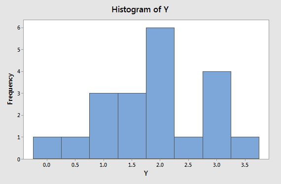
Rather than having the appearance of a normal bell curve, we might characterize this histogram as having a global maximum bar centered at 2 and a smaller local maximum bar centered at 3. It almost looks like a bimodal distribution and we would probably have some doubts that this data comes from a normal distribution (which, remember, it actually does).
By contrast, the normal probability plot below looks fine, with the points lining up along the diagonal line nicely:

By the way, it is possible to create a more normal-looking histogram for these data by adjusting the breakpoints along the axis:
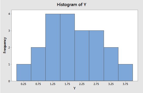
The data is exactly the same as before, but the breakpoints along the axis have been changed and the visual impression of the plot has completely changed.
Bottom line - normal probability plots are generally more effective than histograms for visually assessing normality.