Lesson 11: Influential Points
Lesson 11: Influential PointsOverview
In this lesson, we learn about how data observations can potentially be influential in different ways. If an observation has a response value that is very different from the predicted value based on a model, then that observation is called an outlier. On the other hand, if an observation has a particularly unusual combination of predictor values (e.g., one predictor has a very different value for that observation compared with all the other data observations), then that observation is said to have high leverage. Thus, there is a distinction between outliers and high-leverage observations, and each can impact our regression analyses differently. It is also possible for an observation to be both an outlier and have high leverage. Thus, it is important to know how to detect outliers and high-leverage data points. Once we've identified any outliers and/or high-leverage data points, we then need to determine whether or not the points actually have an undue influence on our model. This lesson addresses all these issues using the following measures:
- leverages
- residuals
- studentized residuals (or internally studentized residuals) [which Minitab calls standardized residuals]
- (unstandardized) deleted residuals (or PRESS prediction errors)
- studentized deleted residuals (or externally studentized residuals) [which Minitab calls deleted residuals]
- difference in fits (DFFITS)
- Cook's distance measure
Objectives
- Understand the concept of an influential data point.
- Know how to detect outlying y values by way of studentized residuals or studentized deleted residuals.
- Understand leverage, and know how to detect outlying x values using leverages.
- Know how to detect potentially influential data points by way of DFFITS and Cook's distance measure.
Lesson 11 Code Files
Below is a zip file that contains all the data sets used in this lesson:
- hospital_infct_03.txt
- influence1.txt
- influence2.txt
- influence3.txt
- influence4.txt
11.1 - Distinction Between Outliers & High Leverage Observations
11.1 - Distinction Between Outliers & High Leverage ObservationsIn this section, we learn the distinction between outliers and high-leverage observations. In short:
- An outlier is a data point whose response y does not follow the general trend of the rest of the data.
- A data point has high leverage if it has "extreme" predictor x values. With a single predictor, an extreme x value is simply one that is particularly high or low. With multiple predictors, extreme x values may be particularly high or low for one or more predictors or may be "unusual" combinations of predictor values (e.g., with two predictors that are positively correlated, an unusual combination of predictor values might be a high value of one predictor paired with a low value of the other predictor).
Note that — for our purposes — we consider a data point to be an outlier only if it is extreme with respect to the other y values, not the x values.
A data point is influential if it unduly influences any part of regression analysis, such as the predicted responses, the estimated slope coefficients, or the hypothesis test results. Outliers and high-leverage data points have the potential to be influential, but we generally have to investigate further to determine whether or not they are actually influential.
One advantage of the case in which we have only one predictor is that we can look at simple scatter plots in order to identify any outliers and influential data points. Let's take a look at a few examples that should help to clarify the distinction between the two types of extreme values.
Example 11-1
Based on the definitions above, do you think the following influence1 data set contains any outliers? Or, any high-leverage data points?
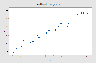
You got it! All of the data points follow the general trend of the rest of the data, so there are no outliers (in the y direction). And, none of the data points are extreme with respect to x, so there are no high leverage points. Overall, none of the data points would appear to be influential with respect to the location of the best-fitting line.
Example 11-2
Now, how about this example? Do you think the following influence2 data set contains any outliers? Or, any high-leverage data points?
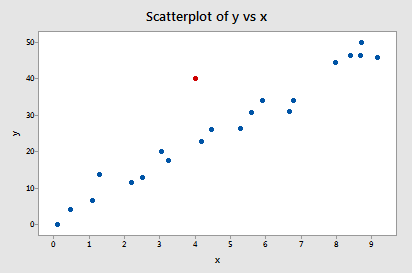
Of course! Because the red data point does not follow the general trend of the rest of the data, it would be considered an outlier. However, this point does not have an extreme x value, so it does not have high leverage. Is the red data point influential? An easy way to determine if the data point is influential is to find the best-fitting line twice — once with the red data point included and once with the red data point excluded. The following plot illustrates the two best-fitting lines:
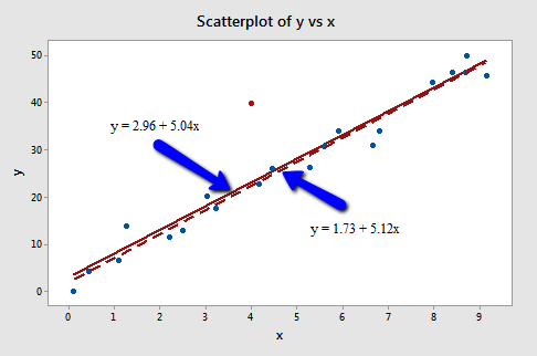
Wow — it's hard to even tell the two estimated regression equations apart! The solid line represents the estimated regression equation with the red data point included, while the dashed line represents the estimated regression equation with the red data point taken excluded. The slopes of the two lines are very similar — 5.04 and 5.12, respectively.
Do the two samples yield different results when testing \(H_0 \colon \beta_1 = 0\)? Well, we obtain the following output when the red data point is included:
Model Summary
| S | R-sq | R-sq(adj) | R-sq(pred) |
|---|---|---|---|
| 4.71075 | 91.01% | 90.53% | 89.61% |
Model Summary
| Term | Coef | SE Coef | T-Value | P-Value | VIF |
|---|---|---|---|---|---|
| Constant | 2.96 | 2.01 | 1.47 | 0.157 | |
| X | 5.037 | 0.363 | 13.86 | 0.000 | 1.00 |
Regression Equation
\(\widehat{y} = 2.96 + 5.037 x\)
and the following output when the red data point is excluded:
Model Summary
| S | R-sq | R-sq(adj) | R-sq(pred) |
|---|---|---|---|
| 2.59199 | 97.32% | 97.17% | 96.63% |
Model Summary
| Term | Coef | SE Coef | T-Value | P-Value | VIF |
|---|---|---|---|---|---|
| Constant | 1.73 | 1.12 | 1.55 | 0.140 | |
| X | 5.117 | 0.200 | 25.55 | 0.000 | 1.00 |
Regression Equation
\(\widehat{y} = 1.73 + 5.117 x\)
There certainly are some minor side effects of including the red data point, but none too serious:
- The \(R^{2}\) value has decreased slightly, but the relationship between y and x would still be deemed strong.
- The standard error of \(b_1\), which is used in calculating our confidence interval for \(\beta_1\), is larger when the red data point is included, thereby increasing the width of our confidence interval. You may recall that the standard error of \(b_1\) depends on the mean squared error MSE, which quantifies the difference between the observed and predicted responses. It is because the red data point is an outlier — in the y direction — that the standard error of \(b_1\) increases, not because the data point is influential in any way.
- In each case, the P-value for testing \(H_0 \colon \beta_1 = 0\) is less than 0.001. In either case, we can conclude that there is sufficient evidence at the 0.05 level to conclude that, in the population, x is related to y.
In short, the predicted responses, estimated slope coefficients, and hypothesis test results are not affected by the inclusion of the red data point. Therefore, the data point is not deemed influential. In summary, the red data point is not influential and does not have high leverage, but it is an outlier.
Example 11-3:
Now, how about this example? Do you think the following influence3 data set contains any outliers? Or, any high-leverage data points?

In this case, the red data point does follow the general trend of the rest of the data. Therefore, it is not deemed an outlier here. However, this point does have an extreme x value, so it does have high leverage. Is the red data point influential? It certainly appears to be far removed from the rest of the data (in the x direction), but is that sufficient to make the data point influential in this case?
The following plot illustrates two best-fitting lines — one obtained when the red data point is included and one obtained when the red data point is excluded:
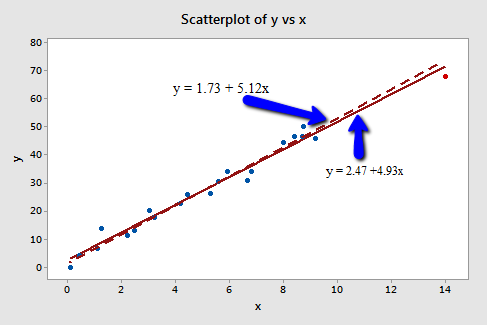
Again, it's hard to even tell the two estimated regression equations apart! The solid line represents the estimated regression equation with the red data point included, while the dashed line represents the estimated regression equation with the red data point taken excluded. The slopes of the two lines are very similar — 4.927 and 5.117, respectively.
Do the two samples yield different results when testing \(H_0 \colon \beta_1 = 0\)? Well, we obtain the following output when the red data point is included:
Model Summary
| S | R-sq | R-sq(adj) | R-sq(pred) |
|---|---|---|---|
| 2.70911 | 97.74% | 97.62% | 97.04% |
Model Summary
| Term | Coef | SE Coef | T-Value | P-Value | VIF |
|---|---|---|---|---|---|
| Constant | 2.47 | 1.08 | 2.29 | 0.033 | |
| x | 4.927 | 0.172 | 28.66 | 0.000 | 1.00 |
Regression Equation
\(\widehat{y} = 2.47 + 4927 x\)
and the following output when the red data point is excluded:
Model Summary
| S | R-sq | R-sq(adj) | R-sq(pred) |
|---|---|---|---|
| 2.59199 | 97.32% | 97.17% | 96.63% |
Model Summary
| Term | Coef | SE Coef | T-Value | P-Value | VIF |
|---|---|---|---|---|---|
| Constant | 1.73 | 1.12 | 1.55 | 0.140 | |
| x | 5.117 | 0.200 | 25.55 | 0.000 | 1.00 |
Regression Equation
\(\widehat{y} = 1.73 + 5.117 x\)
Here, there are hardly any side effects at all from including the red data point:
- The \(R^{2}\) value has hardly changed at all, increasing only slightly from 97.3% to 97.7%. In either case, the relationship between y and x is deemed strong.
- The standard error of \(b_1\) is about the same in each case — 0.172 when the red data point is included, and 0.200 when the red data point is excluded. Therefore, the width of the confidence intervals for \(\beta_1\) would largely remain unaffected by the existence of the red data point. You might take note that this is because the data point is not an outlier heavily impacting MSE.
- In each case, the P-value for testing \(H_0 \colon \beta_1 = 0\) is less than 0.001. In either case, we can conclude that there is sufficient evidence at the 0.05 level to conclude that, in the population, x is related to y.
In short, the predicted responses, estimated slope coefficients, and hypothesis test results are not affected by the inclusion of the red data point. Therefore, the data point is not deemed influential. In summary, the red data point is not influential, nor is it an outlier, but it does have high leverage.
Example 11-4
One last example! Do you think the following influence4 data set contains any outliers? Or, any high-leverage data points?
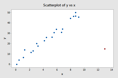
That's right — in this case, the red data point is most certainly an outlier and has high leverage! The red data point does not follow the general trend of the rest of the data and it also has an extreme x value. And, in this case, the red data point is influential. The two best-fitting lines — one obtained when the red data point is included and one obtained when the red data point is excluded:
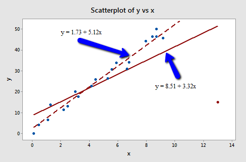
are (not surprisingly) substantially different. The solid line represents the estimated regression equation with the red data point included, while the dashed line represents the estimated regression equation with the red data point taken excluded. The existence of the red data point significantly reduces the slope of the regression line — dropping it from 5.117 to 3.320.
Do the two samples yield different results when testing \(H_0 \colon \beta_1 = 0\)? Well, we obtain the following output when the red data point is included:
Model Summary
| S | R-sq | R-sq(adj) | R-sq(pred) |
|---|---|---|---|
| 10.4459 | 55.19% | 52.84% | 19.11% |
Model Summary
| Term | Coef | SE Coef | T-Value | P-Value | VIF |
|---|---|---|---|---|---|
| Constant | 8.50 | 4.22 | 2.01 | 0.058 | |
| x | 3.320 | 0.686 | 4.484 | 0.000 | 1.00 |
Regression Equation
\(\widehat{y} = 8.50 + 3.320 x\)
and the following output when the red data point is excluded:
Model Summary
| S | R-sq | R-sq(adj) | R-sq(pred) |
|---|---|---|---|
| 2.59199 | 97.32% | 97.17% | 96.63% |
Model Summary
| Term | Coef | SE Coef | T-Value | P-Value | VIF |
|---|---|---|---|---|---|
| Constant | 1.73 | 1.12 | 1.55 | 0.140 | |
| x | 5.117 | 0.200 | 25.55 | 0.000 | 1.00 |
Regression Equation
\(\widehat{y} = 1.73 + 5.117 x\)
What impact does the red data point have on our regression analysis here? In summary:
- The \(R^{2}\) value has decreased substantially from 97.32% to 55.19%. If we include the red data point, we conclude that the relationship between y and x is only moderately strong, whereas if we exclude the red data point, we conclude that the relationship between y and x is very strong.
- The standard error of \(b_1\) is almost 3.5 times larger when the red data point is included — increasing from 0.200 to 0.686. This increase would have a substantial effect on the width of our confidence interval for \(\beta_1\). Again, the increase is because the red data point is an outlier — in the y direction.
- In each case, the P-value for testing \(H_0 \colon \beta_1 = 0\) is less than 0.001. In both cases, we can conclude that there is sufficient evidence at the 0.05 level to conclude that, in the population, x is related to y. Note, however, that the t-statistic decreases dramatically from 25.55 to 4.84 upon inclusion of the red data point.
Here, the predicted responses and estimated slope coefficients are clearly affected by the presence of the red data point. While the data point did not affect the significance of the hypothesis test, the t-statistic did change dramatically. In this case, the red data point is deemed both high leverage and an outlier, and it turned out to be influential too.
Summary
The above examples — through the use of simple plots — have highlighted the distinction between outliers and high-leverage data points. There were outliers in examples 2 and 4. There were high-leverage data points in examples 3 and 4. However, only in example 4 did the data point that was both an outlier and a high leverage point turn out to be influential. That is, not every outlier or high-leverage data point strongly influences the regression analysis. It is your job as a regression analyst to always determine if your regression analysis is unduly influenced by one or more data points.
Of course, the easy situation occurs for simple linear regression, when we can rely on simple scatter plots to elucidate matters. Unfortunately, we don't have that luxury in the case of multiple linear regression. In that situation, we have to rely on various measures to help us determine whether a data point is an outlier, high leverage, or both. Once we've identified such points we then need to see if the points are actually influential. We'll learn how to do all this in the next few sections!
11.2 - Using Leverages to Help Identify Extreme x Values
11.2 - Using Leverages to Help Identify Extreme x ValuesIn this section, we learn about "leverages" and how they can help us identify extreme x values. We need to be able to identify extreme x values, because in certain situations they may highly influence the estimated regression function.
Definition and properties of leverages
You might recall from our brief study of the matrix formulation of regression that the regression model can be written succinctly as:
\(Y=X\beta+\epsilon\)
Therefore, the predicted responses can be represented in matrix notation as:
\(\hat{y}=Xb\)
And, if you recall that the estimated coefficients are represented in matrix notation as:
\(b = (X^{'}X)^{-1}X^{'}y\)
then you can see that the predicted responses can be alternatively written as:
\(\hat{y}=X(X^{'}X)^{-1}X^{'}y\)
That is, the predicted responses can be obtained by pre-multiplying the n × 1 column vector, y, containing the observed responses by the n × n matrix H:
\(H=X(X^{'}X)^{-1}X^{'}\)
That is:
\(\hat{y}=Hy\)
Do you see why statisticians call the n × n matrix H "the hat matrix?" That's right — because it's the matrix that puts the hat "ˆ" on the observed response vector y to get the predicted response vector \(\hat{y}\)! And, why do we care about the hat matrix? Because it contains the "leverages" that help us identify extreme x values!
If we actually perform the matrix multiplication on the right side of this equation:
\(\hat{y}=Hy\)
we can see that the predicted response for observation i can be written as a linear combination of the n observed responses \(y_1, y_2, \dots y_n \colon \)
\(\hat{y}_i=h_{i1}y_1+h_{i2}y_2+...+h_{ii}y_i+ ... + h_{in}y_n \;\;\;\;\; \text{ for } i=1, ..., n\)
where the weights \(h_{i1} , h_{i2} , \dots h_{ii} \dots h_{in} \colon \) depend only on the predictor values. That is:
\(\hat{y}_1=h_{11}y_1+h_{12}y_2+\cdots+h_{1n}y_n\)
\(\hat{y}_2=h_{21}y_1+h_{22}y_2+\cdots+h_{2n}y_n\)
\(\vdots\)
\(\hat{y}_n=h_{n1}y_1+h_{n2}y_2+\cdots+h_{nn}y_n\)
Because the predicted response can be written as:
\(\hat{y}_i=h_{i1}y_1+h_{i2}y_2+...+h_{ii}y_i+ ... + h_{in}y_n \;\;\;\;\; \text{ for } i=1, ..., n\)
the leverage, \(h_{ii}\), quantifies the influence that the observed response \(y_{i}\) has on its predicted value \(\hat{y}_i\). That is if \(h_{ii}\) is small, then the observed response \(y_{i}\) plays only a small role in the value of the predicted response \(\hat{y}_i\). On the other hand, if \(h_{ii}\) is large, then the observed response \(y_{i}\) plays a large role in the value of the predicted response \(\hat{y}_i\). It's for this reason that the \(h_{ii}\) is called the "leverages."
Here are some important properties of the leverages:
- The leverage \(h_{ii}\) is a measure of the distance between the x value for the \(i^{th}\) data point and the mean of the x values for all n data points.
- The leverage \(h_{ii}\) is a number between 0 and 1, inclusive.
- The sum of the \(h_{ii}\) equals p, the number of parameters (regression coefficients including the intercept).
The first bullet indicates that the leverage \(h_{ii}\) quantifies how far away the \(i^{th}\) x value is from the rest of the x values. If the \(i^{th}\) x value is far away, the leverage \(h_{ii}\) will be large; otherwise not.
Let's use the above properties — in particular, the first one — to investigate a few examples.
Example 11-2 Revisited
Let's take another look at the following Influence2 data set:
this time focusing only on whether any of the data points have high leverage on their predicted response. That is, are any of the leverages \(h_{ii}\) unusually high? What does your intuition tell you? Do any of the x values appear to be unusually far away from the bulk of the rest of the x values? Sure doesn't seem so, does it?
Let's see if our intuition agrees with the leverages. Rather than looking at a scatter plot of the data, let's look at a dot plot containing just the x values:
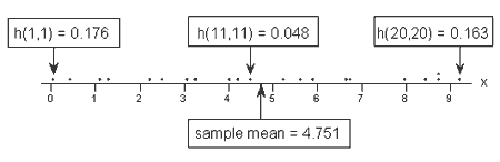
Three of the data points — the smallest x value, an x value near the mean, and the largest x value — are labeled with their corresponding leverages. As you can see, the two x values furthest away from the mean have the largest leverages (0.176 and 0.163), while the x value closest to the mean has a smaller leverage (0.048). In fact, if we look at a sorted list of the leverages obtained in Minitab:
HI1
| List of Leverages from Minitab | |||||||
|---|---|---|---|---|---|---|---|
| 0.176297 | 0.157454 | 0.127015 | 0.119313 | 0.086145 | 0.077744 | 0.065028 | 0.061276 |
| 0.048147 | 0.049628 | 0.049313 | 0.051829 | 0.055760 | 0.069310 | 0.072580 | 0.109616 |
| 0.127489 | 0.141136 | 0.140453 | 0.163492 | 0.050974 | |||
we see that as we move from the small x values to the x values near the mean, the leverages decrease. And, as we move from the x values near the mean to the large x values the leverages increase again.
You might also note that the sum of all 21 of the leverages adds up to 2, the number of beta parameters in the simple linear regression model — as we would expect based on the third property mentioned above.
Example 11-3 Revisited
Let's take another look at the following Influence3 data set:
What does your intuition tell you here? Do any of the x values appear to be unusually far away from the bulk of the rest of the x values? Hey, quit laughing! Sure enough, it seems as if the red data point should have a high leverage value. Let's see!
A dot plot containing just the x values:
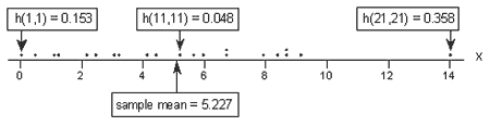
tells a different story this time. Again, of the three labeled data points, the two x values furthest away from the mean have the largest leverages (0.153 and 0.358), while the x value closest to the mean has a smaller leverage (0.048). Looking at a sorted list of the leverages obtained in Minitab:
HI1
| List of Leverages from Minitab | |||||||
|---|---|---|---|---|---|---|---|
| 0.153481 | 0.139367 | 0.116292 | 0.110382 | 0.084374 | 0.077557 | 0.066879 | 0.063589 |
| 0.050033 | 0.052121 | 0.047632 | 0.048156 | 0.049557 | 0.055893 | 0.057574 | 0.07821 |
| 0.088549 | 0.096634 | 0.096227 | 0110048 | 0.357535 | |||
we again see that as we move from the small x values to the x values near the mean, the leverages decrease. And, as we move from the x values near the mean to the large x values the leverages increase again. But, note that this time, the leverage of the x value that is far removed from the remaining x values (0.358) is much, much larger than all of the remaining leverages. This leverage thing seems to work!
Oh, and don't forget to note again that the sum of all 21 of the leverages adds up to 2, the number of beta parameters in the simple linear regression model. Again, we should expect this result based on the third property mentioned above.
Identifying data points whose x values are extreme
The great thing about leverages is that they can help us identify x values that are extreme and therefore potentially influential on our regression analysis. How? Well, all we need to do is determine when a leverage value should be considered large. A common rule is to flag any observation whose leverage value, \(h_{ii}\), is more than 3 times larger than the mean leverage value:
\(\bar{h}=\dfrac{\sum_{i=1}^{n}h_{ii}}{n}=\dfrac{p}{n}\)
This is the rule that Minitab uses to determine when to flag an observation. That is, if:
\(h_{ii} >3\left( \dfrac{p}{n}\right)\)
then Minitab flags the observations as "Unusual X" (although it would perhaps be more helpful if Minitab reported "X denotes an observation whose X value gives it potentially large influence" or "X denotes an observation whose X value gives it large leverage").
As with many statistical "rules of thumb," not everyone agrees about this \(3 p/n\) cut-off and you may see \(2 p/n\) used as a cut-off instead. A refined rule of thumb that uses both cut-offs is to identify any observations with a leverage greater than \(3 p/n\) or, failing this, any observations with a leverage that is greater than \(2 p/n\) and very isolated.
Example 11-3 Revisited again
Let's try our leverage rule out an example or two, starting with this Influence3 data set:
Of course, our intuition tells us that the red data point (x = 14, y = 68) is extreme with respect to the other x values. But, is the x value extreme enough to warrant flagging it? Let's see!
In this case, there are n = 21 data points and p = 2 parameters (the intercept \(\beta_{0}\) and slope \(\beta_{1}\)). Therefore:
\(3\left( \frac{p}{n}\right)=3\left( \frac{2}{21}\right)=0.286\)
Now, the leverage of the data point — 0.358 (obtained in Minitab) — is greater than 0.286. Therefore, the data point should be flagged as having high leverage. And, that's exactly what Minitab does:
Fits and Diagnostics for Unusual Observations
| Obs | y | Fit | Resid | Std Resid | |
|---|---|---|---|---|---|
| 21 | 68.00 | 71.45 | -3.45 | -1.59 | X |
X Unusual X
A word of caution! Remember, a data point has a large influence only if it affects the estimated regression function. As we know from our investigation of this data set in the previous section, the red data point does not affect the estimated regression function all that much. Leverages only take into account the extremeness of the x values, but a high-leverage observation may or may not actually be influential.
Example 11-4 Revisited
Let's see how the leverage rule works on this influence4 data set:
Of course, our intuition tells us that the red data point (x = 13, y = 15) is extreme with respect to the other x values. Is the x value extreme enough to warrant flagging it?
Again, there are n = 21 data points and p = 2 parameters (the intercept \(\beta_{0}\) and slope \(\beta_{1}\)). Therefore:
\(3\left( \frac{p}{n}\right)=3\left( \frac{2}{21}\right)=0.286\)
Now, the leverage of the data point — 0.311 (obtained in Minitab) —is greater than 0.286. Therefore, the data point should be flagged as having high leverage, as it is:
Fits and Diagnostics for Unusual Observations
| Obs | y | Fit | Resid | Std Resid | ||
|---|---|---|---|---|---|---|
| 21 | 15.00 | 51.66 | -36.66 | -4.23 | R | X |
R Large residual
X Unusual X
In this case, we know from our previous investigation that the red data point does indeed highly influence the estimated regression function. For reporting purposes, it would therefore be advisable to analyze the data twice — once with and once without the red data point — and to report the results of both analyses.
An important distinction!
There is such an important distinction between a data point that has high leverage and one that has high influence that it is worth saying it one more time:
- The leverage merely quantifies the potential for a data point to exert a strong influence on the regression analysis.
- The leverage depends only on the predictor values.
- Whether the data point is influential or not also depends on the observed value of the response \(y_{i}\).
11.3 - Identifying Outliers (Unusual y Values)
11.3 - Identifying Outliers (Unusual y Values)Previously in Lesson 4, we mentioned two measures that we use to help identify outliers. They are:
- Residuals
- Studentized residuals (or internally studentized residuals) (which Minitab calls standardized residuals)
We briefly review these measures here. However, this time, we add a little more detail.
Residuals
As you know, ordinary residuals are defined for each observation, i = 1, ..., n as the difference between the observed and predicted responses:
\(e_i=y_i-\hat{y}_i\)
For example, consider the following very small (contrived) data set containing n = 4 data points (x, y).
| x | y | FITS | RESI |
|---|---|---|---|
| 1 | 2 | 2.2 | -0.2 |
| 2 | 5 | 4.4 | 0.6 |
| 3 | 6 | 6.6 | -0.6 |
| 4 | 9 | 8.8 | 0.2 |
The column labeled "FITS" contains the predicted responses, while the column labeled "RESI" contains the ordinary residuals. As you can see, the first residual (-0.2) is obtained by subtracting 2.2 from 2; the second residual (0.6) is obtained by subtracting 4.4 from 5; and so on.
As you know, the major problem with ordinary residuals is that their magnitude depends on the units of measurement, thereby making it difficult to use the residuals as a way of detecting unusual y values. We can eliminate the units of measurement by dividing the residuals by an estimate of their standard deviation, thereby obtaining what is known as studentized residuals (or internally studentized residuals) (which Minitab calls standardized residuals).
Studentized residuals (or internally studentized residuals)
Studentized residuals (or internally studentized residuals) are defined for each observation, i = 1, ..., n as an ordinary residual divided by an estimate of its standard deviation:
\(r_{i}=\dfrac{e_{i}}{s(e_{i})}=\dfrac{e_{i}}{\sqrt{MSE(1-h_{ii})}}\)
Here, we see that the internally studentized residual for a given data point depends not only on the ordinary residual but also on the size of the mean square error (MSE) and the leverage \(h_{ii}\).
For example, consider again the (contrived) data set containing n = 4 data points (x, y):
| x | y | FITS | RESI | HI | SRES |
|---|---|---|---|---|---|
| 1 | 2 | 2.2 | -0.2 | 0.7 | -0.57735 |
| 2 | 5 | 4.4 | 0.6 | 0.3 | 1.13389 |
| 3 | 6 | 6.6 | -0.6 | 0.3 | -1.13389 |
| 4 | 9 | 8.8 | 0.2 | 0.7 | 0.57735 |
The column labeled "FITS" contains the predicted responses, the column labeled "RESI" contains the ordinary residuals, the column labeled "HI" contains the leverages \(h_{ii}\), and the column labeled "SRES" contains the internally studentized residuals (which Minitab calls standardized residuals). The value of MSE is 0.40. Therefore, the first internally studentized residual (-0.57735) is obtained by:
\(r_{1}=\dfrac{-0.2}{\sqrt{0.4(1-0.7)}}=-0.57735\)
and the second internally studentized residual is obtained by:
\(r_{2}=\dfrac{0.6}{\sqrt{0.4(1-0.3)}}=1.13389\)
and so on.
The good thing about internally studentized residuals is that they quantify how large the residuals are in standard deviation units, and therefore can be easily used to identify outliers:
- An observation with an internally studentized residual that is larger than 3 (in absolute value) is generally deemed an outlier. (Sometimes, the term "outlier" is reserved for observation with an externally studentized residual that is larger than 3 in absolute value—we consider externally studentized residuals in the next section.)
- Recall that Minitab flags any observation with an internally studentized residual that is larger than 2 (in absolute value).
Minitab may be a little conservative, but perhaps it is better to be safe than sorry. The key here is not to take the cutoffs of either 2 or 3 too literally. Instead, treat them simply as red warning flags to investigate the data points further.
Example 11-2 Revisited
Let's take another look at the following Influence2 data set
In our previous look at this data set, we considered the red data point an outlier, because it does not follow the general trend of the rest of the data. Let's see what the internally studentized residual of the red data point suggests:
Fits and Diagnostics for Unusual Observations
| Obs | y | Fit | Resid | Std Resid | |
|---|---|---|---|---|---|
| 21 | 40.00 | 23.11 | 16.89 | 3.68 | R |
R Large residual
Indeed, its internally studentized residual (3.68) leads Minitab to flag the data point as being an observation with a "Large residual." Note that Minitab labels internally studentized residuals as "Std Resid" because it refers to such residuals as "standardized residuals."
Why should we care about outliers?
We sure spend an awful lot of time worrying about outliers. But, why should we? What impact does their existence have on our regression analyses? One easy way to learn the answer to this question is to analyze a data set twice—once with and once without the outlier—and to observe differences in the results.
Let's try doing that to our Example #2 data set. If we regress y on x using the data set without the outlier, we obtain:
Analysis of Variance
| Source | DF | Seq SS | Seq MS | F-Value | P-Value |
|---|---|---|---|---|---|
| Regression | 1 | 4386.1 | 4386.07 | 652.84 | 0.000 |
| x | 1 | 4386.1 | 4386.07 | 652.84 | 0.000 |
| Error | 18 | 120.9 | 6.72 | ||
| Total | 19 | 4507.0 |
Modal Summary
| S | R-sq | R-sq(adj) | R-sq(pred) |
|---|---|---|---|
| 2.59199 | 97.32% | 91.17% | 96.63% |
Regression Equation
\(\widehat{y}= 1.3 + 5.117x\)
And if we regress y on x using the full data set with the outlier, we obtain:
Analysis of Variance
| Source | DF | Seq SS | Seq MS | F-Value | P-Value |
|---|---|---|---|---|---|
| Regression | 1 | 4265.8 | 4265.82 | 192.23 | 0.000 |
| x | 1 | 4265.8 | 4265.82 | 192.23 | 0.000 |
| Error | 19 | 421.6 | 22.19 | ||
| Total | 20 | 4687.5 |
Modal Summary
| S | R-sq | R-sq(adj) | R-sq(pred) |
|---|---|---|---|
| 4.71075 | 91.01% | 90.53% | 89.61% |
Regression Equation
\(\widehat{y}= 2.96 + 5.037x\)
What aspect of the regression analysis changes substantially because of the existence of the outlier? Did you notice that the mean square error MSE is substantially inflated from 6.72 to 22.19 by the presence of the outlier? Recalling that MSE appears in all of our confidence and prediction interval formulas, the inflated size of MSE would thereby cause a detrimental increase in the width of all of our confidence and prediction intervals. However, as noted in Section 11.1, the predicted responses, estimated slope coefficients, and hypothesis test results are not affected by the inclusion of the outlier. Therefore, the outlier, in this case, is not deemed influential (except with respect to MSE).
11.4 - Deleted Residuals
11.4 - Deleted ResidualsSo far, we have learned various measures for identifying extreme x values (high-leverage observations) and unusual y values (outliers). When trying to identify outliers, one problem that can arise is when there is a potential outlier that influences the regression model to such an extent that the estimated regression function is "pulled" towards the potential outlier, so that it isn't flagged as an outlier using the standardized residual criterion. To address this issue, deleted residuals offer an alternative criterion for identifying outliers. The basic idea is to delete the observations one at a time, each time refitting the regression model on the remaining n–1 observation. Then, we compare the observed response values to their fitted values based on the models with the ith observation deleted. This produces (unstandardized) deleted residuals. Standardizing the deleted residuals produces studentized deleted residuals, also known as externally studentized residuals.
(Unstandardized) deleted residuals
If we let:
- \(y_{i}\) denote the observed response for the \(i^{th}\) observation, and
- \(\hat{y}_{(i)}\) denote the predicted response for the \(i^{th}\) observation based on the estimated model with the \(i^{th}\) observation deleted
then the \(i^{th}\) (unstandardized) deleted residual is defined as:
\(d_i=y_i-\hat{y}_{(i)}\)
Why this measure? Well, data point i being influential implies that the data point "pulls" the estimated regression line towards itself. In that case, the observed response would be close to the predicted response. But, if you removed the influential data point from the data set, then the estimated regression line would "bounce back" away from the observed response, thereby resulting in a large deleted residual. That is, a data point having a large deleted residual suggests that the data point is influential.
Example 11-5
Consider the following plot of n = 4 data points (3 blue and 1 red):
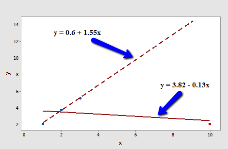
The solid line represents the estimated regression line for all four data points, while the dashed line represents the estimated regression line for the data set containing just the three data points — with the red data point omitted. Observe that, as expected, the red data point "pulls" the estimated regression line towards it. When the red data point is omitted, the estimated regression line "bounces back" away from the point.
Let's determine the deleted residual for the fourth data point — the red one. The value of the observed response is \(y_{4} \) = 2.1. The estimated regression equation for the data set containing just the first three points is:
\(\hat{y}_{(4)}=0.6+1.55x\)
making the predicted response when x = 10:
\(\hat{y}_{(4)}=0.6+1.55(10)=16.1\)
Therefore, the deleted residual for the red data point is:
\(d_4=2.1-16.1=-14\)
Is this a large deleted residual? Well, we can tell from the plot in this simple linear regression case that the red data point is clearly influential, and so this deleted residual must be considered large. But, in general, how large is large? Unfortunately, there's not a straightforward answer to that question. Deleted residuals depend on the units of measurement just as ordinary residuals do. We can solve this problem though by dividing each deleted residual by an estimate of its standard deviation. That's where "studentized deleted residuals" come into play.
Studentized deleted residuals (or externally studentized residuals)
A studentized deleted (or externally studentized) residual is:
\(t_i=\dfrac{d_i}{s(d_i)}=\dfrac{e_i}{\sqrt{MSE_{(i)}(1-h_{ii})}}\)
That is, a studentized deleted (or externally studentized) residual is just an (unstandardized) deleted residual divided by its estimated standard deviation (first formula). This turns out to be equivalent to the ordinary residual divided by a factor that includes the mean square error based on the estimated model with the \(i^{th}\) observation deleted, \(MSE_{ \left(i \right) }\), and the leverage, \(h_{ii} \) (second formula). Note that the only difference between the externally studentized residuals here and the internally studentized residuals considered in the previous section is that internally studentized residuals use the mean square error for the model based on all observations, while externally studentized residuals use the mean square error based on the estimated model with the \(i^{th}\) observation deleted, \(MSE_{ \left(i \right) }\).
Another formula for studentized deleted (or externally studentized) residuals allows them to be calculated using only the results for the model fit to all the observations:
\(t_i=r_i \left( \dfrac{n-p-1}{n-p-r_{i}^{2}}\right) ^{1/2},\)
where \(r_i\) is the \(i^{th}\) internally studentized residual, n = the number of observations, and p = the number of regression parameters including the intercept.
In general, externally studentized residuals are going to be more effective for detecting outlying Y observations than internally studentized residuals. If an observation has an externally studentized residual that is larger than 3 (in absolute value) we can call it an outlier. (Recall from the previous section that some use the term "outlier" for an observation with an internally studentized residual that is larger than 3 in absolute value. To avoid any confusion, you should always clarify whether you're talking about internally or externally studentized residuals when designating an observation to be an outlier.)
Example 11-6
Let's return to our example with n = 4 data points (3 blue and 1 red):
Regressing y on x and requesting the studentized deleted (or externally studentized)) residuals (which Minitab simply calls "deleted residuals"), we obtain the following Minitab output:
| x | y | RESI | TRES |
|---|---|---|---|
| 1 | 2.1 | -1.59 | -1.7431 |
| 2 | 3.8 | 0.24 | 0.1217 |
| 3 | 5.2 | 1.77 | 1.6361 |
| 10 | 2.1 | -0.42 | -19.7990 |
As you can see, the studentized deleted residual ("TRES") for the red data point is \(t_4 = -19.7990\). Now we just have to decide if this is large enough to deem the data point influential. To do that we rely on the fact that, in general, studentized deleted residuals follow a t distribution with ((n-1)-p) degrees of freedom (which gives them yet another name: "deleted t residuals"). That is, all we need to do is compare the studentized deleted residuals to the t distribution with ((n-1)-p) degrees of freedom. If a data point's studentized deleted residual is extreme—that is, it sticks out like a sore thumb—then the data point is deemed influential.
Here, n = 4 and p = 2. Therefore, the t distribution has 4 - 1 - 2 = 1 degree of freedom. Looking at a plot of the t distribution with 1 degree of freedom:
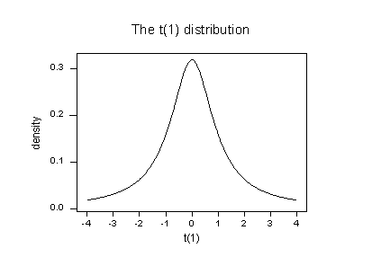
we see that almost all of the t values for this distribution fall between -4 and 4. Three of the studentized deleted residuals — -1.7431, 0.1217, and, 1.6361 — are all reasonable values for this distribution. But, the studentized deleted residual for the fourth (red) data point — -19.799 — sticks out like a very sore thumb. It is "off the chart" so to speak. Based on studentized deleted residuals, the red data point is deemed influential.
Example 11-2 Revisited
Let's return to Example #2 (Influence2 data set):
Regressing y on x and requesting the studentized deleted residuals, we obtain the following Minitab output:
| Row | x | y | RESI | SRES | TRES |
|---|---|---|---|---|---|
| 1 | 0.10000 | -0.0716 | -3.5330 | -0.82635 | -0.81917 |
| 2 | 0.45401 | 4.1673 | -1.0773 | -0.24915 | -0.24291 |
| 3 | 1.09765 | 6.5703 | -1.9166 | -0.43544 | -0.42596 |
| ... | |||||
| 19 | 8.70156 | 46.5475 | -0.2429 | -0.05562 | -0.05414 |
| 20 | 9.16463 | 45.7762 | -3.3468 | -0.77680 | -0.76838 |
| 21 | 4.00000 | 40.0000 | 16.8930 | 3.68110 | 6.69013 |
For the sake of saving space, I intentionally only show the output for the first three and last three observations. Again, the studentized deleted residuals appear in the column labeled "TRES." Minitab reports that the studentized deleted residual for the red data point is \(t_{21} = 6.69013\).
Because n-1-p = 21-1-2 = 18, to determine if the red data point is influential, we compare the studentized deleted residual to a t distribution with 18 degrees of freedom:
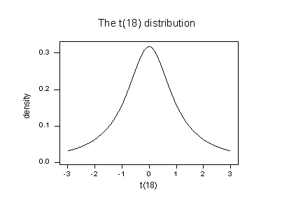
The studentized deleted residual for the red data point (6.69013) sticks out like a sore thumb. Again, it is "off the chart." Based on studentized deleted residuals, the red data point in this example is deemed influential. Incidentally, recall that earlier in this lesson, we deemed the red data point not influential because it did not affect the estimated regression equation all that much. On the other hand, the red data point did substantially inflate the mean square error. Perhaps it is in this sense that one would want to treat the red data point as influential.
11.5 - Identifying Influential Data Points
11.5 - Identifying Influential Data PointsIn this section, we learn the following two measures for identifying influential data points:
- Difference in fits (DFFITS)
- Cook's distance
The basic idea behind each of these measures is the same, namely to delete the observations one at a time, each time refitting the regression model on the remaining n–1 observations. Then, we compare the results using all n observations to the results with the ith observation deleted to see how much influence the observation has on the analysis. Analyzed as such, we are able to assess the potential impact each data point has on the regression analysis.
Difference in Fits (DFFITS)
The difference in fits for observation i, denoted \(DFFITS_i\), is defined as:
\(DFFITS_i=\dfrac{\hat{y}_i-\hat{y}_{(i)}}{\sqrt{MSE_{(i)}h_{ii}}}\)
As you can see, the numerator measures the difference in the predicted responses obtained when the \(i^{th}\) data point is included and excluded from the analysis. The denominator is the estimated standard deviation of the difference in the predicted responses. Therefore, the difference in fits quantifies the number of standard deviations that the fitted value changes when the \(i^{th}\) data point is omitted.
An observation is deemed influential if the absolute value of its DFFITS value is greater than:
\(2\sqrt{\frac{p+1}{n-p-1}}\)
whereas always n = the number of observations and p = the number of parameters including the intercept. It is important to keep in mind that this is not a hard-and-fast rule, but rather a guideline only! It is not hard to find different authors using slightly different guidelines. Therefore, I often prefer a much more subjective guideline, such as a data point that is deemed influential if the absolute value of its DFFITS value sticks out like a sore thumb from the other DFFITS values. Of course, this is a qualitative judgment, perhaps as it should be, since outliers by their very nature are subjective quantities.
Example 11-2 Revisited
Let's check out the difference in fits measure for this Influence2 data set:
Regressing y on x and requesting the difference in fits, we obtain the following Minitab output:
| Row | x | y | DFIT |
|---|---|---|---|
| 1 | 0.10000 | -0.0716 | -0.378974 |
| 2 | 0.45401 | 4.1673 | -0.105007 |
| 3 | 1.09765 | 6.5703 | -0.162478 |
| 4 | 1.27936 | 13.8150 | 0.36737 |
| 5 | 2.20611 | 11.4501 | -0.17547 |
| 6 | 2.50064 | 12.9554 | -0.16377 |
| 7 | 3.04030 | 20.1575 | 0.10670 |
| 8 | 3.23583 | 17.5633 | -0.09265 |
| 9 | 4.45308 | 26.0317 | 0.03061 |
| 10 | 4.16990 | 22.7573 | -0.05849 |
| 11 | 5.28474 | 26.3030 | -0.16025 |
| 12 | 5.59238 | 30.6885 | -0.02183 |
| 13 | 5.92091 | 33.9402 | 0.05988 |
| 14 | 6.66066 | 30.9402 | -0.34035 |
| 15 | 6.79953 | 34.1100 | -0.18834 |
| 16 | 7.9943 | 44.4536 | 0.10017 |
| 17 | 8.41536 | 46.5022 | 0.09771 |
| 18 | 8.71607 | 50.0568 | 0.29276 |
| 19 | 8.70156 | 46.5475 | -0.02188 |
| 20 | 9.16463 | 45.7762 | -0.33970 |
| 21 | 4.00000 | 40.0000 | 1.55050 |
Using the objective guideline defined above, we deem a data point as being influential if the absolute value of its DFFITS value is greater than:
\(2\sqrt{\dfrac{p+1}{n-p-1}}=2\sqrt{\dfrac{2+1}{21-2-1}}=0.82\)
Only one data point — the red one — has a DFFITS value whose absolute value (1.55050) is greater than 0.82. Therefore, based on this guideline, we would consider the red data point influential.
Example 11-3 Revisited
Let's check out the difference in fits measure for this Influence3 data set:
Regressing y on x and requesting the difference in fits, we obtain the following Minitab output:
| Row | x | y | DFIT |
|---|---|---|---|
| 1 | 0.10000 | -0.0716 | -0.52504 |
| 2 | 0.4540 | 4.1673 | -0.08388 |
| 3 | 1.0977 | 6.5703 | -0.18233 |
| 4 | 1.2794 | 13.8150 | 0.75898 |
| 5 | 2.2061 | 11.4501 | -0.21823 |
| 6 | 2.5006 | 12.9554 | -0.20155 |
| 7 | 3.0403 | 20.1575 | 0.27773 |
| 8 | 3.2358 | 17.5633 | -0.08229 |
| 9 | 4.4531 | 26.0317 | 0.13864 |
| 10 | 4.1699 | 22.7573 | -0.02221 |
| 11 | 5.2847 | 26.3030 | -0.18487 |
| 12 | 5.5924 | 30.6885 | 0.05524 |
| 13 | 5.9209 | 33.9402 | 0.19741 |
| 14 | 6.6607 | 30.9228 | -0.42448 |
| 15 | 6.7995 | 34.1100 | -0.17249 |
| 16 | 7.9794 | 44.4536 | 0.29917 |
| 17 | 8.4154 | 46.5022 | 0.30961 |
| 18 | 8.7161 | 50.5068 | 0.63049 |
| 19 | 8.7016 | 46.5475 | 0.14947 |
| 20 | 9.1646 | 45.7762 | -0.25095 |
| 21 | 14.0000 | 68.0000 | -1.23842 |
Using the objective guideline defined above, we deem a data point as being influential if the absolute value of its DFFITS value is greater than:
\(2\sqrt{\frac{p+1}{n-p-1}}=2\sqrt{\frac{2+1}{21-2-1}}=0.82\)
Only one data point — the red one — has a DFFITS value whose absolute value (1.23841) is greater than 0.82. Therefore, based on this guideline, we would consider the red data point influential.
When we studied this data set at the beginning of this lesson, we decided that the red data point did not affect the regression analysis all that much. Yet, here, the difference in fits measure suggests that it is indeed influential. What is going on here? It all comes down to recognizing that all of the measures in this lesson are just tools that flag potentially influential data points for the data analyst. In the end, the analyst should analyze the data set twice — once with and once without the flagged data points. If the data points significantly alter the outcome of the regression analysis, then the researcher should report the results of both analyses.
Incidentally, in this example here, if we use the more subjective guideline of whether the absolute value of the DFFITS value sticks out like a sore thumb, we are likely not to deem the red data point as being influential. After all, the next largest DFFITS value (in absolute value) is 0.75898. This DFFITS value is not all that different from the DFFITS value of our "influential" data point.
Example 11-4 Revisited
Let's check out the difference in fits measure for this Influence4 data set:
Regressing y on x and requesting the difference in fits, we obtain the following Minitab output:
| Row | x | y | DFIT |
|---|---|---|---|
| 1 | 0.10000 | -0.0716 | -0.4028 |
| 2 | 0.45401 | 4.1673 | -0.2438 |
| 3 | 1.0977 | 6.5703 | -0.2058 |
| 4 | 1.2794 | 13.8150 | 0.0376 |
| 5 | 2.2061 | 11.4501 | -0.1314 |
| 6 | 2.5006 | 12.9554 | -0.1096 |
| 7 | 3.0403 | 20.1575 | 0.0405 |
| 8 | 3.2358 | 17.5633 | -0.0424 |
| 9 | 4.4531 | 26.0317 | 0.0602 |
| 10 | 4.1699 | 22.7573 | 0.0092 |
| 11 | 5.2847 | 26.3030 | 0.0054 |
| 12 | 5.5924 | 30.6885 | 0.0782 |
| 13 | 5.9209 | 33.9402 | 0.1278 |
| 14 | 6.6607 | 30.9402 | 0.0072 |
| 15 | 6.7995 | 34.1100 | 0.0731 |
| 16 | 7.9794 | 44.4536 | 0.2805 |
| 17 | 8.4154 | 46.5022 | 0.3236 |
| 18 | 8.7161 | 50.0568 | 0.4361 |
| 19 | 8.7016 | 46.5475 | 0.3089 |
| 20 | 9.1646 | 45.7762 | 0.2492 |
| 21 | 13.0000 | 15.0000 | -11.4670 |
Using the objective guideline defined above, we again deem a data point as being influential if the absolute value of its DFFITS value is greater than:
\(2\sqrt{\frac{p+1}{n-p-1}}=2\sqrt{\frac{2+1}{21-2-1}}=0.82\)
What do you think? Do any of the DFFITS values stick out like a sore thumb? Errr — the DFFITS value of the red data point (–11.4670) is certainly of a different magnitude than all of the others. In this case, there should be little doubt that the red data point is influential!
Cook's distance measure
Just jumping right in here, Cook's distance measure, denoted \(D_{i}\), is defined as:
\(D_i=\dfrac{(y_i-\hat{y}_i)^2}{p \times MSE}\left( \dfrac{h_{ii}}{(1-h_{ii})^2}\right)\)
It looks a little messy, but the main thing to recognize is that Cook's \(D_{i}\) depends on both the residual, \(e_{i}\) (in the first term), and the leverage, \(h_{ii}\) (in the second term). That is, both the x value and the y value of the data point play a role in the calculation of Cook's distance.
In short:
- \(D_{i}\) directly summarizes how much all of the fitted values change when the \(i^{th}\) observation is deleted.
- A data point having a large \(D_{i}\) indicates that the data point strongly influences the fitted values.
Let's investigate what exactly that first statement means in the context of some of our examples.
Example 11-1 Revisited
You may recall that the plot of the Influence1 data set suggests that there are no outliers nor influential data points for this example:
If we regress y on x using all n = 20 data points, we determine that the estimated intercept coefficient \(b_0 = 1.732\) and the estimated slope coefficient \(b_1 = 5.117\). If we remove the first data point from the data set, and regress y on x using the remaining n = 19 data points, we determine that the estimated intercept coefficient \(b_0 = 1.732\) and the estimated slope coefficient \(b_1 = 5.1169\). As we would hope and expect, the estimates don't change all that much when removing the one data point. Continuing this process of removing each data point one at a time, and plotting the resulting estimated slopes (\(b_1\)) versus estimated intercepts (\(b_0\)), we obtain:
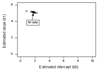
The solid black point represents the estimated coefficients based on all n = 20 data points. The open circles represent each of the estimated coefficients obtained when deleting each data point one at a time. As you can see, the estimated coefficients are all bunched together regardless of which, if any, data point is removed. This suggests that no data point unduly influences the estimated regression function or, in turn, the fitted values. In this case, we would expect all of the Cook's distance measures, \(D_{i}\), to be small.
Example 11-4 Revisited
You may recall that the plot of the Influence4 data set suggests that one data point is influential and an outlier for this example:
If we regress y on x using all n = 21 data points, we determine that the estimated intercept coefficient \(b_0 = 8.51\) and the estimated slope coefficient \(b_1 = 3.32\). If we remove the red data point from the data set, and regress y on x using the remaining n = 20 data points, we determine that the estimated intercept coefficient \(b_0 = 1.732\) and the estimated slope coefficient \(b_1 = 5.1169\). Wow—the estimates change substantially upon removing the one data point. Continuing this process of removing each data point one at a time, and plotting the resulting estimated slopes (\(b_1\)) versus estimated intercepts (\(b_0\)), we obtain:
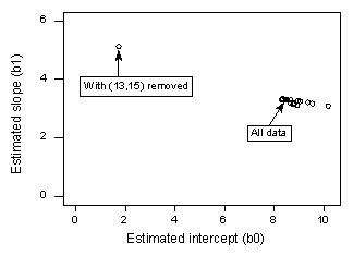
Again, the solid black point represents the estimated coefficients based on all n = 21 data points. The open circles represent each of the estimated coefficients obtained when deleting each data point one at a time. As you can see, with the exception of the red data point (x = 13, y = 15), the estimated coefficients are all bunched together regardless of which, if any, data point is removed. This suggests that the red data point is the only data point that unduly influences the estimated regression function and, in turn, the fitted values. In this case, we would expect the Cook's distance measure, \(D_{i}\), for the red data point to be large and the Cook's distance measures, \(D_{i}\), for the remaining data points to be small.
Using Cook's distance measures
The beauty of the above examples is the ability to see what is going on with simple plots. Unfortunately, we can't rely on simple plots in the case of multiple regression. Instead, we must rely on guidelines for deciding when a Cook's distance measure is large enough to warrant treating a data point as influential.
Here are the guidelines commonly used:
- If \(D_{i}\) is greater than 0.5, then the \(i^{th}\) data point is worthy of further investigation as it may be influential.
- If \(D_{i}\) is greater than 1, then the \(i^{th}\) data point is quite likely to be influential.
- Or, if \(D_{i}\) sticks out like a sore thumb from the other \(D_{i}\) values, it is almost certainly influential.
Example 11-2 Revisited
Let's check out the Cook's distance measure for this data set (Influence2 dataset):
Regressing y on x and requesting the Cook's distance measures, we obtain the following Minitab output:
| Row | x | y | COOK1 |
|---|---|---|---|
| 1 | 0.10000 | -0.0716 | 0.073076 |
| 2 | 0.45401 | 4.1673 | 0.005800 |
| 3 | 1.09765 | 6.5703 | 0.013794 |
| 4 | 1.27936 | 13.8150 | 0.067493 |
| 5 | 2.20611 | 11.4501 | 0.015960 |
| 6 | 2.50064 | 12.9554 | 0.013909 |
| 7 | 3.04030 | 20.1575 | 0.005954 |
| 8 | 3.23583 | 17.5633 | 0.004498 |
| 9 | 4.45308 | 26.0317 | 0.000494 |
| 10 | 4.16990 | 22.7573 | 0.001799 |
| 11 | 5.28474 | 26.3030 | 0.013191 |
| 12 | 5.59238 | 30.6885 | 0.000251 |
| 13 | 5.92091 | 33.9402 | 0.001886 |
| 14 | 6.66066 | 30.9228 | 0.056275 |
| 15 | 6.79953 | 34.1100 | 0.018262 |
| 16 | 7.97943 | 44.4536 | 0.005272 |
| 17 | 8.41536 | 46.5022 | 0.005021 |
| 18 | 8.71607 | 50.0568 | 0.043960 |
| 19 | 8.70156 | 46.5475 | 0.000253 |
| 20 | 9.16463 | 45.7762 | 0.058968 |
| 21 | 4.00000 | 40.0000 | 0.363914 |
The Cook's distance measure for the red data point (0.363914) stands out a bit compared to the other Cook's distance measures. Still, the Cook's distance measure for the red data point is less than 0.5. Therefore, based on the Cook's distance measure, we would not classify the red data point as being influential.
Example 11-3 Revisited
Let's check out the Cook's distance measure for this Influence3 data set :
Regressing y on x and requesting the Cook's distance measures, we obtain the following Minitab output:
| Row | x | y | COOK1 |
|---|---|---|---|
| 1 | 0.10000 | -0.0716 | 0.134157 |
| 2 | 0.45401 | 4.1673 | 0.003705 |
| 3 | 1.09765 | 6.5703 | 0.017302 |
| 4 | 1.27936 | 13.8150 | 0.241690 |
| 5 | 2.20611 | 11.4501 | 0.024433 |
| 6 | 2.50064 | 12.9554 | 0.020879 |
| 7 | 3.04030 | 20.1575 | 0.038412 |
| 8 | 3.23583 | 17.5633 | 0.003555 |
| 9 | 4.45308 | 26.0317 | 0.009943 |
| 10 | 4.16990 | 22.7573 | 0.000260 |
| 11 | 5.28474 | 26.3030 | 0.017379 |
| 12 | 5.59238 | 30.6885 | 0.001605 |
| 13 | 5.92091 | 33.9402 | 0.019748 |
| 14 | 6.66066 | 30.9228 | 0.081344 |
| 15 | 6.79953 | 34.1100 | 0.015289 |
| 16 | 7.97943 | 44.4536 | 0.044620 |
| 17 | 8.41536 | 46.5022 | 0.047961 |
| 18 | 8.71607 | 50.0568 | 0.173901 |
| 19 | 8.70156 | 46.5475 | 0.011656 |
| 20 | 9.16463 | 45.7762 | 0.032322 |
| 21 | 14.0000 | 68.0000 | 0.701965 |
The Cook's distance measure for the red data point (0.701965) stands out a bit compared to the other Cook's distance measures. Still, the Cook's distance measure for the red data point is gretaer than 0.5 but less than 1. Therefore, based on the Cook's distance measure, we would perhaps investigate further but not necessarily classify the red data point as being influential.
Example 11-4 Revisited
Let's check out the Cook's distance measure for this Influence4 data set:
Regressing y on x and requesting the Cook's distance measures, we obtain the following Minitab output:
| Row | x | y | COOK1 |
|---|---|---|---|
| 1 | 0.10000 | -0.0716 | 0.08172 |
| 2 | 0.45401 | 4.1673 | 0.03076 |
| 3 | 1.09765 | 6.5703 | 0.02198 |
| 4 | 1.27936 | 13.8150 | 0.00075 |
| 5 | 2.20611 | 11.4501 | 0.00901 |
| 6 | 2.50064 | 12.9554 | 0.00629 |
| 7 | 3.04030 | 20.1575 | 0.00086 |
| 8 | 3.23583 | 17.5633 | 0.00095 |
| 9 | 4.45308 | 26.0317 | 0.00191 |
| 10 | 4.16990 | 22.7573 | 0.00004 |
| 11 | 5.28474 | 26.3030 | 0.00002 |
| 12 | 5.59238 | 30.6885 | 0.00320 |
| 13 | 5.92091 | 33.9402 | 0.00848 |
| 14 | 6.66066 | 30.9228 | 0.00003 |
| 15 | 6.79953 | 34.1100 | 0.00280 |
| 16 | 7.97943 | 44.4536 | 0.03958 |
| 17 | 8.41536 | 46.5022 | 0.05229 |
| 18 | 8.71607 | 50.0568 | 0.09180 |
| 19 | 8.70156 | 46.5475 | 0.04809 |
| 20 | 9.16463 | 45.7762 | 0.03194 |
| 21 | 13.0000 | 15.0000 | 4.04801 |
In this case, the Cook's distance measure for the red data point (4.04801) stands out substantially compared to the other Cook's distance measures. Furthermore, the Cook's distance measure for the red data point is greater than 1. Therefore, based on the Cook's distance measure—and not surprisingly—we would classify the red data point as being influential.
An alternative method for interpreting Cook's distance that is sometimes used is to relate the measure to the F(p, n–p) distribution and to find the corresponding percentile value. If this percentile is less than about 10 or 20 percent, then the case has little apparent influence on the fitted values. On the other hand, if it is near 50 percent or even higher, then the case has a major influence. (Anything "in between" is more ambiguous.)
11.6 - Further Examples
11.6 - Further ExamplesExample 11-7: Male Foot Length and Height Data
First, let us consider a dataset where y = foot length (cm) and x = height (in) for n = 33 male students in a statistics class (Height Foot data set).
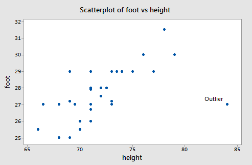
There is a clear outlier with values (\(x_i\) , \(y_i\)) = (84, 27). If that data point is deleted from the dataset, the estimated equation, using the other 32 data points, is \(\hat{y}_i = 0.253 + 0.384x_i\). For the deleted observation, \(x_i\) = 84, so
\(\hat{y}_{i(i)}= 0.253 + 0.384(84) = 32.5093\)
The (unstandardized) deleted residual is
\(d_i=y_i-\hat{y}_{i(i)}= 27 − 32.5093 = −5.5093\)
The usual sample residual will be smaller in absolute size because the outlier will pull the line toward itself. With all data points used, \(\hat{y}_i = 10.936+0.2344x_i\). At \(x_i\) = 84, \(\hat{y}_i = 30.5447\) and \(e_i\) = 27 − 30.5447 = −3.5447.
The difference between the two predicted values computed for the outlier is:
unstandardized \(DFFITS = \hat{y}_i -\hat{y}_{i(i)}= 30.5447 − 32.5093 = −1.9646\).
A dot plot of Cook’s \(D_i\) values for the male foot length and height data is below:
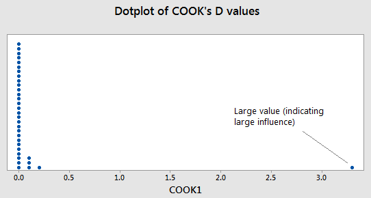
Note the outlier from earlier is the large value way to the right. The one large value of Cook’s \(D_i\) is for the point that is the outlier in the original data set. The interpretation is that the inclusion (or deletion) of this point will have a large influence on the overall results (which we saw from the calculations earlier).
From the analysis we did on the residuals, one may justify deleting the data point (\(x_i\), \(y_i\)) = (84, 27) from the dataset. If you choose to take such a measure in practice, you need to always justify with some sort of residual analysis why you are deleting a data point.
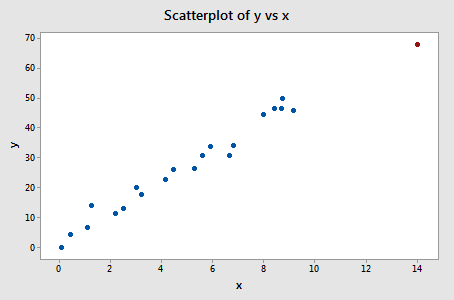
Example 11-8: Hospital Infection Data

Below is a scatterplot for the Hospital Infection risk data.
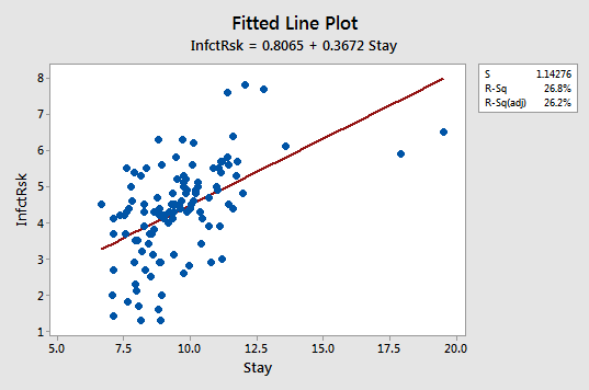
For this dataset, y = infection risk and x = average length of patient stay for n = 112 hospitals in the United States. A regression line is superimposed. Notice that there are two hospitals with extremely large values for the length of stay and that the infection risks for those two hospitals are not correspondingly large. This causes the sample regression line to tilt toward the outliers and apparently not have the correct slope for the bulk of the data.
Below is the “Unusual Observations” display that Minitab gave for this regression.
Fits and Diagnostics for Unusual Observations
| Obs | InfectRsk | Fit | SE Fit | 95% CI | Resid | Std Resid | Del Resid | DFITS | ||
|---|---|---|---|---|---|---|---|---|---|---|
| 2 | 1.600 | 4.045 | 0.117 | (3.812, 4.277) | -2.445 | -2.15 | -2.19 | -0.225615 | R | |
| 40 | 1.300 | 3.802 | 0.137 | (3.532, 4.073) | -2.502 | -2.21 | -2.25 | -0.270620 | R | |
| 47 | 6.500 | 7.988 | 0.585 | (6.828, 9.148) | -1.488 | -1.52 | -1.53 | -0.909869 | X | |
| 53 | 7.600 | 4.996 | 0.150 | (4.699, 5.293) | 2.604 | 2.30 | 2.35 | 0.310508 | R | |
| 54 | 7.800 | 5.238 | 0.179 | (4.884, 5.592) | 2.562 | 2.27 | 2.31 | 0.366190 | R | |
| 93 | 1.300 | 4.082 | 0.115 | (3.853, 4.310) | -2.782 | -2.55 | -2.50 | -0.253571 | R | |
| 111 | 5.900 | 7.393 | 0.494 | (6.415, 8.372) | -1.493 | -1.45 | -1.46 | -0.697504 | X | |
Click the Results tab in the regression dialog and change “Basic tables” to “Expanded tables” to obtain the additional columns in this table."
Notice that two observations in this display are marked with an 'X'. These are the hospitals with the long average length of stay. Notice also that these two points do not have particularly large studentized residuals (which Minitab calls standardized residuals). This is because the line was "pulled" toward the observed y-values and so the studentized residuals are not overly large. Also, these two points do not have particularly large studentized deleted residuals ("Del Resid"). This is because deleted residuals only adjust for one observation being omitted from the model at a time. In this case, if Obs 47 is omitted, Obs 111 remains to "pull" the regression line towards its observed y-value. Similarly, if Obs 111 is omitted, Obs 47 remains to "pull" the regression line towards its observed y-value. Thus, the deleted residuals are unable to flag that these two observations are probably outliers.
There are five observations marked with an 'R' for "large (studentized) residual." This is about the right number for a sample of n = 112 (5% of 112 comes to 5.6 observations) and none of these studentized residuals are overly large (say, greater than 3 in absolute value). Thus, the two data points to the far right are probably the only ones we need to worry about.
The question here would be whether we should delete the two hospitals to the far right and continue to use a linear model or whether we should retain the hospitals and use a curved model. The justification for deletion might be that we could limit our analysis to hospitals for which length of stay is less than 14 days, so we have a well defined criterion for the dataset that we use.
11.7 - A Strategy for Dealing with Problematic Data Points
11.7 - A Strategy for Dealing with Problematic Data PointsYou should certainly have a good idea now that identifying and handling outliers and influential data points is a "wishy-washy" business. That is, the various measures that we have learned in this lesson can lead to different conclusions about the extremity of a particular data point. It is for this reason that data analysts should use the measures described herein only as a way of screening their data set for potentially influential data points. With this in mind, here are the recommended strategies for dealing with problematic data points:
First, check for obvious data errors:
- If the error is just a data entry or data collection error, correct it.
- If the data point is not representative of the intended study population, delete it.
- If the data point is a procedural error and invalidates the measurement, delete it.
Consider the possibility that you might have just incorrectly formulated your regression model:
- Did you leave out any important predictors?
- Should you consider adding some interaction terms?
- Is there any nonlinearity that needs to be modeled?
If nonlinearity is an issue, one possibility is to just reduce the scope of your model. If you do reduce the scope of your model, you should be sure to report it, so that readers do not misuse your model.
Decide whether or not deleting data points is warranted:
- Do not delete data points just because they do not fit your preconceived regression model.
- You must have a good, objective reason for deleting data points.
- If you delete any data after you've collected it, justify and describe it in your reports.
- If you are not sure what to do about a data point, analyze the data twice — once with and once without the data point — and report the results of both analyses.
First, foremost, and finally — it's okay to use your common sense and knowledge about the situation.
11.8 - Summary
11.8 - SummaryIn this lesson, we learned the distinction between outliers and high leverage data points, and how each of their existences can impact our regression analyses differently. A data point is influential if it unduly influences any part of a regression analysis, such as the predicted responses, the estimated slope coefficients, or the hypothesis test results. We learned how to detect outliers, high leverage data points, and influential data points using the following measures:
- leverages
- residuals
- studentized residuals (or internally studentized residuals) [which Minitab calls standardized residuals]
- (unstandardized) deleted residuals (or PRESS prediction errors)
- studentized deleted residuals (or externally studentized residuals) [which Minitab calls deleted residuals]
- difference in fits (DFFITS)
- Cook's distance measure
We also learned a strategy for dealing with problematic data points once we've discovered them.
Software Help 11
Software Help 11
The next two pages cover the Minitab and R commands for the procedures in this lesson.
Below is a zip file that contains all the data sets used in this lesson:
- hospital_infct_03.txt
- influence1.txt
- influence2.txt
- influence3.txt
- influence4.txt
Minitab Help 11: Influential Points
Minitab Help 11: Influential PointsMinitab®
Influence 1 (no influential points)
Influence 2 (outlier, low leverage, not influential)
- Create a basic scatterplot.
- Perform a linear regression analysis for all the data (click "Storage" in the regression dialog and select "Fits" to save the fitted values).
- Select Data > Subset Worksheet to create a worksheet that excludes observation #21 and Perform a linear regression analysis.
- Return to the original worksheet and select Calc > Calculator to calculate fitted values based on the fitted equation for the subsetted worksheet, e.g., FITX = 1.73+5.117*x.
- Return to the scatterplot and select Editor > Calc > Calculated Line with y=FITS and x=x to add a regression line to the scatterplot.
- Select Editor > Calc > Calculated Line with y=FITX and x=x to add a regression line based on the fitted equation for the subsetted worksheet.
- Click "Storage" in the regression dialog to calculate leverages, standardized residuals, studentized (deleted) residuals, DFFITS, and Cook's distances.
Influence 3 (high leverage, not an outlier, not influential)
- Create a basic scatterplot.
- Perform a linear regression analysis for all the data (click "Storage" in the regression dialog and select "Fits" to save the fitted values).
- Select Data > Subset Worksheet to create a worksheet that excludes observation #21 and Perform a linear regression analysis.
- Return to the original worksheet and select Calc > Calculator to calculate fitted values based on the fitted equation for the subsetted worksheet, e.g., FITX = 1.73+5.117*x.
- Return to the scatterplot and select Editor > Calc > Calculated Line with y=FITS and x=x to add a regression line to the scatterplot.
- Select Editor > Calc > Calculated Line with y=FITX and x=x to add a regression line based on the fitted equation for the subsetted worksheet.
- Click "Storage" in the regression dialog to calculate leverages, DFFITS, and Cook's distances.
Influence 4 (outlier, high leverage, influential)
- Create a basic scatterplot.
- Perform a linear regression analysis for all the data (click "Storage" in the regression dialog and select "Fits" to save the fitted values).
- Select Data > Subset Worksheet to create a worksheet that excludes observation #21 and Perform a linear regression analysis.
- Return to the original worksheet and select Calc > Calculator to calculate fitted values based on the fitted equation for the subsetted worksheet, e.g., FITX = 1.73+5.117*x.
- Return to the scatterplot and select Editor > Calc > Calculated Line with y=FITS and x=x to add a regression line to the scatterplot.
- Select Editor > Calc > Calculated Line with y=FITX and x=x to add a regression line based on the fitted equation for the subsetted worksheet.
- Click "Storage" in the regression dialog to calculate leverages, DFFITS, and Cook's distances.
Foot length and height (outlier, high leverage, influential)
- Create a basic scatterplot.
- Perform a linear regression analysis for all the data. Click "Storage" in the regression dialog to calculate DFFITS and Cook's distances.
- Select Data > Subset Worksheet to create a worksheet that excludes observation #28 and Perform a linear regression analysis.
Hospital infection risk (two outliers, high leverages)
- Perform a linear regression analysis for all the data.
- Create a fitted line plot.
R Help 11: Influential Points
R Help 11: Influential PointsR Help
Influence 1 (no influential points)
- Load the influence1 data.
- Create a scatterplot of the data.
influence1 <- read.table("~/path-to-data/influence1.txt", header=T)
attach(influence1)

plot(x, y)

detach(influence1)
Influence 2 (outlier, low leverage, not influential)
- Load the influence2 data.
- Create a scatterplot of the data.
- Fit a simple linear regression model to all the data.
- Fit a simple linear regression model to the data excluding observation #21.
- Add regression lines to the scatterplot, one for each model.
- Calculate leverages, standardized residuals, studentized residuals, DFFITS, and Cook's distances.
influence2 <- read.table("~/path-to-data/influence2.txt", header=T)
attach(influence2)

plot(x, y)

model.1 <- lm(y ~ x)
summary(model.1)
#             Estimate Std. Error t value Pr(>|t|)
# (Intercept)   2.9576     2.0091   1.472    0.157
# x             5.0373     0.3633  13.865 2.18e-11 ***
# ---
# Residual standard error: 4.711 on 19 degrees of freedom
# Multiple R-squared:  0.9101,  Adjusted R-squared:  0.9053
# F-statistic: 192.2 on 1 and 19 DF,  p-value: 2.179e-11

model.2 <- lm(y ~ x, subset=1:20) # exclude obs #21
summary(model.2)
#             Estimate Std. Error t value Pr(>|t|)
# (Intercept)   1.7322     1.1205   1.546     0.14
# x             5.1169     0.2003  25.551 1.35e-15 ***
# ---
# Residual standard error: 2.592 on 18 degrees of freedom
# Multiple R-squared:  0.9732,  Adjusted R-squared:  0.9717
# F-statistic: 652.8 on 1 and 18 DF,  p-value: 1.353e-15

plot(x=x, y=y, col=ifelse(Row<=20, "blue", "red"),
     panel.last = c(lines(sort(x), fitted(model.1)[order(x)], col="red"),
                    lines(sort(x[-21]), fitted(model.2)[order(x[-21])],
                          col="red", lty=2)))
legend("topleft", col="red", lty=c(1,2),
       inset=0.02, legend=c("Red point included", "Red point excluded"))

lev <- hatvalues(model.1)
round(lev, 6)
#        1        2        3        4        5        6        7        8        9
# 0.176297 0.157454 0.127015 0.119313 0.086145 0.077744 0.065028 0.061276 0.048147
#       10       11       12       13       14       15       16       17       18
# 0.049628 0.049313 0.051829 0.055760 0.069310 0.072580 0.109616 0.127489 0.141136
#       19       20       21
# 0.140453 0.163492 0.050974
sum(lev) # 2

sta <- rstandard(model.1)
round(sta, 6)
#         1         2         3         4         5         6         7         8
# -0.826351 -0.249154 -0.435445  0.998187 -0.581904 -0.574462  0.413791 -0.371226
#         9        10        11        12        13        14        15        16
#  0.139767 -0.262514 -0.713173 -0.095897  0.252734 -1.229353 -0.683161  0.292644
#        17        18        19        20        21
#  0.262144  0.731458 -0.055615 -0.776800  3.681098

stu <- rstudent(model.1)
round(stu, 6)
#         1         2         3         4         5         6         7         8
# -0.819167 -0.242905 -0.425962  0.998087 -0.571499 -0.564060  0.404582 -0.362643
#         9        10        11        12        13        14        15        16
#  0.136110 -0.255977 -0.703633 -0.093362  0.246408 -1.247195 -0.673261  0.285483
#        17        18        19        20        21
#  0.255615  0.722190 -0.054136 -0.768382  6.690129

dffit <- dffits(model.1)
round(dffit, 6)
#         1         2         3         4         5         6         7         8
# -0.378974 -0.105007 -0.162478  0.367368 -0.175466 -0.163769  0.106698 -0.092652
#         9        10        11        12        13        14        15        16
#  0.030612 -0.058495 -0.160254 -0.021828  0.059879 -0.340354 -0.188345  0.100168
#        17        18        19        20        21
#  0.097710  0.292757 -0.021884 -0.339696  1.550500

cook <- cooks.distance(model.1)
round(cook, 6)
#        1        2        3        4        5        6        7        8
# 0.073076 0.005800 0.013794 0.067493 0.015960 0.013909 0.005954 0.004498
#        9       10       11       12       13       14       15       16
# 0.000494 0.001799 0.013191 0.000251 0.001886 0.056275 0.018262 0.005272
#       17       18       19       20       21
# 0.005021 0.043960 0.000253 0.058968 0.363914

detach(influence2)
Influence 3 (high leverage, not an outlier, not influential)
- Load the influence3 data.
- Create a scatterplot of the data.
- Fit a simple linear regression model to all the data.
- Fit a simple linear regression model to the data excluding observation #21.
- Add regression lines to the scatterplot, one for each model.
- Calculate leverages, DFFITS, and Cook's distances.
influence3 <- read.table("~/path-to-data/influence3.txt", header=T)
attach(influence3)

plot(x, y)

model.1 <- lm(y ~ x)
summary(model.1)
#             Estimate Std. Error t value Pr(>|t|)
# (Intercept)   2.4679     1.0757   2.294   0.0333 *
# x             4.9272     0.1719  28.661   <2e-16 ***
# ---
# Residual standard error: 2.709 on 19 degrees of freedom
# Multiple R-squared:  0.9774,  Adjusted R-squared:  0.9762
# F-statistic: 821.4 on 1 and 19 DF,  p-value: < 2.2e-16

model.2 <- lm(y ~ x, subset=1:20) # exclude obs #21
summary(model.2)
#             Estimate Std. Error t value Pr(>|t|)
# (Intercept)   1.7322     1.1205   1.546     0.14
# x             5.1169     0.2003  25.551 1.35e-15 ***
# ---
# Residual standard error: 2.592 on 18 degrees of freedom
# Multiple R-squared:  0.9732,  Adjusted R-squared:  0.9717
# F-statistic: 652.8 on 1 and 18 DF,  p-value: 1.353e-15

plot(x=x, y=y, col=ifelse(Row<=20, "blue", "red"),
     panel.last = c(lines(sort(x), fitted(model.1)[order(x)], col="red"),
                    lines(sort(x[-21]), fitted(model.2)[order(x[-21])],
                          col="red", lty=2)))
legend("topleft", col="red", lty=c(1,2),
       inset=0.02, legend=c("Red point included", "Red point excluded"))

lev <- hatvalues(model.1)
round(lev, 6)
#        1        2        3        4        5        6        7        8        9
# 0.153481 0.139367 0.116292 0.110382 0.084374 0.077557 0.066879 0.063589 0.050033
#       10       11       12       13       14       15       16       17       18
# 0.052121 0.047632 0.048156 0.049557 0.055893 0.057574 0.078121 0.088549 0.096634
#       19       20       21
# 0.096227 0.110048 0.357535
sum(lev) # 2

dffit <- dffits(model.1)
round(dffit, 6)
#         1         2         3         4         5         6         7         8
# -0.525036 -0.083882 -0.182326  0.758981 -0.218230 -0.201548  0.277728 -0.082294
#         9        10        11        12        13        14        15        16
#  0.138643 -0.022210 -0.184873  0.055235  0.197411 -0.424484 -0.172490  0.299173
#        17        18        19        20        21
#  0.309606  0.630493  0.149474 -0.250945 -1.238416

cook <- cooks.distance(model.1)
round(cook, 6)
#        1        2        3        4        5        6        7        8
# 0.134157 0.003705 0.017302 0.241690 0.024433 0.020879 0.038412 0.003555
#        9       10       11       12       13       14       15       16
# 0.009943 0.000260 0.017379 0.001605 0.019748 0.081344 0.015289 0.044620
#       17       18       19       20       21
# 0.047961 0.173901 0.011656 0.032322 0.701965

detach(influence3)
Influence 4 (outlier, high leverage, influential)
- Load the influence4 data.
- Create a scatterplot of the data.
- Fit a simple linear regression model to all the data.
- Fit a simple linear regression model to the data excluding observation #21.
- Add regression lines to the scatterplot, one for each model.
- Calculate leverages, DFFITS, and Cook's distances.
influence4 <- read.table("~/path-to-data/influence4.txt", header=T)
attach(influence4)

plot(x, y)

model.1 <- lm(y ~ x)
summary(model.1)
#             Estimate Std. Error t value Pr(>|t|)
# (Intercept)   8.5046     4.2224   2.014 0.058374 .
# x             3.3198     0.6862   4.838 0.000114 ***
# ---
# Residual standard error: 10.45 on 19 degrees of freedom
# Multiple R-squared:  0.5519,  Adjusted R-squared:  0.5284
# F-statistic: 23.41 on 1 and 19 DF,  p-value: 0.0001143

model.2 <- lm(y ~ x, subset=1:20) # exclude obs #21
summary(model.2)
#             Estimate Std. Error t value Pr(>|t|)
# (Intercept)   1.7322     1.1205   1.546     0.14
# x             5.1169     0.2003  25.551 1.35e-15 ***
# ---
# Residual standard error: 2.592 on 18 degrees of freedom
# Multiple R-squared:  0.9732,  Adjusted R-squared:  0.9717
# F-statistic: 652.8 on 1 and 18 DF,  p-value: 1.353e-15

plot(x=x, y=y, col=ifelse(Row<=20, "blue", "red"),
     panel.last = c(lines(sort(x), fitted(model.1)[order(x)], col="red"),
                    lines(sort(x[-21]), fitted(model.2)[order(x[-21])],
                          col="red", lty=2)))
legend("topleft", col="red", lty=c(1,2),
       inset=0.02, legend=c("Red point included", "Red point excluded"))

lev <- hatvalues(model.1)
round(lev, 6)
#        1        2        3        4        5        6        7        8        9
# 0.158964 0.143985 0.119522 0.113263 0.085774 0.078589 0.067369 0.063924 0.049897
#       10       11       12       13       14       15       16       17       18
# 0.052019 0.047667 0.048354 0.049990 0.057084 0.058943 0.081446 0.092800 0.101587
#       19       20       21
# 0.101146 0.116146 0.311532
sum(lev) # 2

dffit <- dffits(model.1)
round(dffit, 6)
#         1          2          3          4          5          6          7
# -0.402761  -0.243756  -0.205848   0.037612  -0.131355  -0.109593   0.040473
#         8          9         10         11         12         13         14
# -0.042401   0.060224   0.009181   0.005430   0.078165   0.127828   0.007230
#        15         16         17         18         19         20         21
#  0.073067   0.280501   0.323599   0.436114   0.308869   0.249206 -11.467011

cook <- cooks.distance(model.1)
round(cook, 6)
#        1        2        3        4        5        6        7        8
# 0.081718 0.030755 0.021983 0.000746 0.009014 0.006290 0.000863 0.000947
#        9       10       11       12       13       14       15       16
# 0.001907 0.000044 0.000016 0.003203 0.008478 0.000028 0.002804 0.039575
#       17       18       19       20       21
# 0.052293 0.091802 0.048085 0.031938 4.048013

detach(influence4)
Foot length and height (outlier, high leverage, influential)
- Load the height_foot data.
- Create a scatterplot of the data.
- Fit a simple linear regression model to all the data.
- Fit a simple linear regression model to the data excluding observation #28.
- Calculate DFFITS and Cook's distance for obs #28.
heightfoot <- read.table("~/path-to-data/height_foot.txt", header=T)
attach(heightfoot)

plot(height, foot)

model.1 <- lm(foot ~ height)
summary(model.1)
#             Estimate Std. Error t value Pr(>|t|)
# (Intercept) 10.93577    4.43778   2.464 0.019477 *
# height       0.23344    0.06151   3.795 0.000643 ***
# ---
# Residual standard error: 1.286 on 31 degrees of freedom
# Multiple R-squared:  0.3173,  Adjusted R-squared:  0.2952
# F-statistic: 14.41 on 1 and 31 DF,  p-value: 0.0006428

which(height>80) # 28
model.2 <- lm(foot ~ height, subset=(1:33)[-28]) # exclude obs #28
summary(model.2)
#             Estimate Std. Error t value Pr(>|t|)
# (Intercept)  0.25313    4.33232   0.058    0.954
# height       0.38400    0.06038   6.360 5.12e-07 ***
# ---
# Residual standard error: 1.028 on 30 degrees of freedom
# Multiple R-squared:  0.5741,  Adjusted R-squared:  0.5599
# F-statistic: 40.45 on 1 and 30 DF,  p-value: 5.124e-07

dffit <- dffits(model.1)
dffit[28] # -3.200223

cook <- cooks.distance(model.1)
cook[28] # 3.274466

detach(heightfoot)
Hospital infection risk (two outliers, high leverages)
- Load the infection risk data.
- Fit a simple linear regression model to all the data.
- Create a scatterplot of the data and add the regression line.
- Display influence measures for influential points, including DFFITS, Cook's distances, and leverages (hat).
infectionrisk <- read.table("~/path-to-data/infectionrisk.txt", header=T)
attach(infectionrisk)

model <- lm(InfctRsk ~ Stay)
summary(model)

plot(x=Stay, y=InfctRsk,
     panel.last = lines(sort(Stay), fitted(model)[order(Stay)]))

summary(influence.measures(model))
#     dfb.1_ dfb.Stay dffit   cov.r   cook.d hat
# 2   -0.13   0.09    -0.23    0.94_*  0.02   0.01
# 34  -0.04   0.05     0.05    1.07_*  0.00   0.05
# 40  -0.20   0.17    -0.27    0.94_*  0.04   0.01
# 47   0.85  -0.90    -0.92_*  1.30_*  0.42   0.25_*
# 53  -0.16   0.20     0.30    0.94_*  0.04   0.02
# 93  -0.14   0.09    -0.25    0.92_*  0.03   0.01
# 104 -0.11   0.12     0.14    1.07_*  0.01   0.05_*
# 112  0.64  -0.68    -0.70_*  1.19_*  0.24   0.18_*

detach(infectionrisk)