3: ANOVA Models Part I
3: ANOVA Models Part IOverview
In Lesson 2, we learned that ANOVA is based on testing the effect of the treatment relative to the amount of random error. In statistics, we call this the partitioning of variability (some due to the treatment and some due to random measurement variability). This partitioning of the deviations can be written mathematically as:
\(\underbrace{Y_{ij}-\bar{Y}_{..}}_{\enclose{circle}{\color{black}{1}}} = \underbrace{\bar{Y}_{i.}-\bar{Y}_{..}}_{\enclose{circle}{\color{black}{2}}} + \underbrace{Y_{ij}-\bar{Y}_{i.}}_{\enclose{circle}{\color{black}{3}}}\)
Thus, the total deviation \(Y_{ij}-\bar{Y}_{..}\) in \(\enclose{circle}{\color{black}{1}}\) can be viewed as the sum of two components:
- \(\enclose{circle}{\color{black}{2}}\) Deviation of estimated factor level mean around overall mean, and
- \(\enclose{circle}{\color{black}{3}}\) Deviation of the jth response of the ith factor around the estimated factor level mean.
These two deviations are also called variability between groups, a reflection of differences between treatment levels, and the variability within groups, which serves as a proxy for the error variability among individual observations. A practitioner would be more interested in the variability between groups, as it is the indicator of treatment level differences, and may have little interest in the within-group variability, expecting it to be small. However, both these variability measures will play an important role in the ANOVA statistical procedures.
There are several mathematically equivalent forms of ANOVA models describing the relationship between the response and the treatment. In this lesson, we will focus on the effects model and in the next lesson, the alternative models will be introduced.
This lesson will cover the model assumptions needed to employ the ANOVA. Model diagnostics, which deal with verifying the validity of model assumptions, are discussed along with power analysis techniques to assess the power associated with a statistical study. Software methods using the statistical techniques discussed will also be presented.
Objectives
- Apply the Effects Model for a one-way ANOVA and interpret the results.
- Examine the assumptions for ANOVA and associated diagnostics.
- Use statistical software to conduct an ANOVA (in SAS, R, and Minitab).
- Conduct a power analysis and recognize the role of power analysis in a statistical hypothesis test.
3.1 - The Model
3.1 - The ModelThe effects model for one way ANOVA is a linear additive statistical model which relates the response to the treatment and can be expressed as
\(Y_{ij}=\mu+\tau_i+\epsilon_{ij}\)
where \(\mu\) is the grand mean, \(\tau_i\) (i = 1, 2, ..., T) are the deviations from the grand mean due to the treatment levels and \(\epsilon_{ij}\) are the error terms. The quantities \(\tau_i\) add to zero, and are also referred to as the treatment level effects. Alternatively, the errors account for the amount ‘left over’ after considering the grand mean and the effect of a particular treatment level.
Here is the analogy in terms of the greenhouse experiment. Imagine someone unaware that different fertilizers were used inquiring about the plant heights on average. The overall sample mean, an estimate of the true grand mean, will be a suitable response to this inquiry. On the other hand, the overall mean would not be satisfactory information for the experimenter of the study who obviously suspects that there will be height differences among different fertilizer types. Instead, more informative to the experimenter are the plant height estimates after including the effect of the treatment \(\tau_i\).
Under the null hypothesis where the treatment effect is zero, the reduced model can be written \(Y_{ij}=\mu+\epsilon_{ij}\).
Under the alternative hypothesis, where the treatment effects are not zero for at least one treatment level, the full model can be written \(Y_{ij}=\mu +\tau_i+\epsilon_{ij}\).
If \(SSE(R)\) denotes the error sums of squares associated with the reduced model and \(SSE(F)\) denotes the error sums of squares associated with the full model, we can utilize the General Linear Test approach to test the null hypothesis using the test statistic:
\(F=\frac{\left(\dfrac{SSE(R)-SSE(F)}{df_R-df_F}\right)}{\left(\dfrac{SSE(F)}{df_F}\right)}\)
Under the null hypothesis, this statistic has an F-distribution with numerator and denominator degrees of freedom equal to \(df_R-df_F\) and \(df_F\), respectively, where \(df_R\) is the degrees of freedom associated with \(SSE(R)\) and \(df_F\) is the degree of freedom associated with \(SSE(F)\). It is easy to see that \(df_R=N-1\) and \(df_F=N-T\) where \(N=\sum_{i=1}^{T} n_{i}\).
Also,
\(SSE(R) = \sum_i \sum_j (Y_{ij} - \bar{Y}_{..})^2=SS_{Total}\) (See Section 2.2)
Therefore the test statistic can be rewritten solely in terms from the full model (dropping the "\((F)\)" notation),
\begin{aligned} F &= \frac{\left(\dfrac{SS_{Total}-SSE}{T-1}\right)}{\left(\dfrac{SSE}{N-T}\right)} \\ &= \frac{\left(\dfrac{SS_{Trt}}{df_{Trt}}\right)}{\left(\dfrac{SSE}{df_{Error}}\right)} \\ &= \frac{MS_{Trt}}{MSE} \end{aligned}
Note that this is the same test statistic derived in Section 2.2 for testing the treatment significance. If the null hypothesis is true, then the treatment effect is not significant. If we reject the null hypothesis, then we conclude that the treatment effect is significant, which leads to the conclusion that at least one treatment level is better than the others.
3.2 - Assumptions and Diagnostics
3.2 - Assumptions and DiagnosticsBefore we draw any conclusions about the significance of the model, we need to make sure we have a "valid" model. Like any other statistical procedure, the ANOVA has assumptions that must be met. Failure to meet these assumptions means any conclusions drawn from the model are not to be trusted.
Assumptions
So what are these assumptions being made to employ the ANOVA model? The errors are assumed to be independent and identically distributed (iid) with a normal distribution having a mean of 0 and unknown equal variance.
As the model residuals serve as estimates of the unknown error, diagnostic tests to check for validity of model assumptions are based on residual plots, and thus, the implementation of diagnostic tests is also called ‘Residual Analysis’.
Diagnostic Tests
Most useful is the residual vs. predicted value plot, which identifies the violations of zero mean and equal variance. Residuals are also plotted against the treatment levels to examine if the residual behavior differs among treatments. The normality assumption is checked by using a normal probability plot.
Residual plots can help identify potential outliers, and the pattern of residuals vs. fitted values or treatments may suggest a transformation of the response variable. Lesson 4: SLR Model Assumptions of STAT 501 online notes discuss various diagnostic procedures in more detail.
There are other various statistical tests to check the validity of these assumptions, but some may not be that useful. For example, Bartlett’s test for homogeneity is too sensitive and indicates that problems exist when they do not. It turns out that the ANOVA is very robust and is not overly affected by minor violations of these assumptions. In practice, a good deal of common sense and the visual inspection of the residual plots are sufficient to determine if serious problems exist.
Here are common patterns that you may encounter in the residual analysis (i.e. plotting residuals, \(e\) against the predicted values, \(\hat{y}\)). Figure (a) shows the prototype plot when the ANOVA model is appropriate for data. The residuals are scattered randomly around mean zero and variability is constant (i.e. within the horizontal bands) for all groups.
Figure (b) suggests that although the variance is constant, there are some trends in the response that is not explained by a linear model. Using figure (c), we can depict that the linear model is appropriate as the central trend in data is a line. However, the megaphone patterns in figure (c) suggest that variance is not constant.
In figure (d), we are plotting residuals against the order of the observations. The order-related trend depicts a prototype situation where the errors are not independent. In other words, errors that are near to each other in the sequence might be correlated with each other.
Alert!
A common problem encountered in ANOVA is when the variance of treatment levels is not equal (heterogeneity of variance). If the variance is increasing in proportion to the mean (panel (c) in the figure above), a logarithmic transformation of Y can 'stabilize' the variances. If the residuals vs. predicted values instead show a curvilinear trend (panel (b) in the figure above), then a quadratic or other transformation may help. Since finding the correct transformation can be challenging, the Box-Cox method is often used to identify the appropriate transformation, given in terms of \(\lambda\) as shown below.
\(y_i^{(\lambda)} = \begin{cases} \frac{y_i^\lambda - 1}{\lambda},& \text{if } \lambda \neq 0,\\ \ln y_i, & \text{if } \lambda = 0 \end{cases}\)
Some \(\lambda\) values result some common transformations.
| \(\lambda\) | \(Y^\lambda\) | Transformation |
|---|---|---|
| 2 | \(Y^2\) | Square |
| 1 | \(Y^1\) | Original (No transform) |
| 1/2 | \(\sqrt{Y}\) | Square Root |
| 0 | \(log(Y)\) | Logarithm |
| -1/2 | \(\frac{1}{\sqrt{Y}}\) | Reciprocal Square Root |
| -1 | \(\frac{1}{Y}\) | Reciprocal |
Using Technology
The Box-Cox procedure in SAS is more complicated in a general setting. It is done through the Transreg procedure, by obtaining the ANOVA solution with regression which first requires coding the treatment levels with effect coding discussed in Lesson 4.
However, for one-way ANOVA (ANOVA with only one factor) we can use the SAS Transreg procedure without much hassle. Suppose we have SAS data as follows.
| Obs | Treatment | ResponseVariable |
|---|---|---|
| 1 | A | 12 |
| 2 | A | 23 |
| 3 | A | 34 |
| 4 | B | 45 |
| 5 | B | 56 |
| 6 | B | 67 |
| 7 | C | 14 |
| 8 | C | 25 |
| 9 | C | 36 |
We can use the following SAS commands to run the Box-Cox analysis.
proc transreg data=boxcoxSimData;
model boxcox(ResponseVariable)=class(Treatment);
run;
This would generate an output as follows, which suggests a transformation using \(\lambda=1\) (i.e. no transformation).
To run the Box-Cox procedure in Minitab, set up the data (Simulated Data), as a stacked format (a column with treatment (or trt combination) levels, and the second column with the response variable.
| Treatment | Response Variable |
|---|---|
| A | 12 |
| A | 23 |
| A | 34 |
| B | 45 |
| B | 56 |
| B | 67 |
| C | 14 |
| C | 25 |
| C | 36 |
-
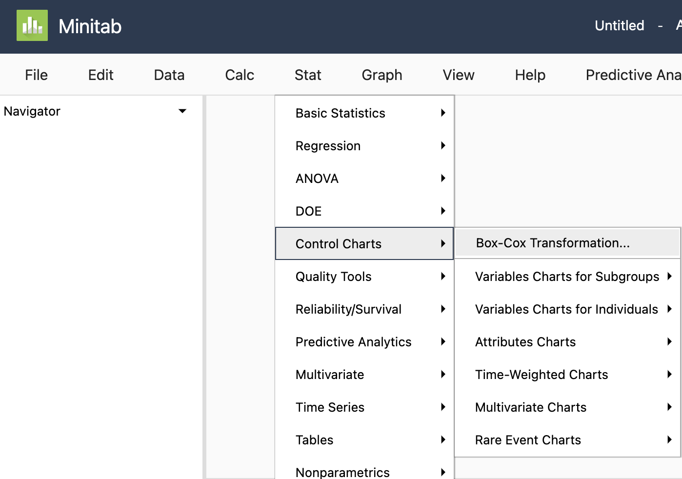
On the Minitab toolbar, choose
Stat > Control Charts > Box-Cox Transformation
-
Place “Response Variable” and “Treatment” in the boxes as shown below.
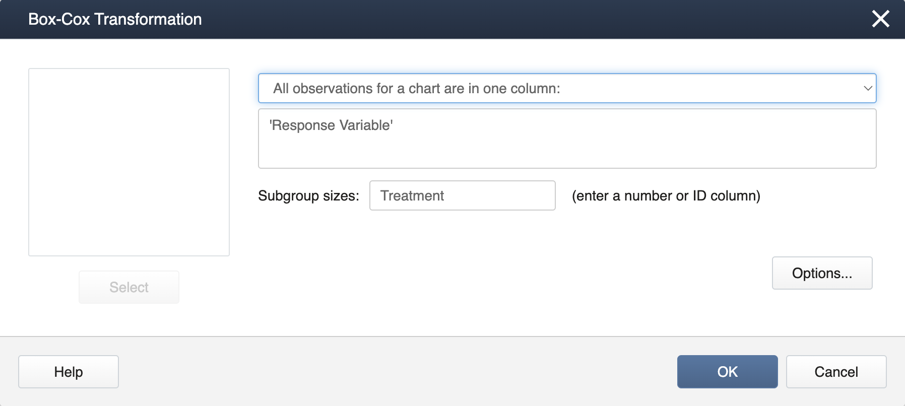
-
Click OK to finish. You will get an output like this:
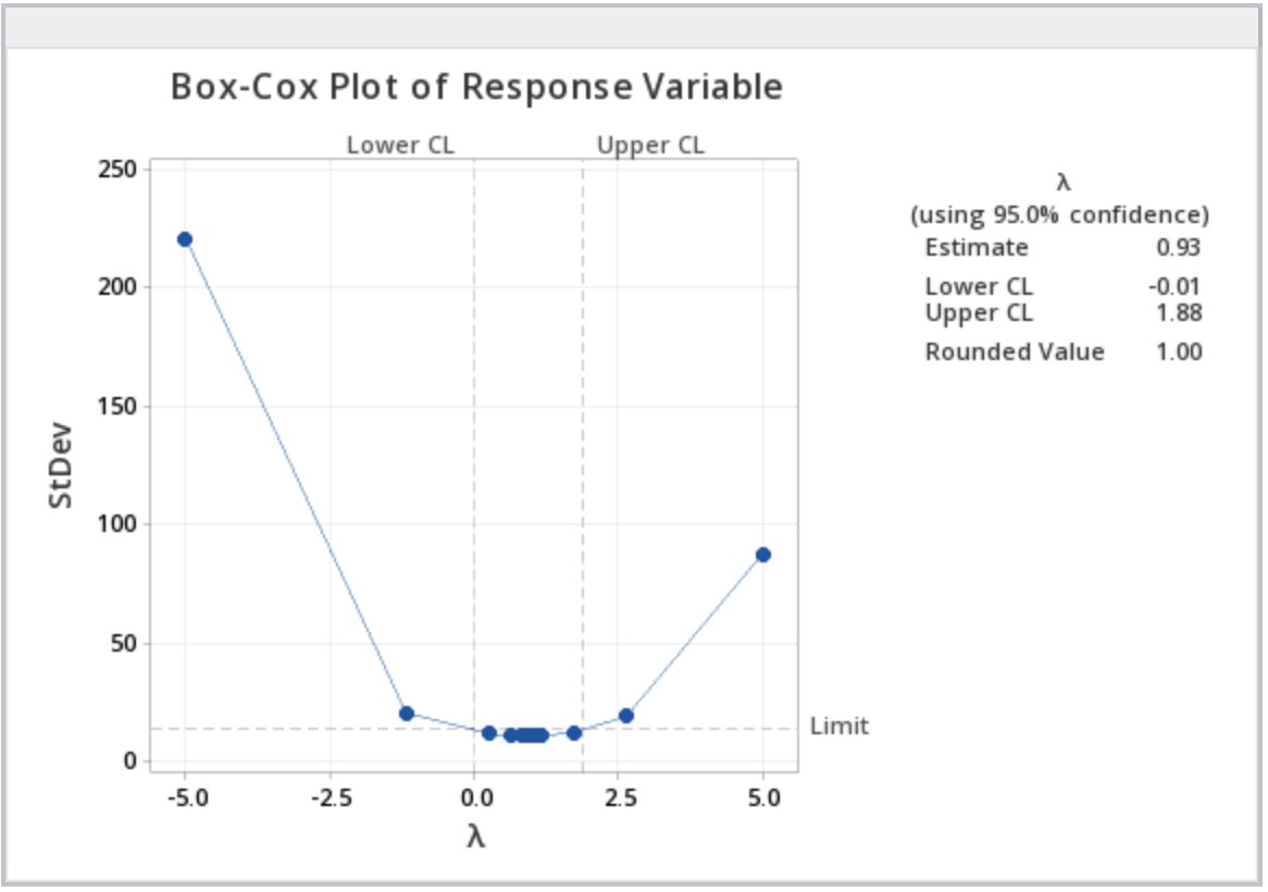
In the upper right-hand box, the rounded value for \(\lambda\) is given from which the appropriate transformation of the response variable can be found using the chart above. Note, with a \(\lambda\) of 1, no transformation is recommended.
First, load and attach the simulated data in R. Note that simulated data are in the stacked format (a column with treatment levels and a column with the response variable).
setwd("~/path-to-folder/")
simulated_data<-read.table("simulated_data.txt",header=T,sep ="\t")
attach(simulated_data)
Then we install and load the package AID and perform the Box-Cox procedure.
install.packages("AID")
library(AID)
boxcoxfr(Response_Variable,Treatment)
  Box-Cox power transformation
---------------------------------------------------------------------

  lambda.hat : 0.93


  Shapiro-Wilk normality test for transformed data (alpha = 0.05)
-------------------------------------------------------------------
  Level statistic   p.value Normality
1     A 0.9998983 0.9807382       YES
2     B 0.9999840 0.9923681       YES
3     C 0.9999151 0.9824033       YES


  Bartlett's homogeneity test for transformed data (alpha = 0.05)
-------------------------------------------------------------------
  Level   statistic   p.value Homogeneity
1   All 0.008271728 0.9958727         YES
---------------------------------------------------------------------
From the output, we can see that the \(\lambda\) value for the transformation is 0.93. Since this value is very close to 1 we can use \(\lambda=1\) (no transformation). In addition, from the output, we can see that normality exists in all 3 levels (Shapiro-Wilk test) and we have the same variance (Bartlett's test).
As an alternative method, we can use the boxcox function from the package MASS. The boxcox function produces a plot illustrating the 95% CI.
library(MASS)
Box_Cox_Plot<-boxcox(aov(Response.Variable~Treatment),lambda=seq(-3,3,0.01))
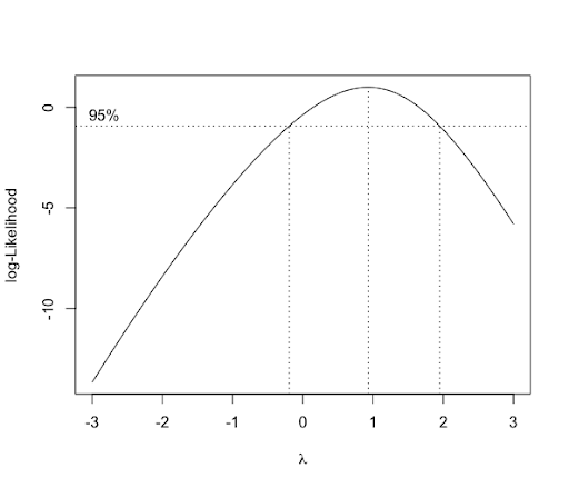
Since \(\lambda=1\) is within the CI, there is no need for transformation. We can also obtain the MLE \(\lambda\) (0.93) as follows.
lambda<-Box_Cox_Plot$x[which.max(Box_Cox_Plot$y)]
lambda
[1] 0.93
We conclude our analysis and detach the dataset.
detach(simulated_data)
3.3 - Anatomy of SAS programming for ANOVA
3.3 - Anatomy of SAS programming for ANOVASAS® ANOVA-Related Statistical Procedures
The statistical software SAS is widely used in this course and in previous lessons we came across outputs generated through SAS programs. In this section, we begin to delve further into SAS programming with a special focus on ANOVA-related statistical procedures. STAT 480-course series is also a useful resource for additional help.
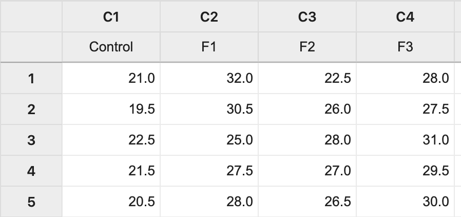
Here is the program used to generate the summary output in Lesson 2.1:
data greenhouse;
input Fert $ Height;
The first line begins with the word ‘data’ and invokes the data step. Notice that the end of each SAS statement has a semi-colon. This is essential. In the dataset, the data to be used and its variables are named. Note that SAS assumes variables are numeric in the input statement, so if we are going to use a variable with alpha-numeric values (e.g. F1 or Control), then we have to follow the name of the variable in the input statement with a “$” sign.
A simple way to input small datasets is shown in this code, wherein we embed the data in the program. This is done with the word “datalines."
datalines;
Control      21
Control      19.5
Control      22.5
Control      21.5
Control      20.5
Control      21
F1      32
F1      30.5
F1      25
F1      27.5
F1      28
F1      28.6
F2      22.5
F2      26
F2      28
F2      27
F2      26.5
F2      25.2
F3      28
F3      27.5
F3      31
F3      29.5
F3      30
F3      29.2
;
The semicolon here ends the dataset.
SAS then produces an output of interest using “proc” statements, short for “procedure”. You only need to use the first four letters, so SAS code is full of “proc” statements to do various tasks. Here we just wanted to print the data to be sure it read it in OK.
proc print data= greenhouse;
title 'Raw Data for Greenhouse Data'; run;
Notice that the data set to be printed is specified in the proc print command. This is an important habit to develop because if not specified SAS will use the last created data set (which may be a different output data set generated as a result of the SAS procedures run up to that point).
The summary procedure can be very useful in both EDA (exploratory data analysis) and obtaining descriptive statistics such as mean, variance, minimum, maximum, etc. When using SAS procedures (including the summary procedure), categorical variables are specified in the class statement. Any variable NOT listed in the class statement is treated as a continuous variable. The target variable for which the summary will be made is specified by the var (for variable) statement.
The output statement creates an output dataset and the 'out=' part assigns a name of your choice to the output. Descriptive statistics also can be named. For example, in the output statement below, mean=mean assigns the name mean to the mean of the variable fert and stderr=se assigns the name se to the standard error. The output data sets of any SAS procedure will not be automatically printed. As illustrated in the code below, the print procedure would then have to be used to print the generated output. In the proc print command a title can be included as a means of identifying and describing the output contents.
proc summary data= greenhouse;
class fert;
var height;
output out=output1 mean=mean stderr=se;
run;
proc print data=output1;
title 'Summary Output for Greenhouse Data';
run;
The two commands “title; run;” right after will erase the title assignment. This prevents the same title to be used in every output generated thereafter, which is a default feature in SAS.
title; run;
Summary Output for Greenhouse Data
| Obs | Fert | TYPE | FREQ | mean | se |
|---|---|---|---|---|---|
| 1 | 0 | 24 | 26.1667 | 0.75238 | |
| 2 | Control | 1 | 6 | 21.0000 | 0.40825 |
| 3 | F1 | 1 | 6 | 28.6000 | 0.99499 |
| 4 | F2 | 1 | 6 | 25.8667 | 0.77531 |
| 5 | F3 | 1 | 6 | 29.2000 | 0.52599 |
3.4 - Greenhouse Example in SAS
3.4 - Greenhouse Example in SASSAS® One-Way ANOVA
In this section, we will modify our previous program for the greenhouse example to run an ANOVA model. The two SAS procedures that are commonly used are: proc glm and proc mixed. Here we utilize proc mixed.
data greenhouse;
input fert $ Height;
datalines;
Control      21
Control      19.5
Control      22.5
Control      21.5
Control      20.5
Control      21
F1      32
F1      30.5
F1      25
F1      27.5
F1      28
F1      28.6
F2      22.5
F2      26
F2      28
F2      27
F2      26.5
F2      25.2
F3      28
F3      27.5
F3      31
F3      29.5
F3      30
F3      29.2
;

/*
Any lines enclosed between starting with "/*" & ending with "*/" will be ignored by SAS.
*/

/* Recall, how to print the data and obtain summary statistics. See section 3.3*/

/*To run the ANOVA model, use proc mixed procedure*/
proc mixed data=greenhouse method=type3 plots=all;
class fert;
model height=fert;
store myresults; /*myresults is an user defined object that stores results*/
title 'ANOVA of Greenhouse Data';
run;

/*To conduct the pairwise comparisons using Tukey adjustment*/
/*lsmeans statement below outputs the estimates means,
performs the Tukey paired  comparisons, plots the data. */
/*Use proc plm procedure for post estimation analysis*/
proc plm restore=myresults;
lsmeans fert / adjust=tukey plot=meanplot cl lines;
run;

/* Testing for contrasts of interest with Bonferroni adjustment*/
proc plm restore=myresults;
lsmeans fert / adjust=tukey plot=meanplot cl lines;
estimate 'Compare control + F3  with F1 and F2 ' fert 1 -1  -1 1,
		 'Compare control + F2 with F1' fert 1 -2 1 0/ adjust=bon;
run;
3.5 - SAS Output for ANOVA
3.5 - SAS Output for ANOVASAS® - Output
The first output of the ANOVA procedure (shown below) gives useful details about the model.
ANOVA of Greenhouse Data
The Mixed Procedure
Model Information | |
|---|---|
Data Set | WORK.GREENHOUSE |
Dependent Variable | Height |
Covariance Structure | Diagonal |
Estimation Method | Type 3 |
Residual Variance Method | Factor |
Fixed Effects SE Method | Model-Based |
Degrees of Freedom Method | Residual |
Class Level Information | ||
|---|---|---|
Class | Levels | Values |
fert | 4 | Control F1 F2 F3 |
Dimensions | |
|---|---|
Covariance Parameters | 1 |
Columns in X | 5 |
Columns in Z | 0 |
Subjects | 0 |
Max Obs Per Subject | 24 |
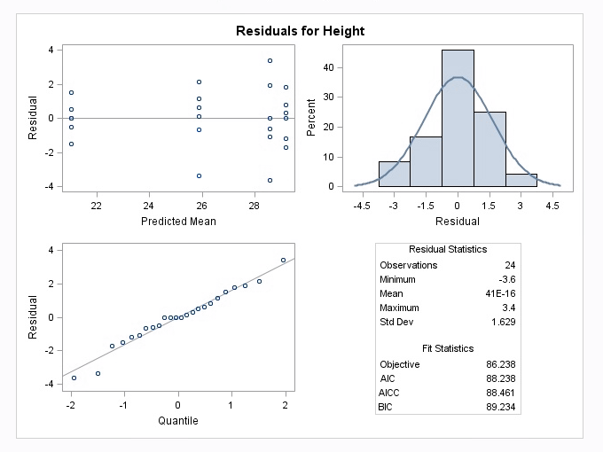
The output below titled ‘Type 3 Analysis of Variance’ is similar to the ANOVA table we are already familiar with. Note that it does not include the Total SS, however it can be computed as the sum of all SS values in the table.
Type 3 Analysis of Variance | ||||||||
|---|---|---|---|---|---|---|---|---|
Sources | DF | Sum of Squares | Mean Square | Expected Mean Square | Error Term | Error DF | F Value | Pr > F |
fert | 3 | 251.440000 | 83.813333 | Var(Residual)+Q(fert) | MS(Residual) | 20 | 27.46 | <.0001 |
Residual | 20 | 61.033333 | 3.051667 | Var(Residual) | ||||
Covariance Parameter Estimates | |
|---|---|
Cov Parm | Estimate |
Residual | 3.0517 |
Fit Statistics | |
|---|---|
-2 Res Log Likelihood | 86.2 |
AIC (smaller is better) | 88.2 |
AICC (smaller is better) | 88.5 |
BIC (smaller is better) | 89.2 |
Type 3 Tests of Fixed Effects | ||||
|---|---|---|---|---|
Effect | Num DF | Den DF | F Value | Pr > F |
fert | 3 | 20 | 27.46 | <.0001 |
The output above titled “Type 3 Tests of Fixed Effects” will display the \(F_{\text{calculated}}\) and p-value for the test of any variables that are specified in the model statement. Additional information can also be requested. For example, the method = type 3 option will include the Expected Mean Squares (EMS) for each source, which will be useful in Lesson 6.
The mixed procedure also produces the following diagnostic plots:

The following display is a result of the LSmeans statement in the PLM procedure which was included in the programming code.
fert Least Squares Means | ||||||||
|---|---|---|---|---|---|---|---|---|
fert | Estimate | Standard Error | DF | t Value | Pr > |t| | Alpha | Lower | Upper |
Control | 21.0000 | 0.7132 | 20 | 29.45 | <.0001 | 0.05 | 19.5124 | 22.4876 |
F1 | 28.6000 | 0.7132 | 20 | 40.10 | <.0001 | 0.05 | 27.1124 | 30.0876 |
F2 | 25.8667 | 0.7132 | 20 | 36.27 | <.0001 | 0.05 | 24.3790 | 27.3543 |
F3 | 29.2000 | 0.7132 | 20 | 40.94 | <.001 | 0.05 | 27.7124 | 30.6876 |
In the "Least Squares Means" table above, note that the t-value and Pr >|t| are testing null hypotheses that each group mean= 0. (These tests usually do not provide any useful information). The Lower and Upper values are the 95% confidence limits for the group means. Note also that the least square means are the same as the original arithmetic means that were generated in the Summary procedure in Section 3.3 because all 4 groups have the same sample sizes. With unequal sample sizes or if there is a covariate present, the least square means can differ from the original sample means.
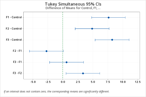
Next, the Plot= mean plot option in the LSmeans statement yields a mean plot and also a diffogram, shown below. The confidence intervals in the mean plot are commonly used to identify the significantly different treatment levels or groups. If two confidence intervals do not overlap, then the difference between the two associated means is statistically significant, which is a valid conclusion. However, if they overlap, it may be the case that the difference might still be significant. Consequently, conclusions made based on the visual inspection of the mean plot may not match with those arrived at using the table of ‘Difference of Least Square Means’, another output of the Tukey procedure, and is displayed below.
Notice this output is different from the previous table because it displays the results of each pairwise comparison. For example, the first row shows the comparison between the control and F1. The interpretation of these results is similar to any other confidence interval for the difference in two means - if the confidence interval does not contain zero, then the difference between the two associated means is statistically significant.
Differences of fert Least Squares Means Adjustment for Multiple Comparisons: Tukey | ||||||||||||
|---|---|---|---|---|---|---|---|---|---|---|---|---|
fert | _fert | Estimate | Standard Error | DF | t Value | Pr > |t| | Adj P | Alpha | Lower | Upper | Adj Lower | Adj Upper |
Control | F1 | -7.6000 | 1.0086 | 20 | -7.54 | <.0001 | <.0001 | 0.05 | -9.7038 | -5.4962 | -10.4229 | -4.7771 |
Control | F2 | -4.8667 | 1.0086 | 20 | -4.83 | 0.0001 | 0.0006 | 0.05 | -6.9705 | -2.7628 | -7.6896 | -2.0438 |
Control | F3 | -8.2000 | 1.0086 | 20 | -8.13 | <.0001 | <.0001 | 0.05 | -10.3038 | -6.0962 | -11.0229 | -5.3771 |
F1 | F2 | 2.7333 | 1.0086 | 20 | 2.71 | 0.0135 | 0.0599 | 0.05 | 0.6295 | 4.8372 | -0.08957 | 5.5562 |
F1 | F3 | -0.6000 | 1.0086 | 20 | -0.59 | 0.5586 | 0.9324 | 0.05 | -2.7038 | 1.5038 | -3.4229 | 2.2229 |
F2 | F3 | -3.3333 | 1.0086 | 20 | -3.30 | 0.0035 | .0171 | 0.05 | -5.4372 | -1.2295 | -6.1562 | -0.5104 |
This discrepancy between the mean plot and the ‘Difference of Least Square Means’ results occurs because the testing is done in terms of the difference of two means, using the standard error of the difference of the two-sample means, but the confidence intervals of the mean plot are computed for the individual means which are in terms of the standard error of individual sample means. Consistent results can be achieved by using the diffogram as discussed below or the confidence intervals displayed in the ‘difference in mean plot’ available in SAS 14, but not included here.
The diffogram has two useful features. It allows one to identify the significant mean pairs and also gives estimates of the individual means. The diagonal line shown in the diffogram is used as a reference line. Each group (or factor level) is marked on the horizontal and vertical axes and has vertical and horizontal reference lines with their intersection point falling on the diagonal reference line. The x or the y coordinates of this intersection point which are equal is the sample mean of that group. For example, the sample mean for the Control group is about 21, which matches with the estimate provided in the ‘Least Squares Means’ table displayed above. Furthermore, each slanted line represents a mean pair. Start with any group label from the horizontal axis and run your cursor up along the associated vertical line until it meets a slanted line, and then go across the intersecting horizontal line to identify the other group (or factor level). For example, the lowermost solid line (colored blue) represents the Control and F2. As stated at the bottom of the chart, the solid (or blue) lines indicate significant pairs, and the broken (or red) lines correspond to the non-significant pairs. Furthermore, a line corresponding to a nonsignificant pair will cross the diagonal reference line.
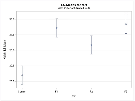
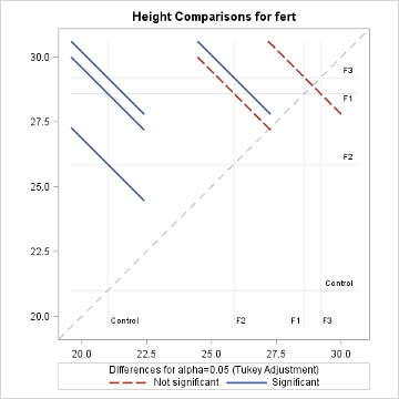
The non-overlapping confidence intervals in the mean plot above indicate that the average plant height due to control is significantly different from those of the other 3 fertilizer levels and that the F2 fertilizer type yields a statistically different average plant height from F3. The diffogram also delivers the same conclusions and so, in this example, conclusions are not contradictory. In general, the diffogram always provides the same conclusions as derived from the confidence intervals of difference of least-square means shown in the ‘Difference of Least Square Means’ table, but the conclusions based on the mean plot may differ.
There are two contrasts of interest: contrast to compare the control and F3 with F1 and F2 (i.e. \(\mu_{control}-\mu_{F_1}-\mu_{F_2}+\mu_{F_3}\)) and the contrast to compare control and F2 with F1 (i.e. \(\mu_{control}-2\mu_{F_1}+\mu_{F_2}\)). Since we are testing for two contrasts, we should adjust for multiple comparisons. We use Bonferroni adjustment. In SAS, we can use the estimate command under proc plm to make these computations.
In general, the estimate command estimates linear combinations of model parameters and performs t-tests on them. Contrasts are linear combinations that satisfy a special condition. We will discuss the model parameters in Lesson 4.
Estimates | ||||||
|---|---|---|---|---|---|---|
Label | Estimate | Standard Error | DF | t Value | Pr > |t| | Adj P |
Compare control + F3 with F1 and F2 | -4.2667 | 1.4263 | 20 | -2.99 | 0.0072 | 0.0144 |
Compare control + F2 with F1 | -10.3333 | 1.7469 | 20 | -5.92 | <.0001 | <.0001 |
SAS returns both unadjusted and adjusted p-values. Suppose we wanted to make the comparisons at 1% level. If we ignored the multiple comparisons (i.e. using unadjusted p-values), the both comparisons are statistically significant. However, if we consider the adjusted p-values, we will fail to reject the hypothesis corresponding to the first contrast at the 1% level.
3.6 - Greenhouse Example in Minitab & R
3.6 - Greenhouse Example in Minitab & R
One-Way ANOVA
- Step 1: Import the data
The data (Lesson1 Data) can be copied and pasted from a word processor into a worksheet in Minitab:
- Step 2: Run the ANOVA
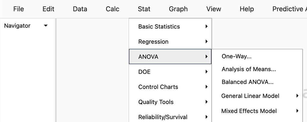
To run the ANOVA, we use the sequence of tool-bar tabs: Stat > ANOVA > One-way…
You then get the pop-up box seen below. Be sure to select from the drop-down in the upper right 'Response data are in a separate column for each factor level':
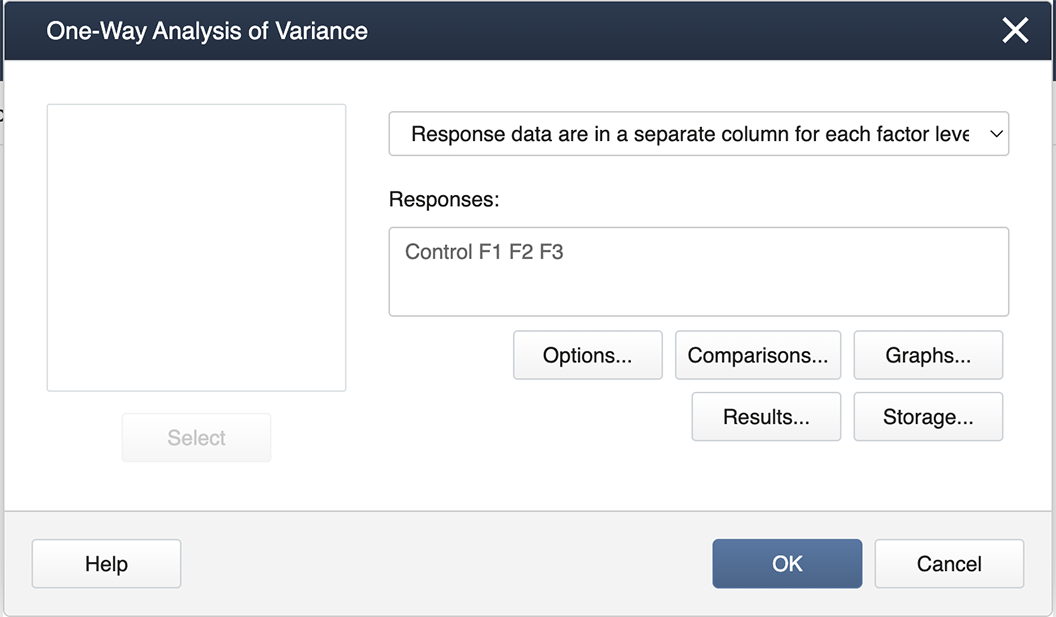
Then we double-click from the left-hand list of factor levels to the input box labeled ‘Responses’, and then click on the box labeled Comparisons.
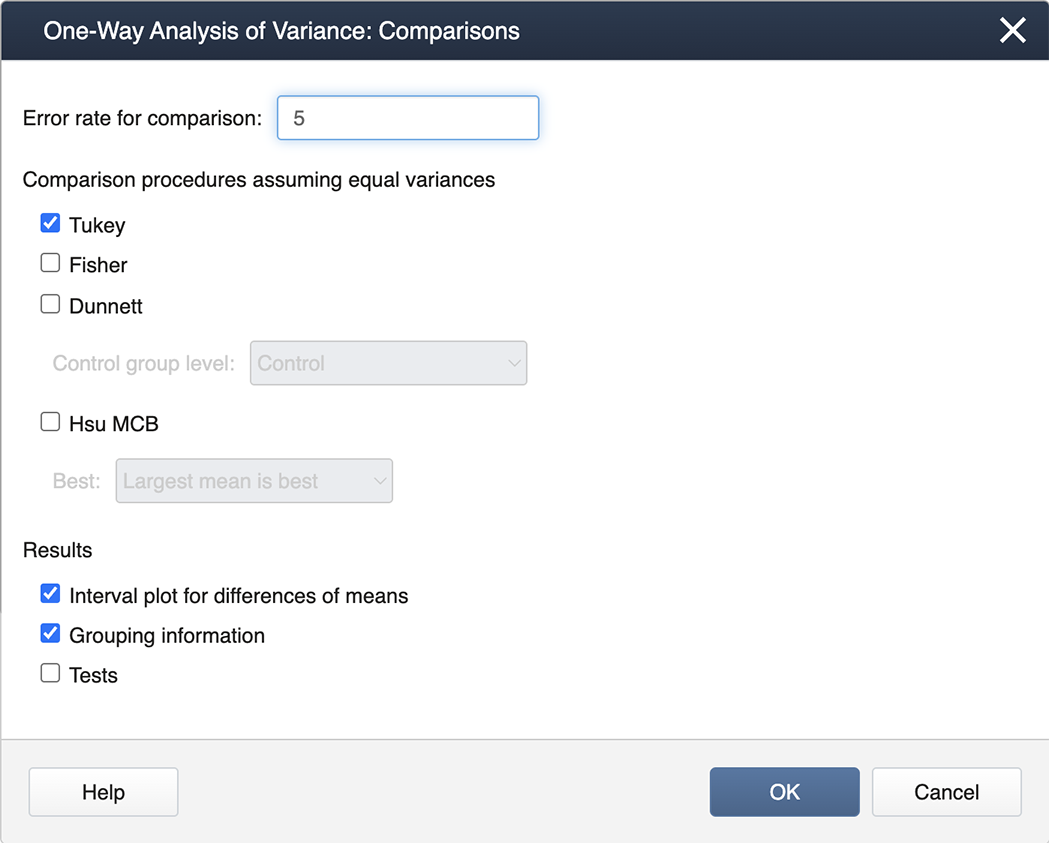
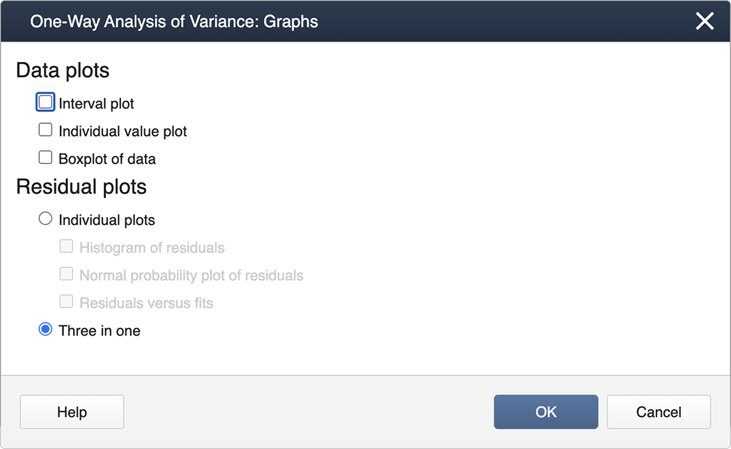
We check the box for Tukey and then exit by clicking on OK . To generate the Diagnostics, we then click on the box for Graphs and select the "Three in one" option:
You can now ‘back out' by clicking on OK in each nested panel.
- Step 3: Results
Now in the Session Window, we see the ANOVA table along with the results of the Tukey Mean Comparison:
One-Way ANOVA: Control, F1, F2, F3
Method
Null Hypothesis: All means are equal
Alternative Hypothesis: Not all means are equal
Significance Level: \(\alpha=0.05\)
Equal variances were assumed for the analysis.
Factor Information
Factor Levels Values Factor 4 Control, F1, F2, F3 Analysis of Variance
Source DF Adj SS Adj MS F-Value P-Value Factor 3 251.44 83.813 27.46 0.000 Error 20 61.03 3.052 Total 23 312.47 (Extracted from the output that follows from above.)
Grouping Information Using Tukey Method
N Mean Grouping F3 6 29.200 A F1 6 28.600 A B F2 6 25.867 B Control 6 21.000 C Means that do not share a letter are significantly different.
As can be seen, Minitab provides a difference in means plot, which can be conveniently used to identify the significantly different means by following the rule: if the confidence interval does not cross the vertical zero line, then the difference between the two associated means is statistically significant.
The diagnostic (residual) plots, as we asked for them, are in one figure:
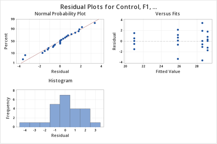
Note that the Normal Probability plot is reversed (i.e, the axes are switched) compared to the SAS output. Assessing straight line adherence is the same, and the residual analysis provided is comparable to SAS output.
First, load the greenhouse data in R. Note the greenhouse data are in separate columns.
setwd("~/path-to-folder/")
greenhouse_data<-read.table("greenhouse_data.txt",header=T)
We put our data in a stacked format; the first column has the response variable (height) and the second column has the treatment levels (fert). We can then attach the stacked dataset.
my_data<-stack(greenhouse_data)
colnames(my_data)<-c("height","fert")
attach(my_data)
To calculate the overall mean, standard deviation, and standard error we can use the following commands:
overall_mean<-mean(height)
overall_mean
[1] 26.16667
overall_sd<-sd(height)
overall_sd
[1] 3.685892
overall_standard_error<-overall_sd/sqrt(length(height))
overall_standard_error
[1] 0.7523795
Next, we calculate the mean, standard deviation, and standard error for each group.
aggregate(height~fert, FUN=mean)
     fert   height
1 Control 21.00000
2      F1 28.60000
3      F2 25.86667
4      F3 29.20000
aggregate(height~fert, FUN=sd)
     fert   height
1 Control 1.000000
2      F1 2.437212
3      F2 1.899123
4      F3 1.288410
std_error_fn = function(x){ sd(x)/sqrt(length(x)) }
aggregate(height~fert, FUN=std_error_fn)
     fert    height
1 Control 0.4082483
2      F1 0.9949874
3      F2 0.7753136
4      F3 0.5259911
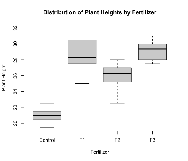
Next, we produce a boxplot.
boxplot(height~fert,xlab="Fertilizer",ylab="Plant Height",
         main="Distribution of Plant Heights by Fertilizer")
Next, we run the ANOVA model. The most commonly used function for ANOVA in R is aov. However, this function implements a sequential sum of squares (Type 1). To implement Type 3 sum of squares, we utilize the Anova function within the car package. Type 3 hypotheses are only used with effects coding for categorical variables (which we will learn more about in later lessons). Therefore before we obtain the ANOVA table, we must change the coding options to contr.sum, i.e. effect coding.
options(contrasts=c("contr.sum","contr.poly"))

library(car)
lm1 = lm(height ~ fert, data=my_data)
aov3 = Anova(lm1, type=3)
aov3
Anova Table (Type III tests)

Response: height
             Sum Sq Df  F value    Pr(>F)
(Intercept) 16432.7  1 5384.817 < 2.2e-16 ***
fert          251.4  3   27.465 2.712e-07 ***
Residuals      61.0 20
---
Signif. codes:  0 ‘***’ 0.001 ‘**’ 0.01 ‘*’ 0.05 ‘.’ 0.1 ‘ ’ 1
We can see the sum of squares in the first column, the degrees of freedom in the second column, the F-test statistic in the third column, and finally, we can see the p-value in the fourth column.
Note the output doesn't give the SSTotal. To find it, use the identity \(SSTotal=SSTreatment+SSResidual=251.44+61.03=312.47\). Similarly for the df associated with \(SSTotal\), we can add the df of \(SSTreatment\) and \(SSResidual\).
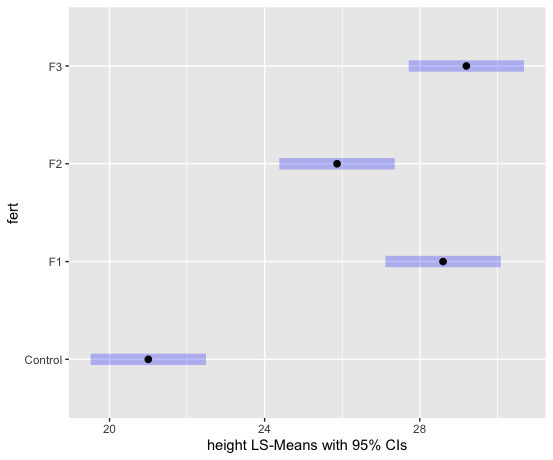
We can examine the LS means interval plot using the emmeans function (from the emmeans package) applied to the output of the aov function.
aov1 = aov(lm1) # equivalent to aov1 = aov(height ~ fert)
library(emmeans)
lsmeans = emmeans(aov1, ~fert)
plot(lsmeans, xlab="height LS-Means with 95% CIs")
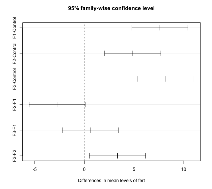
To obtain the Tukey pairwise comparisons of means with a 95% family-wise confidence level we use the following commands:
tpairs = TukeyHSD(aov1)
tpairs
plot(tpairs)
  Tukey multiple comparisons of means
    95% family-wise confidence level

Fit: aov(formula = lm1)

$fert
                diff        lwr         upr     p adj
F1-Control  7.600000  4.7770648 10.42293521 0.0000016
F2-Control  4.866667  2.0437315  7.68960188 0.0005509
F3-Control  8.200000  5.3770648 11.02293521 0.0000005
F2-F1      -2.733333 -5.5562685  0.08960188 0.0598655
F3-F1       0.600000 -2.2229352  3.42293521 0.9324380
F3-F2       3.333333  0.5103981  6.15626854 0.0171033
Alternatively, the emmeans package can be used as follows (output not shown):
lsmeans = emmeans(aov1, ~fert)
tpairs2 = pairs(lsmeans,adjust="Tukey")
tpairs2
plot(tpairs2)
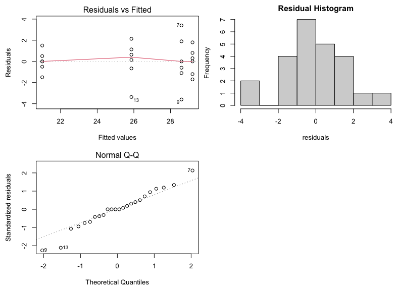
Finally, we can produce diagnostic (residual) plots as follows:
par(mfcol=c(2,2),mar=c(4.5,4.5,2,0)) # produces plots in one figure
plot(aov1,1)
plot(aov1,2)
hist(aov1$residuals,main="Residual Histogram",xlab="residuals")
3.7 - Power Analysis
3.7 - Power AnalysisAfter completing a statistical test, conclusions are drawn about the null hypothesis. In cases where the null hypothesis is not rejected, a researcher may still feel that the treatment did have an effect. Let's say that three weight loss treatments are conducted. At the end of the study, the researcher analyzes the data and finds there are no differences among the treatments. The researcher believes that there really are differences. While you might think this is just wishful thinking on the part of the researcher, there MAY be a statistical reason for the lack of significant findings.
At this point, the researcher can run a power analysis. More specifically, this would be a retrospective power analysis as it is done after the experiment was completed. Recall from your introductory text or course, that power is the ability to reject the null when the null is really false. The factors that impact power are sample size (larger samples lead to more power), the effect size (treatments that result in larger differences between groups are more readily found), the variability of the experiment, and the significance of the type 1 error.
As a note, the most common type of power analysis are those that calculate needed sample sizes for experimental designs. These analyses take advantage of pilot data or previous research. When power analysis is done ahead of time it is a prospective power analysis.
Typically, we want power to be at 80%. Again, power represents our ability to reject the null when it is false, so a power of 80% means that 80% of the time our test identifies a difference in at least one of the means correctly. The converse of this is that 20% of the time we risk not rejecting the null when we really should be.
Using our greenhouse example, we can run a retrospective power analysis. (Just a reminder we typically don't do this unless we have some reason to suspect the power of our test was very low.) This is one analysis where Minitab is much easier and still just as accurate as SAS, so we will use Minitab to illustrate this simple power analysis in detail and follow up the analysis with SAS.
Power Analysis
In Minitab select STAT > Power and Sample Size > One-Way ANOVA
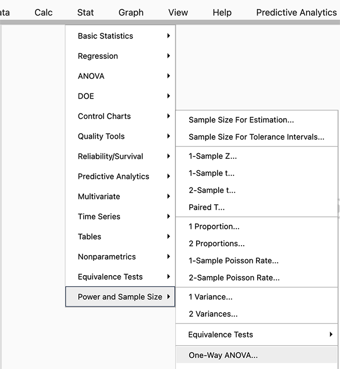
Since we have a one-way ANOVA we select this test (you can see there are power analyses for many different tests and SAS will allow even more complicated options).
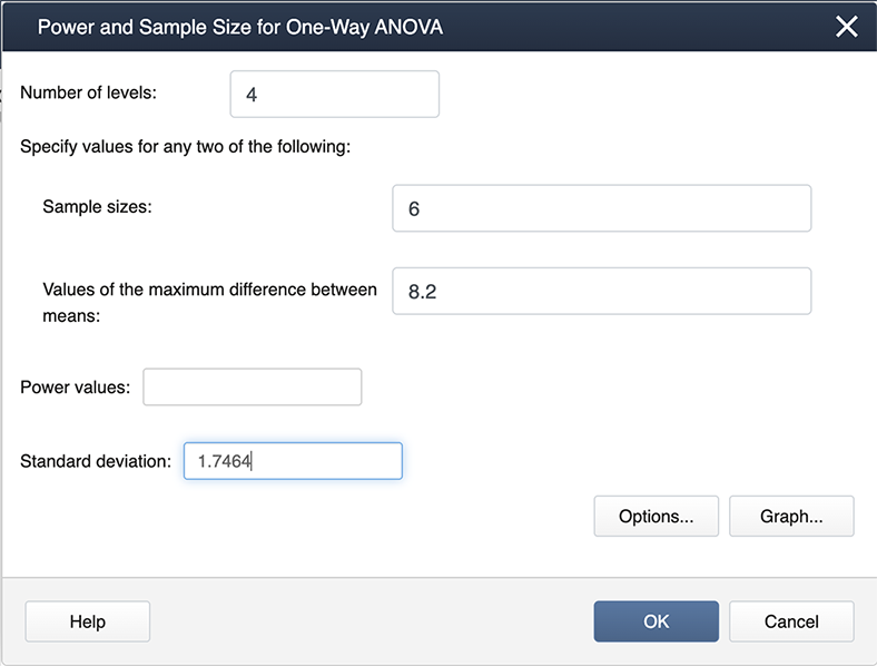
When you look at our filled-in dialogue box you notice we have not entered a value for power. This is because Minitab will calculate whichever box you leave blank (so if we needed sample size we would leave sample size blank and fill in a value for power). From our example, we know the number of levels is 4 because we have four treatments. We have six observations for each treatment so the sample size is 6. The value for the maximum difference in the means is 8.2 (we simply subtracted the smallest mean from the largest mean, and the standard deviation is 1.747. Where did this come from? The MSE, available from the ANOVA table, is about 3, and hence the standard deviation =sqrt(3)=1.747).
After we click OK we get the following output:
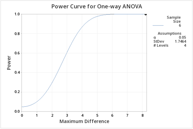
If you follow this graph you see that power is on the y-axis and the power for the specific setting is indicated by a black dot. It is hard to find, but if you look carefully the black dot corresponds to a power of 1. In practice, this is very unusual, but can be easily explained given that the greenhouse data was constructed to show differences.
We can ask the question, what about differences among the treatment groups, not considering the control? All we need to do is modify some of the input in Minitab.
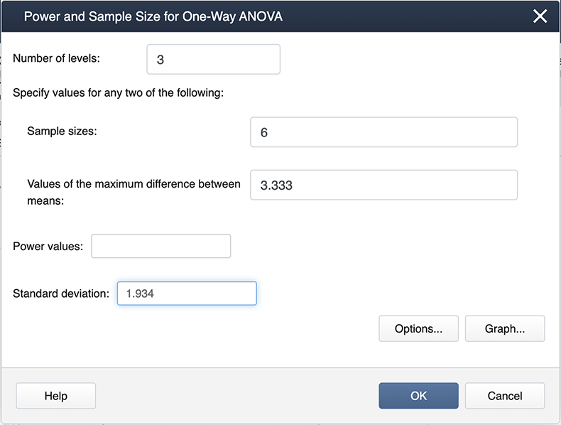
Note the differences here as in the previous screenshot. We now have 3 levels because we are only considering the three treatments. The maximum differences between the means and also the standard deviation are also different.
The output now is much easier to see:
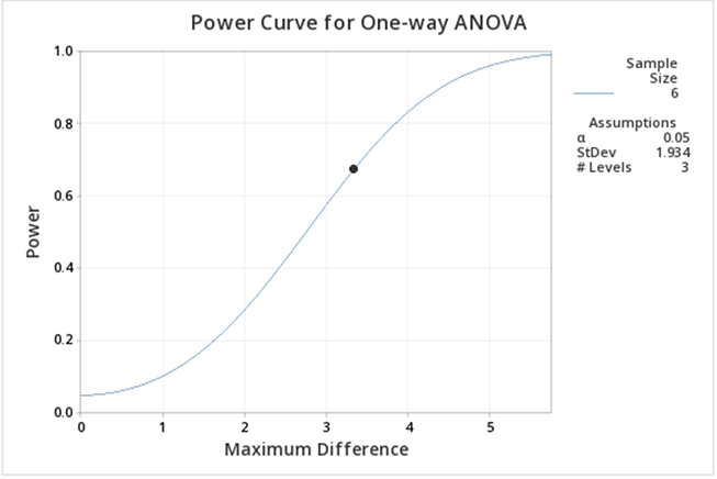
Here we can see the power is lower than when including the control. The main reason for this decrease is that the difference between the means is smaller.
You can experiment with the power function in Minitab to provide you with sample sizes, etc. for various powers. Below is some sample output when we ask for various power curves for various sample sizes, a kind of "what if" scenario.

Just as a reminder, power analyses are most often performed BEFORE an experiment is conducted, but occasionally, power analysis can provide some evidence as to why significant differences were not found.
Let us now consider running the power analysis in SAS. In our greenhouse example with 4 treatments (control, F1, F2, and F3) the estimated means were \(21, 28.6, 25.877, 29.2\) respectively. Using ANOVA the estimated standard deviation of errors was \(1.747\) (which is obtained by \(\sqrt{MSE} = \sqrt{3.0517}\). There are 6 replicates for each treatment. Using these values we could employ SAS POWER procedure to compute the power of our study retrospectively.
proc power;
onewayanova alpha=.05 test=overall
groupmeans=(21 28.6 25.87 29.2)
npergroup=6 stddev=1.747
power=.;
run;
| Fixed Scenario Elements | |
|---|---|
| Method | Exact |
| Alpha | 0.05 |
| Group Means | 21 28.6 25.87 29.2 |
| Standard Deviation | 1.747 |
| Sample Size per Group | 6 |
| Computed Power |
|---|
| Power |
| >.999 |
As with MINITAB, we see that the retrospective power analysis for our greenhouse example yields a power of 1. If we re-do the analysis ignoring the CONTROL treatment group, then we only have 3 treatment groups: F1, F2, and F3. The ANOVA with only these three treatments yields an MSE of \(3.735556\). Therefore the estimated standard deviation of errors would be \(1.933\). We will have a power of 0.731 in this modified scenario as shown in the below output.
| Fixed Scenario Elements | |
|---|---|
| Method | Exact |
| Alpha | 0.05 |
| Group Means | 28.6 25.87 29.2 |
| Standard Deviation | 1.933 |
| Sample Size per Group | 6 |
| Computed Power |
|---|
| Power |
| 0.731 |
Suppose we ask the question: how many replicates we would need to obtain at least 80% power in greenhouse example with the same group means but with different variability in data (i.e. standard deviations should be different)? We can use SAS POWER to answer this question. For example, using the estimated standard deviation 1.747, we can calculate the number of needed replicates as follows.
proc power;
onewayanova alpha=.05 test=overall
groupmeans=(21 28.6 25.87 29.2)
npergroup=. stddev=1.747
power=.8;
run;
| Fixed Scenario Elements | |
|---|---|
| Method | Exact |
| Alpha | 0.05 |
| Group Means | 21 28.6 25.87 29.2 |
| Standard Deviation | 1.747 |
| Nominal Power | 0.8 |
| Computed N per Group | |
|---|---|
| Actual Power | N per Group |
| 0.991 | 3 |
We can see that with a standard deviation of 1.747, if we have only 3 replicates in each of the four treatments, we can detect the differences in greenhouse example means with more than 80% power. However, as data get noisier (i.e. as standard deviation increases) we will need more replicates to achieve 80% power in the same example.
Continuing the R example found in the previous section, we can obtain the power analysis of the greenhouse example. First, reproduce the ANOVA table (defined in the previous section).
aov3 # equivalent to print(aov3)
Anova Table (Type III tests)

Response: height
             Sum Sq Df  F value    Pr(>F)
(Intercept) 16432.7  1 5384.817 < 2.2e-16 ***
fert          251.4  3   27.465 2.712e-07 ***
Residuals      61.0 20
---
Signif. codes:  0 ‘***’ 0.001 ‘**’ 0.01 ‘*’ 0.05 ‘.’ 0.1 ‘ ’ 1
The between and within-group variances are needed to conduct the power analysis. The within-group variance can be estimated using the MSE, calculated from the SSE and df outputs of the table. More specifically:
within.var = aov3$`Sum Sq`[3]/aov3$Df[3]
within.var
[1] 3.051667
The between-group variance can be calculated from the group means. These were calculated in the previous section using the emmeans function. We reproduce the output here:
lsmeans # equivalent to print(lsmeans)
 fert    emmean    SE df lower.CL upper.CL
 Control   21.0 0.713 20     19.5     22.5
 F1        28.6 0.713 20     27.1     30.1
 F2        25.9 0.713 20     24.4     27.4
 F3        29.2 0.713 20     27.7     30.7

Confidence level used: 0.95
Thus we calculate the between-group variance:
groupmeans = summary(lsmeans)$emmean
between.var = var(groupmeans)
between.var
[1] 13.96889
Inputting also the number of groups (4) and the number of replicates within each group (n=6), we use the following command to obtain the power analysis:
power.anova.test(groups=4,n=6,between.var=between.var,within.var=within.var)
     Balanced one-way analysis of variance power calculation

         groups = 4
              n = 6
    between.var = 13.96889
     within.var = 3.051667
      sig.level = 0.05
          power = 1

NOTE: n is number in each group
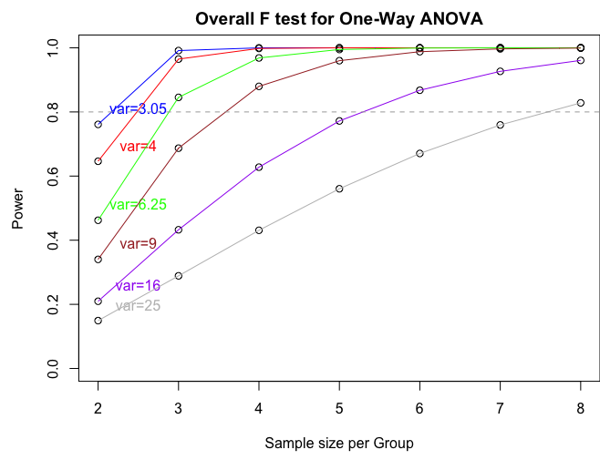
If we want to produce a power plot by increasing sample size and the variance (like the one produced by SAS) we can use the following commands:
n = seq(2,8,by=1)
p = power.anova.test(groups=4,n=n,between.var=between.var,within.var=within.var)
p1 = power.anova.test(groups=4,n=n,between.var=between.var,within.var=4)
p2 = power.anova.test(groups=4,n=n,between.var=between.var,within.var=6.25)
p3 = power.anova.test(groups=4,n=n,between.var=between.var,within.var=9)
p4 = power.anova.test(groups=4,n=n,between.var=between.var,within.var=16)
p5 = power.anova.test(groups=4,n=n,between.var=between.var,within.var=25)
par(mfcol=c(1,1),mar=c(4.5,4.5,2,0))
plot(n,p$power,ylab="Power",xlab="Sample size per Group",main="Overall F test for One-Way ANOVA", ylim=c(0,1))
lines(n,p$power, col = "blue")
text(2.5,p$power[1]+0.05,"var=3.05",col="blue")
points(n,p1$power)
lines(n,p1$power, col = "red")
text(2.5,p1$power[1]+0.05,"var=4",col="red")
points(n,p2$power)
lines(n,p2$power, col = "green")
text(2.5,p2$power[1]+0.05,"var=6.25",col="green")
points(n,p3$power)
lines(n,p3$power, col = "brown")
text(2.5,p3$power[1]+0.05,"var=9",col="brown")
points(n,p4$power)
lines(n,p4$power, col = "purple")
text(2.5,p4$power[1]+0.05,"var=16",col="purple")
points(n,p5$power)
lines(n,p5$power, col = "gray")
text(2.5,p5$power[1]+0.05,"var=25",col="gray")
abline(h=0.80,lty=2,col="dark gray")
3.8 - Try it!
3.8 - Try it!Exercise 1: Diet Study
The weight gain due to 4 different diets given to 24 calves is shown below.
| diet1 | diet2 | diet3 | diet4 |
|---|---|---|---|
| 12 | 18 | 10 | 19 |
| 10 | 19 | 12 | 20 |
| 13 | 18 | 13 | 18 |
| 11 | 18 | 16 | 19 |
| 12 | 19 | 14 | 18 |
| 09 | 19 | 13 | 19 |
- Write the appropriate null and alternative hypotheses to test if the weight gain differs significantly among the 4 diets.
\(H_0\colon\mu_1=\mu_2=\mu_3=\mu_4\) vs. \(H_a\colon\mu_i\ne\mu_j\) for some i,j = 1, 2, 3, 4, or not all means are equal
Note: Here, \(\mu_i, i= 1,2,3,4\) are the actual mean weight gains due to diet1, diet2, diet3, and diet4, respectively.
- Analyze the data and write your conclusion.
Using SAS...
data Lesson3_ex1;
input diet $ wt_gain;
datalines;
diet1 12
diet1 10
diet1 13
diet1 11
diet1 12
diet1 09
diet2 18
diet2 19
diet2 18
diet2 18
diet2 19
diet2 19
diet3 10
diet3 12
diet3 13
diet3 16
diet3 14
diet3 13
diet4 19
diet4 20
diet4 18
diet4 19
diet4 18
diet4 19
;
ods graphics on;
proc mixed data= Lesson3_ex1 plots=all; class diet;
model wt_gain = diet;
contrast 'Compare diet1 with diets 2,3,4 combined ' diet 3 -1  -1 -1;
store result1;
title 'ANOVA of Weight Gain Data';
run;
ods html style=statistical sge=on;
proc plm restore=result1;
lsmeans diet/ adjust=tukey plot=meanplot cl lines;
run;
The ANOVA results shown below indicate that the diet effect is significant with an F-value of 51.27 (p-value <.0001). This means that not all diets provide the same mean weight gain. The diffogram below indicates the significantly different pairs of diets identified by solid blue lines. The estimated mean weight gains from diets 1, 3, 2, and 4 are 11, 13, 18.1, and 19 units respectively. The diet pairs that have significantly different mean weight gains are (1,2), (1,4), (3,2), and (3,4).
Partial Output:
Type 3 Tests of Fixed Effects Effect Num DF Den DF F Value Pr > F diet 3 20 51.27 <.0001 diet LS-Means
diet Least Squares Means diet Estimate Standard Error DF t Value Pr > |t| Alpha Lower Upper diet1 11.1667 0.5413 20 20.63 <.0001 0.05 10.0374 12.2959 diet2 18.5000 0.5413 20 34.17 <.0001 0.05 17.3708 19.6292 diet3 13.0000 0.5413 20 24.01 <.0001 0.05 11.8708 14.1292 diet4 18.8333 0.5413 20 34.79 <.0001 0.05 17.7041 19.9626 Differences of diet Least Squares Means
Adjustment for Multiple Comparisons: Tukeydiet _diet Estimate Standard Error DF t Value Pr > |t| Adj P Alpha Lower Upper Adj Lower Adj Upper diet1 diet2 -7.3333 0.7656 20 -9.58 <.0001 <.0001 0.05 -8.9303 -5.7364 -9.4761 -5.1906 diet1 diet3 -1.8333 0.7656 20 -2.39 0.0265 0.1105 0.05 -3.4303 -0.2364 -3.9761 0.3094 diet1 diet4 -7.6667 0.7656 20 -10.01 <.0001 <.0001 0.05 -9.2636 -6.0697 -9.8094 -5.5239 diet2 diet3 5.5000 0.7656 20 7.18 <.0001 <.0001 0.05 3.9030 7.0970 3.3572 7.6428 diet2 diet4 -0.3333 0.7656 20 -0.44 0.6679 0.9716 0.05 -1.9303 1.2636 -2.4761 1.8094 diet3 diet4 -5.8333 0.7656 20 -7.62 <.0001 <.0001 0.05 -7.4303 -4.2364 -7.9761 -3.6906 

Exercise 2: Commuter Times

Above is a diffogram depicting the differences in daily commuter time (in hours) among regions of a metropolitan city. Answer the following.
- Name the regions included in the study.
SOUT, MIDW, NORT, and WEST
- How many red or blue lines are to be expected?
4 choose 2 = 6 red or blue lines
- Which pairs of regions have significantly different average commuter times?
(SOUT and NORT), (SOUT and WEST), (MIDW and NORT), and (MIDW and WEST) have significantly different mean commuter times.
- Write down the estimated mean daily commuter time for each region.
Region SOUT MIDW NORT WEST Estimated mean commuter time in hours 8.7 10.5 16 16.2
3.9 - Lesson 3 Summary
3.9 - Lesson 3 SummaryThe primary focus in this lesson was to establish the foundation for developing mathematical models in a one-way ANOVA setting. The effects model was discussed, along with the ANOVA model assumptions and diagnostics. The other focus was to illustrate how SAS/Minitab/R can be utilized to run an ANOVA model. Details on SAS/Minitab/R ANOVA basics together with guidance in the interpretation of the outputs were provided. Software-based diagnostics tests to detect the validity of model assumptions were also discussed together with the power analysis procedure which computes any one of the four quantities, sample size, power, effect size, and the significance level, given the other three.
The next lesson will be a continuation of this lesson. Three more different versions of ANOVA model equations that represent a single factor experiment will be discussed. These are known as Overall Mean, Cell Means, and Dummy Variable Regression models.