5: Multi-Factor ANOVA
5: Multi-Factor ANOVAOverview
Introduction to Multi-factor ANOVA
Researchers often identify more than one experimental factor of interest. In this situation one option is to set up separate, independent experiments in which a single treatment (or factor) is used in each experiment. Then the data from each experiment can be analyzed using the one-way ANOVA methods we learned about in previous lessons.
This approach might appear to have the advantage of a concentrated focus on a single treatment as well as simplicity of computations. However, there are several disadvantages.
- First, environmental factors or experimental material conditions may change during the process. This could distort the assessment of the relative importance of different treatments on the response variable.
- Second, it is inefficient. Setting up and running multiple separate experiments usually will involve more work and resources.
- Last, and probably the most important, this one-at-a-time approach does not allow the examination of how several treatments jointly impact the response.
ANOVA methodology can be extended to accommodate this multi-factor setting. Here is Dr. Rosenberger and Dr. Shumway talking about some of the things to look out for as you work your way through this lesson.
To put it into perspective, let’s take a look at the phrase ‘Experimental Design’, a term that you often hear. We are going to take this colloquial phrase and divide it into two formal components:
- The Treatment Design
- The Randomization Design
We will use the treatment design component to address the nature of the experimental factors under study and the randomization design component to address how treatments are assigned to experimental units. An experimental unit is defined to be that which receives a specific treatment level, or in a multi-factor setting, a specific treatment or factor combination. Note that the ANOVA model pertaining to a given study depends on both the treatment design and the randomization process.
The following figure illustrates the conceptual division between the treatment design and the randomization design. The terms that are in boldface type will be addressed in detail in this or future lessons.
Experimental Design
Treatment Design
How many factors are there?
How many levels of each factor are there?
If there is more than 1 factor, how are they related?
Crossed (Factorial): each level of factor occurs with all levels of other factors.
Nested: levels of a factor are unique to different levels of another factor.
Are factors fixed or random effects?
Are there continuous covariates? (Analysis of Covariance -ANCOVA)
Randomization Design
More in lessons 7, 8, 11, and 12!
Objectives
- Identify factorial, nested, and cross-nested treatment designs.
- Use main effects and interaction effects in factorial designs.
- Create nested designs and identify the nesting effects.
- Use statistical software to analyze data from different treatment designs via ANOVA and mean comparison procedures.
5.1 - Factorial or Crossed Treatment Design
5.1 - Factorial or Crossed Treatment DesignIn multi-factor experiments, combinations of factor levels are applied to experimental units. To illustrate this idea consider again the single-factor greenhouse experiment discussed in previous lessons. Suppose there is suspicion that the different fertilizer types may be more effective for certain species of plant. To accommodate this, the experiment can be extended to a multi-factor study by including plant species as an additional factor along with fertilizer type. This will allow for assessment as to whether or not the optimal height growth is perhaps attainable by a unique combination of fertilizer type and plant species. A treatment design that enables analysis of treatment combinations is a factorial design. Within this design, responses are observed at each level of all combinations of the factors. In this setting the factors are said to be "crossed"; thus the design is also sometimes referred to as a crossed design.
A factorial design with \(t\) factors can be defined using the notation “\(l_1 \times l_2 \times ... \times l_t\)”, where \(l_i\) is the number of levels in the \(i^{th}\) factor for \(i=1,2,...,t\). For example, a factorial design with 2 factors, A and B, where A has 4 levels and B has 3 levels, would be a \(4 \times 3\) factorial design.
One complete replication of a factorial design with \(t\) factors requires \(l_1 \times l_2 \times ... \times l_t\) experimental units and this quantity is called the replicate size. If \(r\) is the number of complete replicates, then the total number of observations \(N\) is equal to \(r \times (l_1 \times l_2 \times... \times l_t)\). It is easy to see that with the addition of more and more crossed factors, the replicate size will increase rapidly and design modifications may have to be made to make the experiment more manageable (discussed more in later lessons).
In a factorial experiment it is important to differentiate between the lone (or main) effects of a factor on the response and the combined effects of a group of factors on the response. The main effect of factor A is the effect of A on the response ignoring the effect of all other factors. The main effect of a given factor is equivalent to the factor effect associated with the single-factor experiment using only that particular factor. The combined effect of a specific combination of \(t\) different factors is called the interaction effect (more details later). Typically, the interaction effect of most interest is the two-way interaction effect between only two of the \(t\) possible factors. Two-way interactions are typically denoted by the product of the two letters assigned to the two factors. For example, in a factorial design with 3 factors A, B, C, the two-way interaction effects are denoted \(A\times B\), \(A\times C\), and \(B\times C\) (or just \(AB\), \(AC\), and \(BC\)). Likewise, the three-way interaction effect of these 3 factors is denoted by \(A\times B\times C\).
Let us now examine how the degrees of freedom (df) values of a single-factor ANOVA can be extended to the ANOVA of a two-factor factorial design. Note that the interaction effects are additional terms that need to be included in a multi-factor ANOVA, but the ANOVA rules studied in Lesson 2 for single-factor situations still apply for the main effect of each factor. If the two factors of the design are denoted by A and B with \(a\) and \(b\) as their number of levels respectively, then the df values of the two main effects are \((a-1)\) and \((b-1).\) The df value for the two-way interaction effect is \((a-1)(b-1)\), the product of df values for A and B. The ANOVA table below gives the layout of the df values for a \(2\times 2\) factorial design with 5 complete replications. Note that in this experiment, \(r\) equals 5, and \(N\) is equal to 20.
| Source | d.f. |
|---|---|
| Factor A | (a - 1) = 1 |
| Factor B | (b - 1) = 1 |
| Factor A × Factor B | (a - 1)(b - 1) = 1 |
| Error | 19 - 3 = 16 |
| Total | \(N - 1 = (r a b) - 1 = 19\) |
If in the single-factor model,
\(Y_{ij}=\mu+\tau_i+\epsilon_{ij}\)
\(\tau_i\) is effectively replaced with \(\alpha_i+\beta_j+(\alpha\beta)_{ij}\), then the resulting equation shown below will represent the model equation of a two-factor factorial design.
\(Y_{ijk}=\mu+ \alpha_i+\beta_j+(\alpha\beta)_{ij} +\epsilon_{ijk}\)
where \( \alpha_i\) is the main effect of factor A, \(\beta_j\) is the main effect of factor B, and \((\alpha\beta)_{ij}\) is the interaction effect \((i=1,2,...a, j=1,2,...,b, k=1,2,...,r)\).
This reflects the following partitioning of treatment deviations from the grand mean:
\(\underbrace{\bar{Y}_{ij.}-\bar{Y}_{...}}_{\substack{\text{Deviation of estimated treatment mean} \\ \text{ around overall mean}}} = \underbrace{\bar{Y}_{i..}-\bar{Y}_{...}}_{\text{A main effect}} + \underbrace{\bar{Y}_{.j.}-\bar{Y}_{...}}_{\text{B main effect}} +\underbrace{\bar{Y}_{ij.}-\bar{Y}_{i..}-\bar{Y}_{.j.}+\bar{Y}_{...}}_{\text{AB interaction effect}}\)
The main effects for Factor A and Factor B are straightforward to interpret, but what exactly is an interaction effect? Delving in further, an interaction can be defined as the difference in the response to one factor at various levels of another factor. Notice that \((\alpha\beta)_{ij}\), the interaction term in the model, is multiplicative, and as a result may have a large impact on the response variable. Interactions go by different names in various fields. In medicine for example, physicians commonly ask about current medications before prescribing a new medication. They do this out of a concern for interaction effects of either interference (a canceling effect) or synergism (a compounding effect).
Graphically, in a two factor factorial design with each factor having 2 levels, the interaction can be represented by two non-parallel lines connecting means (adapted from Zar, H. Biostatistical Analysis, 5th Ed., 1999). This is because the interaction reflects the difference in response between the two different levels of one factor for both levels of the other factor. So, if there is no interaction, then this difference in response will be the same, which will result in two parallel lines graphically. Examples of several interaction plots can be seen below. Notice, parallel lines are a consistent feature in all settings with no interaction, whereas in plots depicting interaction, the lines do cross (or would cross if the lines kept going).
In graph 1 there is no effect of Factor A, a small effect of Factor B (and if there were no effect of Factor B the two lines would coincide), and no interaction between Factor A and Factor B.
Graph 2 shows a large effect of Factor A small effect of Factor B, and no interaction.
No effect of Factor A, larger effect of Factor B, and no interaction in graph 3.
In graph 4 there is a large effect of Factor A, a large effect of Factor B , and no interaction.
This is evidence of no effect of Factor A, no effect of Factor B but an interaction between A and B in graph 5.
Large effect of Factor A, no effect of Factor B with a slight interaction in graph 6.
No effect of Factor A, a large effect of Factor B, with a very large interaction in graph 7.
A small effect of Factor A, a large effect of Factor B with a large interaction in graph 8.
In the presence of multiple factors with their interactions multiple hypotheses can be tested. For a two-factor factorial design, those hypotheses are the following.
Main effect of Factor A:
\(H_0 \colon \alpha_{1} =\alpha_{2}= \cdots =\alpha_{a} = 0\)
\(H_A \colon \text{ not all }\alpha_{i} \text{ are equal to zero}\)
Main effect of Factor B:
\(H_0 \colon \beta_{1} =\beta_{2}= \cdots =\beta_{b} = 0\)
\(H_A \colon \text{ not all }\beta_{j} \text{ are equal to zero}\)
A × B interaction effect:
\(H_0 \colon \text{ there is no interaction }\)
\(H_A \colon \text{ an interaction exists }\)
When testing these hypotheses, it is important to test for the significance of the interaction effect first. If the interaction is significant, the main effects are of no consequence - rather the differences among different factor level combinations should be looked into. The greenhouse example, extended to include a second (crossed) factor will illustrate the steps.
5.2 - Two-Factorial: Greenhouse Example
5.2 - Two-Factorial: Greenhouse ExampleLet us return to the greenhouse example with plant species as a predictive factor in addition to fertilizer type. The study then becomes a \(2 \times 4\) factorial as 2 types of plant species and 4 types of fertilizers are investigated. The total number of experimental units (plants) that are needed now is 48, as \(r=6\) and there are 8 plant species and fertilizer type combinations.
The data might look like this:
Control | Fertilizer Treatment | ||||
|---|---|---|---|---|---|
F1 | F2 | F3 | |||
Species | A | 21.0 | 32.0 | 22.5 | 28.0 |
19.5 | 30.5 | 26.0 | 27.5 | ||
22.5 | 25.0 | 28.0 | 31.0 | ||
21.5 | 27.5 | 27.0 | 29.5 | ||
20.5 | 28.0 | 26.5 | 30.0 | ||
21.0 | 28.6 | 25.2 | 29.2 | ||
B | 23.7 | 30.1 | 30.6 | 36.1 | |
23.8 | 28.9 | 31.1 | 36.6 | ||
23.7 | 34.4 | 34.9 | 37.1 | ||
22.8 | 32.7 | 30.1 | 36.8 | ||
22.8 | 32.7 | 30.1 | 36.8 | ||
24.4 | 32.7 | 25.5 | 37.1 | ||
The ANOVA table would now be constructed as follows:
Source | df | SS | MS | F |
Fertilizer | (4 -1) = 3 | |||
|---|---|---|---|---|
Species | (2 -1) = 1 | |||
Fertilizer × Species | (2 -1)(4 -1) = 3 | |||
Error | 47 - 7 = 40 | |||
Total | N - 1 = 47 |
The data presented in the table above are in unstacked format. One needs to convert this into a stacked format when attempting to use statistical software. The SAS code is as follows.
data greenhouse_2way;
input fert $ species $ height;
datalines;
control SppA 21.0
control SppA 19.5
control SppA 22.5
control SppA 21.5
control SppA 20.5
control SppA 21.0
control SppB 23.7
control SppB 23.8
control SppB 23.8
control SppB 23.7
control SppB 22.8
control SppB 24.4
f1 SppA 32.0
f1 SppA 30.5
f1 SppA 25.0
f1 SppA 27.5
f1 SppA 28.0
f1 SppA 28.6
f1 SppB 30.1
f1 SppB 28.9
f1 SppB 30.9
f1 SppB 34.4
f1 SppB 32.7
f1 SppB 32.7
f2 SppA 22.5
f2 SppA 26.0
f2 SppA 28.0
f2 SppA 27.0
f2 SppA 26.5
f2 SppA 25.2
f2 SppB 30.6
f2 SppB 31.1
f2 SppB 28.1
f2 SppB 34.9
f2 SppB 30.1
f2 SppB 25.5
f3 SppA 28.0
f3 SppA 27.5
f3 SppA 31.0
f3 SppA 29.5
f3 SppA 30.0
f3 SppA 29.2
f3 SppB 36.1
f3 SppB 36.6
f3 SppB 38.7
f3 SppB 37.1
f3 SppB 36.8
f3 SppB 37.1
;
run;
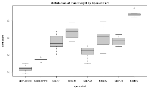
/*The code to generate the boxplot
for distribution of height by species organized by fertilizer
in Figure 5.1*/
proc sort data=greenhouse_2way; by fert species;
proc boxplot data=greenhouse_2way;
plot height*species (fert);
run;
As a preliminary step in Exploratory Data Analysis (EDA), a side-by-side boxplot display of height vs. species organized by fertilizer type would be an ideal graphic. The plot below illustrates, the height differences between species are variable among fertilizer types; see for example the difference in height between SppA and SppB for Control is much less than that for F3. This indicates that fert*species could be a significant interaction prompting a factorial model with interaction.
To run the two-factor factorial model with interaction in SAS proc mixed, we can use:
/*Runs the two-factor factorial model with interaction*/
                proc mixed data=greenhouse_2way method=type3;
                class fert species;
                model height = fert species fert*species;
                store out2way;
                run;
Similar to when running the single factor ANOVA, the name of the dataset is specified in the proc mixed statement as well as the method=type3 option that specifies the way the F-test is calculated. The categorical factors fert and species are included in the class statement. The terms (or effects) in the model statement are consistent with the source effects in the layout of the "theoretical" ANOVA table illustrated in 5.1. Finally, the store command stores the elements necessary for the generation of the LS-means interval plot.
Recall the two ANOVA rules, applicable to any model: (1) the df values add up to total df and (2) the sums of squares add up to total sums of squares. As seen by the output below, the df values and sums of squares follow these rules. (It is easy to confirm that the total sum of squares = 1168.7325, by the 2nd ANOVA rule.)
Type 3 Analysis of Variance | ||||||||
|---|---|---|---|---|---|---|---|---|
Source | DF | Sum of Squares | Mean Square | Expected Mean Square | Error Term | Error DF | F Value | Pr > F |
fert | 3 | 745.437500 | 248.479167 | Var(Residual)+Q(fert,fert*species) | MS(Residual) | 40 | 73.10 | <.0001 |
species | 1 | 236.740833 | 236.740833 | Var(Residual)+Q(species,fert*species) | MS(Residual) | 40 | 69.65 | <.0001 |
fert*species | 3 | 50.584167 | 16.861389 | Var(Residual)+Q(fert*species) | MS(Residual) | 40 | 4.96 | 0.0051 |
Residual | 40 | 135.970000 | 3.399250 | Var(Residual) | ||||
*** RULE ***
In a model with the interaction effect, the interaction term should be interpreted first. If the interaction effect is significant, then do NOT interpret the main effects individually. Instead, compare the mean response differences among the different factor level combinations.
In general, a significant interaction effect indicates that the impact of the levels of Factor A on the response depends upon the level of Factor B and vice versa. In other words, in the presence of a significant interaction, a stand-alone main effect is of no consequence. In the case where an interaction is not significant, the interaction term can be dropped and a model without the interaction should be run. This model without the interaction is called the Additive Model and is discussed in the next section.
Applying the above rule for this example, the small p-value of 0.0051 displayed in the table above indicates that the interaction effect is significant suggesting the main effects of either fert and species should not be considered individually. It is the average response differences among the fert and species combinations that matter. In order to determine the statistically significant treatment combinations a suitable multiple comparison procedure (such as the Tukey procedure) can be performed on the LS-means of the interaction effect.
The necessary follow-up SAS code to perform this procedure is given below.
ods graphics on;
                proc plm restore=out2way;
                lsmeans fert*species / adjust=tukey plot=(diffplot(center)
                meanplot(cl ascending)) cl lines;
                /* Because the 2-factor interaction is significant, we work with
                the means for treatment combination*/
                run;
SAS Output for the LS-means:
fert*species Least Squares Means | |||||||||
|---|---|---|---|---|---|---|---|---|---|
fert | species | Estimate | Standard Error | DF | t Value | Pr > |t| | Alpha | Lower | Upper |
control | SppA | 21.0000 | 0.7527 | 40 | 27.90 | <.0001 | 0.05 | 19.4788 | 22.5212 |
control | SppB | 23.7000 | 0.7527 | 40 | 31.49 | <.0001 | 0.05 | 22.1788 | 25.2212 |
f1 | SppA | 28.6000 | 0.7527 | 40 | 38.00 | <.0001 | 0.05 | 27.0788 | 30.1212 |
f1 | SppB | 31.6167 | 0.7527 | 40 | 42.00 | <.0001 | 0.05 | 30.0954 | 33.1379 |
f2 | SppA | 25.8667 | 0.7527 | 40 | 34.37 | <.0001 | 0.05 | 24.3454 | 27.3879 |
f2 | SppB | 30.0500 | 0.7527 | 40 | 39.92 | <.0001 | 0.05 | 28.5288 | 31.5712 |
f3 | SppA | 29.2000 | 0.7527 | 40 | 38.79 | <.0001 | 0.05 | 27.6788 | 30.7212 |
f3 | SppB | 37.0667 | 0.7527 | 40 | 49.25 | <.0001 | 0.05 | 35.5454 | 38.5879 |
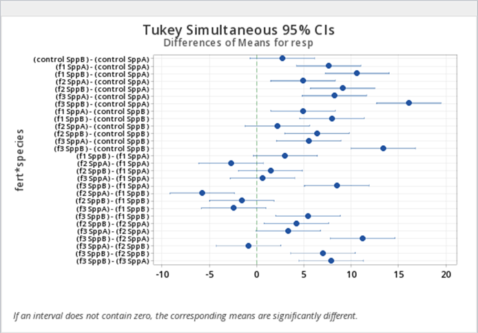
Note that the p-values here (Pr > t) are testing the hypotheses that the fert and species combination means = 0. This may be of very little interest. However, a comparison of mean response values for different species and fertilizer combinations may be more beneficial and can be derived from the diffogram shown in Figure 5.2. Again recall that if the confidence interval does not contain zero, then the difference between the two associated means is statistically significant.
Notice also that we see a single value for the standard error based on the MSE from the ANOVA rather than a separate standard error for each mean as we would get from proc summary for the sample means. In this example, with equal sample sizes and no covariates, the LS-means will be identical to the ordinary means displayed in the summary procedure.
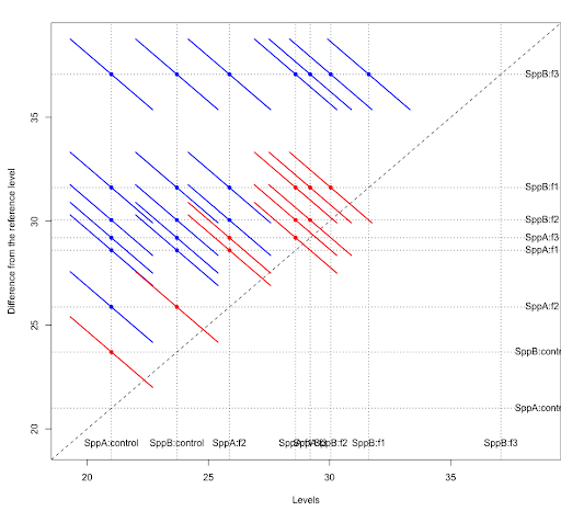
There are a total of 8 fert*species combinations resulting in a total of \({8 \choose 2} = 28\) pairwise comparisons. From the diffogram for differences in fert*species combinations, we see that 10 of them are not significant and 18 of them are significant at a 5% level after Tukey adjustment (more about diffograms). The information used to generate the diffogram is presented in the table for differences of fert*species least squares means in the SAS output (this table is not displayed here).
We can save the differences estimated in SAS proc mixed and utilize proc sgplot to create the plot of differences in mean response for the fert*species combinations as shown in Figure 5.3 (SAS code not provided in these notes). The CIs shown are the Tukey adjusted CIs and the interpretations are similar to what we observed from the diffogram in Figure 5.2.
In addition to comparing differences in mean responses for the fert*species combinations, the SAS code above will also produce the line plot for multiple comparisons of means for fert*species combinations (Figure 5.4) and the plot of means responses organized in the ascending order with 95% CIs for fert*species combinations (Figure 5.5).
The line plot Figure 5.4 connects groups in which the LS-means are not statistically different and displays a summary of which groups have similar means. The plot of means with 95% CIs in Figure 5.5 illustrates the same result, although it uses unadjusted CIs. The organization of the estimated mean responses in ascending order facilitates interpretation of the results.
Using LS-means subsequent to performing an ANOVA will help to identify the significantly different treatment level combinations. In other words, the analysis of a factorial model does not end with a p-value for an F-test. Rather, a small p-value signals the need for a mean comparison procedure.
For Minitab, we also need to convert the data to a stacked format (Lesson4 2 way Stacked Dataset). Once we do this, we will need to use a different set of commands to generate the ANOVA. We use...
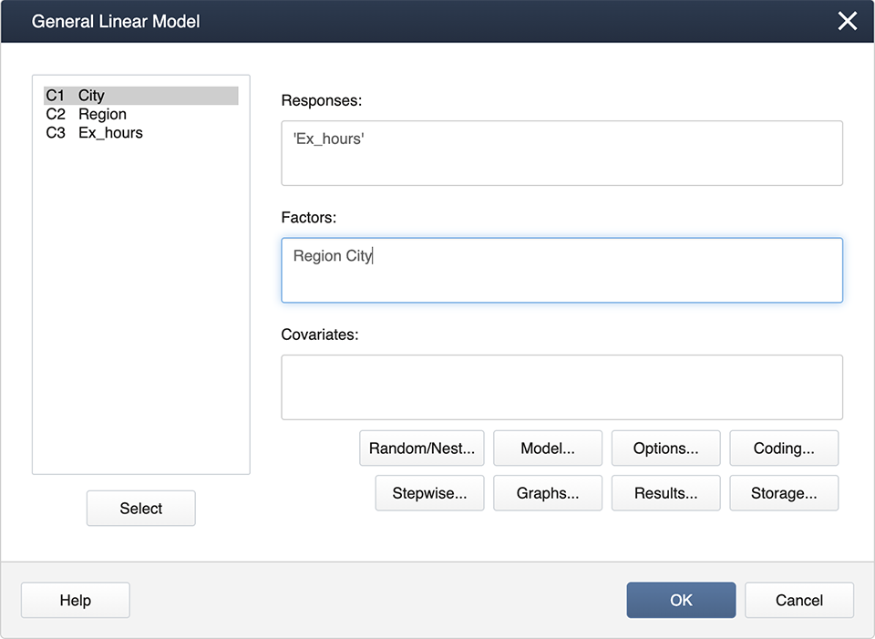
Stat > ANOVA > General Linear Model > Fit General Linear Model
and get the following dialog box:
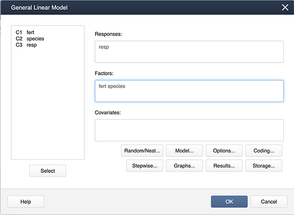
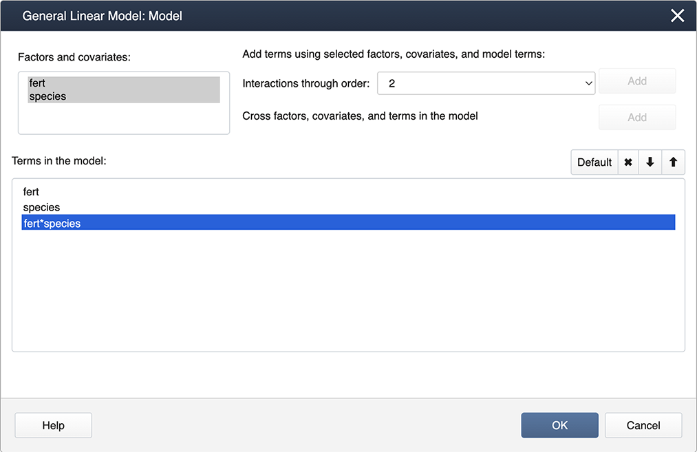
Click on Model…, hold down the shift key and highlight both factors. Then click on the Add box to add the interaction to the model.
These commands will produce the ANOVA results below which are similar to the output generated by SAS (shown in the previous section).
Analysis of Variance
Source | DF | Adj SS | Adj MS | F-value | P-value |
|---|---|---|---|---|---|
fert | 3 | 745.44 | 248.479 | 73.10 | 0.000 |
species | 1 | 236.74 | 236.741 | 69.65 | 0.000 |
fert*species | 3 | 50.58 | 16.861 | 4.96 | 0.005 |
Error | 40 | 135.97 | 3.399 | ||
Total | 47 | 1168.73 |
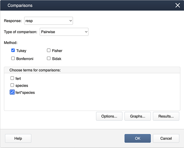
Following the ANOVA run, you can generate the mean comparisons by
Stat > ANOVA > General Linear Model > Comparisons
Then specify the fert*species interaction term for the comparisons by checking the box.
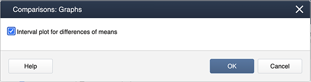
Then choose Graphs to get the following dialog box, where ‘Interval plot for difference of means’ should be checked.
The outputs are shown below.
Grouping Information Using the Tukey Method and 95% Confidence
fert | species | N | Mean | Grouping |
|---|---|---|---|---|
f3 | SppB | 6 | 37.0667 | A |
f1 | SppB | 6 | 31.6167 | B |
f2 | SppB | 6 | 30.0500 | B |
f3 | SppA | 6 | 29.2000 | B C |
f1 | SppA | 6 | 28.6000 | B C |
f2 | SppA | 6 | 25.8667 | C D |
control | SppB | 6 | 23.7000 | D E |
control | SppA | 6 | 21.0000 | E |
Means that do not share a letter are significantly different.
First, load and attach the greenhouse data in R.
setwd("~/path-to-folder/")
                        greenhouse_2way_data <-read.table("greenhouse_2way_data.txt",header=T)
                        attach(greenhouse_2way_data)
We can then produce a boxplot of species organized by fertilizer.
boxplot(resp~species:fert, main = "Distribution of Plant Height by Species:Fert",
                                xlab = "species:fert", ylab = "plant height")
Next, we fit the two-way interaction model and obtain the ANOVA table.
options(contrasts=c("contr.sum","contr.poly"))
                        lm1 = lm(resp ~ species + fert + fert:species) # equivalent to lm1 = lm(resp ~ fert*species)
                        aov3 = car::Anova(lm1, type=3) # equivalent to library(car); aov3 = Anova(lm1, type=3)
                        print(aov3, digits=7)
Anova Table (Type III tests)
Response: resp
Sum Sq Df F value Pr(>F)
(Intercept) 38680.81 1 11379.21821 < 2.22e-16 ***
species 236.74 1 69.64502 2.7065e-10 ***
fert 745.44 3 73.09823 2.7657e-16 ***
species:fert 50.58 3 4.96033 0.0050806 **
Residuals 135.97 40
---
Signif. codes: 0 ‘***’ 0.001 ‘**’ 0.01 ‘*’ 0.05 ‘.’ 0.1 ‘ ’ 1 We can examine the LS means interval plot of the interaction as follows:
 aov1 = aov(lm1)
                        lsmeans = emmeans::emmeans(aov1, ~fert:species)
                        lsmeans
                        plot(lsmeans, xlab="height LS-Means with 95% CIs")
fert species emmean SE df lower.CL upper.CL
control SppA 21.0 0.753 40 19.5 22.5
f1 SppA 28.6 0.753 40 27.1 30.1
f2 SppA 25.9 0.753 40 24.3 27.4
f3 SppA 29.2 0.753 40 27.7 30.7
control SppB 23.7 0.753 40 22.2 25.2
f1 SppB 31.6 0.753 40 30.1 33.1
f2 SppB 30.1 0.753 40 28.5 31.6
f3 SppB 37.1 0.753 40 35.5 38.6
Confidence level used: 0.95 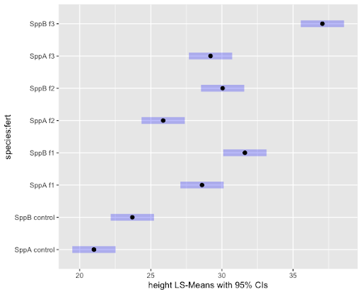
The Tukey pairwise comparisons of means with 95% family-wise confidence can be examined with the following commands. Note we use the bounds of the CIs (computed by the TukeyHSD function) to create a color coding based on significance.
tpairs = TukeyHSD(aov1)
                        col1 = rep("blue",nrow(tpairs$`species:fert`))
                        col1[tpairs$`species:fert`[,2]<0 & tpairs$`species:fert`[,3]>0] = "red"
                        plot(tpairs,col=col1)
There are several packages that can be used to obtain the Tukey groups and diffogram. An example using the sasLM package is as follows.
library(sasLM)LSM(lm1, Data = greenhouse_2way_data, Term = "species:fert", adj = "tukey")
                        Diffogram(lm1, Data = greenhouse_2way_data, Term = "species:fert", adj = "tukey")
Group LSmean LowerCL UpperCL SE Df
SppB:f3 A 37.06667 35.54542 38.58791 0.7526896 40
SppB:f1 B 31.61667 30.09542 33.13791 0.7526896 40
SppB:f2 B 30.05000 28.52876 31.57124 0.7526896 40
SppA:f3 BC 29.20000 27.67876 30.72124 0.7526896 40
SppA:f1 BC 28.60000 27.07876 30.12124 0.7526896 40
SppA:f2 CD 25.86667 24.34542 27.38791 0.7526896 40
SppB:control DE 23.70000 22.17876 25.22124 0.7526896 40
SppA:control E 21.00000 19.47876 22.52124 0.7526896 40
5.3 - The Additive Model: Ketone Example
5.3 - The Additive Model: Ketone ExampleIn a factorial design, we first look at the interactions for significance. In the case where the interaction is not significant, we can drop the term from our model and end up with an "Additive Model".
For a two-factor factorial, the model we initially consider (as we have discussed in Section 5.1) is:
\(Y_{ij}=\mu+\alpha_i+\beta_j+(\alpha\beta)_{ij} +\epsilon_{ijk}\)
If the interaction is found to be non-significant, then the model reduces to:
\(Y_{ij}=\mu+\alpha_i+\beta_j+\epsilon_{ijk}\)
Here we can see that the response variable is simply a function of adding the effects of the two factors.
Ketones in Urine
Consider a study designed to evaluate two methods for measuring the amount of ketones in urine. A large volume of artificial urine served as a starting point for the experiment. The urine was divided into three portions, each had artificial ketones added to it. Three different ketone levels were used. The amount of ketones were then measured by one of the two methods from samples of the urine. This type of experiment is commonly used to compare the sensitivity of different methods.
The amount of ketones detected in each sample was recorded and is presented in the table below.
| Measurement Method | ||||||
|---|---|---|---|---|---|---|
| Method 1 | Method 2 | |||||
| Ketone Level | 1 | 2 | 3 | 1 | 2 | 3 |
| 16.9 | 38.7 | 81.3 | 9.9 | 31.7 | 75.2 | |
| 17.2 | 44.5 | 80.9 | 10.2 | 32.2 | 73.5 | |
| 16.7 | 42.4 | 83.1 | 11.3 | 30.5 | 74.8 | |
The model was run as a two-factor factorial and produced the following results:
| Type 3 Analysis of Variance | ||||||||
|---|---|---|---|---|---|---|---|---|
| Source | DF | Sum of Squares | Mean Square | Expected Mean Square | Error Term | Error DF | F Value | Pr > F |
| method | 1 | 291.208889 | 291.208889 | Var(Residual) + Q(method, method*level) | MS(Residual) | 12 | 143.73 | <.0001 |
| level | 2 | 12797 | 6398.606667 | Var(Residual) + Q(level, method*level) | MS(Residual) | 12 | 3158.07 | <.0001 |
| method*level | 2 | 12.964444 | 6.482222 | Var(Residual) + Q(method*level) | MS(Residual) | 12 | 3.20 | 0.0770 |
| Residual | 12 | 24.313333 | 2.026111 | Var(Residual) | ||||
Here we can see that the interaction of method*level was not significant (p-value > 0.05) at a 5% level. We drop the interaction effect from the model and run the additive model. The resulting ANOVA table is:
| The Mixed Procedure | ||||||||
|---|---|---|---|---|---|---|---|---|
| Type 3 Analysis of Variance | ||||||||
| Source | DF | Sum of Squares | Mean Square | Expected Mean Square | Error Term | Error DF | F Value | Pr > F |
| method | 1 | 291.208889 | 291.208889 | Var(Residual)+Q(method, method) | MS(Residual) | 14 | 109.37 | <.0001 |
| level | 2 | 12797 | 6398.606667 | Var(Residual) + Q(level,level) | MS(Residual) | 14 | 2403.05 | <.0001 |
| Residual | 14 | 37.277778 | 2.662698 | Var(Residual) | ||||
The Error SS is now 37.2778, which is the sum of the interaction SS and the error SS of the model with the interaction. The df values were also added the same way. This example shows that any term not included in the model gets added into the error term, which may erroneously inflate the error especially if the impact of the excluded term on the response is not negligible.
|
method Least Squares Means |
||||||||
|---|---|---|---|---|---|---|---|---|
| method | Estimate | Standard Error | DF | t Value | Pr >|t| | Alpha | Lower | Upper |
| 1 | 46.8556 | 0.5439 | 14 | 86.14 | <.0001 | 0.05 | 45.6890 | 48.0222 |
| 2 | 38.8111 | 0.5439 | 14 | 71.35 | <.0001 | 0.05 | 37.6445 | 39.9777 |
| level Least Squares Means | ||||||||
|---|---|---|---|---|---|---|---|---|
| level | Estimate | Standard Error | DF | t Value | Pr >|t| | Alpha | Lower | Upper |
| 1 | 13.7000 | 0.6662 | 14 | 20.57 | <.0001 | 0.05 | 12.2712 | 15.1288 |
| 2 | 36.6667 | 0.6662 | 14 | 55.04 | <.0001 | 0.05 | 35.2379 | 38.0955 |
| 3 | 78.1333 | 0.6662 | 14 | 117.29 | <.0001 | 0.05 | 76.7045 | 79.5621 |
Here we can see that the amount of ketones detected in a sample (the response variable) is the overall mean PLUS the effect of the method used PLUS the effect of the ketone amount added to the original sample. Hence, the additive nature of this model.
First, load and attach the keytone data in R. Note we specify method and level as factors.
setwd("~/path-to-folder/")
ketone_data<-read.table("ketone_data.txt",header=T,sep ="\t")
attach(ketone_data)
method = as.factor(method)
level = as.factor(level)
We then run the crossed model and obtain the ANOVA table.
options(contrasts=c("contr.sum","contr.poly"))
lm1 = lm(ketone ~ method*level)
aov3_1 = car::Anova(lm1, type=3)
print(aov3_1,digits=7)
Anova Table (Type III tests)

Response: ketone
               Sum Sq Df     F value     Pr(>F)
(Intercept)  33024.50  1 16299.45160 < 2.22e-16 ***
method         291.21  1   143.72800 4.8871e-08 ***
level        12797.21  2  3158.07294 < 2.22e-16 ***
method:level    12.96  2     3.19934   0.076978 .
Residuals       24.31 12
---
Signif. codes:  0 ‘***’ 0.001 ‘**’ 0.01 ‘*’ 0.05 ‘.’ 0.1 ‘ ’ 1
Removing the insignificant interaction, we obtain ANOVA table of the additive model.
lm2 = lm(ketone ~ method + level)
aov3_2 = car::Anova(lm2, type=3)
print(aov3_2,digits=7)
Anova Table (Type III tests)

Response: ketone
              Sum Sq Df    F value     Pr(>F)
(Intercept) 33024.50  1 12402.6438 < 2.22e-16 ***
method        291.21  1   109.3661 5.3505e-08 ***
level       12797.21  2  2403.0535 < 2.22e-16 ***
Residuals      37.28 14
---
Signif. codes:  0 ‘***’ 0.001 ‘**’ 0.01 ‘*’ 0.05 ‘.’ 0.1 ‘ ’ 1
We can then examine the LS mean estimates of both the method and level effects individually.
aov1 = aov(lm2)
lsmeans_method = emmeans::emmeans(aov1,~method)
lsmeans_method
method emmean    SE df lower.CL upper.CL
1        46.9 0.544 14     45.7       48
2        38.8 0.544 14     37.6       40

Results are averaged over the levels of: level
Confidence level used: 0.95
lsmeans_level = emmeans::emmeans(aov1,~level)
lsmeans_level
level emmean    SE df lower.CL upper.CL
1       13.7 0.666 14     12.3     15.1
2       36.7 0.666 14     35.2     38.1
3       78.1 0.666 14     76.7     79.6

Results are averaged over the levels of: method
Confidence level used: 0.95
5.4 - Nested Treatment Design
5.4 - Nested Treatment DesignWhen setting up a multi-factor study, sometimes it is not possible to cross the factor levels. In other words, because of the logistics of the situation, we may not be able to have each level of treatment combined with each level of another treatment. This is most easily illustrated with an example.
Suppose a research team conducted a study to compare the activity levels of high school students across the 3 geographic regions in the United States: Northeast (NE), Midwest (MW), and the West (W). The study also included a comparison of activity levels among cities within each region. Two school districts were chosen from two major cities from each of these 3 regions and the response variable, the average number of exercise hours per week for high school students, was recorded for each school district.
A diagram to illustrate the treatment design can be set up as follows. Here, the subscript (\(i\)) identifies the regions, and the subscript (\(j\)) indicates the cities:
| Factor A (Region) i |
Factor B (City) j |
Average | ||
|---|---|---|---|---|
| 1 | 2 | |||
| NE | 30 | 18 | ||
| 35 | 20 | |||
| Average | \(\bar{Y}_{11.}=32.5\) | \(\bar{Y}_{12.}=19\) | \(\bar{Y}_{1..}=25.75\) | |
| MW | 10 | 20 | ||
| 9 | 22 | |||
| Average | \(\bar{Y}_{21.}=9.5\) | \(\bar{Y}_{22.}=21\) | \(\bar{Y}_{2..}=15.25\) | |
| W | 18 | 4 | ||
| 19 | 6 | |||
| Average | \(\bar{Y}_{31.}=18.5\) | \(\bar{Y}_{32.}=5\) | \(\bar{Y}_{3..}=11.75\) | |
| Average | \(\bar{Y}_{...}=16.83\) | |||
The table above shows the data obtained: the grand mean, the treatment level means (or marginal means), and finally the cell means. The cell means are the averages of the two school district mean activity levels for each combination of Region and City.
This example drives home the point that the levels of the second factor (City) cannot practically be crossed with the levels of the first factor (Region) as cities are specific or unique to regions. Note that the cities are identified as 1 or 2 within each region. But it is important to note that city 1 in the Northeast is not the same as city 1 in the Midwest. The concept of nesting does come in useful to describe this type of situation and the use of parentheses is appropriate to clearly indicate the nesting of factors. To indicate that the City is nested within the factor Region, the notation "City(Region)" will be used. Here, City is the nested factor and Region is the nesting factor.
We can partition the deviations as before into the following components:
\(\underbrace{Y_{ijk}-\bar{Y}_{...}}_{\text{Total deviation}} = \underbrace{\bar{Y}_{i..}-\bar{Y}_{...}}_{\text{A main effect}} + \underbrace{\bar{Y}_{ij.}-\bar{Y}_{i..}}_{\text{Specific B effect when } \\ \text{A at the }i^{th} \text{level}} + \underbrace{Y_{ijk}-\bar{Y}_{ij.}}_{\text{Residual}}\)
Let us now examine the df values of a two-factor nested design. Note that the nested effect is an additional term that needs to be included in a multi-factor ANOVA, but the ANOVA rules studied in Lesson 2 for single-factor situations still apply for the nesting effect. If the two factors of the design are denoted by A and B(A) with a and b as their number of levels respectively, then the df value of the nesting factor A is \( (a−1) \) and the df value for the nested factor is \( a(b−1) \). The ANOVA table below gives the layout of the df values for highschool example given above where region has \( a=3 \) levels, city has \( b=2 \) levels, \( r=2 \) complete replications and \( N=12 \).
| Source | d.f. |
|---|---|
| Region | (a - 1) = 2 |
| City (Region) | a(b - 1) = 3 |
| Error | ab(r - 1) = 6 |
| Total | N - 1 = 11 |
The statistical model shown below represents two-factor nested design.
\(Y_{ijk}=\mu+\alpha_{i}+\beta_{j(i)}+\epsilon_{ijk}\)
where \(\mu\) is a constant, \(\alpha_{i}\) are constants subject to the restriction \(\sum\alpha_i=0\), \(\beta_{j(i)}\) are constants subject to the restriction \(\sum_j\beta_{j(i)}=0\) for all i, \(\epsilon_{ijk}\) are independent from \( N(0, \sigma^2) \), with \(i = 1, ... , a, j = 1, ... , b \text{ and } k = 1, ... ,r\).
In the presence of multiple factors multiple hypotheses can be tested. For a two-factor nested design, specifically the high school example presented above, those hypotheses are the following.
For Factor A, the nesting factor:
\(H_0 \colon \mu_{\text{Northeast}}=\mu_{\text{Midwest}}=\mu_{\text{West}} \text{ vs. } H_A \colon \text{ Not all factor A level means are equal }\)
Up to this point, we have been stating hypotheses in terms of the means, but we can alternatively state the hypotheses in terms of the parameters for that treatment in the model. For example, for the nesting factor A, we could also state the null hypothesis as
\(H_0 \colon \alpha_{\text{Northeast}}=\alpha_{\text{Midwest}}=\alpha_{\text{West}}=0\),
or equivalently \(H_0 \colon \text{ all } \alpha_i=0\).
For Factor B, the nested factor:
When stating the hypotheses for Factor B, the nested effect, alternative notation has to be used. For the nested factor B, the hypotheses should differentiate between the nesting and the nested factors, because we are evaluating the nested factor within the levels of the nesting factor. So for the nested factor (City, nested within Region), we have the following hypotheses.
\(H_0: \text{ all }\beta_{j(i)} =0\) vs. \(H_A: \text{ not all }\beta_{j(i)} =0\) for \( j = 1,2 \)
The F-tests can then proceed as usual using the ANOVA results.
Note:
- There is no interaction between a nested factor and its nesting factor.
- The nested factors always have to be accompanied by their nesting factor. This means that the effect B does not exist and B(A) represents the effect of B within factor A.
- df of B(A)= df of B + df of A*B (This is simply a mathematically correct identity and there may not be much use practically as effects B(A) and A*B cannot coexist.)
- The residual effect of any ANOVA model is a nested effect - the replicate effect nested within the factor level combinations. Recall that the replicates are considered homogeneous and so any variability among them serves to estimate the model error.
5.5 - Nested Model: Exercise Example
5.5 - Nested Model: Exercise ExampleHere is the SAS code to run the ANOVA model for the hours of exercise for high school students example discussed in lesson 5.2:
data Nested_Example_data;
infile datalines delimiter=',';
input Region $ City $ ExHours;
datalines;
NE,NY,30
NE,NY,35
NE,Pittsburgh,18
NE,Pittsburgh,20
MW,Chicago,10
MW,Chicago,9
MW,Detroit,20
MW,Detroit,22
W,LA,18
W,LA,19
W,Seattle,4
W,Seattle,6
;
/*to run the nested ANOVA model*/
proc mixed data=Nested_Example_data method=type3;
class Region City;
model ExHours = Region City(Region);
store nested1;
run;
/*to obtain the resulting multiple comparison results*/
ods graphics on;
proc plm restore=nested1;
lsmeans Region / adjust=tukey plot=meanplot cl lines;
lsmeans City(Region) / adjust=tukey plot=meanplot cl lines;
run;
When we run this SAS program, here is the output that we are interested in:
| Type 3 Analysis of Variance | ||||||||
|---|---|---|---|---|---|---|---|---|
| Source | DF | Sum of Squares | Mean Square | Expected Mean Square | Error Term | Error DF | F Value | Pr > F |
| Region | 2 | 424.666667 | 212.333333 | Var(Residual)+Q(Region, City(Region)) | MS(Residual) | 6 | 65.33 | <.0001 |
| City(Region) | 3 | 496.750000 | 165.583333 | Var(Residual)+Q(City(Region)) | MS(Residual) | 6 | 50.95 | 0.0001 |
| Residual | 6 | 19.500000 | 3.250000 | Var(Residual) | ||||
| Type 3 Test of Fixed Effects | ||||
|---|---|---|---|---|
| Effect | Num DF | Den DF | F Value | Pr>F |
| Region | 2 | 6 | 65.33 | <.0001 |
| City(Region) | 3 | 6 | 50.95 | 0.0001 |
The p-values above indicate that both Region and City(Region) are statistically significant. The plots and charts below obtained from the Tukey option specify the means which are significantly different.
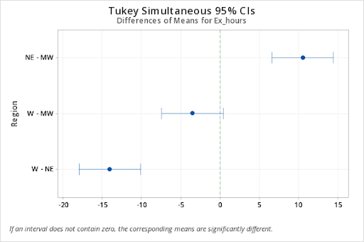
The exercise hours on average are statistically higher in the northeastern region compared to the midwest and the west, while the average exercise hours of these two regions are not significantly different.
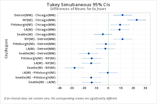
Also, the comparison of the means between cities indicates that the high schoolers in New York City exercise significantly more than the other cities in the study. The exercise levels are similar among Detroit, Pittsburgh, and LA, while the exercise levels of high schoolers in Chicago and Seattle are similar but significantly lower than all other cities in the study.
These grouping observations are further confirmed by the line plots below.
In Minitab, for the following (Nested Example Data):
Stat > ANOVA > General Linear Model > Fit General Linear Model
Enter the factors, 'Region' and 'City' in the Factors box, then click on Random/Nest...Here is where we specify the nested effect of City in Region.
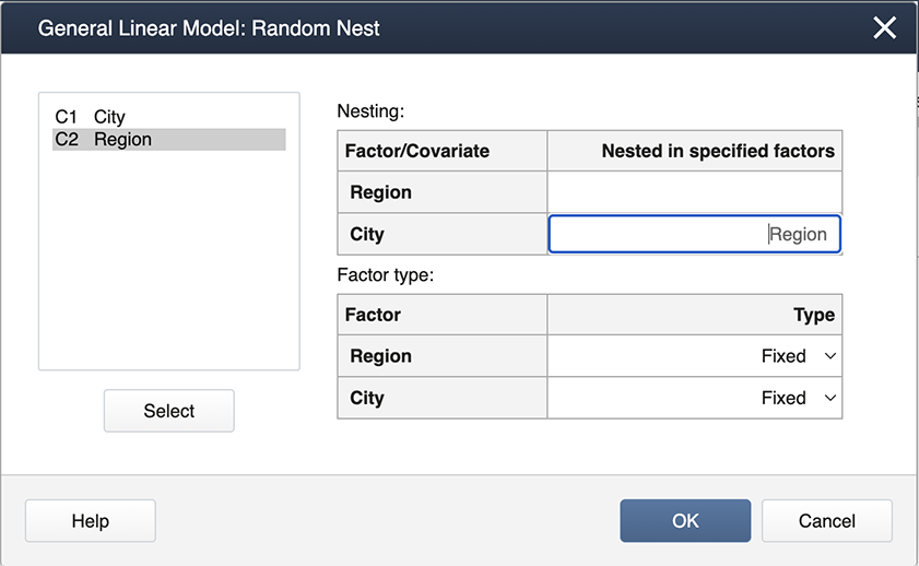
The output is shown below.
Factor Information
General Linear Model: response versus School, Instructor
| Factor | Type | Levels | Values |
|---|---|---|---|
| Region | Fixed | 3 | MW, NE, W |
| City(Region) | Fixed | 6 |
Chicago(MW), Detroit(MW), NY (NE), Pittsburgh(NE), LA(W). Seattle(W) |
Analysis of Variance
| Source | D | Adj SS | Adj MS | F-Value | P-Value |
|---|---|---|---|---|---|
| Region | 2 | 424.67 | 212.333 | 65.33 | 0.000 |
| City(Region) | 3 | 496.75 | 165.583 | 50.95 | 0.000 |
| Error | 6 | 19.50 | 3.250 | ||
| Total | 11 | 940.92 |
Model Summary
| S | R-sq | R-sq(adj) | R-sq(pred) |
|---|---|---|---|
| 1.80278 | 97.93% | 96.20% | 91.71% |
Following the ANOVA run, you can generate the mean comparisons by
Stat > ANOVA > General Linear Model > Comparisons
Then specify “Region” and “City(Region)” for the comparisons by checking the boxes.
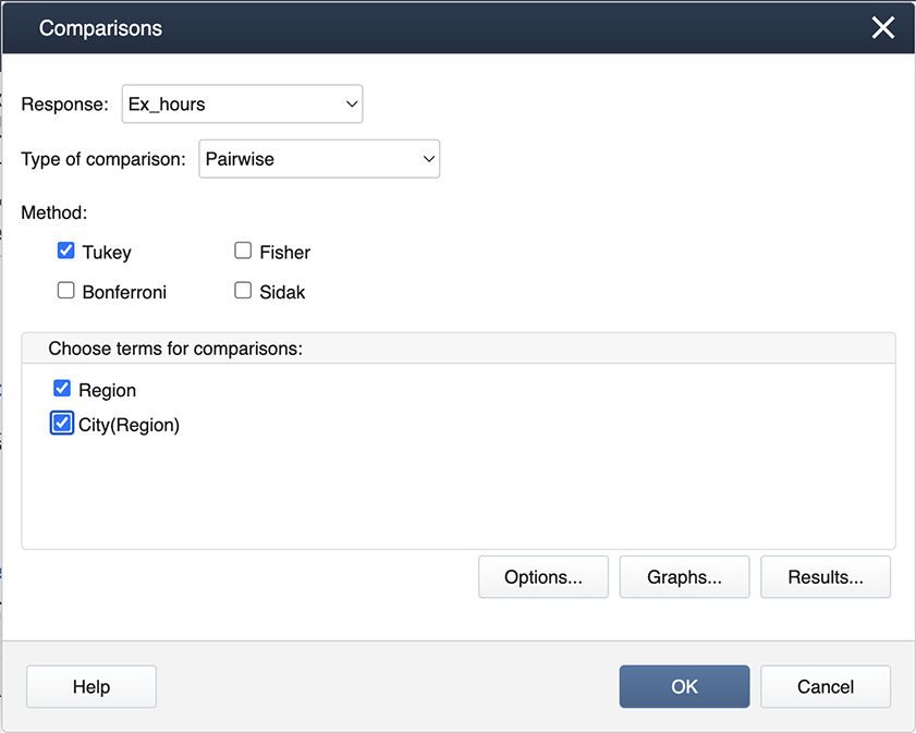
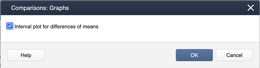
Then choose Graphs to get the following dialog box, where ‘Interval plot for the difference of means’ should be checked.
The outputs are as follows.
Tukey Pairwise Comparisons: Region
Grouping Information Using Tukey Method and 95% Confidence
| Region | N | Mean | Grouping |
|---|---|---|---|
| NE | 4 | 25.75 | A |
| MW | 4 | 15.25 | B |
| W | 4 | 11.75 | B |
Means that do not share a letter are significantly different.
Tukey Pairwise Comparisons: (City)Region
Grouping Information Using Tukey Method and 95% Confidence
| City(Region) | N | Mean | Grouping | |||
|---|---|---|---|---|---|---|
| NY(NE) | 2 | 32.5 | A | |||
| Detroit(MW) | 2 | 21.0 | B | |||
| Pittsburgh(NE) | 2 | 19.0 | B | |||
| LA(W) | 2 | 18.5 | B | |||
| Chicago(MW) | 2 | 9.5 | C | |||
| Seattle(W) | 2 | 5.0 | C | |||
Means that do not share a letter are significantly different.
Note: Nested models in R are a bit temperamental. If we run the model with nested (city) labels which are unique to each nesting factor (region), the resulting model will contain ALL interaction effects with NAs for those not included in the nested model. To avoid this, we can create a new variable in the dataset which labels the nested factors the same within each nesting factor. See below for an example.
First, load and attach the exercise hours data in R. We create a city code for each of the cities within each region. The data is below printed to illustrate the new variable.
setwd("~/path-to-folder/")
exhours_data<-read.table("exhours_data.txt",header=T,sep ="\t")
exhours_data$CityCode = as.factor(rep(c(1,1,2,2),3))
attach(exhours_data)
exhours_data
   Region       City Ex_hours CityCode
1      NE         NY       30        1
2      NE         NY       35        1
3      NE Pittsburgh       18        2
4      NE Pittsburgh       20        2
5      MW    Chicago       10        1
6      MW    Chicago        9        1
7      MW    Detroit       20        2
8      MW    Detroit       22        2
9       W         LA       18        1
10      W         LA       19        1
11      W    Seattle        4        2
12      W    Seattle        6        2
We run the model with the coded nested variable and obtain the ANOVA table.
options(contrasts=c("contr.sum","contr.poly"))
lm1 = lm(Ex_hours ~ Region/CityCode) # equivalent to lm1 = lm(Ex_hours ~ Region + Region:CityCode)
aov3 = car::Anova(lm1, type=3)
aov3
Anova Table (Type III tests)

Response: Ex_hours
                Sum Sq Df  F value    Pr(>F)
(Intercept)     3710.1  1 1141.564 4.475e-08 ***
Region           424.7  2   65.333 8.462e-05 ***
Region:CityCode  496.7  3   50.949 0.0001162 ***
Residuals         19.5  6
---
Signif. codes:  0 ‘***’ 0.001 ‘**’ 0.01 ‘*’ 0.05 ‘.’ 0.1 ‘ ’ 1
We can obtain the Tukey comparison of the regions as follows.
aov1 = aov(lm1)
tpairs_Region = TukeyHSD(aov1,"Region")
tpairs_Region
plot(tpairs_Region)
Tukey multiple comparisons of means
95% family-wise confidence level
Fit: aov(formula = lm1)
$Region
diff lwr upr p adj
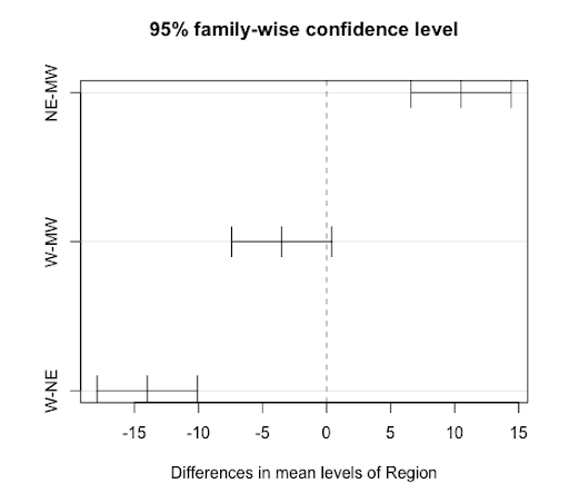
NE-MW 10.5 6.588702 14.4112978 0.0004243
W-MW -3.5 -7.411298 0.4112978 0.0747598
W-NE -14.0 -17.911298 -10.0887022 0.0000836
If we were to use lm1 to obtain the Tukey comparison of the cities, our results would be labeled with the city codes, which is not easily interpreted. To obtain results with the city names, we will rerun the model with the variable City and omit the NAs from the Tukey results before displaying them.
lm2 = lm(Ex_hours ~ Region/City)
aov2 = aov(lm2)
tpairs_City = TukeyHSD(aov2,"Region:City")
tpairs_City$`Region:City` = na.omit(tpairs_City$`Region:City`)
tpairs_City
par(las = 1, mar=c(4.5,12,2,0)); plot(tpairs_City)
Tukey multiple comparisons of means
95% family-wise confidence level
Fit: aov(formula = lm2)
$`Region:City`
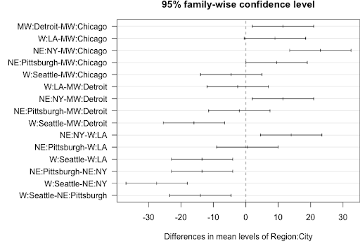
diff lwr upr p adj
MW:Detroit-MW:Chicago 11.5 2.03420257 20.965797 0.0198222
W:LA-MW:Chicago 9.0 -0.46579743 18.465797 0.0626471
NE:NY-MW:Chicago 23.0 13.53420257 32.465797 0.0004610
NE:Pittsburgh-MW:Chicago 9.5 0.03420257 18.965797 0.0491884
W:Seattle-MW:Chicago -4.5 -13.96579743 4.965797 0.5867601
W:LA-MW:Detroit -2.5 -11.96579743 6.965797 0.9752059
NE:NY-MW:Detroit 11.5 2.03420257 20.965797 0.0198222
NE:Pittsburgh-MW:Detroit -2.0 -11.46579743 7.465797 0.9960158
W:Seattle-MW:Detroit -16.0 -25.46579743 -6.534203 0.0035460
NE:NY-W:LA 14.0 4.53420257 23.465797 0.0072412
NE:Pittsburgh-W:LA 0.5 -8.96579743 9.965797 1.0000000
W:Seattle-W:LA -13.5 -22.96579743 -4.034203 0.0087623
NE:Pittsburgh-NE:NY -13.5 -22.96579743 -4.034203 0.0087623
W:Seattle-NE:NY -27.5 -36.96579743 -18.034203 0.0001762
W:Seattle-NE:Pittsburgh -14.0 -23.46579743 -4.534203 0.0072412
5.6 - Crossed - Nested Designs
5.6 - Crossed - Nested DesignsMulti-factor studies can involve factor combinations in which factors are crossed and/or nested. These treatment designs are based on the extensions of the concepts discussed so far.
Consider an example where manufacturers are evaluated for total processing times. There were three factors of interest: manufacturer (1, 2 or 3), site (1 or 2), and assembly order (1, 2 or 3).
| 3-factor table | Manufacturer (A) | ||||||
|---|---|---|---|---|---|---|---|
| 1 | 2 | 3 | |||||
| Site (B) | 1 | 2 | 1 | 2 | 1 | 2 | |
| 1 | 9.4 | 3.3 | 11.2 | 3.2 | 12.3 | 3.2 | |
| 12.3 | 4.3 | 12.6 | 5.3 | 12.1 | 5.3 | ||
| Order (C) | 2 | 15.3 | 7.2 | 11.8 | 3.3 | 12.0 | 1.3 |
| 15.8 | 8.2 | 13.7 | 5.2 | 12.8 | 2.9 | ||
| 3 | 12.7 | 1.6 | 11.9 | 2.8 | 10.9 | 1.9 | |
| 13.8 | 3.5 | 14.9 | 4.2 | 12.6 | 3.2 | ||
Each manufacturer can utilize each assembly order, and so these factors can be crossed. Also, each site can utilize each assembly order and so these factors also are crossed. However, the sites (1 or 2) are unique to each manufacturer, and as a result the site is nested within the manufacturer.
The statistical model contains both crossed and nested effects and is:
\(Y_{ijkl}=\mu+\alpha_i+\beta_{j(i)}+\gamma_k+(\alpha\gamma)_{ik}+(\beta\gamma)_{j(i)k}+\epsilon_{ijkl}\)
With the ANOVA table as follows:
| Source | df |
|---|---|
| Factor A | a - 1 |
| Factor B(A) | a(b - 1) |
| Factor C | c - 1 |
| AC | (a - 1)(c - 1) |
| CB(A) | a(b - 1)(c - 1) |
| Error | abc(r - 1) |
| Total | N - 1 = (rabc) - 1 |
Notice that the two main effects Manufacturer (Factor A) and Order (Factor C) along with their interaction effect are included in the model. The nested relationship of Site (Factor B) within Manufacturer is represented by the Site(Manufacturer) term and the crossed relationship between Site and Order is represented by their interaction effect.
Notice that the main effect Site and the crossed effect Site \(\times\) Manufacturer are not included in the model. This is consistent with the facts that a nested effect cannot be represented as the main effect and also that a nested effect cannot interact with its nesting effect.
5.7 - Try it!
5.7 - Try it!Exercise 1: CO2 Emissions
To study the variability in CO2 emission rate by global regions 4 countries: US, Britain, India, and Australia were chosen. From each country, 3 major cities were chosen and the emission rates for each month for the year 2019 were collected.
-
What type of model is this?
-
Correct!
-
Try again
-
Try again
-
-
How many factors?
-
Try again
-
Try again
-
Correct
-
-
The replicates are...
-
Correct!
-
Try again
-
Try again
-
-
The residual effect in the ANOVA model is...
-
Try again
-
Correct!
-
Try again
-
-
How many degrees of freedom?
-
Try again
-
Correct!
-
Try again
-
\begin{align}\text{error term df} &= \text{total df - (sum df values of the model terms) } \\ &=(144-1) - (\text{country df + city(country) df}) \\ & =143-(3 + 2*4) \\ & = 143-11=132 \\\text{df for month(city(country))} &=11(12) =132 \end{align}
Exercise 2
A military installation is interested in evaluating the speed of reloading a large gun. Two methods of reloading are considered, and 3 groups of cadets were evaluated (light, average, and heavy individuals). Three teams were set up within each group and they wanted to identify the fastest team within each group to go on to a demonstration for the military officials. Each team performed the reloading with each method two times (two replications).
-
Identify (i.e. name) the treatment design.
-
Try again
-
Correct!
-
Try again
-
-
They started to construct the ANOVA table which is given below. Given that there are a total of 36 observations in the dataset, there seems to be a missing source of variation in the analysis. What is this source of variation?
Source df Method 1 Group 2 Method*Group 2 Team (Group) 6 -
Try again
-
Correct!
-
Try again
-
-
How many degrees of freedom are associated with the error term?
-
Try again
-
Try again
-
Correct!
-
Exercise 3: GPA Comparisons
The GPA comparison of four popular majors, biology, business, engineering, and psychology, between males and females is of interest. For 6 semesters, the average GPA of each of these majors for male and female students was computed.
-
What type of model is this?
-
Try again
-
Try again
-
Correct!
-
-
How many factors?
-
Try again
-
Try again
-
Correct
-
-
The replicates are...
-
Correct!
-
Try again
-
Try again
-
-
The residual effect in the ANOVA model is...
-
Try again
-
Correct!
-
Try again
-
-
How many degrees of freedom?
-
Try again
-
Correct!
-
Try again
-
Residual effect (or error term) is semester(gender*major). The error term is the nested effect of 'semester' (the replicate) nested within gender*major, which is the 'combined effect' of the factors. One way to double-check is to verify if df values are the same. \begin{align} \text{error term df} &= \text{total df}-\text{(sum df values of the model terms) }\\ &= (48-1) - (\text{major df} + \text{gender df} + \text{major*gender df})\\& =47-(3+1+3*1)\\&= 40 \\ \text{df for semester(major*gender)}&=5*8\\&= 40\end{align}
5.8 - Lesson 5 Summary
5.8 - Lesson 5 SummaryIn this lesson, we discussed important elements of the 'Treatment Design’, one of the two components of an ‘Experimental Design’.
In a full factorial design, the experiment is carried out at every factor level combination. Most factorial studies do not go beyond a two-way interaction and if a two-way interaction is significant, the mean response values should be compared among different combinations of the two factors rather than among the single factor levels. In other words, the focus should be on response vs. interaction effect rather than response vs. main effects. An interaction plot is a useful graphical tool to understand the extent of interactions among factors (or treatments) with parallel lines indicating no interaction.
In a nested design, the experiment need not be conducted at every combination of levels in all factors. Given two factors in a nested design, there is a distinction between the nested and the nesting factor. The levels of the nested factor may be unique to each level of the nesting factor. Therefore, the comparison of the nested factor levels should be made within each level of the nesting factor. This fact should be kept in mind when stating null and alternative hypotheses for the nested factor(s) and also when writing programming code.
Lesson 5 Enrichment Material (Optional)
Lesson 5 Enrichment Material (Optional)The following section expands on what you've learned in lesson 5. However, this material (5.9) is not assessed in the actual course.
5.9 - Treatment Design Summary
5.9 - Treatment Design SummaryIn an effort to summarize how to think about sums of squares and degrees of freedom and how this translates into a model that can be implemented in SAS, Dr. Rosenberger walks you through this process in the videos below. Pay attention to the subscripts and these are the keys to understanding this material.
Part One
Part Two
Typo at 2:30: The equation should be \( \sum_i \sum_j \sum_k \sum_l (\bar{Y}_{i \cdot\cdot\cdot} - \bar{Y}_{\cdot\cdot\cdot\cdot} )^2 = bcn \sum_i (\bar{Y}_{i \cdot\cdot\cdot} - \bar{Y}_{\cdot\cdot\cdot\cdot} )^2 \)