7.1.5 - Profile Plots
7.1.5 - Profile PlotsIf the data is of a very large dimension, tables of simultaneous or Bonferroni confidence intervals are hard to grasp at a cursory glance. A better approach is to visualize the coverage of the confidence intervals through a profile plot.
Procedure
A profile plot is obtained with the following three-step procedure:
Steps
- Standardize each of the observations by dividing them by their hypothesized means. So the \(i^{th}\) observation of the \(j^{th}\) variable, \(X_{ij}\), is divided by its hypothesized mean for\(j^{th}\) variable \(\mu_0^j\). We will call the result \(Z_{ij}\) as shown below:
\(Z_{ij} = \dfrac{X_{ij}}{\mu^0_j}\)
-
Compute the sample mean for the \(Z_{ij}\)'s to obtain sample means corresponding to each of the variables j, 1 to p. These sample means, \(\bar{z_j}\), are then plotted against the variable j.
-
Plot either simultaneous or Bonferroni confidence bands for the population mean of the transformed variables,
Simultaneous \((1 - α) × 100\%\) confidence bands are given by the usual formula, using the z's instead of the usual x's as shown below:
\(\bar{z}_j \pm \sqrt{\dfrac{p(n-1)}{(n-p)}F_{p,n-p,\alpha}}\sqrt{\dfrac{s^2_{Z_j}}{n}}\)
The same substitutions are made for the Bonferroni \((1 - α) × 100\%\) confidence band formula:
\(\bar{z}_j \pm t_{n-1,\frac{\alpha}{2p}}\sqrt{\dfrac{s^2_{Z_j}}{n}}\)
Example 7-5: Women's Health Survey (Profile Plots)
The profile plots are computed using the SAS program.
Download the SAS Program: nutrient6.sas
Explore the code below to see how to create a profile plot using the SAS statistical software application.
Note: In the upper right-hand corner of the code block you will have the option of copying ( ) the code to your clipboard or downloading ( ) the file to your computer.
options ls=78;
title "Profile Plot - Women's Nutrition Data";

 /* %let allows the p variable to be used throughout the code below
  * After reading in the nutrient data, where each variable is
  * originally in its own column, the next statements stack the data
  * so that all variable names are in one column called 'variable',
  * and all response values divided by their null values
  * are in another column called 'ratio'.
  * This format is used for the calculations that follow, as well
  * as for the profile plot.
  */

%let p=5;
data nutrient;
  infile "D:\Statistics\STAT 505\data\nutrient.csv" firstobs=2 delimiter=','
  input id calcium iron protein a c;
  variable="calcium"; ratio=calcium/1000; output;
  variable="iron";    ratio=iron/15;      output;
  variable="protein"; ratio=protein/60;   output;
  variable="vit a";   ratio=a/800;        output;
  variable="vit c";   ratio=c/75;         output;
  keep variable ratio;
  run;

proc sort;
  by variable;
  run;

 /* The means procedure calculates and saves the sample size,
  * mean, and variance for each variable. It then saves these results
  * in a new data set 'a' for use in the steps below.
  * /

proc means;
  by variable;
  var ratio;
  output out=a n=n mean=xbar var=s2;
  run;

 /* The data step here is used to calculate the simultaneous
  * confidence intervals based on the F-multiplier.
  * Three values are saved for the plot: the ratio itself and
  * both endpoints, lower and upper, of the confidence interval.
  * /

data b;
  set a;
  f=finv(0.95,&p,n-&p);
  ratio=xbar; output;
  ratio=xbar-sqrt(&p*(n-1)*f*s2/(n-&p)/n); output;
  ratio=xbar+sqrt(&p*(n-1)*f*s2/(n-&p)/n); output;
  run;

 /* The axis commands define the size of the plotting window.
  * The horizontal axis is of the variables, and the vertical
  * axis is used for the confidence limits.
  * The reference line of 1 corresponds to the null value of the
  * ratio for each variable.
  * /

proc gplot;
  axis1 length=4 in;
  axis2 length=6 in;
  plot ratio*variable / vaxis=axis1 haxis=axis2 vref=1 lvref=21;
  symbol v=none i=hilot color=black;
  run;
Creating a profile plot
To construct a profile plot with confidence limits:
- Open the ‘nutrient’ data set in a new worksheet
- Name the columns id, calcium, iron, protein, vit_A, and vit_C, from left to right.
- Name new columns R_calcium, R_iron, R_protein, R_A, and R_C for the ratios created next.
- Calc > Calculator
- Highlight and select R_calcium to move it to the Store result window.
- In the Expression window, enter ‘calcium’ / 1000, where the value 1000 comes from the null value of interest.
- Choose 'OK'. The ratios for calcium are displayed in the worksheet variable R_calcium.
- Repeat step 4. for the other 4 variables, where each new ratio is obtained by dividing the original variable by its null value.
- Graph > Interval plot > Multiple Y variables with categorical variables > OK
- Highlight and select all five ratio variables (R_calcium through R_C) to move them to the Y-variables window.
- Display Y’s > Y’s first
- Under Options, make sure the Mean confidence interval bar and Mean symbol are checked.
- Choose 'OK', then 'OK' again. The profile plot is shown in the results area.
Analysis
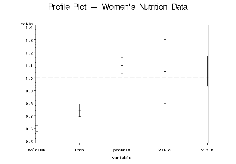
From this plot, the results are immediately clear. We can easily see that the confidence intervals for calcium and iron fall below 1 indicating that the average daily intakes for these two nutrients are below recommended levels. The protein confidence interval falls above the value 1 indicating that the average daily intake of protein exceeds the recommended level. The confidence intervals for vitamins A and C both contain 1 showing no significant evidence against the null hypothesis and suggesting that they meet the recommended intake of these two vitamins.