| Key Learning Goals for this Lesson: |
|
We'll begin with a basic review of some of the concepts in statistics such as populations vsersus samples, exploratory data analysis, statistical hypothesis testing, parametric versus nonparametric testing, ideas of power, false discovery and false non-discovery. Finally, we will have a look at some of the methods in Bayesian statistics, which is increasingly used for bioinformatics. We will briefly go over these topics and then will go into more detail later.
Except when diagnosing, we are not usually interested in the specific items (e.g. mice, tissue samples) we are measuring. We use these units to represent some larger class. For example, we might measure the immune response of 50 volunteers to a new vaccine with the objective of estimating the response if the vaccine is used later in a patient group.
In statistical inference the population is the general class of objects (tissues, cells…) for which we want to make an inferential statement. The sample is the set of the observed items from the population. If the members of the population were identical and if there were no measurement error, there would be no need for statistical inference. Because there is both biological and technical variability, we need to carefully design our studies to control and quantify variability, and use appropriate inferential tools that leverage both the current study and previous information to produce valid and reproducible inference.
The idea behind statistical inference is that we will use the sample to make inference about the population. This means that the sample needs to be representative of the population and not biased. The most fundamental tool that we have for this is randomization. Randomization means that our units are selected at random from the population and that any treatments are applied according to a randomization scheme. The statistical analysis will then use the randomization information as part of the inferential procedure to quantify the variability. See reference [1].
Many of the analyses that we will do assume that the samples are independent of each other. However, correlation is induced both by biology and by our study conditions. Examples of biological correlation are mice from the same litter (family correlation) and repeated measurements on the same mouse. Correlations are induced by what are sometimes called batch effects. For example, if you and a collaborator each do a replicate of an experiment in your own labs, it is likely that the measurements taken within each lab are more similar than measurements taken in different labs. These similarities might be induced by the lab environment, batches of feed, batches of reagents, and who actually handled the mice, took the samples, made the measurements, etc. These similarities induce correlation called the intra-class correlation. We often deliberately induce intraclass correlation by what is called blocking, as a means of controlling variability. This works well as long as we record the blocks and make use of the information in the statistical analysis. When the samples are correlated but we treat them as if they were independent, we can introduce large errors into the analysis which typically lead to a high error rate.
References
[1] López Puga J, Krzywinski M, Altman N. (2015) Points of significance: Bayes' theorem. [1] Nat Methods. 2015 Apr;12(4):277-8. PubMed PMID: 26005726.
To illustrate some of the statistical issues, we will use some human colon cancer data available in R. There are 40 samples from tumors "t" and 22 samples are from normal "n" biopsies. The data was originally collected on microarrays with 6500 probes. 2000 of them were selected apparently, randomly, to be used for demonstrating statistical methods. These data are somewhat more complicated than most of the data sets we will use because the 22 normal biopsies came from an unaffected part of the colon of the same patients that also contributed cancer tissue. Therefore, we have to account for correlation between samples for those 22 patients. The other samples are all independent. It is not unusual to have paired samples of this type, but it is unusual to have both paired and unpaired samples. We will see later in the course how the linear mixed model can be used to handle this situation.
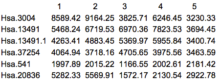
The first thing that we should do is to actually look at the data. Here are the first 5 rows and columns of the raw intensity scale data.
There are many things that can be ascertained by simply looking at the data. First of all, it's always good to know what you have been given, especially since we often work with multiple labs which might give the data in somewhat different formats or list the features in different order. Frequently I have received data from the same lab from the same study in which the genes were in a different order, or in which some of the samples appeared in two different spreadsheets. Another common situation is that some data are missing. R can accept a blank cell or a cell with NA (Not Available) as missing. Asterisks (*) and other commonly used symbols need to be replaced before reading the data into R.
Micro-array data is on a continuous scale so usually has a decimal place. Often log2 is taken, which typically makes the data values between 4 and 16. With sequencing data you should see counts, with some of them being zero. A common mistake is working with the data on the wrong measurement scale.
Most "omics" data will include feature names and possibly other annotation. R will interpret certain characters such as quotes and $ as terminators. For this reason the data might not be entered in properly. Before proceeding with your analysis, you need to make sure that the data have the right number of rows and columns and the gene names are acceptable.
Once we have our data in an acceptable format, we usually do some exploratory data analysis. This usually includes summary statistics and graphics that help us understand the data. This stage also includes quality control. I typically spend at least as much time on this stage of the analysis as on the actual inferential stage to ensure that I have high quality data going in. The GIGO principle "Garbage In, Garbage Out" applies even more to "omics" than to low throughput data analysis, because we seldom do detailed checks of the data on a feature by feature basis when we have thousands of features.
The simplest graphic is probably a histogram. What you see below is expression from one of the genes, looking specifically at the tumor and normal samples. On the left is a typical histogram with bins selected by R. There is a lot of variability from bin to bin, and the appearance of the histogram could change considerably if the bin boundaries or number of bins is changed. On the right is a smoothed version of the histogram called a density plot. It has less detail, but gives a picture of the data that is easier to intepret and to compare against other histograms.
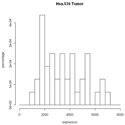
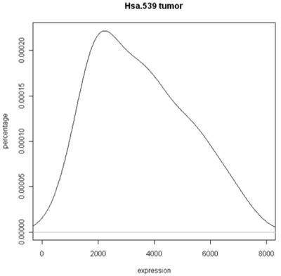
Histogram and density plots of tumor tissue
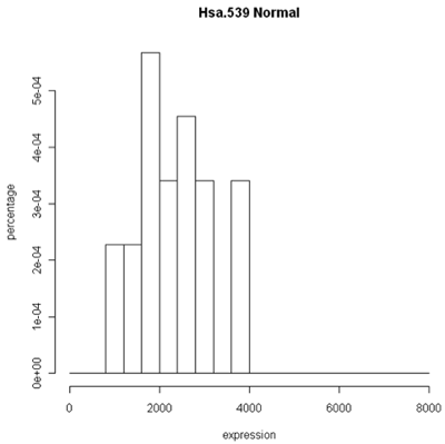
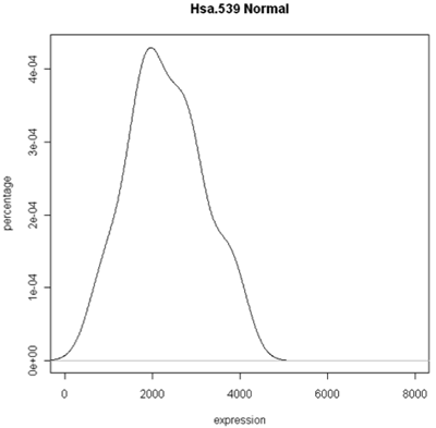
Histogram and density plots of normal tissue
One thing to look at is the scaling of the plot. As you can see, the normals are not a spread out as the tumors which might mean that there are fewer of them or have something to do with tumor biology, or this particular gene. Here I forced the tumor and normal tissues to have the same x-axis, which made the difference in spread quite obvious. By default, graphics software picks scaling to fill the plot, which can obscure features you want to compare or blow up tiny differences that likely have no biological meaning. The default settings of the graphics often produce nice plots, but for interpretation you might need to select your own settings.
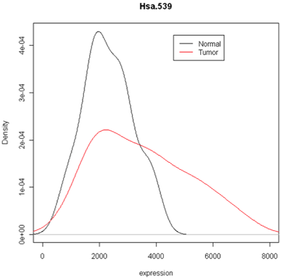
Combined density plots
Above I've used a combined plot that make it very clear that the tumor samples were more spread out.
Unfortunately, these are plots for just one gene and in this data set we have 2000 of these! A modern high-throuput assay may have hundreds of thousands of features. So, it is unlikely that I'm going to take a look at each one of these plots. A simplified version called the box plot makes it easier to visualize many features at the same time or compare multiple samples. Boxplots require at least 5 samples.
A boxplot [1] takes the ordered data and computes the median (50th quantile, the red line) and the quantiles at the 25th and 75th quantiles, (green lines). This is the "box". The length of the edge joining the 25th and 75th quantiles is called the InterQuartile Range or IQR. The "whiskers" extend 1.5 IQRs from each end of the box, but are truncated at the outermost data value lying within the 1.5 IQRs.
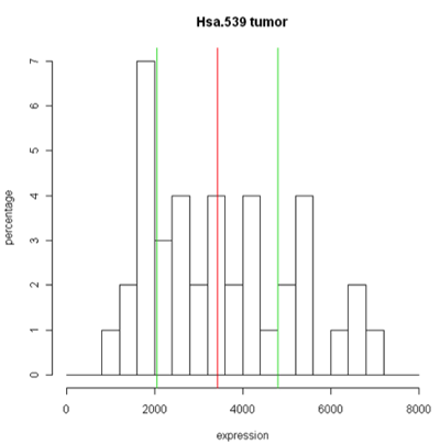
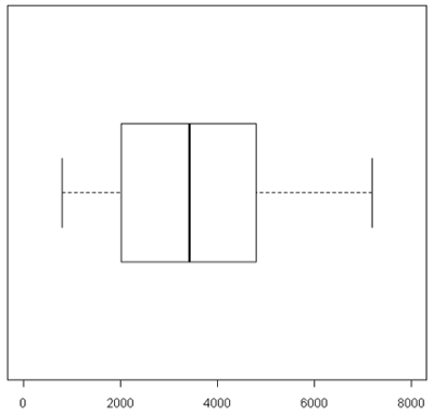
For this particular example the box is very symmetric around the median but this is not usually the case as you can see below. The lines outside of the box are called the 'whiskers'. The whiskers go out to the furthest data point that is within 1.5 interquartile range. Anything outside of that is plotted as a little circle. This is a device to help identify unusual "outliers".
These types of plots are very nice for comparisons (below). In this case,you can see very quickly that the normals are less spread out and they also have a lower median expression. Boxplots are often used when there are many samples to be compared. They can be enhanced by plotting other summary statistics such as the sample mean and a confidence interval for the mean.
When you want to compare many samples at the same time it's much easier to use a box plot to do this comparison than to use superimposed histograms.
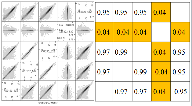
Another useful quality control graphic is a scatterplot matrix, which plots each sample against each other sample. For our example, we look at all 2000 gene expressions (on the log2 scale) for each sample. There are 2000 data points in each of these scatterplots. Here we show the first 4 samples, which are the normal and tumor samples for 2 patients. In the R implementation, it is feasible to visualize up to 8 samples simultaneously - after that the plots become too small to see the interesting details.
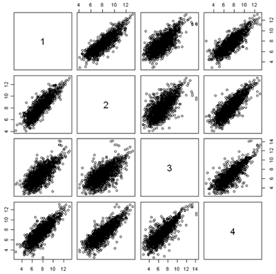
In this figure, the plots are arranged in matrix form, with sample i on the Y axis and sample j on the X axis. So, plot i,j and plot j,i are the same plot with the axes swapped. For gene expression, we expect to see a strong diagonal trend in these plots. We can also see that the two samples from the same patient (1,2) and (3,4) are less spread out around the trend line than samples from different patients. We can also see that the two tumor samples (1,3) are more spread out around the trend than the two normal samples (2,4). The spread around this trend line represents differences in expression - we might have expected that the tumor samples were more variable than the normal samples, but not that the normal and tumor samples from the same patient are less variable.
Scatterplots are good for quality control because even when the arrays or other expressions come from different tissues, or different conditions, or different organisms, you often get a lot of data along the 45° line. If you don't, something is wrong.
Because of the numbers of features in a nucleotide sample, it's very hard to see some things on these plots because there's a lot of over plotting. Another option is to replace the individual data points by a grayscale or color code that represents the density of points in a small region. (You can think of this as a contour map, where the elevations are the heights of the frequency histogram. In R, this is done using a plot called a hexbin plot which uses a grayscale by density. In the plot below, you can clearly see that most of the data lie along the diagonal, although there is a lot of spread. These samples come from an apple microarray with about 60,000 features, so on a regular scatterplot very little detail is available.
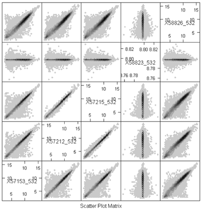
Before describing what I see in this plot, I will note a minor annoyance in the implementation. The scatterplot matrices lay out the plots in matrix order so that the top left is (1,1) and the bottom right is (m,m) where m is the number of samples. The hexbin matrices lay out the plots in x-y order, so that the bottom left is (1,1,) and the top right is (m,m). So, in the plot above, array 4 is shown in the fourth column but in the second row.
The most important feature that can be seen in the hexbin matrix is that array 4 does not display a diagonal pattern. In fact, if you can see the scale (which is printed in the diagonal squares) you can see that while the other arrays have data in the range 5 - 15, this array has data in a very tight range around 8.7. This array was a dud and had to be redone. This is immediately obvious in the plot (even without looking at the scale) because of the lack of a diagonal pattern.
Another important feature that is evident in the plot is that arrays 2 and 3 are much more similar than the other arrays. This might be expected or surprising, depending on the study design. For example, it might be expected if these were two samples from the same tree, but unexpected if they were samples from different varieties of apple. Note however that even for the other pairs which have much more scatter around the diagonal, the predominant pattern is along the y=x line.
Investigators are far too eager to do statistical testing and compute p-values without examining the data. You need to look at the data table and plot everything that you can, including the p-values.
Taking logarithms usually improves expression data
Statisticians often take the logarithm of expression data if the data are positive and there are no zeros. One very good reason for doing this is that if this data are skewed toward zero then you get something much less skewed on a log scale.This is preferrable for both visualization and statistical analysis.
For example, consider the data below. On a scatterplot, most of the values will be close to zero (creating a blob near the origin) and only a few large values will show up well on the plot. The data are more evenly spread on the log scale.
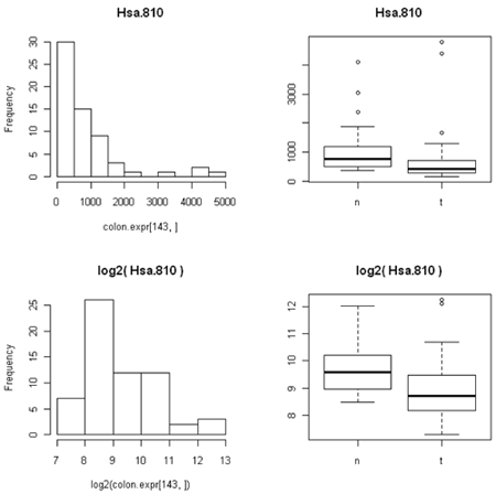
The other thing that's not so obvious but often occurs, is that the spread of the data between two different conditions (e.g. normal versusu tumor) is often closer to constant on the log scale than on the expression scale. This is because the variation is often proportional to the amount of expression, so that the conditions with lower expression are also less variable. (We saw this in the first histogram, where the normal samples have lower expression for this particular gene and the expression is less spread out than in the tumor samples.)
Many comparative statistical methods are most accurate when the data are Normally distributed (bell-shaped histogram) and the variance is the same under all the conditions being compared. Taking logarithms takes gene expression data closer to both of these ideal conditions and so is routinely done.
Incidentally, it does not matter whether you use natural logarithms, log10 or log2, as the results are just constant multiples of one another. For some reason biologists like to use log2, which is a common in gene and protein expression.
You often might hear biologists are other scientists talk about 'fold' differences between expression under two conditions. To a statistician or computer scientist this is just the ratio of the two expression values. Log(x/y)=log(x)-log(y) so taking logarithms also changes ratios to differences, which is also convenient. There are many statistical methods that are suitable for differences between measurements but many fewer for ratios.
"2 fold" differences seem to be a benchmark for biological importance in comparing expression values. Using log2, a two-fold difference is just log(x)-log(y)=+/- 1.
Although taking logarithms usually improves expression data, it does have one big problem - you cannot take log(0). This is particularly problematic with count data, as some features will not be observed and so will have count 0. One technique would be to add a very small number in its place. Which small number you use depends on the kind of data, because you want the small number to be between zero and the smallest nonzero or real number in the data. There's no rule of thumb here that would be good for every example. For count data, we typically add 0.5 or 0.25 to all of our counts before taking log2. However, this would be a poor idea if our data were (for example) counts per million, since we might have values which are much smaller than 0.25. Typically, I search for the smallest non-zero value in the data, and then add 1/4 of this value to ALL the values before taking logarithms.
References
[1] Krzywinski, M., & Altman, N. (2014). Points of significance: Visualizing samples with box plots. Nature Methods, 11(2), 119–120, doi:10.1038/nmeth.2813
It is good to have plots of the data, but it is also important to have numerical summaries. The two main types of summary that we use are summaries of the center of the distribution and of spread. We distinguish between the population summary, which would could compute in theory if we could measure every possible sample from the population, and the sample summary, which is what we can compute from the observed data.

To measure the center statisticians often use the mean. The sample version is also called the average and is denoted by putting a bar above the notation. For example, if we denote our measurement by Y, then
sample mean = average = \(\bar{Y}\)
The median is the point at which 50% are less and 50% or higher.
Median = 50th quantile
The mode is the highest point in the histogram - this might depend on the bins that you used in the histogram. Finally, the geometric mean comes from taking the mean on the log scale and then converting back to the original scale.
Geometric mean = anti-log(mean(log(data)))
Since we often use the log-scale for expression data, if we convert an average back to "natural" expression units we will be using the geometric mean.
The most commonly used measure of spread is the variance which is based on the squared difference between each observation and the mean. The difference is squared so that the positive and negative values the won't cancel out. When computing the population variance, we take the mean of these squared differences. For a sample of size n, we divide the sum of squared differences by n-1, which is a bit closer to the population variance than the average squared differences.
\[S_{Y}^{2}=\frac{\sum(Y_i-\bar{Y})^2}{n-1}\]
You can think of variance is an average squared deviation from the mean, so its units are the square of the units of the data. To bring things to the same scale, we take the square root of the variance which is called the standard deviation or SD.
\[S_Y=\sqrt{S_{Y}^{2}}\]
The SD measures how spread the histogram is from the mean. However, when the data are highly skewed, or there are a small number of data values very far from the mean, it might be misleading. One or two unusual data values can vastly inflate the SD.
The interquartile range (IQR) is the length of the box in a boxplot - i.e. the length of the interval containing the central 50% of the data. Statisticians tend to like it for descriptive purposes because it is less sensitive than the SD when there are a few outliers. It still does well with Bell shaped histograms. IQR is often used as a descriptive method, but the standard statistical inference methods use the SD.
Population summaries are fixed numbers because they are based on the entire population. However, sample summaries depend on which sample is selected and vary from sample to sample. The sampling distribution of a summary (for a fixed sample size) is the population of values of that summary based on all possible samples. A central idea in classical (frequentist) statistics is that the observed sample is only one of the possible samples and should be evaluated using a thought experiment about the other values in the sampling distribution. We will talk more about thought experiments when we discuss statistical testing.
For example, suppose the population is Penn State undergraduates enrolled on a particular date and we are measuring height in inches. To obtain the population mean and SD, we need to take the height of all the undergraduates and compute the mean and SD.
Now consider a sample of size 10 from this population. There are about 100,000 undergraduates enrolled at Penn State (counting all campuses) at any given time, so there are a lot of samples of size 10 that could be measured. Each of those samples has a sample mean and a sample SD. The set of all the sample means is the sampling distribution of the sample mean. The set of all the sample SDs is the sampling distribution of the sample SD. Any summary based on the samples has a sampling distribution - e.g. the sampling distribution of the sample medians, the sampling distribution of the sample IQRs.
The sampling distributions also have means and SDs. The SD of a sampling distribution is called the standard error (SE) - for example, we can talk about the standard error of the sample mean or the standard error of the sample SD. The sampling distribution that is most often used in statistical analysis is the sampling distribution of the sample mean. Often SE is used as a short form for "SE of the sample mean" or even for "estimated SE of the sample mean".
The sampling distribution of the sample mean has two remarkable properties that are true no matter what the underlying population looks like: the mean of the sampling distribution is the mean of the underlying population and the SE of the sample mean is the population SD divided by \(\sqrt{n}\). Using \(Var(Y)\) to mean the poulation variance of Y, we can write this as \[Var(\bar{Y})=Var(Y)/n\].
The sampling distribution of the sample mean also has another remarkable property, called the Central Limit Theorem. For large enough sample sizes, the sampling distribution of the sample mean is approximately Normal as long as the population variance is finite. "Large enough" depends on the distribution of the underlying population. If the underlying population is normal, "large enough" is n=1. If the underlying distribution is highly skewed, a sample size of n=1000 might be necessary. If the underlying distribution is fairly uniform on a fixed interval, n=5 might be sufficient.
The sampling distribution of the sample variance also has a remarkable property (which also explains why we divide by n-1 instead of n). The mean of the sampling distribution of the sample variance is the variance of the underlying population regardless of the shape of the underlying population.
Unfortunately, these nice properties do not necessarily apply to other sample summaries. For example, the mean of the sampling population of the sample SD tends to be a bit smaller than the SD of the underlying population.
Another frequently used summary is correlation [1], which measures how two features vary together. In common English, correlation is often used to mean that features are associated or causally related. In statistics, however, correlation refers to a very specific type of relationship and is completely devoid of any suggestion of causality. Specifically, in statistics, we say that X is correlated with Y if there is a non-zero linear trend in the scatterplot of Y versus X.
The correlation coefficient is a numerical summary between -1 and 1. If the correlation is -1, then the scatterplot shows a perfectly linear trend with negative slope and no deviations from the line. If the correlation is 1, then the scatterplot shows a perfectly linear trend with positive slope. The correlation is 0 if one of X and Y is constant (so that the line is perfectly horizontal or vertical) or if there is spread but the trend line is perfectly horizontal or vertical. We can see correlation very close to zero between microarray 4 and the other arrays and positive correlation between the other pairs of microarrays.
Correlations that are between -1 and 1 (but are not zero) imply that there is a trend line, but that there is scatter around the line. The more scatter, the closer the correlation is to 0.

Correlation is only meant to measure linear trend. The four plots below (called the Anscombe quartet, after British statistician Francis Anscombe who devised them to show the importance of plotting data before analysis) all have the same correlation of 0.8.
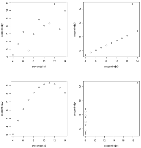
The plot in the upper right would have a perfect correlation of +1 if it weren't for the outlier way up with the top. For the plot the lower left correlation is not a bad summary but there seems to be a perfect relationship between X and Y, it just happens to be quadratic rather than linear linear. (If the plot continued symmetrically to form a parabolic arch, the correlation would be zero, even though Y is perfectly associated with X.) In the lower right there happens to be no correlation between X and and most of theY's, but there is is one weird point in the upper right. We probably would not want to say that X and Y are correlated - instead we would likely want to determine whether the outlying point has some unusual properties.
Gene expression samples are often highly correlated, because the majority of genes have characteristic expression levels that do not vary much from sample to sample. Going back to the hexbin plots, take a look at two graphs that have a correlation of 0.99. They seem to be much more tight than the other plots. However, all of the "good" samples have very high correlation, even though there is a lot of spread. This is because most of the data are very close to the line.
These graphs are all on the log scale. Correlation is invariant to (linear) changes of units such as degrees changing between British and metric units. However, the correlation between X and Y is not the same as the correlation between log(X) and log(Y).
Like the other summaries, there is a population correlation (between all the (X,Y) pairs) and a sample correlation (for the observed (X,Y) pairs). The sample correlation has a sampling distribution based on all the samples that could be selected.
Suppose we are measuring two quantitative features (X and Y) of each item in our sample and that it makes sense to take the sum or difference of these items. An interesting statistical fact is that
\[Var(X+Y)=Var(X)+Var(Y)+2 SD(X)SD(Y)Corr(X,Y)\]
and
\[Var(X-Y)=Var(X)+Var(Y)-2 SD(X)SD(Y)Corr(X,Y)\].
If Corr(X,Y)=0 then we get the interesting fact that
\[Var(X+Y)=Var(X-Y)=Var(X)+Var(Y)\]
This also extends to the variance of sampling distributions. Suppose we are interested in the sampling distribution of \(\bar{X}-\bar{Y}\). If the samples are independent then:
\[Var(\bar{X}-\bar{Y})=Var(\bar{X})+Var(\bar{Y})\].
This has big consequences if we want to compare gene expression in normal versus tumor samples. If the tissue samples come from different individuals, we would expect expression of the gene to be independent from sample to sample. However, if tissue samples come from the same individual, we might expect expression to be correlated.
The statistical analysis of correlated data differs from the analysis of independent data. So, for example, technical replicates are correlated because they come from the same biological sample. For this reason they are also called pseudo-replicates. Samples can also be correlated due to coming from the same biological replicate, even if the tissue sample was taken independently (e.g. leaf and flower from the same plant) or at different times (e.g. leaf sampled at midnight versus noon). Other sources of correlation that are important biologically are familial correlations and correlations induced by the experimental design, such as mice housed together in a single cage. In designing and analyzing any experiment, but especially high throughput experiments, it is important to keep track of the experimental protocol and use methods that account for correlation if it expected from the protocol.
We also expect gene expression to be correlated, because genes interact along pathways. Genes in the same pathway may be positively correlated if they tend to express together or negatively correlated if upregulating one down-regulates the other. This correlation is less important to many of our analyses because often our analyses are for each feature.
References
[1] Altman, N. & Krzywinski, M. (2015). Points of Significance: Association, correlation and causation. Nature Methods, 12(10), 899-900. doi:10.1038/nmeth.3587
Often we have specific hypotheses that we want to test such as "Gene X is over-expressed in tumor samples" or "People with colon cancer are more likely to have SNP Y".
In classical (frequentist) statistics, we do not try to obtain the probability that our hypothesis is true. Instead, we set up a null hypothesis that would be false if our hypothesis is true. We then try to determine if the observed data are surprising if the null hypothesis is true. What do we mean by surprising? If a sample at least as unusual as the observed could have happened by chance it's not surprising. If it happens by chance only with low probability, then it is surprising.
Classical statistical testing is therefore based on a thought experiment: First, we set up a null hypothesis and compute the sampling distribution of our summary (call the test statistic) when the null hypothesis is true. Notice that we can do this without observing any data, because it is based on a thought experiment. Then we take a sample and compute the test statistic. Finally, we compute the probability that a test statistic at least as extreme as the observed value would be if the statistic were selected at random from the sampling distribution we obtain assuming the null hypothesis is true. This probability is called the p-value of the test. If the p-value is small we reject the null hypothesis and state that there is evidence against the null.
To do classical hypothesis testing, we set up two hypotheses. 1) The null hypothesis, which we hope to find evidence against. 2) The alternative hypothesis, which we provide as the alternative source of the data if there is evidence against the null. Note, however, that all probability statements are based on the null hypothesis; evidence against the null does not indicate than any particular alternative is more likely.
For example, if we're looking at gene expression in tumor versus normal tissue our hypotheses would be:
H0: the gene does not differentially express (on average)
HA: the gene does differentially expresses (on average)
If we are looking at drug treatments, the null hypothesis is that the mean response on the drug and on the placebo is the same. The alternative hypothesis is that there is a difference.
The tests that we will start out with required that the data are independent, and usually that they have the same spread or variability under all the conditions of interest. Taking logarithms helps equalize variance for most gene expression data. Boxplots can be used to visualize the data and its spread to see how well this assumption holds.
Independence of the data cannot be determined by looking at a table of numbers. Independence is something that comes from the study design. Dependence is usually due to biology, environment or both. For example, samples taken from the same subject are dependent due to both genetics and shared environment. Samples taken from clones reared separately are dependent due to genetics. Samples taken from unrelated subjects reared together are dependent due to environment.
Notice that the p-value is not the probability that either of the two hypotheses is true. The p-value is the probability that a sample selected at random produces a value of the test statistic at least as extreme as the observed value when H0 is true. We can think of the p-value as measure of how surprising our result is if the null hypothesis is true. If the p-value is small, we reject our null hypothesis H0.
" p is small" is often interpreted as p is < 0.05 (significant) which means that we would see something that was surprisingly 5% of the time if the null hypothesis is true. p-value is < 0.01 would be even more surprising if the null hypothesis is true, and is often denoted as highly significant. However, a typical way to handle high throughput data is to do a test for each feature. So, if we're measuring gene expression for a whole genome and measure 50,000 features, or are doing a GWAS study where we might be doing 2 million tests, events that happen by chance 5% of even 1% of the time are expected. For example, suppose that we measure 50,000 features in two sets of samples from the same population. We know that at the population level there is no differential expression, but 50,000*0.05=2500 test statistics will be statistically significant at p<0.05 and even at p<0.01 we will have 500 significant tests. These are all "false discoveries".
To handle this we will talk about multiple testing later along with false discovery rates and false non-discovery rates, to try to understand this issue and how to deal with it when doing a high throughput study. A simulation study later will help us understand how this works.
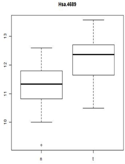
Does HSA.4689 express differently in tumor cells compared to normal cells?
40 samples are from tumor biopsies - 't'
22 samples are from normal biopsies - 'n'
2000 (of 6500) probes were selected for analysis
This graph below shows the observed distribution of log2(expression) in the normal and tumor tissue.
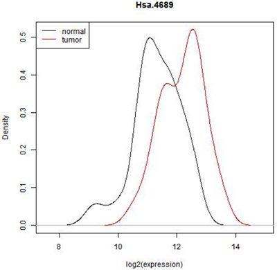
In some situations it is pretty clear that there is a difference in expression - all of the normal tissue samples have lower expression of this feature and all of the tumor samples have a higher expression or vice versa. In that case, we really wouldn't need to do a statistical test. ( In fact, we might have to because the reviewer of our paper might insist on it but the result would be obvious!) However here is there considerable overlap. Expression seems to be shifted up in tumor, but there are only 22 normal and 40 tumor biopsies- perhaps expression is really the same and we just happened by chance to pick a sample with a few smaller values in the normal tissue and a few higher values in the tumor tissue. In fact, we can see that if we just select one random value from the normal samples and one from the tumor samples either one could be higher. Even if we conclude after testing that mean expression of this gene is higher in tumor cells, we will not be able to avoid the fact that most expression values are similar for both cell types.
Notice that what is plotted here is log2(expression). Gene expression values are often skewed with many low values and a few high ones. There are statistical testing methods that can deal with skewed data, but they are not very flexible. log2(expression) is closer to a Bell-shaped distribution for which we can use some very powerful and flexible methods. Expression data is almost always analyzed on the logarithmic scale.
Additionally, one thing that the histogram does not show is the pairing of normal and tumor samples. When we looked at the scatterplot matrix of all the samples together, we saw the two samples from the same patient were much more similar two each other than to normal samples from different patients or two tumor samples from two patients. This pairing is hidden in this histogram.
Although it might be more interesting to ask whether, for this gene, the distribution of gene expression differs between normal and tumor tissue, answering this very general question requires a lot of data. It might also be too general for our needs. Typically, we formulate the null hypothesis in terms of a small set of parameters of the populations, such as the means.
The inferential question we are asking is whether there is a difference in the two population means. We can determine directly from the data whether there is a difference in the sample means, but this is only one possible outcome from all of the possible samples that could be taken of normal and tumor colon tissue. In short, we need to know the sampling distribution of the difference in sample means.
Recall that we set up a null hypothesis that we want to show as false. If we're looking for differential expression,the null hypothesis is that there is no differential expression, that is the mean expression levels are equal. Usually we don't know to advance whether our genes are over or under-expressed, so our alternative hypothesis is just that the means are not equal.
We set up a null and alternative hypothesis in the following manner:
Let X be the log2(expression) in the normal samples with mean \(\mu_X\).
Let Y be the log2(expression) in the tumor samples with mean \(\mu_Y\).
\(H_0: \mu_X=\mu_Y\) or \(H_0: \mu_X-\mu_Y=0\)
\(H_A: \mu_X\neq\mu_Y\) or \(H_A: \mu_X-\mu_Y\neq0\)
The null hypothesis is that the two means of the same and the alternative is that they are different. Often convenient express the null and alternative hypotheses in terms of the difference, i.e. the difference in the means is zero or not zero. We then set up a experiment and our statistical tests so that we can compute the probability of observing a value of the test statistic as extreme or more extreme than the observed value if the null hypothesis is true.
We estimate \(\mu_X\) by \(\bar{X}\) and the variance of X by \(S_X^2\).
We estimate \(\mu_Y\) by \(\bar{Y}\) and the variance of Y by \(S_Y^2\).
If the null hypothesis is true, we expect \(\bar{X}-\bar{Y}\) to be close to zero. The question is: how far from zero does the difference need to be for us to reject the null? Here is where we use the thought experiment. The mean of the sampling distribution of \(\bar{X}-\bar{Y}\) is \(\mu_X-\mu_Y\). We would reject the null hypothesis if the probability of observing a value in the sampling distribution at least as extreme as the observed value is small.

The problem is that we have only one observation - how can we obtain the sampling distribution (or an estimate of the sampling distribution). This is where the thought experiment comes in. We are going to consider both an intuitive method (permutation tests) and a method based on statistical theory (t-tests). The great statistician and genomicist R.A. Fisher thought of the t-test as an approximation to the permutation test, but these days we usually think of permutation tests as suitable when we do not want to make assumptions about the shape of the underlying population (nonparametric) and t-tests when we assume that the underlying population is not too far from Normal (parametric).
The idea in permutation testing is that if there is no difference in means then the gene expression observed in the sample is equally likely to have come from the normal or tumor tissue. We cannot take any new samples, but we could re-assign the values at random to the normal or tumor tissues, by taking the 66 sample labels and just randomly changing their order. Actually, we should not do this due to the pairs of samples that came from the same patient, so lets limit ourselves to one sample per patient - the 22 normal samples and the 18 tumor samples that came from the patients who provided only tumor samples.
So, now there are 40 samples, of which 22 are normal and 18 are tumor. In the permutation test, we simply mix up the samples at random (or equivalently, mix up the labels.) There are a lot of different ways to do this (11,3380,261,800), and computing the difference in means each way gives us an empirical estimate of the null distribution called the permutation distribution. Of course, we will not compute all of the values - a few thousand at most to approximate the null distribution. Suppose that take our original 40 samples and assign 22 at random to the "normal" label and the other 18 to tumor. We then compute the difference in sample means. We do this independently 10,000 times. We then go back to our original value, which is -0.914. We look at the permutation distribution and see how many values are greater than or equal to 0.914 OR less than or equal to -0.914 That tells us how extreme the observed value is if it actually comes from the null distribution distribution. (Remember, this distribution assumes that there is no difference in expression between the normal and tumor samples.) If the observed value is in the typical region, we accept the null hypothesis. If not, we reject the null.
We do this in the demo below. (It will be much clearer if you view it in full screen mode.) I have also uploaded Permutation.Rmd which you can use if you want to try this yourself. Remember that the permutations are created at random, so you will not get the exact same answer that I did.
But there is a big problem with what we have done - we have not used all the samples. It is easy to use this method when all the samples are independent (and this is what was demonstrated). It is also easy to use this method when all the samples are paired (for each patient flip a coin and swap labels when the coin is a head). But it is difficult to do permutation tests when we have a mix of paired and unpaired samples - especially when all the unpaired samples come from the same condition (tumor in this case).
We will consider t-tests in the next section. However, we will not consider tests using all the samples until later in the semester when we cover linear models.
The permutation test can be used to test whether two populations have the same mean both with independent and paired samples, but it is difficult to use all the samples if some are independent and others are paired. The t-test, which is based on statistical theory, is also suitable for either independent or paired samples, but not a mix. However, the statistical theory can be extended to handle a mixed sample. This makes t-tests and their generalizations the basis for much of the work in differential expression analysis.
The t-test uses an approximation to the sampling distribution of the difference in sample means based on the Central Limit Theorem, which ensures that for sufficiently large samples, the sampling distribution will be very close to Normal. The mean of the sampling distribution will be the difference in population means, and the variance of the sampling distribution will be the standard error of the difference in sample means. This approximation works quite well even for small samples (say sample sizes of 10 for both conditions) unless the data are highly skewed. For gene expression data measured on microarrays, taking logarithms of expression usually reduces skewness enough for this approximation to work well.
In this case our two conditions are the normal tissue samples and the tumor tissue samples. We estimate the population means by using the sample means \(\bar{X}\) for normal and \(\bar{Y}\) for tumor. We estimate the the population variances using the sample variances \(S^2_X\) and \(S^2_Y\). For the 40 independent samples, we plug the sample variances into the formula for the standard error of the difference in sample means \(\sqrt{\frac{S^2_X}{n_X}+\frac{S^2_Y}{n_Y}}\) where \(n_X\) and \(n_Y\) are the sample sizes.
Now, if the null hypothesis was true we expect that \(\bar{X} - \bar{Y}\) would be close to zero. Just as with the permutation test, "close" is relative to the sampling distribution. And we have an estimate of the SD of the sampling distribution. Statistical theory then tells us that if the underlying populations are close to Normal, are independent and there is no difference in population means, then
\[ t*=\frac{\bar{X} - \bar{Y}}{\sqrt{\frac{S^2_X}{n_X}+\frac{S^2_Y}{n_Y}}}\]
has a Student-t distribution.
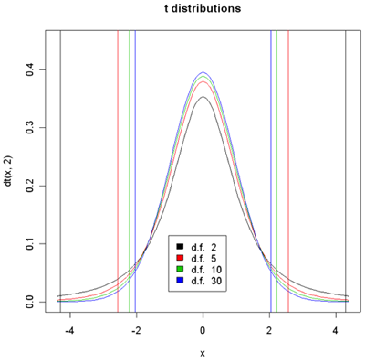
Density histograms of t-distribution for different degrees of freedom.
95% of the sample should yield t values between the vertical lines of the given color.
Student-t is actually a family of distributions defined by a parameter called the degrees of freedom or d.f. The degrees of freedom have to do with the error in estimating variance using the sample variance instead of knowing exactly what it is from the population. When there are infinite d.f, we get the Normal distribution. The larger the d.f. the higher the peak at 0 and the small the percentage of the population which are less than -3 or greater than 3. In the plot above, 95% of the population designated by the color are between vertical bars of the same color. With 30 d.f. the bars are at +/- 2.04. So an unusual value of t would be anything with absolute value greater than 2.04. Similarly, for 2 d.f. the bars are at +/- 4.3. The brilliance of the t-test is that if the null hypothesis is true then the two sample means and variances and the sample sizes are sufficient to compute the t-value and determine the associated p-value.
In the special case when X and Y have the same population variance, we use a pooled variance estimator and the d.f. are exactly \( (n_X-1)+(n_Y-1)\). In general, however, the population variances are not the same and we use the individual variance estimates as given above. In that case, a fairly complex formula is used to estimate the d.f. and the d.f. may be fractional.
When the t-value is typical (i.e. near the center of the distribution), it does not provide evidence against the null hypothesis. I.e. if the null hypothesis is true, then t-values of the observed size readily arise by chance- the difference in sample means is small enough to arise due to measurement and biological variablility between samples.
When the population means are not equal, the distribution of t* is shifted by about \(\frac{\mu_X - \mu_Y}{\sqrt{\frac{\sigma^2_X}{n_X}+\frac{\sigma^2_Y}{n_Y}}}\), so that t* is more likely to be in the left tail if \(\mu_X < \mu_Y\) (blue histogram) and in the right tail if \(\mu_X > \mu_Y\) (red histogram) and therefore to be an unusual value under the null hypothesis of no difference in means (black histogram).

Usually after computing t*, we convert it to a p-value. Suppose we observe the t-value indicated on the graph with the red arrow. Remember, the p-value is the percentage of the histogram that is more extreme, everything farther from the center of the observed t-value and its reflection designated by the two purple arrows.

We focus on the black and the blue curves. Considering the observed t, is it more surprising if you have 2 degrees of freedom or 30 degrees of freedom?
The degree of "surprise" is measured by the percentage of the sampling distribution of t* (when the null hypothesis is true) that would be more extreme than the observed value - i.e. the area under the histogram from the observed t value out to the left and its reflection out to the right. The blue distribution is lower than the black, so there is less room or a smaller percentage of the sampling distribution under the blue distribution then there is under the black. Therefore, it is more surprising if you have 30 degrees of freedom than if you have 2 degrees of freedom. Remember, the degrees of freedom comes from the the two sample sizes. So, for any value of t* that is not exactly zero, the value is more surprising with larger sample sizes. We expect with small sample sizes that \(\bar{X}-\bar{Y}\) might be quite variable and as well the estimate of the sample variances might also be poor, so there is a lot of variability in t*. But in large samples the sample estimates should be closer to the true values. So if there's no difference between gene expression in the normal tissue samples compared to the tumor tissue samples we expect t* to be close to zero in larger samples than in smaller samples.
Often what we say that there is a significant difference if the p-value is less than .05, i.e. the percent of samples that would be more extreme is less than .05. The vertical lines in the histogram show this. The observed t* is significant at p<0.05 for 10 and 30 d.f. but not for 5 and 2 d.f.
Very occasionally we know in advance whether we should be expecting things to be over expressed or under expressed in a certain tissue. In these cases we would only use a one tailed test. Usually, however, we are testing both over and under-expression and use both tails to compute the p-value.
We could compute t* on a calculator and look up the p-value on a t-table, but it is easier to use R.
Results of Welch Two Sample t-test data:
t = -3.9224, df = 37.999, p-value = 0.0003553
95 percent confidence interval: (-1.3866216,-0.4425592)
The p-value for our normal versus tumor tissue samples is 0.0003. This is surprising! This is the probability of seeing something this extreme or more if there is no difference in mean expression. We either got a very unusual sample or the null hypothesis is false and mean expression is higher in the tumor tissue.
The confidence interval is the set of all possible differences in population means for which the observed value of t* would NOT be surprising. The confidence interval tells us that plausible values of the difference in population means is somewhere between -1.39 and -0.44.
We should notice is that statistical significance is not the same as practical significance. Biologists often target 2-fold expression differences as the minimum for biological relevance (although just like p<0.05 for statistical significance, this is just a rule of thumb). 2-fold is the same as +/-1 on the log2 scale. In the current example, the observed difference in means is 11.339-12.186=-0.848 which might not be considered biologically significant.
The difference between statistical and biological significance is a criticism of this type of testing. The reason for this is that in the denominator of the test there are quantities that are divided by the sample sizes. So, if the sample sizes are really big, the denominator becomes very small and tiny differences in the means are going to be statistically significant.
1.Biologists usually twofold difference in expression to be biologically significant (espeically if it is also statistically significant). What about smaller differences such as 5-% or 10%? Is this difference biologically significant? In any study we will need to combine the evidence with the current data with evidence from previous studies to come up with biological inferences and new hypotheses.
2. The t-test that we use was called Welch's t-test. Welch's t-test allows the two populations to have different spreads. There is another form of the test which where we assume the two populations have about the same spread. This may not be very realistic for normal and tumor tissue samples. Gene expression in tumor tissues may be much more spread out than in normal tissue. In fact, in a lot of situations when we are looking at something versus the control, the control has lower variance. Fortunately, the t-test is quite robust to the equal variance assumption unless the differences in expression are very large or the difference in sample sizes is very large.
3. We do need to be careful about independence.
4. We usually use the log2(expression) which generally helps to equalize variance between the two populations (variance stabilizing) and improves Normality of the underlying populations.
Both the permutation test and t-test already discussed require independent samples. We could use either test with the colon cancer data if we use all the normal samples, but do not use the tumor samples from these patients. However, this would be wasteful of our data. We will discuss mixed samples later. For now, we will discuss how to use only the paired samples.
Suppose all the patients provided both normal and tumor samples. The pairs of samples from the same patient have correlated expression. Dependent samples (leading to correlated data) occur quite often in bioinformatics. Dependence may be induced by the biology or the technology. For example, we may take several tissue samples from the same individual, or several biologically related individuals. We may house our plants or animals together, inducing environmental correlation. We might process our nucleic acid samples in batches inducing technical correlation. Typically these dependencies induce positive correlation, so that the data are less variable than they would be if the samples are independent. In a few situations, such as competition studies, negative correlations are induced so that the data are more variable than they would be if the samples are independent.
Suppose were only using the paired samples, that is the 22 patients that have both normal and tumor samples. We are still interested in the same hypothesis \(H_0: \mu_X-\mu_Y=0\) but the variability of the difference in sample means will be different than in independent samples. The reason for this is that the difference in sample means is the same as the sample mean of the expression differences. Let \(X_i\) and \(Y_i\) be the gene expression for the normal and tumor samples respectively in patient \(i\) and let \(D_i=X_i-Y_i\). Note that \(n_X=n_Y\). It is easy to see arithmetically that if all the samples are paired,
\[\bar{X}-\bar{Y}=\bar{D}.\]
Now back when we looked at correlation, we saw the formula:
\[Var(X-Y)=Var(X)+Var(Y)-2 SD(X)SD(Y)Corr(X,Y)\].
We can estimate this variance by computing the two sample variances and the sample correlation, or more simply by computing the sample variance of the \(D_i\)'s (and we should obtain the same answer).
In general expression of the same gene in two samples from the same patient will be positively correlated because if expression is higher than the population average in the patient, it should be higher than average in both samples and if it is lower than average in the patient it should be lower than average in both samples. So, \(Var(D)<Var(X)+Var(Y)\). What this means is that the variance of the sampling distribution of \(\bar{X}-\bar{Y} < \frac{Var(X)}{n_x}+\frac{Var(Y)}{n_Y}\).
If we want to use the permutation method, we want to keep the pairing and swap sample labels within pair. This can readily be done by the equivalent of tossing a fair coin for each sample - if H, then keep the original sample labels; if T, then switch the values for the normal and tumor samples. Compute the sampling distribution using the sample mean D for each of these randomly relabelled samples.
To do a t-test, we need an estimate of the variance of the sampling distribution of \(\bar{X}-\bar{Y}\). Fortunately, we have a direct estimate based on the D's. All we have to do is reduce our data to \(D_i\) for each patient. Consider the underlying population to be the differences, with mean \(\mu_D\) and variance Var(D). Then we just test whether the \(\mu_D=0\).
\(H_0: \mu_D=0\)
\(H_A: \mu_D \ne 0\)
We estimate \(\mu_D\) with \(\bar(D)\) and the SE of the sampling distribution of \(\bar(D)\) with \(\frac{S^2_D}{n_X}\). Finally we do a one sample t-test using D
\[t*=\frac{\bar{D}}{\sqrt{\frac{S^2_D}{n_X}}}\]
with \(n_X-1\) d.f. This is sometimes called the paired t-test.
With identical sample sizes \(n_X=n_Y\) the two sample t-test will have d.f. close to \(2n_X\) so the t-distribution will be more concentrated around 0. However, for the same value of \(\bar{X}-\bar{Y}=\bar{D}\) the t* value will be larger for the paired t-test, because of the smaller variance. Usually, but not always, this leads to a smaller p-value for tests using paired samples.
Below we have the actual outcomes for the two valid methods discussed so far - using the 22 normal samples and the 18 independent tumor samples or using the 22 paired samples.
| Test using the 22 normal samples and the 18 independent tumor samples | Test using the 22 paired samples |
| Welch Two Sample t-test | One Sample t-test |
| t = -3.9224, df = 37.999, p-value = 0.0003553 | t = -3.307, df = 21, p-value = 0.003354 |
| 95 percent confidence interval: (-1.3866216, -0.4425592) | 95 percent confidence interval: (-1.2911223, -0.2941996) |
The p-values and 95% confidence intervals are pretty similar in this case, but this will not be true for all the genes measured. These are both valid tests.
A test using all 62 samples as if all the samples were independent is not valid. A better test using all the data will be discussed when we discuss linear models.
There are many alternatives to the t-test as this is not the only choice for testing hypotheses about average expression levels. However, they all have similar problems. They work well with either independent samples or paired samples, but not both together.
You have already seen the permutation test. The bootstrap test is similar to the permutation test but instead of permuting the labels, you put all of the observations into a single pool and simulate by selecting \(n_X\) samples to be X and \(n_Y\) samples to be Y with replacement. This is done many times to obtain an estimate of the distribution of \(\bar{X}-\bar{Y}\) when the null hypothesis is true. The Wilcoxon test is often used when the underlying populations are not normal. It proceeds by taking all the data and replacing the numbers by the ranks from 1 (for the lowest number) to \(x_X+n_Y\) for the largest number and then doing a t-test on the ranks. However, although it is popular, it turns out not to perform well with high throughput data for 3 reasons:
1) It lacks flexible extensions to complex samples (e.g. with both dependent and independent samples)
2) Although it has similar power to the t-test in large samples, it lacks power in small samples leading to false negatives.
3) In many situations in which the Wilcoxon test is used, the t-test is robust to non-normality and is more powerful.
The other kinds of tests are test of proportions and we will see this quite a lot. For example, when you do a GWAS study using SNPs or some other genetic marker and you have three genotypes, (major/major, minor/minor and major/minor alleles), patients and controls, you might want to know whether the distribution of genotypes is the same in the two groups or whether it differs. This will involve tests of two-way tables, and will be covered later in the course.
Typically when discussing p-values, we consider the probability of a rare event for a single comparison. However, for "omics" data we are doing simultaneous tests of 10s of thousands of variables. An event that occurs 1% of the time is rare when you observe a single value from a sampling distribution, but almost certain to occur if you observe 100 thousand values. If you purchase a lottery ticket the chances that you win may be one in 40 million. But someone will win that lottery! Rare things happen when you do a lot of tests and we will need to take this into acount.
When we did the permutation test and the t-test we assumed that there was no difference in expression in order to compute the p-value. If the null hypothesis is true but we reject it, we made a mistake which is called Type I error or false detection. But that's not the only kind of mistake one could make. We could fail could detect a gene that actually differentially expresses. This is called a type II error or false non-detection. The probability that we correctly detect something when the null hypothesis is false, is called the power of the test.
We would like to design our studies so that the probability of both type I and type II errors are small.
The biology of gene expression in normal and tumor tissues is not under our control. Each gene has a population of expression values in normal tissues and a population of expression values in tumor tissues -- either the population means are the same (null is true) or they are not (null is false). If there is truly a difference we want |t*| to be big. So, what is under our control that can give us more power to reject the null when it is false?
Let's take another look at the equation for t*. What values in the equation below will make t* large?
\[t*=\frac{\bar{X} - \bar{Y}}{\sqrt{\frac{S_x^2}{n}+\frac{S_y^2}{m}}}\]
One thing would be to have a large numerator, \(\bar{X}-\bar{Y}\). However, we know that the mean of the sampling distribution of \(\bar{X}-\bar{Y}\) is \(\mu_X-\mu_Y\) which is the difference in average expression in the two kinds of tissue and is outside of our control. (However, in some experiments in nature we can control this too by selecting more extreme conditions such as exposures!)
On the other hand, we always have control over the denominator because we select the sample size. The larger the sample size the smaller the denominator. This is why statisticians are always saying, "Take more samples!". We also have some control over the variances - we can often reduce variance by improving some aspect of our experiment.
Science takes many resources - time, money, labor and samples. All of these are limited. As well, generally each individual experiment is only part of a sequence of studies which together give a bigger picture of the biology. A good experimental design will try to balance all of these aspects, and this usually means that we cannot take all the samples that statistical principles would suggest.
In the long run, we always want to make sure we have enough samples to have some reasonable amount of power to detect differences of a reasonable size. We won't be able to detect everything. Features that have very small differences might need huge sample sizes to have a reasonable detection probability. We have to figure out what size difference we want to detect and use a sample size that has a chance of detecting it.
We also have two ways control over the variability. One way is experiment control - but we have to be careful about this. For instance, when we grow plants in a greenhouse instead of a field many environmental influences which increase variance will be removed from the picture. However, if you want to find out what happens in the field the greenhouse is not going to be representative. We often control variability in unrealistic ways within our experiments. For example, in nutrition experiments we seldom allow subjects to eat whatever they want - subjects have to agree that they will eat all of their meals in the lab throughout the experiment so that we can remove other sources of variability. From this we try to say what's going to happen in the general population when they follow a dietary guideline.
Recently concerns have been raised that too stringent experimental control is contributing to irreproducible research. The idea is that variability is being so tightly controlled, that it is practically impossible to reproduce the experimental conditions and that either these conditions are contributing to observed differences (or lack of differences) or the estimated variances are so small that there are false detections. See for example [1].
The second way to reduce variability is by using better measurement instruments. This does not change the biological variability but allows us to control measurement error. The smaller the measurement error, the less total variability we have. If we can't get rid of the measurement error, we could take multiple measurements of the same sample and average them together. Averaging gets rid of whatever variability might have occurred through measurement without removing biological variability. For example, people who do dilution series often do these series in triplicate and then averaged results because dilution series are often 'noisy'. However, there are limitations to this type of duplication. Generally it is more effective to take more biological samples rather than duplicate measurements of the same sample, unless the duplicate measures are much less expensive. [2]
It turns out that sample size is very critical to everything. Larger sample size not only increases the power, the possibility of rejecting when you're supposed to, but it also reduces the false discovery rate. Increasing sample size also reduces the false non-discovery rate (FNR).
Increasing sample size is not always the best course of action because we need to make the most of the resources we have. But experiments with sample sizes that are too small are a complete waste of resources leading to mainly false detections and many false nondetections.
Another way to increase power is to improve your analyses. We can improve quite substantially on tests which consider only one feature at a time by using more sophisticated methods. So far we have used frequentist methods. Another approach to statistics is called Bayesian statistics. As well, there are frequentist methods based on appealing approximations to Bayesian statistics which can often produce much more powerful tests. We will look at these methods next.
References
[1] Richter, S.H., Garner, J.P., Zipser, B., Lewejohann, L., Sachser, N., Touma, C., Schindler, B., Chourbaji, S., Brandwein, C., Gass, P., van Stipdonk, N., van der Harst, J., Spruijt, B., Võikar, V., Wolfer, D.P., Würbel, H. Effect of population heterogenization on the reproducibility of mouse behavior: A multi-laboratory study. (2011) PLoS ONE, 6 (1), art. no. e16461,
[2] Krzywinski, M., & Altman, N. (2015) Points of Significance: Sources of variation. Nature Methods, 12(1), 5-6 doi:10.1038/nmeth.3224
Bayesian Methods
Statistical methods are divided broadly into two types: frequentist (or classical) and Bayesian. Both approaches require data generated by a known randomization mechanism from some population with some unknown parameters, with the objective of using the data to determine some of the properties of the unknowns. Both approaches also require some type of model of the population - e.g. the population is Normal, or the population has a finite mean. However, in frequentist statistics, probabilities are assigned only as the frequency of an event occurring when sampling from the population. In Bayesian statistics, the information about the unknown parameters is also summarized by a probability distribution.
To understand the difference, consider tossing a coin 10 times to examine whether it is fair or not. Suppose the outcome is 7 heads. The frequentist obtains the probability of the outcome given that the coin is fair (0.12), the p-value (Prob(7 or more heads or tails|fair)=0.34) and concludes that there is no evidence that the coin is not fair. She might also produce a 95% confidence interval for the probability of a head (0.35, 0.93). For the frequentist, there is no sense in asking the probability that the coin is fair - it either is or is not fair. The frequentist makes statements about the probability of the sample after making an assumption about the population parameter (which in this case is the probability of tossing a head).
The Bayesian, by contrast, starts with general information about similar coins - on average they are fair but each possible value between zero and 1 has some probability, higher near 0.5 and quite low at 0 and 1. The probability assessment of the heads proportion is called the prior probability. Each person might have their individual assessment, based on their personal experience, which is called a subjective prior. Alternatively, a prior probability distribution might be selected based on good properties of the resulting estimates, called an objective prior. The data is then observed. For any particular heads proportion \(\pi\) the probability of 7 heads can be computed (called the likelihood). The likelihood and the prior are then combined using Bayes' theorem in probability, to give the posterior distribution of \(\pi\) - which gives the probability distribution of the heads proportion given the data. Since the observed number (7 heads in 10 tosses) is higher than 50%, the posterior will give higher probability than the prior to proportions greater than 1/2. The Bayesian can compute things like Prob(coin is biased towards head|7 heads in 10 tosses) although she still cannot compute Prob(coin is exactly fair| 7 heads in 10 tosses) (because the probability of any single value is zero). More information about Bayes' Theorem and Bayesian statistics, including more details about this example, can be found in [1] and [2].
In Bayesian statistics unknown quantities are given a prior distribution. When we are measuring only one feature, this is controversial - what is the "population" that a quantity like the population mean could come from? However, in high-throughput analysis, this is a natural approach. Each feature could be considered a member of a population of features. So, for example, the mean expression of gene A (in all possible biological samples) can be thought of as a sample from the mean expression of all genes. When doing differential expression analysis we could put a distribution on \(\mu_X-\mu_Y\) or on the binary outcome: the gene does/does not differentially express.
Due to the information added by the prior, Bayesian analyses tend to be more "powerful" than frequentist analyses. (I put "powerful" in quotes, because it does not mean the same thing to the Bayesian as to the frequentist due to the different formulation.) As well, Bayesians directly address questions like "What is the probability that this gene overexpresses in tumor samples" which are of interest to biologists. So, why don't we use Bayesian methods all the time?
Unfortunately, Bayesian models are quite difficult to set up except in the simplest cases. For example, Bayesian models are available to replace the t-tests we have already looked at, but more complex models including analyses like one-way ANOVA, are difficult to specify because there are multiple dependent parameters. (Recall the one-way ANOVA is an extension of the two-sample t-test to 3 or more populations. With G populations, there are G(G-1)/2 pairwise differences in means, and these differences and their dependencies would all need priors.) Another problem is that investigators with different priors would draw different inferences from the same data, which seems contrary to the idea of objective evidence based on the data. Although the influence of the prior can be shown to be overwhelmed by the data once there is sufficient data, sample sizes in many studies are too small for this to occur.
Software is available to replace t-tests with Bayesian tests for the simplest differential expression scenario. However, because this software is not extensible to more complex situations, we will not be using it in this class. For some problems, however, Bayesian methods provide powerful analysis tools.
Empirical Bayes
In high throughput biology we have the population of features, as well as the population of samples. For each feature we can obtain an estimate of the parameters of interest such as means, variances or differences in means. The histograms of these estimates (over all the genes) provide an estimate of the prior for the population of features called the empirical prior. This leads to a set of frequentist methods called the empirical Bayesian methods, which are more powerful than "one-feature-at-a-time" methods.
The idea with empirical Bayesian methods is to use the Bayesian set-up but to estimate the priors from the population of all features. Formally speaking, empirical Bayes are frequentist methods which produce p-values and confidence intervals. However, because we have the empirical priors, we can also use some of the probabilistic ideas from Bayesian analysis. We will be using empirical Bayes methods for differential expression analysis.
Moderated Methods
Empirical Bayes methods are related to another set of methods called moderated methods or James-Stein estimators. These are based on a remarkable result by James and Stein that when estimating quantities that can be expressed as expectations (which includes both population means and population variances) that when there are 3 or more populations, a weighted average of the sampleestimate from the population and a quantity computed from all the populations is better on average than using just the data from the particular population. (Translated into our setting, it means that if you want to know if genes 1 through G differentially express, you should use the data from all the genes to make this determination for each gene, even though for gene i, its expression levels will be weighted more heavily.) This is called Stein's paradox. Further information can be found in [3] and as well as a brief Wikipedia article. The result is paradoxical, because it does not matter if the populations have anything in common - the result holds even if the quantities we want to estimate are mean salaries of NFL players, mean mass of galaxies, mean cost of a kilo of apples in cities of a certain type and mean air pollution indices.
Moderated methods are very intuitive for "omics" data, as we always have many more than 3 features, and since we have a population of features the result is less paradoxical. Empirical Bayes methods are moderated methods for which the weighting is generated by the empirical prior. Methods which do not fit under the empirical Bayes umbrella rely on ad hoc weights which are chosen using other statistical methods.
Empirical Bayes and moderated methods have been popularized by a number of software packages first developed for differential expression analysis of gene expression microarrays, in particular LIMMA (an empirical Bayes method), SAM (a moderated method) and MAANOVA (a moderated method).
We will start our analyses with microarray data. We will perform t-tests and then will use empirical Bayes t-tests to gain power. The more power you have for a given p-value, the smaller both your false discovery rates and your false non-discovery rates will be.
We improve power by having adequate sample size, good experimental design and a good choice of statistical methodology.
References
[1] López Puga J, Krzywinski M, Altman N. (2015) Points of significance: Bayes' theorem. [1] Nat Methods. 2015 Apr;12(4):277-8. PubMed PMID: 26005726.
[2] Puga, J. L., Krzywinski, M., & Altman, N. (2015). Points of significance: Bayesian Statistics. Nature Methods, 12(5), 377-378 doi:10.1038/nmeth.3368
[3] Efron, B. and Morris, C. (1977), “Stein’s Paradox in Statistics,” Scientific American, 236, 119-127.
Links:
[1] https://www.ncbi.nlm.nih.gov/pubmed/26005726