6.2 - Assessing the Model Assumptions
We can use all the methods we learnt about in Lesson 4 to assess the multiple linear regression model assumptions:
- Create a scatterplot with the residuals, \(e_i\), on the vertical axis and the fitted values, \(\hat{y}_i\), on the horizontal axis and visual assess whether:
- the (vertical) average of the residuals remains close to 0 as we scan the plot from left to right (this affirms the "L" condition);
- the (vertical) spread of the residuals remains approximately constant as we scan the plot from left to right (this affirms the "E" condition);
- there are no excessively outlying points (we'll explore this in more detail in Lesson 9).
- violation of any of these three may necessitate remedial action (such as transforming one or more predictors and/or the response variable), depending on the severity of the violation (we'll explore this in more detail in Lesson 7).
- If the data observations were collected over time (or space) create a scatterplot with the residuals, \(e_i\), on the vertical axis and the time (or space) sequence on the horizontal axis and visual assess whether there is no systematic non-random pattern (this affirms the "I" condition).
- Violation may suggest the need for a time series model (a topic that is not considered in this course).
- Create a series of scatterplots with the residuals, \(e_i\), on the vertical axis and each of the predictors in the model on the horizontal axes and visual assess whether:
- the (vertical) average of the residuals remains close to 0 as we scan the plot from left to right (this affirms the "L" condition);
- the (vertical) spread of the residuals remains approximately constant as we scan the plot from left to right (this affirms the "E" condition);
- violation of either of these for at least one residual plot may suggest the need for transformations of one or more predictors and/or the response variable (again we'll explore this in more detail in Lesson 7).
- Create a histogram, boxplot, and/or normal probability plot of the residuals, \(e_i\) to check for approximate normality (the "N" condition). (Of these plots, the normal probability plot is generally the most effective.)
- Create a series of scatterplots with the residuals, \(e_i\), on the vertical axis and each of the available predictors that have been omitted from the model on the horizontal axes and visual assess whether:
- there are no strong linear or simple nonlinear trends in the plot;
- violation may indicate the predictor in question (or a transformation of the predictor) might be usefully added to the model.
- it can sometimes be helpful to plot functions of predictor variables on the horizontal axis of a residual plot, for example interaction terms consisting of one quantitative predictor multiplied by another quantitative predictor. A strong linear or simple nonlinear trend in the resulting plot may indicate the variable plotted on the horizontal axis might be usefully added to the model.
As you can see, checking the assumptions for a multiple linear regression model comprehensively is not a trivial undertaking! But, the more thorough we are in doing this, the greater the confidence we can have in our model. To illustrate, let's do a residual analysis for the example on IQ and physical characteristics from Lesson 5 (iqsize.txt), where we've fit a model with PIQ as the response and Brain and Height as the predictors:
- First, here's a residual plot with the residuals, \(e_i\), on the vertical axis and the fitted values, \(\hat{y}_i\), on the horizontal axis:
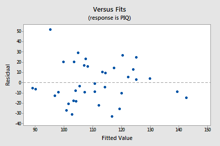
As we scan the plot from left to right, the average of the residuals remains approximately 0, the variation of the residuals appears to be roughly constant, and there are no excessively outlying points (except perhaps the observation with a residual of about 50, which might warrant some further investigation but isn't too much of a worry). Note that the two observations on the right of the plot with fitted values close to 140 are of no concern with respect to the model assumptions. We'd be reading too much into the plot if we were to worry that the residuals appear less variable on the right side of the plot (there are only 2 out of a total of 38 points here and hence there is little information on residual variability in this region of the plot).
- There is no time (or space) variable in this dataset so the next plot we'll consider is a scatterplot with the residuals, \(e_i\), on the vertical axis and one of the predictors in the model, Brain, on the horizontal axis:
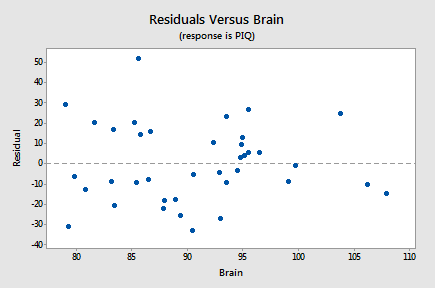
Again, as we scan the plot from left to right, the average of the residuals remains approximately 0, the variation of the residuals appears to be roughly constant, and there are no excessively outlying points. Also, there is no strong nonlinear trend in this plot that might suggest a transformation of PIQ or Brain in this model.
- The next plot we'll consider is a scatterplot with the residuals, \(e_i\), on the vertical axis and the other predictor in the model, Height, on the horizontal axis:
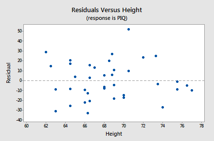
Again, as we scan the plot from left to right, the average of the residuals remains approximately 0, the variation of the residuals appears to be roughly constant, and there are no excessively outlying points. Also, there is no strong nonlinear trend in this plot that might suggest a transformation of PIQ or Height in this model.
- The next plot we'll consider is a histogram of the residuals:
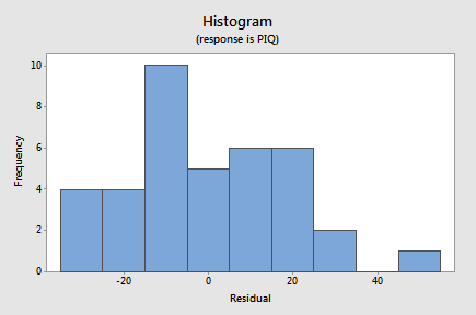
Although this doesn't have the ideal bell-shaped appearance, given the small sample size there's little to suggest violation of the normality assumption.
- Since the appearance of a histogram can be strongly influenced by the choice of intervals for the bars, to confirm this we can also look at a normal probability plot of the residuals:
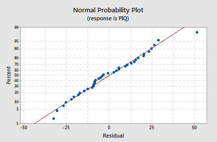
Again, given the small sample size there's little to suggest violation of the normality assumption.
- The final plot we'll consider for this example is a scatterplot with the residuals, \(e_i\), on the vertical axis and the only predictor excluded from the model, Weight, on the horizontal axis:
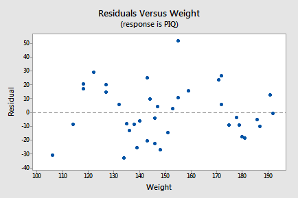
Since there is no strong linear or simple nonlinear trend in this plot, there is nothing to suggest that Weight might be usefully added to the model. Don't get carried away by the apparent "up-down-up-down-up" pattern in this plot. This "trend" isn't nearly strong enough to warrant adding some complex function of Weight to the model - remember we've only got a sample size of 38 and we'd have to use up at least 5 degrees of freedom trying to add a fifth-degree polynomial of Weight to the model. All we'd end up doing if we did this is over-fitting the sample data and ending up with an over-complicated model that predicts new observations very poorly.
One key idea to draw from this example is that if you stare at a scatterplot of completely random points long enough you'll start to see patterns even when there are none! Residual analysis should be done thoroughly and carefully but without over-interpreting every slight anomaly. Serious problems with the multiple linear regression model generally reveal themselves pretty clearly in one or more residual plots. If a residual plot looks "mostly OK," chances are it is fine.