Lesson 1: Collecting and Summarizing Data
Lesson 1: Collecting and Summarizing DataOverview
The lesson starts with a discussion about how to collect data and different methods to use. Once the data is collected, we need to summarize the data. How to summarize the data depends on which variable type we have. All of these concepts will be presented here.
Objectives
- Describe the benefits and limitations of non-probability and probability sampling methods.
- Distinguish between experimental and observational studies. Identify explanatory and response variables in a research study.
- Based on the type of study, determine when a causal conclusion (as opposed to associations) can be made.
- Articulate how the principles of experimental design (control, randomization, replication) would apply to a given study.
- Given a research study, identify possible lurking and confounding variables.
- Classify variables as categorical and quantitative. Create (using technology) graphical displays of categorical variables using pie charts and bar charts.
- Create (using technology) graphical displays of quantitative variables using dotplots, histograms and box plots.
- Select and interpret the appropriate visual representations for one categorical variable, and one quantitative variable.
- Given a data set, compute and interpret measures of center, position (percentiles), and spread.
- Construct and interpret a box plot.
1.1 - Collecting Data
1.1 - Collecting DataCollecting data is an important first step in statistical analysis. The goal of statistics is to make inferences about a population based on a sample. How we collect the data is important. If the sample is not representative of the whole population, we cannot make inferences about the population from that sample.
The following are a few frequently used methods for collecting data:
- Personal Interview
- People usually respond when asked by a person but their answers may be influenced by the interviewer.
- Telephone Interview
- Cost-effective but need to keep it short since respondents tend to be impatient.
- Self-Administered Questionnaires
- Cost-effective but the response rate is lower and the respondents may be a biased sample.
- Direct Observation
- For certain quantities of interest, one may be able to measure it from the sample.
- Web-Based Survey
- Can only target the population who uses the web.
1.1.1 - Types of Bias
1.1.1 - Types of BiasWhenever data is collected, there is a risk that the sample is biased. Here are some potential types of bias.
Types of Bias
- Non-Response Bias
- When a large percentage of those sampled do not respond or participate.
- Response Bias
- When study participants either do not respond truthfully or give answers they feel the researcher wants to hear. For example, when students are asked if they ever cheated on an exam even those who have would respond with "no."
- Selection
- This bias occurs when the sample selected does not reflect the population of interest. For instance, you are interested in the attitude of female students regarding campus safety but when sampling you also include males. In this case, your population of interest was female students however your sample included subjects not in that population (i.e. males).
Looking Ahead
Students interested in pursuing topics related to the design of experiments might explore STAT 503: Design of Experiments. STAT 503 includes extensive coverage implementation and analysis of a wide range of experimental designs.
1.1.2 - Strategies for Collecting Data
1.1.2 - Strategies for Collecting DataHow can we get data? How do we select observations or measurements for a study?
There are two types of methods for collecting data, non-probability methods and probability methods.
- Non-probability Methods
-
These might include:
Convenience sampling (haphazard): Collecting data from subjects who are conveniently obtained.- Example: surveying students as they pass by in the university's student union building.
- Example: using an advertisement in a magazine or on a website inviting people to complete a form or participate in a study.
- Probability Methods
-
- Simple random sample: making selections from a population where each subject in the population has an equal chance of being selected.
- Stratified random sample: where you have first identified the population of interest, you then divide this population into strata or groups based on some characteristic (e.g. sex, geographic region), then perform simple random sample from each strata.
- Cluster sample: where a random cluster of subjects is taken from the population of interest. For instance, if we were to estimate the average salary for faculty members at Penn State - University Park Campus, we could take a simple random sample of departments and find the salary of each faculty member within the sampled department. This would be our cluster sample.
There are advantages and disadvantages to both types of methods. Non-probability methods are often easier and cheaper to facilitate. When non-probability methods are used it is often the case that the sample is not representative of the population. If it is not representative, you can make generalizations only about the sample, not the population. The primary benefit of using probability sampling methods is the ability to make inference. We can assume that by using random sampling we attain a representative sample of the population The results can be “extended” or “generalized” to the population from which the sample came.
Example 1-1: Survey Methods

Airline Company Survey of Passengers
Let's say that you are the owner of a large airline company and you live in Los Angeles. You want to survey your L.A. passengers on what they like and dislike about traveling on your airline. For each of the methods, determine if a non-probability method or a probability method is used. Then determine the type of sampling.
-
Since you live in L.A. you go to the airport and just interview passengers as they approach your ticket counter.Non-probability method; convenience sampling.
-
You have your ticket counter personnel distribute a questionnaire to each passenger requesting they complete the survey and return it at end of the flight.Non-probability methods; Volunteer sampling
-
You randomly select a set of passengers flying on your airline and question those that you have selected.Probability method; Simple random sampling
-
You group your passengers by the class they fly (first, business, economy), and then take a random sample from each of these groups.Probability method: Stratified sampling
-
You group your passengers by the class they fly (first, business, economy) and randomly select such classes from various flights and survey each passenger in that class and flight selected.Probability method; Cluster sampling
Think About it!
In predicting the 2008 Iowa Caucus results a phone survey said that Hillary Clinton would win, but instead, Obama won. Where did they go wrong?
The survey was based on landline phones, which was skewed to older people who tended to support Hillary. However, lots of younger people got involved in this election and voted for Obama. The younger people could only be reached by cell phone.
Looking Ahead
Students interested in pursuing topics related to sampling might explore STAT 506: Sampling Theory. STAT 506 covers sampling design and analysis methods that are useful for research and management in many fields. A well-designed sampling procedure ensures that we can summarize and analyze data with a minimum of assumptions and complications.
1.1.3 - Types of Studies
1.1.3 - Types of StudiesNow that we know how to collect data, the next step is to determine the type of study. The type of study will determine what type of relationship we can conclude.
There are predominantly two different types of studies:
- Observational
- A study where a researcher records or observes the observations or measurements without manipulating any variables. These studies show that there may be a relationship but not necessarily a cause and effect relationship.
- Experimental
- A study that involves some random assignment* of a treatment; researchers can draw cause and effect (or causal) conclusions. An experimental study may also be called a scientific study or an experiment.
Note! Random selection (a probability method of sampling) is not random assignment (as in an experiment). In an ideal world you would have a completely randomized experiment; one that incorporates random sampling and random assignment.
Example 1-2: Types of Studies
Quiz and Exam Score Studies
Let's say that there is an option to take quizzes throughout this class. In an observational study, we may find that better students tend to take the quizzes and do better on exams. Consequently, we might conclude that there may be a relationship between quizzes and exam scores.
In an experimental study, we would randomly assign quizzes to specific students to look for improvements. In other words, we would look to see whether taking quizzes causes higher exam scores.
Causation
It is very important to distinguish between observational and experimental studies since one has to be very skeptical about drawing cause and effect conclusions using observational studies. The use of random assignment of treatments (i.e. what distinguishes an experimental study from an observational study) allows one to employ cause and effect conclusions.
Ethics is an important aspect of experimental design to keep in mind. For example, the original relationship between smoking and lung cancer was based on an observational study and not an assignment of smoking behavior.
Try It!
Method 1
Method 2
1.1.4 - Variables
1.1.4 - VariablesThere may be many variables in a study. The variables may play different roles in the study. Variables can be classified as either explanatory or response variables.
- Variable
- A variable is any characteristic, number, or quantity that can be measured, counted, or observed for record.
- Response Variable
- Variable that about which the researcher is posing the question. May also be called the outcome or the dependent variable.
- Explanatory Variable
- Variables that serve to explain changes in the response. They may also be called the predictor or independent variables.
Example 1-3: Response and Explanatory Variables
Other Variables
Other types of variables include:
- Lurking variable
- A variable that is neither the explanatory variable nor the response variable but has a relationship (e.g. may be correlated) with the response and the explanatory variable. It is not considered in the study but could influence the relationship between the variables in the study.
- Confounding variable
- A variable that is in the study and is related to the other study variables, thus having an effect on the relationship between these variables.
A lurking variable, if included in the study, could have a confounding effect and then be classified as a confounding variable.
Example 1-4: Lurking and Confounding Variables
Suppose you teach a class where students must submit weekly homework and then take a weekly quiz. You want to see if there is a relationship between the scores on the two assignments (i.e. higher homework scores are aligned with higher quiz scores). As you look at the data you begin to consider whether the submission date of the homework has an effect on the quiz grades; that is, do students who submit the homework several days before taking the quiz perform better overall on the quiz than students who do not leave much of a time gap between completing the assignments (e.g. they do both on the same day). The rational is that students who allow time between the homework and quiz to study may perform better compared to the other group.
Answer
In this example, “days between submission of homework and quiz” would be a lurking variable as it was not included in the study. Now once you got that information and re-examined the relationship between the two assignments taking into consideration the time gap, if you saw a change in the relationship between the two assignments (i.e. the relationship changed somewhat from the analysis without the time gap compared to when the time gap was included) then this “days between submission” would be considered a confounding variable.
In an experiment where treatments are randomly assigned, one assumes these variables get evenly shared across the groups with the intention that any influence they may have on the outcome is negated or reduced.
1.1.5 - Principles of Experimental Design
1.1.5 - Principles of Experimental DesignThe following principles of experimental design have to be followed to enable a researcher to conclude that differences in the results of an experiment, not reasonably attributable to chance, are likely caused by the treatments.
- Control
- Need to control for effects due to factors other than the ones of primary interest.
- Randomization
- Subjects should be randomly divided into groups to avoid unintentional selection bias in the groups.
- Replication
- A sufficient number of subjects should be used to ensure that randomization creates groups that resemble each other closely and to increase the chances of detecting differences among the treatments when such differences actually exist.
The benefits to randomization are:
- If a random assignment of treatment is done then significant results can be concluded as causal or cause and effect conclusions. That is, that the treatment caused the result. This treatment can be referred to as the explanatory variable and the result as the response variable.
- If random selection is done where the subjects are randomly selected from some population, then the results can be extended to that population. The random assignment is required for an experiment. When both random assignment and selection are part of the study then we have a completely randomized experiment. Without random assignment (i.e.an observational study) then the treatment can only be referred to as being related to the outcome.
1.2 - Classifying Data
1.2 - Classifying DataDistinguishing between the different types of variables is a basic and integral part of applied statistics. The methods to analyze these data are very different and therefore it is important to make the distinction. The two types of variables are Qualitative and Quantitative.
- Qualitative (Categorical)
- Data that serves the function of a name only. Categorical values may be:
- Binary – where there are two choices, e.g. Male and Female
- Ordinal – where the names imply levels with hierarchy or order of preference, e.g. level of education
- Nominal – where no hierarchy is implied, e.g. political party affiliation.
For example, for coding purposes, you may assign Male as 0, Female as 1. The numbers 0 and 1 stand only for the two categories and there is no order between them.
- Quantitative
- Data that takes on numerical values that has a measure of distance between them. Quantitative values can be:
- Discrete - or “counted” as in the number of people in attendance
- Continuous - or “measured” as in the weight or height of a person.
Additional examples of both include:
- Number of females in this class (Quantitative, Discrete)
- Nationality (Categorical, nominal)
- Amount of milk in a 1-gallon container (Quantitative, Continuous)
- Sex of students (even if coded as M = 0, F = 1) (Categorical, Binary)
1.3 - Summarizing One Qualitative Variable
1.3 - Summarizing One Qualitative VariableOnce we determine that a variable is Qualitative (or Categorical), we need tools to summarize the data. We can summarize the data by using frequencies and by graphing the data.
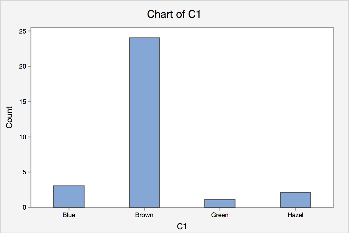
Let’s start by an example. In a class size of 30 students, a survey question asked the students to indicate their eye color. The responses are shown in the table.
| Hazel | Brown | Brown | Brown | Blue | Brown |
| Brown | Brown | Brown | Brown | Brown | Green |
| Brown | Brown | Brown | Brown | Brown | Brown |
| Blue | Brown | Brown | Brown | Hazel | Blue |
| Brown | Brown | Brown | Brown | Brown | Brown |
From this list, we can clearly see that the eye color brown is the most common. Which is more frequent, Hazel or Green? It may only take a few seconds to answer the question but what if there were 100 students? Or 1000? The best way to summarize categorical data is to use frequencies and percentages (or proportions).
- Proportion
- A proportion is a fraction or part of the total that possesses a certain characteristic.
The best way to summarize categorical data is to use frequencies and percentages like in the table.
| Eye Color | Frequency | Percentage |
|---|---|---|
| Brown | 24 | 80% |
| Blue | 3 | 10% |
| Hazel | 2 | 6.6667% |
| Green | 1 | 3.3333% |
The table is much easier to read than the actual data. It is clear to see that more students have Hazel than Green eyes in the class.
As the saying goes, “A picture is worth 1000 words”, it is helpful to visualize the data in a graph.
1.4 - Graphing One Qualitative Variable
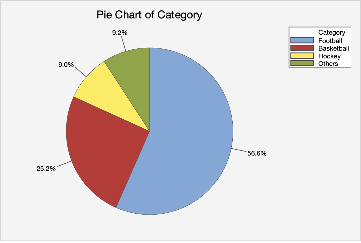
1.4 - Graphing One Qualitative VariableHow can one graph qualitative variables? Two common choices are the pie chart and the bar chart.
Pie Charts
- Pie Chart
- each sector of the circle represents the percentage of that category
Example: A pie chart of the eye color
Notes on pie charts
- Pie charts may not be suitable for too many categories. Thus, if there are too many categories, you can either combine some categories or use a bar chart to represent the data. What is mean by "too many"? There is no clear cutoff, more of just a judgment on the appearance.
- Readers may find the pie chart more useful if the percentages are arranged in a descending or ascending order.
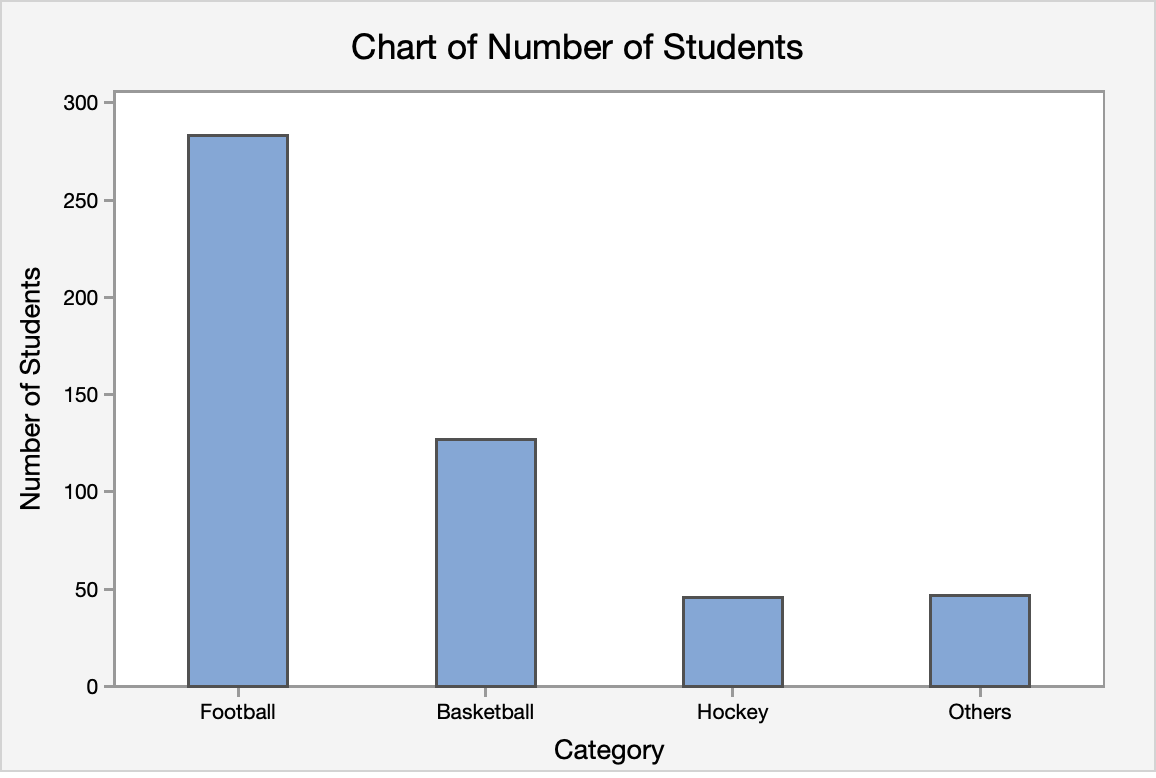
Bar Charts
- Bar Chart
- The height of the bar for each category is equal to the frequency (number of observations) in the category. Leave space in between the bars to emphasize that there is no ordering in the classes.
Example: A bar chart of the eye color
Notes on Bar Charts
- Please pay attention that even though histogram (shown in section 1.4) also have bars sticking up, they are used to describe the frequency for quantitative variables; bar chart is reserved to describe graphs that show frequency of categorical variables.
For this class, we do not expect you to create the graphs by hand. You should, however, make sure you understand how they are created.
1.4.1 - Minitab: Graphing One Qualitative Variable
1.4.1 - Minitab: Graphing One Qualitative VariableMinitab® – Using Minitab to Construct Pie and Bar Charts
Steps for Creating a Pie Chart
- In Minitab choose Graph> Pie Chart.
- Choose one of the following, depending on the format of your data:
- In Category names, enter the column of categorical data that defines the groups.
- In Summary values, enter the column of summary data that you want to graph.
- Choose OK.
Steps for Creating a Bar Chart
- In Minitab choose Graph> Bar Chart.
- Choose one of the following, depending on the format of your data:
- Counts of unique values (This is the best option). Choose Simple for the graph type.
- A function of a variable
- Values from a table
- Choose OK.
Try It!
1.5 - Summarizing One Quantitative Variable
1.5 - Summarizing One Quantitative VariableWe will first talk about descriptive measures of quantitative data. The most important characteristic of a data set, central tendency, will be given. After that, a few descriptive measures of the other important characteristic of a data set, the measure of variability, will be discussed. This lesson will be concluded by a discussion of plots, which are simple graphs that show the central location, variability, symmetry, and outliers very clearly.
1.5.1 - Measures of Central Tendency
1.5.1 - Measures of Central TendencyMean, Median, and Mode
A measure of central tendency is an important aspect of quantitative data. It is an estimate of a “typical” value.
Three of the many ways to measure central tendency are the mean, median and mode.
There are other measures, such as a trimmed mean, that we do not discuss here.
- Mean
- The mean is the average of data.
- Sample Mean
- Let $x_1, x_2, \ldots, x_n$ be our sample. The sample mean is usually denoted by $\bar{x}$
- \(\bar{x}=\sum_{i=1}^n \dfrac{x_i}{n}=\dfrac{1}{n}\sum_{i=1}^n x_i\)
- where n is the sample size and \(x_i\) are the measurements. One may need to use the sample mean to estimate the population mean since usually only a random sample is drawn and we don't know the population mean.
The sample mean is a statistic and a population mean is a parameter. Review the definitions of statistic and parameter in Lesson 0.2.
Note on Notation
What if we say we used $y_i$ for our measurements instead of $x_i$? Is this a problem? No. The formula would simply look like this: \(\bar{y}=\sum_{i=1}^n \dfrac{y_i}{n}=\dfrac{1}{n}\sum_{i=1}^n y_i\) The formulas are exactly the same. The letters that you select to denote the measurements are up to you. For instance, many textbooks use $y$ instead of $x$ to denote the measurements. The point is to understand how the calculation that is expressed in the formula works. In this case, the formula is calculating the mean by summing all of the observations and dividing by the number of observations. There is some notation that you will come to see as standards, i.e, n will always equal sample size. We will make a point of letting you know what these are. However, when it comes to the variables, these labels can (and do) vary.
- Median
-
The median is the middle value of the ordered data.
The most important step in finding the median is to first order the data from smallest to largest.
Steps to finding the median for a set of data:
- Arrange the data in increasing order, i.e. smallest to largest.
- Find the location of the median in the ordered data by \(\frac{n+1}{2}\), where n is the sample size.
- The value that represents the location found in Step 2 is the median.
Note on Odd or Even Sample Sizes
If the sample size is an odd number then the location point will produce a median that is an observed value. If the sample size is an even number, then the location will require one to take the mean of two numbers to calculate the median. The result may or may not be an observed value as the example below illustrates.
- Mode
- The mode is the value that occurs most often in the data. It is important to note that there may be more than one mode in the dataset.
Example 1-5: Test Scores
Consider the aptitude test scores of ten children below:
95, 78, 69, 91, 82, 76, 76, 86, 88, 80
Find the mean, median, and mode.
Answer
Mean
\(\bar{x}=\frac{1}{10}(95+78+69+91+82+76+76+86+88+80)=82.1\)
Median
First, order the data.
69, 76, 76, 78, 80, 82, 86, 88, 91, 95
With n = 10, the median position is found by (10 + 1) / 2 = 5.5. Thus, the median is the average of the fifth (80) and sixth (82) ordered value and the median = 81
Mode
The most frequent value in this data set is 76. Therefore the mode is 76.
Effects of Outliers
One shortcoming of the mean is that means are easily affected by extreme values. Measures that are not that affected by extreme values are called resistant. Measures that are affected by extreme values are called sensitive.
Example 1-6: Test Scores Cont'd...
Using the data from Example 1-5, how would the mean and median change, if the entry 91 is mistakenly recorded as 9?
Answer
The data set would be
9, 69, 76, 76, 78, 80, 82, 86, 88, 95
Mean
The mean would be \(\bar{x}=\frac{1}{10}(9+78+69+95+82+76+76+86+88+80)=73.9\)
The mean would be 73.9, which is very different from 82.1.
Median
Let us see the effect of the mistake on the median value.
The data set (with 91 coded as 9) in increasing order is:
9, 69, 76, 76, 78, 80, 82, 86, 88, 95
where the median = 79
The medians of the two sets are not that different. Therefore the median is not that affected by the extreme value 9.
The mean is a sensitive measure (or sensitive statistic) and the median is a resistant measure (or resistant statistic).
After reading this lesson you should know that there are quite a few options when one wants to describe central tendency. In future lessons, we talk about mainly about the mean. However, we need to be aware of one of its shortcomings, which is that it is easily affected by extreme values.
Unless data points are known mistakes, one should not remove them from the data set! One should keep the extreme points and use more resistant measures. For example, use the sample median to estimate the population median. We will discuss methods using the median in Lesson 11.
Adding and Multiplying Constants
What happens to the mean and median if we add or multiply each observation in a data set by a constant?
Consider for example if an instructor curves an exam by adding five points to each student’s score. What effect does this have on the mean and the median? The result of adding a constant to each value has the intended effect of altering the mean and median by the constant.
For example, if in the above example where we have 10 aptitude scores, if 5 was added to each score the mean of this new data set would be 87.1 (the original mean of 82.1 plus 5) and the new median would be 86 (the original median of 81 plus 5).
Similarly, if each observed data value was multiplied by a constant, the new mean and median would change by a factor of this constant. Returning to the 10 aptitude scores, if all of the original scores were doubled, the then the new mean and new median would be double the original mean and median. As we will learn shortly, the effect is not the same on the variance!
Looking Ahead!
Why would you want to know this? One reason, especially for those moving onward to more applied statistics (e.g. Regression, ANOVA), is the transforming data. For many applied statistical methods, a required assumption is that the data is normal, or very near bell-shaped. When the data is not normal, statisticians will transform the data using numerous techniques e.g. logarithmic transformation. We just need to remember the original data was transformed!!
Shape
The shape of the data helps us to determine the most appropriate measure of central tendency. The three most important descriptions of shape are Symmetric, Left-skewed, and Right-skewed. Skewness is a measure of the degree of asymmetry of the distribution.
-
Symmetric
-
- mean, median, and mode are all the same here
- no skewness is apparent
- the distribution is described as symmetric
A symmetrical distribution. -
Left-Skewed or Skewed Left
-
- mean < median
- long tail on the left
A left skewed distribution. -
Right-skewed or Skewed Right
-
- mean > median
- long tail on the right
A right skewed distribution.
Application: The Skewed Nature of Salary Data

Salary distributions are almost always right-skewed, with a few people that make the most money. To illustrate this, consider your favorite sports team or even the company for which you work. There will be one or two players or personnel that earn the “big bucks”, followed by others who earn less. This will produce a shape that is skewed to the right. Knowing this can be a useful aid in negotiating a higher salary.
When one interviews for a position and the discussion gets around to compensation, it is common that the interviewer states an offer that is “typical for someone in your position”. That is, they are offering you the average salary for someone with your particular skill set (e.g. little experience). But is this average the mode, median, or mean? The company – for whom business is business! – will want to pay you the least they can while you prefer to earn the most you can. Since salaries tend to be skewed to the right, the offer will most likely reflect the mode or median. You simply need to ask to which “average” the offer refers and what is the mean of this average since the mean would be the highest of the three values. Once you have these averages, you can begin to negotiate toward the highest number.
1.5.2 - Measures of Position
1.5.2 - Measures of PositionWhile measures of central tendency are important, they do not tell the whole story. For example, suppose the mean score on a statistics exam is 80%. From this information, can we determine a range in which most people scored? The answer is no. There are two other types of measures, measures of position and variability, that help paint a more concise picture of what is going on in the data. In this section, we will consider the measures of position and discuss measures of variability in the next one.
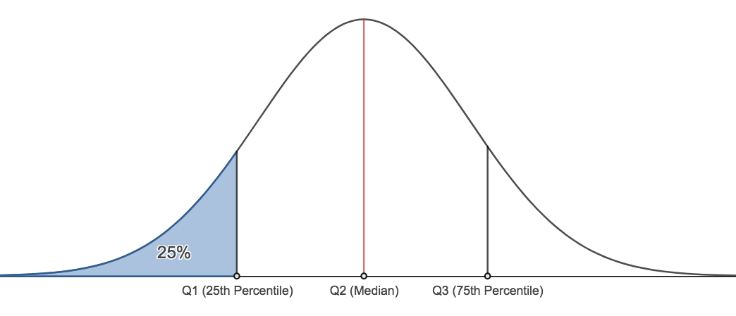
Measures of position give a range where a certain percentage of the data fall. The measures we consider here are percentiles and quartiles.
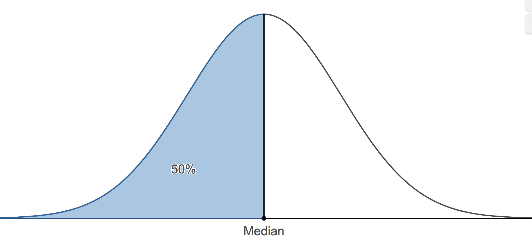
- Percentiles
- The pth percentile of the data set is a measurement such that after the data are ordered from smallest to largest, at most, p% of the data are at or below this value and at most, (100 - p)% at or above it.
A common application of percentiles is their use in determining passing or failure cutoffs for standardized exams such as the GRE. If you have a 95th percentile score then you are at or above 95% of all test takers.
The median is the value where fifty percent or the data values fall at or below it. Therefore, the median is the 50th percentile.
- We can find any percentile we wish. There are two other important percentiles. The 25th percentile, typically denoted, Q1, and the 75th percentile, typically denoted as Q3. Q1 is commonly called the lower quartile and Q3 is commonly called the upper quartile.
Finding Quartiles
The method we will demonstrate for calculating Q1 and Q3 may differ from the method described in our textbook. The results shown here will always be the same as Minitab's results. The method here is also different from the method presented in many undergraduate statistics courses. This method is what we require students to use.
There are two steps to follow:
- Find the location of the desired quartile
If there are n observations, arranged in increasing order, then the first quartile is at position $\dfrac{n+1}{4}$, second quartile (i.e. the median) is at position $\dfrac{2(n+1)}{4}$, and the third quartile is at position $\dfrac{3(n+1)}{4}$.
- Find the value in that position for the ordered data.
Example 1-7: Final Exam Scores
The final exam scores of 18 students are (in increasing order):
24, 58, 61, 67, 71, 73, 76, 79, 82, 83, 85, 87, 88, 88, 92, 93, 94, 97
Find the lower quartile (Q1), the median, and the upper quartile (Q3).
In this example, $n=18$.
For Q1, its position is: $\dfrac{18+1}{4}=4.75$
The actual value of Q1: Q1 = 67 (4th position) + 0.75 · (71 - 67) = 70
For the median, its position is: $\dfrac{18+1}{2}=9.5$
The actual value of the median: Q2 = 82 (9th position) + 0.5 · (83 - 82) = 82.5
For Q3, its position is: \(\dfrac{3(18+1)}{4}=14.25\)
The actual value of Q3: Q3 = 88 + 0.25 · (92 - 88) = 89
The 5 - Number Summary
The Five-Number Summary:
A helpful summary of the data is called the five number summary. The five number summary consists of five values:
- The minimum
- The lower quartile, Q1
- The median (also known as Q2)
- The upper quartile, Q3
- The maximum
Example 1-7
Find the five number summary for the final exam scores. Interpret the values.
\(Min=24, Q1=70, Median=82.5, Q3=89, Max=97\)
The lowest score on the final exam was 24. The highest score on the exam was 97. 25% of the students scored a 70 or below. 50% of the students scored above an 82.5. 75% of the students scored 89 or below. We can also say that 25% of the students scored at least an 89.
1.5.3 - Measures of Variability
1.5.3 - Measures of VariabilityTo introduce the idea of variability, consider this example. Two vending machines A and B drop candies when a quarter is inserted. The number of pieces of candy one gets is random. The following data are recorded for six trials at each vending machine:
Pieces of candy from vending machine A:
1, 2, 3, 3, 5, 4
mean = 3, median = 3, mode = 3
Pieces of candy from vending machine B:
2, 3, 3, 3, 3, 4
mean = 3, median = 3, mode = 3
The dot plot for the pieces of candy from vending machine A and vending machine B is displayed in figure 1.4.
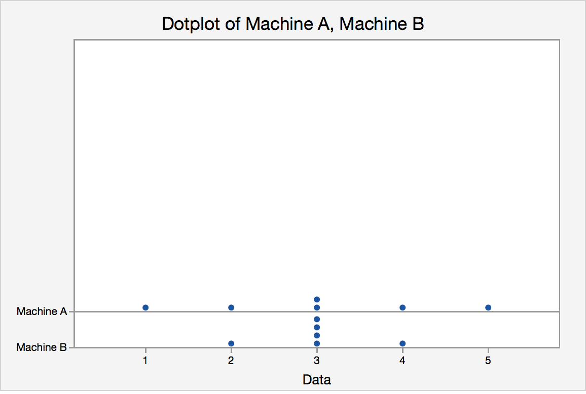
They have the same center, but what about their spreads?
Measures of Variability
There are many ways to describe variability or spread including:
- Range
- Interquartile range (IQR)
- Variance and Standard Deviation
- Range
- The range is the difference in the maximum and minimum values of a data set. The maximum is the largest value in the dataset and the minimum is the smallest value. The range is easy to calculate but it is very much affected by extreme values.
- \(Range = maximum - minimum\)
Like the range, the IQR is a measure of variability, but you must find the quartiles in order to compute its value.
- Interquartile Range (IQR)
- The interquartile range is the difference between upper and lower quartiles and denoted as IQR.
- \begin{align} IQR &=Q3 -Q1\\&=upper\ quartile - lower\ quartile\\&= 75th\ percentile - 25th\ percentile \end{align}
Try it!
Find the IQR for the final exam scores example.
Variance and Standard Deviation
One way to describe spread or variability is to compute the standard deviation. In the following section, we are going to talk about how to compute the sample variance and the sample standard deviation for a data set. The standard deviation is the square root of the variance.
- Variance
- the average squared distance from the mean
- Population variance
- \(\sigma^2=\dfrac{\sum_{i=1}^N (x_i-\mu)^2}{N}\)
- where $\mu$ is the population mean and the summation is over all possible values of the population and \(N\) is the population size.
$\sigma^2$ is often estimated by using the sample variance.
- Sample Variance
- \(s^2=\dfrac{\sum_{i=1}^n (x_i-\bar{x})^2}{n-1}=\dfrac{\sum_{i=1}^n x_i^2-n\bar{x}^2}{n-1}\)
- Where $n$ is the sample size and $\bar{x}$ is the sample mean.
Why do we divide by \(n-1\) instead of by \(n\)?
When we calculate the sample sd we estimate the population mean with the sample mean, and dividing by (n-1) rather than n which gives it a special property that we call an "unbiased estimator". Therefore \(s^2\) is an unbiased estimator for the population variance.
The sample variance (and therefore sample standard deviation) are the common default calculations used by software. When asked to calculate the variance or standard deviation of a set of data, assume - unless otherwise instructed - this is sample data and therefore calculating the sample variance and sample standard deviation.
Example 1-8
Calculate the variance for these final exam scores.
24, 58, 61, 67, 71, 73, 76, 79, 82, 83, 85, 87, 88, 88, 92, 93, 94, 97
First, find the mean:
$\bar{x}=\dfrac{24+58+61+67+71+73+76+79+82+83+85+87+88+88+92+93+94+97}{18}=\dfrac{233}{3}$
|
$x_i$ |
$(x-\bar{x})$ |
$(x-\bar{x})^2$ |
|---|---|---|
|
24 |
-161/3 |
25921/9 |
|
58 |
-59/3 |
3481/9 |
|
61 |
-50/3 |
2500/3 |
|
67 |
-32/3 |
1024/9 |
|
71 |
-20/3 |
400/9 |
|
73 |
-14/3 |
196/9 |
|
76 |
-5/3 |
25/9 |
|
79 |
4/3 |
16/9 |
|
82 |
13/3 |
169/9 |
|
83 |
16/3 |
256/9 |
|
85 |
22/3 |
484/9 |
|
87 |
28/3 |
784/9 |
|
88 |
31/3 |
961/9 |
|
88 |
31/3 |
961/9 |
|
92 |
43/3 |
1849/9 |
|
93 |
46/3 |
2116/9 |
|
94 |
49/3 |
2401/9 |
|
97 |
58/3 |
3364/9 |
|
Sum |
0 |
46908/9 |
Finally,
\(s^2=\dfrac{\sum_{i=1}^n (x_i-\bar{x})^2}{18-1}=\dfrac{46908/9}{17}=\dfrac{5212}{17}\approx 306.588\)
Try it!
Calculate the sample variances for the data set from vending machines A and B yourself and check that it the variance for B is smaller than that for data set A. Work out your answer first, then click the graphic to compare answers.
\(\bar{y}_A=\dfrac{1}{6}(1+2+3+3+5+4)=\dfrac{18}{6}=3\)
\(s^2_A=\dfrac{(1-3)^2+(2-3)^2+(3-3)^2+(3-3)^2+(4-3)^2+(5-3)^2}{6-1}=2\)
\(\bar{y}_B=\dfrac{1}{6}(2+3+3+3+3+4)=\dfrac{18}{6}=3\)
\(s^2_B=\dfrac{(2-3)^2+(3-3)^2+(3-3)^2+(3-3)^2+(3-3)^2+(4-3)^2}{6-1}=0.4\)
Standard Deviation
The standard deviation is a very useful measure. One reason is that it has the same unit of measurement as the data itself (e.g. if a sample of student heights were in inches then so, too, would be the standard deviation. The variance would be in squared units, for example \(inches^2\)). Also, the empirical rule, which will be explained later, makes the standard deviation an important yardstick to find out approximately what percentage of the measurements fall within certain intervals.
- Standard Deviation
- approximately the average distance the values of a data set are from the mean or the square root of the variance
- Population Standard deviation
- \(\sigma=\sqrt{\sigma^2}\)
It has the same unit as the \(x_i\)’s. This is a desirable property since one may think about the spread in terms of the original unit.
\(\sigma\) is estimated by the sample standard deviation \(s\) :
- Sample Standard Deviation
- \(s=\sqrt{s^2}\)
A rough estimate of the standard deviation can be found using \(s\approx \frac{\text{range}}{4}\)
Adding and Multiplying Constants
What happens to measures of variability if we add or multiply each observation in a data set by a constant? We learned previously about the effect such actions have on the mean and the median, but do variation measures behave similarly? Not really.
When we add a constant to all values we are basically shifting the data upward (or downward if we subtract a constant). This has the result of moving the middle but leaving the variability measures (e.g. range, IQR, variance, standard deviation) unchanged.
On the other hand, if one multiplies each value by a constant this does affect measures of variation. The result on the variance is that the new variance is multiplied by the square of the constant, while the standard deviation, range, and IQR are multiplied by the constant. For example, if the observed values of Machine A in the example above were multiplied by three, the new variance would be 18 (the original variance of 2 multiplied by 9). The new standard deviation would be 4.242 (the original standard 1.414 multiplied by 3). The range and IQR would also change by a factor of 3.
Coefficient of Variation
Above we considered three measures of variation: Range, IQR, and Variance (and its square root counterpart - Standard Deviation). These are all measures we can calculate from one quantitative variable e.g. height, weight. But how can we compare dispersion (i.e. variability) of data from two or more distinct populations that have vastly different means?
A popular statistic to use in such situations is the Coefficient of Variation or CV. This is a unit-free statistic and one where the higher the value the greater the dispersion. The calculation of CV is:
- Coefficient of Variation (CV)
- \(CV = \dfrac{\text{Standard Deviation}}{\text{Mean}}\)
To demonstrate, think of prices for luxury and budget hotels. Which do you think would have the higher average cost per night? Which would have the greater standard deviation? The CV would allow you to compare this dispersion in costs in relative terms by accounting for the fact that the luxury hotels would have a greater mean and standard deviation.
Example 1-9: Comparing Prices
You are shopping for toilet tissue. As you compare prices of various brands, some offer price per roll while others offer price per sheet. You are interested in determining which pricing method has less variability so you sample several of each and calculate the mean and standard deviation for the sampled items that are priced per roll, and the mean and standard deviation for the sampled items that are priced per sheet. The table below summarizes your results.
|
Item |
Mean |
Standard Deviation |
|---|---|---|
|
Price per Roll |
0.9196 |
0.4233 |
|
Price Per Sheet |
0.01134 |
0.00553 |
Comparing the standard deviations the Per Sheet appears to have much less variability in pricing. However, the mean is also much smaller. The coefficient of variation allows us to make a relative comparison of the variability of these two pricing schemes:
\(CV_{roll}=\dfrac{0.4233}{0.9196}=0.46\)
\(CV_{sheet}=\dfrac{0.00553}{0.01134}=0.49\)
Relatively speaking, the variation for Price per Sheet is greater than the variability for Price per Roll.
1.5.4 - Minitab: Descriptive Statistics
1.5.4 - Minitab: Descriptive StatisticsMinitab®
Descriptive Statistics
Let's perform some basic operations in Minitab. Some of the examples below are repeats of what we did by hand in earlier lessons while others are new. First, we saw previously how you can enter data into the Minitab worksheet by hand, we will now walk through how to load a dataset into Minitab from an Excel file.
Loading Data into Minitab from an Excel File
For the examples in this section, download the minitabintrodata.xlsx spreadsheet file. Save the file locally (if using Minitab installed on the computer you are using).
Open Minitab web and choose 'Open Local File' to find the spreadsheet file.
With the data in the Minitab worksheet, you can then perform any number of procedures. First, we obtain some basic descriptive statistics.
Descriptive Statistics
With the data from the Excel spreadsheet file into your Minitab worksheet window, you should notice that all columns are labeled ‘Cx’ where the ‘x’ is a number. Some of these are followed by a ‘-T’. Those columns with the ‘-T’ indicate that the data in this column are considered text or categorical data. Otherwise, Minitab recognizes the data as quantitative. If the operation you conduct in Minitab only functions on a certain variable type (e.g. calculating the mean can only be done on quantitative data) then only columns of that data type will be available to use for those operations.
Minitab®
Example 1-10 Hours Data
Let's use Minitab to calculate the five number summary, mean and standard deviation for the Hours data, (contained in minitabintrodata.xlsx). And, as you will see, Minitab by default will provide some added information.
1. At top of the Minitab window select the menu option Stat > Basic Statistics > Display Descriptive Statistics
2. Once this dialog box opens your cursor should be blinking in the 'Variables' window. If not, simply click inside this part of the dialog box. The only variables you should see in the left side window are columns of quantitative data (the two price columns, age, and hours). To enter a variable from the left hand window into the Variables window you can either double-click that variable or click the variable to highlight it and then click the 'Select' button. Do so with the variable 'Hours'.
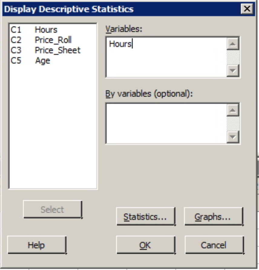
3. With the variable 'Hours' in the 'Variable' window click the 'OK' button.
The following output should appear in the Session window above the worksheet.
Statistics
Variable | N | N* | Mean | SE Mean | StDev | Minimum | Q1 | Median | Q3 | Maximum |
|---|---|---|---|---|---|---|---|---|---|---|
Hours | 50 | 835 | 16.00 | 1.19 | 8.45 | 4.00 | 9.00 | 15.00 | 22.25 | 34.00 |
The mean, standard deviation (StDev), etc. should be the same values as those calculated in the practice problems. Minitab also gives the size of the sample used to create these statistics (N), and the number of observations from this data that were missing (N*).
These statistics are the default statistics. Additional basic descriptive statistics are also available such as trim mean and coefficient of variation (CV).
Minitab®
Example 1-11: The Coefficient of Variation (CV)
To get the CV values for the Price per Sheet and Price per Roll an example found in an earlier lesson, (data contained in minitabintrodata.xlsx).
- Open Minitab and return to Stat > Basic Statistics > Display Descriptive Statistics.
- Enter both variables into the Variables window. That is, both 'Price_Roll' and 'Price_Sheet' should be in the Variables window.
- Click the Statistics tab and then check the box for 'Coefficient of Variation' (notice the other statistics available!) and click OK.
- Click OK again.
The output will include the same statistics as the example above plus the CV values, (it will be titled 'CoefVar').
Descriptive Statistics: Price_Roll, Price_Sheet
Statistics
Variable | N | N* | Mean | SE Mean | StDev | CoefVar | Minimum | Q1 | Median | Q3 | Maximum |
|---|---|---|---|---|---|---|---|---|---|---|---|
Price_Roll | 24 | 861 | 0.9196 | 0.0864 | 0.4233 | 46.03 | 0.5300 | 0.6075 | 0.7750 | 0.9500 | 1.9800 |
Price_Sheet | 24 | 861 | 0.01134 | 0.00113 | 0.00553 | 48.78 | 0.00610 | 0.00753 | 0.00995 | 0.01490 | 0.03180 |
1.6 - Graphing One Quantitative Variable
1.6 - Graphing One Quantitative VariableNow that we discussed how to find summary statistics for quantitative variables, the next step is to graph the data. The graphs we will discuss include:
- Dotplot
- Stem-and-leaf Diagram
- Histogram
- Boxplot
1.6.1 - Dotplots, Stem-and-Leaf Diagrams
1.6.1 - Dotplots, Stem-and-Leaf DiagramsDotplot
A dot plot displays the data as dots on a number line. It is useful to show the relative positions of the data.
Dotplot Example
Each of the ten children in the second grade was given a reading aptitude test. The scores were as follows:
95, 78, 69, 91, 82, 76, 76, 86, 88, 79
Here is a dot plot for the data.
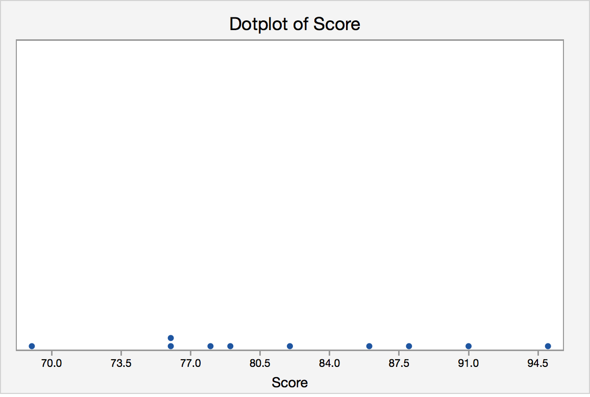
Each of the observations is represented as a dot. If there is more than one observation with the same value, a dot is placed above the others. A dotplot provides us with a quick glance at the data. We can easily see the minimum and maximum values and can see the mode is 76. Dotplots are generally used for small data sets.
Minitab®
Minitab: Dotplots
How to create a dotplot in Minitab:
- Click Graph>Dotplot
- Choose Simple.
- Enter the column with your variable
- Click OK.
Stem-and-Leaf Diagrams
To produce the diagram, the data need to be grouped based on the “stem”, which depends on the number of digits of the quantitative variable. The “leaves” represent the last digit. One advantage of this diagram is that the original data can be recovered (except the order the data is taken) from the diagram.
Stem-and-Leaf Example
Jessica weighs herself every Saturday for the past 30 weeks. The table below shows her recorded weights in pounds.
|
135 |
137 |
136 |
137 |
138 |
139 |
|
140 |
139 |
137 |
140 |
142 |
146 |
|
148 |
145 |
139 |
140 |
142 |
143 |
|
144 |
143 |
141 |
139 |
137 |
138 |
|
139 |
136 |
133 |
134 |
132 |
132 |
Create a Stem-and-Leaf Diagram for Jessica’s Weight.
Answer
The first step is to determine the stem. The weights range from 132 to 148. The stems should be 13 and 14. The leaves should be the last digit. For example, the first value (also smallest value) is 132, it has a stem of 13 and 2 as the leaf.
Stem-and-Leaf of weight of Jessica N = 30
Leaf Unit = 1.0
| 3 | 13 | 223 |
| 5 | 13 | 45 |
| 11 | 13 | 667777 |
| (7) | 13 | 8899999 |
| 12 | 14 | 0001 |
| 8 | 14 | 2233 |
| 4 | 14 | 45 |
| 2 | 14 | 6 |
| 1 | 14 | 8 |
The first column, called depths, are used to display cumulative frequencies. Starting from the top, the depths indicate the number of observations that lie in a given row or before. For example, the 11 in the third row indicates that there are 11 observations in the first three rows. The row that contains the middle observation is denoted by having a bracketed number of observations in that row; (7) for our example. We thus know that the middle value lies in the fourth row. The depths following that row indicate the number of observations that lie in a given row or after. For example, the 4 in the seventh row indicates that there are four observations in the last three rows.
Minitab®
Minitab: Stem-and-Leaf Digrams
How to create a Stem-and-Leaf Diagram in Minitab:
- Click Graph>Stem-and-Leaf
- Enter the column with your variable
- Click OK.
1.6.2 - Histograms
1.6.2 - HistogramsHistogram
If there are many data points and we would like to see the distribution of the data, we can represent the data by a frequency histogram or a relative frequency histogram.
A histogram looks similar to a bar chart but it is for quantitative data. To create a histogram, the data need to be grouped into class intervals. Then create a tally to show the frequency (or relative frequency) of the data into each interval. The relative frequency is the frequency in a particular class divided by the total number of observations. The bars are as wide as the class interval and as tall as the frequency (or relative frequency).
Histogram Example
Jessica weighs herself every Saturday for the past 30 weeks. The table below shows her recorded weights in pounds.
|
135 |
137 |
136 |
137 |
138 |
139 |
|
140 |
139 |
137 |
140 |
142 |
146 |
|
148 |
145 |
139 |
140 |
142 |
143 |
|
144 |
143 |
141 |
139 |
137 |
138 |
|
139 |
136 |
133 |
134 |
132 |
132 |
Create a histogram of her weight.
Answer
For histograms, we usually want to have from 5 to 20 intervals. Since the data range is from 132 to 148, it is convenient to have a class of width 2 since that will give us 9 intervals.
- 131.5-133.5
- 133.5-135.5
- 135.5-137.5
- 137.5-139.5
- 139.5-141.5
- 141.5-143.5
- 143.5-145.5
- 145.5-147.5
- 147.5-149.5
The reason that we choose the end points as .5 is to avoid confusion whether the end point belongs to the interval to its left or the interval to its right. An alternative is to specify the endpoint convention. For example, Minitab includes the left end point and excludes the right end point.
Having the intervals, one can construct the frequency table and then draw the frequency histogram or get the relative frequency histogram to construct the relative frequency histogram. The following histogram is produced by Minitab when we specify the midpoints for the definition of intervals according to the intervals chosen above.
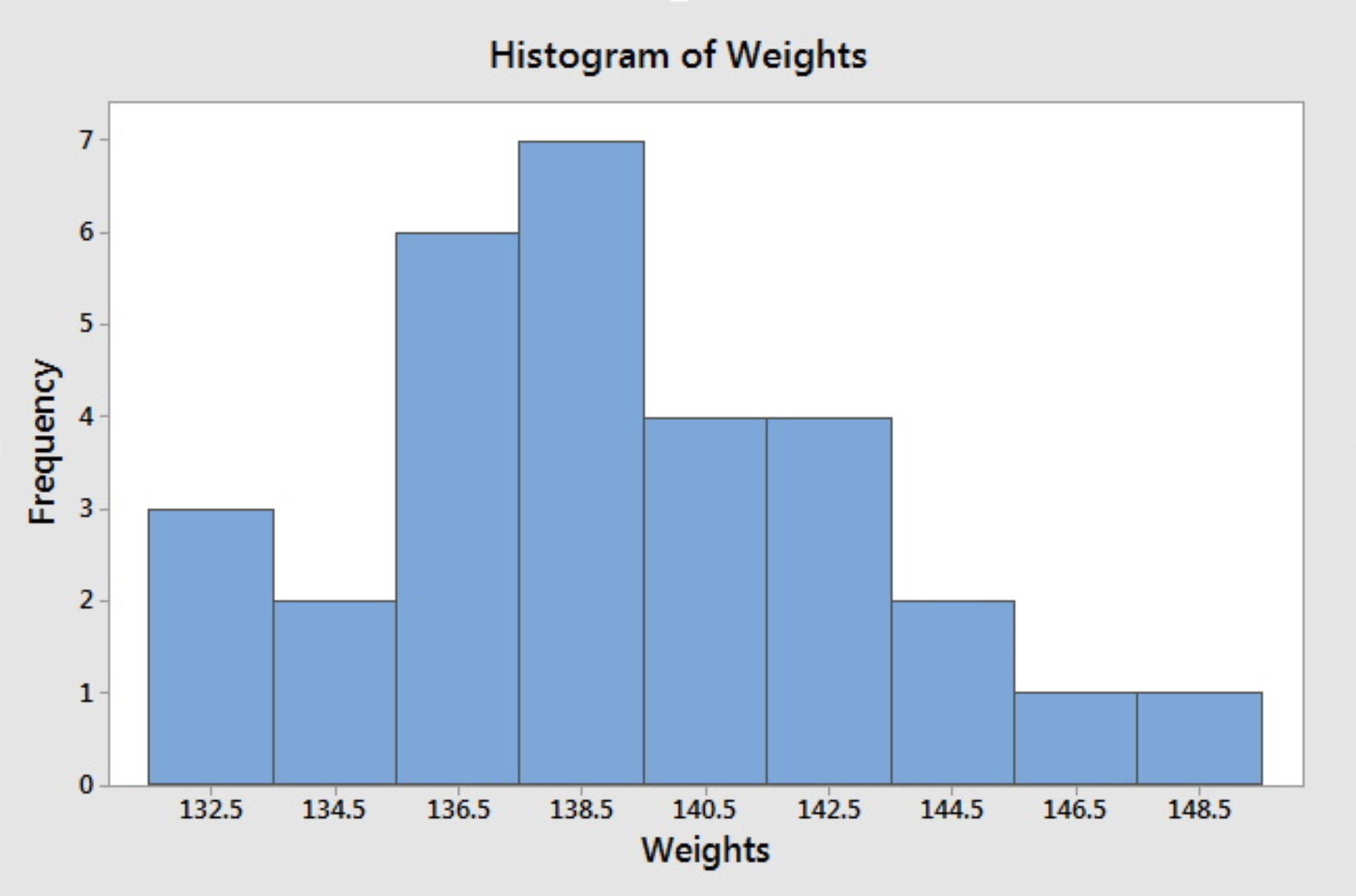
If we do not specify the midpoint for the definition of intervals, Minitab will default to choose another set of class intervals resulting in the following histogram. According to the include left and exclude right endpoint convention, the observation 133 is included in the class 133-135.
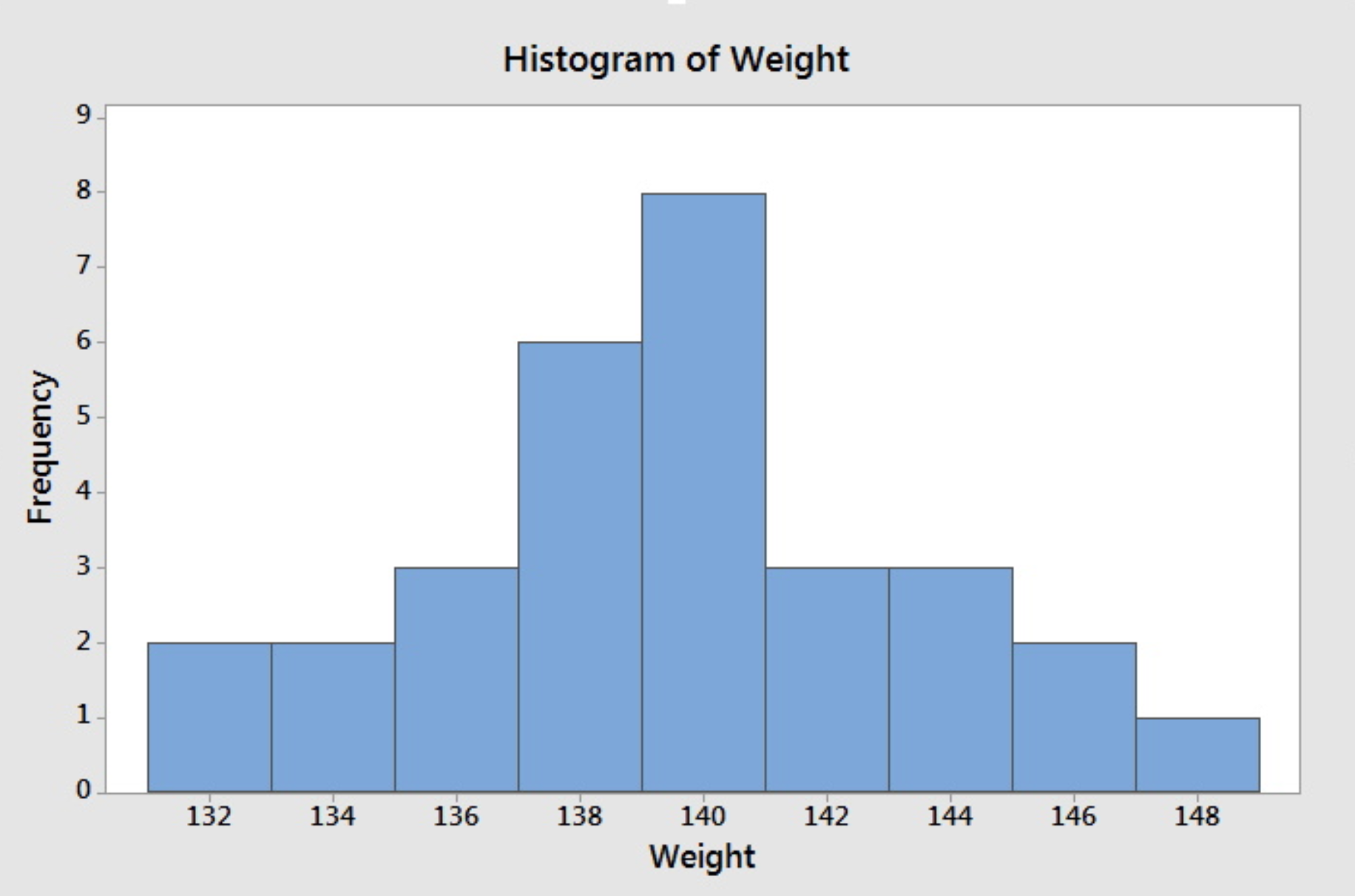
Note that different choices of class intervals will result in different histograms. Relative frequency histograms are constructed in much the same way as a frequency histogram except that the vertical axis represents the relative frequency instead of the frequency. For the purpose of visually comparing the distribution of two data sets, it is better to use relative frequency rather than a frequency histogram since the same vertical scale is used for all relative frequency--from 0 to 1.
Minitab®
Minitab: Histograms
How to create a histogram in Minitab:
- Click Graph>Histogram
- Choose Simple.
- Enter the column with your variable
- Click OK.
1.6.3 - Boxplots
1.6.3 - BoxplotsBoxplot
To create this plot we need the five number summary. Therefore, we need:
- minimum value,
- Q1 (lower quartile),
- Q2 (median),
- Q3 (upper quartile), and
- maximum value.
Using the five number summary, one can construct a skeletal boxplot.
- Mark the five number summary above the horizontal axis with vertical lines.
- Connect Q1, Q2, Q3 to form a box, then connect the box to min and max with a line to form the whisker.
Most statistical software does NOT create graphs of a skeletal boxplot but instead opt for the boxplot as follows below. Boxplots from statistical software are more detailed than skeletal boxplots because they also show outliers. However, if there are no outliers, what is produced by the software is essentially the skeletal boxplot.
The following terminology will prepare us to understand and draw this more detailed type of the boxplot.
Potential outliers are observations that lie outside the lower and upper limits.
Lower limit = Q1 - 1.5 * IQR
Upper limit = Q3 +1.5 * IQR
Adjacent values are the most extreme values that are not potential outliers.
Boxplot Example
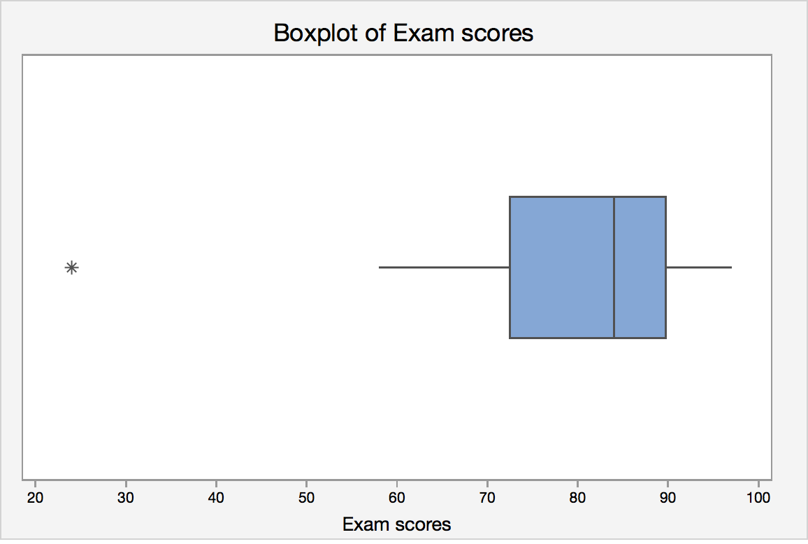
Let's revisit the final exam score data:
24, 58, 61, 67, 71, 73, 76, 79, 82, 83, 85, 87, 88, 88, 92, 93, 94, 97
IQR = Q3 - Q1 = 89 - 70 = 19.
Lower limit = Q1 - 1.5 · IQR = 70 - 1.5 *19 = 41.5
Upper limit = Q3 + 1.5 · IQR = 89 + 1.5 * 19 = 117.5
Lower adjacent value = 58
Upper adjacent value = 97
Since 24 lies outside the lower and upper limit, it is a potential outlier.
Statistical software will create a boxplot of final exam score that may look like this:
Boxplots and Distribution Shapes
Symmetric Data
A symmetric distribution with its corresponding box plot:
Right-Skewed Data
A right-skewed distribution along with it's corresponding box plot:
Left-Skewed Data
A left-skewed distribution along with it's corresponding box plot.:
Minitab®
Minitab: Boxplots
How to create a single histogram in Minitab:
- You must have a column of measurement data.
- Click Graph > Boxplot
- Under One Y, choose Simple , then click OK .
- Enter the column of interest under Graph Variables.
- Click OK .
1.7 - Lesson 1 Summary
1.7 - Lesson 1 SummaryLesson 1 Summary
The goal of statistics is to make inferences about the population based on the sample. Therefore, knowing how the sample is obtained is essential to understand. We also have to know what conclusions we can make based on the type of study we have.
Once we gather the data, we need to summarize it in order to make sense of what we have. How we summarize the data depends on what type of variable we have. For qualitative variables, we can summarize using frequencies and proportions. For quantitative data, we can summarize the data using various measures of center, variability, and position.
For both types of variables, quantitative and qualitative, we can produce graphs to help us visualize the data.
Collecting and summarizing data (numerically and graphically) help us understand what is going on in the sample. The goal is to understand what is happening in the population from that sample (i.e. inference). To begin inference, we need to first learn about probability. Probability is discussed in the next Lesson.