Lesson 8: Health Disparities
Lesson 8: Health DisparitiesOverview
Health Disparities: Meaning and Measurement
In this lesson, we will explore an example of health disparity research and then consider various ways to define and measure health disparities.
When you hear 'health disparity' what comes to mind?
- SES (Socio-economic Status)?
- Difference in capacity to deliver healthcare?
- Different genetic influences?
- Racial inequity?
- Government policies?
Objectives
- provide a definition for a health disparity, and
- discuss measurement of health disparities.
8.1 - Health Definition Disparities
8.1 - Health Definition DisparitiesDefinitions of Health Disparity
The term 'disparity' generally refers to inequality or some kind of difference between groups. Health researchers differ in the ways they define a health disparity. Here are some definitions of disparities related to cancer:
-
Center to Reduce Cancer Health Disparities, National Cancer Institute
“A difference in the incidence, prevalence, mortality, and burden of cancer and related adverse health conditions that exist among specific population groups in the United States.” NCI Center to Reduce Cancer Health Disparities (CRCHD)
-
Minority Health and Health Disparities Research and Education Act of 2000
“A population is a health disparity population if...there is a significant disparity in the overall rate of disease incidence, prevalence, morbidity, mortality, or survival rates in the population as compared to the health status of the general population.” [Minority Health and Health Disparities Research and Education Act of 2000 (47, page 2498)]
-
NIH Strategic Research Plan
“Health disparities are differences in the incidence, prevalence, mortality, and burden of diseases and other adverse health conditions that exist among specific population groups in the United States.” [NIH Strategic Research Plan and Budget to Reduce and Ultimately Eliminate Health Disparities, Vol. 1, Fiscal Years 2002–2006]
-
Dr. David Satcher Former U.S. Surgeon General
“For all the medical breakthroughs we have seen in the past century, there remain significant disparities in the medical conditions of racial groups in this country...[W]hat we have done through [Healthy People 2010] is to make a commitment—really, for the first time in the history of our government—to eliminate, not just reduce, some of the health disparities between majority and minority populations.” [Dr. David Satcher Former U.S. Surgeon General, 1999 (48, page 18–19)]
What differences do you observe in these definitions of cancer disparities?
Try it!
-
Which statement(s) include the 'burden' of disease? How would you define the 'burden' of disease?
NIH and NCI use the term. While incidence, prevalence, and mortality have specific definitions, 'burden' of disease could mean different things to different people.
-
Which makes a comparison between the health of the general population and that of a subgroup? What is the general population?
Minority Health and Health Disparities Research and Education Act of 2000
Since this is a US law, presumably the US population as a whole is the general population.
-
Who talks about a comparison between majority and minority racial groups?
Dr. Satcher
-
Who uses 'health disparity' as an adjective to describe a type of population?
Minority Health and Health Disparities Research and Education Act of 2000
While eliminating health disparities is favored by many, 'health disparity' can mean different things to different researchers and policymakers.
How Do We Measure Health Disparity?
What are the measurement issues inherent in the various definitions of health disparities we have reviewed? If you were going to define how to measure health disparity what kind of issues might come to your mind?
Elimination of Health Disparities
Eliminating health disparities has been adopted as a goal at several US health-related agencies.
“The second goal of Healthy People 2010, to eliminate health disparities, includes differences that occur by gender, race or ethnicity, education or income, disability, geographic location, or sexual orientation.” https://www.cdc.gov/nchhstp/healthdisparities/
Lopez DM, Chen MS. Making Cancer Health Disparities History: Report of the Trans-HS Cancer Health Disparities Progress Review Group. U.S. Department of Health and Human Services, June 2004. NIH Pub. No. 04-5542.
Starfield B, Friedman DJ, Newacheck, P, et al. Eliminating Health Disparities: Strengthening Data on Race, Ethnicity, and Primary Language in the United States. Department of Health and Human Services, The National Committee on Vital and Health Statistics, April 2006.
If the goal is to eliminate a disparity, we must ask how a disparity is identified and measured. Otherwise, how will we know if we have succeeded?
Some important documents from the US government for researches involved with health disparities that attempt to answer how to identify and measure disparity are listed below:
Keppel K, Pamuk E, Lynch J, et al. Methodological issues in measuring health disparities. Hyattsville, MD: U.S. Department of Health and Human Services, National Center for Health Statistics, July 2005. Vital Health Stat 2(141).
Harper S, Lynch, J. Methods for Measuring Cancer Disparities: Using Data Relevant to Healthy People 2010 Cancer-Related Objectives. National Cancer Institute, Surveillance Research Program and Applied Research Program of the Division of Cancer Control and Population Sciences, December 2005. NIH Publication No. 05-5777.
The NCI lists 13 issues to be considered when attempting to measure health disparities.
Issues in Evaluating Measures of Cancer Health Disparities
- Is it relative or absolute disparities that you are interested in?
- Are you talking about total disparity or differences in social groups?
- Reference groups - who will you be referring to?
- Do the social groups have a “natural” order?
- How many social groups will you use?
- Should you vary the groups based on population size?
- What part does the socioeconomic dimension play?
- Do you monitor populations over time?
- How do you handle transfers?
- Subgroup consistency
- Decomposability
- Scale independence
- Transparency / Interpretability for policymakers
Geography is not specifically mentioned in this list. Yet the definition for the elimination of health disparities includes geographic location. What units of geography should be associated with a disparity? How do we measure geographic disparity?
The NCI monograph provides examples of some types of disparity. (this document is posted in Week 8 materials)
8.2 - Types of Disparities
8.2 - Types of DisparitiesAbsolute and Relative Disparity
The blue lines below track stomach cancer mortality over a seventy-year period, by gender. Substantial decreases in stomach cancer mortality are observed in both men and women over this time period. The absolute disparity, i.e. the difference between men and women in stomach cancer mortality, is indicated by the lower red line which has been continually decreasing since about 1945. However, if the relative disparity is considered by dividing the stomach cancer mortality of males by that of females (top red line), the disparity has actually been increasing.
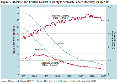
What do you conclude about the trend in disparities in stomach cancer mortality for men versus women?
It depends ... certainly, males have higher mortality but the absolute difference has been getting smaller over time, while the relative difference has increased. Obviously, the choice of absolute or relative difference will affect the interpretation of the data.
Total Disparity vs Social Group Disparity
Let's consider an example of total disparity versus a social group disparity by education level. Mean Body Mass Index (BMI) is indicated for various levels of education.
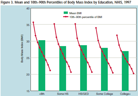
In this case, we can see that those with less than an eighth-grade education had the highest mean BMI. The difference between the lowest and highest education levels is only about two or three points, however, the red line shows you the distribution within each of these categories. So, if you look at the 'less than 8th-grade educational level' group, the 10th percentile has a BMI of 36 and the 90th percentile have a BMI of about 22.
Although the total disparity doesn't look large, the disparity within each of the groups is large. It would be useful to consider the distribution within each of these groups as well, not just a single mean value for each group. You can see for college groups there is not quite as much variability. The range and variability within groups may be more informative than the absolute disparity.
Another illustration of total disparity versus social group disparity is to put forward an example with two different hypothetical societies, A and B. The average life expectancy is equal in these two societies. However, Society A has a much tighter distribution than does Society B. Also, while the average life expectancy is the same, you can see that there is a distinct difference between Group 1 and Group 2 within Society A and less difference between the groups in Society B.
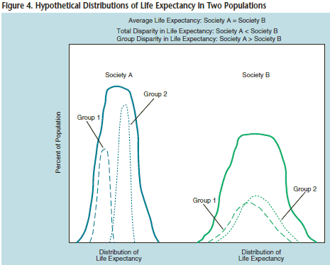
We might conclude that Society A and B have the same life expectancy based on their average values or we may recognize that groups within the societies have different distributions. The disparity between groups in Society A is greater than the disparity between groups in Society B. On the other hand, if you consider the magnitude of the disparity within Society A (the spread of the curve) compared to that of Society B, without regard to subgroups, it appears that disparity is greater in Society B because the curve is wider.
Obviously, the decision of the reference group in disparity research is critical.
Reference Groups
Figure 6 below shows incident cervical cancer in the total SEER population and within various racial/ethnic groups. The relative risk of incident cervical cancer among Hispanics as compared to the total population and to some groups is also noted. For example, the RR of 1.75 compares the rate among Hispanics to that of the total population (16.8/9.6). When we compare Hispanics to non-Hispanic whites the RR increases to 2.21 because non-Hispanic whites have a lower rate of incident cervical cancer than does the total population.
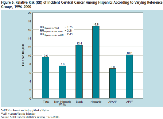
The choice of which group to use as a reference is not just a matter of playing with numbers to get the desired value...it really has to do with your definition of equality. Do you wish to eliminate disparity so group members have health outcomes in general that match those of the total population? Or is your objective that all groups will match the group with the best health outcome? In this example, the American Indian/Alaska natives have the lowest incident rate of cervical cancer. Shall this be the reference group?
Here are some examples of reference groups or values that have been used in studies of disparity:
- the average population member
- a fixed target rate
- social groups and “natural ordering”
- the best-off group/person/rate
- all those better off
All Those Better Off – Reference Group
Suppose you decide to compare to 'all those better off' using the graph below.
Try it!
-
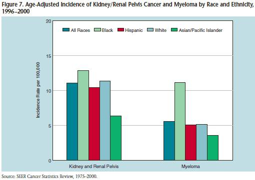
Which group has the worst or highest incidence rate for cancer of the kidney or renal pelvis? For myeloma?
In both diseases, the black (African-American) population has the highest incident rate among these racial/ethnic groups.
-
In which disease is there a greater disparity between African-Americans and the remaining ethnic/racial groups?
Considering the incidence rates alone, the burden of kidney and renal cancer appears greater than that of myeloma among African-Americans. However, if you compare the incidence of disease relative to other groups or to all races, you observe a greater disparity between African-Americans and the other groups in greater in myeloma. African-Americans have much greater rates than the other groups. So how would you use these data? What would be your reference?
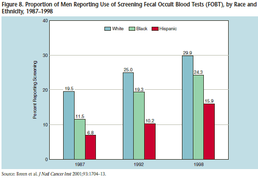
Number of Social Groups
Patterns in disparities are affected by the selection of the social groups for comparison. For example, in the graph below, if the comparison was made between African-Americans and whites only, the absolute difference in screening decreases between 1987 and 1992 and then stays about the same from 1992 to 1998. With the inclusion of the Hispanic data, we see a different pattern. The absolute differences in screening rates for Hispanics compared to whites are larger in 1992 and 1996 than in 1987. So in one type of comparison, disparity decreases while in another, disparity increases. Once again, the choice of the reference group and the number of comparisons will affect the results and conclusions. Consider well which comparisons you wish to make, which disparities you wish to ameliorate.
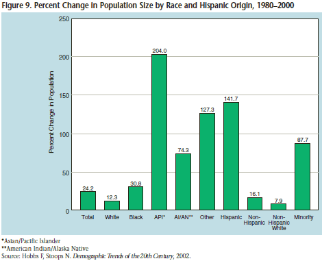
Population Size
Population size has an effect as well. This graph displays the percentage change in population size by race and Hispanic origin over a 20 year period. Asian Pacific Islanders have increased by 204% and the non-Hispanic whites 7.9%. The differences in population change will affect the proportions of these groups in the population as a whole.
Socioeconomic Dimension
How do we measure poverty?
- Do we use personal income or wealth?
- Do we use personal socioeconomic status or socioeconomic position?
- Shall we calculate an index of personal measures?
These examples are from Freeman HP, Horsch KJ. Cancer and the Poor: A Report to the Nation. Atlanta, GA: American Cancer Society.
Addressing Disparity Questions
NCI proposes these steps:
- Inspect the subgroup data - Always an important first step. Use frequency plots, stem & leaf plots, or box plots - look at the data.
- Determine the disparity question
- Example: What is the disparity in mammography screening across all education groups? The comparison uses a summary measure.
- What is the disparity for those with [<8 years] of education? Here, use an individual group measure.
- Choose a measure of health disparity
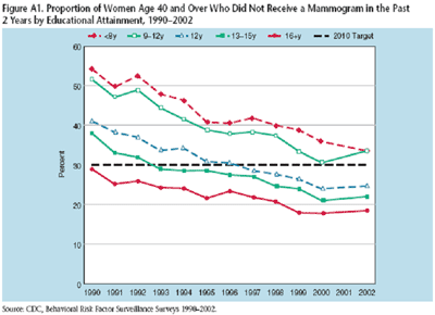
Example 8-1 – Educational Disparity in Mammography Screening, 1990-2002
The graph below shows the proportion of women over 40 who did not receive a mammogram by educational attainment. Using the guidelines at that time, these women were noncompliant.
Summary Measures of Disparity
-
Relative Concentration Index
The relative concentration index takes into account the relative distribution of each of the groups within that social group.
\(R C I=\frac{2}{\mu}\left[\sum_{i=1}^{\prime} p_{i} \mu_{i} R_{j}\right]-1\)
where \(p_i\) is the group's population share, \(\mu_i\) is the group's mean health, and \(R_j\) is the relative rank of the \(j^{th}\) socioeconomic group, which is defined as:
\(R_1=\sum_{i=1}^{\prime} p_{\gamma} -\dfrac{1}{2}p_{i}\)
where \(p_j\) is the cumulative share of the population up to and including group j, and \(p_i\) is the share of the population in group j.
This is an ordered group because it takes into account a cumulative share, i.e. taking into account the size of the population up to that point.
The relative concentration index is meant to summarize relative disparity for the groups, not to compare any two groups.
-
Absolute Concentration Index
The absolute concentration index takes the relative concentration index from above and multiplies it by \(\mu\), the mean level of health in the population.
\(ACI=\mu RCI\)
Let's look again at the plot of education level groups with both of these indices applied to the data. The relative disparity wanders but is not much different in 2002 than it was in 1990. On the other hand, the absolute disparity continues to increase, indicating improvement. The absolute disparity is a reflection of the difference between the groups of the entire population. Whereas the relative disparity tells us about the relative disparity across all groups in the population, taking into account the size of each group.
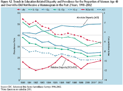
We might conclude that the difference between groups is getting smaller over time as measured by the absolute disparity. But disparities relative to other groups have not changed very much over time. There are many more measures that have been used to summarize disparity, including Jenny coefficients or the slope index of inequality.
Example 8-2: Cervical Cancer Mortality Research
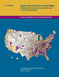
In 2005, NCI researchers Freeman and Wingrove stated the following:
“An entrenched pattern of high cervical cancer mortality has existed for decades in distinct populations and geographic areas. Women suffering most severely from this disparity include African American women in the South, Latina women along the Texas-Mexico border, white women in the Appalachia, American Indians of the North Plains, Vietnamese American women, and Alaska Natives.”
Freeman HP, Wingrove BK. Excess Cervical Cancer Mortality: A Marker for Low Access to Health Care in Poor Communities. Rockville, MD: National Cancer Institute, Center to Reduce Cancer Health Disparities, May 2005. NIH Pub. No. 05-5282.
Do cervical cancer mortality rates cluster in space?
- If so, where?
- Does clustering differ by race?
- What factors are associated with clustering?
Methods
Data was retrieved regarding cervical cancer deaths and population:
- Death in 2000-2004
- Underlying cause of death (ICD -10 rubric: C53) (n=19,907)
- Contiguous area: Lower 48 states and District of Columbia
- By county of residence (n=3105), at time of death
- By women of all races/ethnicities and by white only
- Standard cervical cancer mortality rate and population files from Surveillance, Epidemiology and End Results (SEER) Program
Statistics and Analysis
- Indirect adjustment
- Evaluated the standardized mortality ratio (SMR); observed/expected
- Statistical evaluation of SMR - chi-square test
- Spatial cluster detection – geographic scan statistic
- Evaluate circular cluster around the centroid of each county
- Maximum cluster size – a variable percentage of the population
- Monte-Carlo simulation (n=999 iterations) to evaluate the statistical significance of the cluster (p<0.05)
We will consider some of the issues and implications of this analysis.
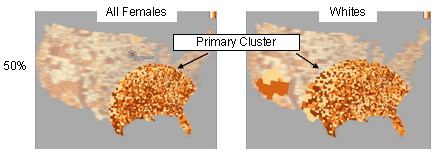
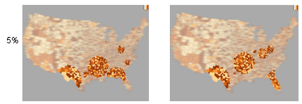
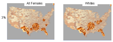
By setting certain parameters and using clustering techniques that look for large cluster areas, the maps below are produced. The procedure to produce the top two graphs (below) calculates an SMR for each county that includes 50% of the population and then runs Monte Carlo simulations to see if this cluster is statistically significant. The darker counties are the ones that have higher SMR. The primary clusters noted are statistically significant. These clusters are geographically large. The graph on the left is for all females. The graph on the right for white females includes a cluster in Southern California.
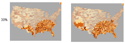
For the second set of graphs, we look at smaller circles, (30%). A cluster appears along the Texas/Mexico border. There are also very small clusters that pop up in Chicago and New York - a little difficult to see on the graph, (below left). The white women, (right), look a little bit different. The area in Appalachia begins to show as a separate cluster, a relatively poor rural white area.
Continuing to look at smaller circles, the pattern begins to look a little bit different. For example, for all females we see these clusters extending through South Carolina and North Carolina. The patterns also now look substantially different between whites and all females.
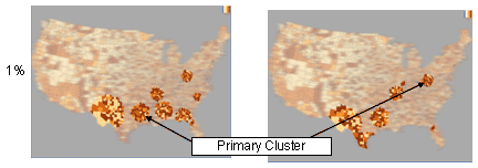
Dropping even smaller we see different clustering patterns, more significant. Our primary clusters still largely revolve around the Texas/Mississippi Delta area.
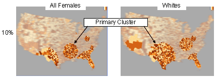
Dropped down to 1% and the primary clusters have shifted. For example, if you're only looking at white females, the primary cluster appears in Appalachia only as opposed to the Texas/Mississippi Delta area.
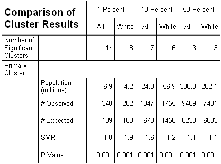
The table below summarizes the cluster analyses. For instance, if we include 50% of the population, there were only three significant clusters for both all females and white females. The SMR for these large clusters is very small, 1.1. When you reduce the percentage of the population around which a cluster exists, you increase the number of significant clusters but the SMR of the primary cluster goes up substantially. The smaller clusters are more relevant when looking for geographic clustering.
Ongoing Research Related to the Geo-Spatial Distribution of Cervical Cancer
Researchers are developing methods for evaluating and quantifying disparity by geographic location. Some areas of research include:
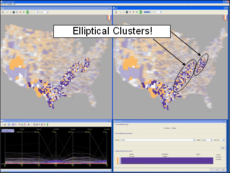
- Estimating the impact of circular vs elliptical clusters
- Geographic projection
- Quantifying the heterogeneity of county-specific SMRs within a spatial cluster
- Quantifying predictors of spatial clustering (e.g., incidence, behaviors/lifestyle, socioeconomic position, health care access)
The overall goal of such research is to help address health policy questions, such as how to accurately estimate risk by geographic location, how to allocate resources to geographic locations, identify specific program goals, measuring disparities. President Bush reauthorized the National Breast and Cervical Cancer Early Detection Program in 2007. Armed with data, you might argue that significant clusters would help more accurately determine where resources should be directed to address these health issues.
Standardization and Inequalities
Kreiger, N., Williams, D. Changing to the 2000 Standard Million: Are Declining Racial/Ethnic and Socioeconomic Inequalities in Health Real Progress or Statistical Illusion? American Journal of Public Health. 91:8, August 2001.
For many years, US health statistics were standardized to the 1940 population. Now the 2000 US population is used, which is considerably older than the 1940 cohort. Diseases of the elderly will be more prominent in the 2000 population. When comparing groups, age-adjusting by the 2000 population can diminish relative risks as compared to what they were using the 1940 population. These authors provide examples where the population used for standardization affects a measure of disparity. Thus, when standardizing health statistics, be aware of the choice of the standard population and how that choice may affect the perception of health disparities.
Kreiger and Williams focus on the 2000 US population standard. There is also a WHO standard; Canada and other countries have their own standards.
In summary, when making comparisons, the choice of the reference is critical!