1.1 - Identifying and Summarizing Data
Statistics is a collection of methods for analyzing data to understand a problem quantitatively and to help make decisions in real-world contexts. We start by framing a problem in such a way that it will be amenable to quantitative analysis (this step lies outside the scope of this course). We assume that we have already obtained sample data relevant to the problem at hand, data that can be considered to be representative of some larger population for which we wish to make statistical inferences.
We next consider identifying and summarizing the data at hand. For example, suppose that we have moved to a new city and wish to buy a home. In deciding on a suitable home, we would probably consider a variety of factors, such as size, location, amenities, and price. For the sake of illustration we focus on price and, in particular, see if we can understand the way in which sale prices vary in a specific housing market. For this example, identifying the data is straightforward: the units of observation are a random sample of size n = 30 single-family homes in our particular housing market, and we have a single measurement for each observation, the sale price in thousands of dollars ($), represented using the notation Y = Price. Here, Y is the generic letter used for any univariate data variable, while Price is the specific variable name for this dataset. These data are available in the houseprice data file—they represent sale prices of 30 homes in Eugene, Oregon during 2005.
The 30 homes in this dataset have been selected randomly from the population of all single-family homes for sale in this housing market. We can simply list small datasets such as this. The values of Price in this case are:
| 155.5 | 195.0 | 197.0 | 207.0 | 214.9 | 230.0 | 239.5 | 242.0 | 252.5 | 255.0 |
| 259.9 | 259.9 | 269.9 | 270.0 | 274.9 | 283.0 | 285.0 | 285.0 | 299.0 | 299.9 |
| 319.0 | 319.9 | 324.5 | 330.0 | 336.0 | 339.0 | 340.0 | 355.0 | 359.9 | 359.9 |
However, even for these data, it helps to summarize the numbers with sample statistics (such as the sample mean and standard deviation) or graphs. A particularly effective graph here is a stem-and-leaf plot, which places the numbers along the vertical axis of the plot, with numbers that are close together in magnitude next to one another on the plot. For example, a stem-and-leaf plot for the 30 sample prices looks like the following:
1 | 6
2 | 0011344
2 | 5666777899
3 | 002223444
3 | 666
In this plot, the decimal point is two digits to the right of the stem. So, the “1” in the stem and the "6" in the leaf represents 160, or, because of rounding, any number between 155 and 164.9. In particular, it represents the lowest price in the dataset of 155.5 (thousand dollars). The next part of the graph shows two prices between 195 and 204.9, two prices between 205 and 214.9, one price between 225 and 234.9, two prices between 235 and 244.9, and so on. A stem-and-leaf plot can easily be constructed by hand for small datasets such as this, or it can be constructed automatically using statistical software. The appearance of the plot can depend on the type of statistical software used.
The overall impression from this graph is that the sample prices range from the mid-150s to the mid-350s, with some suggestion of clustering around the high 200s. Perhaps the sample represents quite a range of moderately priced homes, but with no very cheap or very expensive homes. This type of observation often arises throughout a data analysis—the data begin to tell a story and suggest possible explanations. A good analysis is usually not the end of the story since it will frequently lead to other analyses and investigations. For example, in this case, we might surmise that we would probably be unlikely to find a home priced at much less than \(\$\)150,000 in this market, but perhaps a realtor might know of a nearby market with more affordable housing.
A few modifications to a stem-and-leaf plot produce a histogram—the value axis is now horizontal rather than vertical, and the counts of observations within adjoining data intervals (called “bins”) are displayed in bars (with the counts, or frequency, shown on the vertical axis) rather than by displaying individual values with digits. The following shows a histogram for the home prices data generated by statistical software.
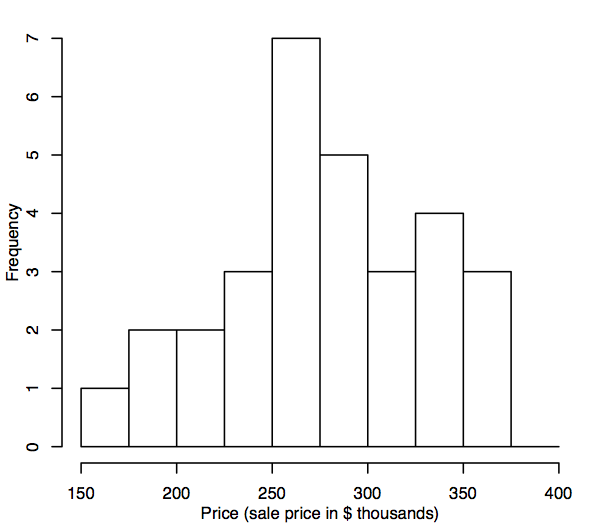
Histograms can convey very different impressions depending on the bin width, start point, and so on. Ideally, we want a large enough bin size to avoid excessive sampling “noise” (a histogram with many bins that looks very wiggly), but not so large that it is hard to see the underlying distribution (a histogram with few bins that looks too blocky). A reasonable pragmatic approach is to use the default settings in whichever software package we are using, and then perhaps to create a few more histograms with different settings to check that we’re not missing anything. There are more sophisticated methods, but for the purposes of the methods in this course, this should suffice.
In addition to graphical summaries such as the stem-and-leaf plot and histogram, sample statistics can summarize data numerically. For example:
-
The sample mean, mY, is a measure of the “central tendency” of the data Y-values. [More traditional notation for the sample mean of Y uses \(\bar{y}\) ("y-bar").]
-
The sample standard deviation, sY, is a measure of the spread or variation in the data Y-values.
We won’t bother here with the formulas for these sample statistics. Since almost all of the calculations necessary for learning the material covered by this course will be performed by statistical software, the course only contains formulas when they are helpful in understanding a particular concept or provide additional insight.
We can calculate sample standardized Z-values from the data Y-values:
Z = (Y − mY) / sY
Sometimes, it is useful to work with sample standardized Z-values rather than the original data Y-values since sample standardized Z-values have a sample mean of 0 and a sample standard deviation of 1.
Statistical software can also calculate additional sample statistics, such as:
- the median (another measure of central tendency, but which is less sensitive than the sample mean to very small or very large values in the data)—half the dataset values are smaller than this quantity and half are larger;
- the minimum and maximum;
- percentiles or quantiles such as the 25th percentile—this is the smallest value that is larger than 25% of the values in the dataset (i.e., 25% of the dataset values are smaller than the 25th percentile, while 75% of the dataset values are larger).
Here are the values obtained by statistical software for the home prices example:
Sample size, n  Valid  30
                Missing 0
Mean             278.6033
Median           278.9500
Std. Deviation    53.8656
Minimum          155.5000
Maximum          359.9000
Percentiles  25  241.3750
             50  278.9500
             75  325.8750