1.2 - Population Distributions
While the methods of the preceding section are useful for describing and displaying sample data, the real power of statistics is revealed when we use samples to give us information about populations. In this context, a population is the entire collection of objects of interest, for example, the sale prices for all single-family homes in the housing market represented by our dataset. We’d like to know more about this population to help us make a decision about which home to buy, but the only data we have is a random sample of 30 sale prices.
Nevertheless, we can employ "statistical thinking" to draw inferences about the population of interest by analyzing the sample data. In particular, we use the notion of a model—a mathematical abstraction of the real world—which we fit to the sample data. If this model provides a reasonable fit to the data, that is, if it can approximate the manner in which the data vary, then we assume that it can also approximate the behavior of the population. The model then provides the basis for making decisions about the population, by, for example, identifying patterns, explaining variation, and predicting future values. Of course, this process can work only if the sample data can be considered representative of the population.
Sometimes, even when we know that a sample has not been selected randomly, we can still model it. Then, we may not be able to formally infer about a population from the sample, but we can still model the underlying structure of the sample. One example would be a convenience sample—a sample selected more for reasons of convenience than for its statistical properties. When modeling such samples, any results should be reported with a caution about restricting any conclusions to objects similar to those in the sample. Another kind of example is when the sample comprises the whole population. For example, we could model data for all 50 states of the United States of America to better understand any patterns or systematic associations among the states.
Since the real world can be extremely complicated (in the way that data values vary or interact together), models are useful because they simplify problems so that we can better understand them (and then make more effective decisions). On the one hand, we therefore need models to be simple enough that we can easily use them to make decisions, but on the other hand, we need models that are flexible enough to provide good approximations to complex situations. Fortunately, many statistical models have been developed over the years that provide an effective balance between these two criteria. One such model, which provides a good starting point for the more complicated models we consider later, is the normal distribution.
From a statistical perspective, a probability distribution is a theoretical model that describes how a random variable varies. For our purposes, a random variable represents the data values of interest in the population, for example, the sale prices of all single-family homes in our housing market. One way to represent the population distribution of data values is in a histogram, as described in Section 1.1. The difference now is that the histogram displays the whole population rather than just the sample. Since the population is so much larger than the sample, the bins of the histogram (the consecutive ranges of the data that comprise the horizontal intervals for the bars) can be much smaller, for example, the following shows a histogram for a simulated population of 1,000 sale prices.
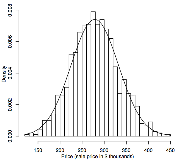
As the population size gets larger, we can imagine the histogram bars getting thinner and more numerous, until the histogram resembles a smooth curve rather than a series of steps. This smooth curve is called a density curve and can be thought of as the theoretical version of the population histogram. Density curves also provide a way to visualize probability distributions such as the normal distribution. A normal density curve is superimposed on the histogram above. The simulated population histogram follows the curve quite closely, which suggests that this simulated population distribution is quite close to normal.
To see how a theoretical distribution can prove useful for making statistical inferences about populations such as that in our home prices example, we need to look more closely at the normal distribution. To begin, we consider a particular version of the normal distribution, the standard normal, as represented by the following density curve.
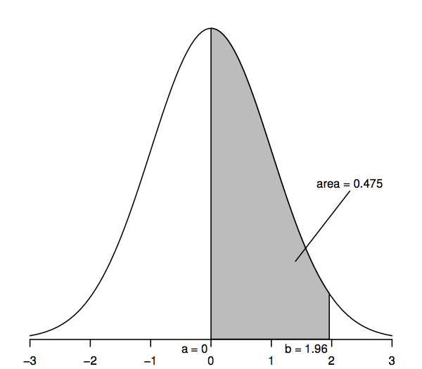
Random variables that follow a standard normal distribution have a mean of 0 (so the curve is symmetric about 0, which is under the highest point of the curve) and a standard deviation of 1 (so the curve has a point of inflection—where the curve bends first one way and then the other—at +1 and −1). The normal density curve is sometimes called the “bell curve” since its shape resembles that of a bell.
The key feature of the normal density curve that allows us to make statistical inferences is that areas under the curve represent probabilities. The entire area under the curve is one, while the area under the curve between one point on the horizontal axis (a, say) and another point (b, say) represents the probability that a random variable that follows a standard normal distribution is between a and b. So, for example, the figure above shows that the probability is 0.475 that a standard normal random variable lies between a=0 and b=1.96, since the area under the curve between a=0 and b=1.96 is 0.475.
We can obtain values for these areas or probabilities from a variety of sources: tables of numbers, calculators, spreadsheet or statistical software, websites, and so on. Below we print only a few select values since most of the later calculations use a generalization of the normal distribution called the “t-distribution.” Also, rather than areas such as that shaded in the figure above, it will become more useful to consider “tail areas” (e.g., to the right of point b), and so for consistency with later tables of numbers, the following table allows calculation of such tail areas:
| Upper-tail area | 0.1 | 0.05 | 0.025 | 0.01 | 0.005 | 0.001 |
| Horizontal axis value | 1.282 | 1.645 | 1.960 | 2.326 | 2.576 | 3.090 |
| Two-tail area | 0.2 | 0.1 | 0.05 | 0.02 | 0.01 | 0.002 |
In particular, the upper-tail area to the right of 1.96 is 0.025; this is equivalent to saying that the area between 0 and 1.96 is 0.475 (since the entire area under the curve is 1 and the area to the right of 0 is 0.5). Similarly, the two-tail area, which is the sum of the areas to the right of 1.96 and to the left of −1.96, is two times 0.025, or 0.05.
How does all this help us to make statistical inferences about populations such as that in our home prices example? The essential idea is that we fit a normal distribution model to our sample data and then use this model to make inferences about the corresponding population. For example, we can use probability calculations for a normal distribution (as shown in the figure above) to make probability statements about a population modeled using that normal distribution—we’ll show exactly how to do this in Section 1.3. Before we do that, however, we pause to consider an aspect of this inferential sequence that can make or break the process. Does the model provide a close enough approximation to the pattern of sample values that we can be confident the model adequately represents the population values? The better the approximation, the more reliable our inferential statements will be.
We saw earlier how a density curve can be thought of as a histogram with a very large sample size. So one way to assess whether our population follows a normal distribution model is to construct a histogram from our sample data and visually determine whether it "looks normal," that is, approximately symmetric and bell-shaped. This is a somewhat subjective decision, but with experience you should find that it becomes easier to discern clearly nonnormal histograms from those that are reasonably normal. For example, while the histogram above clearly looks like a normal density curve, the normality of the histogram of 30 sample sale prices in Section 1.1 is less certain. A reasonable conclusion in this case would be that while this sample histogram isn’t perfectly symmetric and bell-shaped, it is close enough that the corresponding (hypothetical) population histogram could well be normal.
An alternative way to assess normality is to construct a QQ-plot (quantile–quantile plot), also known as a normal probability plot, as shown here for the home prices data:
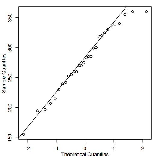
If the points in the QQ-plot lie close to the diagonal line, then the corresponding population values could well be normal. If the points generally lie far from the line, then normality is in question. Again, this is a somewhat subjective decision that becomes easier to make with experience. In this case, given the fairly small sample size, the points are probably close enough to the line that it is reasonable to conclude that the population values could be normal.
There are also a variety of quantitative methods for asessing normality—see Section 6.3.