Lesson 1: Simple Linear Regression
Lesson 1: Simple Linear RegressionOverview
Simple linear regression is a statistical method that allows us to summarize and study relationships between two continuous (quantitative) variables. This lesson introduces the concept and basic procedures of simple linear regression.
Objectives
- Distinguish between a deterministic relationship and a statistical relationship.
- Understand the concept of the least squares criterion.
- Interpret the intercept \(b_{0}\) and slope \(b_{1}\) of an estimated regression equation.
- Know how to obtain the estimates \(b_{0}\) and \(b_{1}\) from Minitab's fitted line plot and regression analysis output.
- Recognize the distinction between a population regression line and the estimated regression line.
- Summarize the four conditions that comprise the simple linear regression model.
- Know what the unknown population variance \(\sigma^{2}\) quantifies in the regression setting.
- Know how to obtain the estimated MSE of the unknown population variance \(\sigma^{2 }\) from Minitab's fitted line plot and regression analysis output.
- Know that the coefficient of determination (\(R^2\)) and the correlation coefficient (r) are measures of linear association. That is, they can be 0 even if there is a perfect nonlinear association.
- Know how to interpret the \(R^2\) value.
- Understand the cautions necessary in using the \(R^2\) value as a way of assessing the strength of the linear association.
- Know how to calculate the correlation coefficient r from the \(R^2\) value.
- Know what various correlation coefficient values mean. There is no meaningful interpretation for the correlation coefficient as there is for the \(R^2\) value.
Lesson 1 Code Files
- bldgstories.txt
- carstopping.txt
- drugdea.txt
- fev_dat.txt
- heightgpa.txt
- husbandwife.txt
- infant.txt
- mccoo.txt
- oldfaithful.txt
- poverty.txt
- practical.txt
- signdist.txt
- skincancer.txt
- student_height_weight.txt
1.1 - What is Simple Linear Regression?
1.1 - What is Simple Linear Regression?- Simple linear regression
-
A statistical method that allows us to summarize and study relationships between two continuous (quantitative) variables:
- One variable, denoted \(x\), is regarded as the predictor, explanatory, or independent variable.
- The other variable, denoted \(y\), is regarded as the response, outcome, or dependent variable.
Because the other terms are used less frequently today, we'll use the "predictor" and "response" terms to refer to the variables encountered in this course. The other terms are mentioned only to make you aware of them should you encounter them in other arenas. Simple linear regression gets its adjective "simple," because it concerns the study of only one predictor variable. In contrast, multiple linear regression, which we study later in this course, gets its adjective "multiple," because it concerns the study of two or more predictor variables.
Types of relationships
Before proceeding, we must clarify what types of relationships we won't study in this course, namely, deterministic (or functional) relationships. Here is an example of a deterministic relationship.
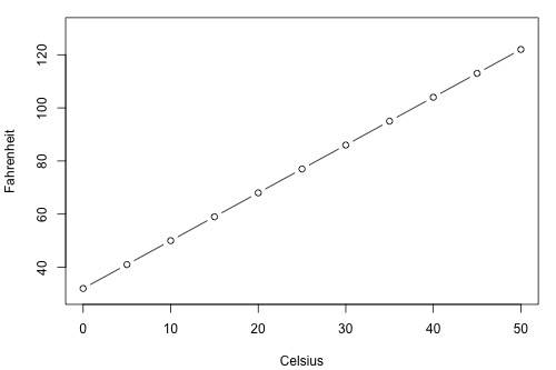
\(\text{Fahr } = \frac{9}{5}\text{Cels}+32\)
That is, if you know the temperature in degrees Celsius, you can use this equation to determine the temperature in degrees Fahrenheit exactly.
Here are some examples of other deterministic relationships that students from previous semesters have shared:
- Circumference = \(\pi\) × diameter
- Hooke's Law: \(Y = \alpha + \beta X\), where Y = amount of stretch in a spring, and X = applied weight.
- Ohm's Law: \(I = V/r\), where V = voltage applied, r = resistance, and I = current.
- Boyle's Law: For a constant temperature, \(P = \alpha/V\), where P = pressure, \(\alpha\) = constant for each gas, and V = volume of gas.
For each of these deterministic relationships, the equation exactly describes the relationship between the two variables. This course does not examine deterministic relationships. Instead, we are interested in statistical relationships, in which the relationship between the variables is not perfect.
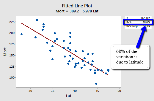
Here is an example of a statistical relationship. The response variable y is the mortality due to skin cancer (number of deaths per 10 million people) and the predictor variable x is the latitude (degrees North) at the center of each of 48 states in the United States (U.S. Skin Cancer data) (The data were compiled in the 1950s, so Alaska and Hawaii were not yet states. And, Washington, D.C. is included in the data set even though it is not technically a state.)
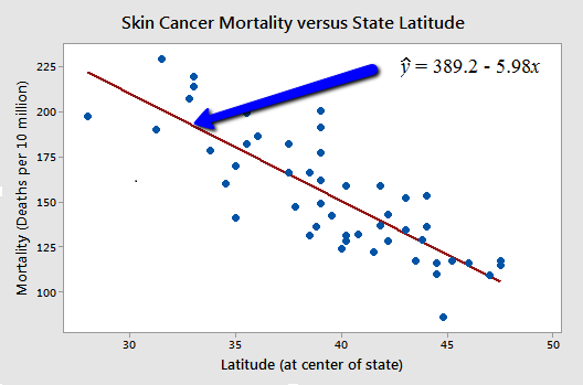
You might anticipate that if you lived in the higher latitudes of the northern U.S., the less exposed you'd be to the harmful rays of the sun, and therefore, the less risk you'd have of death due to skin cancer. The scatter plot supports such a hypothesis. There appears to be a negative linear relationship between latitude and mortality due to skin cancer, but the relationship is not perfect. Indeed, the plot exhibits some "trend," but it also exhibits some "scatter." Therefore, it is a statistical relationship, not a deterministic one.
Some other examples of statistical relationships might include:
- Height and weight — as height increases, you'd expect the weight to increase, but not perfectly.
- Alcohol consumed and blood alcohol content — as alcohol consumption increases, you'd expect one's blood alcohol content to increase, but not perfectly.
- Vital lung capacity and pack-years of smoking — as the amount of smoking increases (as quantified by the number of pack-years of smoking), you'd expect lung function (as quantified by vital lung capacity) to decrease, but not perfectly.
- Driving speed and gas mileage — as driving speed increases, you'd expect gas mileage to decrease, but not perfectly.
Okay, so let's study statistical relationships between one response variable y and one predictor variable x!
1.2 - What is the "Best Fitting Line"?
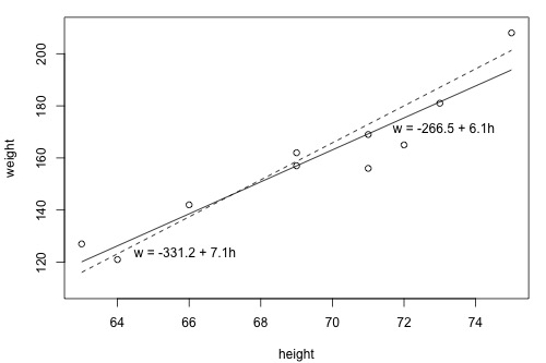
1.2 - What is the "Best Fitting Line"?Since we are interested in summarizing the trend between two quantitative variables, the natural question arises — "what is the best fitting line?" At some point in your education, you were probably shown a scatter plot of (x, y) data and were asked to draw the "most appropriate" line through the data. Even if you weren't, you can try it now on a set of heights (x) and weights (y) of 10 students, (Student Height and Weight Dataset). Looking at the plot below, which line — the solid line or the dashed line — do you think best summarizes the trend between height and weight?
Hold on to your answer! In order to examine which of the two lines is a better fit, we first need to introduce some common notation:
- \(y_i\) denotes the observed response for experimental unit i
- \(x_i\) denotes the predictor value for experimental unit i
- \(\hat{y}_i\) is the predicted response (or fitted value) for experimental unit i
Then, the equation for the best-fitting line is:
\(\hat{y}_i=b_0+b_1x_i\)
Incidentally, recall that an "experimental unit" is the object or person on which the measurement is made. In our height and weight example, the experimental units are students.
Let's try out the notation on our example with the trend summarized by the line \(\hat{w} = -266.53 + 6.1376 h\).
The first data point in the list indicates that student 1 is 63 inches tall and weighs 127 pounds. That is, \(x_{1} = 63\) and \(y_{1} = 127\) . Do you see this point in the plot? If we know this student's height but not his or her weight, we could use the equation of the line to predict his or her weight. We'd predict the student's weight to be -266.53 + 6.1376(63) or 120.1 pounds. That is, \(\hat{y}_1 = 120.1\). Clearly, our prediction wouldn't be perfectly correct — it has some "prediction error" (or "residual error"). In fact, the size of its prediction error is 127-120.1 or 6.9 pounds.
You might want to roll your cursor over each of the 10 data points to make sure you understand the notation used to keep track of the predictor values, the observed responses, and the predicted responses:
i | \(x_i\) | \(y_i\) | \(\hat{y}_i\) |
|---|---|---|---|
1 | 63 | 127 | 120.1 |
2 | 64 | 121 | 126.3 |
3 | 66 | 142 | 138.5 |
4 | 69 | 157 | 157.0 |
5 | 69 | 162 | 157.0 |
6 | 71 | 156 | 169.2 |
7 | 71 | 169 | 169.2 |
8 | 72 | 165 | 175.4 |
9 | 73 | 181 | 181.5 |
10 | 75 | 208 | 193.8 |
As you can see, the size of the prediction error depends on the data point. If we didn't know the weight of student 5, the equation of the line would predict his or her weight to be -266.53 + 6.1376(69) or 157 pounds. The size of the prediction error here is 162-157 or 5 pounds.
In general, when we use \(\hat{y}_i=b_0+b_1x_i\) to predict the actual response \(y_i\), we make a prediction error (or residual error) of size:
\(e_i=y_i-\hat{y}_i\)
A line that fits the data "best" will be one for which the n prediction errors — one for each observed data point — are as small as possible in some overall sense. One way to achieve this goal is to invoke the "least squares criterion," which says to "minimize the sum of the squared prediction errors." That is:
- The equation of the best fitting line is: \(\hat{y}_i=b_0+b_1x_i\)
- We just need to find the values \(b_{0}\) and \(b_{1}\) which make the sum of the squared prediction errors the smallest they can be.
- That is, we need to find the values \(b_{0}\) and \(b_{1}\) that minimize:
\(Q=\sum_{i=1}^{n}(y_i-\hat{y}_i)^2\)
Here's how you might think about this quantity Q:
- The quantity \(e_i=y_i-\hat{y}_i\) is the prediction error for data point i.
- The quantity \(e_i^2=(y_i-\hat{y}_i)^2\) is the squared prediction error for data point i.
- And, the symbol \(\sum_{i=1}^{n}\) tells us to add up the squared prediction errors for all n data points.
Incidentally, if we didn't square the prediction error \(e_i=y_i-\hat{y}_i\) to get \(e_i^2=(y_i-\hat{y}_i)^2\), the positive and negative prediction errors would cancel each other out when summed, always yielding 0.
Now, being familiar with the least squares criterion, let's take a fresh look at our plot again. In light of the least squares criterion, which line do you now think is the best-fitting line?
Let's see how you did! The following two side-by-side tables illustrate the implementation of the least squares criterion for the two lines up for consideration — the dashed line and the solid line.
\(\hat{w} = -331.2 + 7.1 h\) (the dashed line)
i | \(x_i\) | \(y_i\) | \(\hat{y}_i\) | \((y_i-\hat{y}_i)\) | \((y_i-\hat{y}_i)^2\) |
|---|---|---|---|---|---|
1 | 63 | 127 | 116.1 | 10.9 | 118.81 |
2 | 64 | 121 | 123.2 | -2.2 | 4.84 |
3 | 66 | 142 | 137.4 | 4.6 | 21.16 |
4 | 69 | 157 | 158.7 | -1.7 | 2.89 |
5 | 69 | 162 | 158.7 | 3.3 | 10.89 |
6 | 71 | 156 | 172.9 | -16.9 | 285.61 |
7 | 71 | 169 | 172.9 | -3.9 | 15.21 |
8 | 72 | 165 | 180.0 | -15.0 | 225.00 |
9 | 73 | 181 | 187.1 | -6.1 | 37.21 |
10 | 75 | 208 | 201.3 | 6.7 | 44.89 |
______ 766.5 |
\(\hat{w}= -266.53 + 6.1376 h\) (the solid line)
i | \(x_i\) | \(y_i\) | \(\hat{y}_i\) | \((y_i-\hat{y}_i)\) | \((y_i-\hat{y}_i)^2\) |
|---|---|---|---|---|---|
1 | 63 | 127 | 120.139 | 6.8612 | 47.076 |
2 | 64 | 121 | 126.276 | -5.2764 | 27.840 |
3 | 66 | 142 | 138.552 | 3.4484 | 11.891 |
4 | 69 | 157 | 156.964 | 0.0356 | 0.001 |
5 | 69 | 162 | 156.964 | 5.0356 | 25.357 |
6 | 71 | 156 | 169.240 | -13.2396 | 175.287 |
7 | 71 | 169 | 169.240 | -0.2396 | 0.057 |
8 | 72 | 165 | 175.377 | -10.3772 | 107.686 |
9 | 73 | 181 | 181.515 | -0.5148 | 0.265 |
10 | 75 | 208 | 193.790 | 14.2100 | 201.924 |
______ 597.4 |
Based on the least squares criterion, which equation best summarizes the data? The sum of the squared prediction errors is 766.5 for the dashed line, while it is only 597.4 for the solid line. Therefore, of the two lines, the solid line, \(w = -266.53 + 6.1376h\), best summarizes the data. But, is this equation guaranteed to be the best fitting line of all of the possible lines we didn't even consider? Of course not!
If we used the above approach for finding the equation of the line that minimizes the sum of the squared prediction errors, we'd have our work cut out for us. We'd have to implement the above procedure for an infinite number of possible lines — clearly, an impossible task! Fortunately, somebody has done some dirty work for us by figuring out formulas for the intercept \(b_{0}\) and the slope \(b_{1}\) for the equation of the line that minimizes the sum of the squared prediction errors.
The formulas are determined using methods of calculus. We minimize the equation for the sum of the squared prediction errors:
\(Q=\sum_{i=1}^{n}(y_i-(b_0+b_1x_i))^2\)
(that is, take the derivative with respect to \(b_{0}\) and \(b_{1}\), set to 0, and solve for \(b_{0}\) and \(b_{1}\)) and get the "least squares estimates" for \(b_{0}\) and \(b_{1}\):
\(b_0=\bar{y}-b_1\bar{x}\)
and:
\(b_1=\dfrac{\sum_{i=1}^{n}(x_i-\bar{x})(y_i-\bar{y})}{\sum_{i=1}^{n}(x_i-\bar{x})^2}\)
Because the formulas for \(b_{0}\) and \(b_{1}\) are derived using the least squares criterion, the resulting equation — \(\hat{y}_i=b_0+b_1x_i\)— is often referred to as the "least squares regression line," or simply the "least squares line." It is also sometimes called the "estimated regression equation." Incidentally, note that in deriving the above formulas, we made no assumptions about the data other than that they follow some sort of linear trend.
We can see from these formulas that the least squares line passes through the point \((\bar{x},\bar{y})\), since when \(x=\bar{x}\), then \(y=b_0+b_1\bar{x}=\bar{y}-b_1\bar{x}+b_1\bar{x}=\bar{y}\).
In practice, you won't really need to worry about the formulas for \(b_{0}\) and \(b_{1}\). Instead, you are are going to let statistical software, such as Minitab, find least squares lines for you. But, we can still learn something from the formulas — for \(b_{1}\) in particular.
If you study the formula for the slope \(b_{1}\):
\(b_1=\dfrac{\sum_{i=1}^{n}(x_i-\bar{x})(y_i-\bar{y})}{\sum_{i=1}^{n}(x_i-\bar{x})^2}\)
you see that the denominator is necessarily positive since it only involves summing positive terms. Therefore, the sign of the slope \(b_{1}\) is solely determined by the numerator. The numerator tells us, for each data point, to sum up the product of two distances — the distance of the x-value from the mean of all of the x-values and the distance of the y-value from the mean of all of the y-values. Let's see how this determines the sign of the slope \(b_{1}\) by studying the following two plots.
When is the slope \(b_{1}\) > 0? Do you agree that the trend in the following video is positive — that is, as x increases, y tends to increase? If the trend is positive, then the slope \(b_{1}\) must be positive. Let's see how!
Watch the following video and note the following:
- Note that the product of the two distances for the first highlighted data point is positive. In fact, the product of the two distances is positive for any data point in the upper right quadrant.
- Note that the product of the two distances for the second highlighted data point is also positive. In fact, the product of the two distances is positive for any data point in the lower left quadrant.
Adding up all of these positive products must necessarily yield a positive number, and hence the slope of the line \(b_{1}\) will be positive.
When is the slope \(b_{1}\) < 0? Now, do you agree that the trend in the following plot is negative — that is, as x increases, y tends to decrease? If the trend is negative, then the slope \(b_{1}\) must be negative. Let's see how!
Watch the following video and note the following:
- Note that the product of the two distances for the first highlighted data point is negative. In fact, the product of the two distances is negative for any data point in the upper left quadrant.
- Note that the product of the two distances for the second highlighted data point is also negative. In fact, the product of the two distances is negative for any data point in the lower right quadrant.
Adding up all of these negative products must necessarily yield a negative number, and hence the slope of the line \(b_{1}\) will be negative.
Now that we finished that investigation, you can just set aside the formulas for \(b_{0}\) and \(b_{1}\). Again, in practice, you are going to let statistical software, such as Minitab, find the least squares lines for you. We can obtain the estimated regression equation in two different places in Minitab. The following plot illustrates where you can find the least squares line (below the "Regression Plot" title).
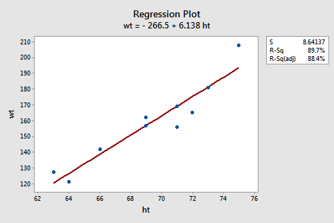
The following Minitab output illustrates where you can find the least squares line (shaded below "Regression Equation") in Minitab's "standard regression analysis" output.
Analysis of Variance
Source | DF | SS | MS | F | P |
|---|---|---|---|---|---|
Constant | 1 | 5202.2 | 5202.2 | 69.67 | 0.000 |
Residual Error | 8 | 597.4 | 74.4 | ||
Total | 9 | 5799.6 |
Model Summary
S | R-sq | R-sq(adj) |
|---|---|---|
8.641 | 89.7% | 88.4% |
Regression Equation
wt =-267 + 6.14 ht
Coefficients
Predictor | Coef | SE Coef | T | P |
|---|---|---|---|---|
Constant | -266.53 | 51.03 | -5.22 | 0.001 |
height | 6.1376 | 0.7353 | 8.35 | 0.000 |
Note that the estimated values \(b_{0}\) and \(b_{1}\) also appear in a table under the columns labeled "Predictor" (the intercept \(b_{0}\) is always referred to as the "Constant" in Minitab) and "Coef" (for "Coefficients"). Also, note that the value we obtained by minimizing the sum of the squared prediction errors, 597.4, appears in the "Analysis of Variance" table appropriately in a row labeled "Residual Error" and under a column labeled "SS" (for "Sum of Squares").
Although we've learned how to obtain the "estimated regression coefficients" \(b_{0}\) and \(b_{1}\), we've not yet discussed what we learn from them. One thing they allow us to do is to predict future responses — one of the most common uses of an estimated regression line. This use is rather straightforward:
- A common use of the estimated regression line: \(\hat{y}_{i,wt}=-267+6.14 x_{i, ht}\)
- Predict (mean) weight of 66"-inch tall people: \(\hat{y}_{i, wt}=-267+6.14(66)=138.24\)
- Predict (mean) weight of 67"-inch tall people: \(\hat{y}_{i, wt}=-267+6.14(67)=144.38\)
Now, what does \(b_{0}\) tell us? The answer is obvious when you evaluate the estimated regression equation at x = 0. Here, it tells us that a person who is 0 inches tall is predicted to weigh -267 pounds! Clearly, this prediction is nonsense. This happened because we "extrapolated" beyond the "scope of the model" (the range of the x values). It is not meaningful to have a height of 0 inches, that is, the scope of the model does not include x = 0. So, here the intercept \(b_{0}\) is not meaningful. In general, if the "scope of the model" includes x = 0, then \(b_{0}\) is the predicted mean response when x = 0. Otherwise, \(b_{0}\) is not meaningful. There is more information about this in a blog post on the Minitab Website.
And, what does \(b_{1}\) tell us? The answer is obvious when you subtract the predicted weight of 66"-inch tall people from the predicted weight of 67"-inch tall people. We obtain 144.38 - 138.24 = 6.14 pounds - the value of \(b_{1}\). Here, it tells us that we predict the mean weight to increase by 6.14 pounds for every additional one-inch increase in height. In general, we can expect the mean response to increase or decrease by \(b_{1}\) units for every one-unit increase in x.
1.3 - The Simple Linear Regression Model
1.3 - The Simple Linear Regression ModelWe have worked hard to come up with formulas for the intercept \(b_{0}\) and the slope \(b_{1}\) of the least squares regression line. But, we haven't yet discussed what \(b_{0}\) and \(b_{1}\) estimate.
What do \(b_{0}\) and \(b_{1}\) estimate?
Let's investigate this question with another example. Below is a plot illustrating a potential relationship between the predictor "high school grade point average (GPA)" and the response "college entrance test score." Only five groups ("subpopulations") of students are considered — those with a GPA of 1, those with a GPA of 2, ..., and those with a GPA of 4.
Let's focus for now just on those students who have a GPA of 1. As you can see, there are so many data points — each representing one student — that the data points run together. That is, the data on the entire subpopulation of students with a GPA of 1 are plotted. And, similarly, the data on the entire subpopulation of students with GPAs of 2, 3, and 4 are plotted.
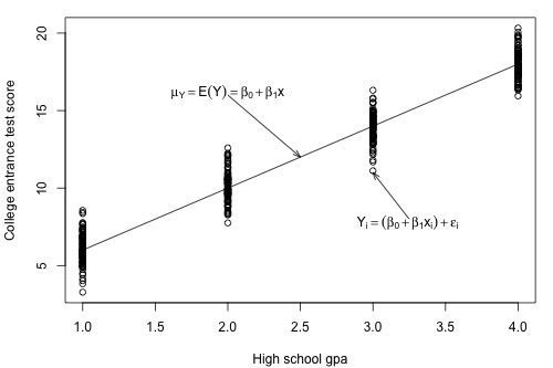
Now, take the average college entrance test score for students with a GPA of 1. And, similarly, take the average college entrance test score for students with a GPA of 2, 3, and 4. Connecting the dots — that is, the averages — you get a line, which we summarize by the formula \(\mu_Y=\mbox{E}(Y)=\beta_0 + \beta_1x\). The line — which is called the "population regression line" — summarizes the trend in the population between the predictor x and the mean of the responses \(\mu_{Y}\). We can also express the average college entrance test score for the \(i^{th}\) student, \(\mbox{E}(Y_i)=\beta_0 + \beta_1x_i\). Of course, not every student's college entrance test score will equal the average \(\mbox{E}(Y_i)\). There will be some errors. That is, any student's response \(y_{i}\) will be the linear trend \(\beta_0 + \beta_1x_i\) plus some error \(\epsilon_i\). So, another way to write the simple linear regression model is \(y_i = \mbox{E}(Y_i) + \epsilon_i = \beta_0 + \beta_1x_i + \epsilon_i\).
When looking to summarize the relationship between a predictor x and a response y, we are interested in knowing the population regression line \(\mu_Y=\mbox{E}(Y)=\beta_0 + \beta_1x\). The only way we could ever know it, though, is to be able to collect data on everybody in the population — most often an impossible task. We have to rely on taking and using a sample of data from the population to estimate the population regression line.
Let's take a sample of three students from each of the subpopulations — that is, three students with a GPA of 1, three students with a GPA of 2, ..., and three students with a GPA of 4 — for a total of 12 students. As the plot below suggests, the least squares regression line \(\hat{y}=b_0+b_1x\) through the sample of 12 data points estimates the population regression line \(\mu_Y=E(Y)=\beta_0 + \beta_1x\). That is, the sample intercept \(b_{0}\) estimates the population intercept \( \beta_{0}\) and the sample slope \(b_{1}\) estimates the population slope \( \beta_{1}\).
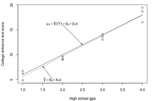
The least squares regression line doesn't match the population regression line perfectly, but it is a pretty good estimate. And, of course, we'd get a different least squares regression line if we took another (different) sample of 12 such students. Ultimately, we are going to want to use the sample slope \(b_{1}\) to learn about the parameter we care about, the population slope \( \beta_{1}\). And, we will use the sample intercept \(b_{0}\) to learn about the population intercept \(\beta_{0}\).
In order to draw any conclusions about the population parameters \( \beta_{0}\) and \( \beta_{1}\), we have to make a few more assumptions about the behavior of the data in a regression setting. We can get a pretty good feel for the assumptions by looking at our plot of GPA against college entrance test scores.
First, notice that when we connected the averages of the college entrance test scores for each of the subpopulations, it formed a line. Most often, we will not have the population of data at our disposal as we pretend to do here. If we didn't, do you think it would be reasonable to assume that the mean college entrance test scores are linearly related to high school grade point averages?
Again, let's focus on just one subpopulation, those students who have a GPA of 1, say. Notice that most of the college entrance scores for these students are clustered near the mean of 6, but a few students did much better than the subpopulation's average scoring around a 9, and a few students did a bit worse scoring about a 3. Do you get the picture? Thinking instead about the errors, \(\epsilon_i\), most of the errors for these students are clustered near the mean of 0, but a few are as high as 3 and a few are as low as -3. If you could draw a probability curve for the errors above this subpopulation of data, what kind of a curve do you think it would be? Does it seem reasonable to assume that the errors for each subpopulation are normally distributed?
Looking at the plot again, notice that the spread of the college entrance test scores for students whose GPA is 1 is similar to the spread of the college entrance test scores for students whose GPA is 2, 3, and 4. Similarly, the spread of the errors is similar, no matter the GPA. Does it seem reasonable to assume that the errors for each subpopulation have equal variance?
Does it also seem reasonable to assume that the error for one student's college entrance test score is independent of the error for another student's college entrance test score? I'm sure you can come up with some scenarios — cheating students, for example — for which this assumption would not hold, but if you take a random sample from the population, it should be an assumption that is easily met.
We are now ready to summarize the four conditions that comprise "the simple linear regression model:"
- Linear Function: The mean of the response, \(\mbox{E}(Y_i)\), at each value of the predictor, \(x_i\), is a Linear function of the \(x_i\).
- Independent: The errors, \( \epsilon_{i}\), are Independent.
- Normally Distributed: The errors, \( \epsilon_{i}\), at each value of the predictor, \(x_i\), are Normally distributed.
- Equal variances (denoted \(\sigma^{2}\)): The errors, \( \epsilon_{i}\), at each value of the predictor, \(x_i\), have Equal variances (denoted \(\sigma^{2}\)).
Do you notice what the first highlighted letters spell? " LINE." And, what are we studying in this course? Lines! Get it? You might find this mnemonic a useful way to remember the four conditions that make up what we call the "simple linear regression model." Whenever you hear "simple linear regression model," think of these four conditions!
An equivalent way to think of the first (linearity) condition is that the mean of the error, \(\mbox{E}(\epsilon_i)\), at each value of the predictor, \(x_i\), is zero. An alternative way to describe all four assumptions is that the errors, \(\epsilon_i\), are independent normal random variables with mean zero and constant variance, \(\sigma^2\).
1.4 - What is The Common Error Variance?
1.4 - What is The Common Error Variance?The plot of our population of data suggests that the college entrance test scores for each subpopulation have equal variance. We denote the value of this common variance as \(\sigma^{2}\).
That is, \(\sigma^{2}\) quantifies how much the responses (y) vary around the (unknown) mean population regression line \(\mu_Y=E(Y)=\beta_0 + \beta_1x\).
Why should we care about \(\sigma^{2}\)? The answer to this question pertains to the most common use of an estimated regression line, namely predicting some future response.
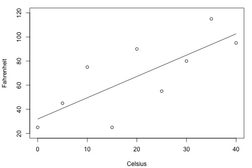
Suppose you have two brands (A and B) of thermometers, and each brand offers a Celsius thermometer and a Fahrenheit thermometer. You measure the temperature in Celsius and Fahrenheit using each brand of thermometer on ten different days. Based on the resulting data, you obtain two estimated regression lines — one for brand A and one for brand B. You plan to use the estimated regression lines to predict the temperature in Fahrenheit based on the temperature in Celsius.
Will this thermometer brand (A) yield more precise future predictions …?
… or this one (B)?
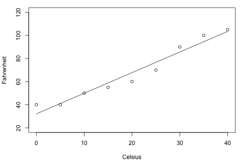
As the two plots illustrate, the Fahrenheit responses for the brand B thermometer don't deviate as far from the estimated regression equation as they do for the brand A thermometer. If we use the brand B estimated line to predict the Fahrenheit temperature, our prediction should never really be too far off from the actual observed Fahrenheit temperature. On the other hand, predictions of the Fahrenheit temperatures using the brand A thermometer can deviate quite a bit from the actual observed Fahrenheit temperature. Therefore, the brand B thermometer should yield more precise future predictions than the brand A thermometer.
To get an idea, therefore, of how precise future predictions would be, we need to know how much the responses (y) vary around the (unknown) mean population regression line \(\mu_Y=E(Y)=\beta_0 + \beta_1x\). As stated earlier, \(\sigma^{2}\) quantifies this variance in the responses. Will we ever know this value \(\sigma^{2}\)? No! Because \(\sigma^{2}\)is a population parameter, we will rarely know its true value. The best we can do is estimate it!
To understand the formula for the estimate of \(\sigma^{2}\)in the simple linear regression setting, it is helpful to recall the formula for the estimate of the variance of the responses, \(\sigma^{2}\), when there is only one population.
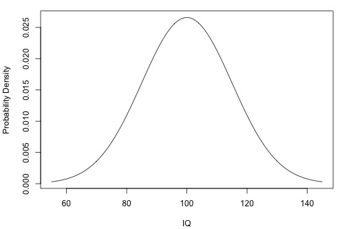
The following is a plot of the (one) population of IQ measurements. As the plot suggests, the average of the IQ measurements in the population is 100. But, how much do the IQ measurements vary from the mean? That is, how "spread out" are the IQs?
- Sample Variance
-
\(s^2=\dfrac{\sum_{i=1}^{n}(y_i-\bar{y})^2}{n-1}\)
The sample variance estimates \(\sigma^{2}\), the variance of one population. The estimate is really close to being like an average. The numerator adds up how far each response \(y_{i}\) is from the estimated mean \(\bar{y}\) in squared units, and the denominator divides the sum by n-1, not n as you would expect for an average. What we would really like is for the numerator to add up, in squared units, how far each response \(y_{i}\)is from the unknown population mean \(\mu\). But, we don't know the population mean \(\mu\), so we estimate it with \(\bar{y}\). Doing so "costs us one degree of freedom". That is, we have to divide by n-1, and not n because we estimated the unknown population mean \(\mu\).
Now let's extend this thinking to arrive at an estimate for the population variance \(\sigma^{2}\) in the simple linear regression setting. Recall that we assume that \(\sigma^{2}\) is the same for each of the subpopulations. For our example on college entrance test scores and grade point averages, how many subpopulations do we have?
There are four subpopulations depicted in this plot. In general, there are as many subpopulations as there are distinct x values in the population. Each subpopulation has its own mean \(\mu_{Y}\), which depends on x through \(\mu_Y=E(Y)=\beta_0 + \beta_1x\). And, each subpopulation mean can be estimated using the estimated regression equation \(\hat{y}_i=b_0+b_1x_i\).
- Mean square error
-
\(MSE=\dfrac{\sum_{i=1}^{n}(y_i-\hat{y}_i)^2}{n-2}\)
The mean square error estimates \(\sigma^{2}\), the common variance of the many subpopulations.
How does the mean square error formula differ from the sample variance formula? The similarities are more striking than the differences. The numerator again adds up, in squared units, how far each response \(y_{i}\) is from its estimated mean. In the regression setting, though, the estimated mean is \(\hat{y}_i\). And, the denominator divides the sum by n-2, not n-1, because in using \(\hat{y}_i\) to estimate \(\mu_{Y}\), we effectively estimate two parameters — the population intercept \(\beta_{0}\) and the population slope \(\beta_{1}\). That is, we lose two degrees of freedom.
In practice, we will let statistical software, such as Minitab, calculate the mean square error (MSE) for us. The estimate of \(\sigma^{2}\) shows up indirectly on Minitab's "fitted line plot." For example, for the student height and weight data (Student Height Weight data), the quantity emphasized in the box, \(S = 8.64137\), is the square root of MSE. That is, in general, \(S=\sqrt{MSE}\), which estimates \(\sigma\) and is known as the regression standard error or the residual standard error. The fitted line plot here indirectly tells us, therefore, that \(MSE = 8.64137^{2} = 74.67\).
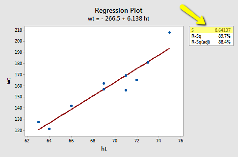
The estimate of \(\sigma^{2}\) shows up directly in Minitab's standard regression analysis output. Again, the quantity S = 8.64137 is the square root of MSE. In the Analysis of Variance table, the value of MSE, 74.67, appears appropriately under the column labeled MS (for Mean Square) and in the row labeled Error.
Analysis of Variance
| Source | DF | SS | MS | F | P |
|---|---|---|---|---|---|
| Constant | 1 | 5202.21 | 5202.21 | 69.67 | 0.000 |
| Error | 8 | 597.39 | 74.67 | ||
| Total | 9 | 5799.60 |
Model Summary
| S | R-sq | R-sq(adj) | R-sq(pred) |
|---|---|---|---|
| 8.64137 | 89.7% | 88.4% | 87.84% |
Regression Equation
wt =-266.5 + 6.138 ht
1.5 - The Coefficient of Determination, \(R^2\)
1.5 - The Coefficient of Determination, \(R^2\)Let's start our investigation of the coefficient of determination, \(R^{2}\), by looking at two different examples — one example in which the relationship between the response y and the predictor x is very weak and a second example in which the relationship between the response y and the predictor x is fairly strong. If our measure is going to work well, it should be able to distinguish between these two very different situations.
Here's a plot illustrating a very weak relationship between y and x. There are two lines on the plot, a horizontal line placed at the average response, \(\bar{y}\), and a shallow-sloped estimated regression line, \(\hat{y}\). Note that the slope of the estimated regression line is not very steep, suggesting that as the predictor x increases, there is not much of a change in the average response y. Also, note that the data points do not "hug" the estimated regression line:
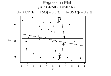
\(SSR=\sum_{i=1}^{n}(\hat{y}_i -\bar{y})^2=119.1\)
\(SSE=\sum_{i=1}^{n}(y_i-\hat{y}_i)^2=1708.5\)
\(SSTO=\sum_{i=1}^{n}(y_i-\bar{y})^2=1827.6\)
The calculations on the right of the plot show contrasting "sums of squares" values:
- SSR is the "regression sum of squares" and quantifies how far the estimated sloped regression line, \(\hat{y}_i\), is from the horizontal "no relationship line," the sample mean or \(\bar{y}\).
- SSE is the "error sum of squares" and quantifies how much the data points, \(y_i\), vary around the estimated regression line, \(\hat{y}_i\).
- SSTO is the "total sum of squares" and quantifies how much the data points, \(y_i\), vary around their mean, \(\bar{y}\).
Contrast the above example with the following one in which the plot illustrates a fairly convincing relationship between y and x. The slope of the estimated regression line is much steeper, suggesting that as the predictor x increases, there is a fairly substantial change (decrease) in the response y. And, here, the data points do "hug" the estimated regression line:
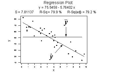
\(SSR=\sum_{i=1}^{n}(\hat{y}_i-\bar{y})^2=6679.3\)
\(SSE=\sum_{i=1}^{n}(y_i-\hat{y}_i)^2=1708.5\)
\(SSTO=\sum_{i=1}^{n}(y_i-\bar{y})^2=8487.8\)
The sums of squares for this data set tell a very different story, namely that most of the variation in the response y (SSTO = 8487.8) is due to the regression of y on x (SSR = 6679.3) not just due to random error (SSE = 1708.5). And, SSR divided by SSTO is \(6679.3/8487.8\) or 0.799, which again appears on Minitab's fitted line plot.
The previous two examples have suggested how we should define the measure formally.
- Coefficient of determination
- The "coefficient of determination" or "R-squared value," denoted \(R^{2}\), is the regression sum of squares divided by the total sum of squares.
- Alternatively (as demonstrated in the video below), since SSTO = SSR + SSE, the quantity \(R^{2}\) also equals one minus the ratio of the error sum of squares to the total sum of squares:
\(R^2=\dfrac{SSR}{SSTO}=1-\dfrac{SSE}{SSTO}\)
Characteristics of \(R^2\)
Here are some basic characteristics of the measure:
- Since \(R^{2}\) is a proportion, it is always a number between 0 and 1.
- If \(R^{2}\) = 1, all of the data points fall perfectly on the regression line. The predictor x accounts for all of the variations in y!
- If \(R^{2}\) = 0, the estimated regression line is perfectly horizontal. The predictor x accounts for none of the variations in y!
Interpretation of \(R^2\)
We've learned the interpretation for the two easy cases — when \(R^{2}\) = 0 or \(R^{2}\) = 1 — but, how do we interpret \(R^{2}\) when it is some number between 0 and 1, like 0.23 or 0.57, say? Here are two similar, yet slightly different, ways in which the coefficient of determination \(R^{2}\) can be interpreted. We say either:
"\(R^{2}\) ×100 percent of the variation in y is reduced by taking into account predictor x"
or:
"\(R^{2}\) ×100 percent of the variation in y is 'explained by the variation in predictor x."
Many statisticians prefer the first interpretation. I tend to favor the second. The risk with using the second interpretation — and hence why 'explained by' appears in quotes — is that it can be misunderstood as suggesting that the predictor x causes the change in the response y. Association is not causation. That is, just because a dataset is characterized by having a large r-squared value, it does not imply that x causes the changes in y. As long as you keep the correct meaning in mind, it is fine to use the second interpretation. A variation on the second interpretation is to say, "\(r^{2}\) ×100 percent of the variation in y is accounted for by the variation in predictor x."
Students often ask: "what's considered a large r-squared value?" It depends on the research area. Social scientists who are often trying to learn something about the huge variation in human behavior will tend to find it very hard to get r-squared values much above, say 25% or 30%. Engineers, on the other hand, who tend to study more exact systems would likely find an r-squared value of just 30% merely unacceptable. The moral of the story is to read the literature to learn what typical r-squared values are for your research area!
Let's revisit the skin cancer mortality example (Skin Cancer Data). Any statistical software that performs a simple linear regression analysis will report the r-squared value for you. It appears in two places in Minitab's output, namely on the fitted line plot:
and in the standard regression analysis output.
Analysis of Variance
| Source | DF | Adj SS | Adj MS | F-Value | P-Value |
|---|---|---|---|---|---|
| Regression | 1 | 36464 | 36464.2 | 99.80 | 0.000 |
| Lat | 1 | 36464 | 36464.2 | 99.80 | 0.000 |
| Error | 47 | 17173 | 365.4 | ||
| Lack-of-Fit | 30 | 12863 | 428.8 | 1.69 | 0.128 |
| Pure Error | 17 | 4310 | 253.6 | ||
| Total | 48 | 53637 |
Model Summary
| S | R-sq | R-sq (adj) | R-sq (pred) |
|---|---|---|---|
| 19.1150 | 67.98% | 67.30% | 65.12% |
We can say that 68% (shaded area above) of the variation in the skin cancer mortality rate is reduced by taking into account latitude. Or, we can say — with knowledge of what it really means — that 68% of the variation in skin cancer mortality is due to or explained by latitude.
1.6 - (Pearson) Correlation Coefficient, \(r\)
1.6 - (Pearson) Correlation Coefficient, \(r\)The correlation coefficient, r, is directly related to the coefficient of determination \(R^{2}\) in an obvious way. If \(R^{2}\) is represented in decimal form, e.g. 0.39 or 0.87, then all we have to do to obtain r is to take the square root of \(R^{2}\):
\(r= \pm \sqrt{R^2}\)
The sign of r depends on the sign of the estimated slope coefficient \(b_{1}\):
- If \(b_{1}\) is negative, then r takes a negative sign.
- If \(b_{1}\) is positive, then r takes a positive sign.
That is, the estimated slope and the correlation coefficient r always share the same sign. Furthermore, because \(R^{2}\) is always a number between 0 and 1, the correlation coefficient r is always a number between -1 and 1.
One advantage of r is that it is unitless, allowing researchers to make sense of correlation coefficients calculated on different data sets with different units. The "unitless-ness" of the measure can be seen from an alternative formula for r, namely:
- Correlation Coefficient, r
- \(r=\dfrac{\sum_{i=1}^{n}(x_i-\bar{x})(y_i-\bar{y})}{\sqrt{\sum_{i=1}^{n}(x_i-\bar{x})^2\sum_{i=1}^{n}(y_i-\bar{y})^2}}\)
If x is the height of an individual measured in inches and y is the weight of the individual measured in pounds, then the units for the numerator are inches × pounds. Similarly, the units for the denominator are inches × pounds. Because they are the same, the units in the numerator and denominator cancel each other out, yielding a "unitless" measure.
Another formula for r that you might see in the regression literature is one that illustrates how the correlation coefficient r is a function of the estimated slope coefficient \(b_{1}\):
\(r=\dfrac{\sqrt{\sum_{i=1}^{n}(x_i-\bar{x})^2}}{\sqrt{\sum_{i=1}^{n}(y_i-\bar{y})^2}}\times b_1\)
We are readily able to see from this version of the formula that:
- The estimated slope \(b_{1}\) of the regression line and the correlation coefficient r always share the same sign. If you don't see why this must be true, view the video.
- The correlation coefficient r is a unitless measure. If you don't see why this must be true, view the video.
- If the estimated slope \(b_{1}\) of the regression line is 0, then the correlation coefficient r must also be 0.
That's enough with the formulas! As always, we will let statistical software such as Minitab do the dirty calculations for us. Here's what Minitab's output looks like for the skin cancer mortality and latitude example (Skin Cancer Data):
Correlation: Mort, Lat
Pearson correlation of Mort and Lat = -0.825
The output tells us that the correlation between skin cancer mortality and latitude is -0.825 for this data set. Note that it doesn't matter the order in which you specify the variables:
Correlation: Lat, Mort
Pearson correlation of Mort and Lat = -0.825
The output tells us that the correlation between skin cancer mortality and latitude is still -0.825. What does this correlation coefficient tell us? That is, how do we interpret the Pearson correlation coefficient r? In general, there is no nice practical operational interpretation for r as there is for \(r^{2}\). You can only use r to make a statement about the strength of the linear relationship between x and y. In general:
- If r = -1, then there is a perfect negative linear relationship between x and y.
- If r = 1, then there is a perfect positive linear relationship between x and y.
- If r = 0, then there is no linear relationship between x and y.
All other values of r tell us that the relationship between x and y is not perfect. The closer r is to 0, the weaker the linear relationship. The closer r is to -1, the stronger the negative linear relationship. And, the closer r is to 1, the stronger the positive linear relationship. As is true for the \(R^{2}\) value, what is deemed a large correlation coefficient r value depends greatly on the research area.
So, what does the correlation of -0.825 between skin cancer mortality and latitude tell us? It tells us:
- The relationship is negative. As the latitude increases, the skin cancer mortality rate decreases (linearly).
- The relationship is quite strong (since the value is pretty close to -1)
1.7 - Some Examples
1.7 - Some ExamplesLet's take a look at some examples so we can get some practice interpreting the coefficient of determination \(R^{2}\) and the correlation coefficient r.
Example 1-1: Temperature in Celsius and Fahrenheit
How strong is the linear relationship between temperatures in Celsius and temperatures in Fahrenheit? Here's a plot of an estimated regression equation based on n = 11 data points:
It shouldn't be surprising that Minitab reports that \(R^{2}\) = 100% and r = 1.000. Both measures tell us that there is a perfect linear relationship between temperature in degrees Celsius and temperature in degrees Fahrenheit. We know that the relationship is perfect, namely that Fahrenheit = 32 + 1.8 × Celsius. It should be no surprise then that \(R^{2}\) tells us that 100% of the variation in temperatures in Fahrenheit is explained by the temperature in Celsius.
Example 1-2: Building Stories and Height
How strong is the linear relationship between the number of stories a building has and its height? One would think that as the number of stories increases, the height would increase, but not perfectly. Some statisticians compiled data on a set of n = 60 buildings reported in the 1994 World Almanac (Building Stories data). Minitab's fitted line plot and correlation output look like this:
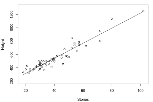
Minitab reports that \(R^{2} = 90.4\%\) and r = 0.951. The positive sign of r tells us that the relationship is positive — as the number of stories increases, height increases — as we expected. Because r is close to 1, it tells us that the linear relationship is very strong, but not perfect. The \(R^{2}\) value tells us that 90.4% of the variation in the height of the building is explained by the number of stories in the building.
Example 1-3: Drivers and Age
How strong is the linear relationship between the age of a driver and the distance the driver can see? If we had to guess, we might think that the relationship is negative — as age increases, the distance decreases. A research firm (Last Resource, Inc., Bellefonte, PA) collected data on a sample of n = 30 drivers (Driver Age and Distance data). Minitab's fitted line plot and correlation output on the data looks like this:
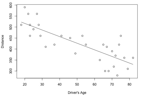
Minitab reports that \(R^{2} = 64.2\%\) and r = -0.801. The negative sign of r tells us that the relationship is negative — as driving age increases, seeing distance decreases — as we expected. Because r is fairly close to -1, it tells us that the linear relationship is fairly strong, but not perfect. The \(R^{2}\) value tells us that 64.2% of the variation in the seeing distance is reduced by taking into account the age of the driver.
Example 1-4: Height and GPA
How strong is the linear relationship between the height of a student and his or her grade point average? Data were collected on a random sample of n = 35 students in a statistics course at Penn State University (Height and GPA data ) and the resulting fitted line plot and correlation output were obtained:
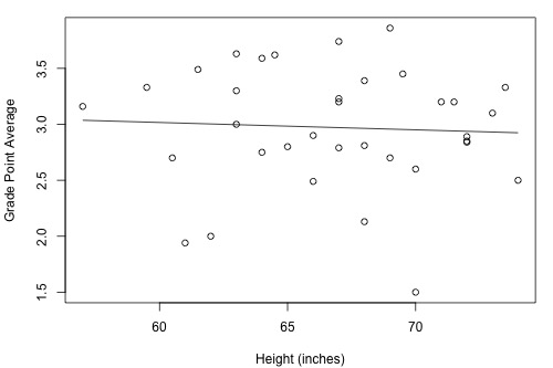
Minitab reports that \(R^{2} = 0.3\% \) and r = -0.053. Because r is quite close to 0, it suggests — not surprisingly, I hope — that there is next to no linear relationship between height and grade point average. Indeed, the \(R^{2}\) value tells us that only 0.3% of the variation in the grade point averages of the students in the sample can be explained by their height. In short, we would need to identify another more important variable, such as the number of hours studied, if predicting a student's grade point average is important to us.
1.8 - \(R^2\) Cautions
1.8 - \(R^2\) CautionsUnfortunately, the coefficient of determination \(R^{2}\) and the correlation coefficient r have to be the most often misused and misunderstood measures in the field of statistics. To ensure that you don't fall victim to the most common mistakes, we review a set of seven different cautions here. Master these and you'll be a master of the measures!
Cautions
Caution #1
The coefficient of determination \(R^{2}\) and the correlation coefficient r quantify the strength of a linear relationship. It is possible that \(R^{2}\) = 0% and r = 0, suggesting there is no linear relation between x and y, and yet a perfect curved (or "curvilinear" relationship) exists.
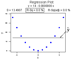
Consider the following example. The upper plot illustrates a perfect, although curved, relationship between x and y, and yet Minitab reports that \(R^{2} = 0\%\) and r = 0. The estimated regression line is perfectly horizontal with slope \(b_{1} = 0\). If you didn't understand that \(R^{2}\) and r summarize the strength of a linear relationship, you would likely misinterpret the measures, concluding that there is no relationship between x and y. But, it's just not true! There is indeed a relationship between x and y — it's just not linear.
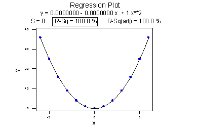
The lower plot better reflects the curved relationship between x and y. Minitab has drawn a quadratic curve through the data, and reports that "R-sq = 100.0%" and r = 0. What is this all about? We'll learn when we study multiple linear regression later in the course that the coefficient of determination \(R^{2}\) associated with the simple linear regression model for one predictor extends to a "multiple coefficients of determination," denoted \(R^{2}\), for the multiple linear regression model with more than one predictor. (The lowercase r and uppercase R are used to distinguish between the two situations. Minitab doesn't distinguish between the two, calling both measures "R-sq.") The interpretation of \(R^{2}\) is similar to that of \(r^{2}\), namely "\(R^{2} \times 100\%\) of the variation in the response is explained by the predictors in the regression model (which may be curvilinear)."
In summary, the \(R^{2}\) value of 100% and the r value of 0 tell the story of the second plot perfectly. The multiple coefficients of determination \(R^{2} = 100\%\) tell us that all of the variations in the response y are explained in a curved manner by the predictor x. The correlation coefficient r = 0 tells us that if there is a relationship between x and y, it is not linear.
Caution #2
A large \(R^{2}\) value should not be interpreted as meaning that the estimated regression line fits the data well. Another function might better describe the trend in the data.
Consider the following example in which the relationship between years (1790 to 1990, by decades) and the population of the United States (in millions) is examined:
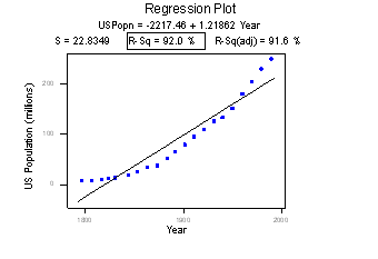
The correlation of 0.959 and the \(R^{2}\) value of 92.0% suggest a strong linear relationship between the year and the U.S. population. Indeed, only 8% of the variation in the U.S. population is left to explain after taking into account the year in a linear way! The plot suggests, though, that a curve would describe the relationship even better. That is, the large \(R^{2}\) value of 92.0% should not be interpreted as meaning that the estimated regression line fits the data well. (Its large value does suggest that taking into account the year is better than not doing so. It just doesn't tell us that we could still do better.)
Again, the \(R^{2}\) value doesn't tell us that the regression model fits the data well. This is the most common misuse of the \(R^{2}\) value! When you are reading the literature in your research area, pay close attention to how others interpret \(R^{2}\). I am confident that you will find some authors misinterpreting the \(R^{2}\) value in this way. And, when you are analyzing your own data make sure you plot the data — 99 times out of 100, the plot will tell more of the story than a simple summary measure like r or \(R^{2}\) ever could.
Caution #3
The coefficient of determination \(R^{2}\) and the correlation coefficient r can both be greatly affected by just one data point (or a few data points).
Consider the following example in which the relationship between the number of deaths in an earthquake and its magnitude is examined. Data on n = 6 earthquakes were recorded, and the fitted line plot on the left was obtained. The slope of the line \(b_{1} = 179.5\) and the correlation of 0.732 suggest that as the magnitude of the earthquake increases, the number of deaths also increases. This is not a surprising result. Therefore, if we hadn't plotted the data, we wouldn't notice that one and only one data point (magnitude = 8.3 and deaths = 503) was making the values of the slope and the correlation positive.
Original plot
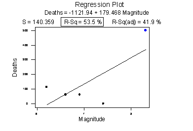
Plot with the unusual point removed
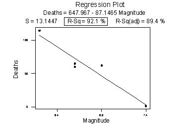
The second plot is a plot of the same data, but with that one unusual data point removed. Note that the estimated slope of the line changes from a positive 179.5 to a negative 87.1 — just by removing one data point. Also, both measures of the strength of the linear relationship improve dramatically — r changes from a positive 0.732 to a negative 0.960, and \(R^{2}\) changes from 53.5% to 92.1%.
What conclusion can we draw from these data? Probably none! The main point of this example was to illustrate the impact of one data point on the r and \(R^{2}\) values. One could argue that a secondary point of the example is that a data set can be too small to draw any useful conclusions.
Caution #4
Correlation (or association) does not imply causation.
Consider the following example in which the relationship between wine consumption and death due to heart disease is examined. Each data point represents one country. For example, the data point in the lower right corner is France, where the consumption averages 9.1 liters of wine per person per year, and deaths due to heart disease are 71 per 100,000 people.
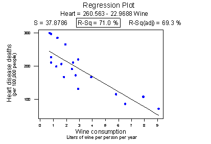
Minitab reports that the \(R^{2}\) value is 71.0% and the correlation is -0.843. Based on these summary measures, a person might be tempted to conclude that he or she should drink more wine since it reduces the risk of heart disease. If only life were that simple! Unfortunately, there may be other differences in the behavior of the people in the various countries that really explain the differences in the heart disease death rates, such as diet, exercise level, stress level, social support structure, and so on.
Let's push this a little further. Recall the distinction between an experiment and an observational study:
- An experiment is a study in which, when collecting the data, the researcher controls the values of the predictor variables.
- An observational study is a study in which, when collecting the data, the researcher merely observes and records the values of the predictor variables as they happen.
The primary advantage of conducting experiments is that one can typically conclude that differences in the predictor values are what caused the changes in the response values. This is not the case for observational studies. Unfortunately, most data used in regression analyses arise from observational studies. Therefore, you should be careful not to overstate your conclusions, as well as be cognizant that others may be overstating their conclusions.
Caution #5
Ecological correlations — correlations that are based on rates or averages — tend to overstate the strength of an association.
Some statisticians (Freedman, Pisani, Purves, 1997) investigated data from the 1988 Current Population Survey in order to illustrate the inflation that can occur in ecological correlations. Specifically, they considered the relationship between a man's level of education and his income. They calculated the correlation between education and income in two ways:
- First, they designated individual men, aged 25-64, as the experimental units. That is, each data point represented a man's income and education level. Using these data, they determined that the correlation between income and education level for men aged 25-64 was about 0.4, not a convincingly strong relationship.
- The statisticians analyzed the data again, but in the second go-around, they treated nine geographical regions as the units. That is, the first computed the average income and average education for men aged 25-64 in each of the nine regions. They determined that the correlation between the average income and average education for the sample of n = 9 regions was about 0.7, obtaining a much larger correlation than that obtained on the individual data.
Again, ecological correlations, such as the one calculated on the region data, tend to overstate the strength of an association. How do you know what kind of data to use — aggregate data (such as regional data) or individual data? It depends on the conclusion you'd like to make.
If you want to learn about the strength of the association between an individual's education level and his income, then, by all means, you should use individual, not aggregate, data. On the other hand, if you want to learn about the strength of the association between a school's average salary level and the school's graduation rate, you should use aggregate data in which the units are the schools.
We hadn't taken note of it at the time, but you've already seen a couple of examples in which ecological correlations were calculated on aggregate data:
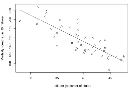
The correlation between wine consumption and heart disease deaths (0.71) is an ecological correlation. The units are countries, not individuals. The correlation between skin cancer mortality and state latitude of 0.68 is also an ecological correlation. The units are states, again not individuals. In both cases, we should not use these correlations to try to draw a conclusion about how an individual's wine consumption or suntanning behavior will affect their individual risk of dying from heart disease or skin cancer. We shouldn't try to draw such conclusions anyway, because "association is not causation."
Caution #6
A "statistically significant" \(R^{2}\) value does not imply that the slope \(β_{1}\) is meaningfully different from 0.
This caution is a little strange as we haven't talked about any hypothesis tests yet. We'll get to that soon, but before doing so ... a number of former students have asked why some article authors can claim that two variables are "significantly associated" with a P-value less than 0.01, yet their \(R^{2}\) value is small, such as 0.09 or 0.16. The answer has to do with the mantra that you may recall from your introductory statistics course: "statistical significance does not imply practical significance."
In general, the larger the data set, the easier it is to reject the null hypothesis and claim "statistical significance." If the data set is very large, it is even possible to reject the null hypothesis and claim that the slope \(β_{1}\) is not 0, even when it is not practically or meaningfully different from 0. That is, it is possible to get a significant P-value when \(β_{1}\) is 0.13, a quantity that is likely not to be considered meaningfully different from 0 (of course, it does depend on the situation and the units). Again, the mantra is "statistical significance does not imply practical significance."
Caution #7
A large \(R^{2}\) value does not necessarily mean that a useful prediction of the response \(y_{new}\), or estimation of the mean response \(\mu_{Y}\), can be made. It is still possible to get prediction intervals or confidence intervals that are too wide to be useful.
We'll learn more about such prediction and confidence intervals in Lesson 3.
Try it!
Cautions about \(R^{2}\)
Although the \(R^{2}\) value is a useful summary measure of the strength of the linear association between x and y, it really shouldn't be used in isolation. And certainly, its meaning should not be over-interpreted. These practice problems are intended to illustrate these points.
- A large \(R^{2}\) value does not imply that the estimated regression line fits the data well.
The American Automobile Association has published data (Defensive Driving: Managing Time and Space, 1991) that looks at the relationship between the average stopping distance ( y = distance, in feet) and the speed of a car (x = speed, in miles per hour). The data set Car Stopping data contains 63 such data points.
- Use Minitab to create a fitted line plot of the data. (See Minitab Help Section - Creating a fitted line plot). Does a line do a good job of describing the trend in the data?
- Interpret the \(R^{2}\) value. Does car speed explain a large portion of the variability in the average stopping distance? That is, is the C value large?
- Summarize how the title of this section is appropriate.
1.1 - The plot shows a strong positive association between the variables that curve upwards slightly.
1.2 - \(R^{2}= 87.5%\) of the sample variation in y = StopDist can be explained by the variation in x = Speed. This is a relatively large value.
1.3 - The value of \(R^{2}\) is relatively high but the estimated regression line misses the curvature in the data.
- One data point can greatly affect the \(R^{2}\) value
The McCoo dataset contains data on running back Eric McCoo's rushing yards (mccoo) for each game of the 1998 Penn State football season. It also contains Penn State's final score (score).
- Use Minitab to create a fitted line plot. (See Minitab Help Section - Creating a fitted line plot). Interpret the \(R^{2}\) value, and note its size.
- Remove the one data point in which McCoo ran 206 yards. Then, create another fitted line plot on the reduced data set. Interpret the \(R^{2}\) value. Upon removing the one data point, what happened to the \(R^{2}\) value?
- When a correlation coefficient is reported in research journals, there often is not an accompanying scatter plot. Summarize why reported correlation values should be accompanied by either the scatter plot of the data or a description of the scatter plot.
2.1 - The plot shows a slight positive association between the variables with \(R^{2} = 24.9%\) of the sample variation in y = Score explained by the variation in McCoo.2.2 - \(R^{2}\) decreases to just 7.9% on the removal of the one data point with McCoo = 206 yards.
- Association is not causation!
Association between the predictor x and response y should not be interpreted as implying that x causes the changes in y. There are many possible reasons why there is an association between x and y, including:
- The predictor x does indeed cause the changes in the response y.
- The causal relation may instead be reversed. That is, the response y may cause the changes in predictor x.
- The predictor x is a contributing but not sole cause of changes in the response variable y.
- There may be a "lurking variable" that is the real cause of changes in y but also is associated with x, thus giving rise to the observed relationship between x and y.
- The association may be purely coincidental.
It is not an easy task to definitively conclude the causal relationships in a-c. It generally requires designed experiments and sound scientific justification. e is related to Type I errors in the regression setting. The exercises in this section and the next are intended to illustrate d, that is, examples of lurking variables.
3a. Drug law expenditures and drug-induced deaths
"Time" is often a lurking variable. If two things (e.g. road deaths and chocolate consumption) just happen to be increasing over time for totally unrelated reasons, a scatter plot will suggest there is a relationship, regardless of it existing only because of the lurking variable "time." The data set Drugdea data contains data on drug law expenditures and drug-induced deaths (Duncan, 1994). The data set gives figures from 1981 to 1991 on the U.S. Drug Enforcement Agency budget (budget) and the number of drug-induced deaths in the United States (deaths).
- Create a fitted line plot treating deaths as the response y and budget as the predictor x. Do you think the budget caused the deaths?
- Create a fitted line plot treating budget as the response y and deaths as the predictor x. Do you think the deaths caused the budget?
- Create a fitted line plot treating budget as the response y and year as the predictor x.
- Create a fitted line plot treating deaths as the response y and year as the predictor x.
- What is going on here? Summarize the relationships between budget, deaths, and year and explain why it might appear that as drug-law expenditures increase, so do drug-induced deaths.
3b. Infant death rates and breastfeeding3a.1 - The plot shows a moderate positive association between the variables but with more variation on the right side of the plot.
3a.2 - This plot also shows a moderate positive association between the variables but with more variation on the right side of the plot.
3a.3 - This plot shows a strong positive association between the variables.
3a.4 - This plot shows a moderate positive association that is very similar to the deaths vs budget plot.
3a.5 - Year appears to be a lurking variable here and the variables deaths and budget most likely have little to do with one another.
The data set Infant data contains data on infant death rates (death) in 14 countries (1989 figures, deaths per 1000 of population). It also contains data on the percentage of mothers in those countries who are still breastfeeding (feeding) at six months, as well as the percentage of the population who have access to safe drinking water (water).
- Create a fitted line plot treating death as the response y and feeding as the predictor x. Based on what you see, what causal relationship might you be tempted to conclude?
- Create a fitted line plot treating feeding as the response y and water as the predictor x. What relationship does the plot suggest?
- What is going on here? Summarize the relationships between death, feeding, and water and explain why it might appear that as the percentage of mothers breastfeeding at six months increases, so does the infant death rate.
3b.1 - The plot shows a moderate positive association between the variables, possibly suggesting that as feeding increases, so too does death.
3b.2 - The plot shows a moderate negative association between the variables, possibly suggesting that as water increases, feeding decreases.
3b.3 - Higher values of water tend to be associated with lower values of both feeding and death, so low values of feeding and death tend to occur together. Similarly, lower values of water tend to be associated with higher values of both feeding and death, so high values of feeding and death tend to occur together. Water is a lurking variable here and is likely the real driver behind infant death rates.
- Does a statistically significant P-value for \(H_0 \colon \beta_{1}\) = 0 imply that \(\beta_{1}\) is meaningfully different from 0?
Recall that just because we get a small P-value and therefore a "statistically significant result" when testing \(H_{0} \colon \beta_{1}\) = 0, it does not imply that \(\beta_{1}\) will be meaningfully different from 0. This exercise is designed to illustrate this point. The Practical dataset contains 1000 (x, y) data points.
- Create a fitted line plot and perform a standard regression analysis on the data set. (See Minitab Help Sections Performing a basic regression analysis and Creating a fitted line plot).
- Interpret the \(R^{2}\) value. Does there appear to be a strong linear relation between x and y?
- Use the Minitab output to conduct the test \(H_{0} \colon \beta_{1}\) = 0. (We'll cover this formally in Lesson 2, but for the purposes of this exercise reject \(H_{0}\) if the P-value for \(\beta_{1}\) is less than 0.05.) What is your conclusion about the relationship between x and y?
- Use the Minitab output to calculate a 95% confidence interval for \(\beta_{1}\). (Again, we'll cover this formally in Lesson 2, but for the purposes of this exercise use the formula \(b_{1}\) ± 2 × se (\(b_{1}\)). Since the sample is so large, we can just use a t-value of 2 in this confidence interval formula.) Interpret your interval. Suppose that if the slope \(\beta_{1}\) is 1 or more, then the researchers would deem it to be meaningfully different from 0. Does the interval suggest, with 95% confidence, that \(\beta_{1}\) is meaningfully different from 0?
- Summarize the apparent contradiction you've found. What do you think is causing the contradiction? And, based on your findings, what would you suggest you should always do, whenever possible when analyzing data?
4.1 - The fitted regression equation is y = 5.0062 + 0.09980 x.
4.2 - \(R^{2} = 24.3%\) of the sample variation in y can be explained by the variation in x. There appears to be a moderate linear association between the variables.
4.3 - The p-value is 0.000 suggesting a significant linear association between y and x.
4.4 - The interval is 0.09980 ± 2(0.0058) or (0.0882, 0.1114). Since this interval excludes the researchers’ threshold of 1, \(\beta_1\) is not meaningfully different from 0.
4.5 - The large sample size results in a sample slope that is significantly different from 0, but not meaningfully different from 0. The scatterplot, which should always accompany a simple linear regression analysis, illustrates.
- A large R-squared value does not necessarily imply useful predictions
The Old Faithful dataset contains data on 21 consecutive eruptions of Old Faithful geyser in Yellowstone National Park. It is believed that one can predict the time until the next eruption (next), given the length of time of the last eruption (duration).
- Use Minitab to quantify the degree of linear association between next and duration. That is, determine and interpret the \(R^{2}\) value.
- Use Minitab to obtain a 95% prediction interval for the time until the next eruption if the last eruption lasted 3 minutes. (See Minitab Help Section - Performing a multiple regression analysis - with options). Interpret your prediction interval. (We'll cover Prediction Intervals formally in Lesson 3, so just use your intuitive notion of what a Prediction Interval might mean for this exercise.)
- Suppose you are a "rat race tourist" who knows that you can only spend up to one hour waiting for the next eruption to occur. Is the prediction interval too wide to be helpful to you?
- Is the title of this section appropriate?
5.1 - \(R^{2} = 74.91%\) of the sample variation in the next can be explained by the variation in duration. There is a relatively high degree of linear association between the variables.
5.2 - The 95% prediction interval is (47.2377, 73.5289), which means we’re 95% confident that the time until the next eruption if the last eruption lasted 3 minutes will be between 47.2 and 73.5 minutes.
5.3 - If we can only wait 60 minutes, this interval is too wide to be helpful to us since it extends beyond 60 minutes.
1.9 - Hypothesis Test for the Population Correlation Coefficient
1.9 - Hypothesis Test for the Population Correlation CoefficientThere is one more point we haven't stressed yet in our discussion about the correlation coefficient r and the coefficient of determination \(R^{2}\) — namely, the two measures summarize the strength of a linear relationship in samples only. If we obtained a different sample, we would obtain different correlations, different \(R^{2}\) values, and therefore potentially different conclusions. As always, we want to draw conclusions about populations, not just samples. To do so, we either have to conduct a hypothesis test or calculate a confidence interval. In this section, we learn how to conduct a hypothesis test for the population correlation coefficient \(\rho\) (the greek letter "rho").
In general, a researcher should use the hypothesis test for the population correlation \(\rho\) to learn of a linear association between two variables, when it isn't obvious which variable should be regarded as the response. Let's clarify this point with examples of two different research questions.
Consider evaluating whether or not a linear relationship exists between skin cancer mortality and latitude. We will see in Lesson 2 that we can perform either of the following tests:
- t-test for testing \(H_{0} \colon \beta_{1}= 0\)
- ANOVA F-test for testing \(H_{0} \colon \beta_{1}= 0\)
For this example, it is fairly obvious that latitude should be treated as the predictor variable and skin cancer mortality as the response.
By contrast, suppose we want to evaluate whether or not a linear relationship exists between a husband's age and his wife's age (Husband and Wife data). In this case, one could treat the husband's age as the response:
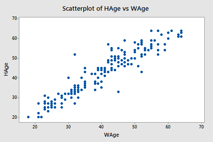
...or one could treat the wife's age as the response:
In cases such as these, we answer our research question concerning the existence of a linear relationship by using the t-test for testing the population correlation coefficient \(H_{0}\colon \rho = 0\).
Let's jump right to it! We follow standard hypothesis test procedures in conducting a hypothesis test for the population correlation coefficient \(\rho\).
Steps for Hypothesis Testing for \(\boldsymbol{\rho}\)
-
Step 1: Hypotheses
First, we specify the null and alternative hypotheses:
- Null hypothesis \(H_{0} \colon \rho = 0\)
- Alternative hypothesis \(H_{A} \colon \rho ≠ 0\) or \(H_{A} \colon \rho < 0\) or \(H_{A} \colon \rho > 0\)
-
Step 2: Test Statistic
Second, we calculate the value of the test statistic using the following formula:
Test statistic: \(t^*=\dfrac{r\sqrt{n-2}}{\sqrt{1-R^2}}\)
-
Step 3: P-Value
Third, we use the resulting test statistic to calculate the P-value. As always, the P-value is the answer to the question "how likely is it that we’d get a test statistic t* as extreme as we did if the null hypothesis were true?" The P-value is determined by referring to a t-distribution with n-2 degrees of freedom.
-
Step 4: Decision
Finally, we make a decision:
- If the P-value is smaller than the significance level \(\alpha\), we reject the null hypothesis in favor of the alternative. We conclude that "there is sufficient evidence at the\(\alpha\) level to conclude that there is a linear relationship in the population between the predictor x and response y."
- If the P-value is larger than the significance level \(\alpha\), we fail to reject the null hypothesis. We conclude "there is not enough evidence at the \(\alpha\) level to conclude that there is a linear relationship in the population between the predictor x and response y."
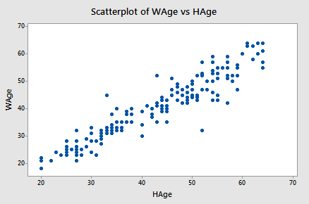
Example 1-5: Husband and Wife Data
Let's perform the hypothesis test on the husband's age and wife's age data in which the sample correlation based on n = 170 couples is r = 0.939. To test \(H_{0} \colon \rho = 0\) against the alternative \(H_{A} \colon \rho ≠ 0\), we obtain the following test statistic:
\begin{align} t^*&=\dfrac{r\sqrt{n-2}}{\sqrt{1-R^2}}\\ &=\dfrac{0.939\sqrt{170-2}}{\sqrt{1-0.939^2}}\\ &=35.39\end{align}
To obtain the P-value, we need to compare the test statistic to a t-distribution with 168 degrees of freedom (since 170 - 2 = 168). In particular, we need to find the probability that we'd observe a test statistic more extreme than 35.39, and then, since we're conducting a two-sided test, multiply the probability by 2. Minitab helps us out here:
Student's t distribution with 168 DF
| x | P(X<= x) |
|---|---|
| 35.3900 | 1.0000 |
The output tells us that the probability of getting a test-statistic smaller than 35.39 is greater than 0.999. Therefore, the probability of getting a test-statistic greater than 35.39 is less than 0.001. As illustrated in the following video, we multiply by 2 and determine that the P-value is less than 0.002.
Since the P-value is small — smaller than 0.05, say — we can reject the null hypothesis. There is sufficient statistical evidence at the \(\alpha = 0.05\) level to conclude that there is a significant linear relationship between a husband's age and his wife's age.
Incidentally, we can let statistical software like Minitab do all of the dirty work for us. In doing so, Minitab reports:
Correlation: WAge, HAge
Pearson correlation of WAge and HAge = 0.939
P-Value = 0.000
Final Note
One final note ... as always, we should clarify when it is okay to use the t-test for testing \(H_{0} \colon \rho = 0\)? The guidelines are a straightforward extension of the "LINE" assumptions made for the simple linear regression model. It's okay:
- When it is not obvious which variable is the response.
- When the (x, y) pairs are a random sample from a bivariate normal population.
- For each x, the y's are normal with equal variances.
- For each y, the x's are normal with equal variances.
- Either, y can be considered a linear function of x.
- Or, x can be considered a linear function of y.
- The (x, y) pairs are independent
1.10 - Further Examples
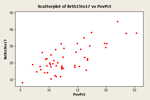
1.10 - Further ExamplesExample 1-6: Teen Birth Rate and Poverty Level Data

This dataset of size n = 51 is for the 50 states and the District of Columbia in the United States (Poverty data). The variables are y = the year 2002 birth rate per 1000 females 15 to 17 years old and x = poverty rate, which is the percent of the state’s population living in households with incomes below the federally defined poverty level. (Data source: Mind On Statistics, 3rd edition, Utts and Heckard).
The plot of the data below (birth rate on the vertical) shows a generally linear relationship, on average, with a positive slope. As the poverty level increases, the birth rate for 15 to 17-year-old females tends to increase as well.
The figure below, created in Minitab using Stat >> Regression >> Fitted Line Plot, shows a regression line superimposed on the data. The equation is given near the top of the plot. Minitab should have written that the equation is for the “average” birth rate (or “predicted” birth rate would be okay too) because a regression equation describes the average value of y as a function of one or more x-variables. In statistical notation, the equation could be written \(\hat{y} = 4.267 + 1.373x \).
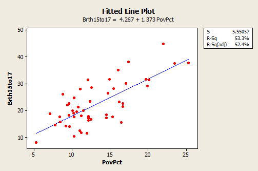
- The interpretation of the slope (value = 1.373) is that the 15 to 17-year-old birth rate increases by 1.373 units, on average, for each unit (one percent) increase in the poverty rate.
- The interpretation of the intercept (value=4.267) is that if there were states with a poverty rate = 0, the predicted average for the 15 to 17-year-old birth rate would be 4.267 for those states. Since there are no states with a poverty rate = 0 this interpretation of the intercept is not practically meaningful for this example.
In the graph with a regression line present, we also see the information that s = 5.55057 and \(R^{2}\) = 53.3%.
- The value of s tells us roughly the average difference between the y-values of individual observations and predictions of y based on the regression line.
- The value of \(R^{2}\) can be interpreted to mean that poverty rates "explain" 53.3% of the observed variation in the 15 to 17-year-old average birth rates of the states.
The \(R^{2}\) (adj) value (52.4%) is an adjustment to \(R^{2}\) based on the number of x-variables in the model (only one here) and the sample size. With only one x-variable, the adjusted \(R^{2}\) is not important.
Example 1-7: Lung Function in 6 to 10 Year Old Children

The data are from n = 345 children between 6 and 10 years old. The variables are y = forced exhalation volume (FEV), a measure of how much air somebody can forcibly exhale from their lungs, and x = age in years. (Data source: The data here are a part of a dataset given in Kahn, Michael (2005). "An Exhalent Problem for Teaching Statistics", The Journal of Statistical Education, 13(2).
Below is a plot of the data with a simple linear regression line superimposed. The plot was done in Minitab and as pointed out earlier, the word “average” should come before the y-variable name.
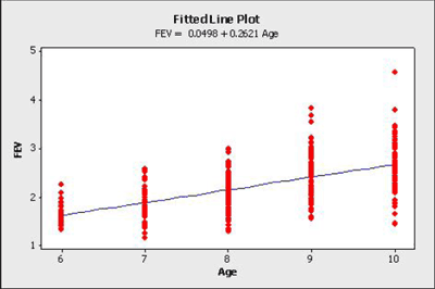
- The estimated regression equation is that average \(FEV = 0.0498 + 0.2621 \times age\). For instance, for an 8 year old we can use the equation to estimate that the average \(FEV = 0.0498 + 0.2621 \times (8) = 2.1466\).
- The interpretation of the slope is that the average FEV increases by 0.2621 for each one-year increase in age (in the observed age range).
An interesting and possibly important feature of these data is that the variance of individual y-values from the regression line increases as age increases. This feature of data is called non-constant variance. For example, the FEV values of 10-year-olds are more variable than the FEV values of 6-year-olds. This is seen by looking at the vertical ranges of the data in the plot. This may lead to problems using a simple linear regression model for these data, which is an issue we'll explore in more detail in Lesson 4.
Above, we only analyzed a subset of the entire dataset. The full dataset (FEV Data) is shown in the plot below:
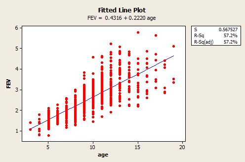
As we can see, the range of ages now spans 3 to 19 years old and the estimated regression equation is FEV = 0.4316 + 0.2220 × age. Both the slope and intercept have noticeably changed, but the variance still appears to be non-constant. This illustrates that it is important to be aware of how you are analyzing your data. If you only use a subset of your data that spans a shorter range of predictor values, then you could obtain noticeably different results than if you had used the full dataset.
Software Help 1
Software Help 1
The next two pages cover the Minitab and R commands for the procedures in this lesson.
Below is a zip file that contains all the data sets used in this lesson:
- bldgstories.txt
- carstopping.txt
- drugdea.txt
- fev_dat.txt
- heightgpa.txt
- husbandwife.txt
- infant.txt
- mccoo.txt
- oldfaithful.txt
- poverty.txt
- practical.txt
- signdist.txt
- skincancer.txt
- student_height_weight.txt
Minitab Help 1: Simple Linear Regression
Minitab Help 1: Simple Linear RegressionMinitab®
Skin cancer mortality
Student height and weight
- Perform a basic regression analysis.
- Create a fitted line plot.
- Find a confidence interval and a prediction interval for the response to predict weight for height=66 and height=67.
Skin cancer mortality (revisited)
Building stories
Driver's age and distance
Student's height and GPA
Teen birth rate and poverty
Lung function
- Use Data > Subset Worksheet to select only observations with age between 6 and 10.
- Perform a basic regression analysis.
- Create a fitted line plot.
R Help 1: Simple Linear Regression
R Help 1: Simple Linear RegressionR Instructions
Temperature
- Create the temperature data and produce a scatterplot with points and lines:
C <- seq(0, 50, by=5)
F <- (9/5)*C+32
plot(C, F, type="b", xlab="Celsius", ylab="Fahrenheit", ylim=c(30,130))
Skin cancer
- Load the skin cancer data and produce a scatterplot with a simple linear regression line:
skincancer <- read.table("~/path-to-folder/skincancer.txt", header=T)
attach(skincancer)
model <- lm(Mort ~ Lat)
plot(x=Lat, y=Mort,
     xlab="Latitude (at center of state)", ylab="Mortality (deaths per 10 million)",
     main="Skin Cancer Mortality versus State Latitude",
     panel.last = lines(sort(Lat), fitted(model)[order(Lat)]))
detach(skincancer)
Student height and weight
- Load the student height and weight data.
- Fit a simple linear regression model.
- Produce a scatterplot with a simple linear regression line and another line with specified intercept and slope.
- Calculate sum of squared errors (SSE).
- Predict weight for height=66 and height=67.
heightweight <- read.table("~/path-to-folder/student_height_weight.txt", header=T)
attach(heightweight)

model <- lm(wt ~ ht)
summary(model)
# Hashtag denotes comments
# Coefficients:
#              Estimate Std. Error t value Pr(>|t|)
# (Intercept) -266.5344    51.0320  -5.223    8e-04 ***
# ht             6.1376     0.7353   8.347 3.21e-05 ***

plot(x=ht, y=wt, ylim=c(110,210), xlab="height", ylab="weight",
     panel.last = c(lines(sort(ht), fitted(model[order(ht)]),
                    lines(ht, -331.2+7.1*ht, lty=2)))
sum(residuals(model)^2) # SSE = 597.386
predict(model, newdata=data.frame(ht=c(66, 67))) # 138.5460 144.6836
detach(heightweight)
High school GPA and college test scores
- Generate the high school GPA and college test score (population) data.
- Produce a scatterplot of the population data with the population regression line.
- Sample the data (your results will differ since we're randomly sampling here).
- Produce a scatterplot of the sample data with a simple linear regression line and the the population regression line.
- Calculate sum of squared errors (SSE), mean square error (MSE), and regression (or residual) standard error (S).
X <- c(rep(1, 100), rep(2, 100), rep(3, 100), rep(4, 100))
Y <- 2 + 4*X + rnorm(400, 0, 1)
plot(X, Y, xlab="High school gpa", ylab="College entrance test score",
     panel.last = lines(X, 2+4*X))
Xs <- c(rep(1, 3), rep(2, 3), rep(3, 3), rep(4, 3))
Ys <- Y[c(rep(0, 3), rep(100, 3), rep(200, 3), rep(300, 3)) + sample.int(100, 12)]
model <- lm(Ys ~ Xs)
plot(Xs, Ys, xlab="High school gpa", ylab="College entrance test score",
     panel.last = c(lines(Xs, 2+4*Xs),
                    lines(sort(Xs), fitted(model[order(Xs)]),lty=2))
sum(residuals(model)^2) # SSE = 8.677833
sum(residuals(model)^2)/10 # MSE = 0.8677833
sqrt(sum(residuals(model)^2)/10) # S = 0.9315489
summary(model) # Residual standard error: 0.9315 on 10 degrees of freedom
Skin cancer
- Load the skin cancer data.
- Fit a simple linear regression model with y = Mort and x = Lat and display the coefficient of determination, \(R^2\).
- Calculate the correlation between Mort and Lat.
skincancer <- read.table("~/path-to-folder/skincancer.txt", header=T)
attach(skincancer)
model <- lm(Mort ~ Lat)
summary(model) # Multiple R-squared:  0.6798
cor(Mort, Lat) # correlation = -0.8245178
detach(skincancer)
Temperature
- Create the temperature data.
- Fit a simple linear regression model with y = F and x = C and display the coefficient of determination, \(R^2\).
- Calculate the correlation between F and C.
C <- seq(0, 50, by=5)
F <- (9/5)*C+32
model <- lm(F ~ C)
summary(model) # Multiple R-squared:      1
cor(F, C) # correlation = 1
Building stories
- Load the building stories data.
- Fit a simple linear regression model with y = Height and x = Stories and display the coefficient of determination, \(R^2\).
- Calculate the correlation between Height and Stories.
bldgstories <- read.table("~/path-to-folder/bldgstories.txt", header=T)
attach(bldgstories)
model <- lm(HGHT ~ STORIES)
summary(model) # Multiple R-squared:  0.9036
cor(HGHT, STORIES) # correlation = 0.9505549
detach(bldgstories)
Driver's age and distance
- Load the driver's age and distance data.
- Fit a simple linear regression model with y = Distance and x = Age and display the coefficient of determination, \(R^2\).
- Calculate the correlation between Distance and Age.
signdist <- read.table("~/path-to-folder/signdist.txt", header=T)
attach(signdist)
model <- lm(Distance ~ Age)
summary(model) # Multiple R-squared:  0.642
cor(Distance, Age) # correlation = -0.8012447
detach(signdist)
Student's height and GPA
- Load the student's height and GPA data.
- Fit a simple linear regression model with y = GPA and x = Height and display the coefficient of determination, \(R^2\).
- Calculate the correlation between GPA and Height.
heightgpa <- read.table("~/path-to-folder/heightgpa.txt", header=T)
attach(heightgpa)
model <- lm(gpa ~ height)
summary(model) # Multiple R-squared:  0.002835
cor(gpa, height) # correlation = -0.05324126
detach(heightgpa)
Teen birth rate and poverty
- Load the teen birth rate and poverty data.
- Fit a simple linear regression model with y = Brth15to17 and x = PovPct and display the model results.
- Produce a scatterplot with a simple linear regression line.
poverty <- read.table("~/path-to-folder/poverty.txt", header=T)
attach(poverty)

model <- lm(Brth15to17 ~ PovPct)
summary(model)
# Coefficients:
#             Estimate Std. Error t value Pr(>|t|)
# (Intercept)   4.2673     2.5297   1.687    0.098 .
# PovPct        1.3733     0.1835   7.483 1.19e-09 ***
# ---
# Signif. codes:  0 ‘***’ 0.001 ‘**’ 0.01 ‘*’ 0.05 ‘.’ 0.1 ‘ ’ 1
#
# Residual standard error: 5.551 on 49 degrees of freedom
# Multiple R-squared:  0.5333,  Adjusted R-squared:  0.5238

plot(PovPct, Brth15to17, xlab="Poverty Rate", ylab="15 to 17 Year Old Birth Rate",
     panel.last = lines(sort(PovPct), fitted(model)[order(PovPct)]))
detach(poverty)
Lung function
- Load the lung function data.
- Fit a simple linear regression model with y = FEV and x = age for ages 6-10 only and display the model results.
- Produce a scatterplot for ages 6-10 only with a simple linear regression line.
- Fit a simple linear regression model with y = FEV and x = age for the full dataset and display the model results.
- Produce a scatterplot for the full dataset with a simple linear regression line.
lungfunction <- read.table("~/path-to-folder/fev_dat.txt", header=T)
attach(lungfunction)

model.1 <- lm(FEV ~ age, subset = age>=6 & age<=10)
summary(model.1)
# Coefficients:
#             Estimate Std. Error t value Pr(>|t|)
# (Intercept)  0.01165    0.15237   0.076    0.939
# age          0.26721    0.01801  14.839   <2e-16 ***

plot(age[age>=6 & age<=10], FEV[age>=6 & age<=10],
     xlab="Age", ylab="Forced Exhalation Volume (FEV)",
     panel.last = lines(sort(age[age>=6 & age<=10]),
                        fitted(model.1)[order(age[age>=6 & age<=10])]))

model.2 <- lm(FEV ~ age)
summary(model.2)
# Coefficients:
#             Estimate Std. Error t value Pr(>|t|)
# (Intercept) 0.431648   0.077895   5.541 4.36e-08 ***
# age         0.222041   0.007518  29.533  < 2e-16 ***

plot(age, FEV, xlab="Age", ylab="Forced Exhalation Volume (FEV)",
     panel.last = lines(sort(age), fitted(model.2)[order(age)]))
detach(lungfunction)