Lesson 4: SLR Model Assumptions
Lesson 4: SLR Model AssumptionsOverview
How do we evaluate a model? How do we know if the model we are using is good? One way to consider these questions is to assess whether the assumptions underlying the simple linear regression model seem reasonable when applied to the dataset in question. Since the assumptions relate to the (population) prediction errors, we do this through the study of the (sample) estimated errors, the residuals.
We focus in this lesson on graphical residual analysis. When we revisit this topic in the context of multiple linear regression in Lesson 7 we'll also study some statistical tests for assessing the assumptions. We'll consider various remedies for when linear regression model assumptions fail throughout the rest of the course, particularly in Lesson 9.
Objectives
- Understand why we need to check the assumptions of our model.
- Know the things that can go wrong with the linear regression model.
- Know how we can detect various problems with the model using a residuals vs. fits plot.
- Know how we can detect various problems with the model using residuals vs. predictor plots.
- Know how we can detect a certain kind of dependent error terms using residuals vs. order plots.
- Know how we can detect non-normal error terms using a normal probability plot.
Lesson 4 Code Files
Below is a zip file that contains all the data sets used in this lesson:
- adaptive.txt
- adaptive.txt
- alcoholarm.txt
- alcoholtobacco.txt
- alligator.txt
- alphapluto.txt
- anscombe.txt
- bloodpress.txt
- bluegills.txt
- carstopping.txt
- corrosion.txt
- handheight.txt
- incomebirth.txt
- realestate_sales.txt
- residuals.txt
- skincancer.txt
- solutions_conc.txt
- treadmill.txt
- treadwear.txt
4.1 - Background
4.1 - BackgroundIn this lesson, we learn how to check the appropriateness of a simple linear regression model. Recall that the four conditions ("LINE") that comprise the simple linear regression model are:
- Linear Function: The mean of the response, \(\mbox{E}(Y_i)\), at each value of the predictor, \(x_i\), is a Linear function of the \(x_i\).
- Independent: The errors, \( \epsilon_{i}\), are Independent.
- Normally Distributed: The errors, \( \epsilon_{i}\), at each value of the predictor, \(x_i\), are Normally distributed.
- Equal variances: The errors, \( \epsilon_{i}\), at each value of the predictor, \(x_i\), have Equal variances (denoted \(\sigma^{2}\)).
An equivalent way to think of the first (linearity) condition is that the mean of the error, \(\mbox{E}(\epsilon_i)\), at each value of the predictor, \(x_i\), is zero. An alternative way to describe all four assumptions is that the errors, \(\epsilon_i\), are independent normal random variables with mean zero and constant variance, \(\sigma^2\).
The four conditions of the model pretty much tell us what can go wrong with our model, namely:
- The population regression function is not linear. That is, the response \(Y_{i}\) is not a function of linear trend (\( \beta_{0}\) + \( \beta_{1}\) \(x_i\) ) plus some error \(\epsilon_i\) .
- The error terms are not independent.
- The error terms are not normally distributed.
- The error terms do not have equal variance.
In this lesson, we learn ways to detect the above four situations, as well as learn how to identify the following two problems:
- The model fits all but one or a few unusual observations. That is, are there any "outliers"?
- An important predictor variable has been left out of the model. That is, could we do better by adding a second or third predictor into the model, and instead use a multiple regression model to answer our research questions?
Before jumping in, let's make sure it's clear why we have to evaluate any regression model that we formulate and subsequently estimate. In short, it's because:
- All of the estimates, intervals, and hypothesis tests arising in a regression analysis have been developed assuming that the model is correct. That is, all the formulas depend on the model being correct!
- If the model is incorrect, then the formulas and methods we use are at risk of being incorrect.
The good news is that some of the model conditions are more forgiving than others. So, we really need to learn when we should worry the most and when it's okay to be more carefree about model violations. Here's a pretty good summary of the situation:
- All tests and intervals are very sensitive to even minor departures from independence.
- All tests and intervals are sensitive to moderate departures from equal variance.
- The hypothesis tests and confidence intervals for \( \beta_{0}\) and \( \beta_{1}\) are fairly "robust" (that is, forgiving) against departures from normality.
- Prediction intervals are quite sensitive to departures from normality.
The important thing to remember is that the severity of the consequences is always related to the severity of the violation. And, how much you should worry about a model violation depends on how you plan to use your regression model. For example, if all you want to do with your model is to test for a relationship between x and y, i.e. test that the slope \( \beta_{1}\) is 0, you should be okay even if it appears that the normality condition is violated. On the other hand, if you want to use your model to predict a future response \(y_{\text{new}}\), then you are likely to get inaccurate results if the error terms are not normally distributed.
In short, you'll need to learn how to worry just the right amount. Worry when you should, and don't ever worry when you shouldn't! And when you are worried, there are remedies available, which we'll learn more about later in the course. For example, one thing to try is transforming either the response variable, predictor variable, or both - there is an example of this in Section 4.8 and we'll see more examples in Lesson 9.
This is definitely a lesson in which you are exposed to the idea that data analysis is an art (subjective decisions!) based on science (objective tools!). We might, therefore, call data analysis "an artful science!" Let's get to it!
The basic idea of residual analysis
Recall that not all of the data points in a sample will fall right on the least squares regression line. The vertical distance between any one data point \(y_i\) and its estimated value \(\hat{y}_i\) is its observed "residual":
\(e_i = y_i-\hat{y}_i\)
Each observed residual can be thought of as an estimate of the actual unknown "true error" term:
\(\epsilon_i = Y_i-E(Y_i)\)
Let's look at an illustration of the distinction between a residual \(e_{i}\) and an unknown true error term \( \epsilon_{i}\). The solid line on the plot describes the true (unknown) linear relationship in the population. Most often, we can't know this line. However, if we could, the true error would be the distance from the data point to the solid line.
On the other hand, the dashed line on the plot represents the estimated linear relationship for a random sample. The residual error is the distance from the data point to the dashed line. Click on the icon to zoom in and see the two types of errors.
The observed residuals should reflect the properties assumed for the unknown true error terms. The basic idea of residual analysis, therefore, is to investigate the observed residuals to see if they behave “properly.” That is, we analyze the residuals to see if they support the assumptions of linearity, independence, normality, and equal variances.
4.2 - Residuals vs. Fits Plot
4.2 - Residuals vs. Fits PlotWhen conducting a residual analysis, a "residuals versus fits plot" is the most frequently created plot. It is a scatter plot of residuals on the y-axis and fitted values (estimated responses) on the x-axis. The plot is used to detect non-linearity, unequal error variances, and outliers.
Let's look at an example to see what a "well-behaved" residual plot looks like. Some researchers (Urbano-Marquez, et al., 1989) were interested in determining whether or not alcohol consumption was linearly related to muscle strength. The researchers measured the total lifetime consumption of alcohol (x) on a random sample of n = 50 alcoholic men. They also measured the strength (y) of the deltoid muscle in each person's non-dominant arm. A fitted line plot of the resulting data, (Alcohol Arm data), looks like this:
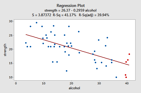
The plot suggests that there is a decreasing linear relationship between alcohol and arm strength. It also suggests that there are no unusual data points in the data set. And, it illustrates that the variation around the estimated regression line is constantly suggesting that the assumption of equal error variances is reasonable.
Here's what the corresponding residuals versus fits plot looks like for the data set's simple linear regression model with arm strength as the response and level of alcohol consumption as the predictor:
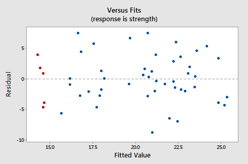
Note that, as defined, the residuals appear on the y-axis and the fitted values appear on the x-axis. You should be able to look back at the scatter plot of the data and see how the data points there correspond to the data points in the residual versus fits plot here. In case you're having trouble with doing that, look at the five data points in the original scatter plot that appears in red. Note that the predicted response (fitted value) of these men (whose alcohol consumption is around 40) is about 14. Also, note the pattern in which the five data points deviate from the estimated regression line.
Now, look at how and where these five data points appear in the residuals versus fits plot. Their fitted value is about 14 and their deviation from the residual = 0 line shares the same pattern as their deviation from the estimated regression line. Do you see the connection? Any data point that falls directly on the estimated regression line has a residual of 0. Therefore, the residual = 0 line corresponds to the estimated regression line.
This plot is a classical example of a well-behaved residual vs. fits plot. Here are the characteristics of a well-behaved residual vs. fits plot and what they suggest about the appropriateness of the simple linear regression model:
- The residuals "bounce randomly" around the residual = 0 line. This suggests that the assumption that the relationship is linear is reasonable.
- The residuals roughly form a "horizontal band" around the residual = 0 line. This suggests that the variances of the error terms are equal.
- No one residual "stands out" from the basic random pattern of residuals. This suggests that there are no outliers.
In general, you want your residual vs. fits plots to look something like the above plot. Don't forget though that interpreting these plots is subjective. My experience has been that students learning residual analysis for the first time tend to over-interpret these plots, looking at every twist and turn as something potentially troublesome. You'll especially want to be careful about putting too much weight on residual vs. fits plots based on small data sets. Sometimes the data sets are just too small to make the interpretation of a residual vs. fits plot worthwhile. Don't worry! You will learn — with practice — how to "read" these plots, although you will also discover that interpreting residual plots like this is not straightforward. Humans love to seek out order in chaos, and patterns in randomness. It's like looking up at the clouds in the sky - sooner or later you start to see images of animals. Resist this tendency when doing graphical residual analysis. Unless something is pretty obvious, try not to get too excited, particularly if the "pattern" you think you are seeing is based on just a few observations. You will learn some numerical methods for supplementing the graphical analyses in Lesson 7. For now, just do the best you can, and if you're not sure if you see a pattern or not, just say that.
Try it! Residual analysis
The least squares estimate from fitting a line to the data points in Residual dataset are \(b_{0}\) = 6 and \(b_{1}\) = 3. (You can check this claim, of course).
- Copy x-values in, say, column C1 and y-values in column C2 of a Minitab worksheet.
- Using the least squares estimates, create a new column that contains the predicted values, \(\hat{y}_i\), for each \(x_{i}\) — you can use Minitab's calculator to do this. Select Calc >> Calculator... In the box labeled "Store result in variable", specify the new column, say C3, where you want the predicted values to appear. In the box labeled Expression, type 6+3*C1. Select OK. The predicted values, \(\hat{y}_i\), should appear in column C3. You might want to label this column "fitted." You might also convince yourself that you indeed calculated the predicted values by checking one of the calculations by hand.
- Now, create a new column, say C4, that contains the residual values — again use Minitab's calculator to do this. Select Calc >> Calculator... In the box labeled "Store result in variable", specify the new column, say C4, where you want the residuals to appear. In the box labeled Expression, type C2-C3. Select OK. The residuals, \(e_{i}\), should appear in column C4. You might want to label this column "resid." You might also convince yourself that you indeed calculated the residuals by checking one of the calculations by hand.
- Create a "residuals versus fits" plot, that is, a scatter plot with the residuals (\(e_{i}\)) on the vertical axis and the fitted values (\(\hat{y}_i\)) on the horizontal axis. (See Minitab Help Section - Creating a basic scatter plot). Around what horizontal line (residual = ??) do the residuals "bounce randomly?" What does this horizontal line represent?
Here are the data with fitted values and residuals:
| x | y | fitted | resid |
|---|---|---|---|
| 1 | 10 | 9 | 1 |
| 2 | 13 | 12 | 1 |
| 3 | 7 | 15 | -8 |
| 4 | 22 | 18 | 4 |
| 5 | 28 | 21 | 7 |
| 6 | 19 | 24 | -5 |
And, here is a scatterplot of these residuals vs. the fitted values:
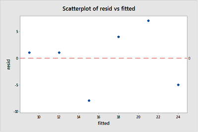
Given the small size, it appears that the residuals bounce randomly around the residual = 0 line. The horizontal line resid = 0 (red dashed line) represents potential observations with residuals equal to zero, indicating that such observations would fall exactly on the fitted regression line.
4.3 - Residuals vs. Predictor Plot
4.3 - Residuals vs. Predictor PlotAn alternative to the residuals vs. fits plot is a "residuals vs. predictor plot." It is a scatter plot of residuals on the y-axis and the predictor (x) values on the x-axis. For a simple linear regression model, if the predictor on the x-axis is the same predictor that is used in the regression model, the residuals vs. predictor plot offers no new information to that which is already learned by the residuals vs. the fits plot. On the other hand, if the predictor on the x-axis is a new and different predictor, the residuals vs. predictor plot can help to determine whether the predictor should be added to the model (and hence a multiple regression model used instead).
The interpretation of a "residuals vs. predictor plot" is identical to that of a "residuals vs. fits plot." That is, a well-behaved plot will bounce randomly and form a roughly horizontal band around the residual = 0 line. And, no data points will stand out from the basic random pattern of the other residuals.
Here's the residuals vs. predictor plot for the data set's simple linear regression model with arm strength as the response and level of alcohol consumption as the predictor:
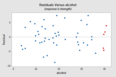
Note that, as defined, the residuals appear on the y-axis and the predictor values — the lifetime alcohol consumptions for the men — appear on the x-axis. Now, you should be able to look back at the scatter plot of the data:

and the residuals vs. fits plot:

to see how the data points there correspond to the data points in the residuals versus predictor plot:

The five red data points should help you out again. The alcohol consumption of the five men is about 40, and hence why the points now appear on the "right side" of the plot. In essence, for this example, the residuals vs. predictor plot is just a mirror image of the residuals vs. fits plot. The residuals vs. predictor plot offers no new information.
Let's take a look at an example in which the residuals vs. predictor plot is used to determine whether or not another predictor should be added to the model. A researcher is interested in determining which of the following — age, weight, and duration of hypertension — are good predictors of the diastolic blood pressure of an individual with high blood pressure. The researcher measured the age (in years), weight (in pounds), duration of hypertension (in years), and diastolic blood pressure (in mm Hg) on a sample of n = 20 hypertensive individuals (Blood Pressure data).
The regression of the response diastolic blood pressure (BP) on the predictor age:
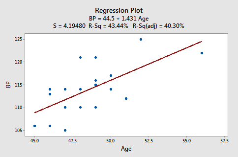
suggests that there is a moderately strong linear relationship \((R^2 = 43.44%)\) between diastolic blood pressure and age. The regression of the response diastolic blood pressure (BP) on the predictor weight:
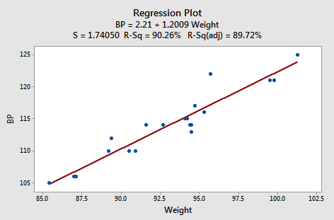
suggests that there is a strong linear relationship (r2 = 90.26%) between diastolic blood pressure and weight. And, the regression of the response diastolic blood pressure (BP) on the predictor duration:
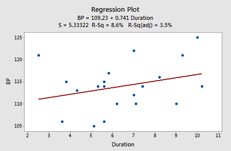
suggests that there is little linear association \((R^2= 8.6%)\) between diastolic blood pressure and the duration of hypertension. In summary, it appears as if the weight has the strongest association with diastolic blood pressure, age has the second strongest association, and duration is the weakest.
Let's investigate various residuals vs. predictors plots to learn whether adding predictors to any of the above three simple linear regression models is advised. Upon regressing blood pressure on age, obtaining the residuals, and plotting the residuals against the predictor weight, we obtain the following "residuals versus weight" plot:
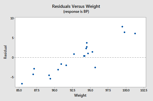
This "residuals versus weight" plot can be used to determine whether we should add the predictor weight to the model that already contains the predictor age. In general, if there is some non-random pattern to the plot, it indicates that it would be worthwhile adding the predictor to the model. In essence, you can think of the residuals on the y-axis as a "new response," namely the individual's diastolic blood pressure adjusted for their age. If a plot of the "new response" against a predictor shows a non-random pattern, it indicates that the predictor explains some of the remaining variability in the new (adjusted) response. Here, there is a pattern in the plot. It appears that adding the predictor weight to the model already containing age would help to explain some of the remaining variability in the response.
We haven't yet learned about multiple linear regression models — regression models with more than one predictor. But, you'll soon learn that it's a straightforward extension of simple linear regression. Suppose we fit the model with blood pressure as the response and age and weight as the two predictors. Should we also add the predictor duration to the model? Let's investigate! Upon regressing blood pressure on weight and age, obtaining the residuals, and plotting the residuals against the predictor duration, we obtain the following "residuals versus duration" plot:
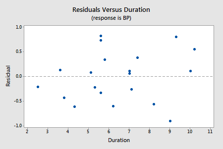
The points on the plot show no pattern or trend, suggesting that there is no relationship between the residuals and duration. That is, the residuals vs. duration plot tells us that there is no sense in adding duration to the model that already contains age and weight. Once we've explained the variation in the individuals' blood pressures by taking into account the individuals' ages and weights, no significant amount of the remaining variability can be explained by the individuals' durations.
Try it! Residual analysis
The basic idea (continued)
In the practice problems in the previous section, you created a residuals versus fits plot "by hand" for the data contained in the Residuals dataset. Now, create a residuals versus predictor plot, that is, a scatter plot with the residuals \((e_i)\) on the y-axis and the predictor \((x_i)\) values on the x-axis. (See Minitab Help: Creating a basic scatter plot). In what way — if any — does this plot differ from the residuals versus fit plot you obtained previously?
Using residual plots to help identify other good predictors
To assess physical conditioning in normal individuals, it is useful to know how much energy they are capable of expending. Since the process of expending energy requires oxygen, one way to evaluate this is to look at the rate at which they use oxygen at peak physical activity. To examine peak physical activity, tests have been designed where an individual runs on a treadmill. At specified time intervals, the speed at which the treadmill moves and the grade of the treadmill both increase. The individual is then systematically run to maximum physical capacity. The maximum capacity is determined by the individual; the person stops when unable to go any further. A researcher subjected 44 healthy individuals to such a treadmill test, collecting the following data:
- \(vo_{2}\) (max) = a measure of oxygen consumption, defined as the volume of oxygen used per minute per kilogram of body weight
- dur = how long, in seconds, the individual lasted on the treadmill
- age = age, in years of individual
The data set Treadmill Dataset contains the data on 44 individuals.
-
Fit a simple linear regression model using Minitab's fitted line plot treating \(vo_{2}\) as the response y and dur as the predictor x. (See Minitab Help Section - Creating a fitted line plot). Does there appear to be a linear relationship between \(vo_{2}\) and dur?Yes, there appears to be a strong linear relationship between \(vo_{2}\) and dur based on the scatterplot and r-squared = 81.9%.
-
Fit a simple linear regression model using Minitab's fitted line plot treating \(vo_{2}\) as the response y and age as the predictor x. Does there appear to be a linear relationship between \(vo_{2}\) and age?Yes, there appears to be a moderate linear relationship between \(vo_{2}\) and age based on the scatterplot and r-squared = 44.3%
-
Fit a simple linear regression model using Minitab's fitted line plot treating dur as the response y and age as the predictor x. Does there appear to be a linear relationship between age and dur?Yes, there appears to be a moderate linear relationship between age and dur based on the scatterplot and r-squared = 43.6%.
-
Now, fit a simple linear regression model using Minitab's regression command treating \(vo_{2}\) as the response y and dur as the predictor x. In doing so, request a residuals vs. age plot. (See Minitab Help Section - Creating residual plots). Does the residuals vs. age plot suggest that age would be an additional good predictor to add to the model to help explain some of the variations in \(vo_{2}\)?After fitting a simple linear regression model with \(vo_{2}\) as the response y and dur as the predictor x, the residuals vs. age plot does not suggest that age would be an additional good predictor to add to the model to help explain some of the variations in \(vo_{2}\) since there does not appear to be a strong linear trend in this plot.
-
Now, fit a simple linear regression model using Minitab's regression command treating \(vo_{2}\) as the response y and age as the predictor x. In doing so, request a residuals vs. dur plot. Does the residuals vs. dur plot suggest that dur would be an additional good predictor to add to the model to help explain some of the variations in \(vo_{2}\)?After fitting a simple linear regression model with \(vo_{2}\) as the response y and age as the predictor x, the residuals vs. dur plot suggests that dur could be an additional good predictor to add to the model to help explain some of the variation in \(vo_{2}\) since there is a moderate linear trend in this plot.
-
Summarize what is happening here.Of the two predictors, dur has a stronger linear association with \(vo_{2}\) than age. So, there is no benefit to adding age to a model including dur. However, there is some benefit to adding dur to a model including age. If you do this and fit a multiple linear regression model with both age and dur as the predictors then it turns out that dur is significant (at the 0.05 level) but age is not. In summary, the "best" model includes just dur, but a model with age and dur is better than a model with just age.
4.4 - Identifying Specific Problems Using Residual Plots
4.4 - Identifying Specific Problems Using Residual PlotsIn this section, we learn how to use residuals versus fits (or predictor) plots to detect problems with our formulated regression model. Specifically, we investigate:
- how a non-linear regression function shows up on a residuals vs. fits plot
- how unequal error variances show up on a residuals vs. fits plot
- how an outlier shows up on a residuals vs. fits plot.
Example Is tire tread wear linearly related to mileage? A laboratory (Smith Scientific Services, Akron, OH) conducted an experiment in order to answer this research question. As a result of the experiment, the researchers obtained a data set (Treadwear data) containing the mileage (x, in 1000 miles) driven and the depth of the remaining groove (y, in mils). The fitted line plot of the resulting data:
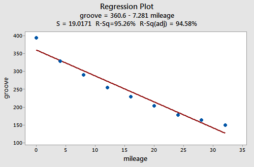
suggests that there is a relationship between groove depth and mileage. The relationship is just not linear. As is generally the case, the corresponding residuals vs. fits plot accentuates this claim:
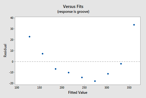
Incidentally, did you notice that the \(r^2\) value is very high (95.26%)? This is an excellent example of the caution that "a large \(r^2\) value should not be interpreted as meaning that the estimated regression line fits the data well." The large \(r^2\) value tells you that if you wanted to predict groove depth, you'd be better off taking into account mileage than not. The residuals vs. fits plot tells you, though, that your prediction would be better if you formulated a non-linear model rather than a linear one.
Answer:
Non-constant error variance shows up on a residuals vs. fits (or predictor) plot in any of the following ways:
- The plot has a "fanning" effect. That is, the residuals are close to 0 for small x values and are more spread out for large x values.
- The plot has a "funneling" effect. That is, the residuals are spread out for small x values and close to 0 for large x values.
- Or, the spread of the residuals in the residuals vs. fits plot varies in some complex fashion.
An Example: How is plutonium activity related to alpha particle counts? Plutonium emits subatomic particles — called alpha particles. Devices used to detect plutonium record the intensity of alpha particle strikes in counts per second. To investigate the relationship between plutonium activity (x, in pCi/g) and alpha count rate (y, in number per second), a study was conducted on 23 samples of plutonium. The following fitted line plot was obtained on the resulting data (Alpha Pluto dataset):
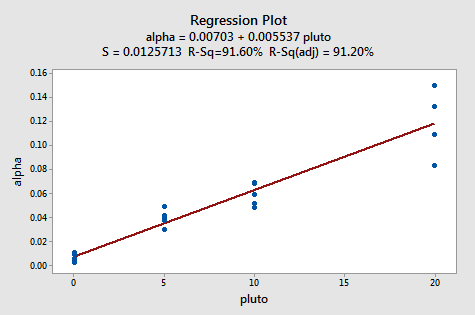
The plot suggests that there is a linear relationship between alpha count rate and plutonium activity. It also suggests that the error terms vary around the regression line in a non-constant manner — as the plutonium level increases, not only does the mean alpha count rate increase, but also the variance increases. That is, the fitted line plot suggests that the assumption of equal variances is violated. As is generally the case, the corresponding residuals vs. fits plot accentuates this claim:
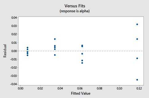
Answer:
The observation's residual stands apart from the basic random pattern of the rest of the residuals. The random pattern of the residual plot can even disappear if one outlier really deviates from the pattern of the rest of the data.
An Example: Is there a relationship between tobacco use and alcohol use? The British government regularly conducts surveys on household spending. One such survey (Family Expenditure Survey, Department of Employment, 1981) determined the average weekly expenditure on tobacco (x, in British pounds) and the average weekly expenditure on alcohol (y, in British pounds) for households in n = 11 different regions in the United Kingdom. The fitted line plot of the resulting data (Alcohol Tobacco dataset):
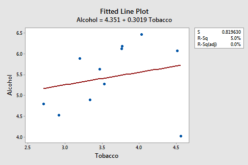
suggests that there is an outlier — in the lower right corner of the plot — which corresponds to the Northern Ireland region. In fact, the outlier is so far removed from the pattern of the rest of the data that it appears to be "pulling the line" in its direction. As is generally the case, the corresponding residuals vs. fits plot accentuates this claim:
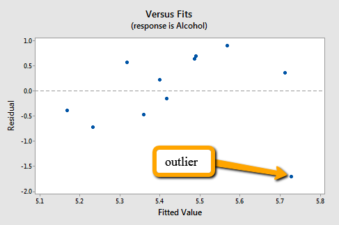
Note that Northern Ireland's residual stands apart from the basic random pattern of the rest of the residuals. That is, the residual vs. fits plot suggests that an outlier exists.
Incidentally, this is an excellent example of the caution that the "coefficient of determination \(r^2\) can be greatly affected by just one data point." Note above that the \(r^2\) value on the data set with all n = 11 regions included is 5%. Removing Northern Ireland's data point from the data set, and refitting the regression line, we obtain:
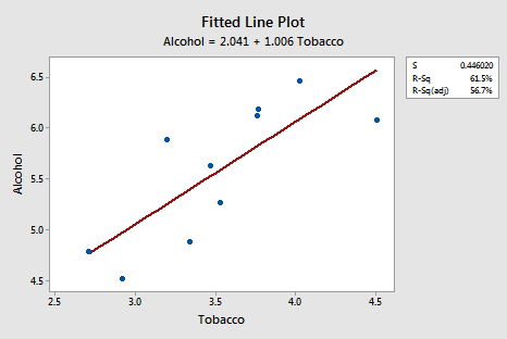
The \(r^2\) value has jumped from 5% ("no-relationship") to 61.5% (" moderate relationship")! Can one data point greatly affect the value of \(r^2\)? Clearly, it can!
Now, you might be wondering how large a residual has to be before a data point should be flagged as being an outlier. The answer is not straightforward, since the magnitude of the residuals depends on the units of the response variable. That is, if your measurements are made in pounds, then the units of the residuals are in pounds. And, if your measurements are made in inches, then the units of the residuals are in inches. Therefore, there is no one "rule of thumb" that we can define to flag a residual as being exceptionally unusual.
There's a solution to this problem. We can make the residuals "unitless" by dividing them by their standard deviation. In this way, we create what is called "standardized residuals." They tell us how many standard deviations above — if positive — or below — if negative — a data point is from the estimated regression line.
The corresponding standardized residuals vs. fits plot for our expenditure survey example looks like this:
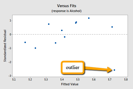
The standardized residual of the suspicious data point is smaller than -2. That is, the data point lies more than 2 standard deviations below its mean. Since this is such a small dataset the data point should be flagged for further investigation!
Incidentally, Minitab (and most other statistical software) identifies observations with large standardized residuals. Here is what a portion of Minitab's output for our expenditure survey example looks like:

Minitab labels observations with large standardized residuals with an "R." For our example, Minitab reports that observation #11 — for which tobacco = 4.56 and alcohol = 4.02 — has a large standardized residual (-2.58). The data point has been flagged for further investigation.
Note! that I have intentionally used the phrase "flagged for futher investigation." I have not said that the data point should be "removed." Here's my recommended strategy, once you've identified a data point as being unusual:
- Determine whether a simple and therefore correctable, mistake was made in recording or entering the data point. Examples include transcription errors (recording 62.1 instead of 26.1) or data entry errors (entering 99.1 instead of 9.1). Correct the mistakes you found.
- Determine if the measurement was made in such a way that keeping the experimental unit in the study can no longer be justified. Was some procedure not conducted according to study guidelines? For example, was a person's blood pressure measured standing up rather than sitting down? Was the measurement made on someone not in the population of interest? For example, was the survey completed by a man instead of a woman? If it is convincingly justifiable, remove the data point from the data set.
- If the first two steps don't resolve the problem, consider analyzing the data twice — once with the data point included and once with the data point excluded. Report the results of both analyses.
4.5 - Residuals vs. Order Plot
4.5 - Residuals vs. Order PlotRecall that the second condition — the "I" condition — of the linear regression model is that the error terms are independent. In this section, we learn how to use a "residuals vs. order plot" as a way of detecting a particular form of non-independence of the error terms, namely serial correlation. If the data are obtained in time (or space) sequence, a residuals vs. order plot helps to see if there is any correlation between the error terms that are near each other in the sequence.
The plot is only appropriate if you know the order in which the data were collected! Highlight this, underline this, circle this, ..., er, on second thought, don't do that if you are reading it on a computer screen. Do whatever it takes to remember it though — it is a very common mistake made by people new to regression analysis.
So, what is this residuals vs. order plot all about? As its name suggests, it is a scatter plot with residuals on the y-axis and the order in which the data were collected on the x-axis. Here's an example of a well-behaved residual vs. order plot:
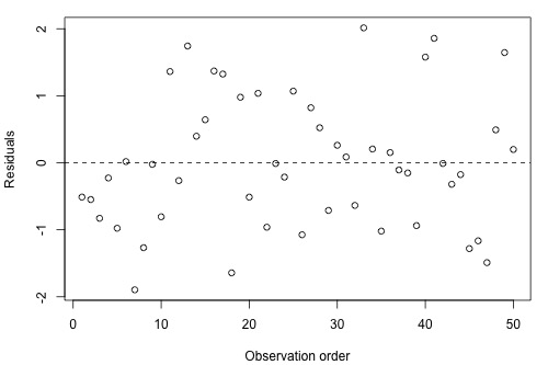
The residuals bounce randomly around the residual = 0 line as we would hope so. In general, residuals exhibiting normal random noise around the residual = 0 line suggests that there is no serial correlation.
Let's take a look at examples of the different kinds of residuals vs. order plots we can obtain and learn what each tells us.
A time trend
Residuals vs. order plot that exhibits (positive) trend as the following plot does:
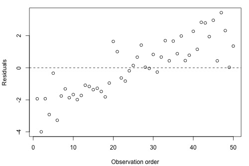
suggests that some of the variations in the response are due to time. Therefore, it might be a good idea to add the predictor "time" to the model. That is, you interpret this plot just as you would interpret any other residual vs. predictor plot. It's just that here your predictor is "time."
Positive serial correlation
A residuals vs. order plot that looks like the following plot:
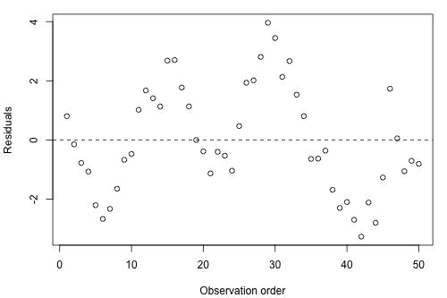
suggests that there is a "positive serial correlation" among the error terms. That is, a positive serial correlation exists when residuals tend to be followed, in time, by residuals of the same sign and about the same magnitude. The plot suggests that the assumption of independent error terms is violated.
Here is another less obvious example of a data set exhibiting positive serial correlation:
Can you see a cyclical trend -- up and then down, up and down, and up again? If not, drag the arrow on the left side across the graph. Certainly, the positive serial correlation in the error terms is not as obvious here as in the previous example. These two examples taken together are a nice illustration of "the severity of the consequences is related to the severity of the violation." The violation in the previous example is much more severe than in this example. Therefore, we should expect that the consequences of using a regression model in the previous example would be much greater than using one in this example. In either case, you would be advised to move out of the realm of regression analysis and into that of "time series modeling."
Negative serial correlation
A residuals vs. order plot that looks like the following plot:
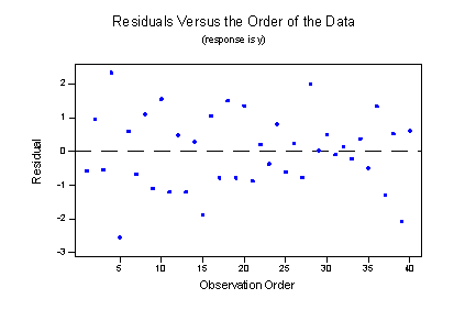
suggests that there is a "negative serial correlation" among the error terms. A negative serial correlation exists when residuals of one sign tend to be followed, in time, by residuals of the opposite sign. What? Can't you see it? If you connect the dots in order from left to right, you should be able to see the pattern. If you can't see it, drag the arrow on the left across the image:
Negative, positive, negative, positive, negative, positive, and so on. The plot suggests that the assumption of independent error terms is violated. If you obtain a residuals vs. order plot that looks like this, you would again be advised to move out of the realm of regression analysis and into that of "time series modeling."
4.6 - Normal Probability Plot of Residuals
4.6 - Normal Probability Plot of ResidualsRecall that the third condition — the "N" condition — of the linear regression model is that the error terms are normally distributed. In this section, we learn how to use a "normal probability plot of the residuals" as a way of learning whether it is reasonable to assume that the error terms are normally distributed.
Here's the basic idea behind any normal probability plot: if the data follow a normal distribution with mean \(\mu\) and variance \(σ^{2}\), then a plot of the theoretical percentiles of the normal distribution versus the observed sample percentiles should be approximately linear. Since we are concerned about the normality of the error terms, we create a normal probability plot of the residuals. If the resulting plot is approximately linear, we proceed, assuming that the error terms are normally distributed.
The theoretical pth percentile of any normal distribution is the value such that p% of the measurements fall below the value. Here's a screencast illustrating a theoretical pth percentile.
The problem is that to determine the percentile value of a normal distribution, you need to know the mean \(\mu\) and the variance \(\sigma^2\). And, of course, the parameters \(\mu\) and \(σ^{2}\) are typically unknown. Statistical theory says its okay just to assume that \(\mu = 0\) and \(\sigma^2 = 1\). Once you do that, determining the percentiles of the standard normal curve is straightforward. The pth percentile value reduces to just a "Z-score" (or "normal score"). Here's a screencast illustrating how the p-th percentile value reduces to just a normal score.
The sample pth percentile of any data set is, roughly speaking, the value such that p% of the measurements fall below the value. For example, the median, which is just a special name for the 50th percentile, is the value so that 50%, or half, of your measurements, falls below the value. Now, if you are asked to determine the 27th percentile, you take your ordered data set, and you determine the value so that 27% of the data points in your dataset fall below the value. And so on.
Consider a simple linear regression model fit a simulated dataset with 9 observations so that we're considering the 10th, 20th, ..., and 90th percentiles. A normal probability plot of the residuals is a scatter plot with the theoretical percentiles of the normal distribution on the x-axis and the sample percentiles of the residuals on the y-axis, for example:
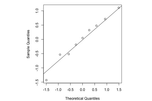
The diagonal line (which passes through the lower and upper quartiles of the theoretical distribution) provides a visual aid to help assess whether the relationship between the theoretical and sample percentiles is linear.
Note that the relationship between the theoretical percentiles and the sample percentiles is approximately linear. Therefore, the normal probability plot of the residuals suggests that the error terms are indeed normally distributed.
Statistical software sometimes provides normality tests to complement the visual assessment available in a normal probability plot (we'll revisit normality tests in Lesson 7). Different software packages sometimes switch the axes for this plot, but its interpretation remains the same.
Let's take a look at examples of the different kinds of normal probability plots we can obtain and learn what each tells us.
Normally distributed residuals
Histogram
The following histogram of residuals suggests that the residuals (and hence the error terms) are normally distributed:
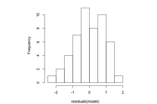
Normal Probability Plot
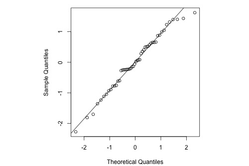
The normal probability plot of the residuals is approximately linear supporting the condition that the error terms are normally distributed.
Normal residuals but with one outlier
Histogram
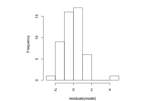
The following histogram of residuals suggests that the residuals (and hence the error terms) are normally distributed. But, there is one extreme outlier (with a value larger than 4):
Normal Probability Plot
Here's the corresponding normal probability plot of the residuals:
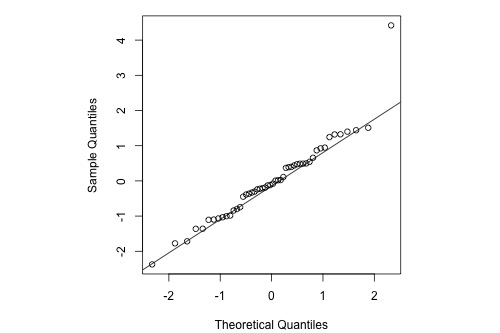
This is a classic example of what a normal probability plot looks like when the residuals are normally distributed, but there is just one outlier. The relationship is approximately linear with the exception of one data point. We could proceed with the assumption that the error terms are normally distributed upon removing the outlier from the data set.
Skewed residuals
Histogram
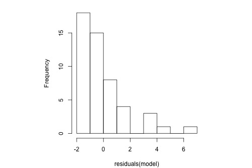
The following histogram of residuals suggests that the residuals (and hence the error terms) are not normally distributed. On the contrary, the distribution of the residuals is quite skewed.
Normal Probability Plot
Here's the corresponding normal probability plot of the residuals:
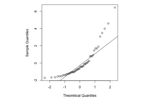
This is a classic example of what a normal probability plot looks like when the residuals are skewed. Clearly, the condition that the error terms are normally distributed is not met.
Heavy-tailed residuals
Histogram
The following histogram of residuals suggests that the residuals (and hence the error terms) are not normally distributed. There are too many extreme positive and negative residuals. We say the distribution is "heavy-tailed."
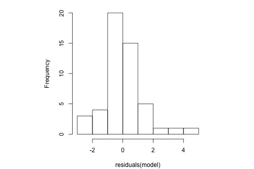
Normal Probability Plot
Here's the corresponding normal probability plot of the residuals:
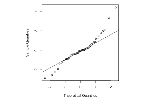
The relationship between the sample percentiles and theoretical percentiles is not linear. Again, the condition that the error terms are normally distributed is not met.
4.6.1 - Normal Probability Plots Versus Histograms
4.6.1 - Normal Probability Plots Versus HistogramsAlthough both histograms and normal probability plots of the residuals can be used to graphically check for approximate normality, the normal probability plot is generally more effective. Histograms can be useful for identifying a highly asymmetric distribution, but they don’t tend to be as useful for identifying normality specifically (versus other symmetric distributions) unless the sample size is relatively large. One problem is the sensitivity of a histogram to the choice of breakpoints for the bars - small changes can alter the visual impression quite drastically in some cases. By contrast, the normal probability plot is more straightforward and effective and it is generally easier to assess whether the points are close to the diagonal line than to assess whether histogram bars are close enough to a normal bell curve.
For example, consider the following histogram for a sample of 20 normally-distributed data points:
Rather than having the appearance of a normal bell curve, we might characterize this histogram as having a global maximum bar centered at 2 and a smaller local maximum bar centered at 3. It almost looks like a bimodal distribution and we would probably have some doubts that this data comes from a normal distribution (which, remember, it actually does).
By contrast, the normal probability plot below looks fine, with the points lining up along the diagonal line nicely:
By the way, it is possible to create a more normal-looking histogram for these data by adjusting the breakpoints along the axis:
The data is exactly the same as before, but the breakpoints along the axis have been changed and the visual impression of the plot has completely changed.
Bottom line - normal probability plots are generally more effective than histograms for visually assessing normality.
4.7 - Assessing Linearity by Visual Inspection
4.7 - Assessing Linearity by Visual InspectionThe first simple linear regression model condition concerns linearity: the mean of the response at each predictor value should be a linear function of the predictor. The neat thing about simple linear regression — in which there is a response y and just one predictor x — is that we can get a good feel for this condition just by looking at a simple scatter plot (so, in this case, we don't even need to look at a residual plot). Let's start by looking at three different examples.
Skin Cancer and Mortality
Do the data suggest that a linear function is adequate in describing the relationship between skin cancer mortality and latitude (Skin Cancer dataset)?
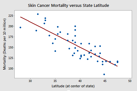
The answer is yes! It appears as if the relationship between latitude and skin cancer mortality is indeed linear, and therefore it would be best if we summarized the trend in the data using a linear function.
Alligators
The length of an alligator can be estimated fairly accurately from aerial photographs or from a boat. Estimating the weight of the alligator, however, is a much greater challenge. One approach is to use a regression model that summarizes the trend between the length and weight of alligators. The length of an alligator obtained from an aerial photograph or boat can then be used to predict the weight of the alligator. In taking this approach, some wildlife biologists captured a random sample of n = 25 alligators. They measured the length (x, in inches) and weight (y, in pounds) of each alligator. (Alligator dataset)
Do the resulting data suggest that a linear function is adequate in describing the relationship between the length and weight of an alligator?
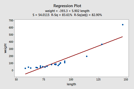
The answer is no! Don't you think a curved function would more adequately describe the trend? The scatter plot gives us a pretty good indication that a linear model is inadequate in this case.
Alloy Corrosion
Thirteen (n = 13) alloy specimens comprised of 90% copper and 10% nickel — each with a specific iron content — were tested for corrosion. Each specimen was rotated in salty seawater at 30 feet per second for 60 days. The corrosion was measured in weight loss in milligrams/square decimeters/day. The researchers were interested in studying the relationship between iron content (x) and weight loss due to corrosion (y). (Corrosion dataset)
Do the resulting data that appear in the following plot suggest that a linear function is adequate in describing the relationship between iron content and weight loss due to corrosion?
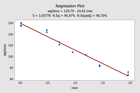
The answer is yes! As in the first example, our visual inspection of the data suggests that a linear model would be adequate in describing the trend between iron content and weight loss due to corrosion.
Try It! Visual inspection of plots
-
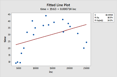
Income and time to the first child. The Income and Birth dataset contains the husband's annual incomes (inc, in dollars) and time (time, in months) between marriage and first child for n = 20 couples. (As you can tell by the incomes, the data set is rather old!)
- Create a fitted line plot treating time as the response and inc as the predictor. (See Minitab Help: Creating a fitted line plot).
-
Looking at the plot, is a linear function adequate in describing the relationship between inc and time? Explain your answer.
No, the data displays a curvilinear relationship between Y = time and X = inc.
-
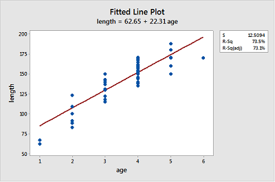
Bluegill fish. The Blue Gills dataset contains the lengths (in mm) and ages (in years) of n = 78 bluegill fish.
- Create a fitted line plot treating length as the response and age as the predictor.
-
Looking at the plot, is a linear function adequate in describing the relationship between age and length? Explain your answer.
Probably not, because the growth pattern seems steeper than the fitted line for ages 1-4 and then length seems to level out for ages 5-6.
-
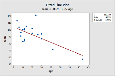
Gesell adaptive scores. The Adaptive dataset contains the Gesell adaptive scores and ages (in months) of n = 21 children with cyanotic heart disease.
- Create a fitted line plot treating score as the response and age as the predictor.
-
Looking at the plot, is a linear function adequate in describing the relationship between age and score? Explain your answer.
The linear function describes the relationship reasonably well for most of the data points but seems strongly influenced by the point for age = 42 at the far right and the point with score = 120 at the top does not seems to fit the overall trend very well.
4.8 - Further Examples
4.8 - Further ExamplesExample 4-1: A Good Residual Plot
Below is a plot of residuals versus fits after a straight-line model was used on data for y = handspan (cm) and x = height (inches), for n = 167 students (Hand and Height dataset).
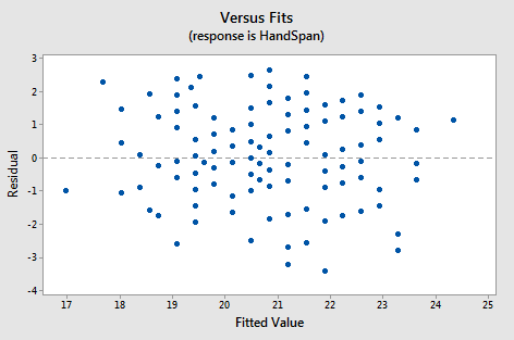
Interpretation: This plot looks good in that the variance is roughly the same all the way across and there are no worrisome patterns. There seem to be no difficulties with the model or data.
Example 4-2: Residual Plot Resulting from Using the Wrong Model
Below is a plot of residuals versus fits after a straight-line model was used on data for y = concentration of a chemical solution and x = time after the solution was made (Solutions Concentration dataset).
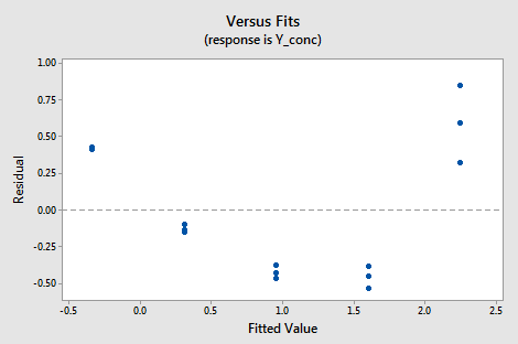
Interpretation: This plot of residuals versus plots shows two difficulties. First, the pattern is curved which indicates that the wrong type of equation was used. Second, the variance (vertical spread) increases as the fitted values (predicted values) increase.
Example 4-3: Indications that Assumption of Constant Variance is Not Valid
Below is a plot of residuals versus fits after a straight-line model was used on data for y = sale price of a home and x = square foot area of the home (Real estate dataset).
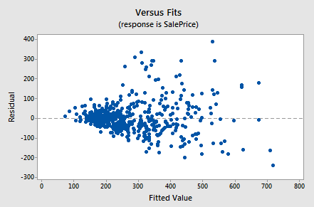
Interpretation: This plot of residuals versus fits shows that the residual variance (vertical spread) increases as the fitted values (predicted values of the sale price) increase. This violates the assumption of constant error variance.
Example 4-4: Indications that Assumption of Normal Distribution for Errors is Valid
The graphs below are a histogram and a normal probability plot of the residuals after a straight-line model was used for fitting y = time to the next eruption and x = duration of the last eruption for eruptions (Old Faithful dataset).
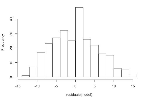
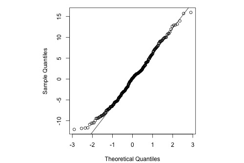
Interpretation: The histogram is roughly bell-shaped so it is an indication that it is reasonable to assume that the errors have a normal distribution. The pattern of the normal probability plot is straight, so this plot also provides evidence that it is reasonable to assume that the errors have a normal distribution.
Example 4-5: Indications that Assumption of Normal Distribution for Errors is Not Valid
Below is a normal probability plot for the residuals from a straight-line regression with y = infection risk in a hospital and x = average length of stay in the hospital. The observational units are hospitals and the data are taken from regions 1 and 2 (Infection Risk dataset).
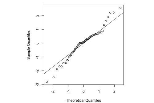
Interpretation: The plot shows some deviation from the straight-line pattern indicating a distribution with heavier tails than a normal distribution.
Example 4-6: Stopping Distance Data
We investigate how transforming y can sometimes help us with nonconstant variance problems. We will look at the stopping distance data with y = stopping distance of a car and x = speed of the car when the brakes were applied (Car Stopping data). A graph of the data is given below.
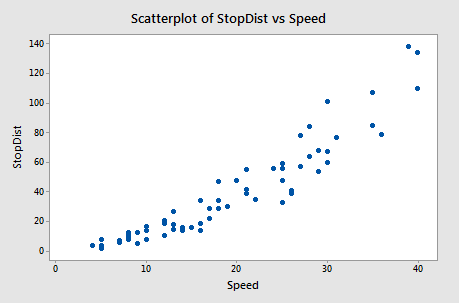
Fitting a simple linear regression model to these data leads to problems with both curvature and nonconstant variance. One possible remedy is to transform y. With some trial and error, we find that there is an approximately linear relationship between \(\sqrt{y}\) and x with no suggestion of nonconstant variance.
The Minitab output below gives the regression equation for square root distance on speed along with predicted values and prediction intervals for speeds of 10, 20, 30, and 40 mph. The predictions are for the square root of the stopping distance.
Regression Equation
sqrtdist = 0.918 + .253 Speed
| Speed | Fit | 95% PI |
|---|---|---|
| 10 | 3.44 | 1.98, 4.90 |
| 20 | 5.97 | 4.52, 7.42 |
| 30 | 8.50 | 7.03, 9.97 |
| 40 | 11.03 | 9.53, 13.53 |
Then, the output below shows predicted values and prediction intervals when we square the results (i.e., transform back to the scale of the original data).
| Speed | Fit | 95% PI |
|---|---|---|
| 10 | 11.83 | 3.92, 24.01 |
| 20 | 35.64 | 20.43, 55.06 |
| 30 | 72.25 | 49.42, 99.40 |
| 40 | 121.66 | 90.82, 156.75 |
Notice that the predicted values coincide more or less with the average pattern in the scatterplot of speed and stopping distance above. Also, notice that the prediction intervals for stopping distance are becoming increasingly widespread as speed increases. This reflects the nonconstant variance in the original data.
We cover transformations like this in more detail in Lesson 9.
Software Help 4
Software Help 4
The next two pages cover the Minitab and R commands for the procedures in this lesson.
Below is a zip file that contains all the data sets used in this lesson:
- adaptive.txt
- adaptive.txt
- alcoholarm.txt
- alcoholtobacco.txt
- alligator.txt
- alphapluto.txt
- anscombe.txt
- bloodpress.txt
- bluegills.txt
- carstopping.txt
- corrosion.txt
- handheight.txt
- incomebirth.txt
- realestate_sales.txt
- residuals.txt
- skincancer.txt
- solutions_conc.txt
- treadmill.txt
- treadwear.txt
Minitab Help 4: SLR Model Assumptions
Minitab Help 4: SLR Model AssumptionsMinitab® – Help
Alcohol consumption and muscle strength
- Perform a basic regression analysis with y = strength and x = alcohol.
- Create a fitted line plot.
- Create residual plots and select "Residuals versus fits" to display a residual plot with fitted values on the horizontal axis.
- Display a residual plot with x = alcohol on the horizontal axis.
Blood pressure
- Perform a basic regression analysis with y = BP and x = Age. Repeat with x = Weight and x = Duration.
- Create a fitted line plot.
- Create residual plots for the model using x = Age and click in the "Residuals versus the variables" box to plot "Weight" on the horizontal axis.
- Perform a basic regression analysis with y = BP, x1 = Age, and x2 = Weight.
- Create residual plots for the model using x1 = Age and x2 = Weight and click in the "Residuals versus the variables" box to plot "Duration" on the horizontal axis.
Treadwear
- Perform a basic regression analysis with y = groove and x = mileage.
- Create a fitted line plot.
- Create residual plots and select "Residuals versus fits" to display a residual plot with fitted values on the horizontal axis.
Plutonium
- Perform a basic regression analysis with y = alpha and x = pluto.
- Create a fitted line plot.
- Create residual plots and select "Residuals versus fits" to display a residual plot with fitted values on the horizontal axis.
Alcohol and tobacco
- Perform a basic regression analysis with y = Alcohol and x = Tobacco.
- Create a fitted line plot.
- Create residual plots and select "Residuals versus fits" to display a residual plot with fitted values on the horizontal axis.
- Use Data > Subset Worksheet to exclude Northern Ireland from the worksheet.
- Perform a basic regression analysis with y = Alcohol and x = Tobacco (excluding Northern Ireland).
- Create a fitted line plot (excluding Northern Ireland).
- Return to the original worksheet that included Northern Ireland.
- Create residual plots and select "Standardized" and "Residuals versus fits" to display a standardized residual plot with fitted values on the horizontal axis.
Anscombe data
- Perform a basic regression analysis with y = y3 and x = x3.
- Create a fitted line plot.
- Create residual plots and select "Residuals versus fits" to display a residual plot with fitted values on the horizontal axis.
Skin cancer mortality
- Perform a basic regression analysis with y = Mort and x = Lat.
- Create a fitted line plot.
Alligators
- Perform a basic regression analysis with y = weight and x = length.
- Create a fitted line plot.
Alloy corrosion
- Perform a basic regression analysis with y = wgtloss and x = iron.
- Create a fitted line plot.
Handspan and height
- Perform a basic regression analysis with y = HandSpan and x = Height.
- Create residual plots and select "Residuals versus fits" to display a residual plot with fitted values on the horizontal axis.
Chemical solution concentration
- Perform a basic regression analysis with y = y (concentration) and x = x (time).
- Create residual plots and select "Residuals versus fits" to display a residual plot with fitted values on the horizontal axis.
Real estate sales
- Perform a basic regression analysis with y = SalePrice and x = Sqrfeet.
- Create residual plots and select "Residuals versus fits" to display a residual plot with fitted values on the horizontal axis.
Old Faithful geyser eruptions
- Perform a basic regression analysis with y = waiting and x = eruption.
- Create residual plots and select "Histogram of residuals" and "Normal probability plot of residuals."
Hospital infection risk
- Use Data > Subset Worksheet to select only hospitals in regions 1 or 2.
- Perform a basic regression analysis with y = InfctRsk and x = Stay.
- Create residual plots and select "Normal probability plot of residuals."
Car stopping distances
- Perform a basic regression analysis with y = StopDist and x = Speed.
- Create a fitted line plot.
- Create residual plots and select "Residuals versus fits" to display a residual plot with fitted values on the horizontal axis.
- Use Calc > Calculator to create a new response variable equal to √StopDist.
- Perform a basic regression analysis with y = √StopDist and x = Speed.
- Create a fitted line plot.
- Create residual plots and select "Residuals versus fits" to display a residual plot with fitted values on the horizontal axis.
- Find a confidence interval and a prediction interval for the response to predict StopDist for Speed = 10, 20, 30, and 40.
R Help 4: SLR Model Assumptions
R Help 4: SLR Model AssumptionsR Help
Alcohol consumption and muscle strength
- Load the alcoholarm data.
- Fit a simple linear regression model with y = strength and x = alcohol.
- Display model results.
- Display a scatterplot of the data with the simple linear regression line.
- Display a residual plot with fitted values on the horizontal axis.
- Display a residual plot with x = alcohol on the horizontal axis.
alcoholarm <- read.table("~/path-to-folder/alcoholarm.txt", header=T)
attach(alcoholarm)

model <- lm(strength ~ alcohol)
summary(model)
# Coefficients:
#             Estimate Std. Error t value Pr(>|t|)
# (Intercept) 26.36954    1.20273  21.925  < 2e-16 ***
# alcohol     -0.29587    0.05105  -5.796 5.14e-07 ***
# ---
# Signif. codes:  0 ‘***’ 0.001 ‘**’ 0.01 ‘*’ 0.05 ‘.’ 0.1 ‘ ’ 1
#
# Residual standard error: 3.874 on 48 degrees of freedom
# Multiple R-squared:  0.4117,  Adjusted R-squared:  0.3994
# F-statistic: 33.59 on 1 and 48 DF,  p-value: 5.136e-07

plot(x=alcohol, y=strength,
     xlab="Lifetime consumption of alcohol", ylab="Deltoid muscle strength",
     panel.last = lines(sort(alcohol), fitted(model)[order(alcohol)]))

plot(x=fitted(model), y=residuals(model),
     xlab="Fitted values", ylab="Residuals",
     panel.last = abline(h=0, lty=2))

plot(x=alcohol, y=residuals(model),
     xlab="Lifetime consumption of alcohol", ylab="Residuals",
     panel.last = abline(h=0, lty=2))

detach(alcoholarm)
Blood pressure
- Load the bloodpress data.
- Fit a simple linear regression model with y = BP and x = Age, display model results, and display a scatterplot of the data with the simple linear regression line.
- Fit a simple linear regression model with y = BP and x = Weight, display model results, and display a scatterplot of the data with the simple linear regression line.
- Fit a simple linear regression model with y = BP and x = Duration, display model results, and display a scatterplot of the data with the simple linear regression line.
- Display a residual plot for the model using x = Age with Weight on the horizontal axis.
- Fit a multiple linear regression model with y = BP, x1 = Age, and x2 = Weight.
- Display a residual plot for the model using x1 = Age and x2 = Weight with Duration on the horizontal axis.
bloodpress <- read.table("~/path-to-folder/bloodpress.txt", header=T)
attach(bloodpress)

model.1 <- lm(BP ~ Age)
summary(model.1)
# Coefficients:
#             Estimate Std. Error t value Pr(>|t|)
# (Intercept)  44.4545    18.7277   2.374  0.02894 *
# Age           1.4310     0.3849   3.718  0.00157 **
# ---
# Signif. codes:  0 ‘***’ 0.001 ‘**’ 0.01 ‘*’ 0.05 ‘.’ 0.1 ‘ ’ 1
#
# Residual standard error: 4.195 on 18 degrees of freedom
# Multiple R-squared:  0.4344,  Adjusted R-squared:  0.403
# F-statistic: 13.82 on 1 and 18 DF,  p-value: 0.001574
plot(x=Age, y=BP,
     xlab="Age (years)", ylab="Diastolic blood pressure (mm Hg)",
     panel.last = lines(sort(Age), fitted(model.1)[order(Age)]))

model.2 <- lm(BP ~ Weight)
summary(model.2)
# Coefficients:
#             Estimate Std. Error t value Pr(>|t|)
# (Intercept)  2.20531    8.66333   0.255    0.802
# Weight       1.20093    0.09297  12.917 1.53e-10 ***
# ---
# Signif. codes:  0 ‘***’ 0.001 ‘**’ 0.01 ‘*’ 0.05 ‘.’ 0.1 ‘ ’ 1
#
# Residual standard error: 1.74 on 18 degrees of freedom
# Multiple R-squared:  0.9026,  Adjusted R-squared:  0.8972
# F-statistic: 166.9 on 1 and 18 DF,  p-value: 1.528e-10
plot(x=Weight, y=BP,
     xlab="Weight (pounds)", ylab="Diastolic blood pressure (mm Hg)",
     panel.last = lines(sort(Weight), fitted(model.2)[order(Weight)]))

model.3 <- lm(BP ~ Dur)
summary(model.3)
# Coefficients:
#             Estimate Std. Error t value Pr(>|t|)
# (Intercept) 109.2350     3.8563  28.327   <2e-16 ***
# Dur           0.7411     0.5703   1.299     0.21
# ---
# Signif. codes:  0 ‘***’ 0.001 ‘**’ 0.01 ‘*’ 0.05 ‘.’ 0.1 ‘ ’ 1
#
# Residual standard error: 5.333 on 18 degrees of freedom
# Multiple R-squared:  0.08575,  Adjusted R-squared:  0.03496
# F-statistic: 1.688 on 1 and 18 DF,  p-value: 0.2102
plot(x=Dur, y=BP,
     xlab="Duration of hypertension (years)",
     ylab="Diastolic blood pressure (mm Hg)",
     panel.last = lines(sort(Dur), fitted(model.3)[order(Dur)]))

plot(x=Weight, y=residuals(model.1),
     xlab="Weight (pounds)", ylab="Residuals from model with Age",
     panel.last = abline(h=0, lty=2))

model.12 <- lm(BP ~ Age + Weight)

plot(x=Dur, y=residuals(model.12),
     xlab="Duration of hypertension (years)",
     ylab="Residuals from model with Age and Weight",
     panel.last = abline(h=0, lty=2))

detach(bloodpress)
Treadwear
- Load the treadwear data.
- Fit a simple linear regression model with y = groove and x = mileage.
- Display model results.
- Display a scatterplot of the data with the simple linear regression line.
- Display a residual plot with fitted values on the horizontal axis.
treadwear <- read.table("~/path-to-folder/treadwear.txt", header=T)
attach(treadwear)

model <- lm(groove ~ mileage)
summary(model)
# Coefficients:
#             Estimate Std. Error t value Pr(>|t|)
# (Intercept) 360.6367    11.6886   30.85 9.70e-09 ***
# mileage      -7.2806     0.6138  -11.86 6.87e-06 ***
# ---
# Signif. codes:  0 ‘***’ 0.001 ‘**’ 0.01 ‘*’ 0.05 ‘.’ 0.1 ‘ ’ 1
#
# Residual standard error: 19.02 on 7 degrees of freedom
# Multiple R-squared:  0.9526,  Adjusted R-squared:  0.9458
# F-statistic: 140.7 on 1 and 7 DF,  p-value: 6.871e-06

plot(x=mileage, y=groove,
     xlab="Mileage (1000s of miles)", ylab="Depth of groove (mils)",
     panel.last = lines(sort(mileage), fitted(model)[order(mileage)]))

plot(x=fitted(model), y=residuals(model),
     xlab="Fitted values", ylab="Residuals",
     panel.last = abline(h=0, lty=2))

detach(treadwear)
Plutonium
- Load the alphapluto data.
- Fit a simple linear regression model with y = alpha and x = pluto.
- Display model results.
- Display a scatterplot of the data with the simple linear regression line.
- Display a residual plot with fitted values on the horizontal axis.
alphapluto <- read.table("~/path-to-folder/alphapluto.txt", header=T)
attach(alphapluto)

model <- lm(alpha ~ pluto)
summary(model)
# Coefficients:
#             Estimate Std. Error t value Pr(>|t|)
# (Intercept) 0.0070331  0.0035988   1.954   0.0641 .
# pluto       0.0055370  0.0003659  15.133 9.08e-13 ***
# ---
# Signif. codes:  0 ‘***’ 0.001 ‘**’ 0.01 ‘*’ 0.05 ‘.’ 0.1 ‘ ’ 1
#
# Residual standard error: 0.01257 on 21 degrees of freedom
# Multiple R-squared:  0.916,  Adjusted R-squared:  0.912
# F-statistic:   229 on 1 and 21 DF,  p-value: 9.077e-13

plot(x=pluto, y=alpha,
     xlab="Plutonium activity (pCi/g)", ylab="Alpha count rate (number per second)",
     panel.last = lines(sort(pluto), fitted(model)[order(pluto)]))

plot(x=fitted(model), y=residuals(model),
     xlab="Fitted values", ylab="Residuals",
     panel.last = abline(h=0, lty=2))

detach(alphapluto)
Alcohol and tobacco
- Load the alcoholtobacco data.
- Fit a simple linear regression model with y = Alcohol and x = Tobacco.
- Display model results.
- Display a scatterplot of the data with the simple linear regression line.
- Display a residual plot with fitted values on the horizontal axis.
- Refit the model excluding Northern Ireland.
- Display a scatterplot of the data excluding Northern Ireland with the simple linear regression line for the model excluding Northern Ireland.
- Display a standardized residual plot for the model fit to all the data with fitted values on the horizontal axis.
- Calculate the standardized residual for Northern Ireland.
alcoholtobacco <- read.table("~/path-to-folder/alcoholtobacco.txt", header=T)
attach(alcoholtobacco)

model.1 <- lm(Alcohol ~ Tobacco)
summary(model.1)
# Coefficients:
#             Estimate Std. Error t value Pr(>|t|)
# (Intercept)   4.3512     1.6067   2.708   0.0241 *
# Tobacco       0.3019     0.4388   0.688   0.5087
# ---
# Signif. codes:  0 ‘***’ 0.001 ‘**’ 0.01 ‘*’ 0.05 ‘.’ 0.1 ‘ ’ 1
#
# Residual standard error: 0.8196 on 9 degrees of freedom
# Multiple R-squared:  0.04998,  Adjusted R-squared:  -0.05557
# F-statistic: 0.4735 on 1 and 9 DF,  p-value: 0.5087

plot(x=Tobacco, y=Alcohol,
     xlab="Ave weekly tobacco expenditure (GBP)",
     ylab="Ave weekly alcohol expenditure (GBP)",
     panel.last = lines(sort(Tobacco), fitted(model.1)[order(Tobacco)]))

plot(x=fitted(model.1), y=residuals(model.1),
     xlab="Fitted values", ylab="Residuals",
     panel.last = abline(h=0, lty=2))

model.2 <- lm(Alcohol ~ Tobacco, subset=Region!="NorthernIreland")

plot(x=Tobacco[Region!="NorthernIreland"], y=Alcohol[Region!="NorthernIreland"],
     xlab="Ave weekly tobacco expenditure (GBP)",
     ylab="Ave weekly alcohol expenditure (GBP)",
     panel.last = lines(sort(Tobacco), fitted(model.2)[order(Tobacco)]))

plot(x=fitted(model.1), y=rstandard(model.1),
     xlab="Fitted values", ylab="Standardized residuals",
     panel.last = abline(h=0, lty=2))

rstandard(model.1)[Region=="NorthernIreland"] # -2.575075

detach(alcoholtobacco)
Anscombe data
- Load the anscombe data.
- Fit a simple linear regression model with y = y3 and x = x3.
- Display model results.
- Display a scatterplot of the data with the simple linear regression line.
- Display a residual plot with fitted values on the horizontal axis.
anscombe <- read.table("~/path-to-folder/anscombe.txt", header=T)
attach(anscombe)

model <- lm(y3 ~ x3)
summary(model)
# Coefficients:
#             Estimate Std. Error t value Pr(>|t|)
# (Intercept)   3.0025     1.1245   2.670  0.02562 *
# x3            0.4997     0.1179   4.239  0.00218 **
# ---
# Signif. codes:  0 ‘***’ 0.001 ‘**’ 0.01 ‘*’ 0.05 ‘.’ 0.1 ‘ ’ 1
#
# Residual standard error: 1.236 on 9 degrees of freedom
# Multiple R-squared:  0.6663,  Adjusted R-squared:  0.6292
# F-statistic: 17.97 on 1 and 9 DF,  p-value: 0.002176

plot(x=x3, y=y3,
     panel.last = lines(sort(x3), fitted(model)[order(x3)]))

plot(x=fitted(model), y=residuals(model),
     xlab="Fitted values", ylab="Residuals",
     panel.last = abline(h=0, lty=2))

detach(anscombe)
Skin cancer mortality
- Load the skin cancer data.
- Fit a simple linear regression model with y = Mort and x = Lat.
- Display a scatterplot of the data with the simple linear regression line.
attach(skincancer)

model <- lm(Mort ~ Lat)

plot(x=Lat, y=Mort,
     xlab="Latitude (at center of state)", ylab="Mortality (deaths per 10 million)",
     main="Skin Cancer Mortality versus State Latitude",
     panel.last = lines(sort(Lat), fitted(model)[order(Lat)]))

detach(skincancer)
Alligators
- Load the alligator data.
- Fit a simple linear regression model with y = weight and x = length.
- Display a scatterplot of the data with the simple linear regression line.
alligator <- read.table("~/path-to-folder/alligator.txt", header=T)
attach(alligator)

model <- lm(weight ~ length)

plot(x=length, y=weight, ylim=c(-50, 650),
     panel.last = lines(sort(length), fitted(model)[order(length)]))

detach(alligator)
Alloy corrosion
- Load the corrosion data.
- Fit a simple linear regression model with y = wgtloss and x = iron.
- Display a scatterplot of the data with the simple linear regression line.
corrosion <- read.table("~/path-to-folder/corrosion.txt", header=T)
attach(corrosion)

model <- lm(wgtloss ~ iron)

plot(x=iron, y=wgtloss,
     panel.last = lines(sort(iron), fitted(model)[order(iron)]))

detach(corrosion)
Hand code and height
- Load the handheight data.
- Fit a simple linear regression model with y = HandSpan and x = Height.
- Display a residual plot with fitted values on the horizontal axis.
handheight <- read.table("~/path-to-folder/handheight.txt", header=T)
attach(handheight)

model <- lm(HandSpan ~ Height)

plot(x=fitted(model), y=residuals(model),
     xlab="Fitted values", ylab="Residuals",
     panel.last = abline(h=0, lty=2))

detach(handheight)
Chemical solution concentration
- Load the solconc data.
- Fit a simple linear regression model with y = y (concentration) and x = x (time).
- Display a residual plot with fitted values on the horizontal axis.
solconc <- read.table("~/path-to-folder/solutions_conc.txt", header=T)
attach(solconc)

model <- lm(y ~ x)

plot(x=fitted(model), y=residuals(model),
     xlab="Fitted values", ylab="Residuals",
     panel.last = abline(h=0, lty=2))

detach(solconc)
Real estate sales
- Load the realestate data.
- Fit a simple linear regression model with y = SalePrice and x = Sqrfeet.
- Display a residual plot with fitted values on the horizontal axis.
realestate <- read.table("~/path-to-folder/realestate_sales.txt", header=T)
attach(realestate)

model <- lm(SalePrice ~ SqrFeet)

plot(x=fitted(model), y=residuals(model),
     xlab="Fitted values", ylab="Residuals",
     panel.last = abline(h=0, lty=2))

detach(realestate)
Old Faithful geyser eruptions
- Load the oldfaithful data.
- Fit a simple linear regression model with y = waiting and x = eruption.
- Display a histogram and normal probability plot of the residuals.
oldfaithful <- read.table("~/path-to-folder/oldfaithful.txt", header=T)
attach(oldfaithful)

model <- lm(waiting ~ eruption)

hist(residuals(model), main="", breaks=12)

qqnorm(residuals(model), main="")
qqline(residuals(model))

detach(oldfaithful)
Hospital infection risk
- Load the infectionrisk data.
- Select only hospitals in regions 1 or 2.
- Fit a simple linear regression model with y = InfctRsk and x = Stay.
- Display a normal probability plot of the residuals.
infectionrisk <- read.table("~/path-to-folder/infectionrisk.txt", header=T)
infectionrisk <- infectionrisk[infectionrisk$Region==1 | infectionrisk$Region==2, ]
attach(infectionrisk)

model <- lm(InfctRsk ~ Stay)

qqnorm(residuals(model), main="")
qqline(residuals(model))

detach(infectionrisk)
Car stopping distances
- Load the carstopping data.
- Fit a simple linear regression model with y = StopDist and x = Speed.
- Display a scatterplot of the data with the simple linear regression line.
- Display a residual plot with fitted values on the horizontal axis.
- Create a new response variable equal to √StopDist.
- Fit a simple linear regression model with y = √StopDist and x = Speed.
- Display a scatterplot of the data with the simple linear regression line.
- Display a residual plot with fitted values on the horizontal axis.
- Use the model to predict StopDist for Speed = 10, 20, 30, and 40.
carstopping <- read.table("~/path-to-folder/carstopping.txt", header=T)
attach(carstopping)

model <- lm(StopDist ~ Speed)
plot(x=Speed, y=StopDist,
     panel.last = lines(sort(Speed), fitted(model)[order(Speed)]))
plot(x=fitted(model), y=residuals(model),
     xlab="Fitted values", ylab="Residuals",
     panel.last = abline(h=0, lty=2))

sqrtdist <- sqrt(StopDist)

model <- lm(sqrtdist ~ Speed)
plot(x=Speed, y=sqrtdist,
     panel.last = lines(sort(Speed), fitted(model)[order(Speed)]))
plot(x=fitted(model), y=residuals(model),
     xlab="Fitted values", ylab="Residuals",
     panel.last = abline(h=0, lty=2))

predict(model, interval="prediction",
        newdata=data.frame(Speed=c(10, 20, 30, 40)))^2
#         fit      lwr       upr
# 1  11.86090  3.93973  24.03997
# 2  35.63671 20.42935  55.04771
# 3  72.17067 49.44080  99.18664
# 4 121.46277 90.63292 156.79793

detach(carstopping)