"A picture is worth a 1000 words!"
|
Key Concepts: Displaying data Just as with Non-Graphical EDA, Graphical EDA has the same four points as a focal point. These are:
|
Types of displays
The distribution of a variable tells us what values the variable takes and how often each value occurs.
|
Quantitative Line graph across time 1 variable: Histograms, Boxplots, Stem and Leaf plots, Quantile normal plot 2 variables: Scatterplots |
Categorical 1 variable: Pie charts, Bar graphs 2 or more: Bar graphs, Pictograms, Contingency Tables |
|
Categorical & Quantitative: boxplot
|
|
In well-designed displays, the data should clearly stand out. Graphs should show clear labeling indicating:
- the title or purpose
- each axes, bar, pie segment, etc.
- the scale of each axis
Every display should state the source of the data, and include as little extraneous material as possible.
Common Problems with Graphics
- "Figures don't lie, but liars figure"
- No labeling
- Not starting at zero to exaggerate trends
- Change in labeling in one or more axes
- Misleading units
- Using poor information
- Example: See the in-class handout
Boxplot Examples
|
|
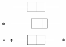
The first boxplot looks like that for a normal distribution. The second shows skew to the left. The third has some outliers (unusual observations). |
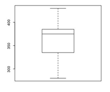
The edges correspond to Q1 and Q3. The line in the middle represents the median. The ends of "whiskers" indicate the MIN and MAX values, unless there are outliers. Stars represent the outliers (1.5 x IQR below Q1 and above Q3).
Plots for Our 1 Bedroom Apartment Example
|
Stem-and-Leaf Plot The decimal point is 2 digit(s) to the right of the |
|
|
| Histogram |
 |
|
Boxplot
|
|
Questions:
- What is the shape of the distribution?
- Any outliers?
- Is the median larger or smaller than the mean?
Another Example
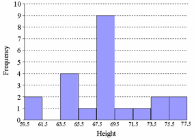
Suppose we observed the height of twenty students to be:
60,68,69,64,68,67,68,69,77,69,69,72,69,65,65,68,64,71,74,74
The variable is height. The sample could be the 20 people or the 20 numbers, depending on your point of view. The sample size is n = 20. The mean and the median are both about 68.5 inches. The standard deviation is about 3.9 inches.
A boxplot is another good way to look at the shape of a distribution.

The following is a frequency histogram for the height data.
A relative frequency histogram is similar but uses proportions instead of counts.
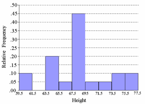
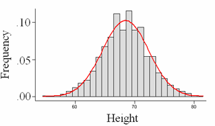
What do we get if we draw a smooth curve over our histogram? If your sample is large enough, a relative frequency histogram will give a rough indication of the characteristics of the whole population. Height of the curve is NOT proportion or frequency any more. This curve must satisfy: area under the curve equals 1.
