10 Longitudinal Analysis/ Repeated Measures
Longitudinal analysis
Repeated measures
Generalized Least Squares
R Code
In this lesson, we’ll look at the analysis of repeated measures designs, sometimes called the analysis of longitudinal data. In the analysis, we compare treatment groups with regard to a (usually) short time series.
Objectives
Upon completion of this lesson, you should be able to:
- Recognize the experimental design for repeated measures data
- Identify and interpret interaction terms
- Model repeated measures ANOVA
- Identify and interpret various correlation structures
- Compare GLS models with different correlation structures
- Estimate polynomial effects
10.1 Repeated Measures and Longitudinal Data
The term repeated measures refers to experimental designs (or observational studies) in which each experimental unit (or subject) is measured at several points in time. The term longitudinal data is also used for this type of data.
Typical Design
Experimental units are randomly allocated to one of g treatments. A short time series is observed for each observation. An example in which there are 3 treatment groups with 3 units per treatment, and each unit is measured at four times is as follows:
| Treatment | Unit | Time 1 | Time 2 | Time 3 | Time 4 |
|---|---|---|---|---|---|
| 1 | 1 | No Data | No Data | No Data | No Data |
| 1 | 2 | No Data | No Data | No Data | No Data |
| 1 | 3 | No Data | No Data | No Data | No Data |
| 2 | 4 | No Data | No Data | No Data | No Data |
| 2 | 5 | No Data | No Data | No Data | No Data |
| 2 | 6 | No Data | No Data | No Data | No Data |
| 3 | 7 | No Data | No Data | No Data | No Data |
| 3 | 8 | No Data | No Data | No Data | No Data |
| 3 | 9 | No Data | No Data | No Data | No Data |
In the example design just given, we have observed nine short time series, one for each experimental unit. The focus of the analysis would be to determine treatment differences, both in mean level and patterns across time. We may also want to characterize the overall time pattern (assuming that pattern doesn’t differ substantially for different treatments).
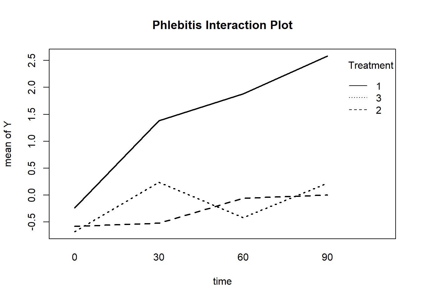
Example 10.1 An experiment is done to examine ways to detect phlebitis during the intravenous administration of a particular drug. Phlebitis is an inflammation of a blood vein. Three intravenous treatments were administered. 15 test animals were randomly divided into three groups of n = 5. Each group is given a different treatment. The treatments are:
- Treatment 1: The drug in a solution designed to carry the drug
- Treatment 2: The carrier solution only (no drug)
- Treatment 3: Saline solution
The treatments were administered to one ear of the test animal. The y variable = difference in temperature between the treated ear and the untreated ear. This is measured at times 0, 30 minutes, 60 minutes, and 90 minutes after the treatment is administered. It is believed that increased temperature in the treated ear may be an early sign of phlebitis.
A graph of mean responses across time for the three treatments follows. Generally, the mean response increases over time. We see that the overall level is higher for treatment 1 and that the increase over time is also greater for treatment 1.
A Commonly Used Model
One approach to analyzing these data is the ANOVA model
Y = Treatment + Animal(Treatment) + Time + Treatment*Time + Error
- Animal is a “random” factor assumed to have mean 0 and an unknown constant variance. “Random” means that the animals are considered to be a random sample from a larger population of animals.
- The notation Animal(Treatment) specifies that animals were nested in treatment meaning that different animals were in the different treatment groups.
- The Treatment factor measures whether the mean response differs for the three treatments when we average over all animals and all times.
- The Time factor measures whether the mean response differs over time when we average over all animals and all treatments.
- The Time*Treatment interaction which is sensitive to whether the pattern across time depends upon the specific treatment used.
- The errors are assumed to be independently normally distributed with mean 0 and constant variance.
An analysis of variance for this example is given below. All factors are statistically significant. The Treatment factor is significant with p-value = .0001737. The Time factor is significant with p-value = .0001117 and the interaction between treatment and time is significant with p-value = .0207002. The significant interaction confirms that the pattern of change over time differs for the treatments.
Error: factor(Animal)
                  Df Sum Sq Mean Sq F value   Pr(>F)
factor(Treatment)  2  35.38  17.689    19.4 0.000174 ***
Residuals         12  10.94   0.912
---
Signif. codes:  0 '***' 0.001 '**' 0.01 '*' 0.05 '.' 0.1 ' ' 1

Error: Within
                               Df Sum Sq Mean Sq F value   Pr(>F)
factor(Time)                    3  16.08   5.361    9.27 0.000112 ***
factor(Treatment):factor(Time)  6  10.06   1.677    2.90 0.020700 *
Residuals                      36  20.82   0.578
---
Signif. codes:  0 '***' 0.001 '**' 0.01 '*' 0.05 '.' 0.1 ' ' 1
Consequence of the Assumptions for This Model – Compound Symmetry
The assumptions for this model lead to another assumption – that, in theory, the correlation is equal for all time gaps between observations. For instance, the correlation between data at times 1 and 2 is the same as the correlation between data at times 1 and 3, and is also the same as the correlation between times 1 and 4. This is called the compound symmetry assumption.
For the phlebitis example in which each animal is measured at four times, the assumed correlation matrix for the measurements at the four times has the structure
\[\left(\begin{array}{cccc}1 & \rho & \rho & \rho \\ \rho & 1 & \rho & \rho \\ \rho & \rho & 1 & \rho \\ \rho & \rho & \rho & 1\end{array}\right)\]
More flexible models for the correlation structure of the observations across time are available in R and SAS, but not in Minitab.
Generalized Least Squares
In R, the function gls within the nlme library can be used to specify several different structures for the correlations among measurements. For any specified assumption, maximum likelihood estimation is used to estimate the model parameters (including parameters in the correlation matrix). For each model, R calculates AIC and BIC statistics that can be used to compare models. An “adjusted” analysis of variance can also be calculated.
To use gls, you must first use the command library(nlme).
Among the possibilities for assumptions about the correlations among observations across time are:
- Compound symmetry with the equal variances at the different time points (the assumption above)
- A completely unstructured set of correlations, meaning that the correlations are different for the various time gaps and have no ARIMA structure. This also allows for either equal or unequal variances at the different time points.
- An AR(1) structure, either with or without unequal variances
- A general ARIMA structure
Find a complete list of possibilities at Correlation Structure Classes.
The gls command is described here: Fit Linear Model Using Generalized Least Squares.
Code for the phlebitis example will be given (and explained) at the end of this lesson.
Example 10.2 (Phlebitis Example Revisited) For the phlebitis data, we examined four possible models for the correlation structure of the repeated measurements:
- Compound symmetry
- Completely unstructured with possibly unequal variances
- AR(1) with equal variances
- AR(1) with unequal variances
The other components of each model were the same as before – the treatment factor, the time factor, the interaction between time and treatment, and a random animal factor.
A comparative summary of results, produced in R, is the following:
             Model df      AIC      BIC    logLik   Test  L.Ratio p-value
fit.compsym      1 14 162.7072 188.9040 -67.35359
fit.nostruct     2 22 172.2292 213.3956 -64.11459 1 vs 2 6.478005  0.5938
fit.ar1          3 14 160.1418 186.3386 -66.07088 2 vs 3 3.912580  0.8649
fit.ar1het       4 17 164.5801 196.3905 -65.29004 3 vs 4 1.561667  0.6681
The AR(1) model for correlations among repeated measures gives the lowest AIC and BIC statistics, although not by much. The original compound symmetry model is a close second. The completely unstructured model (for correlations) is the worst based on AIC and BIC. This model has the maximum log likelihood value (a good thing), but the gain in log likelihood was outweighed by the increased number of parameters that had to be estimated.
The table above also includes likelihood ratio tests that compare the models sequentially, based on the order of models given in the command that created the table. The L. Ratio column = −2 *Difference in log likelihood values. This statistic has an approximate chi-square distribution with df = difference in DF values. The DF value given for a model is the total number of parameters that had to be estimated for all effects in the model. The chi-square distribution is used to determine a p-value for a test of whether the additional parameters = 0 or not. Failure to reject means that the models are not significantly different. That’s the case here.
The following table compares analysis of variance results for the best two models of the models that we tried. There’s not much difference! For this example, we get essentially the same results for the important factors of interest regardless of the model used for correlations across time.
Denom. DF: 48
                               numDF   F-value p-value
(Intercept)                        1  6.599042  0.0134
factor(Treatment)                  2 19.400817  <.0001
factor(Time)                       3  9.270373  0.0001
factor(Treatment):factor(Time)     6  2.900042  0.0171
Denom. DF: 48
numDF F-value p-value
(Intercept) 1 5.485687 0.0234
factor(Treatment) 2 17.251192 <.0001
factor(Time) 3 8.645712 0.0001
factor(Treatment):factor(Time) 6 2.777399 0.0212Polynomial Effects across Time
We might be interested in whether the pattern across time is linear, quadratic, and so on, and whether treatments differ with regard to linear trend, quadratic trend, and so on. This can be done using orthogonal polynomial components for Time. The phrase orthogonal polynomial refers to a coding of time (or any other variable) such that polynomial components (linear, quadratic, cubic, and so on) are statistically independent of one another.
It might help to look back at the graph above in this lesson. We’re trying to characterize the trend pattern across time and compare the treatments with regard to the pattern(s).
In our example, there are four time points so we can fit a cubic polynomial (at most) to the mean responses at the four times. This is an extension of “two points determine a line.” In this case, four points determine a cubic. We then examine the significance of the various polynomial components in order to describe the trend across time, and we can also look at the interactions between the polynomial components and treatments.
It’s important to note that the use of polynomial trends does not change the overall results of F tests for the factors Time and Time*Treatment. We are simply considering the four time points in a more structured way.
The following output was produced in R by specifying an orthogonal polynomial of degree 3 (a cubic) for time and using an AR(1) specification for the correlations among repeated measures.
                                               Value Std.Error    t-value      p-value
(Intercept)                                 1.400000 0.2234244  6.2661027 9.821110e-08
factor(Treatment)2                         -1.690000 0.3159698 -5.3486131 2.435872e-06
factor(Treatment)3                         -1.560000 0.3159698 -4.9371813 9.981608e-06
poly(Time, degree = 3)1                     7.759588 1.4520434  5.3439090 2.475810e-06
poly(Time, degree = 3)2                    -1.781572 1.2430736 -1.4331994 1.582826e-01
poly(Time, degree = 3)3                     1.143154 1.1011202  1.0381732 3.043911e-01
factor(Treatment)2:poly(Time, degree = 3)1 -5.854332 2.0534994 -2.8509050 6.408310e-03
factor(Treatment)3:poly(Time, degree = 3)1 -5.992896 2.0534994 -2.9183820 5.341082e-03
factor(Treatment)2:poly(Time, degree = 3)2  1.781572 1.7579715  1.0134250 3.159385e-01
factor(Treatment)3:poly(Time, degree = 3)2  1.239355 1.7579715  0.7049913 4.842227e-01
factor(Treatment)2:poly(Time, degree = 3)3 -1.835974 1.5572191 -1.1790080 2.442063e-01
factor(Treatment)3:poly(Time, degree = 3)3 1.351000 1.5572191 0.8675719 3.899454e-01- The first two lines under the headings give comparison of treatment 2 to treatment 1 and treatment 3 to treatment 1. We can tell this by the numbers at the end of the coefficient descriptions and the fact that the there isn’t a line for treatment 1.
- The next three lines give significance results for the linear, quadratic and cubic components (in that order) of a cubic polynomial for the time trend for treatment 1 only.
- The final six lines give significance results for interactions between treatment and the polynomial components. The following two lines have to do with the linear component:
                                               Value Std.Error   t-value     p-value
factor(Treatment)2:poly(Time, degree = 3)1 -5.854332  2.053499 -2.850905 0.006408310
factor(Treatment)3:poly(Time, degree = 3)1 -5.992896  2.053499 -2.918382 0.005341082
These results indicate that the linear trend (slope) differs for the treatments. More specifically the first line indicates that the slope differs for treatments 1 and 2. The second line indicates that the linear slope differs for the treatments 1 and 3.
The remaining interaction terms are not statistically significant.
In maximum likelihood estimation, the AIC and BIC values change due to the use of an orthogonal polynomial for the time trend. This might lead you to think that the fit has been improved. That’s not the case. The overall fit and analysis of variance is still the same, but the scaling of the likelihood is affected by the scaling of the coding for the factors.
Here’s what happened when we tried to compare the fits of the original model with no structure for time trend and the model with an orthogonal polynomial for time:
                Model df      AIC      BIC    logLik
fit.ar1polytime     1 14 139.9282 166.1250 -55.96409
fit.ar1             2 14 160.1418 186.3386 -66.07088
R Code for the Phelibitis Example
Code for this example follows. Explanations are given following the code.
Download the data used in the following code: (phlebitis.csv)
phlebitisdata = read.table("phlebitis.csv", header=T, sep=",")
attach(phlebitisdata)
phlebitisdata #This isn’t necessary, but you might want to see the data structure

aov.p = aov(Y~(factor(Treatment)*factor(Time))+Error(factor(Animal)),phlebitisdata )
summary(aov.p)

library(nlme) #activates the nlme library

interaction.plot (Time, factor(Treatment), Y, lty=c(1:3),lwd=2,ylab="mean of Y", xlab="time", trace.label="Treatment")
nestinginfo <- groupedData(Y ~ Treatment | Animal, data= phlebitisdata)
fit.compsym <- gls(Y ~ factor(Treatment)*factor(Time), data=nestinginfo, corr=corCompSymm(, form= ~ 1 | Animal))
fit.nostruct <- gls(Y ~ factor(Treatment)*factor(Time), data=nestinginfo, corr=corSymm(, form= ~ 1 | Animal), weights = varIdent(form = ~ 1 | Time))
fit.ar1 <- gls(Y ~ factor(Treatment)*factor(Time), data=nestinginfo, corr=corAR1(, form= ~ 1 | Animal))
fit.ar1het <- gls(Y ~ factor(Treatment)*factor(Time), data=nestinginfo, corr=corAR1(, form= ~ 1 | Animal), weights=varIdent(form = ~ 1 | Time))
anova(fit.compsym, fit.nostruct, fit.ar1, fit.ar1het) #compares the models
fit.ar1polytime <- gls(Y ~ factor(Treatment)*poly(Time, degree = 3), data=nestinginfo, corr=corAR1(, form= ~ 1 | Animal))

summary(fit.ar1polytime)

anova(fit.compsym)
anova(fit.ar1)
anova(fit.ar1polytime)
anova(fit.ar1polytime, fit.ar1)

detach(phlebitisdata)
Explanations of the Code
The data are in a “csv” file named phlebitis.csv. The dataset includes variables named Treatment, Time, Animal, and Y.
The first line reads the data, indicating that the first row gives text variable names, and a “,” separates data value. The second line makes the variable names available to R commands and the last line removes them when finished working with phlebitis data. The next two lines have explanations given within the command lines.
The interaction.plot command created the Phlebitis Interaction Plot. The lty parameter assigned line types to the 3 treatment. If we have four treatments, for example, switch that to lty = c(1:4). The lwd = 2 parameter is optional. It increases the line widths. We did this to be sure that the line patterns (dashes, etc, could be seen).
The command that starts nestinginfo defines the nesting property of animals within treatments. A “new” dataset is created that actually is the same as the original, but information about nesting is added. (Nesting means different subjects are used within differing levels of another factor.)
The gls commands define a basic model involving Treatment, Time and their interaction, along with the nesting and a correlation model. The factor specification orders R to treat Time and Treatment as categorical factors rather than regression type variables.
Two commands used to examine results are summary and anova.
- The command
summary(object name), where object name is a name attached to aglsanalysis will give AIC and BIC values along with coefficient estimates. In the code, this was used only for the last fit (with polynomial trend), but it could have been used for any fit. - The command
anova(object name)will give an analysis of variance for theglswith that object name. - The command
anova(list of object names)– for exampleanova(fit.compsym, fit.nostruct, fit.ar1, fit.ar1het) will compare AIC and BIC values for the various models.
Alternative references for this lesson are