3.3 - Sums of Squares
Example 1
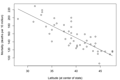
Let's return to the skin cancer mortality example (skincancer.txt) and investigate the research question, "Is there a (linear) relationship between skin cancer mortality and latitude?"
Review the following scatter plot and estimated regression line. What does the plot suggest is the answer to the research question? The linear relationship looks fairly strong. The estimated slope is negative, not equal to 0.
We can answer the research question using the P-value of the t-test for testing:
- the null hypothesis H0: β1 = 0
- against the alternative hypothesis HA: β1 ≠ 0.
As the statistical software output below suggests, the P-value of the t-test for "Lat" is less than 0.001. There is enough statistical evidence to conclude that the slope is not 0, that is, that there is a linear relationship between skin cancer mortality and latitude.
There is an alternative method for answering the research question, which uses the analysis of variance F-test. Let's first look at what we are working towards understanding. The (standard) "analysis of variance" table for this data set is highlighted in the software output below. There is a column labeled F, which contains the F-test statistic, and there is a column labeled P, which contains the P-value associated with the F-test. Notice that the P-value, 0.000, appears to be the same as the P-value, 0.000, for the t-test for the slope. The F-test similarly tells us that there is enough statistical evidence to conclude that there is a linear relationship between skin cancer mortality and latitude.
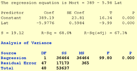
Now, let's investigate what all the numbers in the table represent. Let's start with the column labeled SS for "sums of squares." We considered sums of squares in Lesson 2 when we defined the coefficient of determination, \(r^2\), but now we consider them again in the context of the analysis of variance table.
The scatter plot of mortality and latitude appears again below, but now it is adorned with three labels:
- yi denotes the observed mortality for state i
- \(\hat{y}_i\) is the estimated regression line (solid line) and therefore denotes the estimated (or "fitted") mortality for the latitude of state i
- \(\bar{y}\) represents what the line would look like if there were no relationship between mortality and latitude. That is, it denotes the "no relationship" line (dashed line). It is simply the average mortality of the sample.
If there is a linear relationship between mortality and latitude, then the estimated regression line should be "far" from the no relationship line. We just need a way of quantifying "far." The above three elements are useful in quantifying how far the estimated regression line is from the no relationship line. As illustrated by the plot, the two lines are quite far apart.
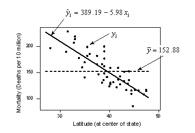 |
\(\sum_{i=1}^{n}(\hat{y}_i-\bar{y})^2 =36464\) \(\sum_{i=1}^{n}(y_i-\hat{y}_i)^2 =17173\) \(\sum_{i=1}^{n}(y_i-\bar{y})^2 =53637\) |
The distance of each observed value yi from the no regression line \(\bar{y}\) is \(y_i - \bar{y}\). If you determine this distance for each data point, square each distance, and add up all of the squared distances, you get:
\[\sum_{i=1}^{n}(y_i-\bar{y})^2 =53637\]
Called the "total sum of squares," it quantifies how much the observed responses vary if you don't take into account their latitude.
The distance of each fitted value \(\hat{y}_i\) from the no regression line \(\bar{y}\) is \(\hat{y}_i - \bar{y}\). If you determine this distance for each data point, square each distance, and add up all of the squared distances, you get:
\[\sum_{i=1}^{n}(\hat{y}_i-\bar{y})^2 =36464\]
Called the "regression sum of squares," it quantifies how far the estimated regression line is from the no relationship line.
The distance of each observed value yi from the estimated regression line \(\hat{y}_i\) is \(y_i-\hat{y}_i\). If you determine this distance for each data point, square each distance, and add up all of the squared distances, you get:
\[\sum_{i=1}^{n}(y_i-\hat{y}_i)^2 =17173\]
Called the "error sum of squares," as you know, it quantifies how much the data points vary around the estimated regression line.
In short, we have illustrated that the total variation in observed mortality y (53637) is the sum of two parts — variation "due to" latitude (36464) and variation just due to random error (17173). (We are careful to put "due to" in quotes in order to emphasize that a change in latitude does not necessarily cause the change in mortality. All we could conclude is that latitude is "associated with" mortality.)
Example 2
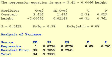
Now, let's do a similar analysis to investigate the research question, "Is there a (linear) relationship between height and grade point average?" (heightgpa.txt)
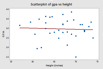
Review the following scatterplot and estimated regression line. What does the plot suggest is the answer to the research question? In this case, it appears as if there is almost no relationship whatsoever. The estimated slope is almost 0.
Again, we can answer the research question using the P-value of the t-test for:
- testing the null hypothesis H0: β1 = 0
- against the alternative hypothesis HA: β1 ≠ 0.
As the statistical software output below suggests, the P-value of the t-test for "height" is 0.761. There is not enough statistical evidence to conclude that the slope is not 0. We conclude that there is no linear relationship between height and grade point average.
The software output also shows the analysis of variable table for this data set. Again, the P-value associated with the analysis of variance F-test, 0.761, appears to be the same as the P-value, 0.761, for the t-test for the slope. The F-test similarly tells us that there is insufficient statistical evidence to conclude that there is a linear relationship between height and grade point average.
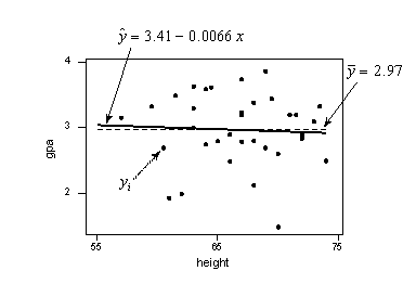
The scatter plot of grade point average and height appears below, now adorned with the three labels:
- yi denotes the observed grade point average for student i
- \(\hat{y}_i\) is the estimated regression line (solid line) and therefore denotes the estimated grade point average for the height of student i
- \(\bar{y}\) represents the "no relationship" line (dashed line) between height and grade point average. It is simply the average grade point average of the sample.
For this data set, note that the estimated regression line and the "no relationship" line are very close together. Let's see how the sums of squares summarize this point.
 |
\(\sum_{i=1}^{n}(\hat{y}_i-\bar{y})^2 =0.0276\) \(\sum_{i=1}^{n}(y_i-\hat{y}_i)^2 =9.7055\) \(\sum_{i=1}^{n}(y_i-\bar{y})^2 =9.7331\) |
- The "total sum of squares," which again quantifies how much the observed grade point averages vary if you don't take into account height, is \(\sum_{i=1}^{n}(y_i-\bar{y})^2 =9.7331\).
- The "regression sum of squares," which again quantifies how far the estimated regression line is from the no relationship line, is \(\sum_{i=1}^{n}(\hat{y}_i-\bar{y})^2 =0.0276\).
- The "error sum of squares," which again quantifies how much the data points vary around the estimated regression line, is \(\sum_{i=1}^{n}(y_i-\hat{y}_i)^2 =9.7055\).
In short, we have illustrated that the total variation in the observed grade point averages y (9.7331) is the sum of two parts — variation "due to" height (0.0276) and variation due to random error (9.7055). Unlike the last example, most of the variation in the observed grade point averages is just due to random error. It appears as if very little of the variation can be attributed to the predictor height.