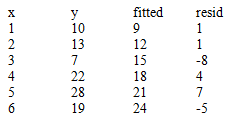
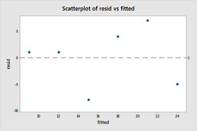
4.2 - Residuals vs. Fits Plot
When conducting a residual analysis, a "residuals versus fits plot" is the most frequently created plot. It is a scatter plot of residuals on the y axis and fitted values (estimated responses) on the x axis. The plot is used to detect non-linearity, unequal error variances, and outliers.
Let's look at an example to see what a "well-behaved" residual plot looks like. Some researchers (Urbano-Marquez, et al., 1989) were interested in determining whether or not alcohol consumption was linearly related to muscle strength. The researchers measured the total lifetime consumption of alcohol (x) on a random sample of n = 50 alcoholic men. They also measured the strength (y) of the deltoid muscle in each person's nondominant arm. A fitted line plot of the resulting data, (alcoholarm.txt), looks like:
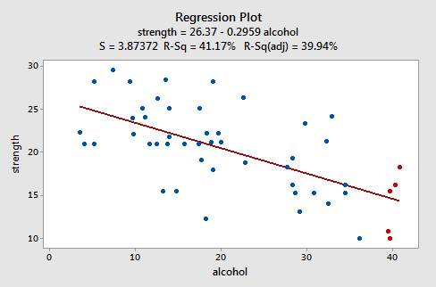
The plot suggests that there is a decreasing linear relationship between alcohol and arm strength. It also suggests that there are no unusual data points in the data set. And, it illustrates that the variation around the estimated regression line is constant suggesting that the assumption of equal error variances is reasonable.
Here's what the corresponding residuals versus fits plot looks like for the data set's simple linear regression model with arm strength as the response and level of alcohol consumption as the predictor:
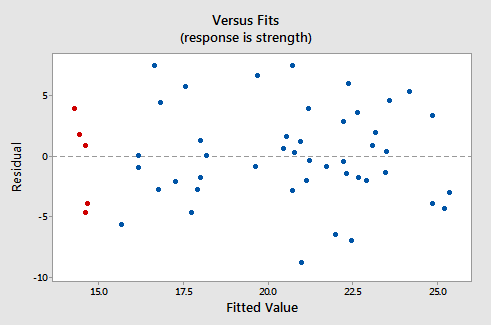
Note that, as defined, the residuals appear on the y axis and the fitted values appear on the x axis. You should be able to look back at the scatter plot of the data and see how the data points there correspond to the data points in the residual versus fits plot here. In case you're having trouble with doing that, look at the five data points in the original scatter plot that appear in red. Note that the predicted response (fitted value) of these men (whose alcohol consumption is around 40) is about 14. Also, note the pattern in which the five data points deviate from the estimated regression line.
Now look at how and where these five data points appear in the residuals versus fits plot. Their fitted value is about 14 and their deviation from the residual = 0 line shares the same pattern as their deviation from the estimated regression line. Do you see the connection? Any data point that falls directly on the estimated regression line has a residual of 0. Therefore, the residual = 0 line corresponds to the estimated regression line.
This plot is a classical example of a well-behaved residuals vs. fits plot. Here are the characteristics of a well-behaved residual vs. fits plot and what they suggest about the appropriateness of the simple linear regression model:
- The residuals "bounce randomly" around the 0 line. This suggests that the assumption that the relationship is linear is reasonable.
- The residuals roughly form a "horizontal band" around the 0 line. This suggests that the variances of the error terms are equal.
- No one residual "stands out" from the basic random pattern of residuals. This suggests that there are no outliers.
In general, you want your residual vs. fits plots to look something like the above plot. Don't forget though that interpreting these plots is subjective. My experience has been that students learning residual analysis for the first time tend to over-interpret these plots, looking at every twist and turn as something potentially troublesome. You'll especially want to be careful about putting too much weight on residual vs. fits plots based on small data sets. Sometimes the data sets are just too small to make interpretation of a residuals vs. fits plot worthwhile. Don't worry! You will learn — with practice — how to "read" these plots.