4.8 - Further Residual Plot Examples
Example 1: A Good Residual Plot
Below is a plot of residuals versus fits after a straight-line model was used on data for y = handspan (cm) and x = height (inches), for n = 167 students (handheight.txt).
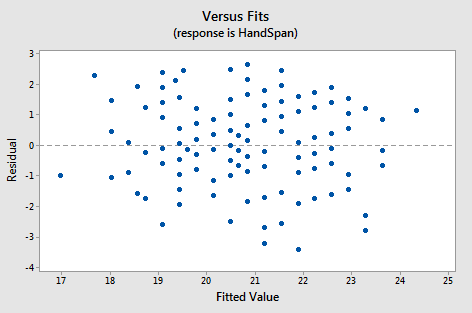
Interpretation: This plot looks good in that the variance is roughly the same all the way across and there are no worrisome patterns. There seems to be no difficulties with the model or data.
Example 2: Residual Plot Resulting from Using the Wrong Model
Below is a plot of residuals versus fits after a straight-line model was used on data for y = concentration of a chemical solution and x = time after solution was made (solutions_conc.txt).
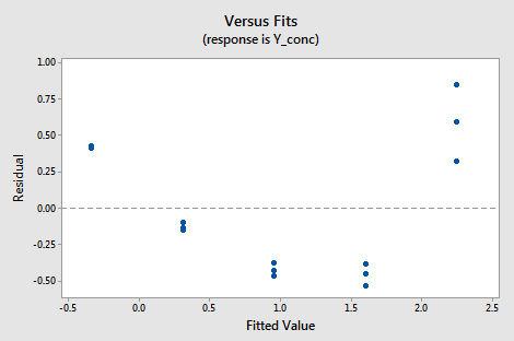
Interpretation: This plot of residuals versus plots shows two difficulties. First, the pattern is curved which indicates that the wrong type of model was used. Second, the variance (vertical spread) increases as the fitted values (predicted values) increase.
Example 3: Indications that Assumption of Constant Variance is Not Valid
Below is a plot of residuals versus fits after a straight-line model was used on data for y = sale price of a home and x = square foot area of home (realestate.txt).
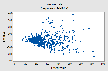
Interpretation: This plot of residuals versus fits shows that the residual variance (vertical spread) increases as the fitted values (predicted values of sale price) increase. This violates the assumption of constant error variance.
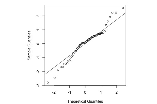
Example 5: Indications that Assumption of Normal Distribution for Errors is Valid
The graphs below are a histogram and a normal probability plot of the residuals after a straight-line model was used for fitting y = time to next eruption and x = duration of last eruption for eruptions of the Old Faithful geyser.
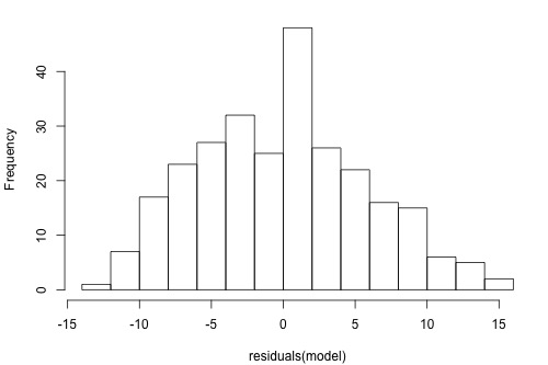
Interpretation: The histogram is roughly bell-shaped so it is an indication that it is reasonable to assume that the errors have a normal distribution. The pattern of the normal probability plot is straight, so this plot also provides evidence that it is reasonable to assume that the errors have a normal distribution.
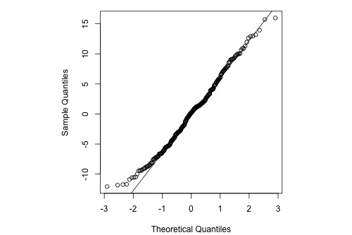
Example 5: Indications that Assumption of Normal Distribution for Errors is Not Valid
Below is a normal probability plot for the residuals from a straight-line regression with y = infection risk in a hospital and x = average length of stay in the hospital. The observational units are hospitals and the data are taken from regions 1 and 2 in the infection risk dataset.
Interpretation: The plot shows some deviation from the straight-line pattern indicating a distribution with heavier tails than a normal distribution.
Example 6: Stopping Distance Data
We investigate how transforming y can sometimes help us with nonconstant variance problems. We will look at the stopping distance data with y = stopping distance of a car and x = speed of the car when the brakes were applied (carstopping.txt). A graph of the data is given below.
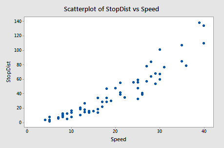
Fitting a simple linear regression model to these data leads to problems with both curvature and nonconstant variance. One possible remedy is to transform y. With some trial and error, we find that there is an approximate linear relationship between \(\sqrt{y}\) and x with no suggestion of nonconstant variance.
The software output below gives the regression equation for square root distance on speed along with predicted values and prediction intervals for speeds of 10, 20, 30 and 40 mph. The predictions are for the square root of stopping distance.
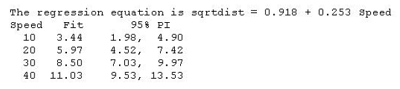
Then, the output below shows predicted values and prediction intervals when we square the results (i.e., transform back to the scale of the original data).
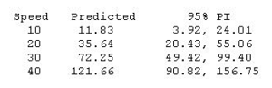
Notice that the predicted values coincide more or less with the average pattern in the scatterplot of speed and stopping distance above. Also notice that the prediction intervals for stopping distance are becoming increasingly wide as speed increases. This reflects the nonconstant variance in the original data.
We cover transformations like this in more detail in Lesson 7.