2.9 - Simple Linear Regression Examples
 Example 1: Teen Birth Rate and Poverty Level Data
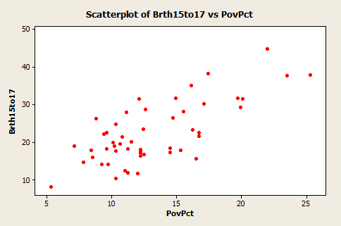
This dataset of size n = 51 are for the 50 states and the District of Columbia in the United States (poverty.txt). The variables are y = year 2002 birth rate per 1000 females 15 to 17 years old and x = poverty rate, which is the percent of the state’s population living in households with incomes below the federally defined poverty level. (Data source: Mind On Statistics, 3rd edition, Utts and Heckard).
The plot of the data below (birth rate on the vertical) shows a generally linear relationship, on average, with a positive slope. As the poverty level increases, the birth rate for 15 to 17 year old females tends to increase as well.
The following plot shows a regression line superimposed on the data.
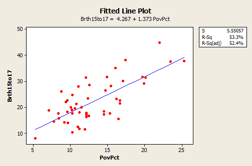
The equation of the fitted regression line is given near the top of the plot. The equation should really state that it is for the “average” birth rate (or “predicted” birth rate would be okay too) because a regression equation describes the average value of y as a function of one or more x-variables. In statistical notation, the equation could be written \(\hat{y} = 4.267 + 1.373x \).
- The interpretation of the slope (value = 1.373) is that the 15 to 17 year old birth rate increases 1.373 units, on average, for each one unit (one percent) increase in the poverty rate.
- The interpretation of the intercept (value=4.267) is that if there were states with poverty rate = 0, the predicted average for the 15 to 17 year old birth rate would be 4.267 for those states. Since there are no states with poverty rate = 0 this interpretation of the intercept is not practically meaningful for this example.
In the graph with a regression line present, we also see the information that s = 5.55057 and r2 = 53.3%.
- The value of s tells us roughly the standard deviation of the differences between the y-values of individual observations and predictions of y based on the regression line.
- The value of r2 can be interpreted to mean that poverty rates "explain" 53.3% of the observed variation in the 15 to 17 year old average birth rates of the states.
The R2 (adj) value (52.4%) is an adjustment to R2 based on the number of x-variables in the model (only one here) and the sample size. With only one x-variable, the adjusted R2 is not important.
 Example 2: Lung Function in 6 to 10 Year Old Children
The data are from n = 345 children between 6 and 10 years old. The variables are y = forced exhalation volume (FEV), a measure of how much air somebody can forcibly exhale from their lungs, and x = age in years. (Data source: The data here are a part of dataset given in Kahn, Michael (2005). "An Exhalent Problem for Teaching Statistics", The Journal of Statistical Education, 13(2).
Below is a plot of the data with a simple linear regression line superimposed.
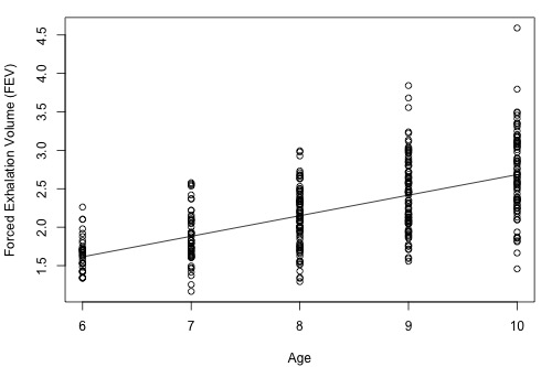
- The estimated regression equation is that average FEV = 0.01165 + 0.26721 × age. For instance, for an 8 year old we can use the equation to estimate that the average FEV = 0.01165 + 0.26721 × (8) = 2.15.
- The interpretation of the slope is that the average FEV increases 0.26721 for each one year increase in age (in the observed age range).
An interesting and possibly important feature of these data is that the variance of individual y-values from the regression line increases as age increases. This feature of data is called non-constant variance. For example, the FEV values of 10 year olds are more variable than FEV value of 6 year olds. This is seen by looking at the vertical ranges of the data in the plot. This may lead to problems using a simple linear regression model for these data, which is an issue we'll explore in more detail in Lesson 4.
Above, we only analyzed a subset of the entire dataset. The full dataset (fev_dat.txt) is shown in the plot below:
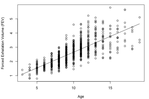
As we can see, the range of ages now spans 3 to 19 years old and the estimated regression equation is FEV = 0.43165 + 0.22204 × age. Both the slope and intercept have noticeably changed, but the variance still appears to be non-constant. This illustrates that it is important to be aware of how you are analyzing your data. If you only use a subset of your data that spans a shorter range of predictor values, then you could obtain noticeably different results than if you had used the full dataset.