2.8 - R-squared Cautions
Unfortunately, the coefficient of determination r2 and the correlation coefficient r have to be the most often misused and misunderstood measures in the field of statistics. To ensure that you don't fall victim to the most common mistakes, we review a set of seven different cautions here. Master these and you'll be a master of the measures!
Caution # 1
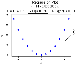
The coefficient of determination r2 and the correlation coefficient r quantify the strength of a linear relationship. It is possible that r2 = 0% and r = 0, suggesting there is no linear relation between x and y, and yet a perfect curved (or "curvilinear" relationship) exists.
Consider the following example. The upper plot illustrates a perfect, although curved, relationship between x and y, and yet r2 = 0% and r = 0. The estimated regression line is perfectly horizontal with slope b1 = 0. If you didn't understand that r2 and r summarize the strength of a linear relationship, you would likely misinterpret the measures, concluding that there is no relationship between x and y. But, it's just not true! There is indeed a relationship between x and y — it's just not linear.
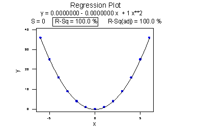
The lower plot better reflects the curved relationship between x and y. There is a "quadratic" curve through the data for which R2 = 100%. What is this all about? We'll learn when we study multiple linear regression later in the course that the coefficient of determination r2 associated with the simple linear regression model for one predictor extends to a "multiple coefficient of determination," denoted R2, for the multiple linear regression model with more than one predictor. (The lowercase r and uppercase R are used to distinguish between the two situations. Statistical software typically doesn't distinguish between the two, calling both measures "R2.") The interpretation of R2 is similar to that of r2, namely "R2 × 100% of the variation in the response is explained by the predictors in the regression model (which may be curvilinear)."
In summary, the R2 value of 100% and the r value of 0 tell the story of the second plot perfectly. The multiple coefficient of determination R2 = 100% tells us that all of the variation in the response y is explained in a curved manner by the predictors x and x2. The correlation coefficient r = 0 tells us that if there is a relationship between x and y, it is not linear.
Caution # 2
A large r2 value should not be interpreted as meaning that the estimated regression line fits the data well. Another function might better describe the trend in the data.
Consider the following example in which the relationship between year (1790 to 1990, by decades) and population of the United States (in millions) is examined:
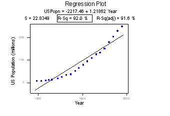
The correlation between year and population is 0.959. This and the r2 value of 92.0% suggest a strong linear relationship between year and U.S. population. Indeed, only 8% of the variation in U.S. population is left to explain after taking into account the year in a linear way! The plot suggests, though, that a curve would describe the relationship even better. That is, the large r2 value of 92.0% should not be interpreted as meaning that the estimated regression line fits the data well. (Its large value does suggest that taking into account year is better than not doing so. It just doesn't tell us that we could still do better.)
Again, the r2 value doesn't tell us that the regression model fits the data well. This is the most common misuse of the r2 value! When you are reading the literature in your research area, pay close attention to how others interpret r2. I am confident that you will find some authors misinterpreting the r2 value in this way. And, when you are analyzing your own data make sure you plot the data — 99 times out of a 100, the plot will tell more of the story than a simple summary measure like r or r2 ever could.
Caution # 3
The coefficient of determination r2 and the correlation coefficient r can both be greatly affected by just one data point (or a few data points).
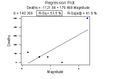
Consider the following example in which the relationship between the number of deaths in an earthquake and its magnitude is examined. Data on n = 6 earthquakes were recorded, and the upper fitted line plot below was obtained. The correlation between deaths and magnitude is 0.732. The slope of the line b1 = 179.5 and the correlation of 0.732 suggest that as the magnitude of the earthquake increases, the number of deaths also increases. This is not a surprising result. Therefore, if we hadn't plotted the data, we wouldn't notice that one and only one data point (magnitude = 8.3 and deaths = 503) was making the values of the slope and the correlation positive.
Original plot
Plot with unusual point removed
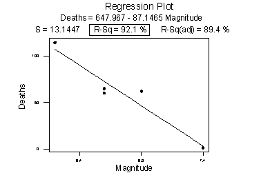
The second plot is a plot of the same data, but with the one unusual data point removed. The correlation between deaths and magnitude with the one unusual point removed is -0.960. Note that the estimated slope of the line changes from a positive 179.5 to a negative 87.1 — just by removing one data point. Also, both measures of the strength of the linear relationship improve dramatically — r changes from a positive 0.732 to a negative 0.960, and r2 changes from 53.5% to 92.1%.
What conclusion can we draw from these data? Probably none! The main point of this example was to illustrate the impact of one data point on the r and r2 values. One could argue that a secondary point of the example is that a data set can be too small to draw any useful conclusions.
Caution # 4
Correlation (or association) does not imply causation.
Consider the following example in which the relationship between wine consumption and death due to heart disease is examined. Each data point represents one country. For example, the data point in the lower right corner is France, where the consumption averages 9.1 liters of wine per person per year and deaths due to heart disease are 71 per 100,000 people.
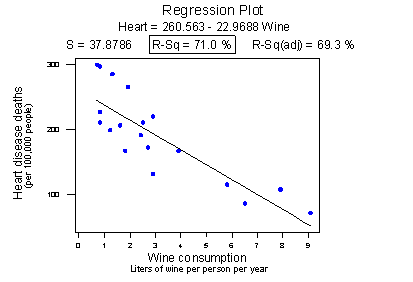
Statistical software reports that the r2 value is 71.0% and the correlation is -0.843. Based on these summary measures, a person might be tempted to conclude that he or she should drink more wine, since it reduces the risk of heart disease. If only life were that simple! Unfortunately, there may be other differences in the behavior of the people in the various countries that really explain the differences in the heart disease death rates, such as diet, exercise level, stress level, social support structure and so on.
Let's push this a little further. Recall the distinction between an experiment and an observational study:
- An experiment is a study in which, when collecting the data, the researcher controls the values of the predictor variables.
- An observational study is a study in which, when collecting the data, the researcher merely observes and records the values of the predictor variables as they happen.
The primary advantage of conducting experiments is that one can typically conclude that differences in the predictor values is what caused the changes in the response values. This is not the case for observational studies. Unfortunately, most data used in regression analyses arise from observational studies. Therefore, you should be careful not to overstate your conclusions, as well as be cognizant that others may be overstating their conclusions.
Caution # 5
Ecological correlations — correlations that are based on rates or averages — tend to overstate the strength of an association.
Some statisticians (Freedman, Pisani, Purves, 1997) investigated data from the 1988 Current Population Survey in order to illustrate the inflation that can occur in ecological correlations. Specifically, they considered the relationship between a man's level of education and his income. They calculated the correlation between education and income in two ways:
- First, they treated individual men, aged 25-64, as the experimental units. That is, each data point represented a man's income and education level. Using these data, they determined that the correlation between income and education level for men aged 25-64 was about 0.4, not a convincingly strong relationship.
- The statisticians analyzed the data again, but in the second go-around they treated nine geographical regions as the units. That is, they first computed the average income and average education for men aged 25-64 in each of the nine regions. They determined that the correlation between the average income and average education for the sample of n = 9 regions was about 0.7, obtaining a much larger correlation than that obtained on the individual data.
Again, ecological correlations, such as the one calculated on the region data, tend to overstate the strength of an association. How do you know what kind of data to use — aggregate data (such as the regional data) or individual data? It depends on the conclusion you'd like to make.
If you want to learn about the strength of the association between an individual's education level and his income, then by all means you should use individual, not aggregate, data. On the other hand, if you want to learn about the strength of the association between a school's average salary level and the schools graduation rate, you should use aggregate data in which the units are the schools.
We hadn't taken note of it at the time, but you've already seen a couple of examples in which ecological correlations were calculated on aggregate data:
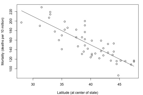
The correlation between wine consumption and heart disease deaths of -0.843 is an ecological correlation. The units are countries, not individuals. The correlation between skin cancer mortality and state latitude of -0.825 is also an ecological correlation. The units are states, again not individuals. In both cases, we should not use these correlations to try to draw a conclusion about how an individual's wine consumption or suntanning behavior will affect their individual risk of dying from heart disease or skin cancer. We shouldn't try to draw such conclusions anyway, because "association is not causation."
Caution # 6
A "statistically significant" r2 value does not imply that the slope β1 is meaningfully different from 0.
This caution is a little strange as we haven't talked about any hypothesis tests yet. We'll get to that soon, but before doing so ... a number of former students have asked why some article authors can claim that two variables are "significantly associated" with a P-value less than 0.01, but yet their r2 value is small, such as 0.09 or 0.16. The answer has to do with the mantra that you may recall from your introductory statistics course: "statisical significance does not imply practical significance."
In general, the larger the data set, the easier it is to reject the null hypothesis and claim "statistical significance." If the data set is very large, it is even possible to reject the null hypothesis and claim that the slope β1 is not 0, even when it is not practically or meaningfully different from 0. That is, it is possible to get a significant P-value when β1 is 0.13, a quantity that is likely not to be considered meaningfully different from 0 (of course, it does depend on the situation and the units). Again, the mantra is "statistical significance does not imply practical significance."
Caution # 7
A large r2 value does not necessarily mean that a useful prediction of the response ynew, or estimation of the mean response µY, can be made. It is still possible to get prediction intervals or confidence intervals that are too wide to be useful.
We'll learn more about such prediction and confidence intervals in Lesson 4.