C. Significance of a Correlation Coefficient
Page 163. The point the authors make in the first paragraph is a very important one. If you have a large data set, it is quite possible that you'll have a small enough P-value to conclude that the population correlation is significantly different from 0, when in fact it is not all that much different from 0. You'll want to make sure you use common sense when interpreting the results.
The point the authors make in the second paragraph is equally important. Always remember the mantra: correlation does not imply causation.
Page 164. The authors present a great example. I just wished they had taken it a little bit further. What they are getting at is the possibility of getting a sample correlation coefficient that leads to rejecting the null hypothesis of a zero population correlation coefficient, when in fact the population correlation coefficient is zero. You might recall from your statistical studies that we call this a Type I error.
If you look at the data in the plot, it doesn't look like there is much of a correlation between the x and y variables. If you think of all of the dots on the plot as the population, and the black dots on the plot as the sample, then you can get the idea that by chance you might get a sample that leads to concluding the population correlation differs from 0 when in fact it doesn't. Since the authors didn't provide the data, I eyeballed the black dots on the plot and ran the CORR procedure on the data:
OPTIONS PS = 58 LS = 72 NODATE NONUMBER;

DATA HOSP_PATIENTS;
	INPUT #1
		@1  ID           $3.
		@4  DATE1   MMDDYY8.
		@12 HR1           3.
		@15 SBP1          3.
		@18 DBP1          3.
		@21 DX1           3.
		@24 DOCFEE1       4.
		@28 LABFEE1       4.
			#2
		@4  DATE2   MMDDYY8.
		@12 HR2           3.
		@15 SBP2          3.
		@18 DBP2          3.
		@21 DX2           3.
		@24 DOCFEE2       4.
		@28 LABFEE2       4.
			#3
		@4  DATE3   MMDDYY8.
		@12 HR3           3.
		@15 SBP3          3.
		@18 DBP3          3.
		@21 DX3           3.
		@24 DOCFEE3       4.
		@28 LABFEE3       4.
			#4
		@4  DATE4   MMDDYY8.
		@12 HR4           3.
		@15 SBP4          3.
		@18 DBP4          3.
		@21 DX4           3.
		@24 DOCFEE4       4.
		@28 LABFEE4       4.;
	FORMAT DATE1-DATE4 MMDDYY10.;
DATALINES;
0071021198307012008001400400150
0071201198307213009002000500200
007
007
0090903198306611007013700300000
009
009
009
0050705198307414008201300900000
0050115198208018009601402001500
0050618198207017008401400800400
0050703198306414008401400800200
;
RUN;

PROC PRINT data = HOSP_PATIENTS;
RUN;
This is the portion of the output that makes the point:
Pearson Correlation Coefficient, N=10
Prob > |r| under H0: Rho=0
| x | y | |
|---|---|---|
| x | 1.00000 | 0.91252 |
| 0.0002 | ||
| y | 0.91252 | 1.00000 |
| 0.0002 |
As suspected, the sample correlation is large (0.91252) leading to a small P-value (0.0002). Therefore, we would reject the null hypothesis of a zero population correlation coefficient, when in fact the population correlation coefficient is zero. We would indeed be committing a Type I error.
F. Linear Regression
Page 168. In general, the 95% confidence interval for the slope is obtained by taking the parameter estimate of the slope (11.19127) and adding and subtracting 2 standard errors (2 × 1.2178). The calculation is as follows:
11.19127 - (2 × 1.2178) = 11.19127 - 2.4356 = 8.75
11.19127 + (2 × 1.2178) = 11.19127 + 2.4356 = 13.63
In the case when the sample size is small, as it is here, we replace the 2 with the appropriate t-value. As the authors, explain the appropriate t-value here is 2.57. Then, the calculation is:
11.19127 - (2.57 × 1.2178) = 11.19127 - 3.1297 = 8.06
11.19127 + (2.57 × 1.2178) = 11.19127 + 3.1297 = 14.32
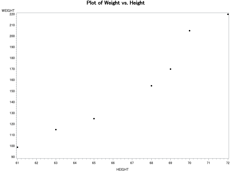
Page 169. Here, since the reported R-square value is 0.9441, we can say that 94.4% of the variation in weight can be explained by height.
H. Producing a Scatter Plot and the Regression Line
Page 170. The authors use the graphic version of the scatter plot procedure. You can create a character-based plot as well using the PLOT procedure. In that case, the code would be the same except PLOT would replace GPLOT:
PROC PLOT data = corr_eg;
    PLOT WEIGHT*HEIGHT;
RUN;
If you haven't worked with the GPLOT procedure before, you should be aware that SAS displays the results in a new graph window. You might want to run the code so that you can see this for yourself:
DATA CORR_EG;
	INPUT GENDER $ HEIGHT WEIGHT AGE;
DATALINES;
M 68 155 23
F 61 99 20
F 63 115 21
M 70 205 45
M 69 170 .
F 65 125 30
M 72 220 48
;
RUN;

SYMBOL VALUE = DOT COLOR = BLACK;

PROC GPLOT DATA=CORR_EG;
	title 'Plot of Weight vs. Height';
	PLOT WEIGHT*HEIGHT;
RUN;
QUIT;
By the way, you'll notice that this program ends with a QUIT; statement. If you leave it out, the GPLOT procedure will continue to run in the background. You can see this for yourself by removing the QUIT; statement, and re-running the program. Then, look at the editor window title. You should see:
In general, if you want a quick-and-dirty plot, the PLOT procedure will probably suffice. On the other hand, if you want a publication-quality plot, you'll want to use the GPLOT procedure.
Page 173. The end of the first sentence on this page should say "... interval about the individual y-values (RLCLI95)."
J. Transforming Data
Page 177. A common programming mistake is to try to transform the variables right in the model statement:
MODEL hr = log(dose);
Don't worry... SAS will squawk at you to let you know that you've made a mistake. If it does, just remind yourself that you need to make the transformation in the DATA step, not in the MODEL statement.