9.2 - Checking Data Quality
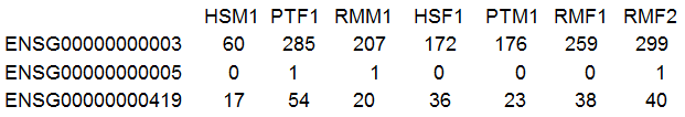
As in all statistical analyses, it is wise to check your RNA-seq data for data quality by visualization and simple summaries before proceeding with a formal analysis. We will use the LiverData which you looked at in the RNA seq R Lab. It consists of 36 sequencing lanes of read counts. The data came from a study of gene expression in liver from male and female (M or F), humans (HS), chimpanzees (PT) and rhesus monkey (RM). There were 3 biological replicates for each treatment combination and each replicate was split into 2 sequencing lanes. 20689 features (genes) were recorded.
After reading in the data, I generally check the dimension (which you did in Homework 2) and also have a look at some of the entries. It is amazing how many errors you can prevent with these two simple steps! RNA-seq data should be counts (whole numbers). As we see below, that is what we have. We also have a lot of zeroes in the data.
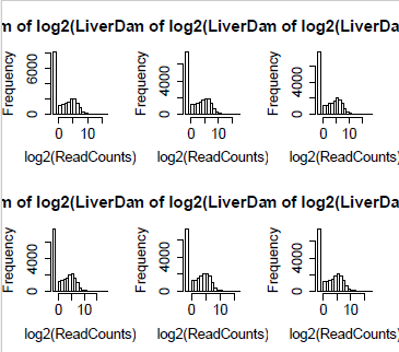
For the statistical analysis, we use the counts. However, so visualization it is convenient to use log2(counts). To make sure that the zeroes turn up in our visualizations, we need to add 0.5 or 0.25 to every observation. This places the zeroes at -1 or -2 respectively, but has little effect for counts above 2.
Data Visualization
The histograms below are done for each lane (column) of the matrix with 0.25 added to the data before taking log2. (In the data table above, the column names were truncated. Here we have the full column name which is Run# Lane#, species, gender and biological replicate.) We can see that for each lane there is a large preponderance of zeroes.
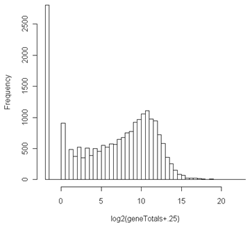
Even after aggregating across samples by taking row sums, there are lots of undetected genes as seen below. These need to be removed, since genes which do not express at all cannot be differentially expressed.
As with microarrays, it can be helpful to plot each sequencing lane against every other sequencing lane. We have done this below for the 4 lanes of data from 2 of the human males. Even after removing genes that have zero reads in the entire study, there are lots of genes that have no reads in any pair of lanes. These are the black dot at (-2,-2).
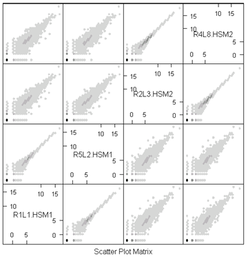
Notice how tightly the 2 lanes from the same individual follow each other. These are technical replicates and have only Poisson variation. Any pair of lanes from different biological replicates have extra-Poisson variation.
A cluster diagram of the samples provides a type of "reality check". The diagram is built on the correlation of the samples. We expect the two lanes from the same individual to be tightly clustered. Since these are liver samples, we might not expect large gender differences. On the other hand, we might expect species differences (especially as all the data were mapped to the human reference - chimpanzees and rhesus monkeys might have some mismatches which would lower the read counts).
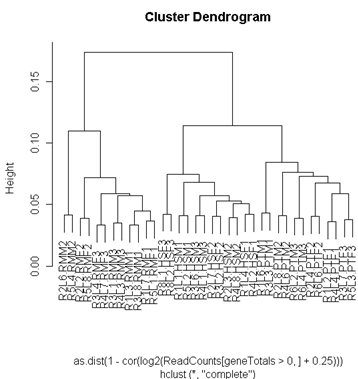
The cluster diagram shows a pattern that is about what we might expect. The 2 lanes from the same individual cluster most tightly, and then the clustering is by species. The humans cluster more closely to chimpanzees than to rhesus monkeys, as we would expect from the evolutionary history of these 3 species.
Numerical Summaries
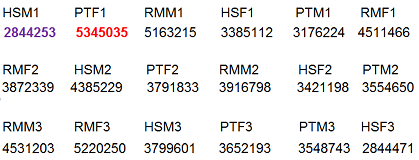
The next thing to look at is library size - the total number of mapped reads in each lane. As we can see below, this can vary considerable. (This is from one of the early studies - library sizes are much bigger today.) A lane that is an order of magnitude smaller than the others might indicate a technical problem which might require another sequencing run for that lane.
At this point we should also look at the percentage of reads from each sample which were not mapped. This should usually be about the same for each sample. If they are very different, then some samples may be degraded or contaminated. Of course, in the current study, this might be species specific, because the rhesus samples might not map to the human reference genome as well as the human samples.
Typically, even highly expressing features contribute only a small percentage of the reads in each lane, but this is not always the case. Since the log-linear model shows we are analyzing the percentage of reads in each sample that come from each feature, features that take up a large percentage of the library artificially depress the percentage that come from other features.
Below we have the percentage of each lane taken up by the most highly expressing feature. (It might be a different feature in each lane, but in this case it is not.) Notice that this one feature (Albumin) is 4 fold up in some lanes compared to others and that this effect does not appear to be species dependent.
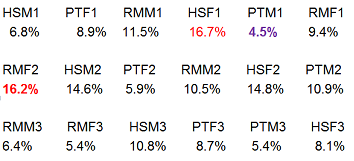
In these samples, the most highly expressed gene is a large percentage of each sample. In fact, the nine most abundant transcripts account for 25% of the reads. These features do not follow the assumptions needed for Poisson variation and may not follow the same distribution as the other features.