16.3 - Choosing the number of eigencomponents
When you do the singular value decomposition the first left and right singular vectors are always the most dominant patterns in the data. However left singular vectors are all selected to be uncorrelated with one another and the right singular vectors are selected to be uncorrelated with one another. Because of this, after the first singular vector, the remaining singular vectors are not always readily interpreted as patterns in the data. For example, the next most predominant pattern might not be an eigengene - it might be a weighted average of the first 2 eigengenes. However, plotting the data on the first 2 or 3 singular values often produces an informative plot, as the clusters of features (or samples) with similar patterns will cluster together.
SVD and PCA always produce eigencomponents just as cluster analysis always produces clusters. However, unlike clusters, each eigencomponent comes with a measure of its importance - the singular values or alternatively the percent variance explained (squared singular values over total sum of squares). The cumulative percent variance explained by the first k eigencomponents is identical to \(R^2\) in multiple linear regression and is a measure of how much of the data matrix can be predicted by regressing the entries of the data matrix on k eigenfeatures or eigensamples.
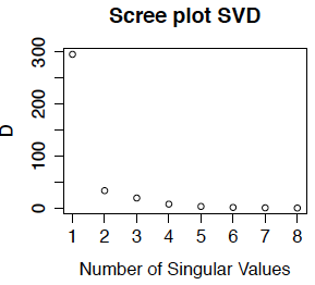
Often we plot either the singular values or the percent variance explained (which is the squared singular value as a percentage of the total sum of squares) against the number of the singular vectors. This is called the scree plot. Below we show the scree plot for the SVD of the primate brain data. We can see immediately from this plot that the first singular vector is the most important. while the last few have about the same level of importance. Because we did not center the data, the first eigentreatment (which has an entry for every gene) is highly correlated with the mean expression for each gene - in fact for this example, the correlation is -0.9999. This is the dominant pattern in the eigentreatments. Comparing with the treatment-wise plots in Section 15.2, we can see that the first eigengene is approximately the contrast between the mean of expression in caudate and cerebellum compared to the other two brain regions.
The English word "scree" refers to the pile of eroded rock that is found at the foot of a mountain, as in the picture below. We use the scree plot to pick out the mountain (i.e. the important singular vectors) from the rubble at the bottom (the unimportant singular vectors) which are interpreted as noise. Although our scree plot suggests that only one, or at most 2 of the eigengenes are important for "explaining" the gene expression data, I would probably use all 4 of these eigengenes because they all have interpretable patterns that have biological meaning.

An alternative to the scree plot is to use the cumulative sum of the percent variance explained (this could also be plotted, but that is not really necessary). In this example, the first 3 eigengenes have cumulative percent variance explained:
0.981 0.994 0.999 0.999
so 98% of the variance in the gene expression matrix is explained by the first eigengene. However, this "variance" is the average squared deviation from the origin, not from the gene means. Since the overall mean expression (over all 200 genes and 8 treatments) is about 7.2, it is not surprising that we can predict the data matrix very well with even one eigencomponent (compared to predicting all of the entries as zero).
Let \( U_1, U_2 \cdots U_n\) be the columns of U and \( V_1, V_2 \cdots V_n\) be the columns of V. It turns out that regressing the data matrix M on the first k eigenfeatures or eigensamples, is the same as computing estimating M by
\[\hat{M}=\sum_{i=1}^k U_i d_{ii} V_i^\top .\]
The regression sum of squares is \(\sum_{i=1}^k d_{ii}^2\) and the residual sum of squares is \(\sum_{i}\sum_j(M_{ij}-\hat{M}_{ij})^2=\sum_{i=k+1}^n d_{ii}^2\).
Scree Plot for Principal Components Analysis
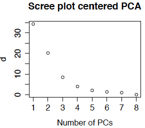
Scree plots are also used in principal components analysis. Because the feature means have been removed, the eigenvalues \(d_{ii}^2\) are now actually variances (computed as the sum of squared deviation from the gene means). Most PCA routines produce a scree plot - some plot \(d_{ii}^2\) and others plot \(d_{ii}\). The routines in R plot \(d_{ii}\) and call the singular values the standard deviations (because they are the square roots of the variances). Below is the scree plot for ordinary PCA. We see that \(d_{11}\) is much smaller than obtained from the uncentered data. This is because we are approximating the centered data matrix \(\tilde{M}\) for which the mean entry is 0 (not 7.2). We also see that the first 3 or 4 singular values are relatively large, so it is not surprising that we obtained interpretable results for the first 4 eigengenes.
Now the cumulative percent variance explained are 70% 94% 99.4% 99.6%. The usual rule of thumb is to select enough PCs to explain over 90% of the variance, or until the scree plot flattens out. This means that we would generally pick 2 or 3 principal components, although again, because they were biologically interpretable I would likely use all 4 (or more if the 5th or 6th were also interpretable).
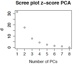
Another option (which is less commonly used in bioinformatics) is to compute the z-score for each gene before doing PCA. The resulting scree plot for the primate brain data is below. (It is so similar to the plot above that I double-checked to be sure that I had not recopied the plot!) The reason that the plots (and the eigentreatments) are so similar is that there is not much different in the variability from gene to gene.