6.5 - R Scripts
1) Acquire Data
Diabetes data
The diabetes data set is taken from the UCI machine learning database repository at: https://archive.ics.uci.edu/ml/datasets/Pima+Indians+Diabetes .
- 768 samples in the dataset
- 8 quantitative variables
- 2 classes; with or without signs of diabetes
Load data into R as follows:
# set the working directory
setwd("C:/STAT 897D data mining")
# comma delimited data and no header for each variable
RawData <- read.table("diabetes.data",sep = ",",header=FALSE)
In RawData, the response variable is its last column; and the remaining columns are the predictor variables.
responseY <- RawData[,dim(RawData)[2]]
predictorX <- RawData[,1:(dim(RawData)[2]-1)]
2) Principal Component Analysis
Principal component analysis is done by the princomp function. For computing the principal components, sometimes it is recommended the data be scaled first. However, one needs to judge whether scaling is necessary on a case by case base. For scaling, we can set the cor=T argument.
pca <- princomp(predictorX, cor=T) # principal components analysis using correlation matrix
$scores gives the principal components arranged in decreasing order of the standard deviations of the principal components. Suppose we want to get the first and second principal components. We use the following code. The scatter plot for the two components is then drawn.
pc.comp <- pca$scores
pc.comp1 <- -1*pc.comp[,1] # principal component 1 scores (negated for convenience)
pc.comp2 <- -1*pc.comp[,2] # principal component 2 scores (negated for convenience)
plot(pc.comp1, pc.comp2, xlim=c(-6,6), ylim=c(-3,4), type="n")
points(pc.comp1[responseY==0], pc.comp2[responseY==0], cex=0.5, col="blue")
points(pc.comp1[responseY==1], pc.comp2[responseY==1], cex=0.5, col="red")
The scattor plot of the first two principal components are shown in the following figure. The red circles show data in Class 1 (cases with diabetes), and the blue circles show Class 0 (non diabetes).
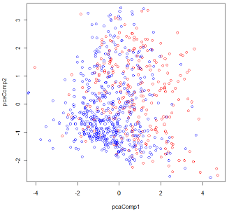
Figure 1: The scatter plot of the first two principal components for the Diabetes data