10.6 - Highly Correlated Predictors
Okay, so we've learned about all of the good things that can happen when predictors are perfectly or nearly perfectly uncorrelated. Now, let's discover the bad things that can happen when predictors are highly correlated.
What happens if the predictor variables are highly correlated?
Let's return again to the blood pressure data set (bloodpress.txt). This time, let's focus, however, on the relationships among the response y = BP and the predictors x2 = Weight and x3 = BSA:
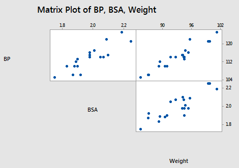
As the matrix plot and the following correlation matrix suggest:
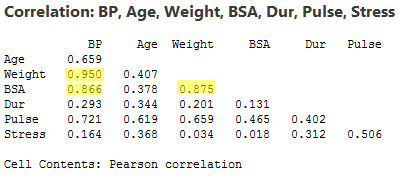
there appears to be not only a strong relationship between y = BP and x2 = Weight (r = 0.950) and a strong relationship between y = BP and the predictor x3 = BSA (r = 0.866), but also a strong relationship between the two predictors x2 = Weight and x3 = BSA (r = 0.875). Incidentally, it shouldn't be too surprising that a person's weight and body surface area are highly correlated.
What impact does the strong correlation betwen the two predictors have on the regression analysis and the subsequent conclusions we can draw? Let's proceed as before by reviewing the output of a series of regression analyses and collecting various pieces of information along the way. When we're done, we'll review what we learned by collating the various items in a summary table.
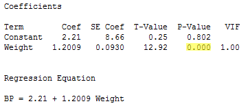
The regression of the response y = BP on the predictor x2= Weight:
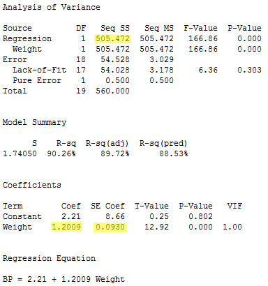
yields the estimated coefficient b2 = 1.2009, the standard error se(b2) = 0.0930, and the regression sum of squares SSR(x2) = 505.472.
The regression of the response y = BP on the predictor x3= BSA:
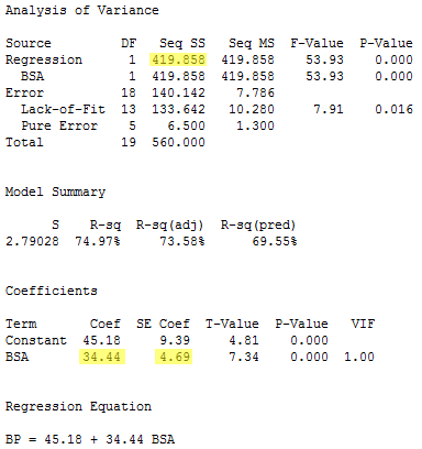
yields the estimated coefficient b3 = 34.44, the standard error se(b3) = 4.69, and the regression sum of squares SSR(x3) = 419.858.
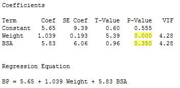
The regression of the response y = BP on the predictors x2= Weight and x3 = BSA (in that order):
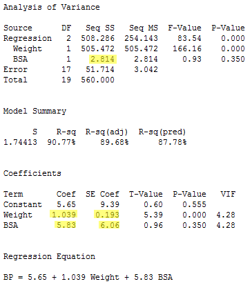
yields the estimated coefficients b2 = 1.039 and b3 = 5.83, the standard errors se(b2) = 0.193 and se(b3) = 6.06, and the sequential sum of squares SSR(x3|x2) = 2.814.
And finally, the regression of the response y = BP on the predictors x3= BSA and x2= Weight (in that order):
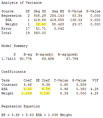
yields the estimated coefficients b2 = 1.039 and b3 = 5.83, the standard errors se(b2) = 0.193 and se(b3) = 6.06, and the sequential sum of squares SSR(x2|x3) = 88.43.
Compiling the results in a summary table, we obtain:
|
Model |
b2
|
se(b2)
|
b3
|
se(b3)
|
Seq SS
|
|
x2 only
|
1.2009
|
0.0930
|
---
|
---
|
SSR(x2)
505.472 |
|
x3 only
|
---
|
---
|
34.44
|
4.69
|
SSR(x3)
419.858 |
|
x2, x3
(in order) |
1.039
|
0.193
|
5.83
|
6.06
|
SSR(x3|x2)
2.814 |
|
x3, x2
(in order) |
1.039
|
0.193
|
5.83
|
6.06
|
SSR(x2|x3)
88.43 |
Geez — things look a little different than before. It appears as if, when predictors are highly correlated, the answers you get depend on the predictors in the model. Let's proceed through the table and in so doing carefully summarize the effects of multicollinearity on the regression analyses.
Effect #1
When predictor variables are correlated, the estimated regression coefficient of any one variable depends on which other predictor variables are included in the model.
Here's the relevant portion of the table:
|
Variables in model |
b2
|
b3
|
|
x2
|
1.20
|
---
|
|
x3
|
---
|
34.4
|
|
x2, x3
|
1.04
|
5.83
|
Note that, depending on which predictors we include in the model, we obtain wildly different estimates of the slope parameter for x3 = BSA!
- If x3 = BSA is the only predictor included in our model, we claim that for every additional one square meter increase in body surface area (BSA), blood pressure (BP) increases by 34.4 mm Hg.
- On the other hand, if x2 = Weight and x3 = BSA are both included in our model, we claim that for every additional one square meter increase in body surface area (BSA), holding weight constant, blood pressure (BP) increases by only 5.83 mm Hg.
The high correlation among the two predictors is what causes the large discrepancy. When interpreting b3 = 34.4 in the model that excludes x2 = Weight, keep in mind that when we increase x3 = BSA then x2 = Weight also increases and both factors are associated with increased blood pressure. However, when interpreting b3 = 5.83 in the model that includes x2 = Weight, we keep x2 = Weight fixed, so the resulting increase in blood pressure is much smaller.
Effect #2
When predictor variables are correlated, the precision of the estimated regression coefficients decreases as more predictor variables are added to the model.
Here's the relevant portion of the table:
|
Variables in model |
se(b2)
|
se(b3)
|
|
x2
|
0.093
|
---
|
|
x3
|
---
|
4.69
|
|
x2, x3
|
0.193
|
6.06
|
The standard error for the estimated slope b2 obtained from the model including both x2 = Weight and x3 = BSA is about double the standard error for the estimated slope b2 obtained from the model including only x2 = Weight. And, the standard error for the estimated slope b3 obtained from the model including both x2 = Weight and x3 = BSA is about 30% larger than the standard error for the estimated slope b3 obtained from the model including only x3 = BSA.
What is the major implication of these increased standard errors? Recall that the standard errors are used in the calculation of the confidence intervals for the slope parameters. That is, increased standard errors of the estimated slopes lead to wider confidence intervals, and hence less precise estimates of the slope parameters.
Three plots to help clarify the second effect. Recall that the first data set (uncorrpreds.txt) that we investigated in this lesson contained perfectly uncorrelated predictor variables (r = 0). Upon regressing the response y on the uncorrelated predictors x1 and x2, the following animation shows the "best fitting" plane through the data points:
Click on the Best Fitting Plane button in order to see the best fitting plane for this particular set of responses. Now, here's where you have to turn on your imagination. The primary characteristic of the data — because the predictors are perfectly uncorrelated — is that the predictor values are spread out and anchored in each of four corners, providing a solid base over which to draw the response plane. Now, even if the responses (y) varied somewhat from sample to sample, the plane couldn't change all that much because of the solid base. That is, the estimated coefficients, b1 and b2, couldn't change that much, and hence the standard errors of the estimated coefficients, se(b1) and se(b2), will necessarily be small.
Now, let's take a look at the second example (bloodpress.txt) that we investigated in this lesson, in which the predictors x3 = BSA and x6 = Stress were nearly perfectly uncorrelated (r = 0.018). Upon regressing the response y = BP on the nearly uncorrelated predictors x3 = BSA and x6 = Stress, the following animation shows the "best fitting" plane through the data points:
Click on the Best Fitting Plane button in order to see the best fitting plane for this particular set of responses. Again, the primary characteristic of the data — because the predictors are nearly perfectly uncorrelated — is that the predictor values are spread out and just about anchored in each of four corners, providing a solid base over which to draw the response plane. Again, even if the responses (y) varied somewhat from sample to sample, the plane couldn't change all that much because of the solid base. That is, the estimated coefficients, b3 and b6, couldn't change all that much. The standard errors of the estimated coefficients, se(b3) and se(b6), again will necessarily be small.
Now, let's see what happens when the predictors are highly correlated. Let's return to our most recent example (bloodpress.txt), in which the predictors x2 = Weight and x3 = BSA are very highly correlated (r = 0.875). Upon regressing the response y = BP on the predictors x2 = Weight and x3 = BSA, the following 3D scatterplot shows the the "best fitting" plane through the data points.
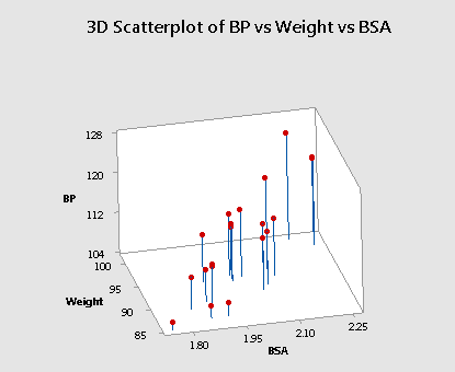
Do you see the difficulty in finding the best fitting plane in this situation? The primary characteristic of the data — because the predictors are so highly correlated — is that the predictor values tend to fall in a straight line. That is, there are no anchors in two of the four corners. Therefore, the base over which the response plane is drawn is not very solid.
Let's put it this way — would you rather sit on a chair with four legs or one with just two legs? If the responses (y) varied somewhat from sample to sample, the position of the plane could change significantly. That is, the estimated coefficients, b2 and b3, could change substantially. The standard errors of the estimated coefficients, se(b2) and se(b3), will then be necessarily larger. Here is an animated view of the problem that highly correlated predictors can cause with finding the best fitting plane.
Effect #3
When predictor variables are correlated, the marginal contribution of any one predictor variable in reducing the error sum of squares varies depending on which other variables are already in the model.
For example, regressing the response y = BP on the predictor x2 = Weight, we obtain SSR(x2) = 505.472. But, regressing the response y = BP on the two predictors x3 = BSA and x2 = Weight (in that order), we obtain SSR(x2|x3) = 88.43. The first model suggests that weight reduces the error sum of squares substantially (by 505.472), but the second model suggests that weight doesn't reduce the error sum of squares all that much (by 88.43) once a person's body surface area is taken into account.
This should make intuitive sense. In essence, weight appears to explain some of the variation in blood pressure. However, because weight and body surface area are highly correlated, most of the variation in blood pressure explained by weight could just have easily been explained by body surface area. Therefore, once you take into account a person's body surface area, there's not much variation left in the blood pressure for weight to explain.
Incidentally, we see a similar phenomenon when we enter the predictors into the model in the reverse order. That is, regressing the response y = BP on the predictor x3 = BSA, we obtain SSR(x3) = 419.858. But, regressing the response y = BP on the two predictors x2 = Weight and x3 = BSA (in that order), we obtain SSR(x3|x2) = 2.814. The first model suggests that body surface area reduces the error sum of squares substantially (by 419.858), and the second model suggests that body surface area doesn't reduce the error sum of squares all that much (by only 2.814) once a person's weight is taken into account.
Effect #4
When predictor variables are correlated, hypothesis tests for βk = 0 may yield different conclusions depending on which predictor variables are in the model. (This effect is a direct consequence of the three previous effects.)
To illustrate this effect, let's once again quickly proceed through the output of a series of regression analyses, focusing primarily on the outcome of the t-tests for testing H0 : βBSA = 0 and H0 : βWeight = 0.
The regression of the response y = BP on the predictor x3 = BSA:
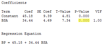
indicates that the P-value associated with the t-test for testing H0 : βBSA = 0 is 0.000... < 0.001. There is sufficient evidence at the 0.05 level to conclude that blood pressure is significantly related to body surface area.
The regression of the response y = BP on the predictor x2 = Weight:
indicates that the P-value associated with the t-test for testing H0 : βWeight = 0 is 0.000... < 0.001. There is sufficient evidence at the 0.05 level to conclude that blood pressure is significantly related to weight.
And, the regression of the response y = BP on the predictors x2 = Weight and x3 = BSA:
indicates that the P-value associated with the t-test for testing H0 : βWeight = 0 is 0.000... < 0.001. There is sufficient evidence at the 0.05 level to conclude that, after taking into account body surface area, blood pressure is significantly related to weight.
However, the regression also indicates that the P-value associated with the t-test for testing H0 : βBSA = 0 is 0.350. There is insufficient evidence at the 0.05 level to conclude that blood pressure is significantly related to body surface area after taking into account weight. This might sound contradictory to what we claimed earlier, namely that blood pressure is indeed significantly related to body surface area. Again, what is going on here is that, once you take into account a person's weight, body surface area doesn't explain much of the remaining variability in blood pressure readings.
Effect #5
High multicollinearity among predictor variables does not prevent good, precise predictions of the response within the scope of the model.
Well, okay, it's not an effect, and it's not bad news either! It is good news! If the primary purpose of your regression analysis is to estimate a mean response μY or to predict a new response y, you don't have to worry much about multicollinearity.
For example, suppose you are interested in predicting the blood pressure (y = BP) of an individual whose weight is 92 kg and whose body surface area is 2 square meters:
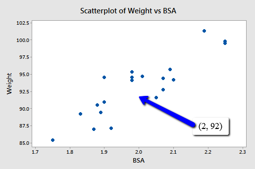
Because the point (2, 92) falls within the scope of the model, you'll still get good, reliable predictions of the response y, regardless of the correlation that exists among the two predictors BSA and Weight. Geometrically, what is happening here is that the best fitting plane through the responses may tilt from side to side from sample to sample (because of the correlation), but the center of the plane (in the scope of the model) won't change all that much.
The following output illustrates how the predictions don't change all that much from model to model:
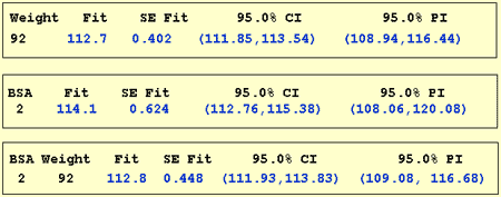
The first output yields a predicted blood pressure of 112.7 mm Hg for a person whose weight is 92 kg based on the regression of blood pressure on weight. The second output yields a predicted blood pressure of 114.1 mm Hg for a person whose body surface area is 2 square meters based on the regression of blood pressure on body surface area. And the last output yields a predicted blood pressure of 112.8 mm Hg for a person whose body surface area is 2 square meters and whose weight is 92 kg based on the regression of blood pressure on body surface area and weight. Reviewing the confidence intervals and prediction intervals, you can see that they too yield similar results regardless of the model.
The bottom line
Now, in short, what are the major effects that multicollinearity has on our use of a regression model to answer our research questions? In the presence of multicollinearity:
- It is okay to use an estimated regression model to predict y or estimate μY as long as you do so within the scope of the model.
- The usual interpretation of a slope coefficient is limited. The usual interpretation considers the change in the mean response for each additional unit increase in the predictor xk, when all the other predictors are held constant. However, if predictors are highly correlated, it no longer makes much sense to talk about holding the values of correlated predictors constant, since changing one predictor necessarily changes the values of the others.
Example - Poverty and Teen Birth Rate Data
(Data source: The U.S. Census Bureau and Mind On Statistics, (3rd edition), Utts and Heckard). In this example, the observations are the 50 states of the United States (poverty.txt - Note: remove data from the District of Columbia). The variables are y = percentage of each state’s population living in households with income below the federally defined poverty level in the year 2002, x1 = birth rate for females 15 to 17 years old in 2002, calculated as births per 1000 persons in the age group, and x2 = birth rate for females 18 to 19 years old in 2002, calculated as births per 1000 persons in the age group.
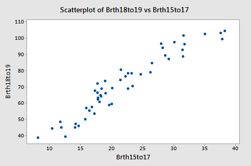
The two x-variables are highly correlated (so we have multicollinearity). The correlation is about 0.95. A plot of the two x-variables is given below.
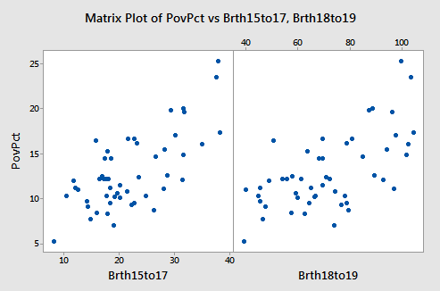
The figure below shows plots of y = poverty percentage versus each x-variable separately. Both x-variables are linear predictors of the poverty percentage.
Results for the two possible simple regressions and the multiple regression are given below.
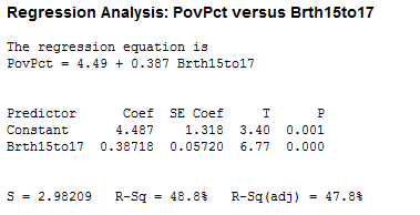
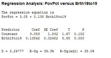
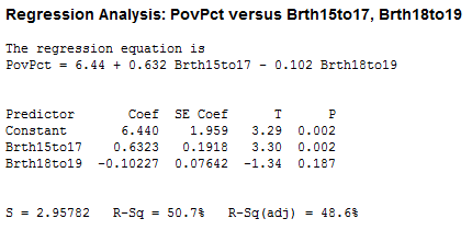
We note the following:
- The value of the sample coefficient that multiplies a particular x-variable is very different in the multiple regression as it is in the relevant simple regression.
- The R2 for the multiple regression is not even close to the sum of the R2 values for the simple regressions. An x-variable (either one) is not making an independent “add-on” in the multiple regression.
- The 18 to 19 year-old birth rate variable is significant in the simple regression, but not in the multiple regression. This discrepancy is caused by the correlation between the two x-variables. The 15 to 17 year-old birth rate is the stronger predictor out of the two x-variables, and given it’s presence in the equation, the 18 to 19 year-old rate does not improve R2 enough to be significant. More specifically, the correlation between the two x-variables has increased the standard errors of the coefficients, so we have less precise estimates of the individual slopes.