14.3 - Discriminant Analysis
Discriminant analysis is the oldest of the three classification methods. It was originally developed for multivariate normal distributed data. Actually, for linear discriminant analysis to be optimal, the data as a whole should not be normally distributed but within each class the data should be normally distributed. This means that if you could plot the data, each class would form an ellipsoid, but the means would differ.
The simplest type of discriminant analysis is called linear discriminant analysis or LDA. The LDA model is appropriate when the ellipsoids have the same orientation as shown below. A related method called quadratic discriminant analysis is appropriate when the ellipsoids have different orientations.
To understand how the method works, consider the 2 ellipses in Figure 1a, which have the same orientation and spread. Now consider drawing any line on the plot, and putting the centers of the ellipses on the line by drawing an orthogonal to the line (Figure 1b shows 2 examples). Now consider putting all the data on the line also by drawing an orthogonal from each data point to the line (Figure 1c). This is called the orthogonal projection.
For each ellipse, the projected data has a Normal distribution (Figure 1d) with mean the projected center and some variance. As we change the orientation of the lines, the mean and variance change. Note that only the orientation of the lines matters to the distance between the means and the 2 variances. For a given line, call the two means \(\mu_1\) and \(\mu_2\) and the two variances \(\sigma^2_1\) and \(\sigma^2_2\). Then similar to the two-sample t-test, we consider the difference between the means measured in SDs is
\[\frac{\mu_1- \mu_2}{\sqrt{\sigma^2_1+\sigma^2_2}}\]
Now consider a point M on the line which minimizes \((\mu_1-M)^2/\sigma_1^2 + (\mu_2-M)^2/\sigma_2^2\). When the variances are the same, M is just the midpoint between the two means. The orthogonal line going through M is called a separating line. (Figure 1e) (When there are more than two dimensions it is called a separating hyperplane.) The best separating line (hyperplane) is the line going through M that is orthogonal to the projection minimizing the difference in means. Data points are classified according to which side of the hyperplane they lie on or alternatively, to the class whose projected mean is closest to the projected point.
When the two data ellipses have the same orientation but different sizes (Figure 1f) M moves closer to the mean of the class with the smaller variance. Otherwise the computation is the same.
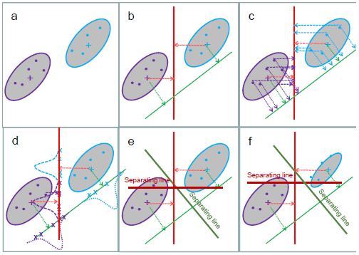
Figure 1: Linear discriminant analysis
It turns out that this method maximizes the ratio of the within group variance among the points to the between group variance of the means. Unlike recursive partitioning, there is both a concept of separating the groups AND of maximizing the distance between them.
To account for the orientation and differences in spread, a weighted distance called Mahalanobis distance is usually used with LDA, because it provides a more justifiable idea of distance in terms of SD along the line joining the point to the mean. We expect data from the cluster to be closer to the center if it is in one of the "thin" directions than if it is in one of the "fat" directions. One effect of using Mahalanobis distance is to move the split point between the means closer to the less variable class as we have already seen in Figure 1f.
It is not important to know the exact equation for Mahalanobis distance, but for those who are interested, if two data points are designed by x and y (and each is a vector) and if S is a symmetric positive definite matrix:
Euclidean Distance between x and y is \(\sqrt{(x-y)^\top(x-y)}\).
The S-weighted distance between x and y is \(\sqrt{(x-y)^\top S^{-1}(x-y)}\).
The Mahalanobis distance between x and the center ci of class i is the S-weighted distance where S is the estimated variance-covariance matrix of the class.
When there are more than 2 classes and the ellipses are oriented in the same direction, the separating hyperplanes are eigenvectors of the ratio of the between and within variance matrices. These are not readily visualized on the scatterplot (and in any case, with multiple features it is not clear which scatterplot should be used) so instead the data are often plotted by their projections onto the eigenvectors. This produces the directions in which the ratio of between class to within class variance is maximized, so we should be able to see the clusters on the plot as shown in the example. Basically, the plot is a rotation to new axes in the directions of greatest spread.
If the classes are elliptical but have a different orientation, the minimizer of the ratio of within to between class differences turns out to describe a quadratic surface rather than a linear surface. The method is called quadratic discriminant analysis or QDA.
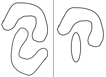
LDA and QDA often do a good job of classification even if the classes are not elliptical but neither can do a good job if the classes are not convex. (See the sketch below). A newer method called kernel discriminant analysis (KDA) uses an even more general weighting scheme than S-weights, and can follow very curved boundaries. The ideas behind KDA are the same as the ideas behind the kernel support vector machine and will be illustrated in the next section.
With "omics" data, we have a huge multiplicity problem. When you have more features or variables than the number of samples we can get perfect separation even if the data are just noise! The solution is to firstly select a small set of features based on other criteria such as differential expression. As with recursive partitioning, we use a training sample and validation sample and/or cross validation to mimic how well the classifier will work with new samples.
Bone Marrow Data
Let's see how linear discriminant analysis works for our bone marrow data. Recall that the scatterplot matrix of the five most differentially expressed genes indicate that we should be able to do well in classifying the Normal samples, and reasonably well in classifying the "G" samples, but distinguishing between "M" and "S" might be difficult.
Let's start by looking at the two genes we selected for recursive partitioning. We have already seen the plot of the two genes, which is repeated below.
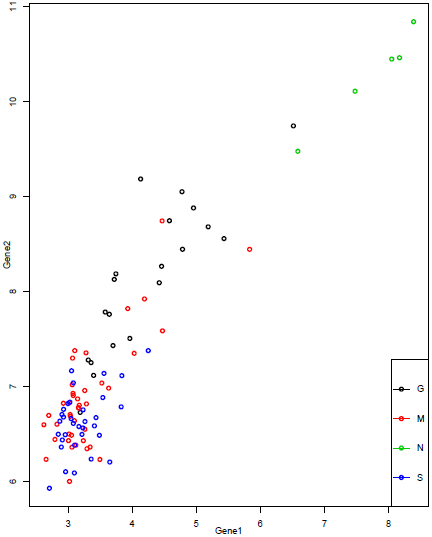
We can see that we might be able to draw a line separating the "N" samples from most of the others, and another separating the "G" samples from most of the others, but the "M" and "S" samples are not clearly separated. Since we are using only 2 features, we have only 2 discriminant functions. Projecting each sample onto the two directions and then plotting gives the plot below.
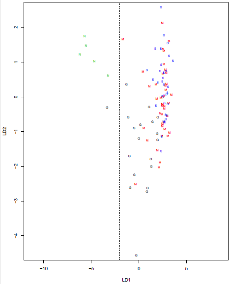
We can see that direction LD1 does a good job of separating out the "N" and "G" groups, with the former having values less than -2 and the latter having values between -2 and 2. The utility of direction LD2 is less clear, but it might help us distinguish between "G" and "M". Direction LD1 is essentially the trend line on the scatterplot.
Using the 10 most differentially expressed genes allows us to find 3 discriminant functions. Plotting them pairwise gives the plot below:
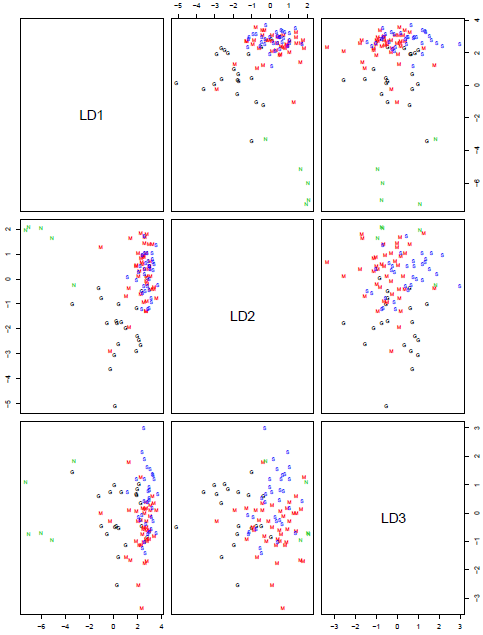
Note that LD1 on this plot is not the same as on the previous plot, as it is sitting in a 10-dimensional space instead of a 2-dimensional space. However, by concentrating on the first column of the scatterplot matrix (LD1 is the x-axis for both plots) we can see that it is a very similar direction. Samples with LD1<-2 are mainly "N" and between -2 and 2 are mainly "G". Directions LD2 and LD3 are disentangling the "G", "M" and "S" samples, but not well.
We saw from the scatterplot matrix of the features, that at least the first 5 features have a very similar pattern across the samples. We might do better in classification if we could find genes that are differentially expressed, but have different patterns than these. There are a number of ways to do this. One method is variable selection - start with a larger set of genes and then sequentially add genes that do a good job of classification. However, when selecting variables we are very likely to overfit so methods like the bootstrap and cross-validation must be used to provide less biased estimates of the quality of the classifier.