2.3 - Exploratory Graphical Analysis
Once we have our data in an acceptable format, we usually do some exploratory data analysis. This usually includes summary statistics and graphics that help us understand the data. This stage also includes quality control. I typically spend at least as much time on this stage of the analysis as on the actual inferential stage to ensure that I have high quality data going in. The GIGO principle "Garbage In, Garbage Out" applies even more to "omics" than to low throughput data analysis, because we seldom do detailed checks of the data on a feature by feature basis when we have thousands of features.
Histograms
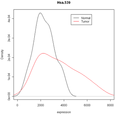
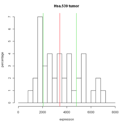
The simplest graphic is probably a histogram. What you see below is expression from one of the genes, looking specifically at the tumor and normal samples. On the left is a typical histogram with bins selected by R. There is a lot of variability from bin to bin, and the appearance of the histogram could change considerably if the bin boundaries or number of bins is changed. On the right is a smoothed version of the histogram called a density plot. It has less detail, but gives a picture of the data that is easier to interpret and to compare against other histograms.
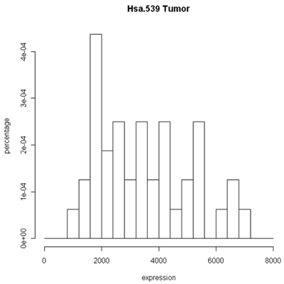
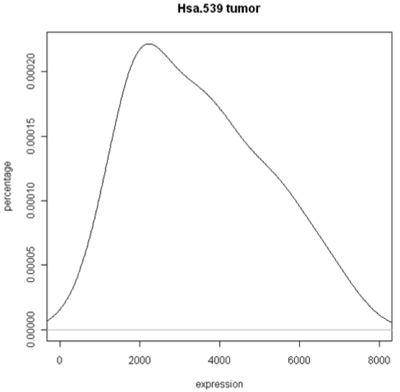
Histogram and density plots of tumor tissue
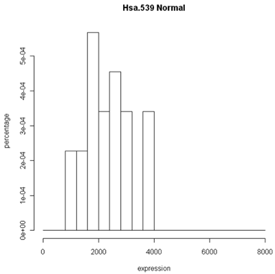
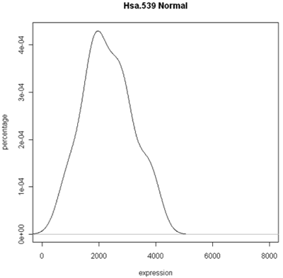
Histogram and density plots of normal tissue
One thing to look at is the scaling of the plot. As you can see, the normals are not a spread out as the tumors which might mean that there are fewer of them or have something to do with tumor biology, or this particular gene. Here I forced the tumor and normal tissues to have the same x-axis, which made the difference in spread quite obvious. By default, graphics software picks scaling to fill the plot, which can obscure features you want to compare or blow up tiny differences that likely have no biological meaning. The default settings of the graphics often produce nice plots, but for interpretation you might need to select your own settings.
Combined density plots
Above I've used a combined plot that make it very clear that the tumor samples were more spread out.
Boxplots
Unfortunately, these are plots for just one gene and in this data set we have 2000 of these! A modern high-throuput assay may have hundreds of thousands of features. So, it is unlikely that I'm going to take a look at each one of these plots. A simplified version called the box plot makes it easier to visualize many features at the same time or compare multiple samples. Boxplots require at least 5 samples.
A boxplot [1] takes the ordered data and computes the median (50th quantile, the red line) and the quantiles at the 25th and 75th quantiles, (green lines). This is the "box". The length of the edge joining the 25th and 75th quantiles is called the InterQuartile Range or IQR. The "whiskers" extend 1.5 IQRs from each end of the box, but are truncated at the outermost data value lying within the 1.5 IQRs.
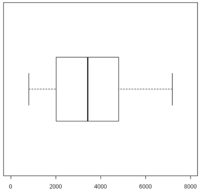
For this particular example the box is very symmetric around the median but this is not usually the case as you can see below. The lines outside of the box are called the 'whiskers'. The whiskers go out to the furthest data point that is within 1.5 interquartile range. Anything outside of that is plotted as a little circle. This is a device to help identify unusual "outliers".
These types of plots are very nice for comparisons (below). In this case,you can see very quickly that the normals are less spread out and they also have a lower median expression. Boxplots are often used when there are many samples to be compared. They can be enhanced by plotting other summary statistics such as the sample mean and a confidence interval for the mean.
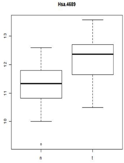
When you want to compare many samples at the same time it's much easier to use a box plot to do this comparison than to use superimposed histograms.
Scatterplot Matrices
Another useful quality control graphic is a scatterplot matrix, which plots each sample against each other sample. For our example, we look at all 2000 gene expressions (on the log2 scale) for each sample. There are 2000 data points in each of these scatterplots. Here we show the first 4 samples, which are the normal and tumor samples for 2 patients. In the R implementation, it is feasible to visualize up to 8 samples simultaneously - after that the plots become too small to see the interesting details.
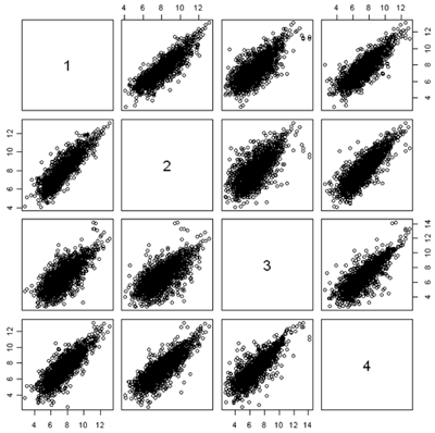
In this figure, the plots are arranged in matrix form, with sample i on the Y axis and sample j on the X axis. So, plot i,j and plot j,i are the same plot with the axes swapped. For gene expression, we expect to see a strong diagonal trend in these plots. We can also see that the two samples from the same patient (1,2) and (3,4) are less spread out around the trend line than samples from different patients. We can also see that the two tumor samples (1,3) are more spread out around the trend than the two normal samples (2,4). The spread around this trend line represents differences in expression - we might have expected that the tumor samples were more variable than the normal samples, but not that the normal and tumor samples from the same patient are less variable.
Scatterplots are good for quality control because even when the arrays or other expressions come from different tissues, or different conditions, or different organisms, you often get a lot of data along the 45° line. If you don't, something is wrong.
Because of the numbers of features in a nucleotide sample, it's very hard to see some things on these plots because there's a lot of over plotting. Another option is to replace the individual data points by a grayscale or color code that represents the density of points in a small region. (You can think of this as a contour map, where the elevations are the heights of the frequency histogram. In R, this is done using a plot called a hexbin plot which uses a grayscale by density. In the plot below, you can clearly see that most of the data lie along the diagonal, although there is a lot of spread. These samples come from an apple microarray with about 60,000 features, so on a regular scatterplot very little detail is available.
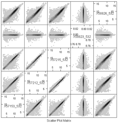
Before describing what I see in this plot, I will note a minor annoyance in the implementation. The scatterplot matrices lay out the plots in matrix order so that the top left is (1,1) and the bottom right is (m,m) where m is the number of samples. The hexbin matrices lay out the plots in x-y order, so that the bottom left is (1,1,) and the top right is (m,m). So, in the plot above, array 4 is shown in the fourth column but in the second row.
The most important feature that can be seen in the hexbin matrix is that array 4 does not display a diagonal pattern. In fact, if you can see the scale (which is printed in the diagonal squares) you can see that while the other arrays have data in the range 5 - 15, this array has data in a very tight range around 8.7. This array was a dud and had to be redone. This is immediately obvious in the plot (even without looking at the scale) because of the lack of a diagonal pattern.
Another important feature that is evident in the plot is that arrays 2 and 3 are much more similar than the other arrays. This might be expected or surprising, depending on the study design. For example, it might be expected if these were two samples from the same tree, but unexpected if they were samples from different varieties of apple. Note however that even for the other pairs which have much more scatter around the diagonal, the predominant pattern is along the y=x line.
A Plot is Worth 50,000 p-values!
Investigators are far too eager to do statistical testing and compute p-values without examining the data. You need to look at the data table and plot everything that you can, including the p-values.
Taking logarithms usually improves expression data
Statisticians often take the logarithm of expression data if the data are positive and there are no zeros. One very good reason for doing this is that if this data are skewed toward zero then you get something much less skewed on a log scale. This is preferable for both visualization and statistical analysis.
For example, consider the data below. On a scatterplot, most of the values will be close to zero (creating a blob near the origin) and only a few large values will show up well on the plot. The data are more evenly spread on the log scale.
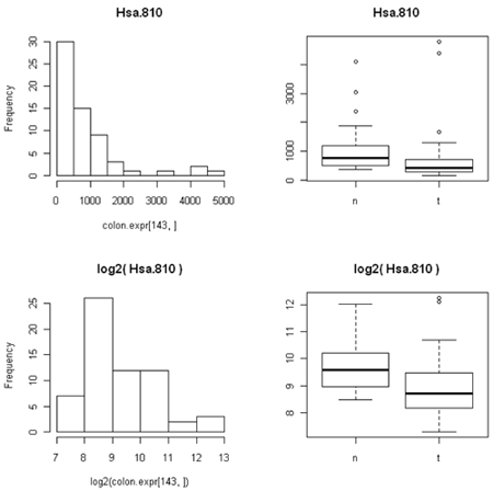
The other thing that's not so obvious but often occurs, is that the spread of the data between two different conditions (e.g. normal versusu tumor) is often closer to constant on the log scale than on the expression scale. This is because the variation is often proportional to the amount of expression, so that the conditions with lower expression are also less variable. (We saw this in the first histogram, where the normal samples have lower expression for this particular gene and the expression is less spread out than in the tumor samples.)
Many comparative statistical methods are most accurate when the data are Normally distributed (bell-shaped histogram) and the variance is the same under all the conditions being compared. Taking logarithms takes gene expression data closer to both of these ideal conditions and so is routinely done.
Incidentally, it does not matter whether you use natural logarithms, log10 or log2, as the results are just constant multiples of one another. For some reason biologists like to use log2, which is a common in gene and protein expression.
You often might hear biologists are other scientists talk about 'fold' differences between expression under two conditions. To a statistician or computer scientist this is just the ratio of the two expression values. Log(x/y)=log(x)-log(y) so taking logarithms also changes ratios to differences, which is also convenient. There are many statistical methods that are suitable for differences between measurements but many fewer for ratios.
"2 fold" differences seem to be a benchmark for biological importance in comparing expression values. Using log2, a two-fold difference is just log(x)-log(y)=+/- 1.
Although taking logarithms usually improves expression data, it does have one big problem - you cannot take log(0). This is particularly problematic with count data, as some features will not be observed and so will have count 0. One technique would be to add a very small number in its place. Which small number you use depends on the kind of data, because you want the small number to be between zero and the smallest nonzero or real number in the data. There's no rule of thumb here that would be good for every example. For count data, we typically add 0.5 or 0.25 to all of our counts before taking log2. However, this would be a poor idea if our data were (for example) counts per million, since we might have values which are much smaller than 0.25. Typically, I search for the smallest non-zero value in the data, and then add 1/4 of this value to ALL the values before taking logarithms.
References
[1] Krzywinski, M., & Altman, N. (2014). Points of significance: Visualizing samples with box plots. Nature Methods, 11(2), 119–120, doi:10.1038/nmeth.2813