2.4 - Numerical Summaries
It is good to have plots of the data, but it is also important to have numerical summaries. The two main types of summary that we use are summaries of the center of the distribution and of spread. We distinguish between the population summary, which would could compute in theory if we could measure every possible sample from the population, and the sample summary, which is what we can compute from the observed data.
Location (Center)

To measure the center statisticians often use the mean. The sample version is also called the average and is denoted by putting a bar above the notation. For example, if we denote our measurement by Y, then
sample mean = average = \(\bar{Y}\)
The median is the point at which 50% are less and 50% or higher.
Median = 50th quantile
The mode is the highest point in the histogram - this might depend on the bins that you used in the histogram. Finally, the geometric mean comes from taking the mean on the log scale and then converting back to the original scale.
Geometric mean = anti-log(mean(log(data)))
Since we often use the log-scale for expression data, if we convert an average back to "natural" expression units we will be using the geometric mean.
Scale (Spread)
The most commonly used measure of spread is the variance which is based on the squared difference between each observation and the mean. The difference is squared so that the positive and negative values the won't cancel out. When computing the population variance, we take the mean of these squared differences. For a sample of size n, we divide the sum of squared differences by n-1, which is a bit closer to the population variance than the average squared differences.
\[S_{Y}^{2}=\frac{\sum(Y_i-\bar{Y})^2}{n-1}\]
You can think of variance is an average squared deviation from the mean, so its units are the square of the units of the data. To bring things to the same scale, we take the square root of the variance which is called the standard deviation or SD.
\[S_Y=\sqrt{S_{Y}^{2}}\]
The SD measures how spread the histogram is from the mean. However, when the data are highly skewed, or there are a small number of data values very far from the mean, it might be misleading. One or two unusual data values can vastly inflate the SD.
The interquartile range (IQR) is the length of the box in a boxplot - i.e. the length of the interval containing the central 50% of the data. Statisticians tend to like it for descriptive purposes because it is less sensitive than the SD when there are a few outliers. It still does well with Bell shaped histograms. IQR is often used as a descriptive method, but the standard statistical inference methods use the SD.
Sampling Distributions
Population summaries are fixed numbers because they are based on the entire population. However, sample summaries depend on which sample is selected and vary from sample to sample. The sampling distribution of a summary (for a fixed sample size) is the population of values of that summary based on all possible samples. A central idea in classical (frequentist) statistics is that the observed sample is only one of the possible samples and should be evaluated using a thought experiment about the other values in the sampling distribution. We will talk more about thought experiments when we discuss statistical testing.
For example, suppose the population is Penn State undergraduates enrolled on a particular date and we are measuring height in inches. To obtain the population mean and SD, we need to take the height of all the undergraduates and compute the mean and SD.
Now consider a sample of size 10 from this population. There are about 100,000 undergraduates enrolled at Penn State (counting all campuses) at any given time, so there are a lot of samples of size 10 that could be measured. Each of those samples has a sample mean and a sample SD. The set of all the sample means is the sampling distribution of the sample mean. The set of all the sample SDs is the sampling distribution of the sample SD. Any summary based on the samples has a sampling distribution - e.g. the sampling distribution of the sample medians, the sampling distribution of the sample IQRs.
The sampling distributions also have means and SDs. The SD of a sampling distribution is called the standard error (SE) - for example, we can talk about the standard error of the sample mean or the standard error of the sample SD. The sampling distribution that is most often used in statistical analysis is the sampling distribution of the sample mean. Often SE is used as a short form for "SE of the sample mean" or even for "estimated SE of the sample mean".
The sampling distribution of the sample mean has two remarkable properties that are true no matter what the underlying population looks like: the mean of the sampling distribution is the mean of the underlying population and the SE of the sample mean is the population SD divided by \(\sqrt{n}\). Using \(Var(Y)\) to mean the population variance of Y, we can write this as \[Var(\bar{Y})=Var(Y)/n\].
The sampling distribution of the sample mean also has another remarkable property, called the Central Limit Theorem. For large enough sample sizes, the sampling distribution of the sample mean is approximately Normal as long as the population variance is finite. "Large enough" depends on the distribution of the underlying population. If the underlying population is normal, "large enough" is n=1. If the underlying distribution is highly skewed, a sample size of n=1000 might be necessary. If the underlying distribution is fairly uniform on a fixed interval, n=5 might be sufficient.
The sampling distribution of the sample variance also has a remarkable property (which also explains why we divide by n-1 instead of n). The mean of the sampling distribution of the sample variance is the variance of the underlying population regardless of the shape of the underlying population.
Unfortunately, these nice properties do not necessarily apply to other sample summaries. For example, the mean of the sampling population of the sample SD tends to be a bit smaller than the SD of the underlying population.
Correlation
Another frequently used summary is correlation [1], which measures how two features vary together. In common English, correlation is often used to mean that features are associated or causally related. In statistics, however, correlation refers to a very specific type of relationship and is completely devoid of any suggestion of causality. Specifically, in statistics, we say that X is correlated with Y if there is a non-zero linear trend in the scatterplot of Y versus X.
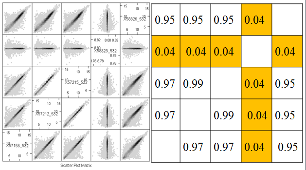
The correlation coefficient is a numerical summary between -1 and 1. If the correlation is -1, then the scatterplot shows a perfectly linear trend with negative slope and no deviations from the line. If the correlation is 1, then the scatterplot shows a perfectly linear trend with positive slope. The correlation is 0 if one of X and Y is constant (so that the line is perfectly horizontal or vertical) or if there is spread but the trend line is perfectly horizontal or vertical. We can see correlation very close to zero between microarray 4 and the other arrays and positive correlation between the other pairs of microarrays.
Correlations that are between -1 and 1 (but are not zero) imply that there is a trend line, but that there is scatter around the line. The more scatter, the closer the correlation is to 0.

Correlation is only meant to measure linear trend. The four plots below (called the Anscombe quartet, after British statistician Francis Anscombe who devised them to show the importance of plotting data before analysis) all have the same correlation of 0.8.
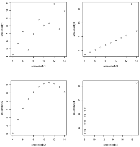
The plot in the upper right would have a perfect correlation of +1 if it weren't for the outlier way up with the top. For the plot the lower left correlation is not a bad summary but there seems to be a perfect relationship between X and Y, it just happens to be quadratic rather than linear linear. (If the plot continued symmetrically to form a parabolic arch, the correlation would be zero, even though Y is perfectly associated with X.) In the lower right there happens to be no correlation between X and and most of theY's, but there is is one weird point in the upper right. We probably would not want to say that X and Y are correlated - instead we would likely want to determine whether the outlying point has some unusual properties.
Gene expression samples are often highly correlated, because the majority of genes have characteristic expression levels that do not vary much from sample to sample. Going back to the hexbin plots, take a look at two graphs that have a correlation of 0.99. They seem to be much more tight than the other plots. However, all of the "good" samples have very high correlation, even though there is a lot of spread. This is because most of the data are very close to the line.
These graphs are all on the log scale. Correlation is invariant to (linear) changes of units such as degrees changing between British and metric units. However, the correlation between X and Y is not the same as the correlation between log(X) and log(Y).
Like the other summaries, there is a population correlation (between all the (X,Y) pairs) and a sample correlation (for the observed (X,Y) pairs). The sample correlation has a sampling distribution based on all the samples that could be selected.
Additive Property of Variances
Suppose we are measuring two quantitative features (X and Y) of each item in our sample and that it makes sense to take the sum or difference of these items. An interesting statistical fact is that
\[Var(X+Y)=Var(X)+Var(Y)+2 SD(X)SD(Y)Corr(X,Y)\]
and
\[Var(X-Y)=Var(X)+Var(Y)-2 SD(X)SD(Y)Corr(X,Y)\].
If Corr(X,Y)=0 then we get the interesting fact that
\[Var(X+Y)=Var(X-Y)=Var(X)+Var(Y)\]
This also extends to the variance of sampling distributions. Suppose we are interested in the sampling distribution of \(\bar{X}-\bar{Y}\). If the samples are independent then:
\[Var(\bar{X}-\bar{Y})=Var(\bar{X})+Var(\bar{Y})\].
This has big consequences if we want to compare gene expression in normal versus tumor samples. If the tissue samples come from different individuals, we would expect expression of the gene to be independent from sample to sample. However, if tissue samples come from the same individual, we might expect expression to be correlated.
The statistical analysis of correlated data differs from the analysis of independent data. So, for example, technical replicates are correlated because they come from the same biological sample. For this reason they are also called pseudo-replicates. Samples can also be correlated due to coming from the same biological replicate, even if the tissue sample was taken independently (e.g. leaf and flower from the same plant) or at different times (e.g. leaf sampled at midnight versus noon). Other sources of correlation that are important biologically are familial correlations and correlations induced by the experimental design, such as mice housed together in a single cage. In designing and analyzing any experiment, but especially high throughput experiments, it is important to keep track of the experimental protocol and use methods that account for correlation if it expected from the protocol.
We also expect gene expression to be correlated, because genes interact along pathways. Genes in the same pathway may be positively correlated if they tend to express together or negatively correlated if up-regulating one down-regulates the other. This correlation is less important to many of our analyses because often our analyses are for each feature.
References
[1] Altman, N. & Krzywinski, M. (2015). Points of Significance: Association, correlation and causation. Nature Methods, 12(10), 899-900. doi:10.1038/nmeth.3587