These are \(2^k\) factorial designs with one observation at each corner of the "cube". An unreplicated \(2^k\) factorial design is also sometimes called a "single replicate" of the \(2^k\) experiment.
You would find these types of designs used where k is very large or the process, for instance, is very expensive or takes a long time to run. In these cases, for the purpose of saving time or money, we want to run a screening experiment with as few observations as possible. When we introduced this topic we wouldn't have dreamed of running an experiment with only one observation. As a matter of fact, the general rule of thumb is that you would have at least two replicates. This would be a minimum in order to get an estimate of variation - but when we are in a tight situation, we might not be able to afford this due to time or expense. We will look at an example with one observation per cell, no replications, and what we can do in this case.
Where are we going with this? We have first discussed factorial designs with replications, then factorial designs with one replication, now factorial designs with one observation per cell and no replications, which will lead us eventually to fractional factorial designs. This is where we are headed, a steady progression to designs with more and more factors, but fewer observations and less direct replication.
Unreplicated \(2^k\) Factorial Designs Section
Let's look at the situation where we have one observation per cell. We need to think about where the variation occurs within this design. These designs are very widely used. However, there are risks…if there is only one observation at each corner, there is a high chance of an unusual response observation spoiling the results. What about an outlier? There would be no way to check if this was the case and thus it could distort the results fairly significantly. You have to remind yourself that these are not the definitive experiments but simply just screening experiments to determine which factors are important.
In these experiments one really cannot model the "noise" or variability very well. These experiments cannot really test whether or not the assumptions are being met - again this is another shortcoming, or the price of the efficiency of these experiment designs.
Spacing of Factor Levels in the Unreplicated \(2^k\) Factorial Designs Section
When choosing the levels of your factors, we only have two options - low and high. You can pick your two levels low and high close together or you can pick them far apart. As most of you know from regression the further apart your two points are the less variance there is in the estimate of the slope. The variance of the slope of a regression line is inversely related the distance between the extreme points. You can reduce this variance by choosing your high and low levels far apart.
However, consider the case where the true underlying relationship is curved, i.e., more like this:
... and you picked your low and high level as illustrated above, then you would have missed capturing the true relationship. Your conclusion would probably be that there is no effect of that factor. You need to have some understanding of what your factor is to make a good judgment about where the levels should be. In the end, you want to make sure that you choose levels in the region of that factor where you are actually interested and are somewhat aware of a functional relationship between the factor and the response. This is a matter of knowing something about the context for your experiment.
How do we analyze our experiment when we have this type of situation? We must realize that the lack of replication causes potential problems in statistical testing:
- Replication provides an estimate of "pure error" (a better phrase is an internal estimate of error), and
- With no replication, fitting the full model results in zero degrees of freedom for error.
Potential solutions to this problem might be:
- Pooling high-order interactions to estimate error, (something we have done already in randomized block design),
- Normal probability plotting of effects (Cuthbert and Daniels, 1959), and/or
- Dropping entire factors from the model and other methods.
Example of an Unreplicated \(2^k\) Design Section
The following \(2^4\) factorial (Example 6-2 in the text) was used to investigate the effects of four factors on the filtration rate of a resin for a chemical process plant. The factors are A = temperature, B = pressure, C = mole ratio (concentration of chemical formaldehyde), D = stirring rate. This experiment was performed in a pilot plant.
Here is the dataset for this Resin Plant experiment. You will notice that all of these factors are quantitative.
| Run Number | Factor | Run Label | Filtration Rate (gal/h) | |||
|---|---|---|---|---|---|---|
| A | B | C | D | |||
| 1 | - | - | - | - | (1) | 45 |
| 2 | + | - | - | - | a | 71 |
| 3 | - | + | - | - | b | 48 |
| 4 | + | + | - | - | ab | 65 |
| 5 | - | - | + | - | c | 68 |
| 6 | + | - | + | - | ac | 60 |
| 7 | - | + | + | - | bc | 80 |
| 8 | + | + | + | - | abc | 65 |
| 9 | - | - | - | + | d | 43 |
| 10 | + | - | - | + | ad | 100 |
| 11 | - | + | - | + | bd | 45 |
| 12 | + | + | - | + | abd | 104 |
| 13 | - | - | + | + | cd | 75 |
| 14 | + | - | + | + | acd | 86 |
| 15 | - | + | + | + | bcd | 70 |
| 16 | + | + | + | + | abcd | 96 |
| Table 6-10 Pilot Plant Filtration Rate Experiment | ||||||
Notice also the use of the Yates notation here that labels the treatment combinations where the high level for each factor is involved. If only A is high then that combination is labeled with the small letter a. In total, there are 16 combinations represented.
Here is a visual representation of this - it would be impossible to show this in a 4-dimensional cube but here are two cubes which attempt to do the same thing.
...
Sequential Procedure for Strategically Finding a Model Section
Let's use the dataset (Ex6-2.csv) and work at finding a model for this data with Minitab...
Even with just one observation per cell, by carefully looking at the results we can come to some understanding as to which factors are important. We do have to take into account that these actual p-values are not something that you would consider very reliable because you are fitting this sequence of models, i.e., fishing for the best model. We have optimized with several decisions that invalidates the actual p-value of the true probability that this could have occurred by chance.
This is one approach to assume that some interactions are not important and use this to test lower order terms of the model and finally come up with a model that is more focused. Based on this for this example that we have just looked at, we can conclude that following factors are important, A, C, D, (of the main effects) and AC and AD of the two-way interactions.
Now I suggest you try this procedure and then go back and check to see what the final model looks like. Here is what we get when we drop factor B and all the interactions that we decided were not important:
Factorial Fit: Rate versus A, C, D
Estimated Effects and Coefficients for Rate (coded units)
| Term | Effect | Coef | SE Coef | T | P |
|---|---|---|---|---|---|
| Constant | 70.063 | 1.104 | 63.44 | 0.000 | |
| A | 21.625 | 10.812 | 1.104 | 9.79 | 0.000 |
| C | 9.875 | 4.938 | 1.104 | 4.47 | 0.001 |
| D | 14.625 | 7.312 | 1.104 | 6.62 | 0.000 |
| A*C | -18.125 | -9.062 | 1.104 | -8.21 | 0.000 |
| A*D | 16.625 | 8.313 | 1.104 | 7.53 | 0.000 |
| S = 4.41730 R-Sq = 96.60% R-Sq(adj) = 94.89% | |||||
Analysis of Variance for Rate (coded units)
| Source | DF | Seq SS | Adj SS | Adj MS | F | P |
|---|---|---|---|---|---|---|
| Main Effects | 3 | 3116.19 | 3116.19 | 1038.73 | 53.23 | 0.000 |
| 2-Way Interactions | 2 | 2419.62 | 2419.62 | 1209.81 | 62.00 | 0.000 |
| Residual Error | 10 | 195.12 | 195.12 | 19.51 | ||
| Lack of Fit | 2 | 15.62 | 15.62 | 7.81 | 0.35 | 0.716 |
| Pure Error | 8 | 179.50 | 179.50 | 22.44 | ||
| Total | 15 | 5730.94 | ||||
The important factors didn't change much here. However, we have slightly higher degrees of freedom for error. But now what the design looks like, by having dropped B totally, is that we now have a \(2^3\) design with 2 replicates per cell. We have moved from a four-factor with one observation per cell, to a three-factor with two observations per cell.
So, we have looked at two strategies here. The first is to take a higher order interaction out of the model and use them as the estimate of error. Next, what we did at the end of the process is drop that factor entirely. If a particular factor in the screening experiment turns out to be not important either as a main effect or as part of any interaction we can remove it. This is the second strategy, and for instance in this example we took out factor B completely from the analysis.
Graphical Approaches to Finding a Model Section
Let's look at some more procedures - this time graphical approaches for us to look at our data in order to find the best model. This technique is really cool. Get a cup of coffee and click:
Normal Probability Plot for the Effects Section
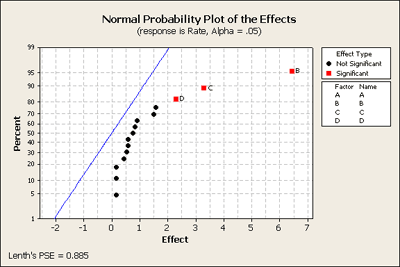
Having included all the terms back into a full model we have shown how to produce a normal plot. Remember that all of these effects are 1 degree of freedom contrasts of the original data, each one of these is a linear combination of the original observations, which are normally distributed with constant variance. Then these 15 linear combinations or contrasts are also normally distributed with some variance. If we assume that none of these effects are significant, the null hypothesis for all of the terms in the model, then we simply have 15 normal random variables, and we will do a normal random variable plot for these. That is what we will ask Minitab to plot for us. We get a normal probability plot, not of the residuals, not of the original observations but of the effects. We have plotted these effects against what we would expect if they were normally distributed.
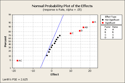
In the middle - the points in black, they are pretty much in a straight line - they are following a normal distribution. In other words, their expectation or percentile is proportionate to the size of the effect. The ones in red are like outliers and stand away from the ones in the middle and indicate that they are not just random noise but there must be an actual affect. Without making any assumptions about any of these terms this plot is an overall test of the hypothesis based on simply assuming all of the effects are normal. This is a very helpful - a good quick and dirty first screen - or assessment of what is going on in the data, and this corresponds exactly with what we found in our earlier screening procedures.
The Pareto Plot Section
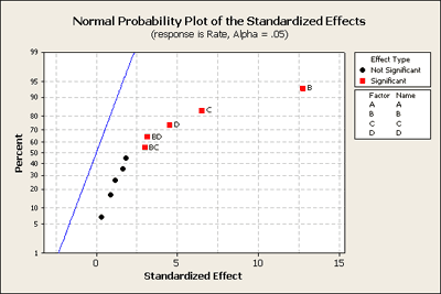
Let's look at another plot - the Pareto plot. This is simply a plot that can quickly show you what is important. It looks at the size of the effects and plots the effect size on a horizontal axis ranked from largest to smallest effect.

Having dropped some of the terms out of the model, for instance the three and four way interactions, Minitab plots the remaining effects, but now it is the standardized effect. Basically it is plotting the t-value, the effect over its standard deviation and then plotting it in ranked order. It also displays the t critical point as a red line at alpha = 0.05.
Effects and Interaction Plots Section
Another Minitab command that we can take a look at is the subcommand called Factorial Plots. Here we can create plots for main effects telling Minitab which factors you want to plot. As well you can plot two-way interactions. Here is a plot of the interactions (which are more interesting to interpret), for the example we've been looking at:
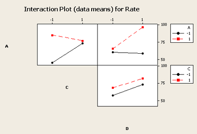
You can see that the C and D interaction plot the lines are almost parallel and therefore do not indicate interaction effects that are significant. However the other two combinations, A and C and A and D, indicate that significant interaction exists. If you just looked at the main effects plot you would likely miss the interactions that are obvious here.
Checking Residuals Using Minitab's Four in One Plot Section
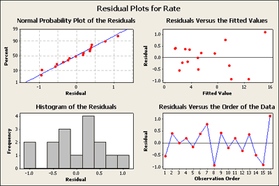
We have reduced the model to include only those terms that we found were important. Now we want to check the residuals in order to make sure that our assumptions are not out of line with any conclusions that we are making. We can ask Minitab to produce a Four in One residuals plot which, for this example, looks like this:
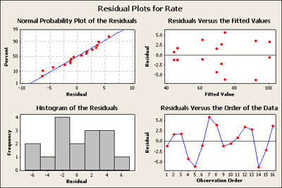
In visually checking the residuals we can see that we have nothing to complain about. There does not seem to be any great deviation in the normal probability plot of the residuals. There's nothing here that is very alarming and it seems acceptable. In looking at the residuals versus the fitted values plot in the upper right of this four in one plot - except for the lower values on the left where there are smaller residuals and you might be somewhat concerned here, the rest do not set off any alarms - but we will come back to this later.
Contour and Surface Plots Section
We may also want contour plots of all pairs of our numeric factors. These can be very helpful to understand and present the relationship between several factors on the response. The contour plots below for our example show the color coded average response over the region of interest. The effect of these changes in colors is to show the twist in the plane.
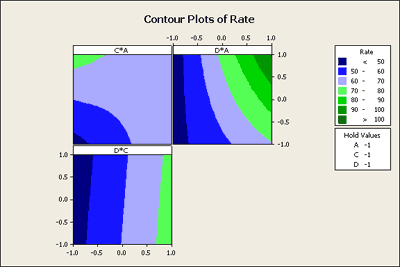
In the D*C plot area you can see that there is no curvature in the colored areas, hence no evidence of interaction. However, if you look at C*A display you can see that if C is low you get a dramatic change. If C is high it makes very little difference. In other words, the response due to A depends on the level of C. This is what the interaction means and it shows up nicely in this contour plot.
Finally, we can also ask Minitab to give us a surface plot. We will set this up the same way in Minitab and this time Minitab will show the plot in three dimensions, two variables at a time.
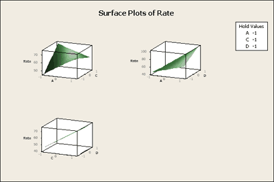
The surface plot shows us the same interaction effect in three dimensions in the twisted plane. This might be a bit easier to interpret. In addition you can ask Minitab to provide you with 3-D graphical tools that will allow you to grab these boxes and twist them around so that you can look at these boxes in space from different perspectives. Pretty cool! Give it a try. These procedures are all 'illustrated in the "Inspect" Flash movie at the beginning of this section.
Another Example - The Drilling Example 6.3 Section
This is another fairly similar example to the one we just looked at. This drilling example (Example 6-3) is a \(2^4\) design - again, the same design that we looked at before. It is originally from C. Daniel, 1976. It has four factors, A = Drill load, B = Flow of a lubricant, C = Speed of drill, D = Type of mud, Y is the Response - the advance rate of the drill, (how fast can you drill an oil or gas well?).
We've used Minitab to create the factorial design and added the data from the experiment into the Minitab worksheet. First, we will produce a normal probability plot of the effects for this data with all terms included in a full model.
Here's what it looks like. It shows a strange pattern! No negative and all positive effects. All of the black dots are in fairly straight order except for perhaps the top two. If we look at these closer we can see that these are the BD and the BC terms, in addition to B, C, and D as our most important terms. Let's go back to Minitab and take out of our model the higher order interactions, (i.e. the 3-way and 4-way interactions), and produce this plot again (see below) just to see what we learn.
The normal probability plot of residuals looks okay. There is a gap in the histogram of other residuals but it doesn't seem to be a big problem.
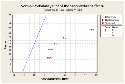
When we look at the normal probability plot below, created after removing 3-way and 4-way interactions, we can see that now BD and BC are significant.
We can also see this in the statistical output of this model as shown below:
Factorial Fit: Rate versus A, B, C, D
Estimate Effects and Coefficients for Rate (coded units)
| Term | Effect | Coef | SE Coef | T | P |
|---|---|---|---|---|---|
| Constant | 6.15250 | 0.2521 | 24.40 | 0.000 | |
| A | 0.91750 | 0.45875 | 0.2521 | 1.82 | 0.128 |
| B | 6.43750 | 3.21875 | 0.2521 | 12.77 | 0.000 |
| C | 3.29000 | 1.64625 | 0.2521 | 6.53 | 0.001 |
| D | 2.29000 | 1.14500 | 0.2521 | 4.54 | 0.006 |
| A*B | 0.59000 | 0.29500 | 0.2521 | 1.17 | 0.295 |
| A*C | 0.15500 | 0.07750 | 0.2521 | 0.31 | 0.771 |
| A*D | 0.83750 | 0.41875 | 0.2521 | 1.66 | 0.158 |
| B*C | 1.51000 | 0.75500 | 0.2521 | 2.99 | 0.030 |
| B*D | 1.59250 | 0.79625 | 0.2521 | 3.16 | 0.025 |
| C*D | 0.44750 | 0.22375 | 0.2521 | 0.89 | 0.415 |
| S = 1.00843 | R-Sq = 98.07% | R-Sq(adj) = 94.20% |
Analysis of Variance for Rate (coded units)
| Source | DF | Seq SS | Adj SS | Adj MS | F | P |
|---|---|---|---|---|---|---|
| Main Effects | 4 | 233.471 | 233.471 | 58.368 | 57.40 | 0.000 |
| 2-Way Interactions | 6 | 24.360 | 24.360 | 4.060 | 3.99 | 0.075 |
| Residual Error | 5 | 5.085 | 5.085 | 1.017 | ||
| Total | 15 | 262.916 |
The combined main effects are significant as seen in the combined summary table. And the individual terms, B, C, D, BC and BD, are all significant, just as shown on the normal probability plot above.
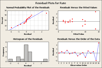
Now let's go one step farther and look at the completely reduced model. We'll go back into Minitab and get rid of everything except for the significant terms. Here is what you get:
What do you think?
Residuals versus the plot of the fitted values in the upper right-hand corner has now a very distinct pattern. It seems to be a classic as the response gets larger the residuals get more spread apart.
What does this suggest is needed? For those of you who have studied heteroscedastic variance patterns in regression models you should be thinking about possible transformations.
A transformation - the large values are more variable than smaller values. But why does this only show up now? Well, when we fit a full model it only has one observation per cell and there's no pure way to test for residuals. But when we fit a reduced model, now there is inherent replication and this pattern becomes apparent.
Take a look at the data set and you will find the square root and the log already added in order to analyze the same model using this transformed data. What do you find happens?