Example 11-2: Places Rated, continued Section
Step 3: To interpret each component, we must compute the correlations between the original data and each principal component.
These correlations are obtained using the correlation procedure. In the variable statement, we include the first three principal components, "prin1, prin2, and prin3", in addition to all nine of the original variables. We use the correlations between the principal components and the original variables to interpret these principal components.
Because of standardization, all principal components will have a mean of 0. The standard deviation is also given for each of the components and these are the square root of the eigenvalue.
The correlations between the principal components and the original variables are copied into the following table for the Places Rated Example. You will also note that if you look at the principal components themselves, then there is zero correlation between the components.
| Principal Component | |||
|---|---|---|---|
| Variable | 1 | 2 | 3 |
| Climate | 0.190 | 0.017 | 0.207 |
| Housing | 0.544 | 0.020 | 0.204 |
| Health | 0.782 | -0.605 | 0.144 |
| Crime | 0.365 | 0.294 | 0.585 |
| Transportation | 0.585 | 0.085 | 0.234 |
| Education | 0.394 | -0.273 | 0.027 |
| Arts | 0.985 | 0.126 | -0.111 |
| Recreation | 0.520 | 0.402 | 0.519 |
| Economy | 0.142 | 0.150 | 0.239 |
Interpretation of the principal components is based on finding which variables are most strongly correlated with each component, i.e., which of these numbers are large in magnitude, the farthest from zero in either direction. Which numbers we consider to be large or small is of course a subjective decision. You need to determine at what level the correlation is of importance. Here a correlation above 0.5 is deemed important. These larger correlations are in boldface in the table above:
We will now interpret the principal component results with respect to the value that we have deemed significant.
First Principal Component Analysis - PCA1 Section
The first principal component is strongly correlated with five of the original variables. The first principal component increases with increasing Arts, Health, Transportation, Housing, and Recreation scores. This suggests that these five criteria vary together. If one increases, then the remaining ones tend to increase as well. This component can be viewed as a measure of the quality of Arts, Health, Transportation, and Recreation, and the lack of quality in Housing (recall that high values for Housing are bad). Furthermore, we see that the first principal component correlates most strongly with the Arts. In fact, we could state that based on the correlation of 0.985 that this principal component is primarily a measure of the Arts. It would follow that communities with high values tend to have a lot of arts available, in terms of theaters, orchestras, etc. Whereas communities with small values would have very few of these types of opportunities.
Second Principal Component Analysis - PCA2 Section
The second principal component increases with only one of the values, decreasing Health. This component can be viewed as a measure of how unhealthy the location is in terms of available health care including doctors, hospitals, etc.
Third Principal Component Analysis - PCA3 Section
The third principal component increases with increasing Crime and Recreation. This suggests that places with high crime also tend to have better recreation facilities.
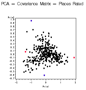
To complete the analysis we oftentimes would like to produce a scatter plot of the component scores.
In looking at the program, you will see a gplot procedure at the bottom where we plot the second component against the first component. A similar plot can also be prepared in Minitab but is not shown here.

Each dot in this plot represents one community. Looking at the red dot out by itself to the right, you may conclude that this particular dot has a very high value for the first principal component and we would expect this community to have high values for the Arts, Health, Housing, Transportation, and Recreation. Whereas if you look at the red dot at the left of the spectrum, you would expect to have low values for each of those variables.
The top dot in blue has a high value for the second component. We would not expect this community to have the best Health Care. And conversely, if you were to look at the blue dot on the bottom, the corresponding community would have high values for Health Care.
Further analyses may include:
- Scatter plots of principal component scores. In the present context, we may wish to identify the locations of each point in the plot to see if places with high levels of a given component tend to be clustered in a particular region of the country, while sites with low levels of that component are clustered in another region of the country.
- Principal components are often treated as dependent variables for regression and analysis of variance.