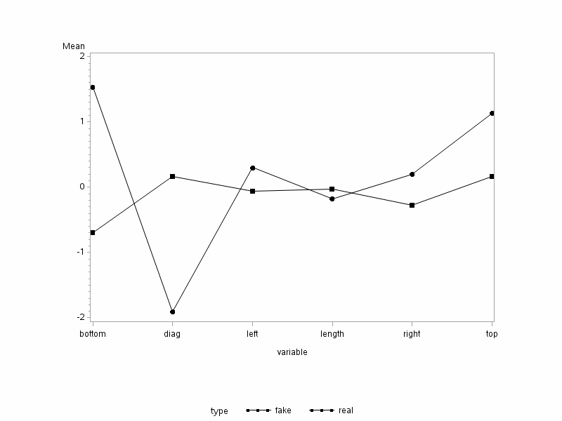
Profile plots provide another useful graphical summary of the data. These are only meaningful if all variables have the same units of measurement. They are not meaningful if the variables have different units of measurement. For example, some variables may be measured in grams while other variables are measured in centimeters. In this case, profile plots should not be constructed.
- In the traditional profile plot, the samples mean for each group is plotted against the variables.
- For the bank notes, it is preferable to subtract the government specifications before carrying out the analyses.
This plot can be obtained by the below:
Download the SAS Program here: swiss13b.sas
Note: In the upper right-hand corner of the code block you will have the option of copying ( ) the code to your clipboard or downloading ( ) the file to your computer.
options ls=78;
title "Profile Plot - Swiss Bank Notes";

 /* After reading in the swiss data, where each variable is
  * originally in its own column, the next statements stack the data
  * so that all variable names are in one column called 'variable',
  * and all response values minus their null values
  * are in another column called 'x'.
  * The subtraction is useful for plotting purposes because
  * it allows for a common reference value of 0 for all variables.
  */

data swiss;
  infile "D:\Statistics\STAT 505\data\swiss3.csv" firstobs=2 delimeter=',';
  input type $ length left right bottom top diag;
  variable="length"; x=length-215.0; output;
  variable="left  "; x=left-130.0;   output;
  variable="right "; x=right-130.0;  output;
  variable="bottom"; x=bottom-9.0;   output;
  variable="top   "; x=top-10.0;     output;
  variable="diag  "; x=diag-141.354; output;
  run;

proc sort;
  by type variable;
  run;

 /* The means procedure calculates and saves mean for
  * each variable and saves the results in a new data set 'a'
  * for use in the steps below.
  * /

proc means data=swiss;
  by type variable;
  var x;
  output out=a mean=xbar;
  run;

 /* The axis commands define the size of the plotting window.
  * The horizontal axis is of the variables, and the vertical
  * axis is used for the mean values.
  * /

proc gplot;
  axis1 length=4 in label=("Mean");
  axis2 length=6 in;
  plot xbar*variable=type / vaxis=axis1 haxis=axis2;
  symbol1 v=J f=special h=2 i=join color=black;
  symbol2 v=K f=special h=2 i=join color=black;
  run;
2 sample profile plot
To compute the two-sample profile plot:
- Open the ‘swiss3’ data set in a new worksheet
- Rename the columns type, length, left, right, bottom, top, and diag.
- Name six new columns in the worksheet: length2 through diag2.
- Calc > Calculator
- Highlight and select length2 to move it to the Store result window.
- In the Expression window, enter ‘length’ - 215, where the value 215 comes from the null value of interest (government specification) for length.
- Choose 'OK'. The length2 variable is populated in the worksheet.
- Repeat step 4. for the other five variables, dividing each by its null value of interest.
- Graph > Line plot > Multiple Y’s with groups > OK
- Highlight and select all 6 variables created in steps 4 and 5 (length2 through diag2) to move them to the Y-variables window.
- Choose type for the Group variable.
- Display Y’s > Y’s first
- Under Options, make sure the Mean confidence interval bar and Mean symbol are checked.
- Choose 'OK', then 'OK' again. The profile plot is shown in the results area.
Analysis
The results are shown below:

From this plot, we can see that the bottom and top margins of the counterfeit notes are larger than the corresponding mean for the genuine notes. Likewise, the left and right margins are also wider for the counterfeit notes than the genuine notes. However, the diagonal and length measurement for the counterfeit notes appears to be smaller than the genuine notes. Please note, however, this plot does not show which results are significant. The significance is from the previous simultaneous or Bonferroni confidence intervals.
One of the things to look for in these plots is if the line segments joining the dots are parallel to one another. In this case, they are not even close to being parallel for any pair of variables.
Profile Analysis
Profile Analysis is used to test the null hypothesis that these line segments are indeed parallel. You should test the hypothesis that the line segments in the profile plot are parallel to one another only if the variables have the same units of measurement. We might expect parallel segments if all of the measurements for the counterfeit notes are consistently larger than the measurements for the genuine notes by some constant.
Use the following procedure to test this null hypothesis:
Step 1: For each group, we create a new random vector \(Y_{ij}\) corresponding to the \(j^{th}\) observation from population i. The elements in this vector are the differences between the values of the successive variables as shown below:
\( \mathbf{Y}_{ij} = \left(\begin{array}{c}X_{ij2}-X_{ij1}\\X_{ij3}-X_{ij2}\\\vdots \\X_{ijp}-X_{ij,p-1}\end{array}\right)\)
Step 2: Apply the two-sample Hotelling's T-square to the data \(\mathbf{Y}_{ij}\) to test the null hypothesis that the means of the \(\mathbf{Y}_{ij}\)'s for population 1 are the same as the means of the \(\mathbf{Y}_{ij}\)'s for population 2:
\(H_0\colon \boldsymbol{\mu}_{\mathbf{Y}_1} = \boldsymbol{\mu}_{\mathbf{Y}_2}\)