
How can one graph qualitative variables? Two common choices are the pie chart and the bar chart.
Pie Charts
- Pie Chart
- each sector of the circle represents the percentage of that category
Example: A pie chart of the eye color
Notes on pie charts
- Pie charts may not be suitable for too many categories. Thus, if there are too many categories, you can either combine some categories or use a bar chart to represent the data. What is mean by "too many"? There is no clear cutoff, more of just a judgment on the appearance.
- Readers may find the pie chart more useful if the percentages are arranged in a descending or ascending order.
Bar Charts
- Bar Chart
- The height of the bar for each category is equal to the frequency (number of observations) in the category. Leave space in between the bars to emphasize that there is no ordering in the classes.
Example: A bar chart of the eye color
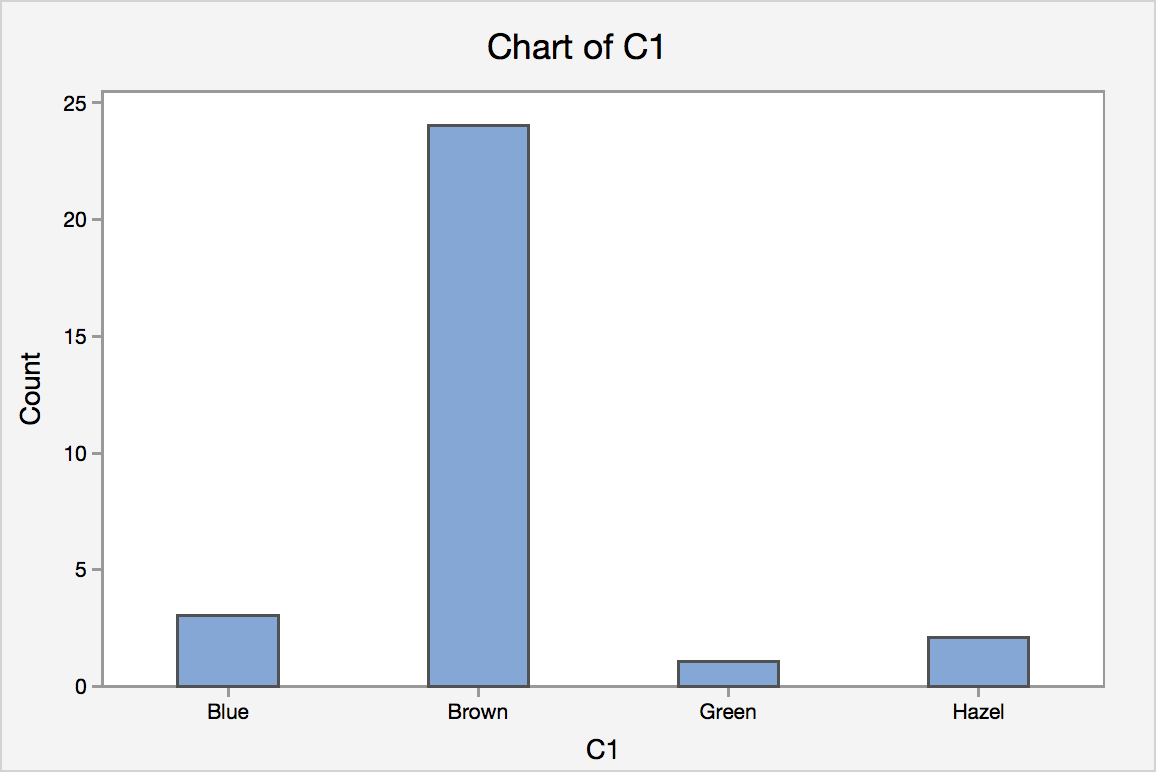
Notes on Bar Charts
- Please pay attention that even though histogram (shown in section 1.4) also have bars sticking up, they are used to describe the frequency for quantitative variables; bar chart is reserved to describe graphs that show frequency of categorical variables.
For this class, we do not expect you to create the graphs by hand. You should, however, make sure you understand how they are created.