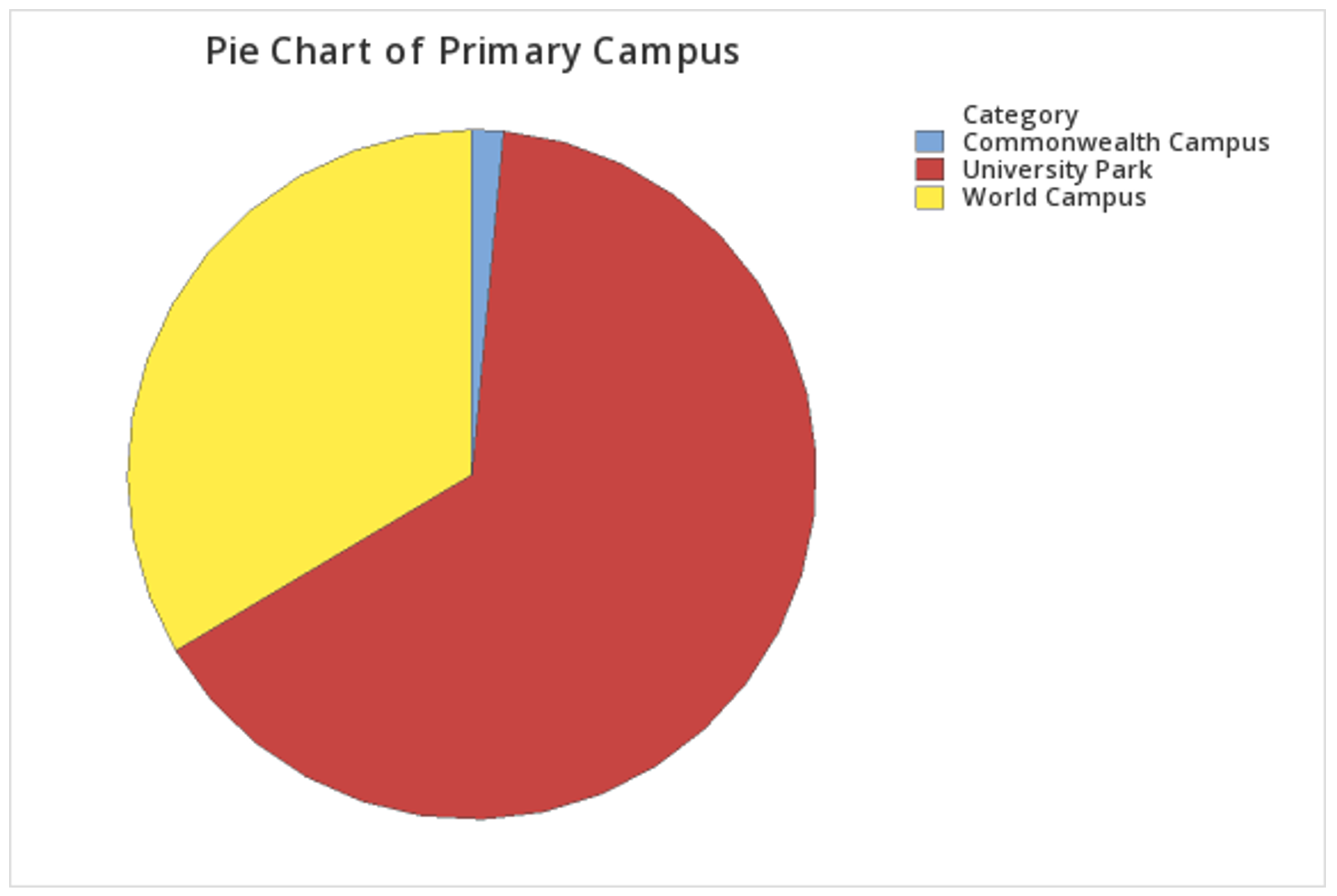
Minitab® – Pie Chart (Raw Data)
This example will use data collected from a sample of students enrolled in online sections of STAT 200 during the Summer 2020 semester. These data can be downloaded as a CSV file:
To create a pie chart using raw data:
- Open the data file in Minitab
- From the tool bar, select Graph > Pie Chart...
- Select Counts of Unique Values
- Click OK
- Double click the variable Primary Campus in the box on the left to insert it into the Categorical variables box on the right
- Click OK
This should result in the pie chart below:
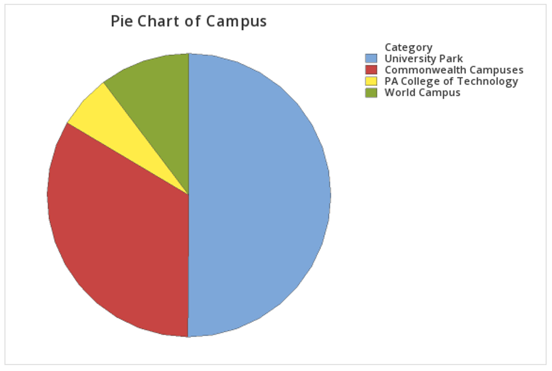
Minitab® – Pie Chart (Summarized Data)
In the example above, raw data were used. In other words, the data file contained one row for each case. It is also possible to use Minitab to construct a pie chart with summarized data, for example, if you have your counts in a frequency table. If this is the case, follow the steps below. This example uses the following data concerning Penn State undergraduate enrollment:
| Campus | Count |
|---|---|
| University Park | 40,639 |
| Commonwealth Campuses | 27,100 |
| PA College of Technology | 4,981 |
| World Campus | 8,360 |
Penn State Fall 2019 Undergraduate Enrollments
To create a pie chart using summarized data:
- Enter the data into a blank Minitab worksheet with one column containing the Campus names and a second column containing the Count for each campus
- From the tool bar, select Graph > Pie Chart...
- Select Summarized Data in a Table
- Click OK
- Double click Campus in the box on the left to insert it into the Categorical variable box on the right
- Double click Count in the box on the left to insert it into the Summary variables box on the right
- Click OK
This should result in the pie chart below: