At the end of Lesson 2.2.10 you learned that the five-number summary includes five values: minimum, Q1, median, Q3, and maximum. These five values can be used to construct a graph known as a boxplot. This is sometimes also referred to as a box and whisker plot.
In a boxplot, outliers are denoted with an asterisk. The bottom whisker extends to the lowest value that is not an outlier and the upper whisker extends to the highest value that is not an outlier. The box represents the middle 50% of observations with the lower end of the box at the 25th percentile (i.e., Q1) and the upper end of the box at the 75th percentile (i.e., Q3). The line in the middle of the box represents the median.
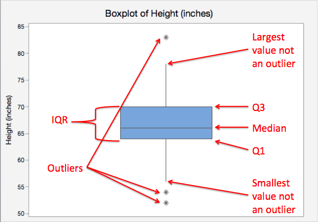
Minitab uses the IQR method to identify outliers. You will learn more about this on the next page.
Single Boxplot
Graph displaying data from one quantitative variable. Also known as a "box-and-whisker plot." The box represents the middle 50% of observed values. The bottom of the box is the first quartile (25th percentile) and the top of the box is the third quartile (75th percentile). The line in the middle of the box is the median (50th percentile). The lines, also known as whiskers, extend to the lowest and highest values that are not outliers. Outliers are symbolized using asterisks or circles.
Minitab® – Single Boxplot
Boxplots Section
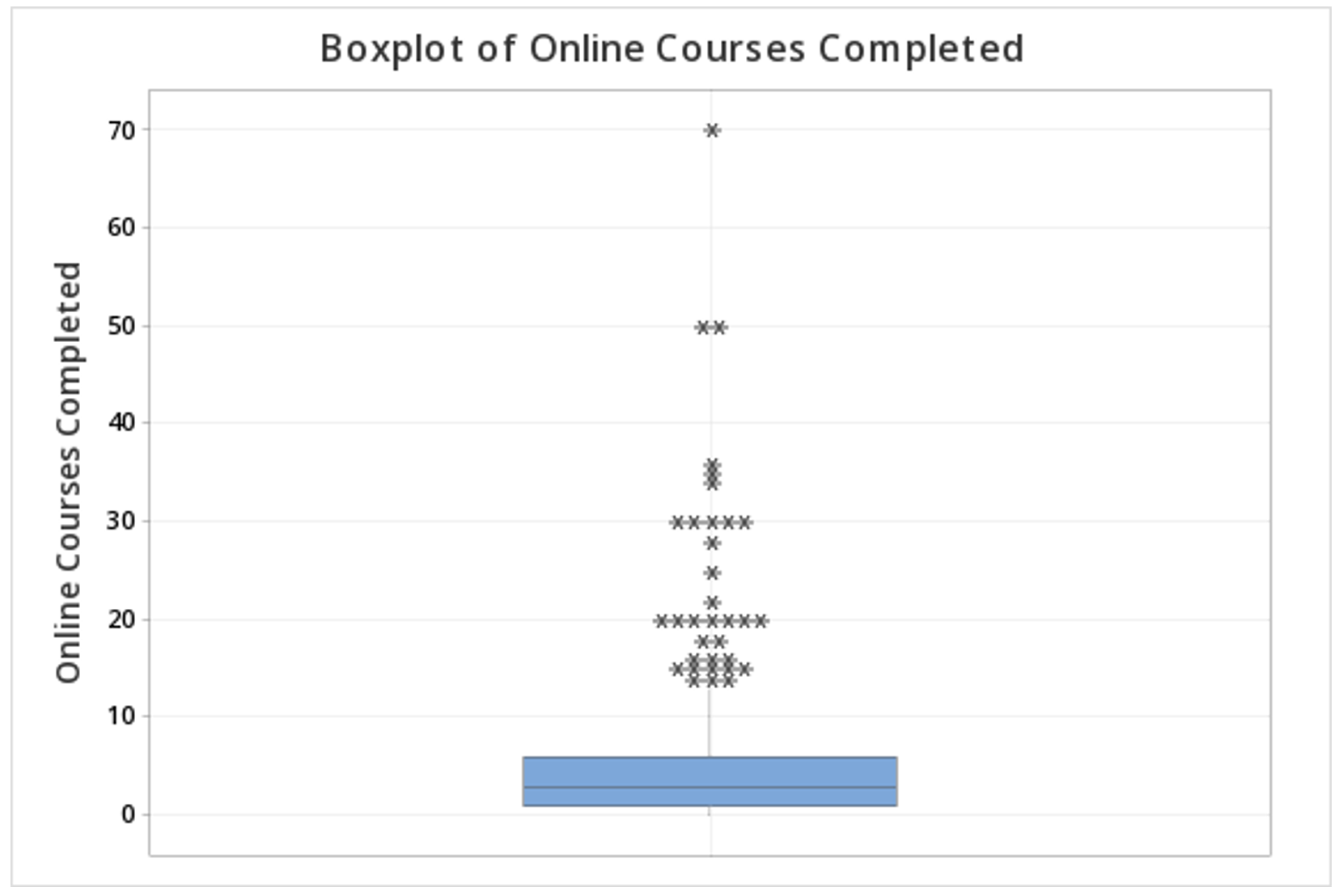
This example will use data collected from a sample of students enrolled in online sections of STAT 200 during the Summer 2020 semester. These data can be downloaded as a CSV file:
To create a boxplot of the number of online courses completed:
- Open the data set in Minitab
- From the tool bar, select Graph > Boxplot...
- Under One Y Variable, select Simple
- Click OK
- Double click the variable Online Courses Completed in the box on the left to insert it into the Y-variable box on the right
- Click OK
This should result in the following boxplot: