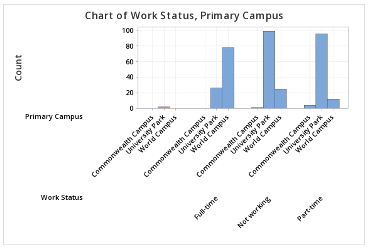
Minitab® – Clustered Bar Chart
This example will use data collected from a sample of students enrolled in online sections of STAT 200.
To create a clustered bar chart of the Work Status and Primary Campus variables in Minitab:
- Open the data file in Minitab
- From the tool bar, select Graph > Bar Chart > Counts of Unique Values
- Select Multiple Variables
- Click OK
- Double click the variables Work Status and Primary Campus to insert them both into the Categorical variables box on the right
- Click OK
This should result in the clustered bar chart below:
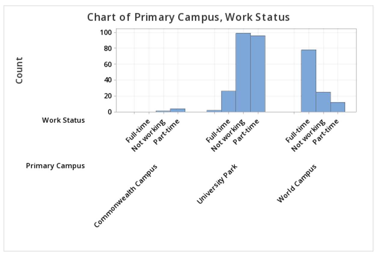
Note: The order in which the variables are entered into the Categorical variables box determines how the bars will be clustered. For example, if we entered Primary Campus and then Work Status, the result would be the following clustered bar chart:
Summarized Data Section
In the example above, raw data were used. In other words, our Minitab worksheet contained one row for each case. It is also possible to use Minitab to construct a clustered bar chart with summarized data, for example, if you have data in a frequency table. To do this, select Graph > Bar Chart > Summarized Data in a Table > Two-Way Table > Clustered or Stacked. Double click each of your variables to move them into the Y-variables box. Move the column containing row labels into the Row labels box. The default is to Cluster variables, which is what should be selected to create a clustered bar chart, with Rows first, Y's below. You also have the option of choosing which variable your bars are clustered by; to flip the variables, select Y's first, rows below from the drop-down.